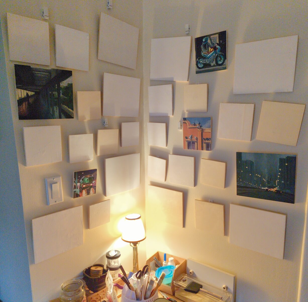
Drawn without water, on a 6 x 9″ grey blue cardstock, I think Strathmore brand. Drawn from life, from a lovely birthday bouquet.
by definition, not static
construction is continuing / old posts are being rebuilt / new archives are being built
I make art!
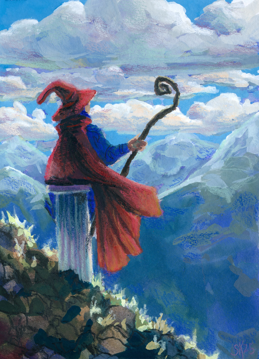
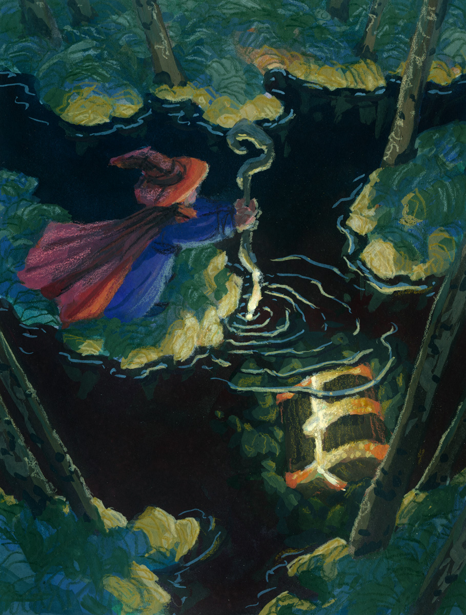
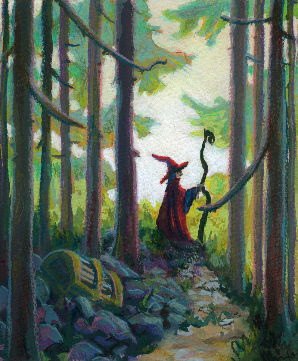
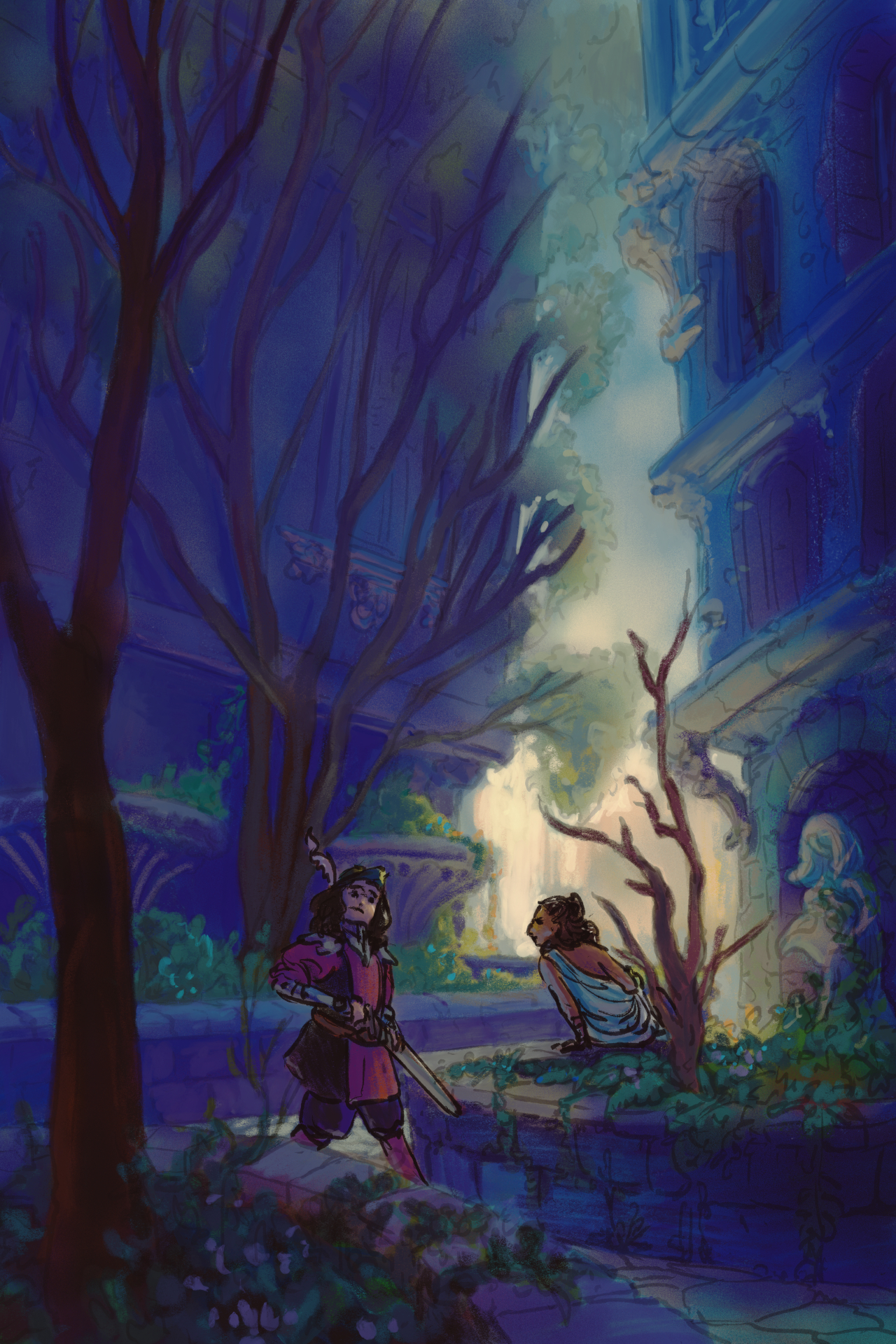
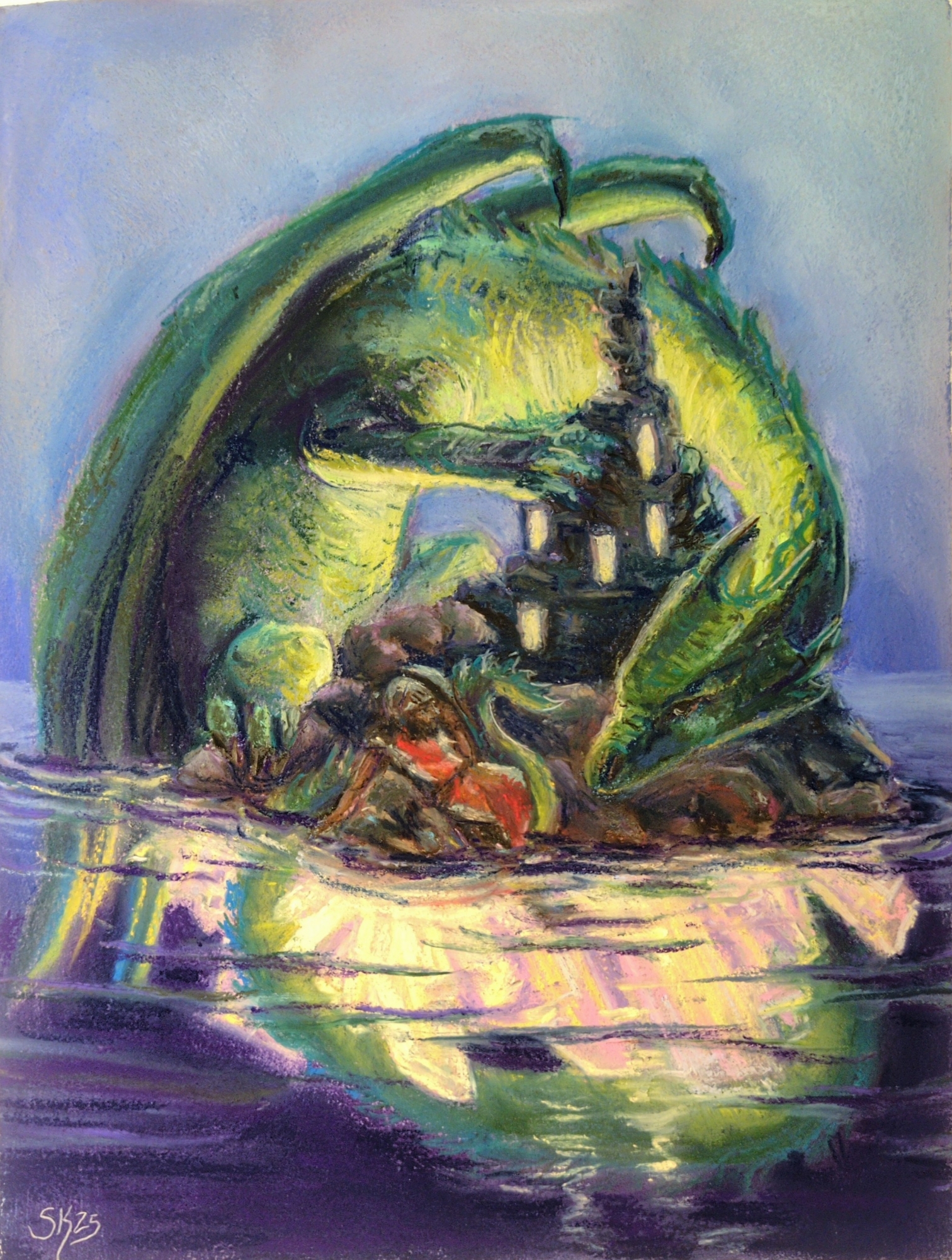
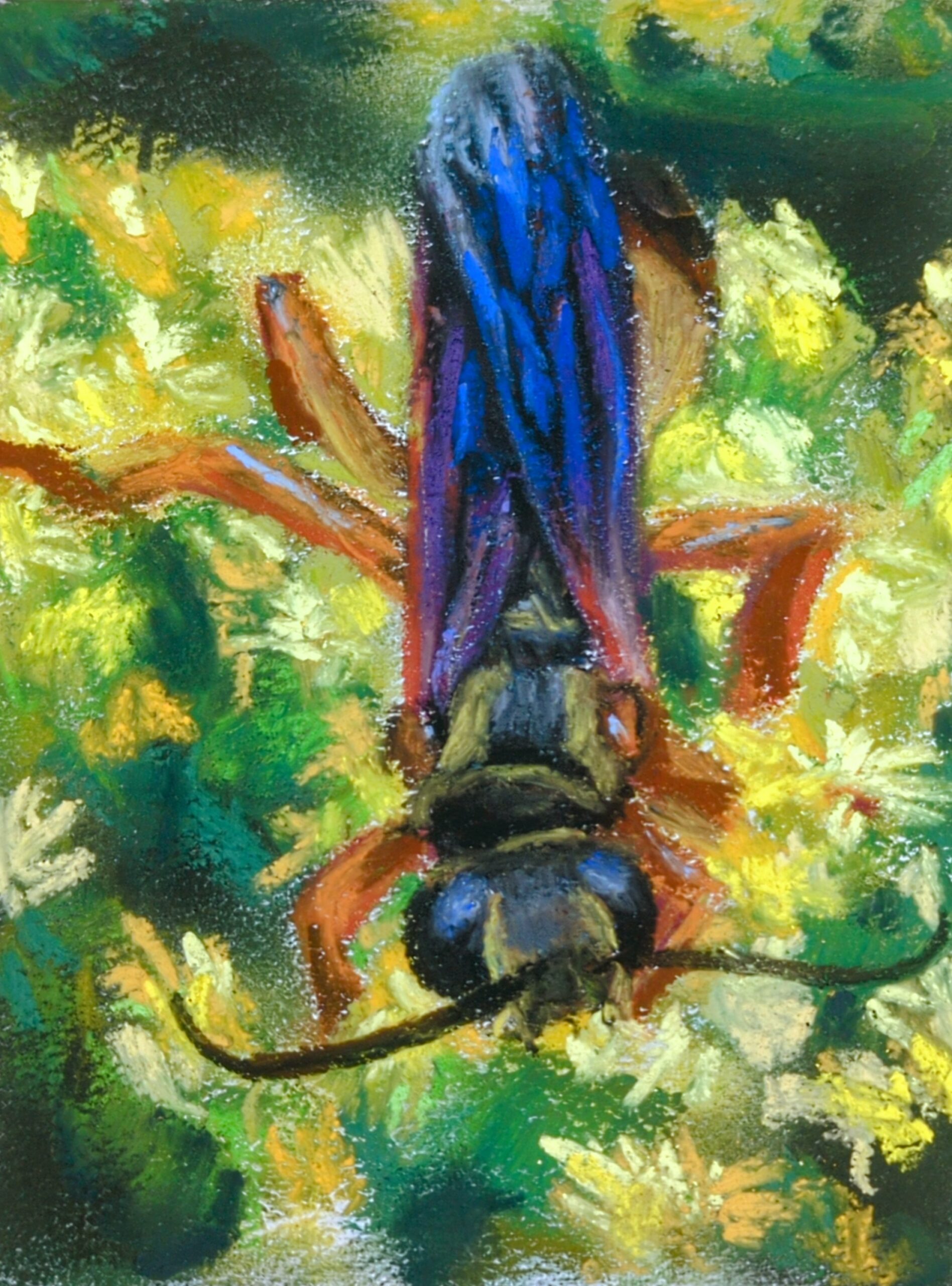
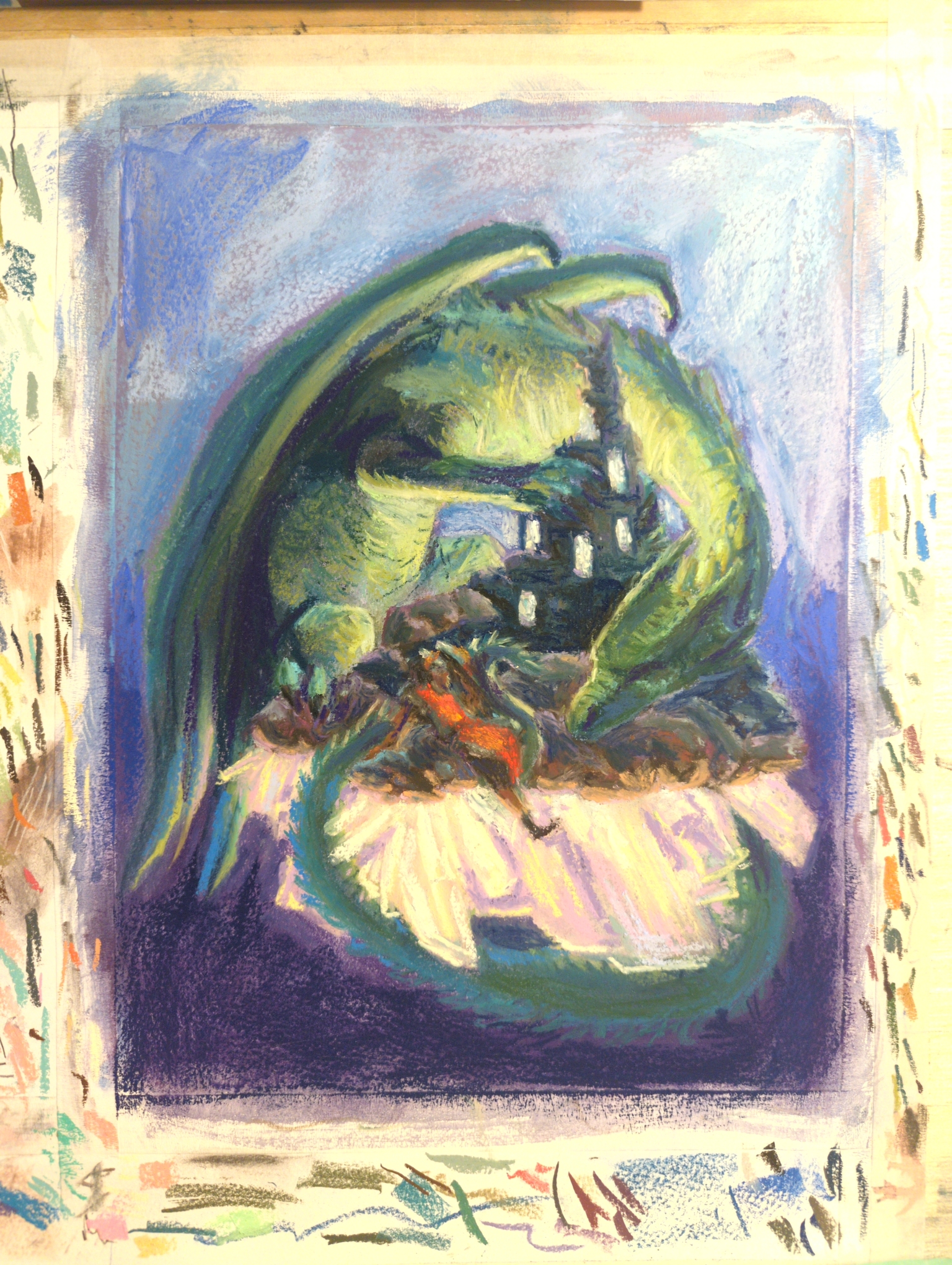
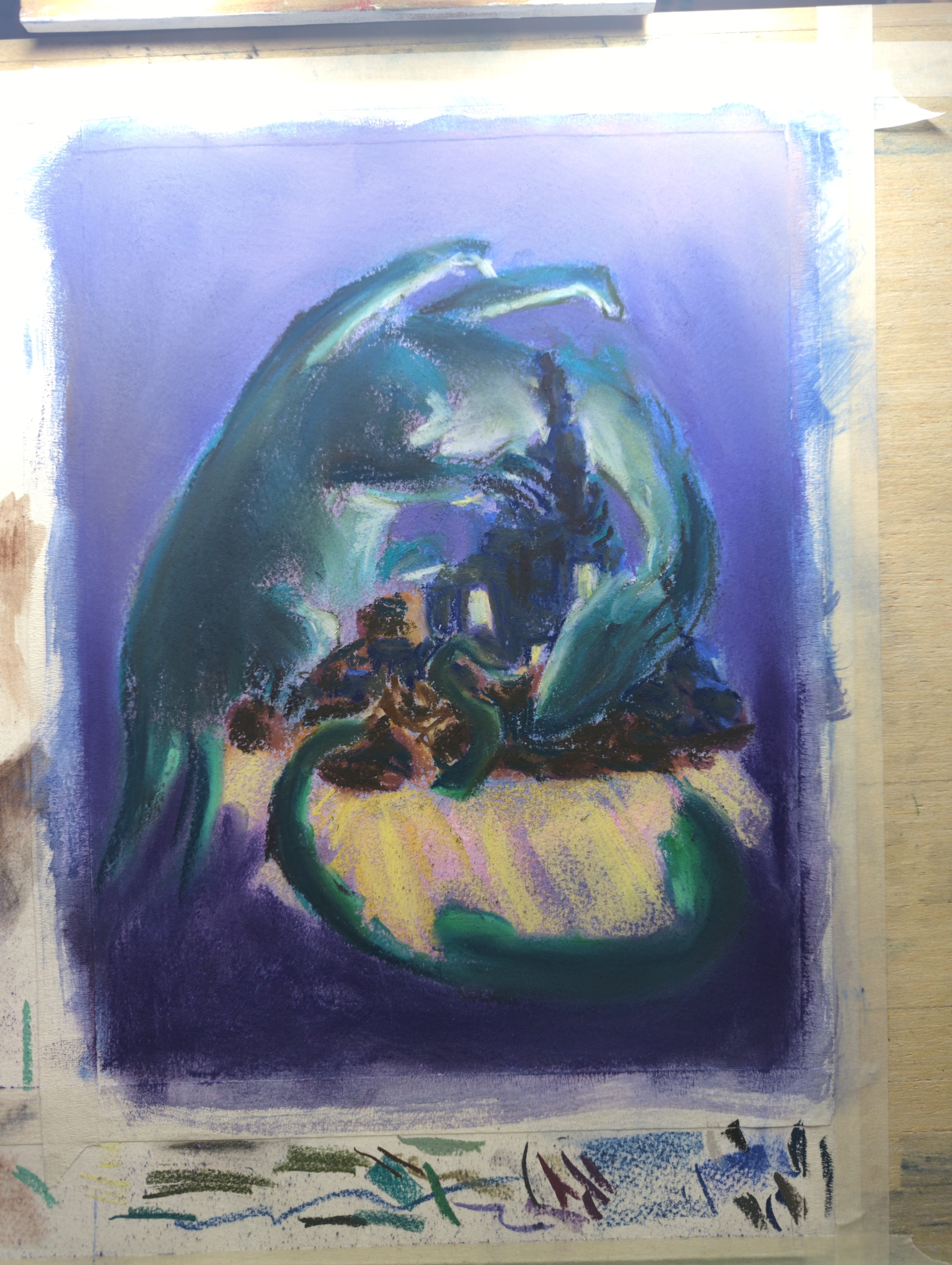
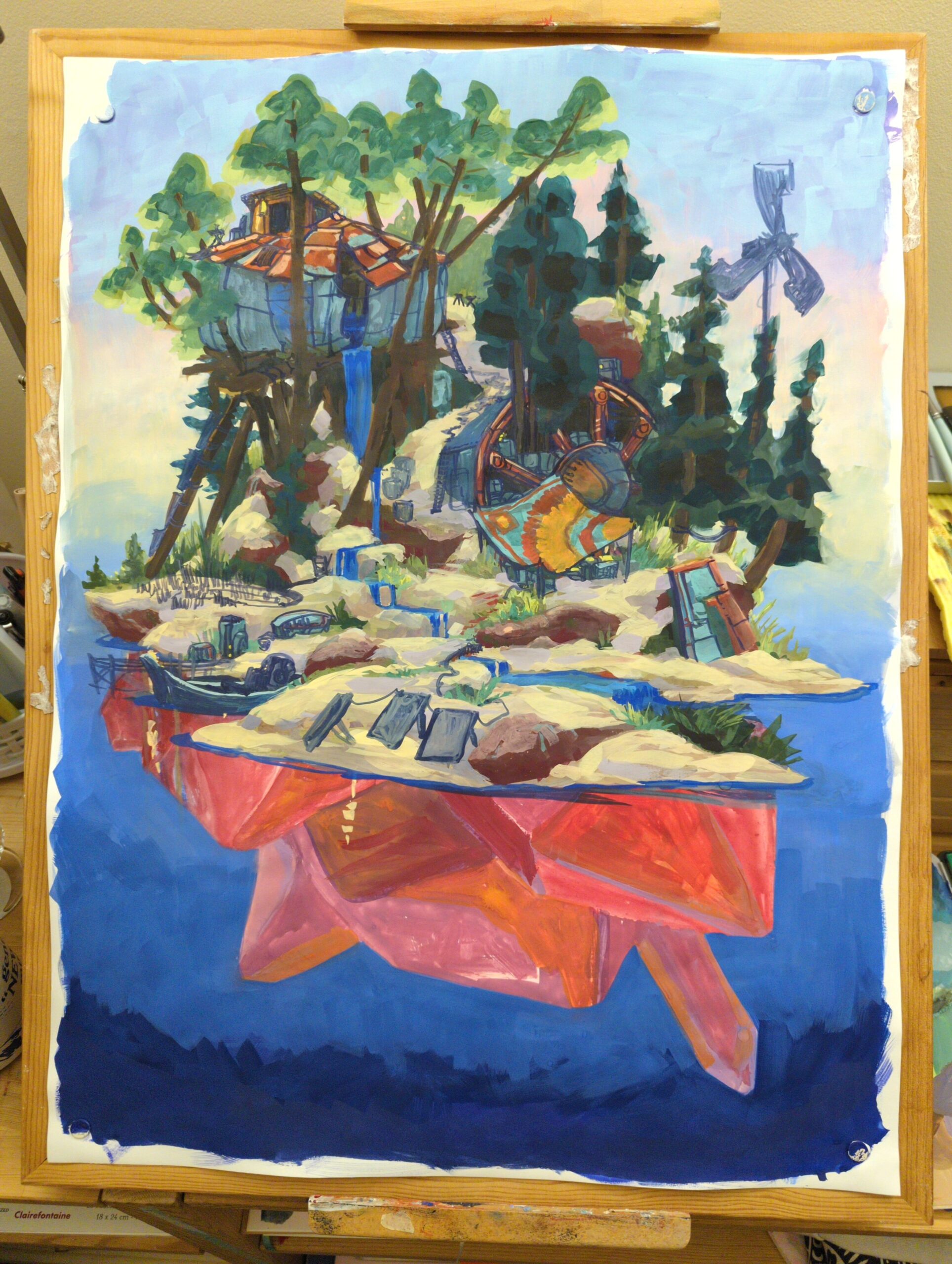
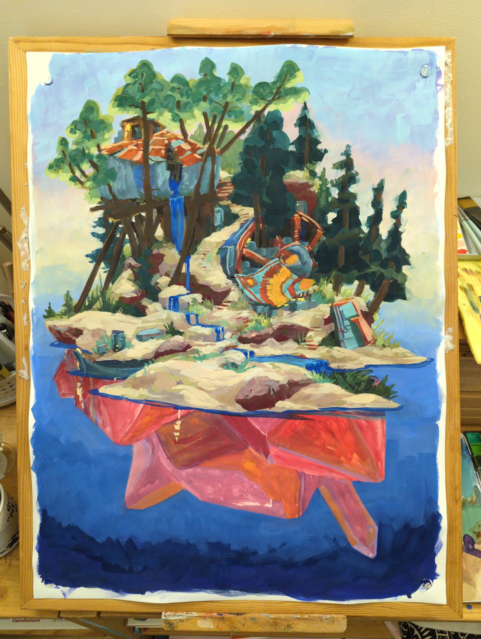
I make things. We’re calling them art for the time being but honestly it’s mostly process and some outcomes.
You might enjoy perusing specific tags! Tags such as:
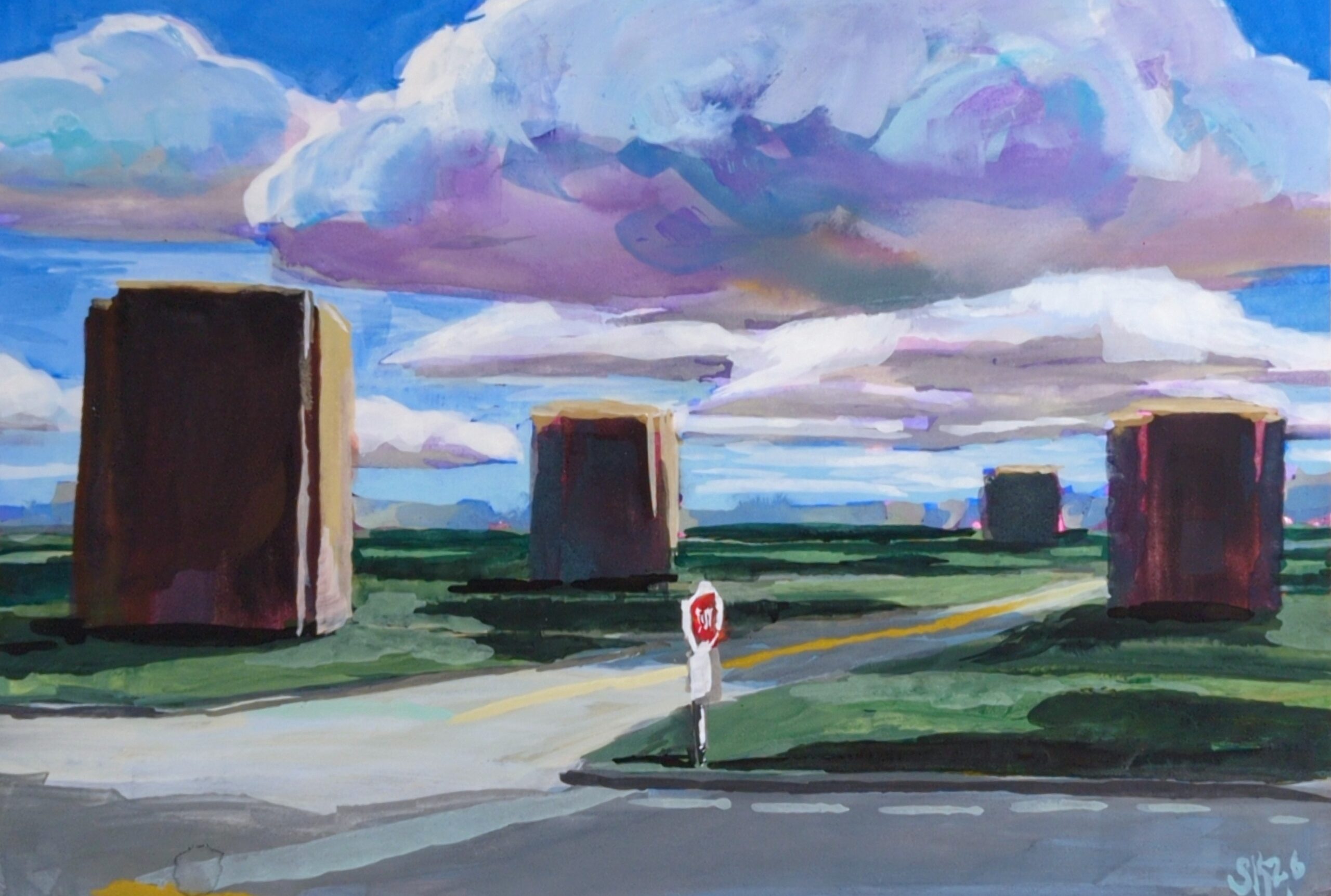
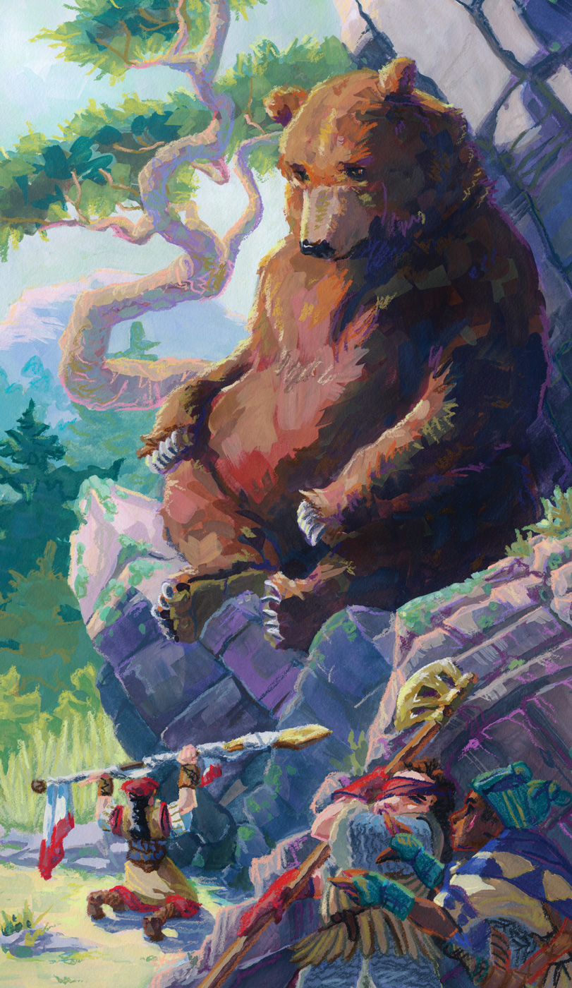
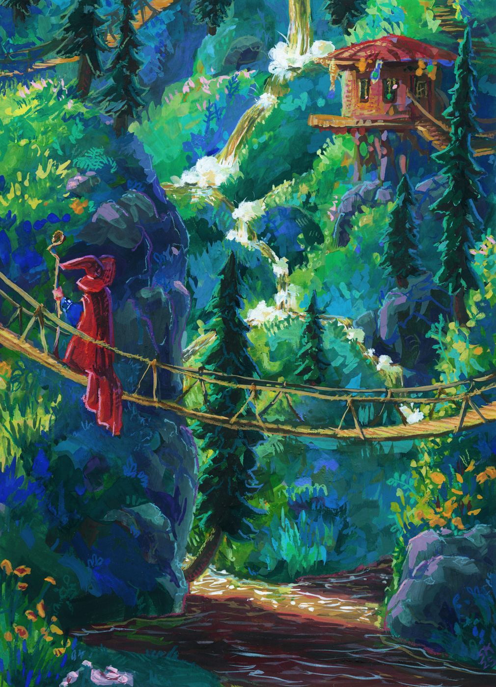
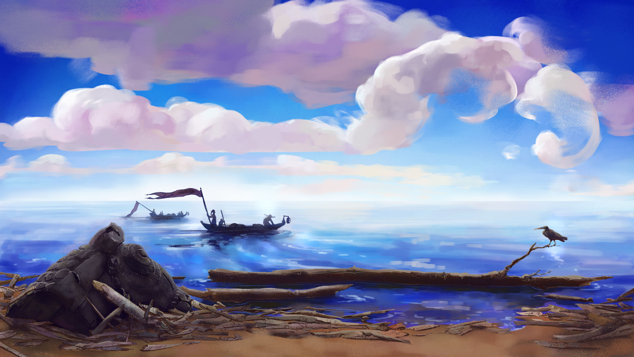
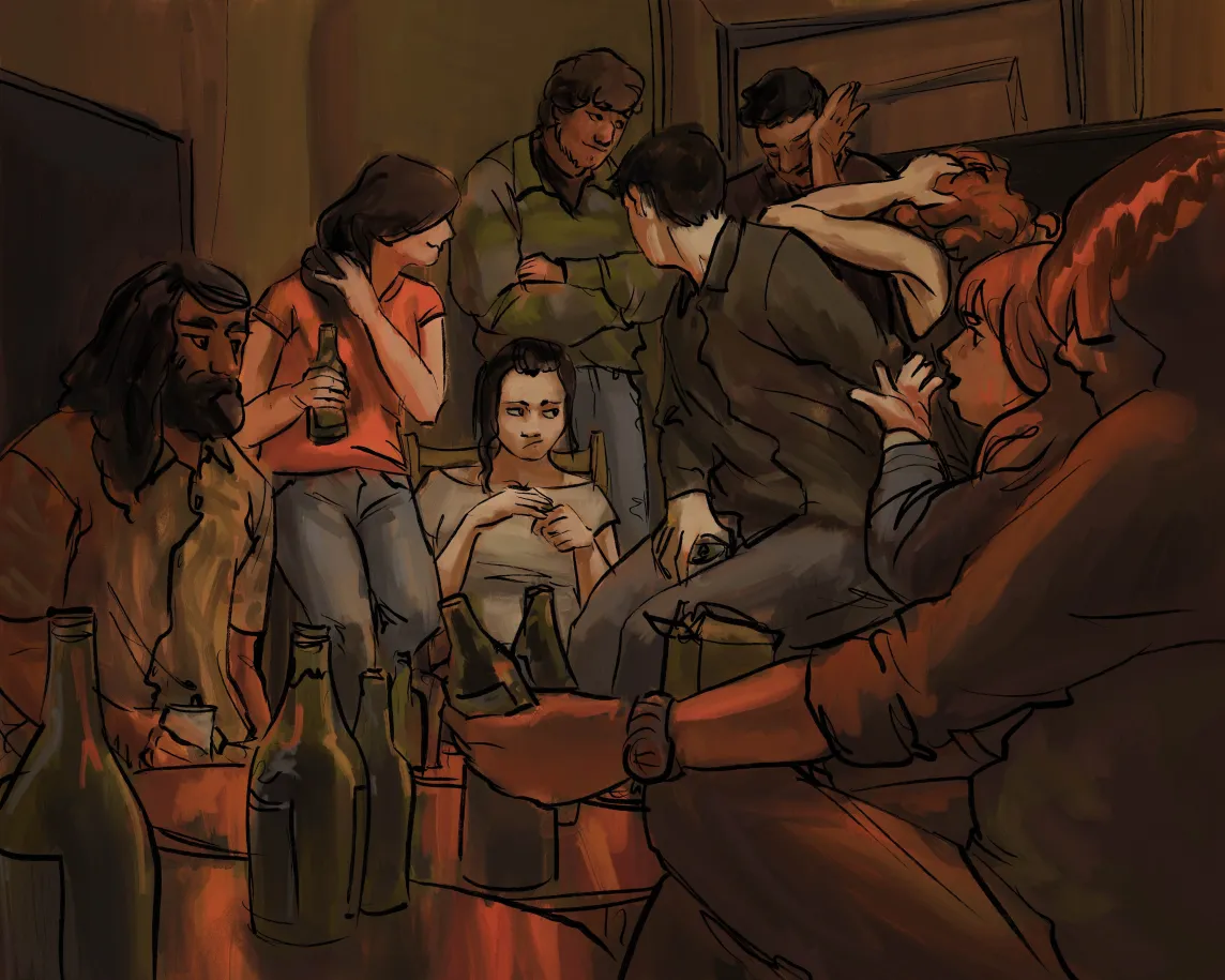
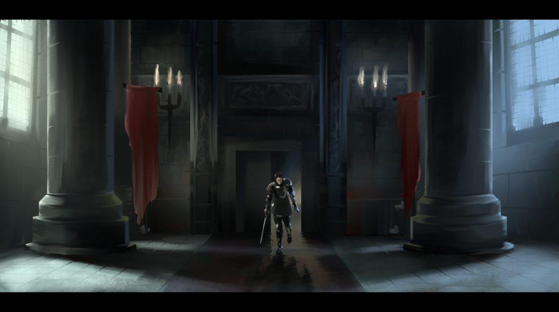
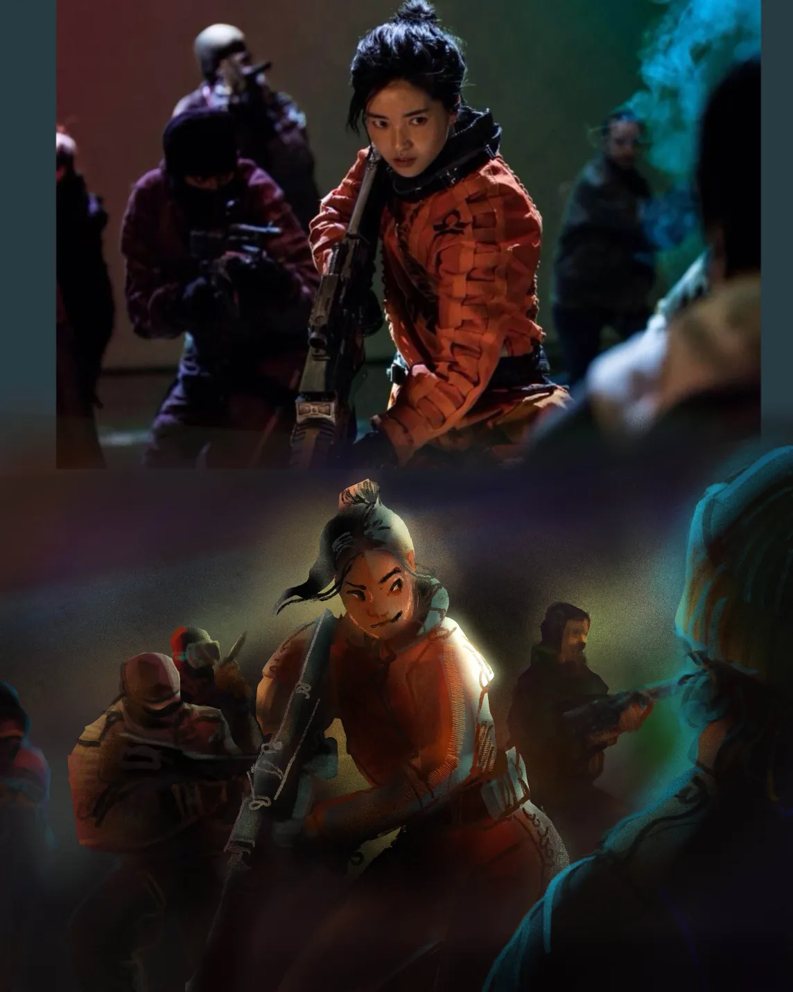
oil pastel or watercolour or gouache or digital art or sculpture
I am happiest when helping other people get excited to make things, so please drop questions and such in the comments fields and let me know what you’re hoping to make these days too!
Treated my birthday self to an Art Toolkit Folio Palette! It’s both big and small, with lots of mixing space, even though it packs up very slim and weighs very little; and it magnets to itself and to whatever I want to stick it to for painting. While the -14C snowy weather here in Southern […] — read more —
Gansai tambi paints and neocolor iis; a very fun combo! I am often sad about the difficulty of making watercolours create rich even dark washes, but the gansai tambi paints excel at it. The only tragedy is how glossy they come out if you go thick with them. Neocolors lay down beautifully on them though, […] — read more —
6 x 6″, sennelier oil pastels on unprimed wood. My partner gave me the full set of sennelier oil pastels for my birthday last week and it’s been excruciatingly hard not to abandon all my other commitments and responsibilities and just play with them incessantly because they are an incredibly enticing and beautiful medium that […] — read more —
Painted this in short bursts over several years – drew it in 2018, and printed it out on watercolour paper and started painting during the pandemic, and finished it last week. Gouache layered with neocolor iis on cold press paper. — read more —
Painted this gouache study on a 4 x 6 postcard, from a photo I took on a winter visit to St John’s, NFLD, from years ago. I was reminded that much of the appeal of painting in gouache lies in the brush strokes, and the quickest route to intentional brush strokes is to use the […] — read more —
More neocolor II crayons on hot press watercolour paper! Learning these is taking some time; unfortunately much of the content on youtube about them is people trying them for the first time, and that’s really not helping me unlock their secrets! But as I keep digging I am finding more folks at least systematically testing […] — read more —
Neocolor II crayons on hot press watercolour paper. This is my first piece done entirely with the neocolors – putting down layers, washing them into the paper, and adding more on top, over and over. They’re very fun, but it does require some hand strength to press them hard enough to get the richest colour […] — read more —
I got a gift card in return for doing a friend a favour this winter break and I decided to spend it on caran d’ache neocolor II watersoluble wax crayons. I’ve had a couple colours for a while and not really … grokked them? But with a broader range of colours and values I am […] — read more —
Gouache and pencil crayon on paper. Some detail shots for the texture: And here’s the piece at the gouache only stage: — read more —
Watercolour on paper. I’ve been thinking about adding people to my crystal islands – and adding little urban elements as well. Bits of Toronto at least. We are a lake city after all, and these crystal islands were absolutely first and foremost lake islands. I don’t know yet what I might call this series but […] — read more —
I swatched out all my gouache tubes this weekend (a great low stakes low light activity for riding out a migraine) and then used my newly organized info to put together a limited palette. I keep thinking I’m going to do more urban sketching, more plein air, than i really make to get to, but […] — read more —
So back in 2016 I decided to learn how to use gouache. For context, I finished my second round of art school in 2013, and that included a lot of drawing training and anatomy study, which I still use every day as an artist. I also already had some classical Russian academy style portrait painting […] — read more —
Drawn without water, on a 6 x 9″ grey blue cardstock, I think Strathmore brand. Drawn from life, from a lovely birthday bouquet.
Canadian here, and I can confirm that, while admittedly I have never seen a product list itself as a pencil crayon in Canada, we all agree that’s what coloured pencils are referred to as in conversation.
Now, certainly more research could be worth doing but, I have a theory… see, our packaging is mandated bilingual, and usually english first:
See how it reads as one long title?
Well, now, imagine kids throw that around for a bit till the verbal greebling is worn off:
Dunno what the official history is to this, linguistically, but this has been my working theory for some time.
Get scrungled, as they say.
Watercolour and carbon ink.
I decided go back in and see if I can’t push the clarity on this further with gouache and I think it really helped!
My photodocumentation is such shit in the winter with no natural light available, sorry. Maybe I’ll scan some sketchbook pages this year! But don’t count on it.
4 x 6″ gouache prawn. I decided to try using some drying time extenders – glycerine, watercolour blending medium – to try for more of a wet in wet blend approach, but honestly it was hard to keep the paint thick enough that it wasn’t just running all over the page. Something to retry in future on either more absorbent paper or with more viscous, fresh gouache.
Drawn on very, very smooth paper, a mistake I will not make again. Photo ref taken from my database of plants that I have grown (intentionally or not!) in my garden over the years.
Drawn from pinterest ref with my FPR ultraflex nib over an undersketch done with a long blade nib and washed into the page with a waterbrush.
this is lovely, I love this one
heck cheers!
Painted in my sketchbook with neocolor iis over a fountain pen sketch. Reffed from pinterest. After having my ass kicked learning to draw boats for a game in 2021, I can’t stop thinking about them! Little boats especially I find so incredibly cute.
Sketchbook page, fountain pen and neocolor iis and a waterbrush, layered and layered and layered.
I think there’s something here but it’ll take a fair bit more reworking to really see it. An idea for later.
Berkey-inspired, done in one of muji’s very cheap and much-nicer-than-expected sketchbooks.
I loved the sketch for this and the painting isn’t quite capturing it, so I’m wondering if, at this WIP stage, it might make sense to go in next with pencil crayons and see if i can’t capture more of what I’m looking for gesturally.
watercolour, including some amazing shimmery blues gifted to me by a friend, white gouache, metallic gelly roll pens, white pencil crayons, and tense neck muscles.
I’ve got a few iterations I’m exploring here and I’m thinking these might be worth doing full paintings of at some point.
A lovely array of flowers i used to walk by every day after work.
got a new tube of gouache paint! Winsor & Newton’s Cascade Green. You can see the tube colour pure in the top left swatch – the rest are mixes.
Teals are wonderfully fun pigments to work with because of this incredible breadth of mixes possible. Functionally, Cascade Green is working like a very highly saturated blue, giving me really vibrant greens, rich royal purples, and cool, elegant greys. Those singing purples in the last row are mixed with W&N Primary Red and Holbein Opera (both paints that do not like to rewet – especially the opera, hence the confetti of pigment in that one purple), the two yellowish olives with burnt umber and burnt sienna, and those vibrant glowing sky blues with various purples.
This colour is extremely hard to neutralize. the greyest two-colour mixes i could get from it still felt quite greenish, blueish or purplish. It’s going to be a very fun addition to any limited palette because of that incredible flexibility.
I chose it over buying a replacement tube of Winsor & Newton’s Turquoise Blue, a colour i used with abandon a few years ago, simply because i hadn’t tried Cascade Green yet. Honestly, I think i prefer it – I’m getting richer mixes from it, even with my multi-pigment pastels. I wouldn’t say no to owning both paints someday, but I’m definitely going to have fun with Cascade Green in the near future and I’m glad I gave it a try.
in terms of its dominance in a mix, it’s as dominant as any of my of earth tones, but not quite powerful enough to stand up to spectrum red or perylene violet.
heck, i love gouache, I’ve missed gouache
Honestly, I love the tiled effect I had going before the tighter rendering and, while the drawing wasn’t solved yet at that stage, I am curious if that isn’t a more appealing style for a potential finish for me on future studies. Something to explore.
watercolour and fountain pen, in my sketchbook.
I’ve been drawing modern wizards for my wizard puberty zine and what if they hung out on crystals islands.
Browsed through Earth’s World for some great natural light portraits to practice with. This was made in a new little 5 x 7ish sketchbook I picked up that’s filled with recycled cotton rag paper. I’d been noticing that rag papers have taken my softest oil pastels the best – you can see one pushed to its limit here – and finding a rag paper sketchbook seemed lucky! So my plan is to fill it up with small tests and just work on my technique.
got the gouache out again for the first time in months; arm recovery really took the fun out of it for me for a while there! but I’m feeling more myself when it comes to holding the brush again, and it was lovely to sit and do a study of the hawk I watched kill and eat a squirrel at my friend’s park birthday celebration earlier this year.
Leave a Reply