
swap to chronological order of most recently posted
-
gifs are so powerful!
-
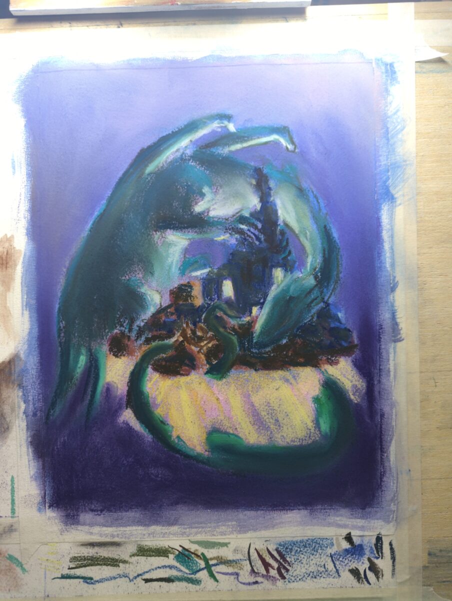
I’ve painted the paper with opaque watercolour ground to add more tooth and honestly it’s working really well!
-
…talkin shit
(done in tribute to an infinitely delightful series of photos by msd on the curious quail blog)
-
-

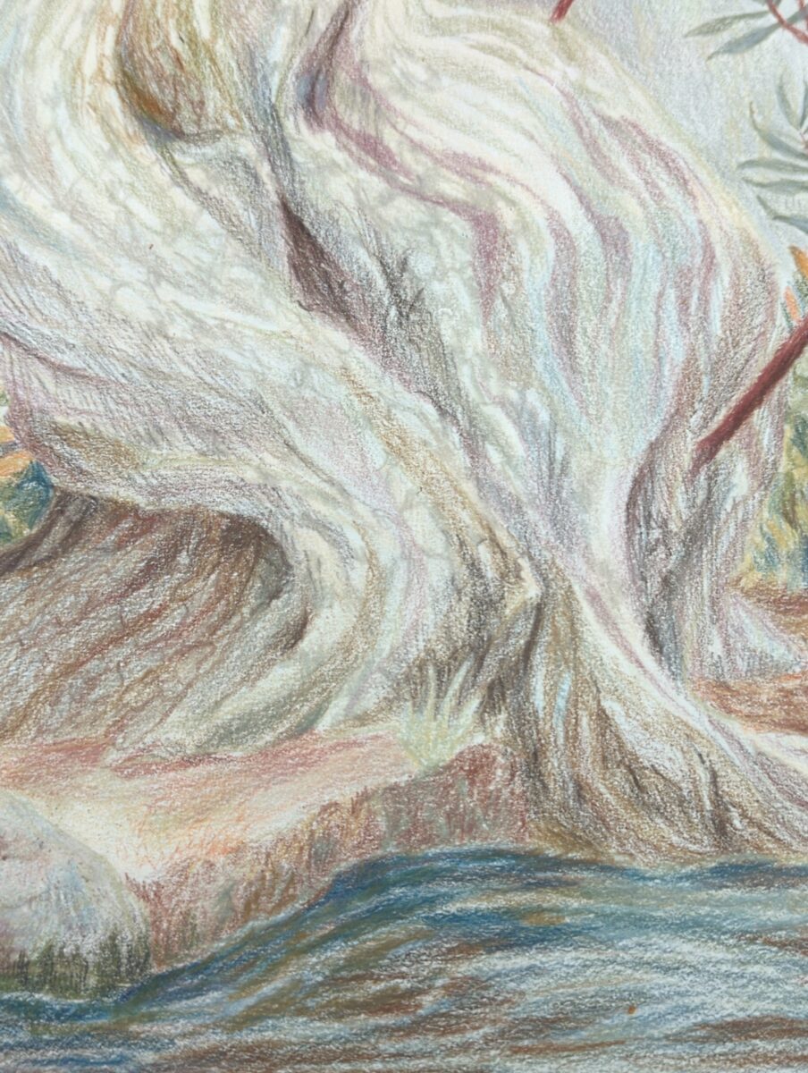
I am starting to really get into the bark, and I think this is going to take a few passes to get right, but! I am so, so excited about how much vibrance I can get by layering these neutrals together!
-
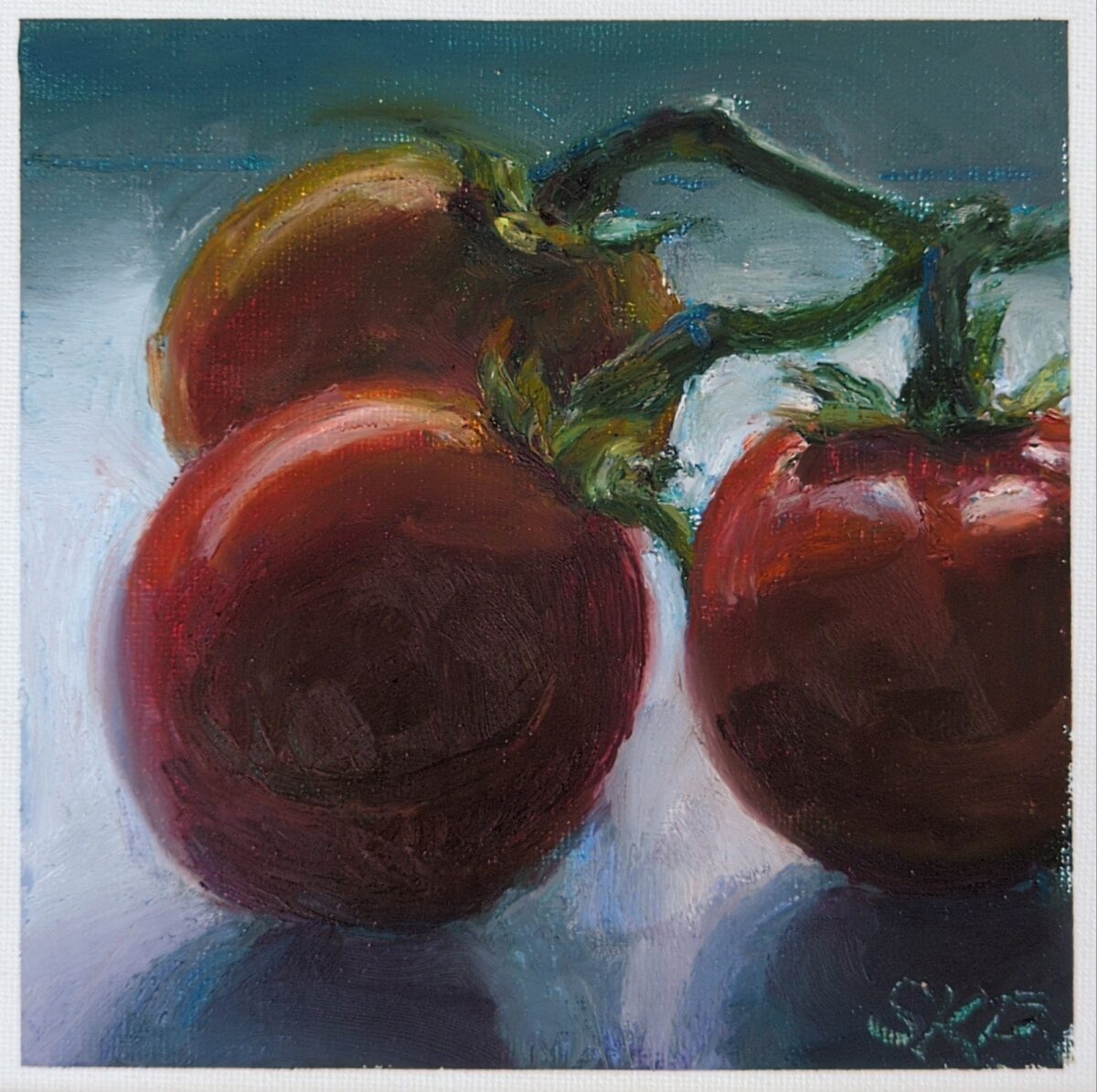
For this one i used all my oil pastels, from the hardest to the stickiest to the softest. The grain of the canvas panel was filled in very quickly and because all the pastels besides sennelier are so opaque, i feel like i lost some of the vibrancy I’d found in the strawberry earlier. However, still life is a wonderfully fun way to treat out and push your skills in a new medium and i can’t recommend it enough!
Also, man, studying ripe tomatoes on the vine from my snowy window seat in February is an exercise in… something. Sitting with unfulfilled cravings maybe.
-
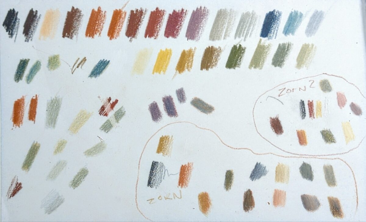
Twenty four colours including white, so, the 23 larger more uniform swatches at the top are the full line of pencil crayons. the rest of the swatches are me tearing blending and mixing, erasing, or making up miniature Zorn pallets of black, red, yellow and white, using different reds and yellows.
it’s a very limited palette, not just in color and saturation but also in value, with really only a few proper darks. I don’t know why the entire range is limited to this palette, but I am finding the challenge of working within it to be really fun and would recommend giving it a shot!
-
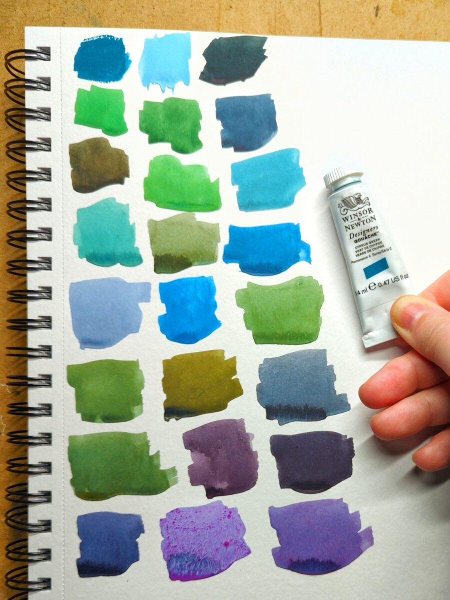
got a new tube of gouache paint! Winsor & Newton’s Cascade Green. You can see the tube colour pure in the top left swatch – the rest are mixes.
Teals are wonderfully fun pigments to work with because of this incredible breadth of mixes possible. Functionally, Cascade Green is working like a very highly saturated blue, giving me really vibrant greens, rich royal purples, and cool, elegant greys. Those singing purples in the last row are mixed with W&N Primary Red and Holbein Opera (both paints that do not like to rewet – especially the opera, hence the confetti of pigment in that one purple), the two yellowish olives with burnt umber and burnt sienna, and those vibrant glowing sky blues with various purples.
This colour is extremely hard to neutralize. the greyest two-colour mixes i could get from it still felt quite greenish, blueish or purplish. It’s going to be a very fun addition to any limited palette because of that incredible flexibility.
I chose it over buying a replacement tube of Winsor & Newton’s Turquoise Blue, a colour i used with abandon a few years ago, simply because i hadn’t tried Cascade Green yet. Honestly, I think i prefer it – I’m getting richer mixes from it, even with my multi-pigment pastels. I wouldn’t say no to owning both paints someday, but I’m definitely going to have fun with Cascade Green in the near future and I’m glad I gave it a try.
in terms of its dominance in a mix, it’s as dominant as any of my of earth tones, but not quite powerful enough to stand up to spectrum red or perylene violet.
-

painted on wood! I converted my reference photo to black and white, as well, and I think it did give me more permission to be weird with the color.
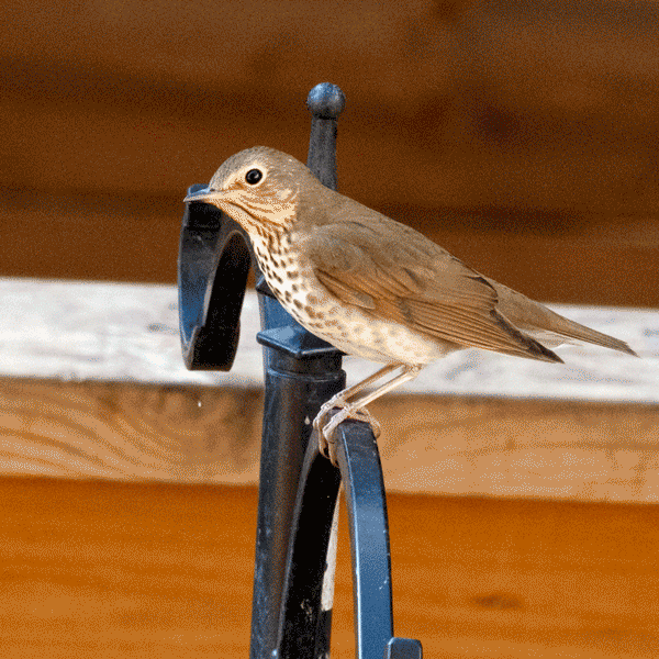
you might not know this, but I kept pet birds from the age of 9 until I was almost 30, first a peach-faced lovebird named Pickles (i was 9, and it was a genius name) and then a series of budgies, Glacier, Uther, and Percival.
as an adult, I know a lot more about the exotic pet bird industry, and I don’t know if owning birds is for me anymore, but if I did, I think I would go for pigeons: proper domesticated creatures that have had evolutionary time to be less stressed around people, and big enough to feel less terrifyingly vulnerable in the hand.
but there is something extremely magical about a bird choosing to sit on your hand, and as I was flipping through unsplash looking for something to paint, I started putting together a collection of reference of just that. so maybe? there will be more of these?
-
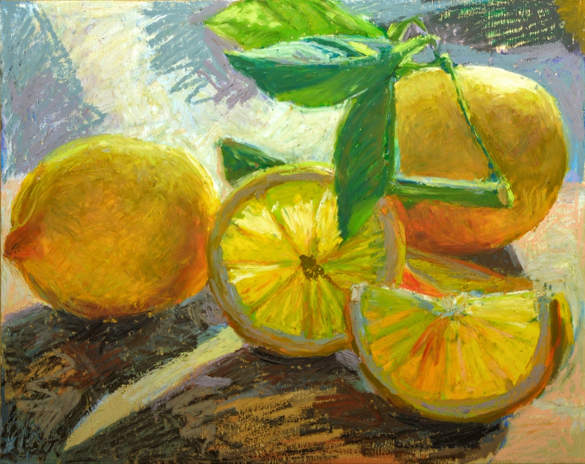
making these read yellow and not orange was tricky!
i haven’t really gotten the hang of mixing these oil pastels to achieve custom colours yet. I can do it but I don’t really have a go to method, not a real understanding of which colours mix how. the mungyo and haiya ones, which were more affordable, definitely mix to less saturated results than the caran d’ache neopastels or the sennellier pastels do, but sometimes you want those more muted results. My still life painting teacher back in 2009, Trudy, called them her “mouse colours”, and that charming language had stuck in my head sadly far better than my ability to plan for, mix, and make good use of neutrals.
something to work on for the next piece, i suppose!

Leave a Reply