
swap to chronological order of most recently modified
-
-
-
Well I mentioned earlier that I was also painting a whole folio for Swords Without Master, a wildly ambitious thing to do in addition to art directing, but I did indeed take it on and in the end: I finished it!
Here are my eight eidolons, which will be part of the game as tarot-sized cards you will be able to use at the table to nail down the tone, setting, mood and vibes of your story before you start play.
Epidiah has titled my folio Trials of the Stargazers, and I took that title and ran with it!
Who are these stargazers?
Where has their heavenly gaze led them so far?
What responsibilities have they undertaken?
What mistakes have they made?
How have they stayed brave and fearless in the face of a world as large and unfeeling as the night sky?
...and what happens when something as grandiose as a constellation turns its gaze upon our rogues themselves?
Each tarot-sized eidolon card will have more story and additional game mechanics on the reverse, and I can’t wait to see what Epidiah builds from these images! See a preview of the reverse of the eidolons in this kickstarter update.
But I dither and delay! Here, let me reveal to you the eight glorious eidolons of the Trials of the Stargazers folio for Swords Without Master!1
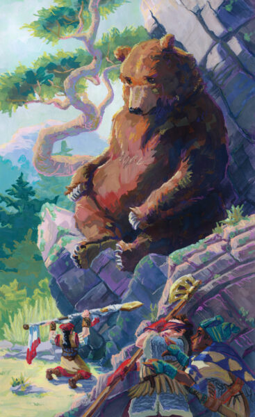
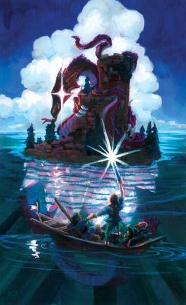
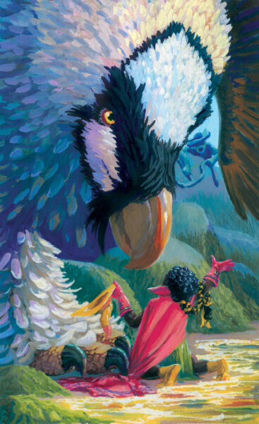
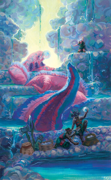
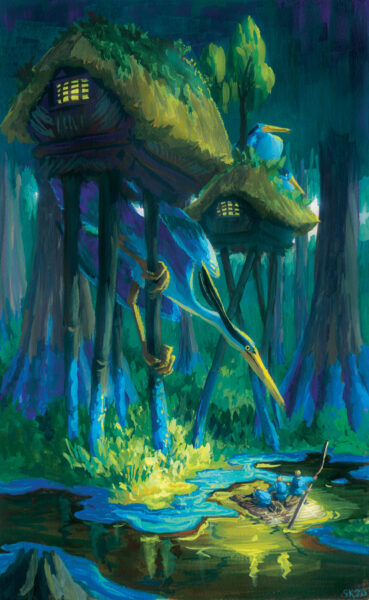
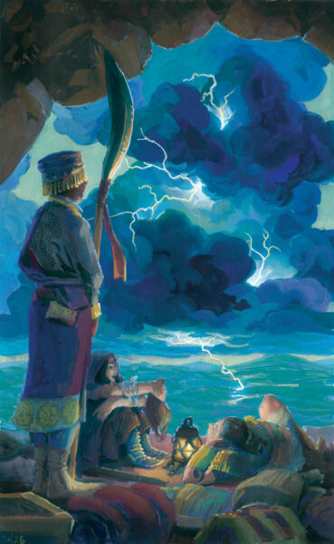
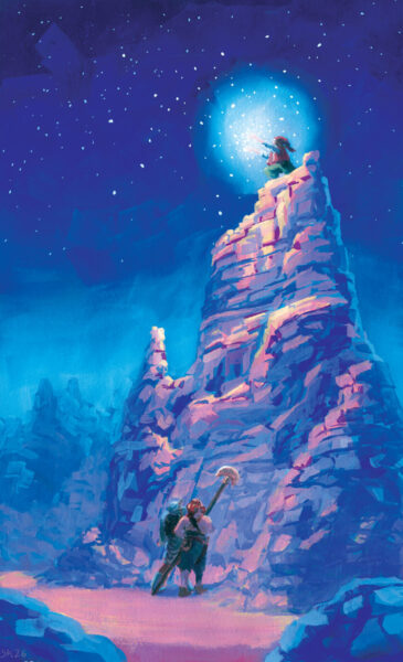
Each of these paintings is about 10 x 16″, on watercolour paper, painted with gouache and neocolour ii art crayons. To say they taught me a lot about my painting process and my own art goals would be an understatement – working on this was transformative, and I feel a little bit like I’ve been let off a leash I didn’t know I was keeping myself on! Where will I go next with this? I will let you all know when I find out, I guess!
But Shel, you ask, how did you manage to create these?
Well, each started as a thumbnail in my sketchbook, and for your viewing pleasure I have actually saved those to share here!

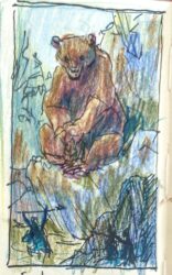
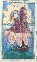


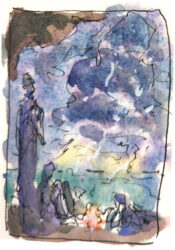

Some thumbnails were really almost ready to paint right off the bat, and others needed more development, but all of them held the seeds of a story that I wanted to know more about, and I hope the finished paintings do right by the possibilities I found here.
For more in-depth information about how these paintings were made, and why they look the way they do, I have already done a write-up on the Great Bear, which you can read here, and I am planning another thorough process post on the Pearl Axolotl, and will link that when it goes up!
In the end, creating this collection of sword and sorcery artwork was a dream come true, even if the process of doing it while also art directing so many brilliant artists (many of whom I have admired for years and years) did leave me with some gut-churning imposter syndrome to work through first! But the best jobs are always the ones that push me to stretch myself beyond my comfort zone, and working with everyone on Swords Without Master certainly did!
If the game appeals, I hope you’ll check it out over at swordswithoutmaster.com and consider grabbing yourself a copy!
In the meantime, I am dying to know – which one of these eidolons would you love to use to build your own epic tale?
- Formerly in Vol 1., Issue 3 of Worlds Without Master, but now successfully kickstarted into its own stand-alone fix-up edition, and still taking late pledges if, say, you missed the funding period but now find yourself desperate to get your hands on the game! ↩︎
-
I wanted to share some of the work I took on in my role as art director on Swords Without Master – not the admin side, today, though — the colour design side! I worked with a few of our artists to take black and white work they were able to offer us, and bring it to life via digital colours.
I love doing colour design! It was an honour to get to play with the beautiful drawings our artists provided, and I’m grateful for their trust in me to transform them respectfully!
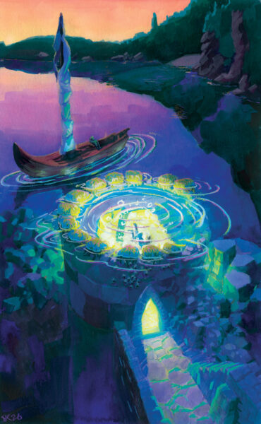
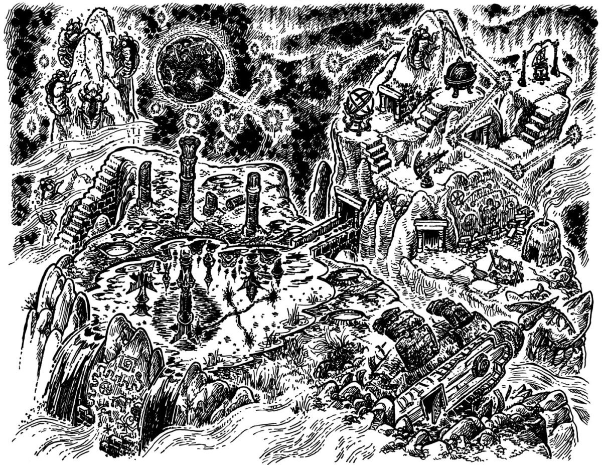
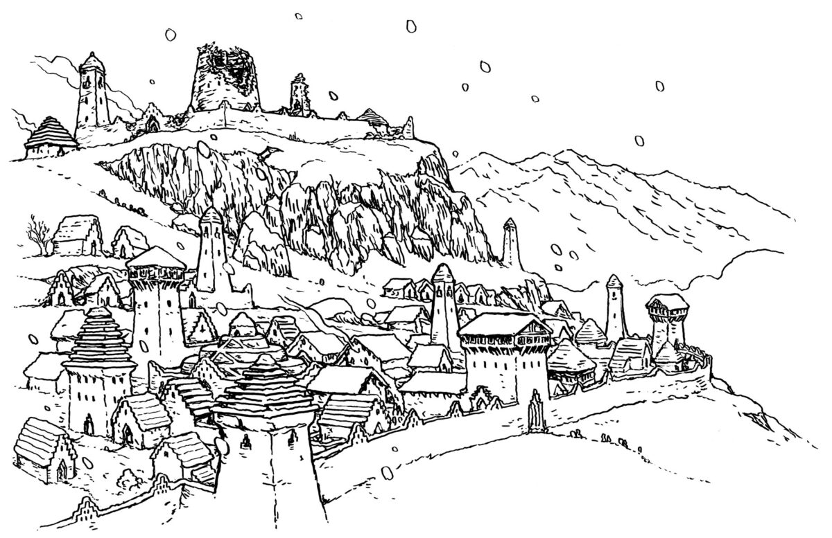
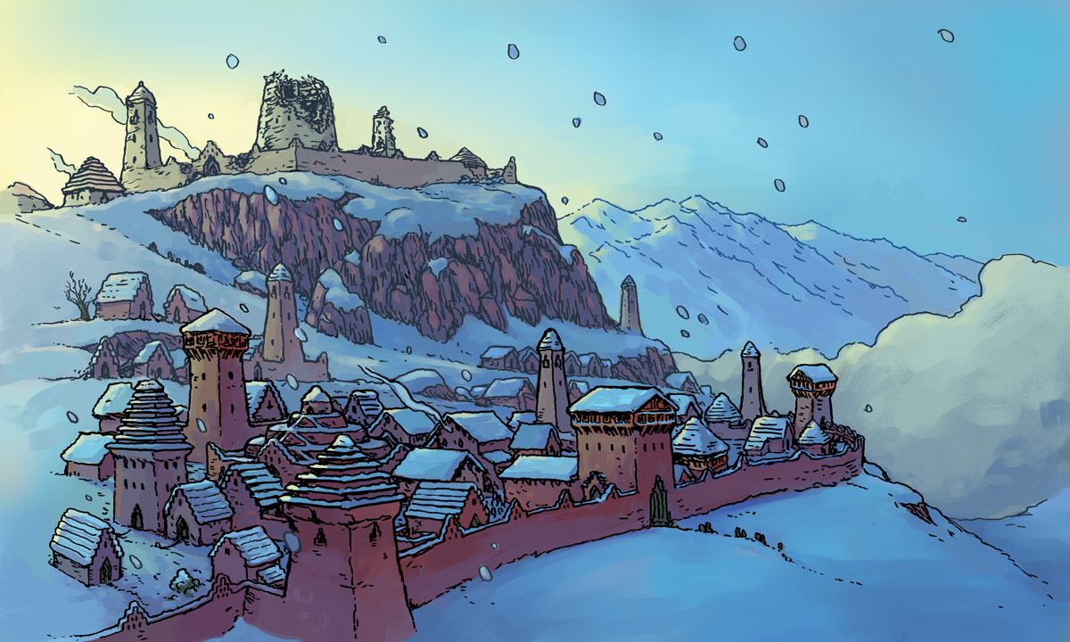
I got to work with one of Kyle Latino‘s glorious maps:
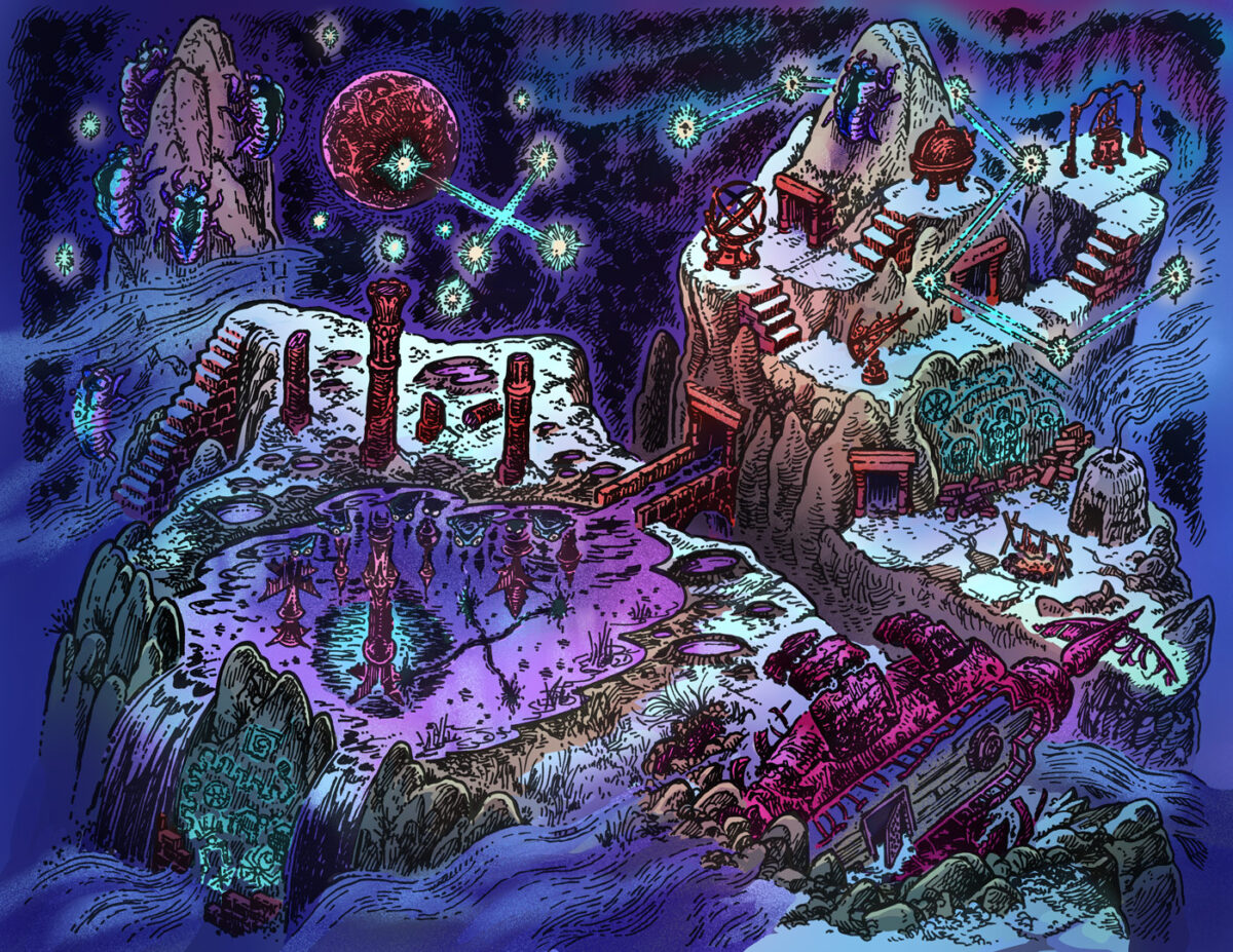
We actually split this map up into two cards for our map folio, but I coloured it as one big image so we would have convincing continuity between them, and keep the location feeling coherent and cohesive even as the two sides ended up somewhat tonally different!
Kyle’s work is wonderful to explore, and the experience of colouring this was also an experience of discovering new hidden details over and over again.
For colours, I kept it cosmic, letting the sky and aurora borealis fall back into cool blues, teals and purples, so that hte dancing stars and vibrating constellations would become the focus. Beneath them, the mountains and architecture took on neutral but warm hues, and the snow glows underneath the starlight. Eldritch and sci-fi elements got more neon colours, and everything is in a dance with Kyle’s beautiful hatching.
For texture, I stuck with a stippled approach to keep things feeling retro – Kyle’s maps feel like pages from a 40+ year old tome, and while I didn’t want to go all the way to ben day dots, i felt the noisy spray captured some of that magic.
Here’s Kyle’s original drawing, if you want to take a better look at it:
The other artist I spent a fair amount of time colouring was Simon Roy! We had four beautiful new eidolons in full colour already from him, so he sent us four drawings we were invited to transform to fill out the other half of his folio! Here’s his linework and my final colours for these four:
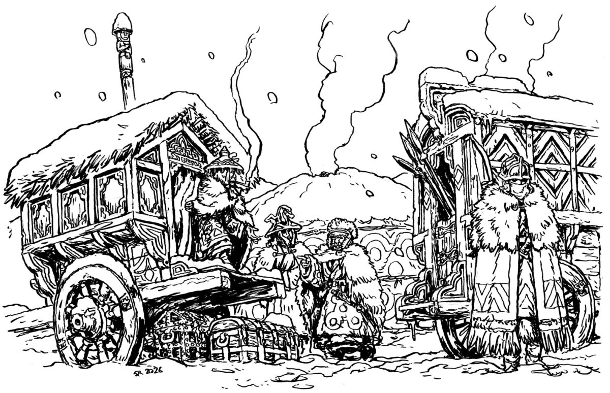
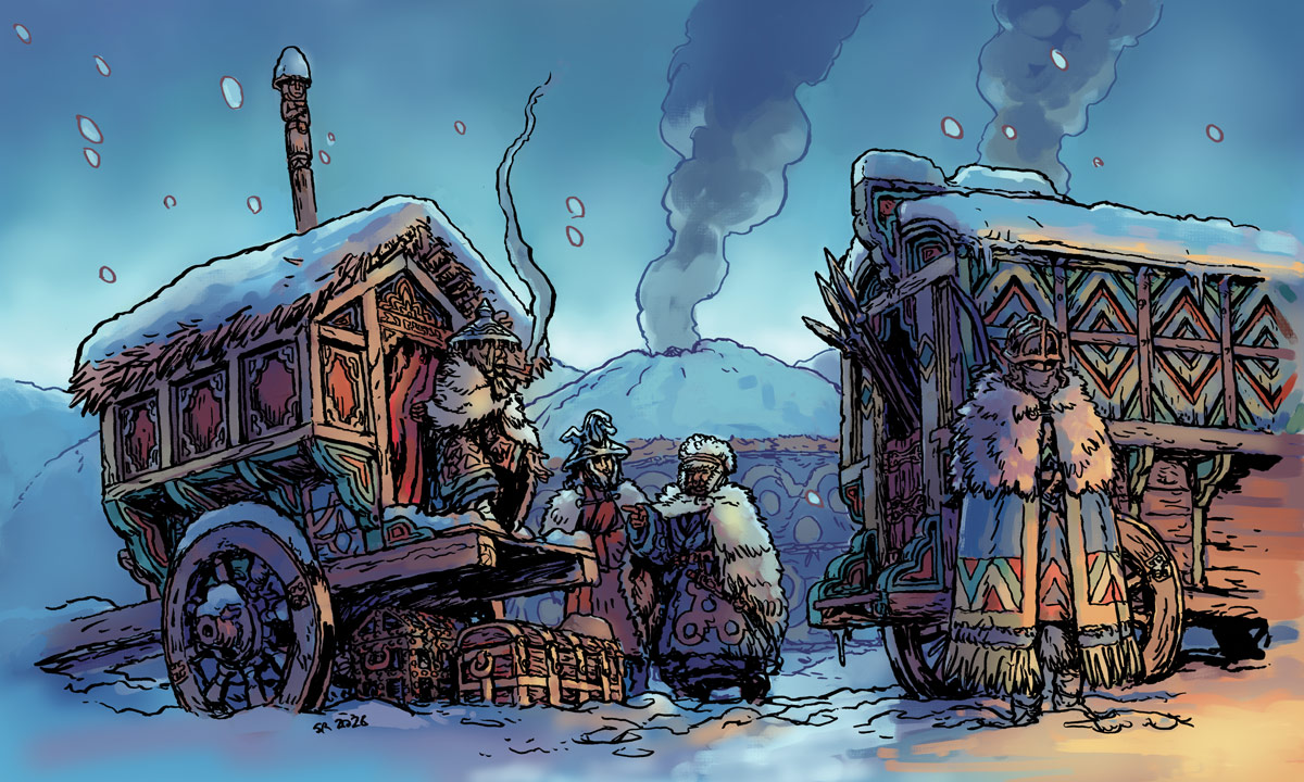
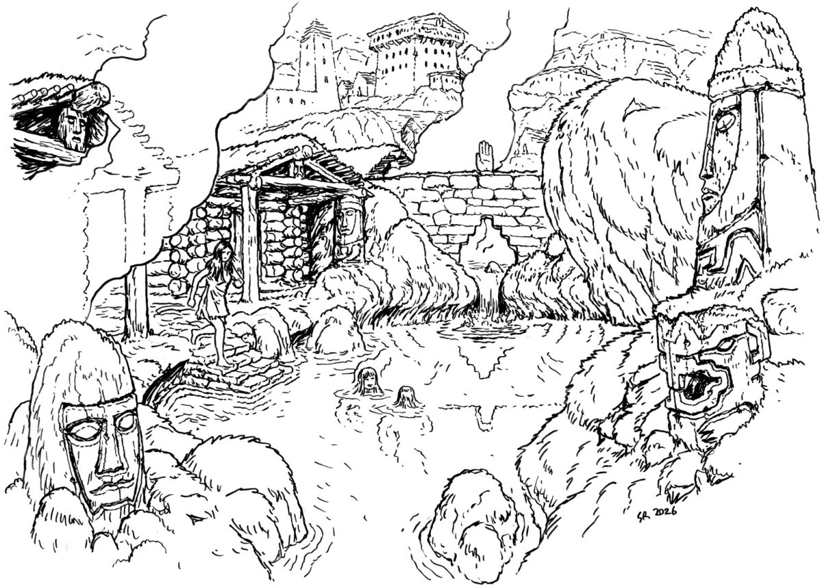
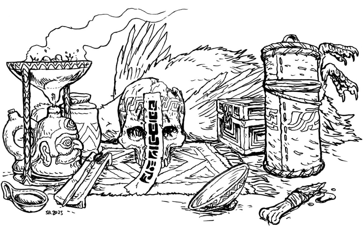
Simon and I have worked together on other projects in the past – we overlapped on the first Six Ages videogame – and I like to think we share a passion for worldbuilding through material culture design. But folks, no one else is doing it like Simon these days! Digging into these drawings was immersing myself in a really carefully built world, and colouring these was all about thinking about materials, connections between the scenes, and cultural patterning.
I had a lot of fun taking the colours from Simon’s first four eidolons (see them in this KS update!) and switching up their weight and prevalence, so that these four cards felt connected but tonally very different. These drawings are from a wintery realm, with no hard shadows, and I wanted to bring that to life through mood! I gave all the exteriors an overcast lighting setup, thinking about the spooky winter days when you never see the sun, and at noon it almost feels like dusk. The sky might glow, but it isn’t throwing much light of any kind. I love tackling nuanced lighting scenarios like that, and I had a blast bringing Simon’s vibrant world into vivid and complex colour!
Art directing Swords Without Master has been amazing through and through, and I am sure I have a lot more to say about it still, so stay tuned or hop on my RSS feed for future blog posts on the subject!
And if you are looking for colour treatments on anything – colour stories for your short film, colour design for your game, colour mock-ups for a book or comic – get in touch with me! I’ll have some availability this summer, and I’d love to help out.
-
Quick news post! I’m in an art show this weekend with Central Connection, so if you’re near Pape Station in Toronto on either day you should come say hi!
-
Plein Airpril 2026
posted:
updated:
posted to: arttagged: animal, bird, gouache, painting, plein airpril, structure, Toronto, traditional art, urban landscape, wood panelThis year I decided to do Plein Airpril again, but from photos, since Toronto’s April weather is rarely good, and I have been so busy photographing things this past year that I’m drowning in my own reference!
And I did it! I did 30 paintings this April, on wood panels ranging from slightly smaller than 5″ square up to 7.5 x 9″!
Here are the paintings:

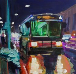
The Night Bus️ 
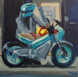
Teal E-Bike 
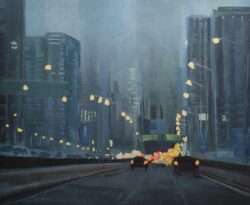
Gardiner Fog 
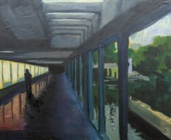
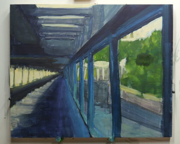
Glowing Hallway 
Friendly Local Crew 
Fiery Autumn Colours 
Stormy Skies 
Double-Crested Cormorant in Flight 
Tiny Visitor 
Deep Snow at Night 
Cellophane Bee 
Beach View 
Local Quest-Giver 
Glowing Night Snow 
Sparkling Window 
Sparrow in Flight 
Puddle Bather 
Park Colours 
Rooftop Company 
Don River Bridge View 
Young Raccoon 
Sparkling Succulent 
Neighbourhood Ambassador 
Preening Ducks 
Glowing Poppy 
Lifeguard Station 
Sunset Harbour 
Snow Squall Stoplight 
Moody Robin 
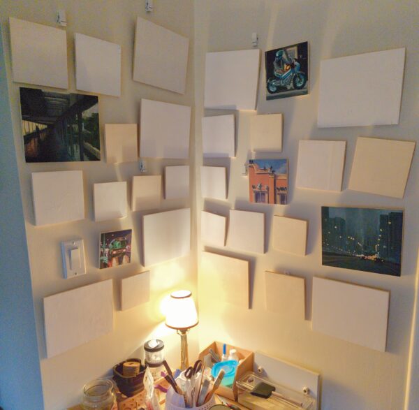
Downy Woodpecker in Autumn I have done plein airpril in the past – and finished! – but I wanted to really feel motivated this year, and so I decided to challenge myself to paint them all on wooden panels, and hang them up as I went. So I cleared out a corner of my studio, hung 30 3M hooks, primed 30 panels, added hanging hardware to the backs of all 30 of them, and hoped that would motivate me to make it all the way through. Here is how it started:

And here’s the big finish:

It was super motivating to have them go up one by one and start filling in that wall, and I will absolutely do this again for other series of work I produce in future! Honestly, I loved it, I really recommend it.
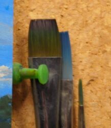
For my set-up, I fiddled around a little before settling on using a cork board and pinning the panels to it with pushpins each day, as that was modular, sat in my desk easel well, and let me move things out of the way for freelance work easily enough. You can see some of that setup here:

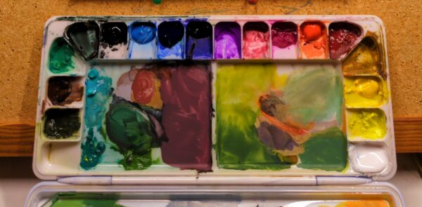
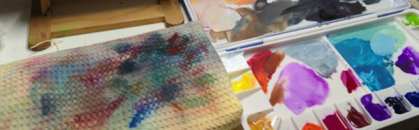
I used a sealing airtight palette for my gouache, so it stayed pretty wet between days. This works when I know I’ll be using it again – if I do this and then leave it for weeks or months, I do end up getting some mold sometimes. But with daily use? No chance of problems! Only fresh, enticing paint!
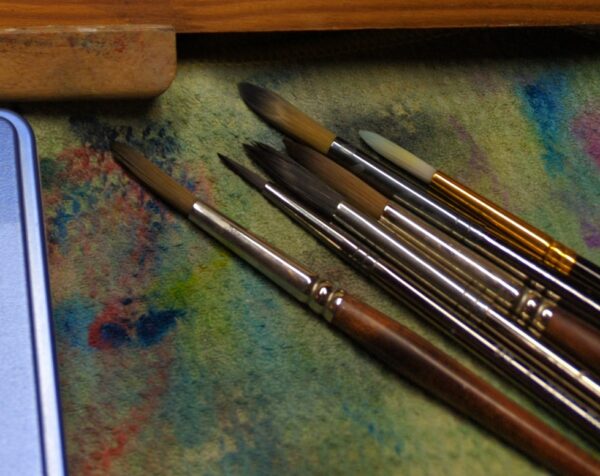
Doing 30 finished gouache paintings in a month is a huge learning experience, and I played with a few different variables, including what colours I used (so many different ones), how I did my underpainting (ended up liking using inktense pencils for the drawing, then throwing an underpainting over them with a fun colour), and which brushes I used (I always default to flats with gouache, but I decided to really explore all my rounds, and learned a lot about how to make fun marks with those too!) – and of course, what I painted.
Thematically, I decided to stick to photos I have of Toronto – our local architecture, infrastructure, flora, fauna, etc. Getting out there with the camera so much this past year has taught me a lot about what kind of lighting and framing I enjoy, and digging through all those photos to pick out ones to paint was incredibly fun! I also went back through my archives – there’s some very old photos in there, but I’m glad I got to go back down memory lane and explore!
Doing something this focused for 30 days was extremely educational, of course, but it also is a stamina game, and not just physically. My mind loves to switch gears as soon as it feels like it’s learned something new, so after only a few paintings I could feel that siren call to switch mediums or formats or projects starting. I think having the wall of blank primed panels looming over me was a huge help in staying focused and feeling good about it! And of course, switching out the subject matter, brushes, colours – these all helped keep me in the game as well.
In the end, gouache has become my comfort zone. I know what it does and how it works at a baseline level now, and it’s finally time to start asking myself questions about the more meta layers of the painting process – what kind of stylization do I want to aim for? What kind of marks, values, colour language feel appropriate for the image I’m making? What does it mean to make a painting out of one scene versus another?
In contrast to plein air, this series could only have been painted from photos – most of these compositions are inherently fleeting, whether because of their contents (flying birds) or the position of the viewer (in a car on the highway). The challenge of making a painting on site is different, and one I do want to tackle more this summer! But getting into these pieces has opened a lot of new possible paths of investigation to me with gouache, and I think my next studio challenge (which I will save for later in the year) will be doing tiny thumbnails as warmups more often – studying from cinema or fine art or photography, I think. We’ll see.
In the interim, I’ve had some folks reach out and ask about buying the original of one of these, and I do want to figure out how to make that possible for folks outside of Toronto, but I haven’t got that solved just yet. But, if you are in Toronto, I’ll be bringing these with me to a group show I’m in on the last weekend of May – I’ll share more details when we officially announce! And whatever is left after that will go to the Danforth Arts Market, I think. Again, I’ll keep you updated!

I did figure out how to make prints available, though! I have got all of these scanned nicely and uploaded to my INPRNT shop in a collection called Toronto Views – Plein Airpril 2026 – click through to see them all and see what formats are available (art prints, cards, and more) and also see what sales INPRNT is running, because friends? They are very often running sales.
If you do pick one of these up, I’d love to know how it looks in its new home!
In the end, this was very satisfying, really fun, and a wonderful evening routine for me in a month full of work and life and really wild weather, actually, I am very glad I chose to stay inside this year.
Thanks for reading along! I think, after everything, my favourite is Rooftop Company. Question before you go: which one is your favourite?
2 responses to “Plein Airpril 2026”
-
These are incredible! I appreciated the write up as well. “Young Raccoon” is my favourite.
-
God this rules so much. I’m torn between Young Raccoon and Snow Squall Stoplight as favs. I think after I move I’ll hit up the inprint for a copy of both
-
-
Plein Airpril Parts 2 and 3
posted:
updated:
posted to: arttagged: bee, bird, cat, gouache, landscape, painting, plein airpril, skyscape, structure, Toronto, traditional art, urban landscapeI missed last week’s blog post because we’ve been under the weather over here, but I did keep up with the paintings themselves! Thankfully, painting a study is a really relaxing, meditative act for me and was already likely to be an activity I did when I wasn’t feeling great otherwise, so staying up to date on Plein Airpril has been a pretty manageable thing.
So! All the paintings from the past two weeks! First, the current state of my wall:

And each individual painting:


Two weeks left – 11 paintings, to be precise! It’s going to happen, I’m going to do it, I want it very badly!
See you in a week and then four days after that!
-
It’s the most painterly time of the year – plein airpril! Learn more about it on the Warrior Painters website here – this year’s theme is Harmony in Contrast, so this is honestly is a very easy theme to run with for me and left me lots of room to set my own boundaries!
This year I am sticking with photo ref because the weather refuses to calm down, but I’m going to keep to a Toronto theme at least!
Here are my first five – click to see them larger:

This year I wanted to make it possible for these to be finished pieces in a way that my sketchbook approach in previous years kind of worked against, so I bought a bulk pack of 30 small wooden panels in three sizes, and I bought three different (I thought) watercolour grounds, and I made myself prep everything ahead of time so every day this month I can just pull a panel off the wall and get painting right away!
Here’s the state of my wall so far:
It’s going to be extremely satisfying to fill it up!
I’ve had a few questions about if I will be selling these as originals or prints – and I think so? But I want to wrap up the series first before I make that decision, so stay tuned for when I make that call in May!
Also, a quick aside on my watercolour ground adventures:
The three that I purchased are the Daniel Smith Titanium White Watercolour Ground, the Daniel Smith Transparent Watercolour Ground, and the Golden Absorbent Ground.
I’ve used the Daniel Smith brand grounds before – I learned about them through Stephanie Law’s demo videos, where she uses them to lock in textures or pull back whites in ways you can still paint over in her watercolour work. They are different – the titanium white is a soft paste that dries with a nice grainy texture, and is easily sanded down, but also can be easily scratched or dented with a sharp pencil when wet. The transparent ground is also nicely grainy, but has more of an acrylic finish and feels slightly less absorbent in comparison, and it is a much more liquid substance in the jar, and a much firmer finish when dry.
I picked up the Golden Absorbent Ground because it was beside the two Daniel Smith grounds on the shelf at the art store, and it has a great feel to the touch – smooth to paint on, opaque but not pasty, and a satisfying dryness to it when dried that feels promising! But when I sat down to paint on it with gouache I discovered that it is NOT intended for this use:
The paint just beaded up! As soon as I tried to layer over, the paint underneath picked up, and every single brushstroke was hypervisible.
While the jar promises an absorbent ground without any qualifiers, doing some googling I found Golden’s own website specified that this was for achieving “watercolour staining effects with acrylic paints”, which is a very different thing than painting with gouache! Acrylic paint cures when dry, and won’t pick up with water, and would just not have the problems I am having with gouache. So clearly this was not going to give me the effects I wanted with gouache.
So I then re-primed all the panels I had primed with the Golden ground – now they have one of the two Daniel Smith grounds laid overtop, and hopefully will behave more predictably for me in future.
I also re-primed this painting, which of course picked up all the gouache that was there and gave me a very neutral grey to paint over, which honestly I liked:
The version you see at the top of the post was then painted over this ground, and it helped a lot.
Anyways, four more weeks to go! I’ll be posting these daily on my tumblr and bluesky, and I’ll collect them weekly on my blog, so stay tuned!
-
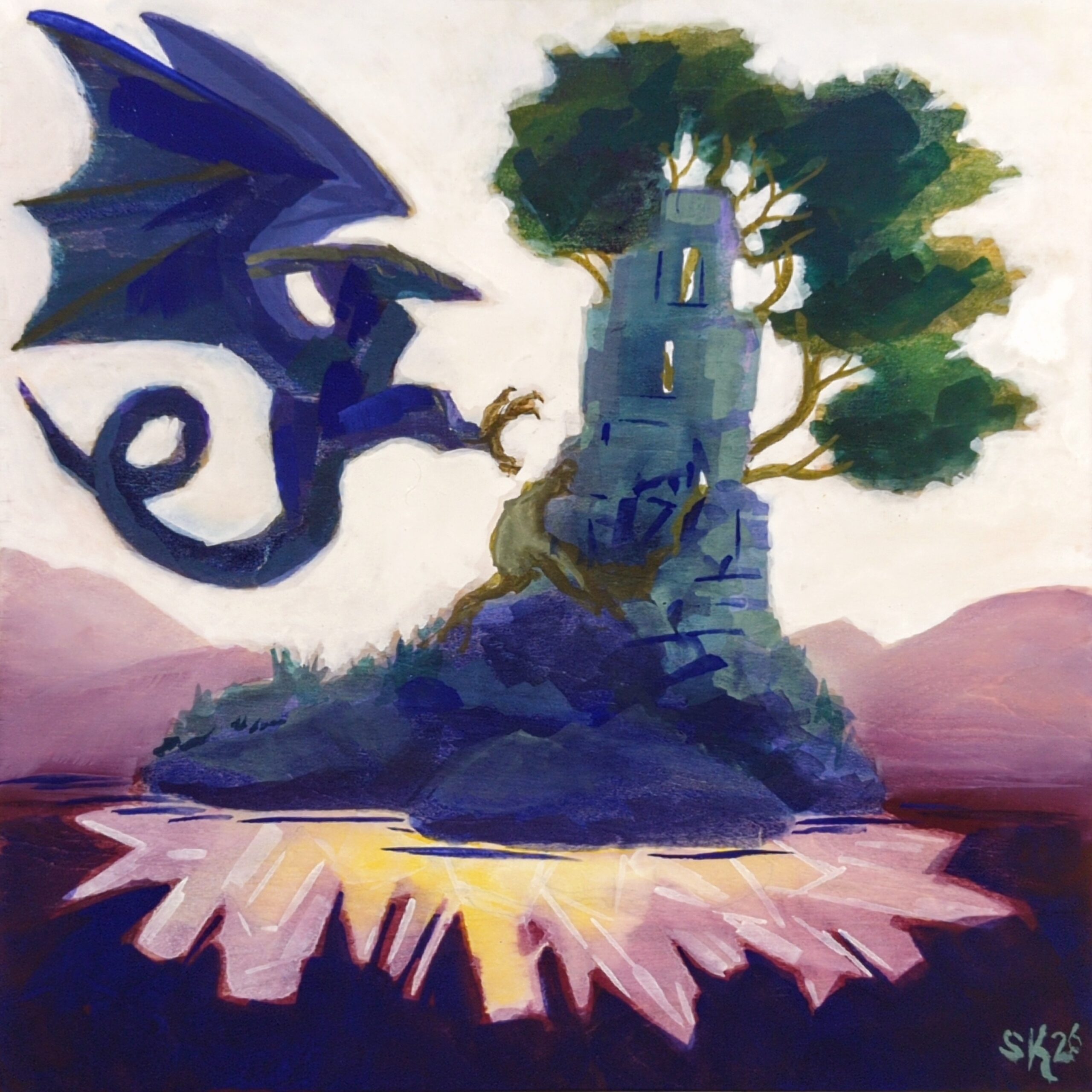
I’ve been thinking a lot about stylization as I do more gouache painting, and particularly trying to find a way to integrate a lot of the “happy accidents” you get from brushes, water, paint and substrate all messing with each other into my larger visual goals. Doing this on paper can be really fun — I love seeing how wet in wet techniques affect gouache, and cotton and cellulose paper have very different properties and can get very different results — but paper overall is a resilient medium for gouache, one where I know how to pull a painting back from the brink and then render it into tight oblivion whenever I want.
So I did this experiment on an 8 x 8″ unprimed wood panel, a gouache substrate I have also really enjoyed in the past, and I was reminded of all the amazing things that gouache can do on an unfinished surface! And then I tried, I really did try, to resist rendering it fully into oblivion, and I really am proud of the result up there! There are some really fun abstract shapes in there, and I love the brush marks and bursts of texture in the ruin and the tree!
But I did take a photo earlier on in the painting’s process, and I have to be honest, friends, it haunts me:
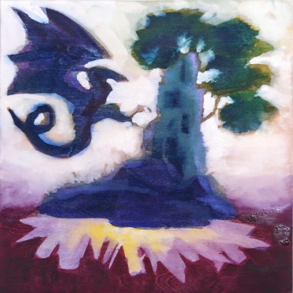
There’s a lot of it that feels very unfinished — the dragon is a mess still, and a lot of the brushstrokes feel chaotic and meaningless, especially in the white sky — but there’s somethin about the softness of the ruin and the tree that I wish, I desperately wish I knew how to do on purpose.
So I think my next personal quest will be to figure out how to do these soft areas on purpose — and how to simplify the paint I surround them with to feel less overworked and more simple, while keeping it cleaner and more intentional than my WIP dragon currently is.
I’m excited to push farther with this approach! I’ve primed a couple panels with different substrates – transparent watercolour ground, opaque watercolour ground, pastel ground — and we’ll see what media works well where to get me this kind of approach.
One response to “Dragon Crystal Island on Wood Panel”
-
I love the final painting and the process! I love the light on the trees
-
-
I’ve been doing some gouache studies from remembered places this week to keep my hand in while I’m at the digital stage on a few pieces of art.
Getting away from reference photos helps me focus on the possibilities of the medium, and this piece was a test of using 100% cotton paper, which will keep wet areas wet for much much longer than cellulose or other substrates. That’s how I could get gouache to blend the way it does in the clouds.
It does mean that any techniques requiring the paper to be dry – which is most gouache techniques that I know – become way more important to time properly. also, you can get away with adding so much more water than you really should without realizing until it’s too late! Definitely a new challenge.


Leave a Reply