
It’s the most painterly time of the year – plein airpril! Learn more about it on the Warrior Painters website here – this year’s theme is Harmony in Contrast, so this is honestly is a very easy theme to run with for me and left me lots of room to set my own boundaries!
This year I am sticking with photo ref because the weather refuses to calm down, but I’m going to keep to a Toronto theme at least!
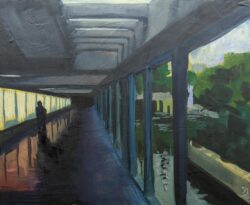
Here are my first five – click to see them larger:


This year I wanted to make it possible for these to be finished pieces in a way that my sketchbook approach in previous years kind of worked against, so I bought a bulk pack of 30 small wooden panels in three sizes, and I bought three different (I thought) watercolour grounds, and I made myself prep everything ahead of time so every day this month I can just pull a panel off the wall and get painting right away!
Here’s the state of my wall so far:
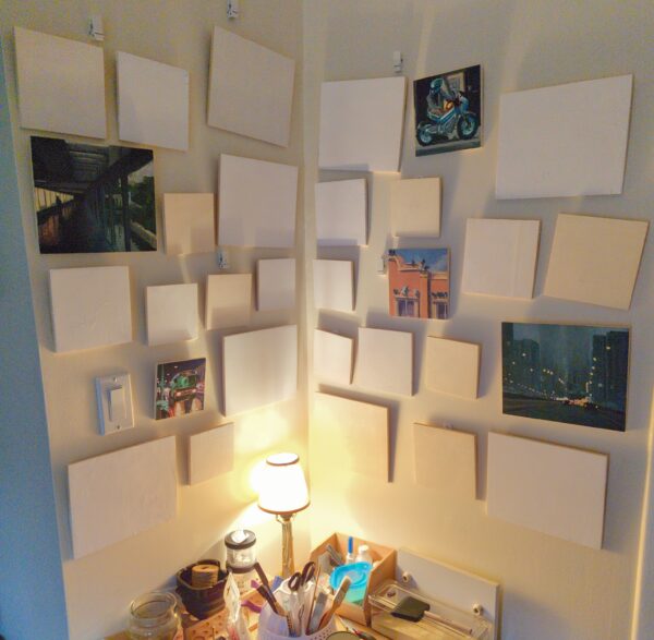
It’s going to be extremely satisfying to fill it up!
I’ve had a few questions about if I will be selling these as originals or prints – and I think so? But I want to wrap up the series first before I make that decision, so stay tuned for when I make that call in May!
Also, a quick aside on my watercolour ground adventures:
The three that I purchased are the Daniel Smith Titanium White Watercolour Ground, the Daniel Smith Transparent Watercolour Ground, and the Golden Absorbent Ground.
I’ve used the Daniel Smith brand grounds before – I learned about them through Stephanie Law’s demo videos, where she uses them to lock in textures or pull back whites in ways you can still paint over in her watercolour work. They are different – the titanium white is a soft paste that dries with a nice grainy texture, and is easily sanded down, but also can be easily scratched or dented with a sharp pencil when wet. The transparent ground is also nicely grainy, but has more of an acrylic finish and feels slightly less absorbent in comparison, and it is a much more liquid substance in the jar, and a much firmer finish when dry.
I picked up the Golden Absorbent Ground because it was beside the two Daniel Smith grounds on the shelf at the art store, and it has a great feel to the touch – smooth to paint on, opaque but not pasty, and a satisfying dryness to it when dried that feels promising! But when I sat down to paint on it with gouache I discovered that it is NOT intended for this use:
The paint just beaded up! As soon as I tried to layer over, the paint underneath picked up, and every single brushstroke was hypervisible.
While the jar promises an absorbent ground without any qualifiers, doing some googling I found Golden’s own website specified that this was for achieving “watercolour staining effects with acrylic paints”, which is a very different thing than painting with gouache! Acrylic paint cures when dry, and won’t pick up with water, and would just not have the problems I am having with gouache. So clearly this was not going to give me the effects I wanted with gouache.
So I then re-primed all the panels I had primed with the Golden ground – now they have one of the two Daniel Smith grounds laid overtop, and hopefully will behave more predictably for me in future.
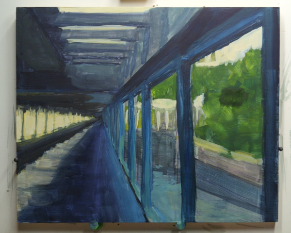
I also re-primed this painting, which of course picked up all the gouache that was there and gave me a very neutral grey to paint over, which honestly I liked:
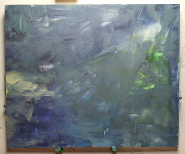
The version you see at the top of the post was then painted over this ground, and it helped a lot.
Anyways, four more weeks to go! I’ll be posting these daily on my tumblr and bluesky, and I’ll collect them weekly on my blog, so stay tuned!
Leave a Reply