
That’s right, chalky, powdery, gloriously colourful soft pastels! Not to be confused with oil pastels, which I have been hyperfocusing on for a year or so.
So, like, years and years and years and years ago I did work in soft pastels a little – I was studying fine art painting and I didn’t have anyone around to instruct me in them specifically, but I did a few pieces for assignments or cafe art shows and such:
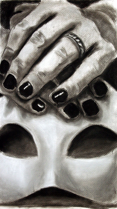
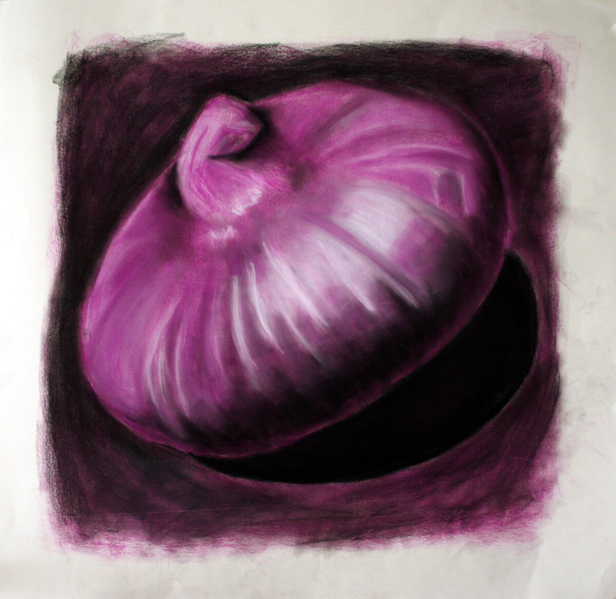
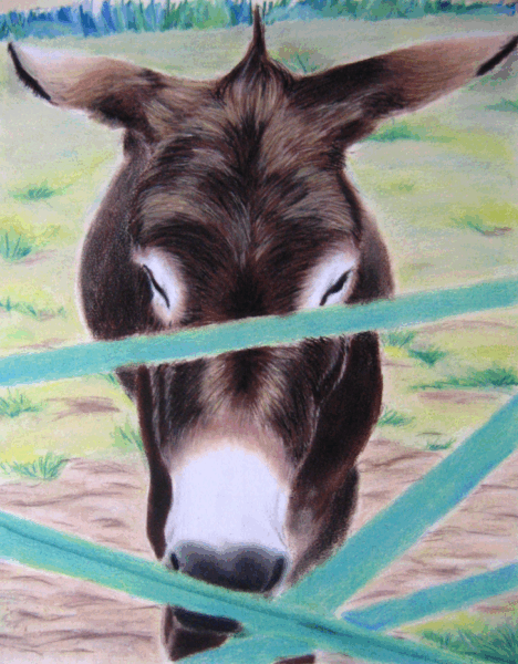
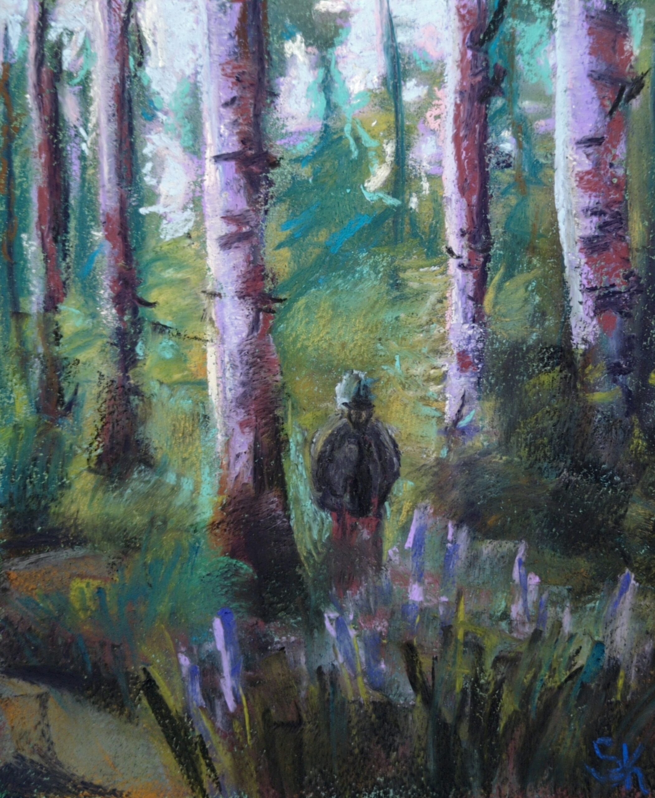
These three above were drawn on whatever paper I had, as a way to just experiment with media in painting and drawing classes in my first few years of art school.
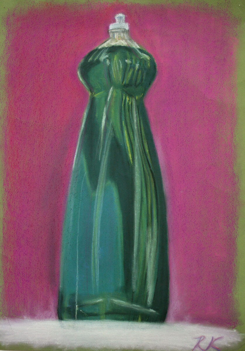
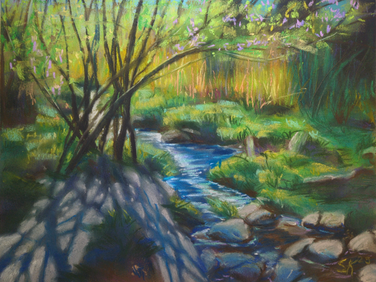
These next two, though, I am pretty sure were drawn on a decent printmaking rag paper, and you can definitely see signs of more intentional layering and blending! These were painted for a cafe art show I had in my last year at university, and they’re each in the 18 x 24″ range, give or take:
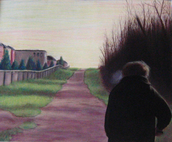
This last one I still have – it’s a painting of my brother, from a photo, and I should really get some better documentation of it. You can see some of my artistic interests starting to solidify: moody lighting, skies that aren’t blue, uncanny suburbia, people not engaging with the viewer, creepy clustered trees… maybe it would be fun to rework this one someday, too!
Anyways, those were painted in early 2007, and then I didn’t intentionally touch chalk/soft pastels again until a little over a month ago!
(As an aside, one of the strongest reasons I avoided this art material was because of all the time I had spent in art college drawing with conte on newsprint. Conte is a sensory nightmare for me, conte on newsprint doubly so, and I had assumed that soft pastels (not oil, the chalky ones) would feel the same. Thankfully I was wrong!)
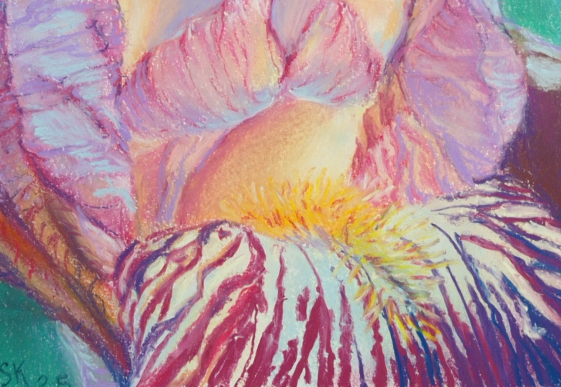
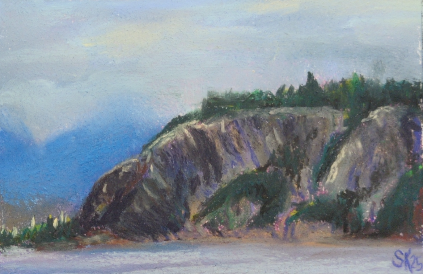
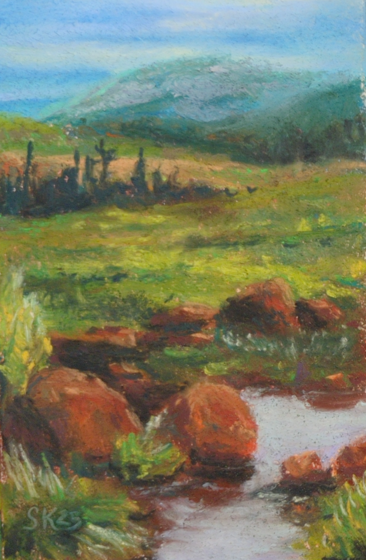
A few weeks ago, my friend Andrea brought a few sticks of some soft pastels to lifedrawing night and let me try them; and they didn’t really squick me out, even as I used them on something very close to newsprint. After that, it was a quick slide down into the rabbit hole of youtube’s pastel artist content, and anyways, most of the work I’ve done at home this past month has been in soft pastels.
What I don’t have is great photodocumentation yet – I need to take all these paintings outside and properly photograph them, and it’s been a blend of too hot, humid, smokey, or thunderstorming all summer. So, I apologize for the quality of my photos, but just to give you an idea of what I’ve been up to:

My first purchase was the Mungyo artist’s soft pastels – about 1cm thick squares; I bought the set of 48. Honestly, I doubt I will ever use the neons, but there’s some great neutrals and a lot of beautiful midtone very saturated colours in this set, and it’s been a great starting point! But absolutely yes I have been collecting more, especially when there’s open stock available at local art stores. I don’t have any clear brand favourites yet, but I am noticing certain pigments that are consistently frustrating to work with across brands! As I continue, I’ll try to take notes and share them here.
The first thing I did was try all the paper I have in the house, and also watch endless videos on youtube about how pastel artists feel about their substrates. Turns out paper is maybe the real deciding factor with pastels – much like watercolour, there are huge swaths of technique only available on specific types of substrate, and it took me a bit to figure out that some things I saw people doing were only going to be possible if I tracked down some very expensive sanded papers or cardstocks.
But despite watercolour papers and mixed media papers being universally disappointing, I did end up finding a stash of mine that worked well with the medium: cotton rag printmaking paper.
When I was doing my BFA at university I did a fair amount of intaglio printmaking, and printed mostly onto cotton rag paper. Thanks to past me, I still have a decent selection of Arches BFK Rives heavyweight in cream, Stonehenge vellum finish in white, and Somerset satin in white. Turns out these papers, with their heavy weight, mottled surface, and lack of strong surface sizing, have enough microscopic tooth to accept layers and layers of soft pastel pigment, and to put up with a fair amount of alcohol or water washes to lock those first few layers too.
I’d already decided that these were my favourite paper for oil pastel, so honestly I’m not surprised that they are high enough quality to win my heart in other arenas as well.
So that’s what I’ve been using!

Next up I’ll be testing out some cheaper papers apparently designed for pastels, like canson mi-teintes and strathmore’s pastel paper; I’ll let you know how they go!
Oh, and the other lesson I learned about soft pastels: folks are NOT KIDDING when they warn you that spraying them with fixative will change the colour!
Before, and After:
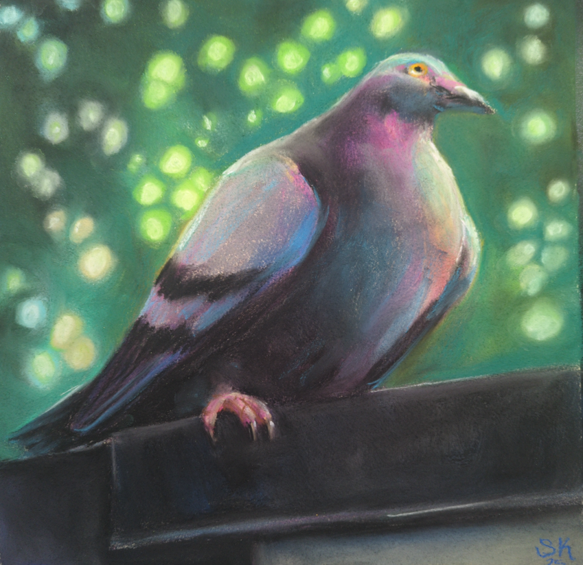
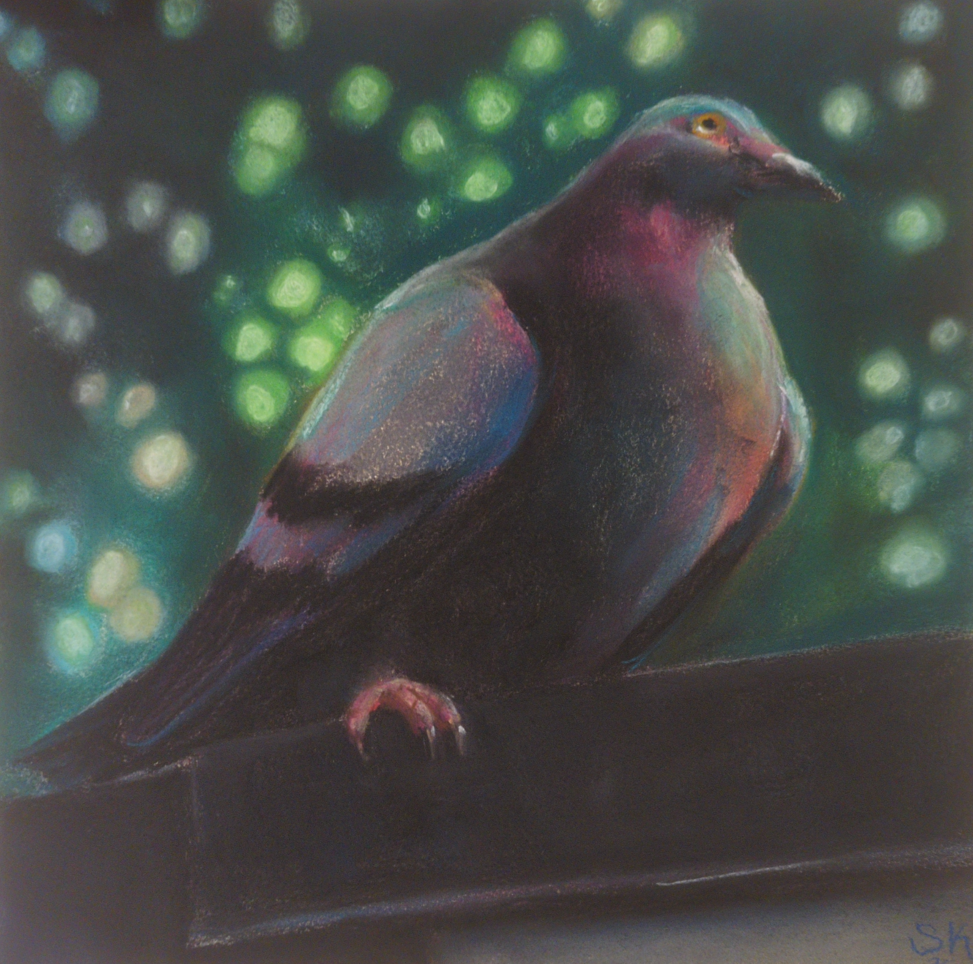
This guy was sprayed with krylon fine art UV safe fixative, and holy heck. I was not prepared for the way it wiped my value contrast out all over the place. My midtones! My punchy highlights!
Anyways I’ve caved and bought sennelier’s dedicated soft pastel fixative, and been taking folks’ warning to use it only in extremely thin, light coats very seriously. In the end, I don’t think there’s anything you can do to make a soft pastel drawing not smudge if you rub it with your finger – even my well sealed pigeon there will still let pigment lift if I try – and I think of the fixative as more of a mild layer of protection than anything else.
Also if that paragraph makes you cringe for how complicated storage of these must be, I am sorry to say you are completely correct, and they are at least as annoying to store as oil pastels. Turns out my life hinges entirely on glassine interleaving papers now! And I desperately need to go find some more asap.
There’s so much in this medium to learn – I see some incredibly expressive work in the contemporary art world, but also there are people using these to do photorealistic wildlife art, or portraiture, or surreal landscapes, all taking the medium and pushing it as far as it can go in various directions. Which directions am I interested in? How does it respond to my usual array of favourite subject matter? And also, for real, why does my fluorescent desk lamp seem to wash out my work so badly while I’m painting? Everything looks so much darker when it’s on a wall vs on my drawing table! So, much to learn still ahead of me.
One last image: this is how I’ve been storing them so far:
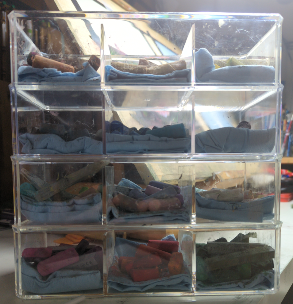
I probably need to cave and pick up more wooden drawers, but so far I am resisting.
Leave a Reply