
Testing more paper by sending the wizard to a very, very colourful realm:
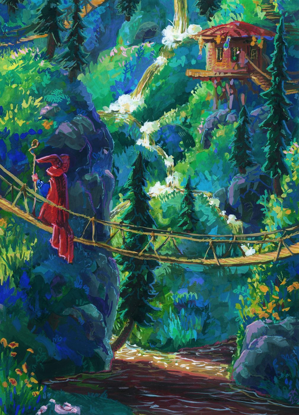
This paper test was scaled up to 9 x 12″, and it was on Strathmore’s 400 series mixed-media paper, which friends of mine who do water media colour on their comics recommend highly!
And it really is lovely for mixed media, but my gosh it was easy to accidentally lift all my gouache right back up at first, especially after using the 100% cotton paper on the last two wizards! This mixed media paper is very very smooth and heavily sized; paint just doesn’t sink into it. That might end up being my preference, because once you know what you’re dealing with, it is manageable, but I’ll do a few more tests before committing, I think.
Also as mentioned in the prior post, I wanted to switch from pencil crayons to neocolours, so I could trust them to be opaque, and I am delighted to report that yes, that is working great and I really can’t overstate what a joy the Neocolor II crayons are to use like this! I did need to sharpen them, which I know might shock some people, but to get precise linework I need a good point, and that’s just how I need to use them. They are especially dreamy on the smooth hot press finish of the mixed media paper, so I think my next test will be something with more texture so I can see what their limits are.
In terms of continuing to learn lessons about what I want to do with the gouache vs the crayons, I do really like the cute doodle-ish quality of the crayons on this one, but I may have gone a little harder than planned with the gouache and not quite hit the balance I’m looking for.
That said, I do really love this piece, and I am very proud of it! It’s the closest I’ve come so far to the vibes I want to hit, and also I just love a nice waterfall, y’know?
Leave a Reply