
swap to chronological order of most recently posted
-

working on canson mi-tientes paper, which really let’s the pastel slide around despite the rougher side’s surface texture.
-
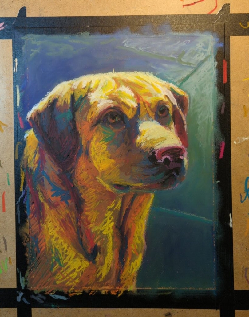
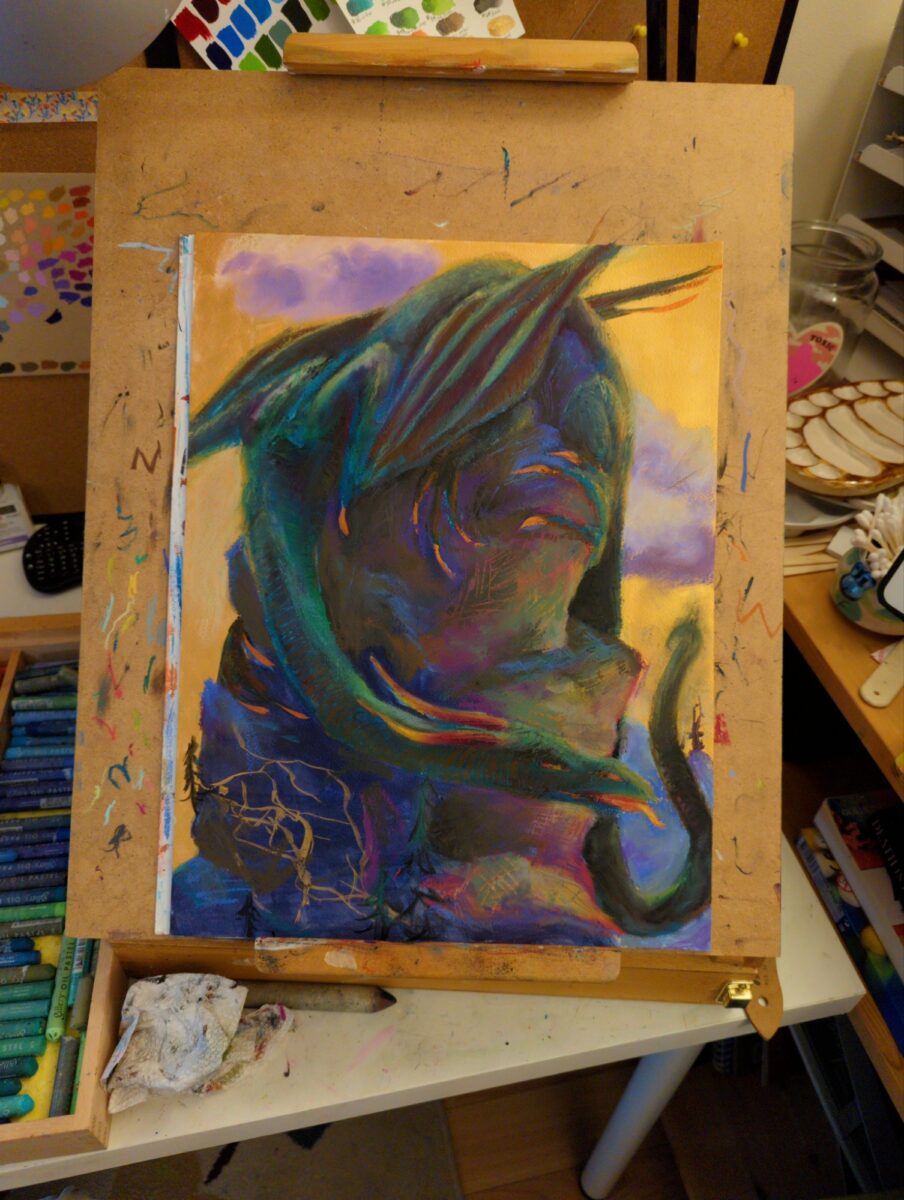
this is the biggest thing I’ve painted yet with the oil pastels; gonna be working in it for a while
i was looking at digital paintings from 2022, and thinking about the method I had started using back then of having a mark making stage and a blending stage as two separate things; and the oil pastels are letting me start to approximate the same workflow, but on paper! interesting…
-

i did a quick watercolour (first) and gave it a coat of fixative so i could try out layering oil pastels on top for a mixed media look (second), but I’ve hit a few challenges:
- the oil pastels are very opaque and happily fully obscure the watercolour under them very very quickly
- the fixative has reduced the absorbency of the paper so the pastels are staying greasy and moving around very easily, giving me wonderful nuance and also no control somehow at the same time
- my original value plan was loose and crappy and had little contrast to speak of, not a strong place to start
- and watercolour has, naturally, such incredibly dark values compared to oil pastels, that i can’t get them both in the same range whatsoever. i dug too deep into the darks, as it were.
- also i had very little plan to speak of and a pretty terrible drawing, so this was maybe doomed from the start
so likely I’ll toss this now and move on, but it has taught me a fair amount of interesting technical facts, which i plan to remember, and also reminded me of some basic truths about planning, drawing, and values, that i would like to remember but will probably ignore once again at some point in the near future.
-


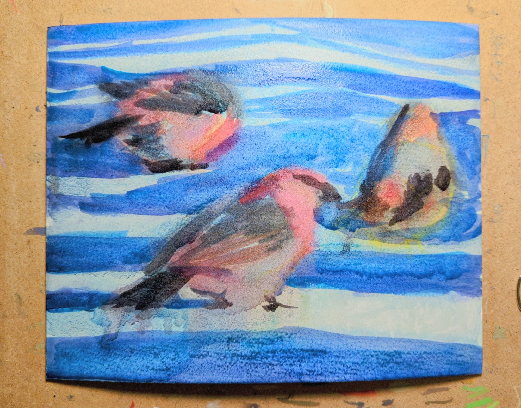
my latest oil pastel experiment is this painting of three pine grosbeaks, referencing a CC0 photograph shared as part of an observation on inaturalist.
this one was created on illustration board, with a full under painting in watercolor first, which you can see in the third image. The illustration board texture has a wonderful grain and could be a very satisfying surface for oil pastel, but it tends to warp pretty dramatically when painted on with water-based media. you can see any image on the right how much it has bowed out while wet; what you can’t see is that it has an inverse warp in it once dried. clamping it down to draw on it released some but not all of it. unfortunately this means it’s just not a good solution for anything with a watercolor under painting.
inaturalist has been a really exciting thing for me to explore, and once I discovered that you can search observations by image license I got really excited. if you’re also looking for reference, especially of specific animals, it might be a great place to start.
-

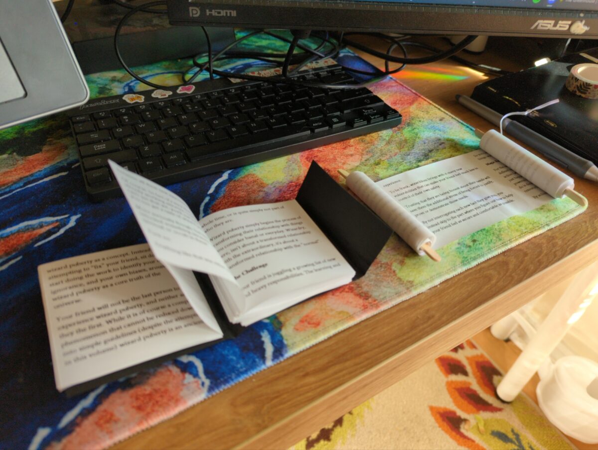
no answers here, folks, I’m asking!
accordion and scroll address both honestly very cute; i suspect there’s a stapled version i could figure out too given time.
4 responses to “how to bind your thermal zine”
-
omg i want a scroll zine, that’s amazing
-
hell yeah, thanks! can’t wait to make a bunch!
-
-
OMG These are soooo cute!! I want a scroll zine. I feel tempted to waste a bunch of receipt paper at work to make one of these. “Oh I just accidentally printed a receipt for a weeding project oh nooooo a long receipt I’m going to keep it though”
-
I HUGELY recommend making one and would def like to see it when you do!
-
-
-
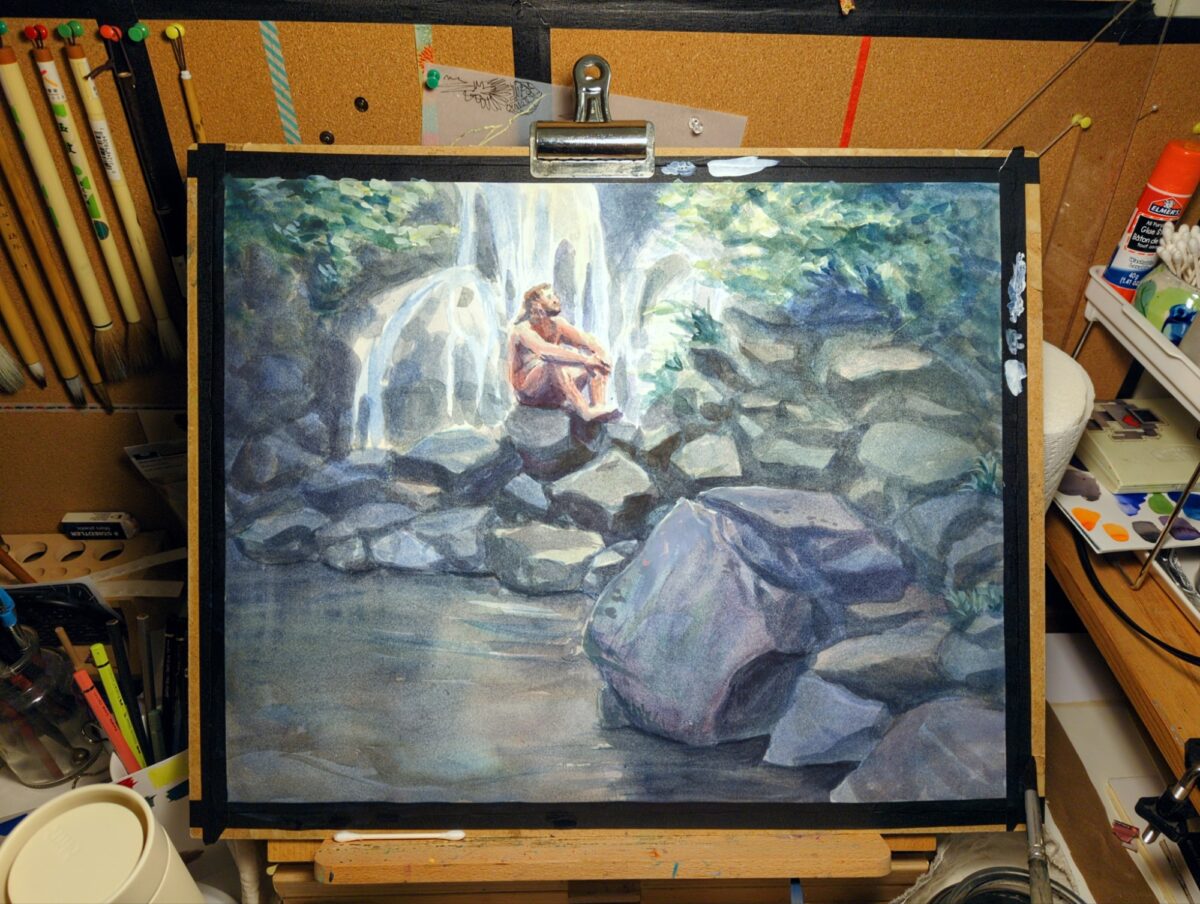
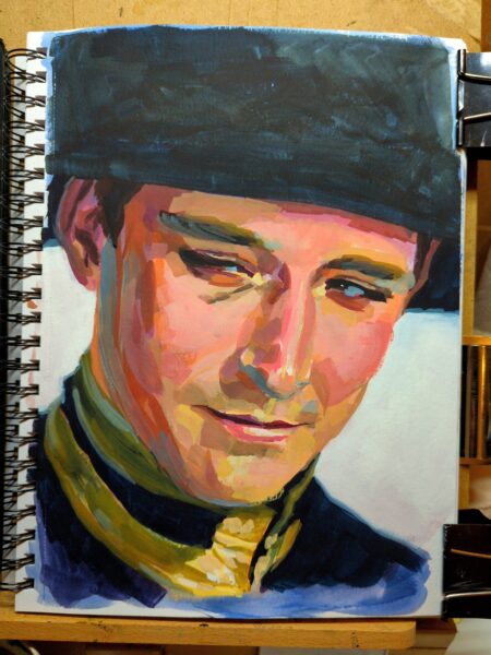
This paper is not sized like watercolour paper and it’s sucking up all my paint! but I’m getting such soft and complex colours because of that… but I’ve lost a lot of my contrast and smaller highlights from the way the paper lets the paint spread into it like a sponge. So it’s definitely time to start bringing back some contrast with white gouache. hopefully i don’t overdo it!
Also, I’ve been meaning to get a better work lamp for these bigger pieces. here’s a photo that better captures what it feels like working at my desk at night:
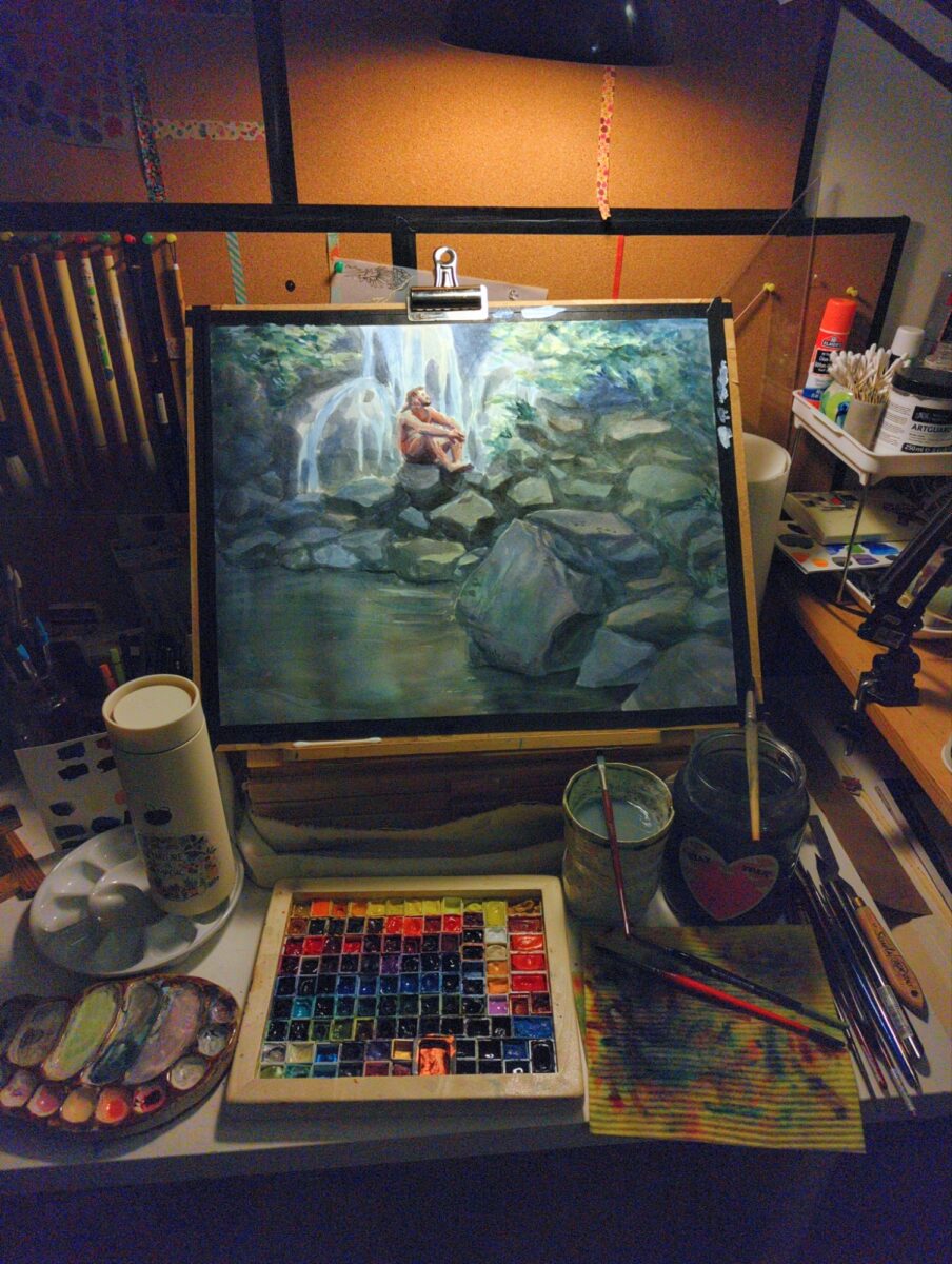
i think i need one of those long arm florescent tube drawing lamps – anyone have a recommendation?
-
as mentioned elsewhere, I’m not a huge fan of my handwriting right now, but it feels like it would be worthwhile to hand write this poem for my zine. I did a first pass and it’s all pretty rough, but I scanned it at a nice high resolution just in case I do use it.
Maybe I’ll pick up some tomoe river paper so my fountain pen inks can really flex for this.
-
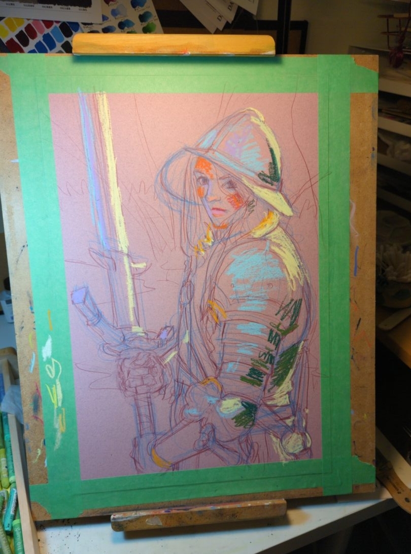
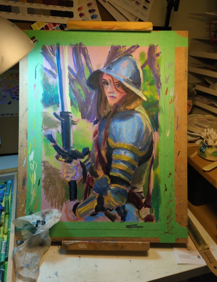
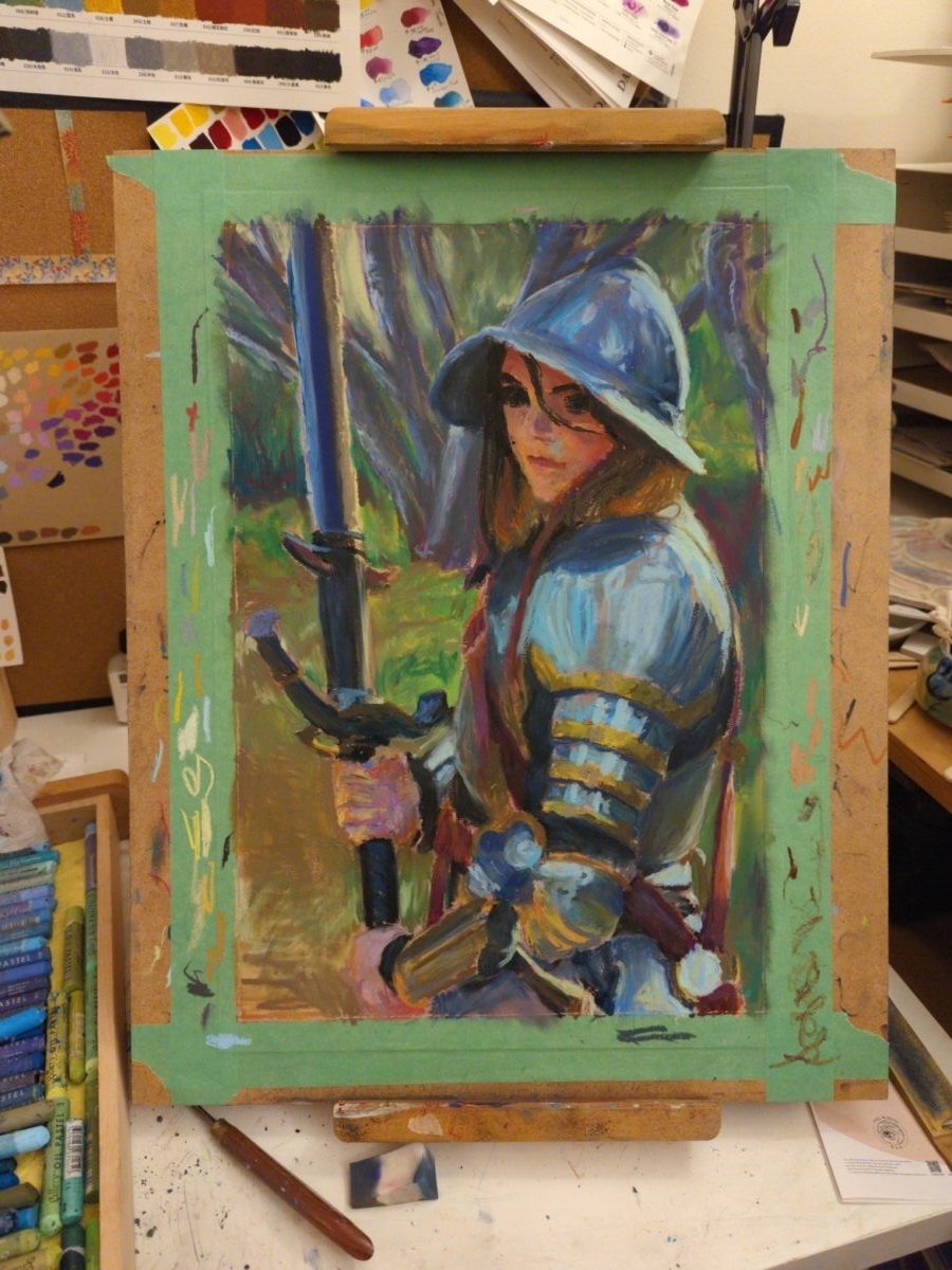
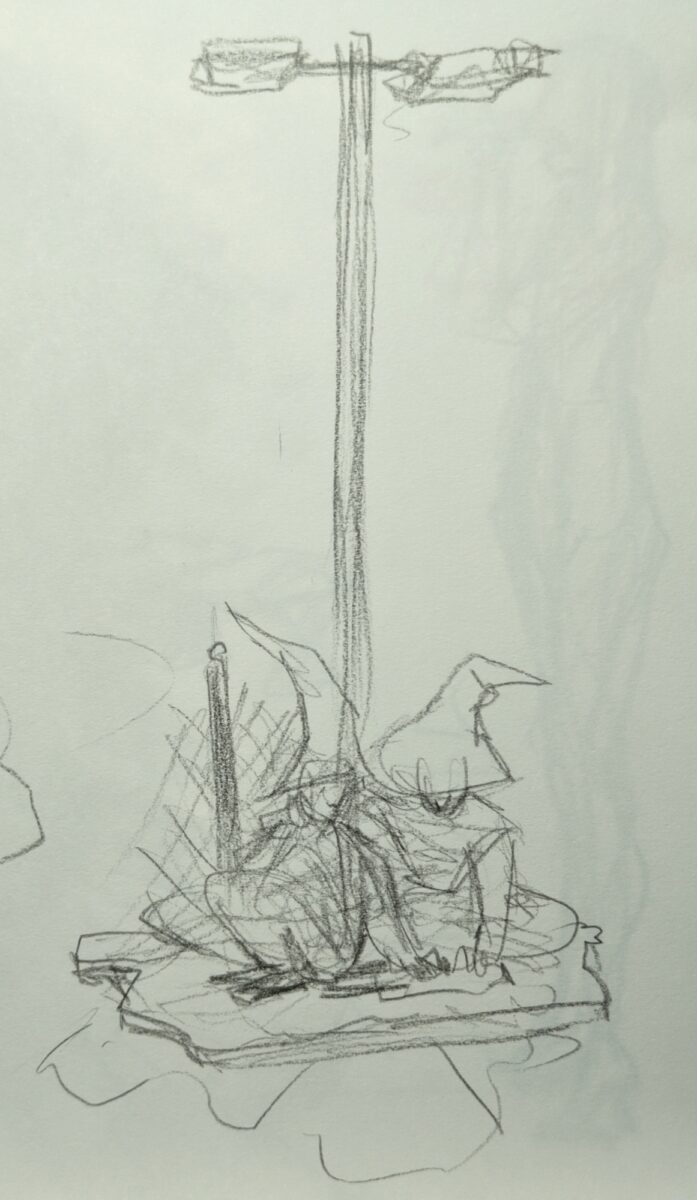
Process shots:

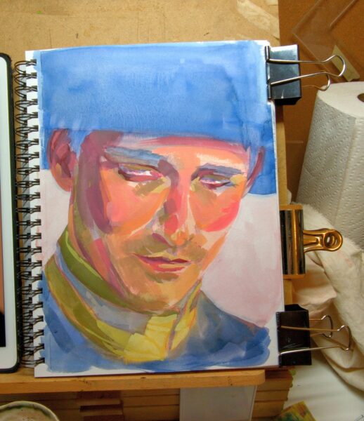
Honestly, I love the tiled effect I had going before the tighter rendering and, while the drawing wasn’t solved yet at that stage, I am curious if that isn’t a more appealing style for a potential finish for me on future studies. Something to explore.
-
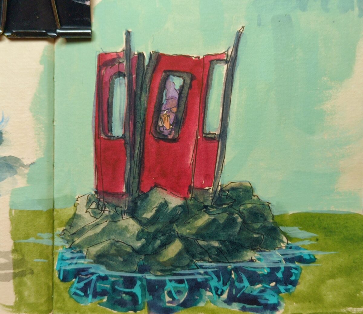
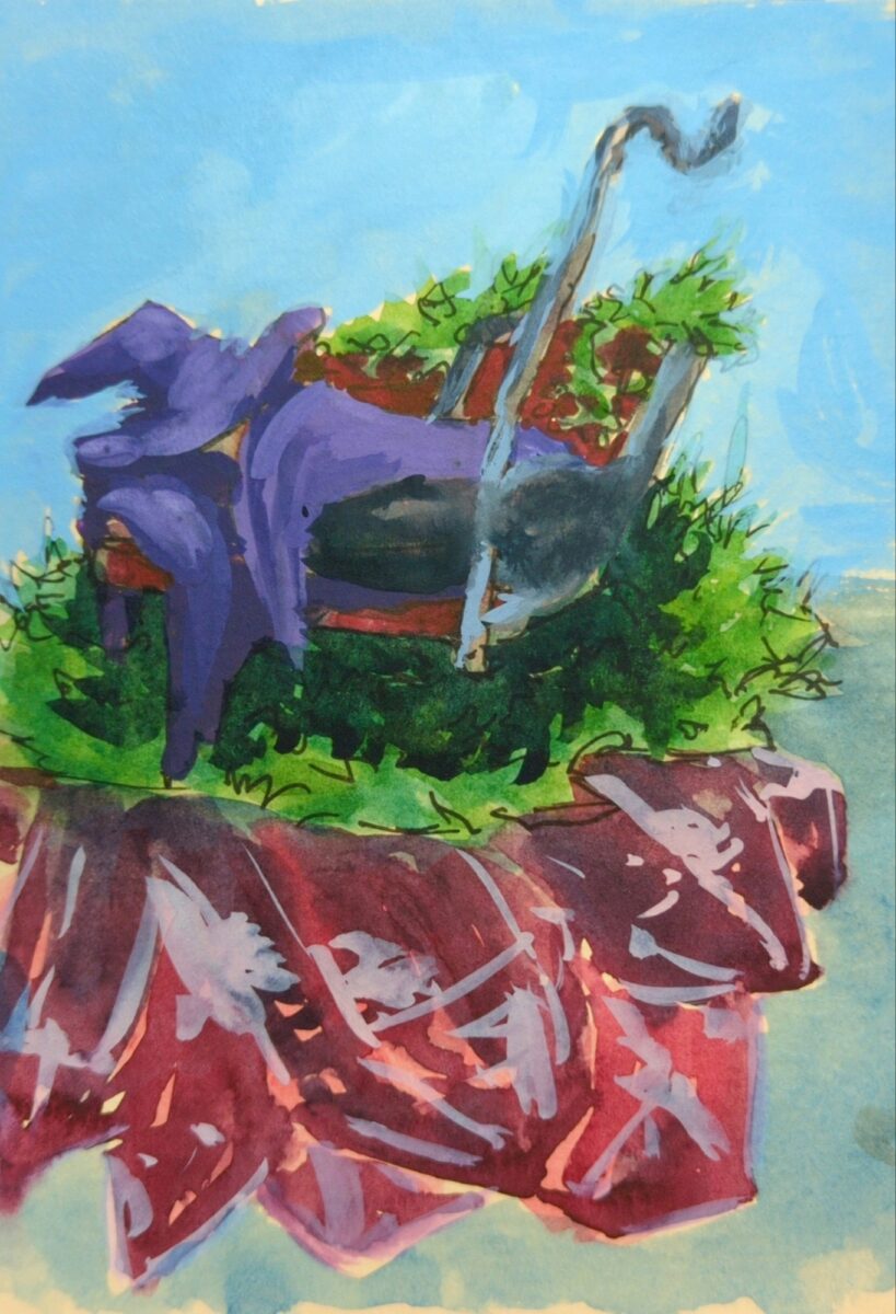

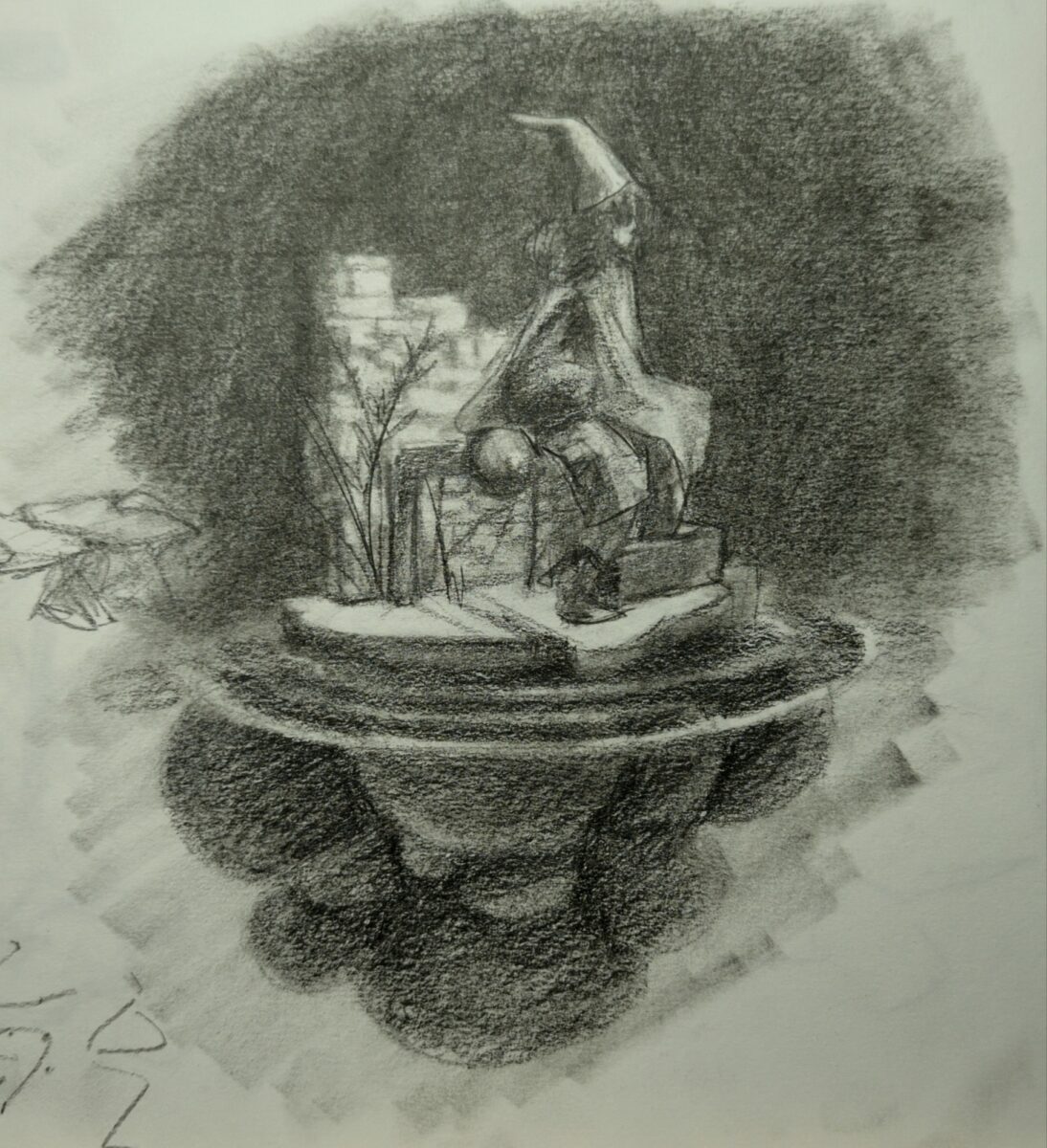
I’ve got a few iterations I’m exploring here and I’m thinking these might be worth doing full paintings of at some point.
-

watercolour, including some amazing shimmery blues gifted to me by a friend, white gouache, metallic gelly roll pens, white pencil crayons, and tense neck muscles.
Leave a Reply