swap to chronological order of most recently posted
-
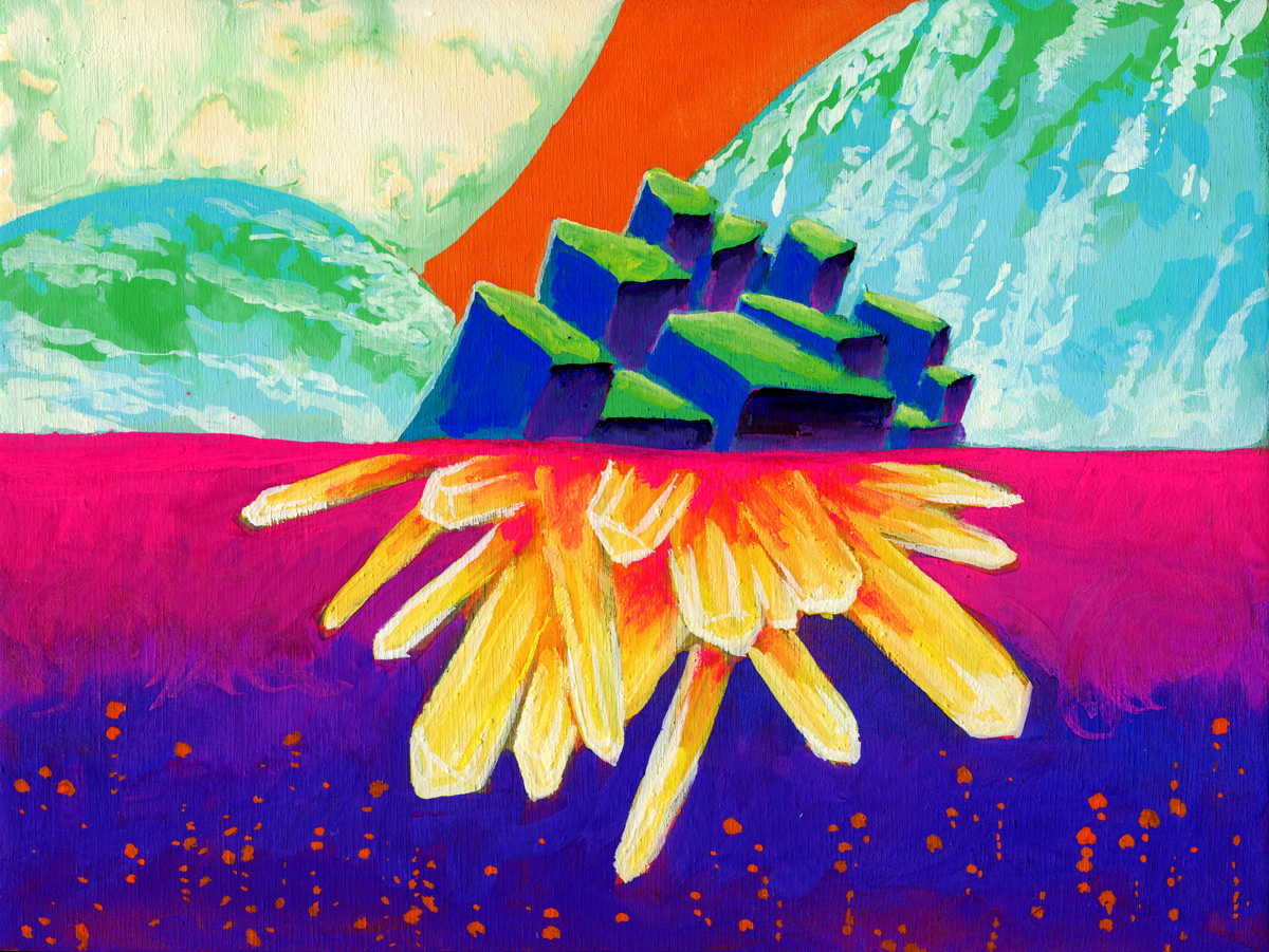
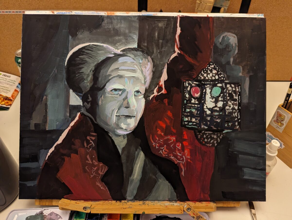
Painted in gouache on wood panel.
-
-
Gouache Studies
posted:
updated:
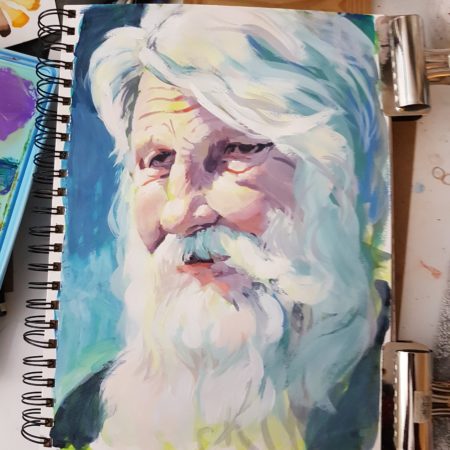
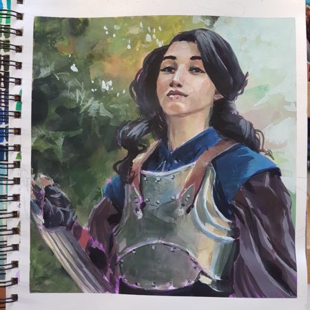
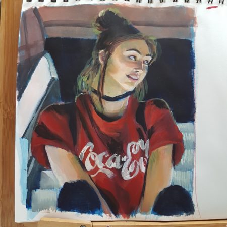
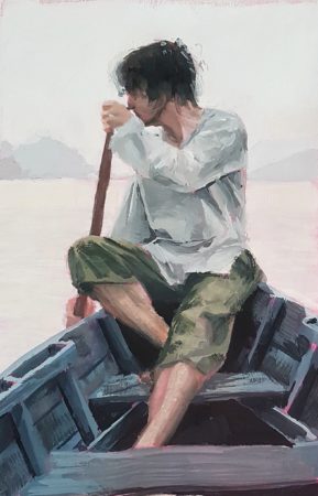
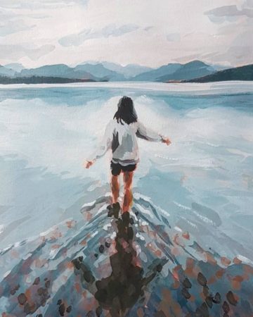
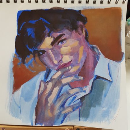
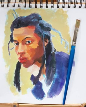
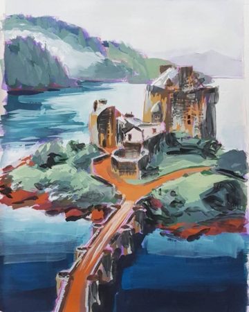
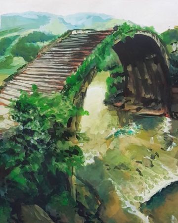
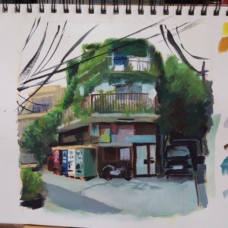
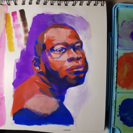
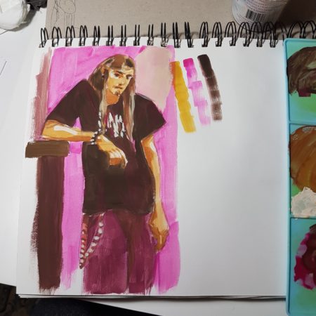
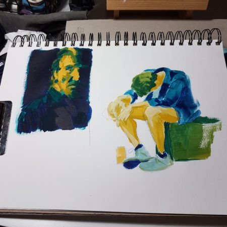
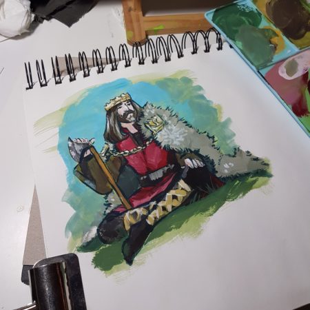
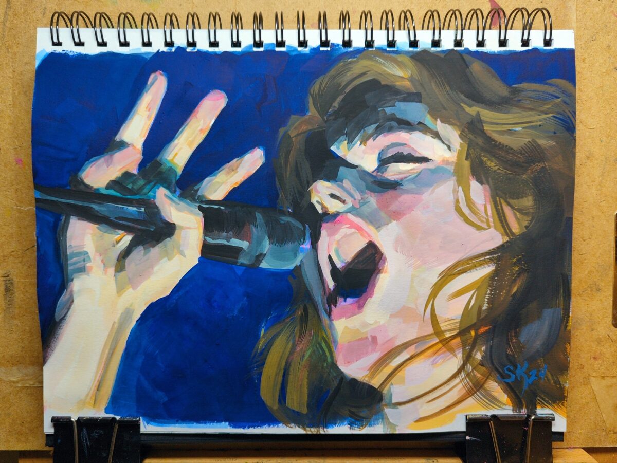
posted to: arttagged: gouache, landscapes, painting, pinterest, practice, sketchbook, structure, studies, traditional artI try and break out the gouache regularly for photo studies; it keeps my hand painterly and reminds me to think about values and simplifying the planes and shapes and also it is always a real challenge! I got some new gouache paints this past year, a Himi/Miya jelly gouache set suitable for painting a big pile of studies with, and it’s been a great excuse to paint more. Here’s some photo documentation of my recent work:
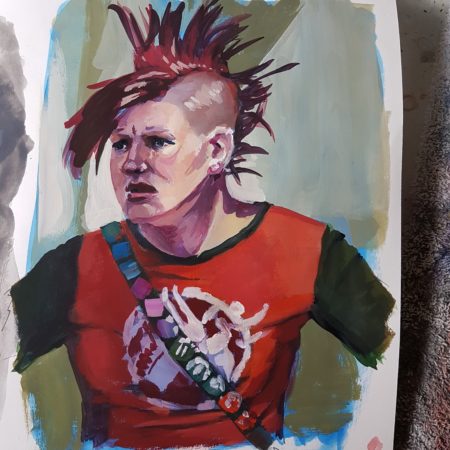
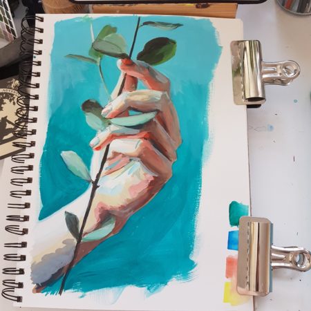
-

I was doing a sketch with this fountain pen, which has non-waterproof ink in it, and I decided to try washing over it with a water brush, and then painting over the tonal result with some gouache, which I haven’t done in a while. it ended up being a very enjoyable if very small painting!
6 responses to “tiny gouache view”
-
what a lovely little painting
-
thank you!
-
-
Oh this is so sweet
-
heck thanks!
-
-
oh I love this!
-
thanks!
-
-
-
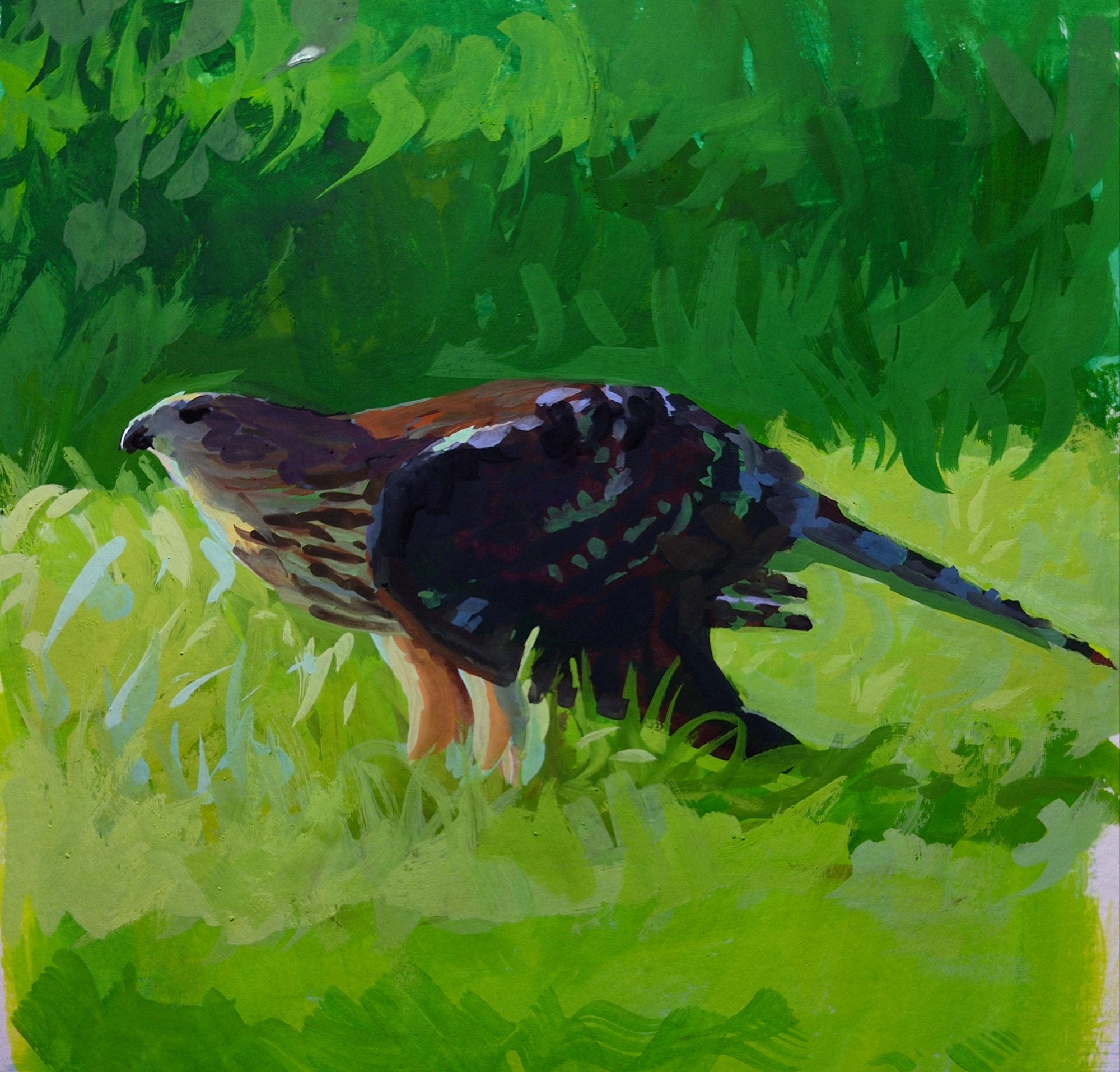
got the gouache out again for the first time in months; arm recovery really took the fun out of it for me for a while there! but I’m feeling more myself when it comes to holding the brush again, and it was lovely to sit and do a study of the hawk I watched kill and eat a squirrel at my friend’s park birthday celebration earlier this year.
-
So back in 2016 I decided to learn how to use gouache.
For context, I finished my second round of art school in 2013, and that included a lot of drawing training and anatomy study, which I still use every day as an artist. I also already had some classical Russian academy style portrait painting training in oils, from back in 2012 and 2013:
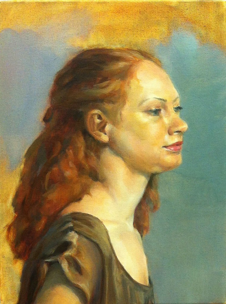
gouache sure as hell doesn’t behave the same way, and there is something so alluring and entrancing about oil paint, especially for painting faces and figures! But it’s beyond my scope for a home painting setup, and I say this with four years of using it academically. Gouache just fits into my life so much better! And while it did initially feel like an alien tool compared to the softness of oil, learning it has been a fun journey!
Speaking specifically of gouache portrait practice, here’s a record of some of my stops along the way to where I am today.
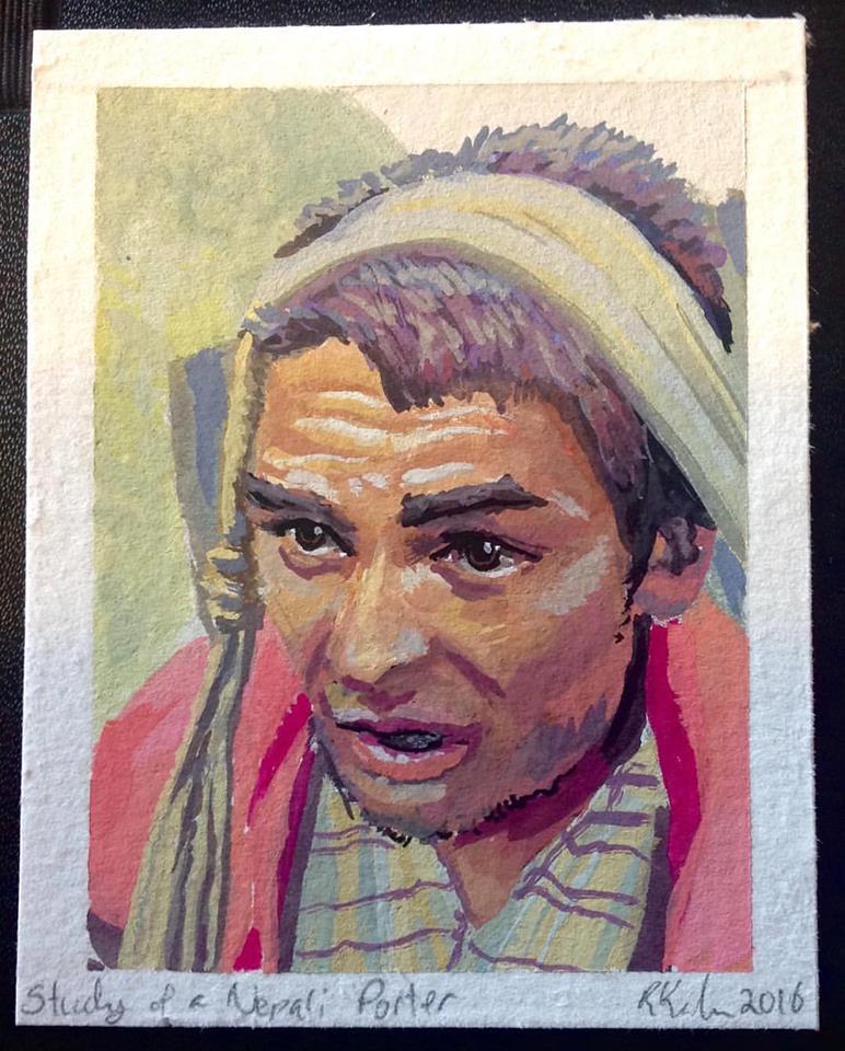
2016 – started doing lengthy, and tiny (4×3″), photo studies, mostly of landscapes but also the occasional face:
then in 2017 i put photos away and just played with gouache for a year with minimal reference used, learning about the medium and learning a LOT about colour:
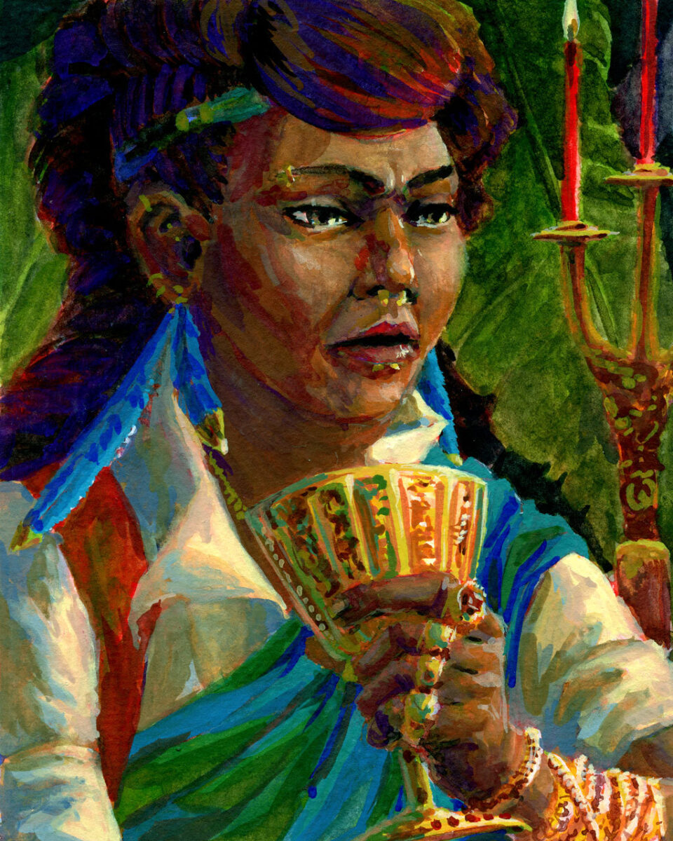
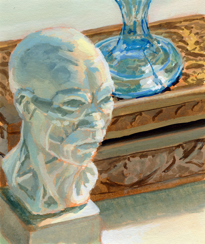
2018 was packed with freelance painting so i only snuck in a few proper studies, mostly still life work:
2019 saw me laid up on the couch most of the year so things were limited to digital iPad work mostly, with a few gouache sketchbook still life studies that really focused on pushing my control of the medium, not portraits:
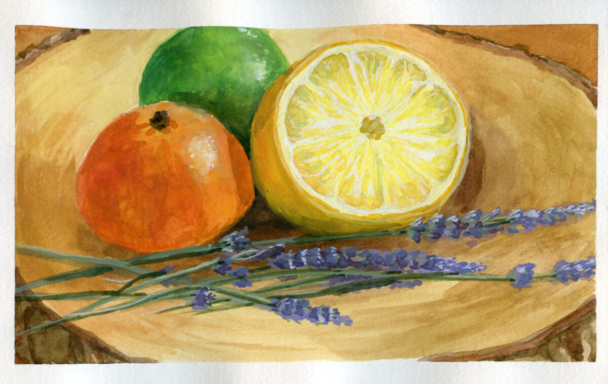
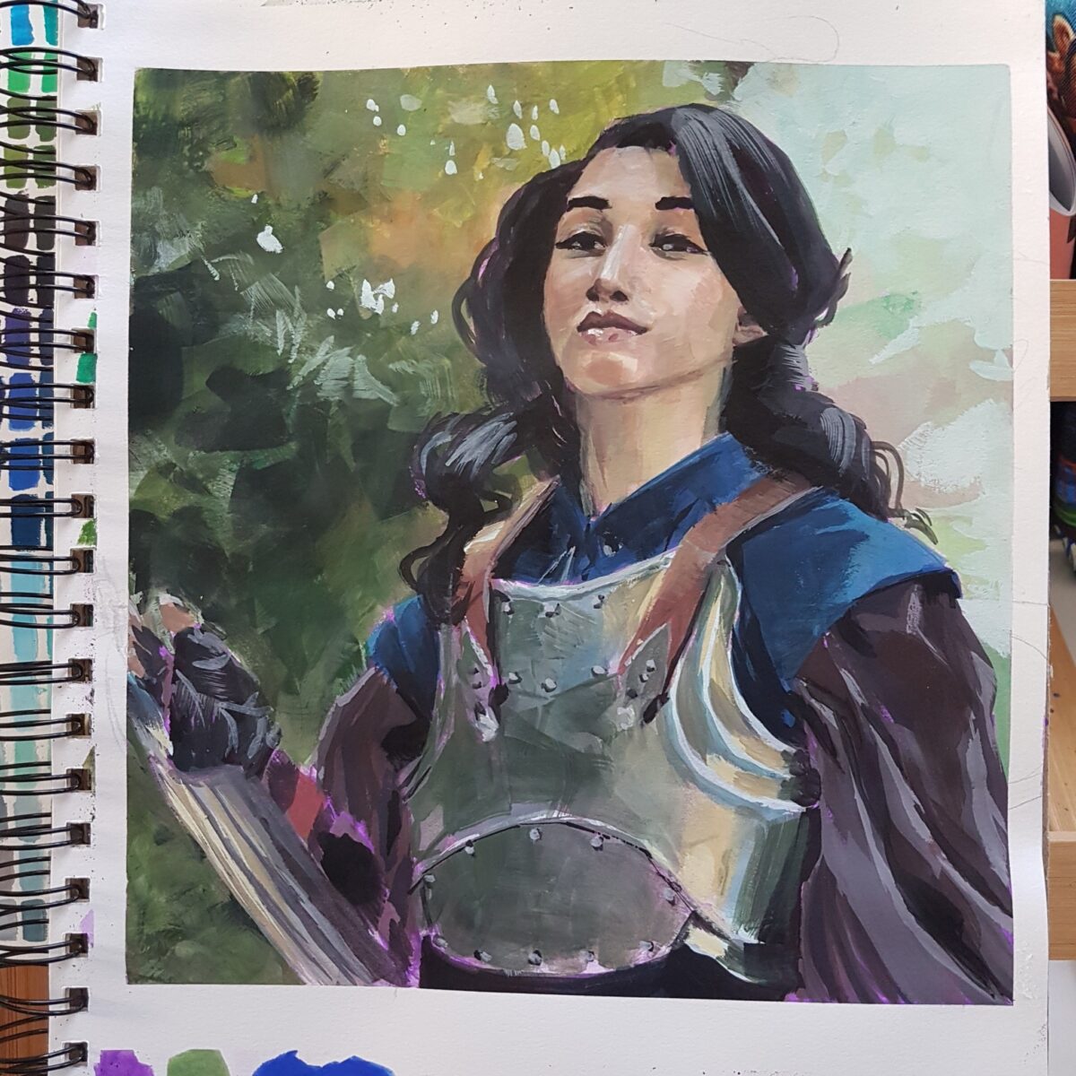
2020 was a famously rough year but i did get back finally to my desk and my paint and my paper and started properly studying gouache portraits:
2021, i kept going, wrestling with anatomy and surface and value and temperature and just being both excited and frustrated by my gouache work:
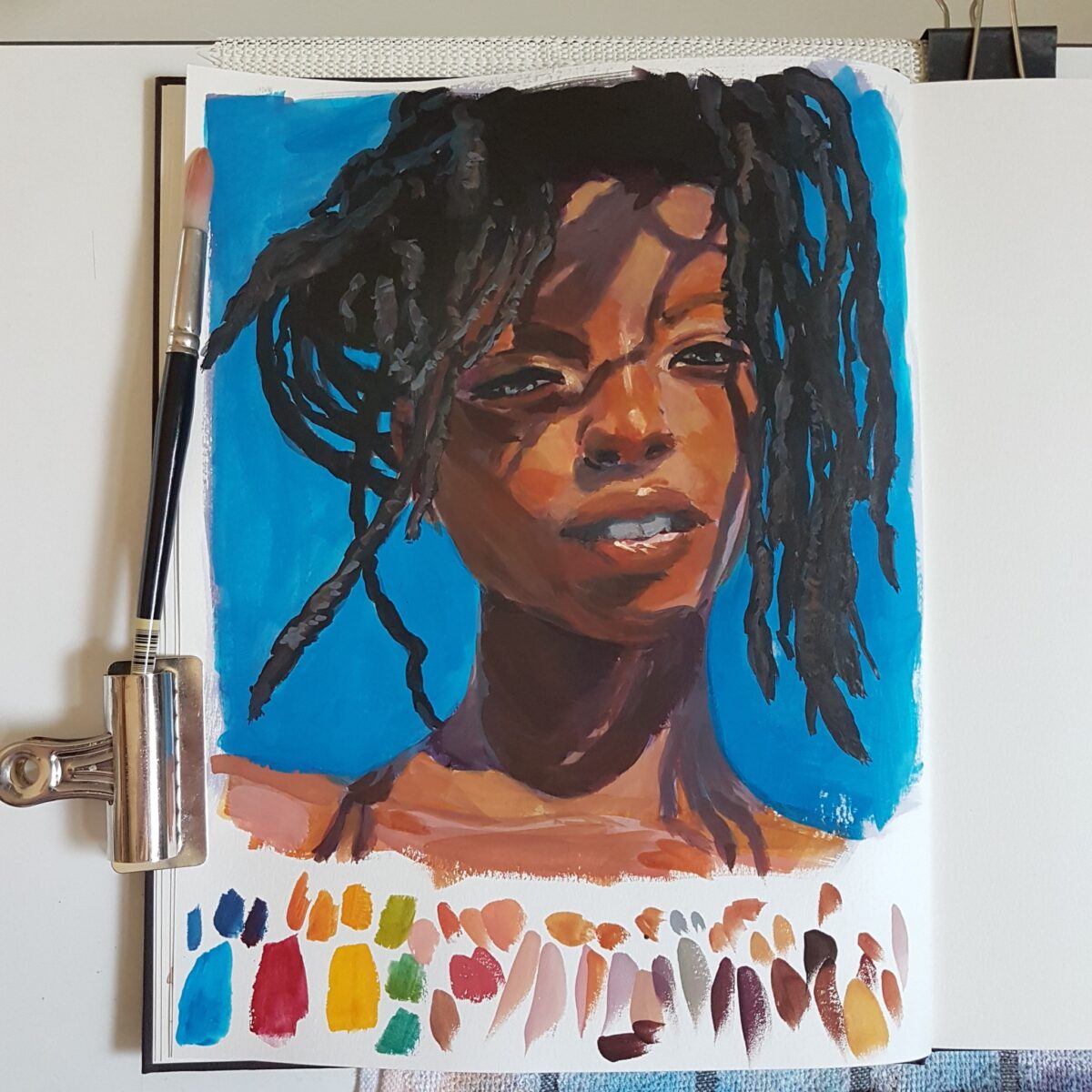
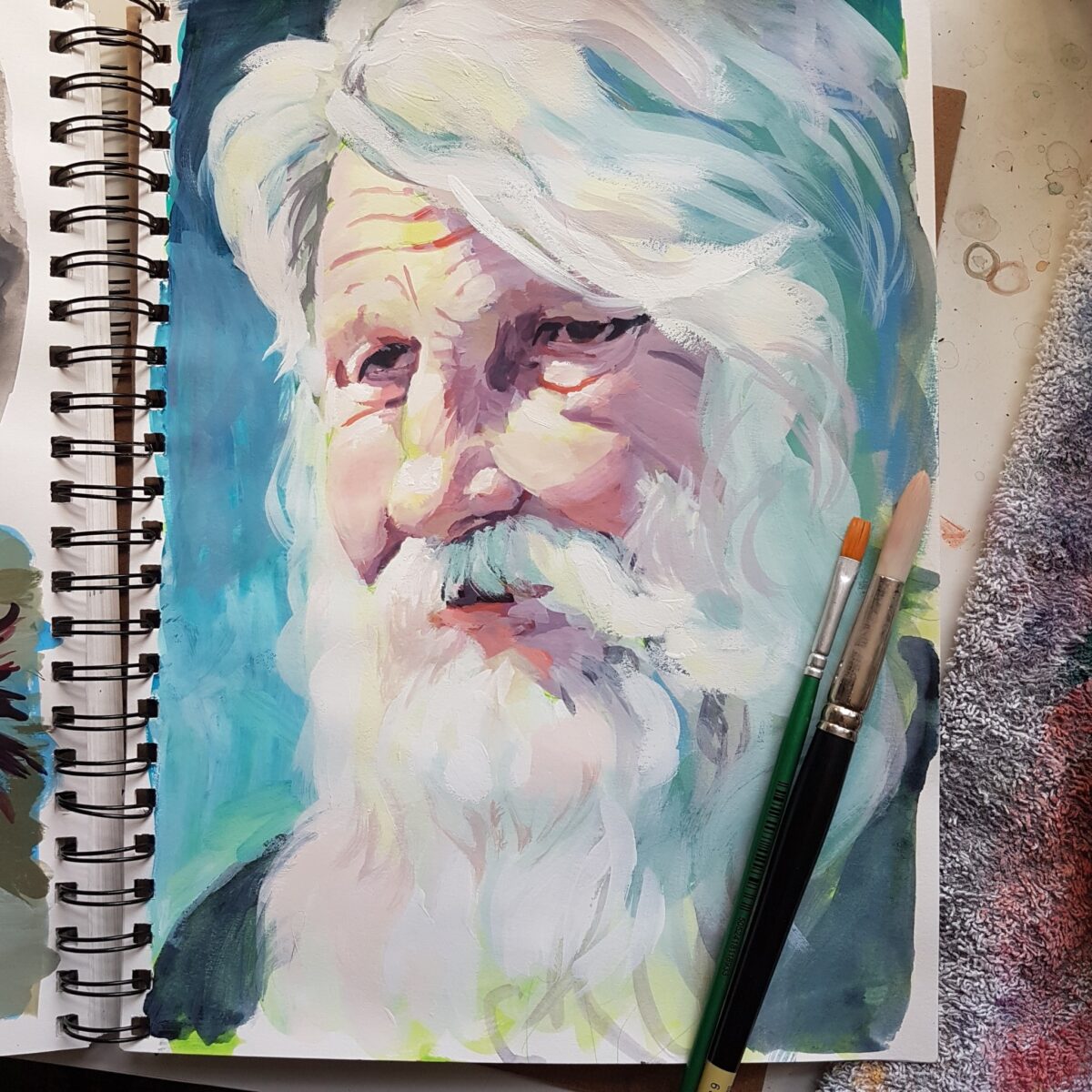
2022 I think something started to click – between getting better at anatomy AND starting to see how gouache can be blended and worked up into lost and found edges:
in 2023 I really felt like I was getting somewhere! Painting bigger was making the drawing harder but I was really starting to get a feel for rendering different materials and surfaces with the gouache:
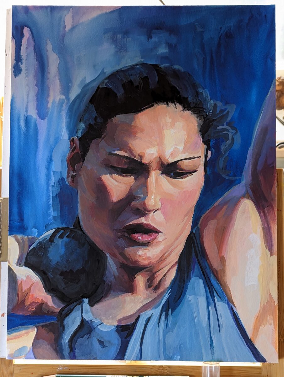
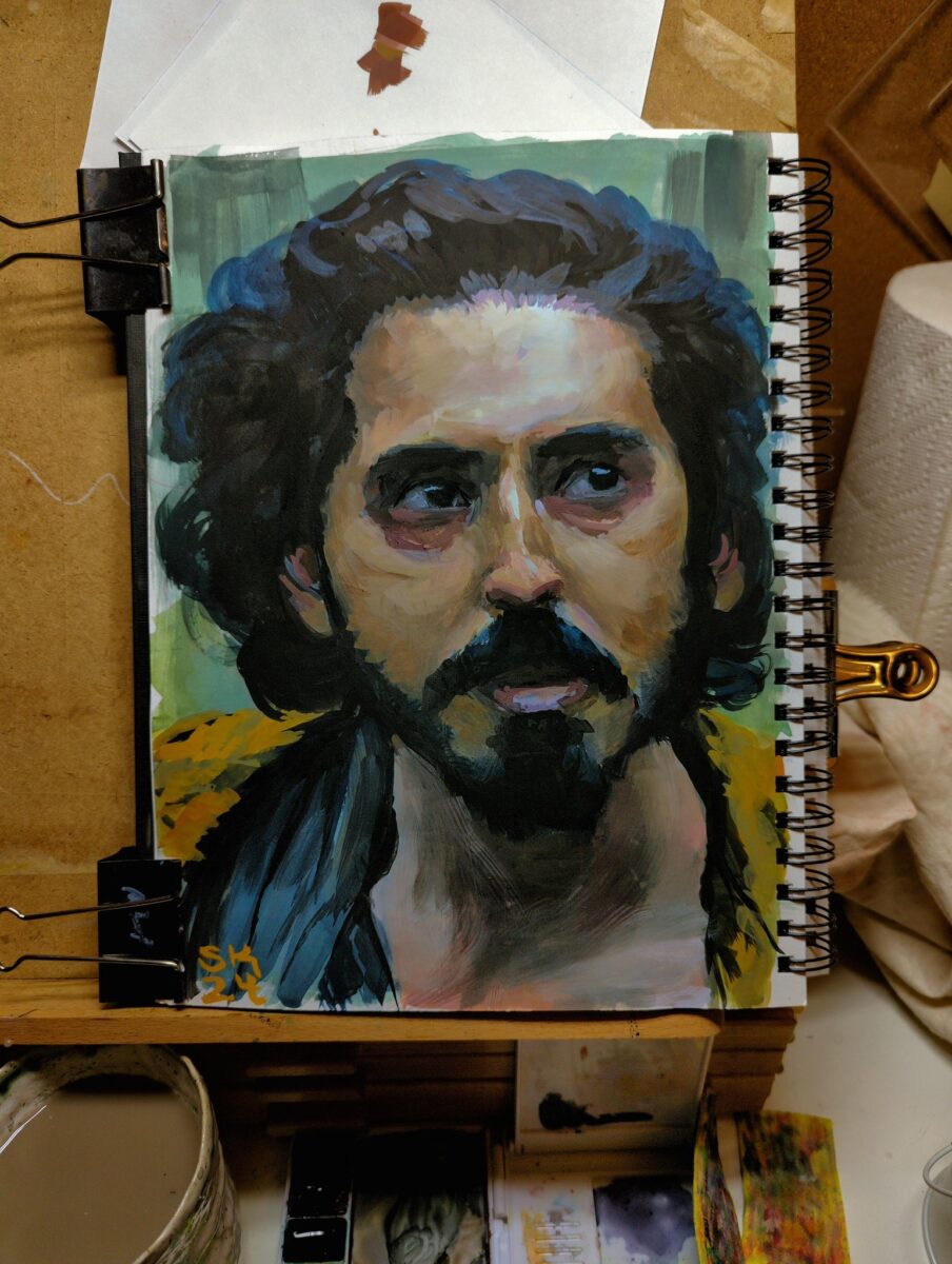
… and then i had my arm surgery and i couldn’t make precise marks anymore. Early 2024, done with mostly my non-dominant hand:
and now almost a year later, I’m slowly relearning how to use my still-healing dominant hand make the marks i want, and it’s so, so good to get back to gouache!
ok but how tho
if there’s one piece of advice I can give you if you’re trying to learn how to do realistic rendering in gouache, it’s this:
these rendered paintings take me three to 12 hours of work. i am not going to get a painting to this level of accuracy and polish in a single sitting. doing a good painting requires stepping away and refreshing my eyes and coming back; and it requires being willing to paint over entire features if they’re wrong.
give yourself the time to take a painting to finish so you can see what you are capable of, then, figure out what you need to work on, work on that discreet thing as a separate sketching process, and finally come back and try another long study and see where you’ve gotten to.
-
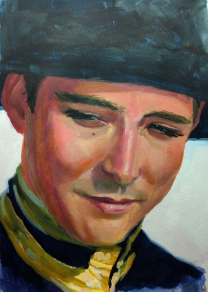
Process shots:

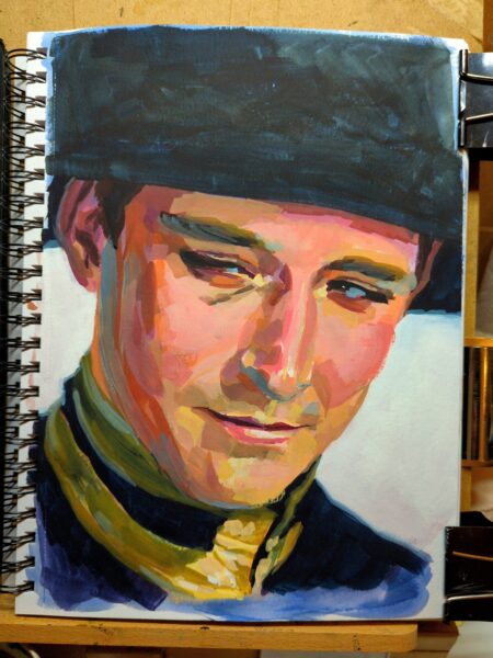
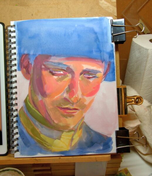
Honestly, I love the tiled effect I had going before the tighter rendering and, while the drawing wasn’t solved yet at that stage, I am curious if that isn’t a more appealing style for a potential finish for me on future studies. Something to explore.
-
-
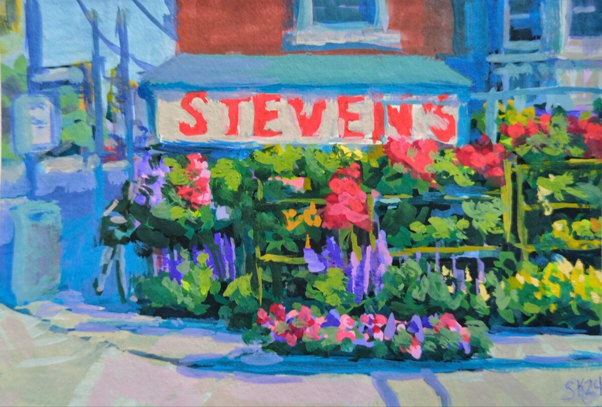
A lovely array of flowers i used to walk by every day after work.
-
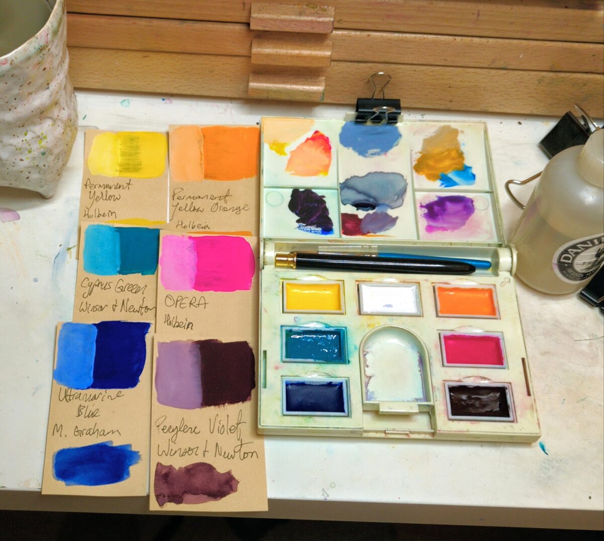
I swatched out all my gouache tubes this weekend (a great low stakes low light activity for riding out a migraine) and then used my newly organized info to put together a limited palette.
I keep thinking I’m going to do more urban sketching, more plein air, than i really make to get to, but whether this palette leaves my house much or not, I’m excited to challenge myself to stretch seven paints as far as i can.
The colours:
- permanent white, Winsor & Newton
- permanent yellow, Holbein
- permanent yellow orange, Holbein
- opera, Holbein
- perylene violet, Winsor & Newton
- ultramarine blue, M. Graham
- cascade green, Winsor & Newton
I poured them into full pans and dropped in a little bit of glycerine to help them rewet better after they dry out between painting sessions. That said, the perylene violet and the opera paints are absolutely nightmarishly un-rewettable sometimes, so they both got double the glycerine that the other colours got.
A traditional six colour palette has a warm and a cool red, yellow and blue paint; for this one, i pushed that framework a bit. Quite a bit maybe. For one, there’s no red, and I’m counting that orange as a yellow, and cascade green is my cool blue. But you can mix a pretty saturated red with magenta and orange, and cascade green mixes gorgeous purples despite the green in its name.
I suspect it’s going to feel like a warm palette overall with some very cold greens, and I’m excited to stretch it to its limits and see what i get 🤘


Leave a Reply