
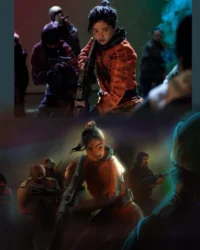
For this painting I spent more time than I honestly expected wrestling with my style goals. In the context of my arm recovery, I’ve been trying to figure out a stylistic angle for myself going forward as an illustrator.
Over the past few months I’ve been doing style tests1, digitally and then on paper, trying to see what feels good, what feels sustainable, what excites me, and what leaves me obsessively fine tuning forever even when I like the painting:


In the end, I decided for Swords Without Master to go forward with finals in gouache, with details added using neocolor ii crayons — but it’s also professional-level work and I need to balance my interest in traditional media with making something as good as I can make it, and using a process that guarantees milestones my clients can give feedback on! So the first chunk of this work is going to look the same as it would for any digital illustration I might do, which I didn’t think would be a problem, but I may have underestimated my own anxieties.
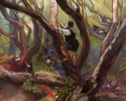
So, step one: the thumbnail! I actually handed in a bunch of thumbnails, since for this project I’ll be doing 6-8 paintings, and from that first batch the client chose three to go forward with, and this one in particular to do first:

My thumbnailing process is pretty broad – whatever medium I have to hand is what I sketch with, and if I can’t think of something to sketch, I make lists, look up reference, dig through older sketches for ideas, or go hunting through my personal photos for a composition or theme that always inspires me! For this one I knew I wanted a hazy, sunny day feel, and enough nature visible to ground the location.

I actually did go down a little side quest where I put the bear under a waterfall and threw the rogues into a river, but I didn’t feel great about how it took the focus off the action and ended up shelving it and coming back to the thumbnail with a more literal interpretation:

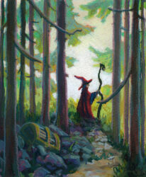
After going through a few colour mockups with the client to reach this one above, I took the art back and started the laborious digital drawing process:

Drawing digitally can feel awkward compared to paper for me in terms of line quality, especially on the slippery cintiq, but being able to zoom in and use my whole arm to draw shapes has been a huge help with getting back to drawing after my nerve graft.
The other important aspect of the drawing process is the gathering of reference:

So, so much reference.
I also gathered reference for the figures, the costumes, the landscape and tree, and so on – the reality is that, for something to feel grounded, I need to use reference at some point in its design, even if I don’t use it the whole time.2
However, I also didn’t reproduce any of my referenced images exactly, because a) that wasn’t at all what this illustration actually needed, b) that would undermine the style goals I set at the beginning, and c) that’s the moment when finding royalty-free reference becomes necessary, in my mind. So in the end I built a drawing that was heavily referenced, but not drawn to feel perfectly realistic.

This is about where the voices of doubt started to kick in. These were lovely inks, I thought! They reminded me of previous work I’d done that I liked – work that other people had also liked! Why abandon them?
But I put a pin in it and went on to my next step, one which I feel confident was hugely important, and one I really don’t do often enough: a value study.
First, I did what we call a notan: black and white. The first one I did based on my chosen lighting:

Now, again, this is not going to be a two-toned drawing. I’m still planning to paint it in full colour, and add linework! But doing a notan was something I’d been meaning to try, as I feel like one of the biggest challenges for me in recent work has been maintaining solid value separation between my lights and darks, and I wanted to experiment more with dramatic lighting in this series for Swords Without Master. If I want to be in control of my lighting, I need to plan it in such a way as to know for sure that it will read well and enhance the image. If I can figure that out in two values, then I can certainly wrangle it in full colour! In theory. So with black and white only, and all the lines removed, I was comfortable that my composition read well and was eye catching.
Then, because the bear was such a big, dark figure compared to lighter sand and rocks and sky and trees, and thus I needed to solve for the dramatic variety in local colour value, I did a notan of the local values of everything too:

This gave me a chance to think about value in regards to the rogues’ designs as well – value pattern is really important in character design, and especially if I want to use these designs again in another drawing, I need them to be readable and distinct. So, I did a notan of local values, unaffected by lighting, and while it wasnt quite as legible as my first, I was happy it gave me interesting shapes and a decently appealing value pattern as well.
These two then got combined to show me a three value version of the image:

Yep, that reads.
So with the magic of adding back in the linework and tinting my notans, I was able to start seeing my warm/cool pattern too:

And then I took all of this prep work — colour rough, drawing, notans, tinted shadows — and I did a rough and ready digital painting of my piece.

And this is when I really hit the wall of my own confidence. This was a solid half-done digital painting! I could take this to finish in clip studio paint, and I could probably do it pretty quickly! And why not – it wouldn’t look bad. It felt very similar to prior work I’ve done – work I’m proud of, work I like! But that was work I did before my arm surgery, and work that had really very different goals than the work I do now.
Back when I drew like this – clean lines, soft digital colours, layered paper textures – I was worried about realism in a big way. I wasn’t that comfortable with it yet at that point, but I cared about it a lot! These days, realism is only a part of my goal with an illustration, and one thing I have learned as I have felt more comfortable with realism is that I don’t actually want to focus on it as an artist. I have other priorities now.
Back then, I also cared about having a fast and efficient process – I developed this line and digital-wash approach because I took on a huge job for Call of Cthulhu, and had to produce 50+ illustrations in a super short period of time. The digital process I created for that was extremely easy to reproduce by duplicating source layers across all my pieces and carving out light, shadow and local colour really quickly! My process these days is going to have to be slower no matter what I do, so I would much rather take the time to find a process that is rewarding in the moment, as well as one that gets me results I like.
Also, back when I drew like this, I had a fully functioning dominant hand, and I felt in control of my lines. And no matter how much the inks I have here for the bear remind me of my inks in the past, I know that they aren’t nearly as well controlled, and that I do not feel like I am getting to make the choices I want to make about line weight, shape, direction, and so forth. It’s subtle, but the differences are there in the results, and the process of inking itself is so different now that I can’t ignore that.
And part of me misses that style a lot – I miss confident clean inks and quick digital washes, and I remember how proud I was of these pieces when I drew them!
But I also remember feeling limited by this style, and feeling like it made me tight and cautious as an artist, unable to do the dramatic lighting effects and more expressive markmaking that I admired in other painters’ work.
And now, while I debated going back to that comfortable old process, I also felt a little… I think I have to call it claustrophobia. I felt the call, and it also felt like a trap. I can’t be that artist anymore, and frankly I know in my heart that I don’t want to! And I was here with clients who had worked with me in the past, and who are excited to work with me now, and who were putting trust in my ability to give them something exciting, even though they knew it couldn’t and wouldn’t be the same as what I had done for them in the past.
So I took a deep breath and committed to the plan I had made in the beginning: do my planning stages on the computer, and then print out the linework, lightbox it onto watercolour paper, get out my gouache and neocolors, and paint this thing.
The painting process was, as expected, really, really fun!
I did my tracing of the linework in watercolour pencil crayons, and misted the page to lock them in. They blur a bit when you do this, but overall they stayed legible, and I love being able to trust that even if the linework peeks through the final paint layer, it will be soft and colourful and feel like a natural part of the rest of the piece.
Then I pulled up my notan studies and started carving out those shadows:

Every section of the painting got a different shadow colour, mostly as an experiment in separating the various planes of action. I am not sure if this ended up having much of an effect on the final, but it was easy to test out and certainly helped me track things during the painting process!

And then I started painting properly! One of the decisions I made was to do some quick local washes of colour, with intent to paint over them more opaquely further along in the process, but I found myself skipping to the opaque stage faster than I meant to. I also found myself really losing track of my value plan, almost instantly!

So then, before rendering anything further, I dug back in and darkened all my values on everything but the bear. I actually kept going back and making things darker, over and over again, throughout the process. I am definitely certain I wouldn’t have felt confident doing that without the notan studies I had done earlier helping me map things out.
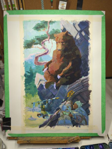
One of the things I did put off as long as I could was the figures in the foreground. People are always hardest to paint, and I was really worried about losing all my careful characterful drawing underneath opaque brushwork – which is why everything else is pretty rendered and they are still in pastel washes at this stage.

Finally though I sat down, painted them, repainted all the shadows on them even darker, popped a few highlights to add contrast, and called the gouache layer done. In this stage above you can now see the tiniest beginning of neocolor ii linework in the piece – specifically the bear’s eyes. I had hoped the linework would tie down all my expressive, loose brushwork, and at this point I was able to relax and say to myself that yes, absolutely it would.

So I drew over everything I thought could benefit from textural linework! I am really, really happy with this piece – and not just because I took myself on a deep dark journey of the soul in the middle. I am excited about making professional work with expressive brushwork like this! I am thrilled I can use my favourite medium and most enjoyable process on client jobs now. And I really am excited about not just what I achieved with this painting, but what unmapped painting territory lies ahead of me for the next ones!
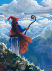
Below is my scanned and cleaned and adjusted final piece. I would love to know your thoughts on the process – and if you’ve been working traditionally, how you’ve found letting go of digital processes despite the lure of them?

Leave a Reply