
Further paper tests allow further wizardry – this time in a more contemplative mode, though.
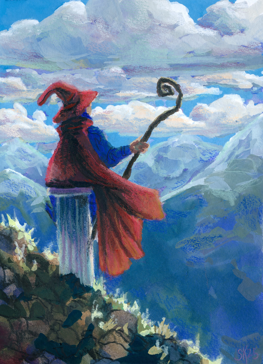
A second test run with the hot press cotton paper let me get more expressive with my brushstrokes and try out more contrasting of the paint approach and the pencil crayon approach
This one feels maybe a bit over-rendered for the style I want? I think the linework on the wizard and the rocky ground is closest to my goal – the shading I added with the pencil crayons on the clouds and mountains isn’t really hitting as hard for me.
The other thing I’m wrestling with is how translucent even my most opaque pencil crayons are! It might be time to switch over to the neocolor iis so that I can feel confident in the opacity of the colours I’m laying down over my painting – but that is for SURE going to necessitate me painting bigger — much bigger.
Leave a Reply