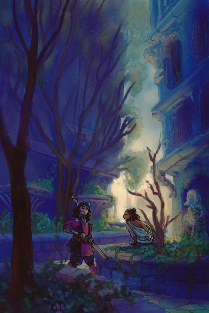
Another style experiment, this time done 95% in Procreate. This one has me using a photo I took in highschool of a courtyard downtown that I have painted from many times before – each time reinterpreting it further and further from the ref.

This one only came into Clip Studio when I realized I had painted it so dark that it only really was legible on the ipad – a mistake I have made before and, I am sure, will make again! That device really does blow out the shadow values a fair bit.

For this painting I returned to trying a heavier line and less rendering overall, simply making the lines transparent when I need them to fall back. I think the fuzziness and looseness of the lines feels satisfying on the environment, but the people also end up feeling a bit indeterminate in details as well.

The style quest continues!

Leave a Reply

Your email address will not be published. Required fields are marked *

This site uses Akismet to reduce spam. Learn how your comment data is processed.

To respond on your own website, enter the URL of your response which should contain a link to this post’s permalink URL. Your response will then appear (possibly after moderation) on this page. Want to update or remove your response? Update or delete your post and re-enter your post’s URL again. (Find out more about Webmentions.)

16 responses to “Style Test – fantastic skyscraper reinterpretation”

Likes, Bookmarks, and Reposts

  • bsky.app
  • Carter! ✨
  • Matt
  • Dr Lynne Hardy
  • John W Sheldon
  • Numerosix
  • Sean Poppe
  • Hardy Tales
  • im rob
  • goshdarnheck
  • Holle
  • Xavid
  • Holle
  • "Eppy-Deppy-Diah!" a thing I say at the end of every episode.
  • shel kahn
  • "Eppy-Deppy-Diah!" a thing I say at the end of every episode.