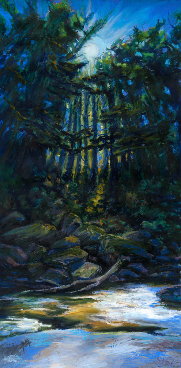
Presenting: this huge oil pastel painting I created this past August! It’s nearly two feet tall, painted in a variety of brands of oil pastel on stonehenge cotton rag paper, with an underpainting in watercolour.
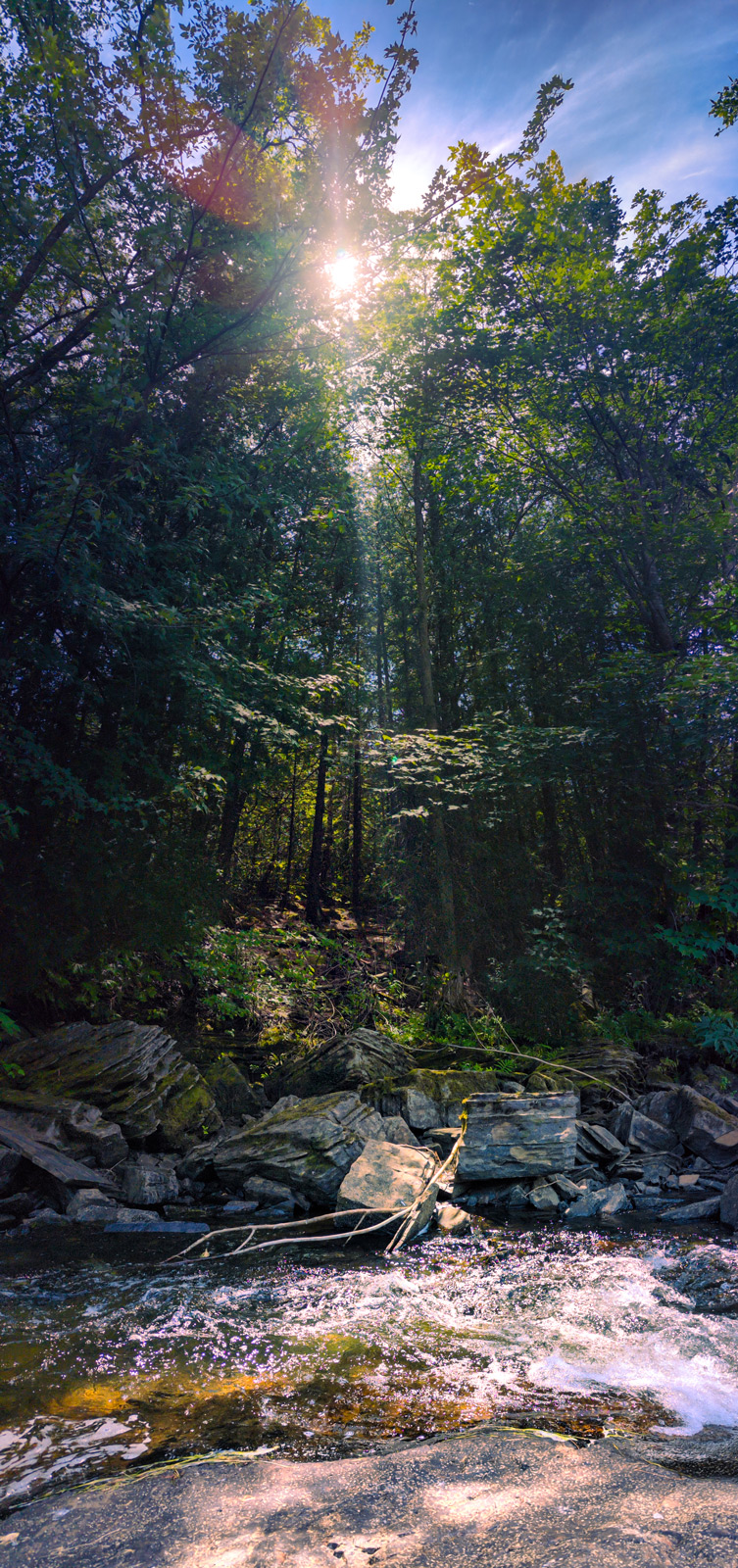
I created it based on photos i’d taken while on a roadtrip around the great lakes through Canada and the US. These were captured on a beautiful cataract waterfall segment of the Voyageur trail across the northern shore of Lake Huron – we’d stopped for a rest and a drink sitting on the rocks in the shade, watching this stream go by and seeing the sun winking through the leaves.
I took a huge pile of photographs sitting there, trying to capture everything that felt so special about the spot, and when I got home I sat down with lightroom and photoshop and tried to develop and collage the photos torebuild my memory. Here’s the results of that digital shenaniganry:
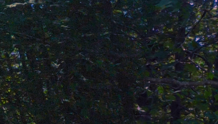
Unfortunately, photoshop was more interested in giving me generated nonsense in some spots than bothering to reassemble every leaf shared between shots, as you can see in these details below:
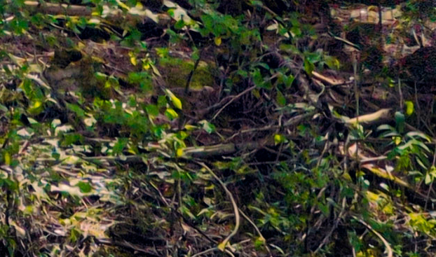
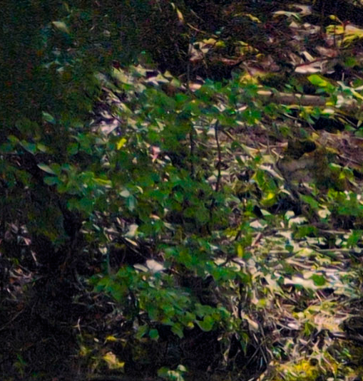
So it didn’t feel like I could, with the tools and patience I have at my disposal right now, create the epic collaged photo of my dreams — but so be it, I have other methods! Hence, oil pastel!
One of the things I keep doing to myself is trying to create oil pastel works with huge and subtle dynamic ranges, despite the fact that I know – I know! – that oil pastel has a very limited range of darks. Anyways, this is how I used up a third of a stick of Sennelier Sap Green, the rich warm nearly-black green of my dreams, and one of the most pricey and yet also soft and yet also small sticks of oil pastel. Worth it, I think.
I hope this post is also interesting for those curious about how I go from reference to painting! Here is a very literal side by side comparison:
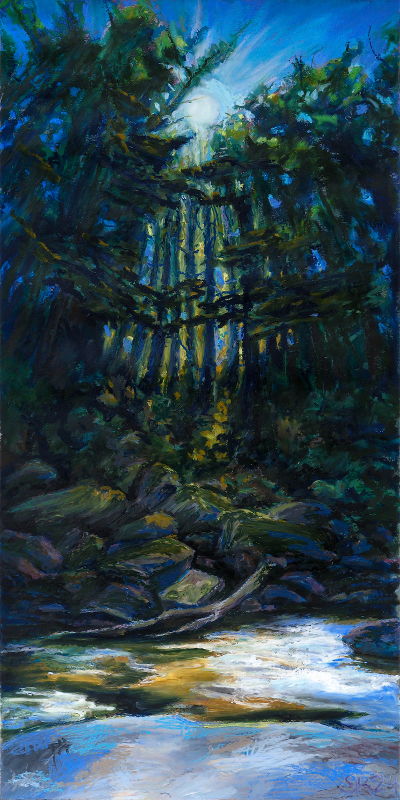
As you can see, keeping objects in subtle scale with one another goes at least a little out the window, especially with oil pastel. Even at the size I worked, it was beyond my skills or interest to get all the tiny fine details, and I moved things around compositionally quite a bit.
Honestly, this feels like a reference photo I might find myself coming back to someday for another go, but not out of dissatisfaction – I am enormously proud of this painting! But there’s so much in it, so much happening with perspective and rhythmic line and the scattered light, it might reward reinterpretation into a variety of media.
Do you have references you see yourself returning to in the future?

Leave a Reply