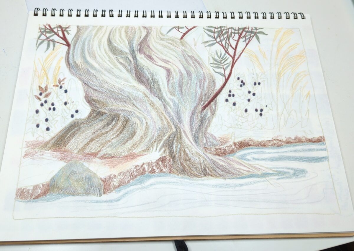
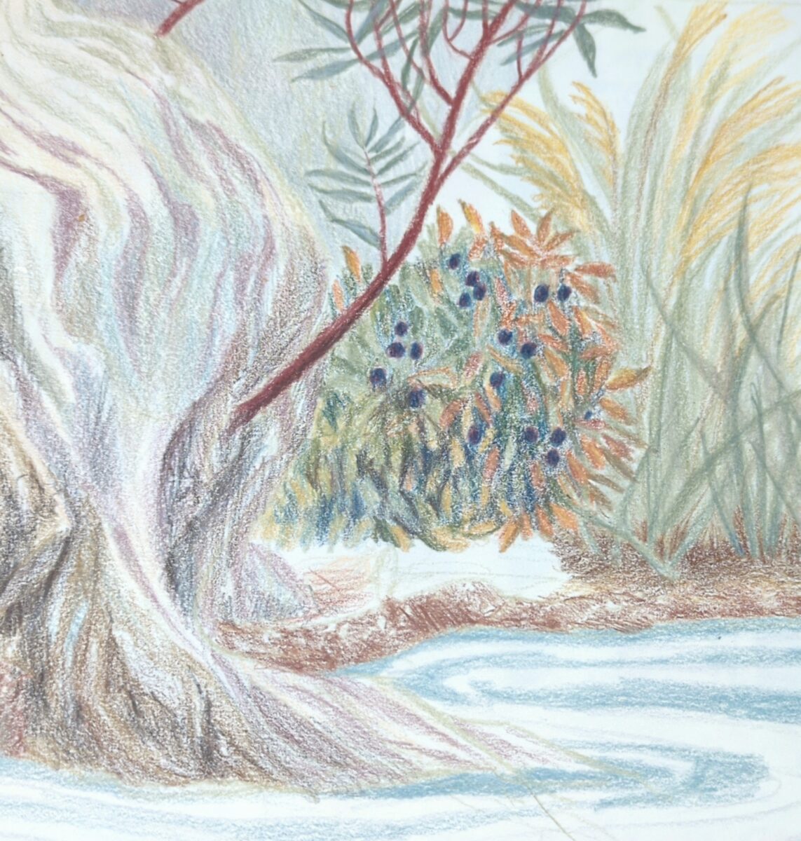
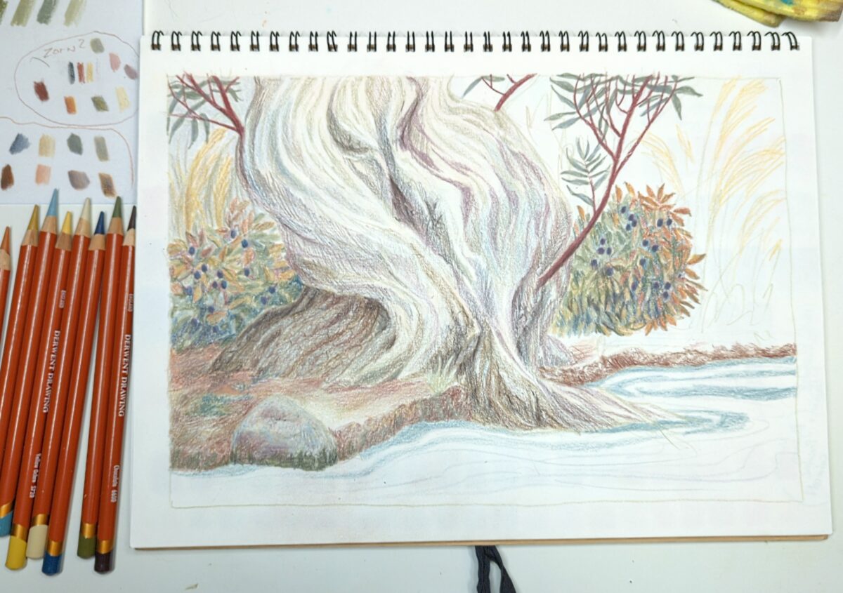
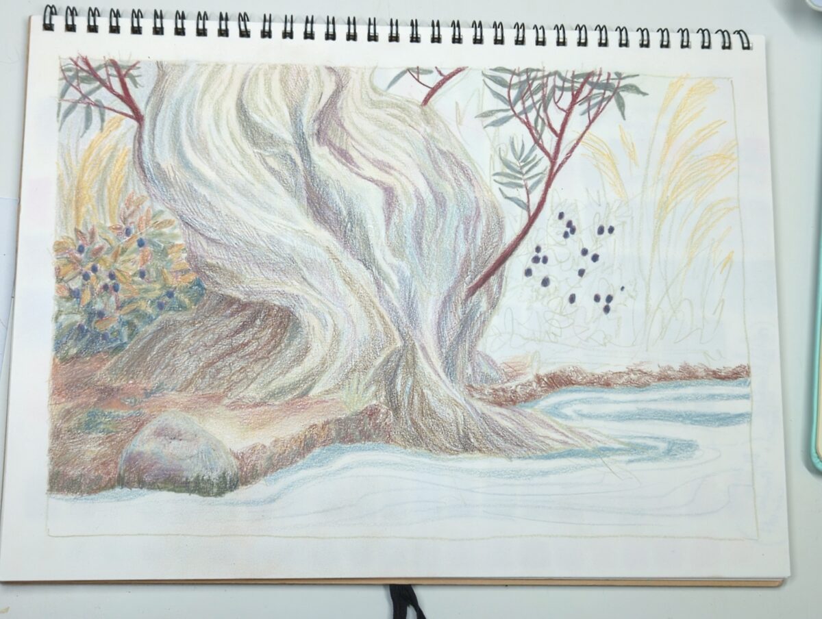
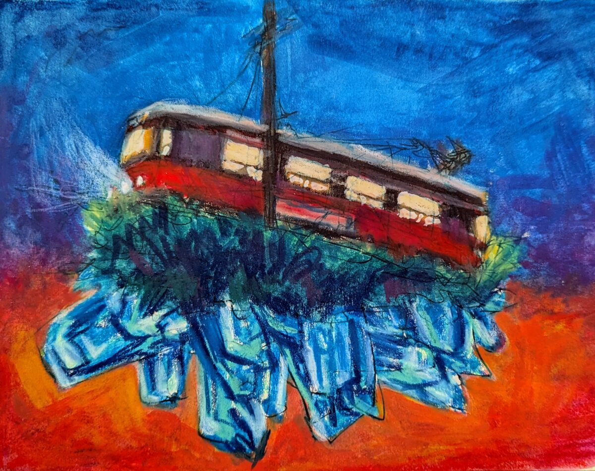
Just need to figure out what approach to take to make it feel like the focal point again – this is what happens when you over-render your blueberry bushes, friends.

by definition, not static
reprioritizing / replanning / restructuring
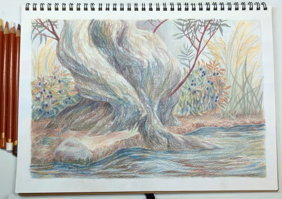
Just need to figure out what approach to take to make it feel like the focal point again – this is what happens when you over-render your blueberry bushes, friends.
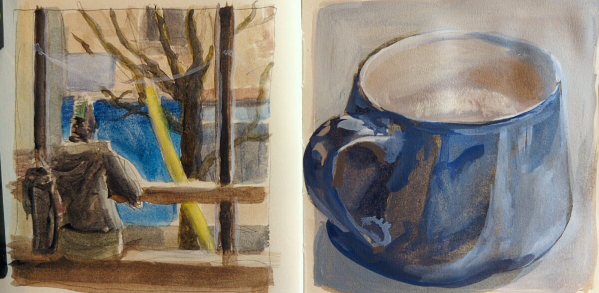
watercolour and white gouache, in my little square royal talens create art sketchbook. one of my favourite london fogs on this side of Toronto.
Well, starting to. This is where I realize a little ref would have gone a long way.But we can probably get somewhere pleasing, even if not accurate, if I keep going.
The texture on the paper in this MUJI sketchbook is so pleasing!
I love how they start to go red in the end of summer, they are underrated ornamental beauties!
This palette really holds you accountable to relative colour! But also: you can use every pencil crayon in your possession and it will still feel perfectly harmonious.

Taking this limited palette on the road!
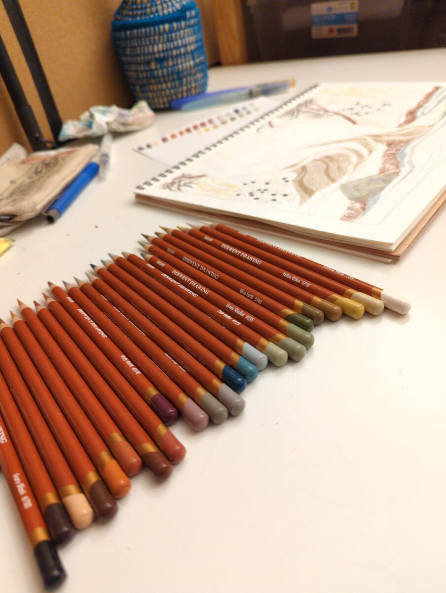
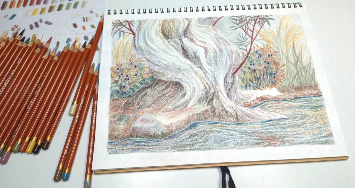
these are the Derwent Drawing line of pencil crayons, and I’m having a lot of fun with them in my cheap MUJI sketchbooks!
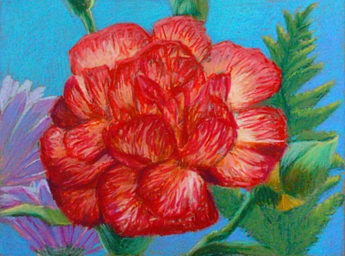
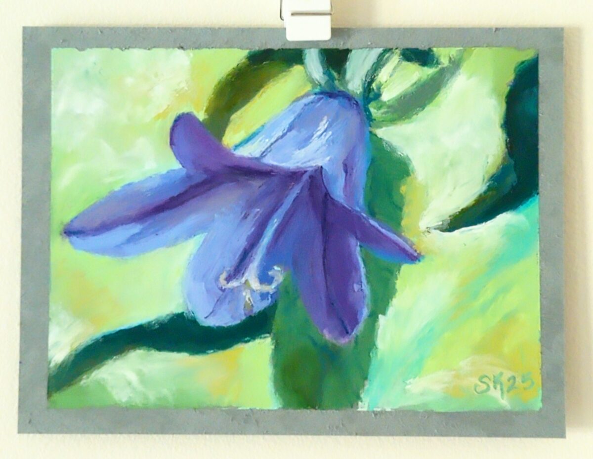
Drawn without water, on a 6 x 9″ grey blue cardstock, I think Strathmore brand. Drawn from life, from a lovely birthday bouquet.
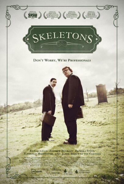
Shoutout to Jurie and Andy for sharing this gem with me; deeply british, dry, spooky, sweet, and shows you the tip of the iceberg of a larger occult understanding that is revealed further through rewatchings and the subsequent mulling over you might do at the pub after with a friend.
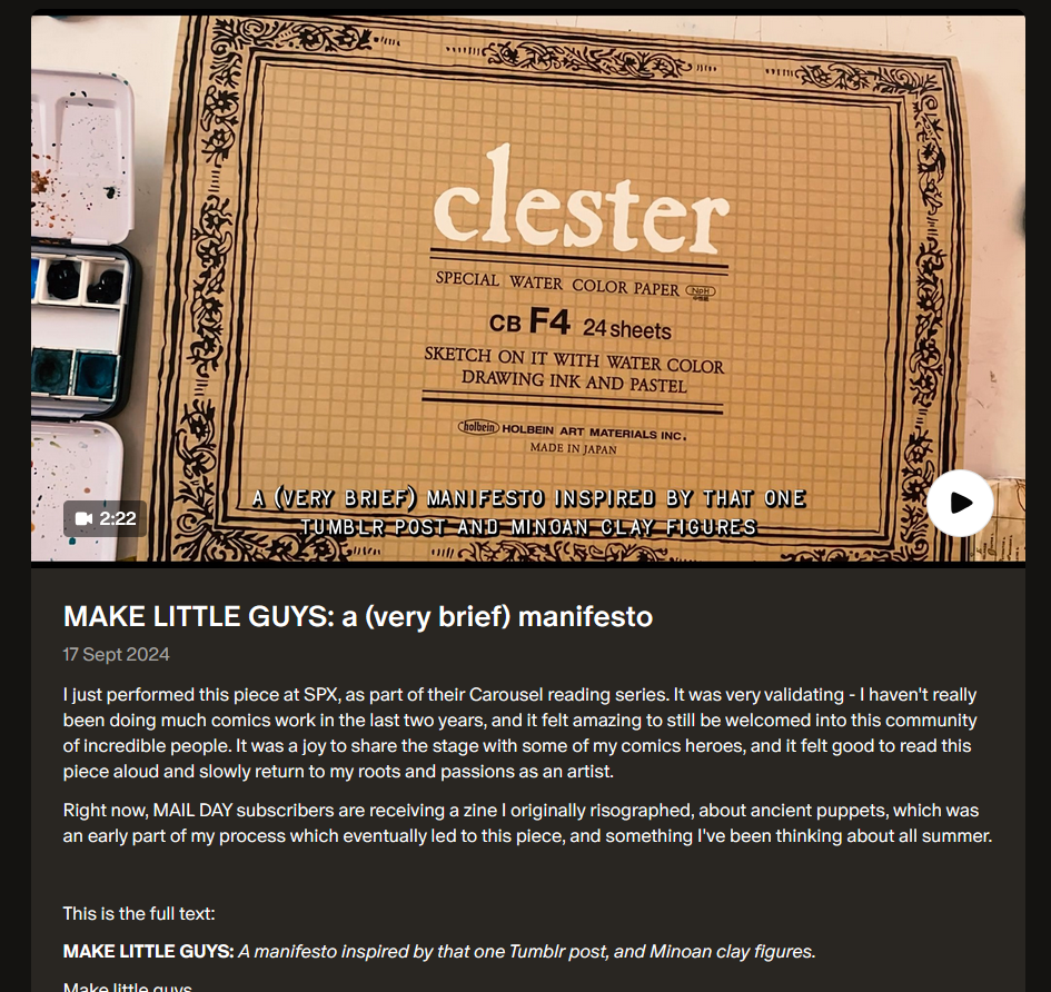
We’re all getting bombarded, and the fight, flight, freeze response is probably flooding your brain, and I too am feeling paralyzed by the constant internal question “what can I even do about ~everything~?!” —
— and this piece – manifesto, poem, performance – from Shing Yin Khor’s patreon popped up in my bookmarks-to-revisit and reminded me that zooming in on something like a Little Guy can be a wonderful empowering connecting experience.
So here, go, enjoy, hold on, challenge the aggressive flood of learned helplessness the world is throwing at us all right now:
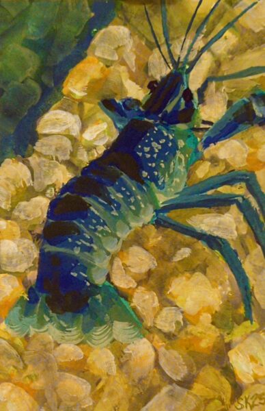
4 x 6″ gouache prawn. I decided to try using some drying time extenders – glycerine, watercolour blending medium – to try for more of a wet in wet blend approach, but honestly it was hard to keep the paint thick enough that it wasn’t just running all over the page. Something to retry in future on either more absorbent paper or with more viscous, fresh gouache.
Drawn on very, very smooth paper, a mistake I will not make again. Photo ref taken from my database of plants that I have grown (intentionally or not!) in my garden over the years.
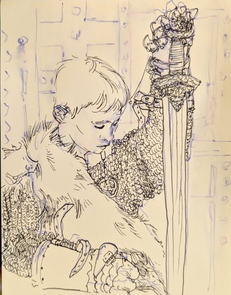
Drawn from pinterest ref with my FPR ultraflex nib over an undersketch done with a long blade nib and washed into the page with a waterbrush.
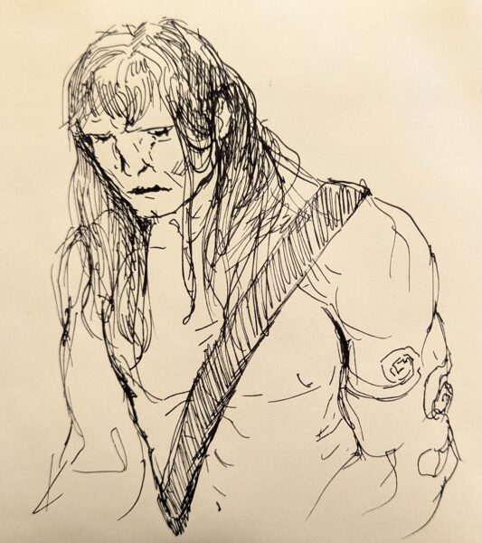
Haven’t drawn a Conan in a while, so, tried my hand at it. Fountain pen is such a delight to sketch with! This was drawn with an FPR Ultraflex nib, tho I dunno if I was really pushing it to its limits with this one.
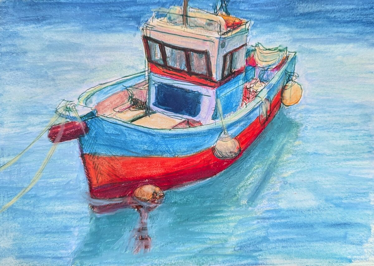
Painted in my sketchbook with neocolor iis over a fountain pen sketch. Reffed from pinterest. After having my ass kicked learning to draw boats for a game in 2021, I can’t stop thinking about them! Little boats especially I find so incredibly cute.
Sketchbook page, fountain pen and neocolor iis and a waterbrush, layered and layered and layered.
I think there’s something here but it’ll take a fair bit more reworking to really see it. An idea for later.
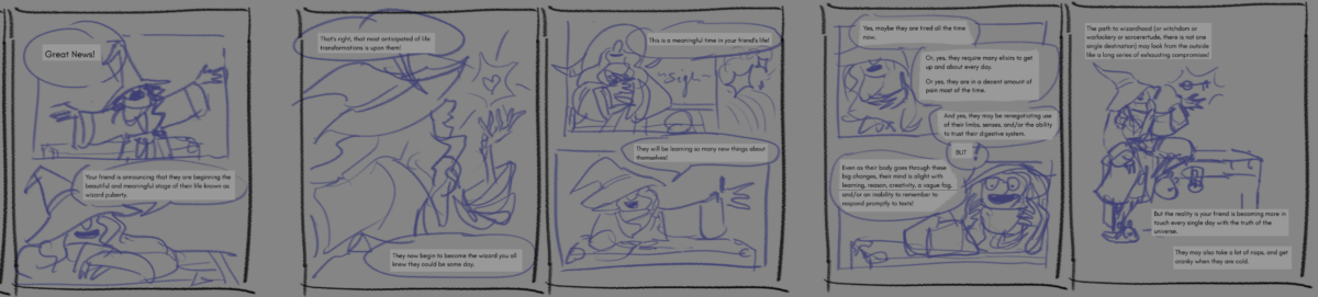
I started thumbnailing out my wizard puberty zine! I think there’s another edit pass on the text ahead of me though; I’m gonna do the first ten or twelve pages, maybe all the way to finish, so I know sort of what my visual language IS, and then go back to the text one more time.
Berkey-inspired, done in one of muji’s very cheap and much-nicer-than-expected sketchbooks.
I loved the sketch for this and the painting isn’t quite capturing it, so I’m wondering if, at this WIP stage, it might make sense to go in next with pencil crayons and see if i can’t capture more of what I’m looking for gesturally.
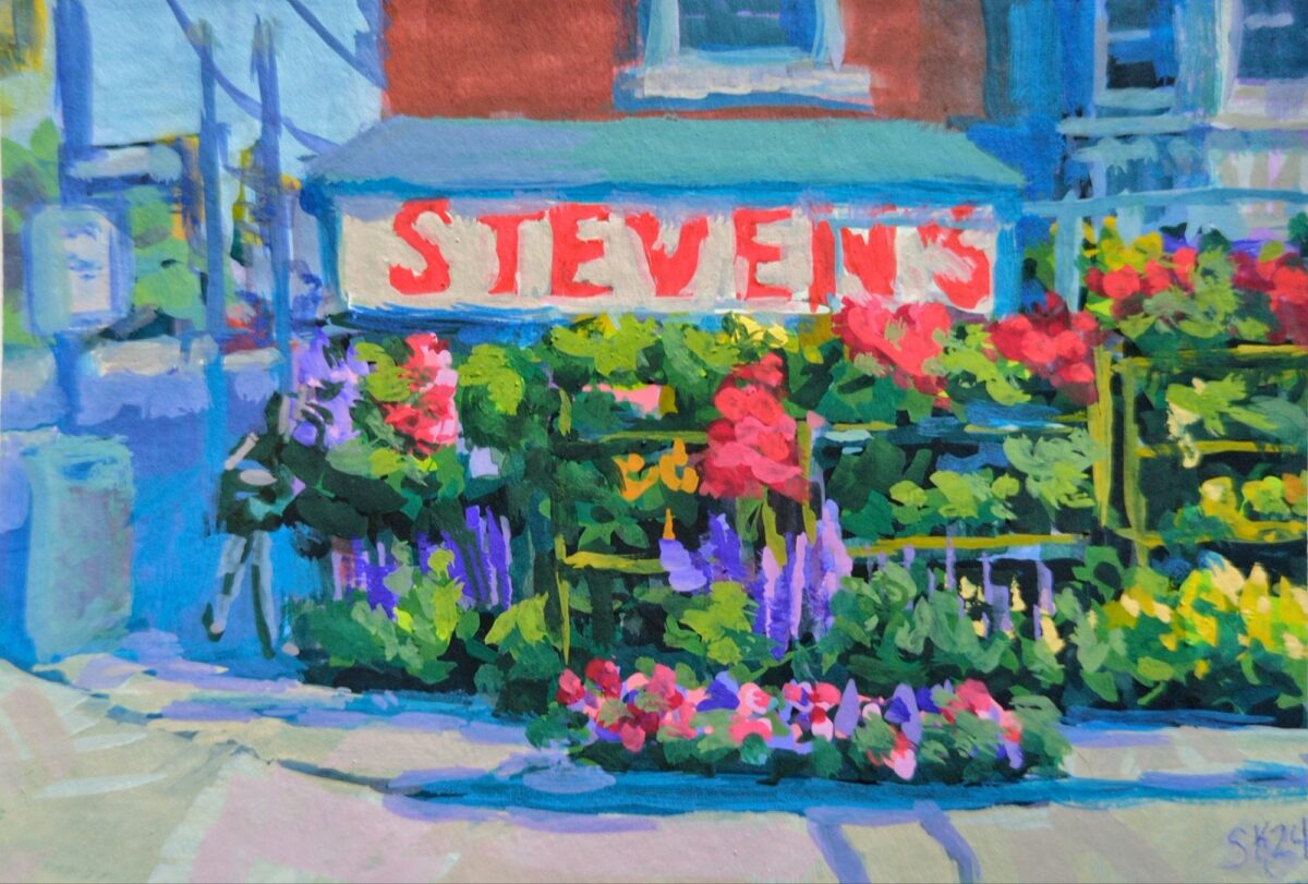
A lovely array of flowers i used to walk by every day after work.
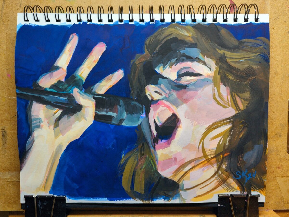
heck, i love gouache, I’ve missed gouache
watercolour and fountain pen, in my sketchbook.
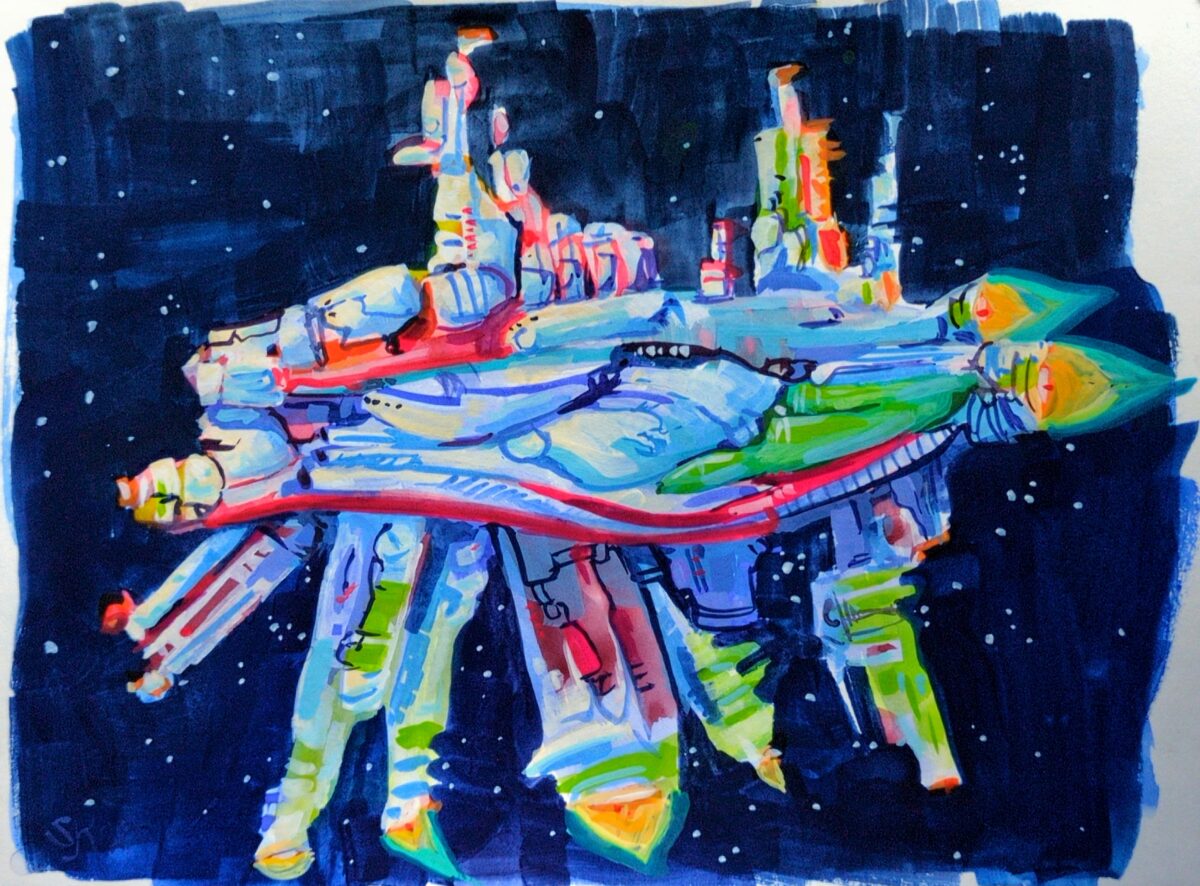
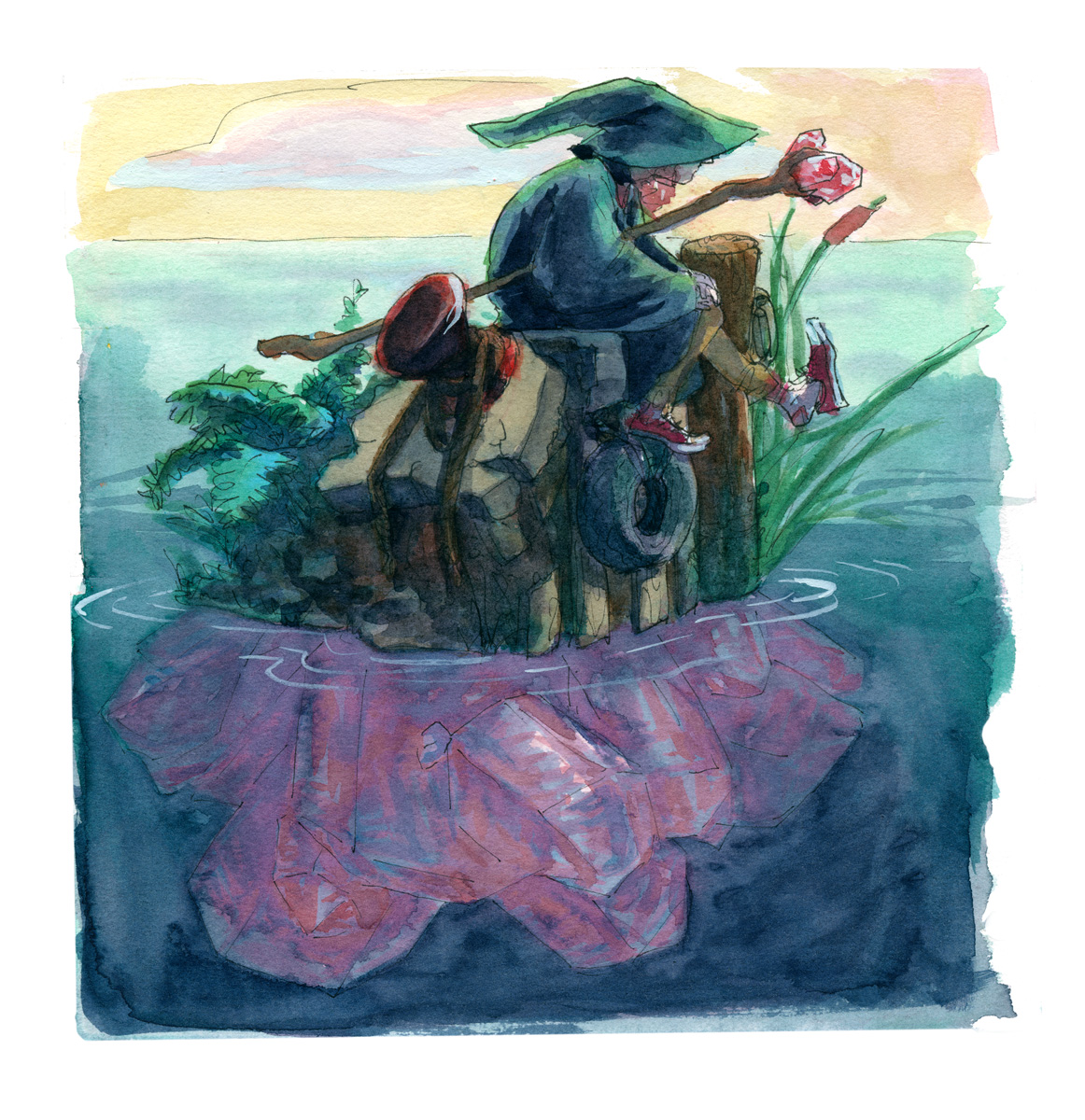
I’ve been drawing modern wizards for my wizard puberty zine and what if they hung out on crystals islands.
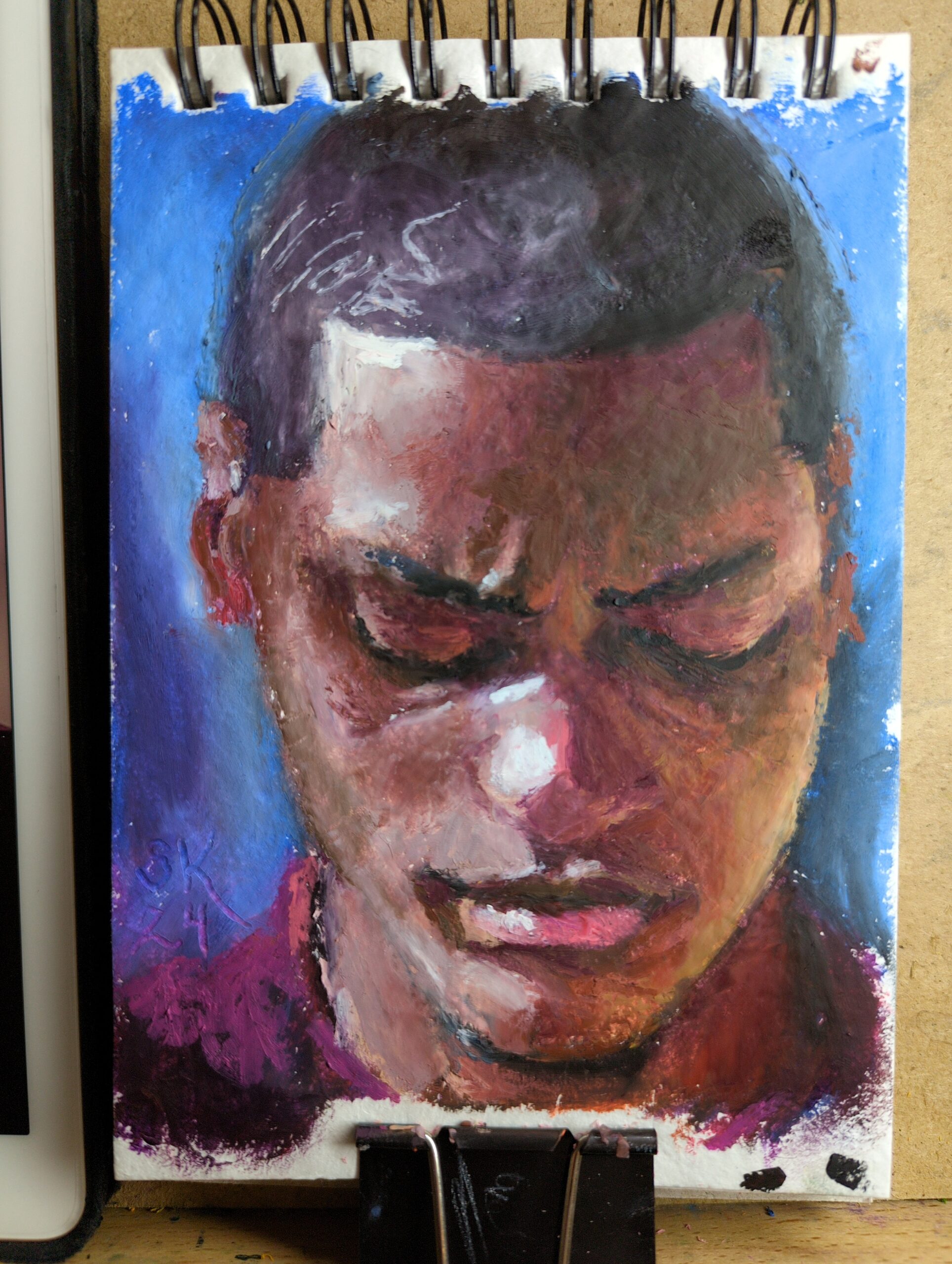
Browsed through Earth’s World for some great natural light portraits to practice with. This was made in a new little 5 x 7ish sketchbook I picked up that’s filled with recycled cotton rag paper. I’d been noticing that rag papers have taken my softest oil pastels the best – you can see one pushed to its limit here – and finding a rag paper sketchbook seemed lucky! So my plan is to fill it up with small tests and just work on my technique.