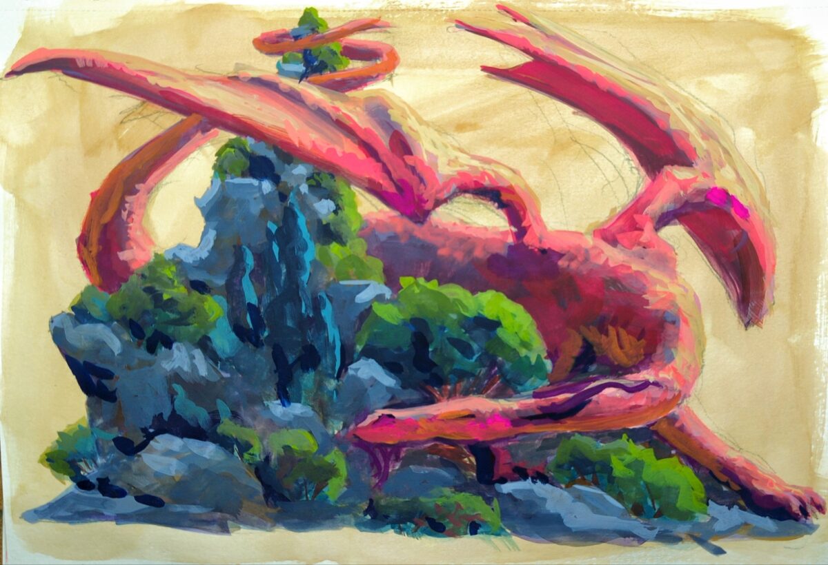
I loved the sketch for this and the painting isn’t quite capturing it, so I’m wondering if, at this WIP stage, it might make sense to go in next with pencil crayons and see if i can’t capture more of what I’m looking for gesturally.
reprioritizing / replanning / restructuring
I loved the sketch for this and the painting isn’t quite capturing it, so I’m wondering if, at this WIP stage, it might make sense to go in next with pencil crayons and see if i can’t capture more of what I’m looking for gesturally.
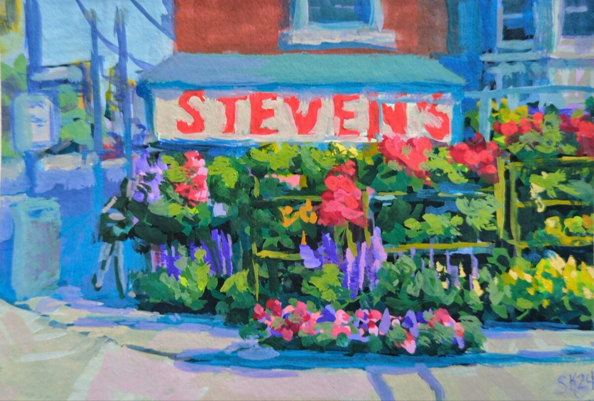
A lovely array of flowers i used to walk by every day after work.
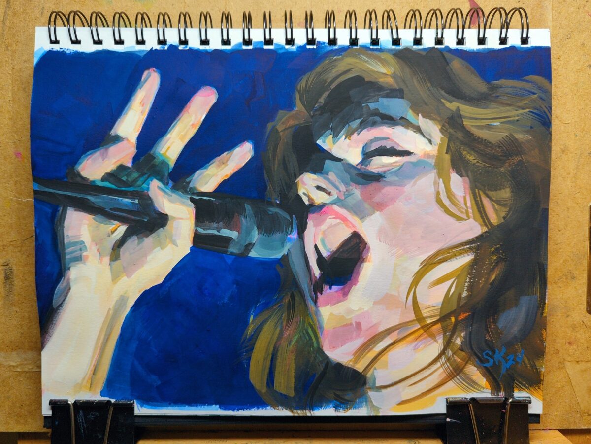
heck, i love gouache, I’ve missed gouache
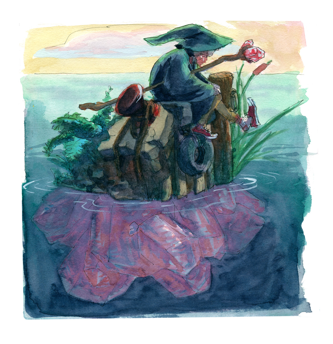
watercolour and fountain pen, in my sketchbook.
I’ve been drawing modern wizards for my wizard puberty zine and what if they hung out on crystals islands.
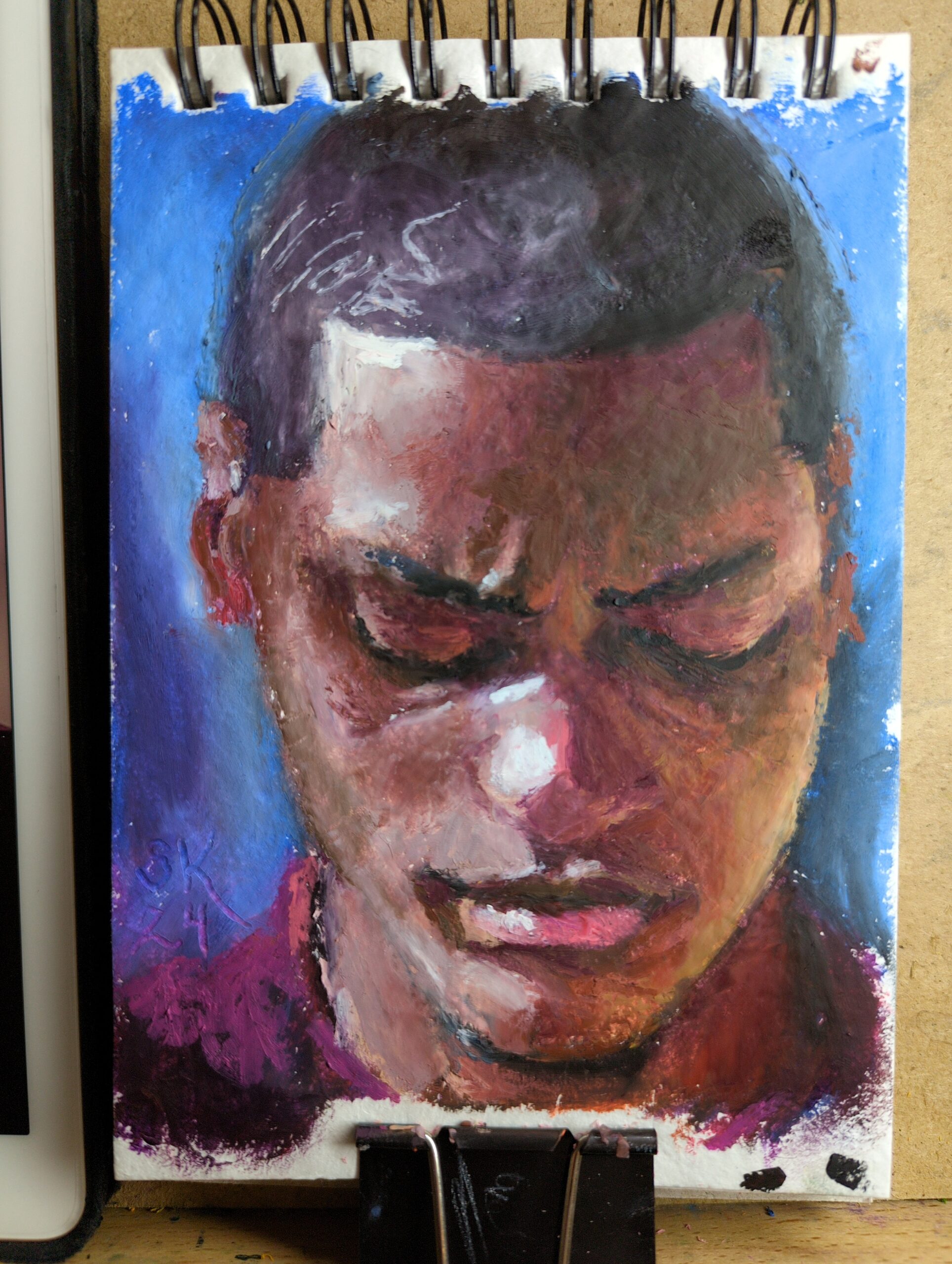
Browsed through Earth’s World for some great natural light portraits to practice with. This was made in a new little 5 x 7ish sketchbook I picked up that’s filled with recycled cotton rag paper. I’d been noticing that rag papers have taken my softest oil pastels the best – you can see one pushed to its limit here – and finding a rag paper sketchbook seemed lucky! So my plan is to fill it up with small tests and just work on my technique.
As I edit posts for spelling and grammar and tagging and layout and all these little invisible things I do to try and learn how to wrangle my website and all its content, I realize that a) this seems to kick them back into RSS “unread” status, which must be annoying..? and b) most folks will not be able to discern any difference in the post itself in most cases.
So what if each post had a potential little changelog on it for stuff like that? so when I modify it I can add a reason why? is that … interesting to anyone else? I’m likely to do it just for myself but let me know. Also, are there folks doing this in a fun way? Curious website owners want t ofind out.
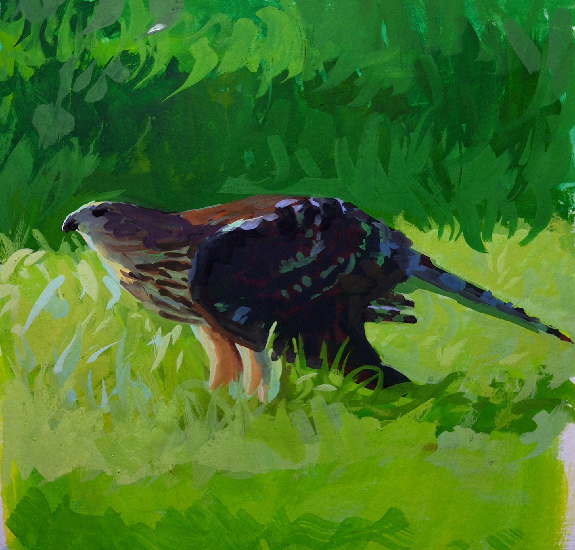
got the gouache out again for the first time in months; arm recovery really took the fun out of it for me for a while there! but I’m feeling more myself when it comes to holding the brush again, and it was lovely to sit and do a study of the hawk I watched kill and eat a squirrel at my friend’s park birthday celebration earlier this year.
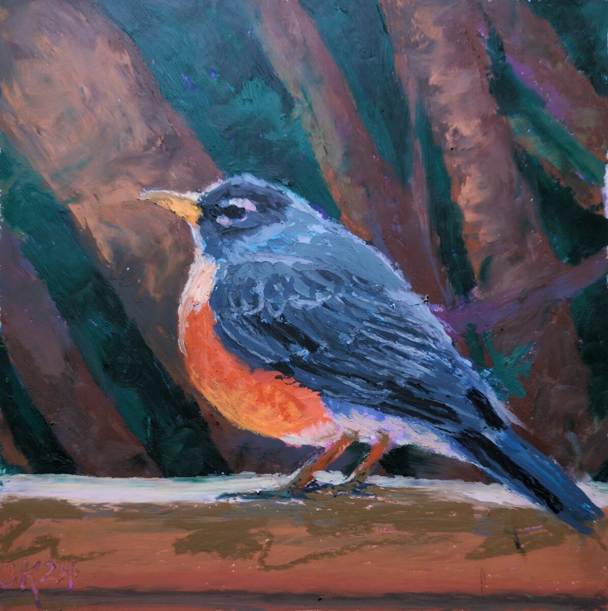
I’ve been doing studies in the Robert Bateman brand sketchbooks, which are a pretty smooth vellum surface; the oil pastel slides around wildly on them but gosh it’s fun! This drawing is maybe 7 x 7″ or so in size. Reffed my own photo.
Again I did an underdrawing with the cray-pas expressionist oil pastels – they hold a decent point and are very easy to layer over with softer brands like mungyo, haiya, or god help me sennellier.
Shoutout to curious quail for this wonderful example of where thermal printing is fun and cute and useful!


I was doing a sketch with this fountain pen, which has non-waterproof ink in it, and I decided to try washing over it with a water brush, and then painting over the tonal result with some gouache, which I haven’t done in a while. it ended up being a very enjoyable if very small painting!
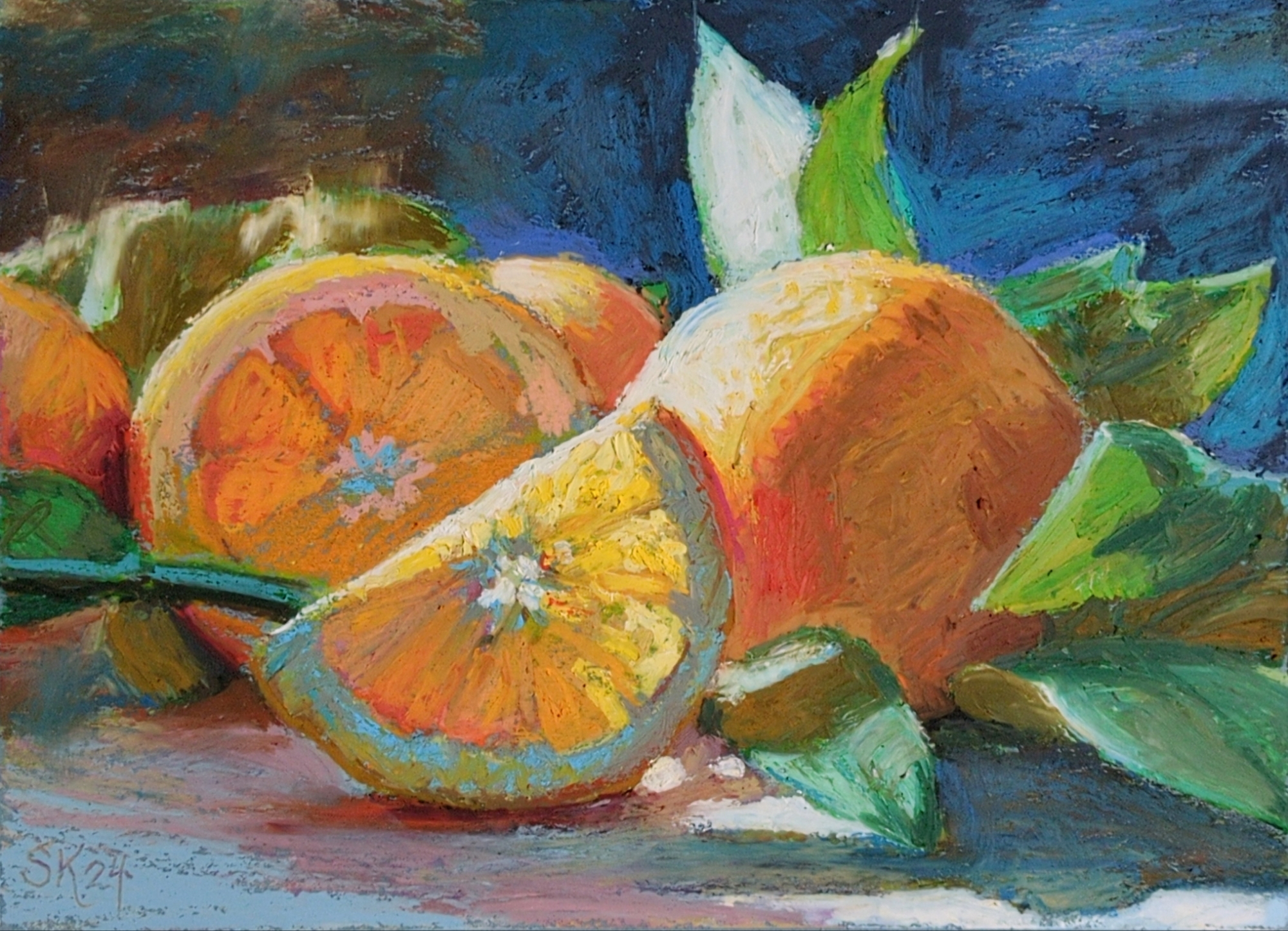
reffing a lovely still life from unsplash, i believe.
done on slate blue 9 x 12″ canson mi-tients paper.
I’ve been doing a lot of underdrawing with the cray-pas expressionist pastels, which are a lot firmer, so they don’t layer that well with themselves but they behave really predictably underneath the rest of my pastels, and are still really quite lovely as a color spread themselves. I think this might be my new go-to process!
I might try giving this one a real glossy varnish, just to see how close I can get things to look to an oil painting. maybe doing that on paper is stupid, but worth a try!
This is a great short breakdown into getting prints out of your label printer! Hope this helps folks hack theirs while I keep testing the limits of mine.
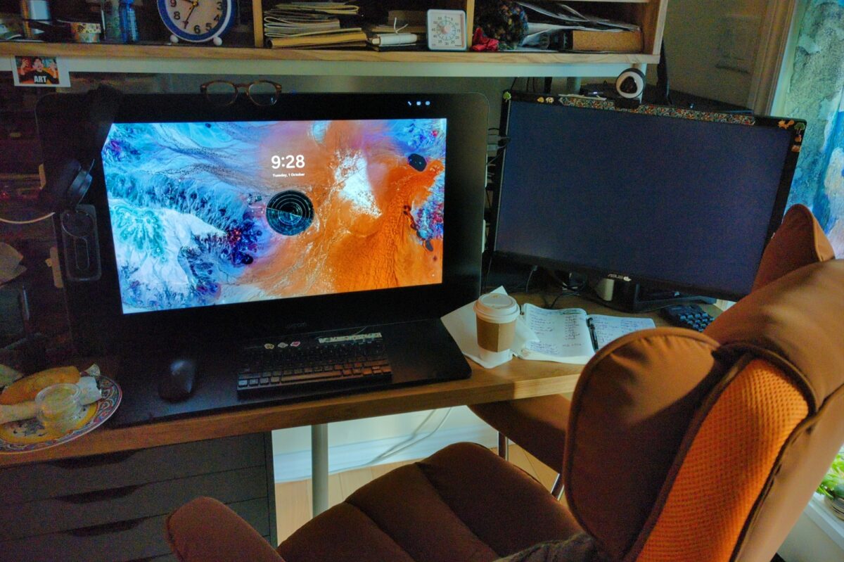
a 27qhd cintiq! complete with pen, stand AND express key remote!
seriously, I’ve already discovered how useful the remote is, it saved me yesterday during hours of setting up tiny assets in unity. it’s enormously more ergonomic for my partially paralyzed right hand than a keyboard right now and i wish I’d thought to try one much much earlier!
overall it’s beautiful and the extra screen real estate even makes game dev’s constant problem of too many apps slightly less annoying! not sure I’m back to full digital painting yet, but it was a great deal and i am glad i snagged it, even if it’s a bit earlier than initially planned.
anyone have any hot tips for min-maxing a Cintiq of this vintage?
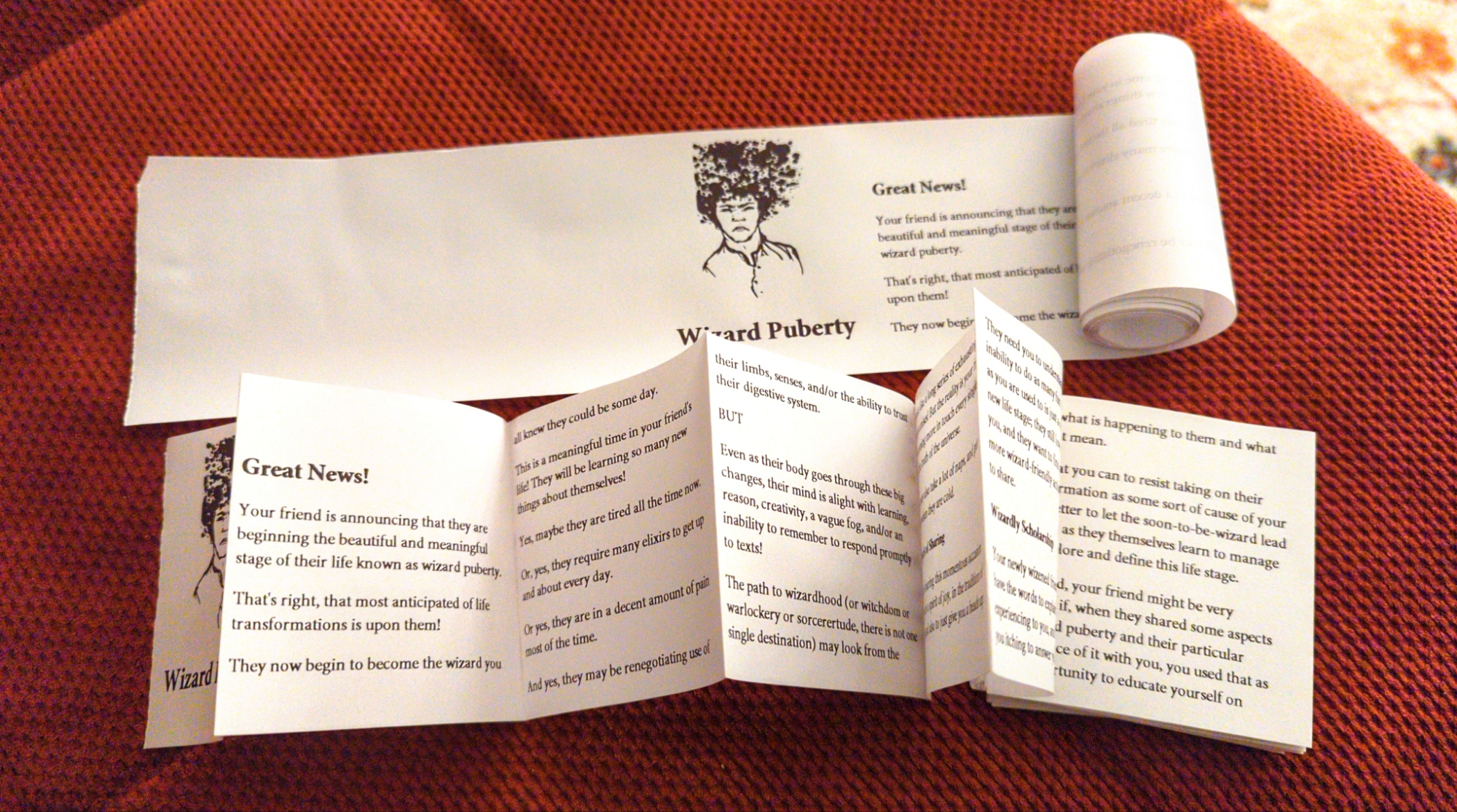
finally got some paper rolls for my label printer and started the important process of figuring out how to make zines with it 💪
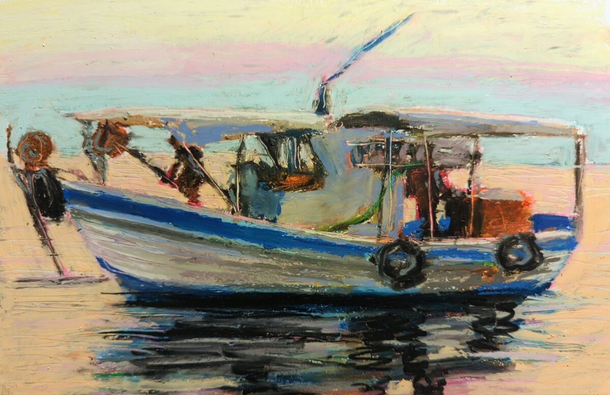
oil pastel pinterest study; i bought a pack of much firmer pastels and did the whole under drawing with those, and then layered the thick opaque pastels on top, and it really worked well!
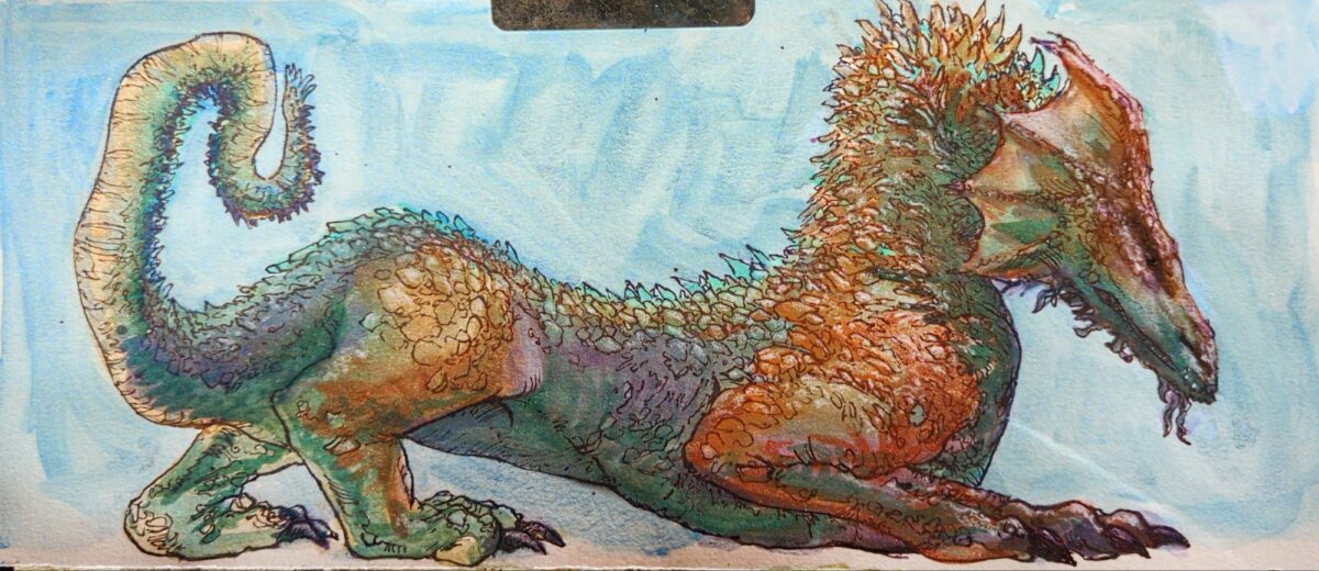
metallic and shimmer watercolours plus fountain pen
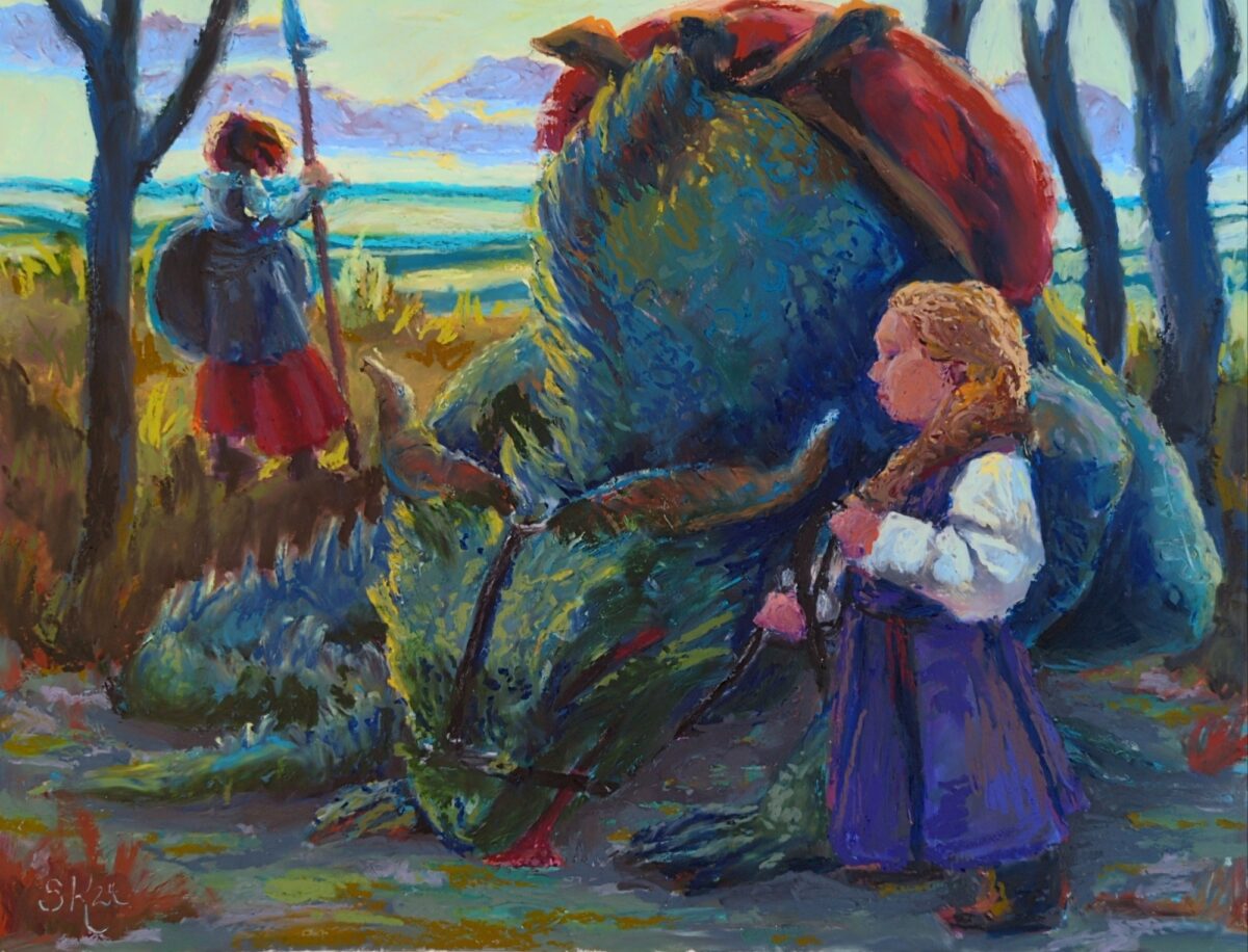
really love the colour palette i achieved here! not sure the drawing was strong enough to support it though, and the canvas was definitely too small for me at the level of precision in comfortable with right now. in the end i called this off before feeling 100% satisfied, but that’s simply the nature of exploratory work and no harm done. as i said, still very proud of this colour scheme!
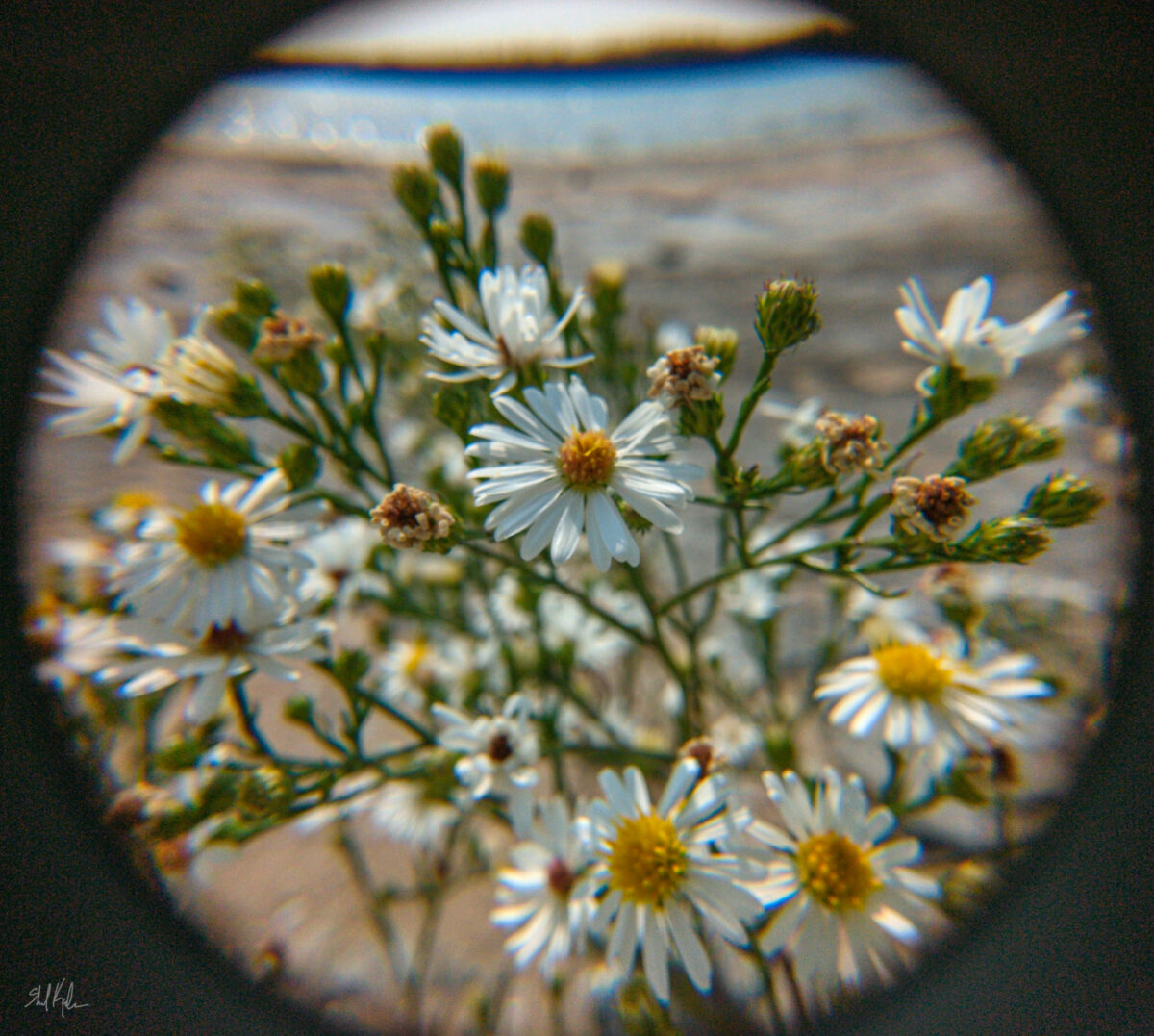
i have been having a lot of fun making some intentionally messy photos with clip-on macro lenses on my cellphone camera, and trying more and more to get the blown out, bokeh’d background to be a more intentional element. this one feels like it’s showing me some potential!
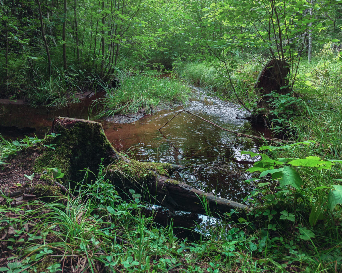
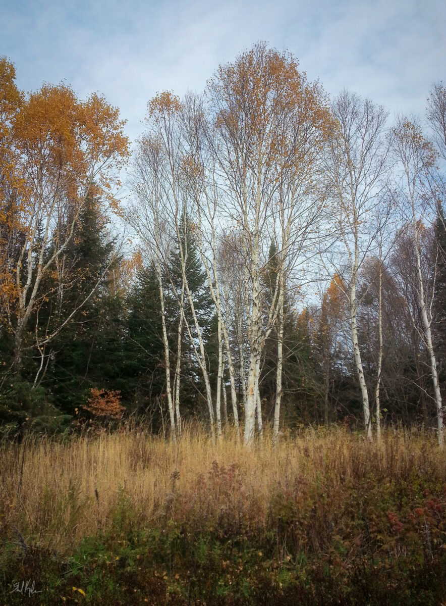
Loved this hike and felt immensely inspired the whole time and yet still wrestled with all the green in the photos. I never understood how people could say green was hard to deal with until I tried to post process digital photos.
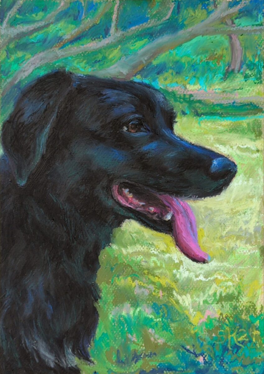

finished this piece of a much missed lucky boy; oil pastel on canson mi-tientes paper.