
I wanted to share some of the work I took on in my role as art director on Swords Without Master – not the admin side, today, though — the colour design side! I worked with a few of our artists to take black and white work they were able to offer us, and bring it to life via digital colours.
I love doing colour design! It was an honour to get to play with the beautiful drawings our artists provided, and I’m grateful for their trust in me to transform them respectfully!
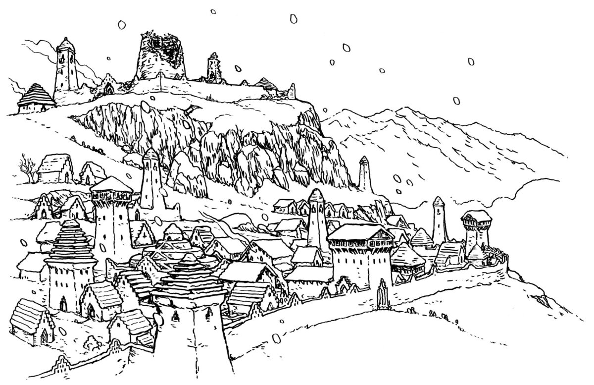
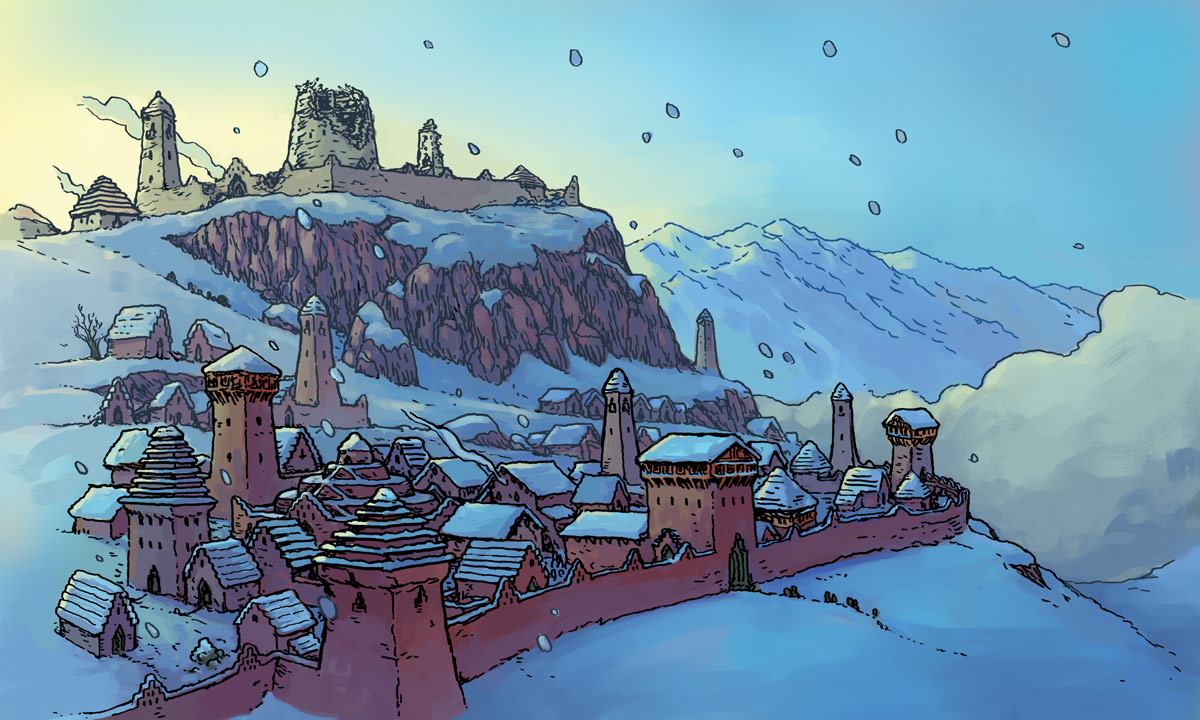
I got to work with one of Kyle Latino‘s glorious maps:
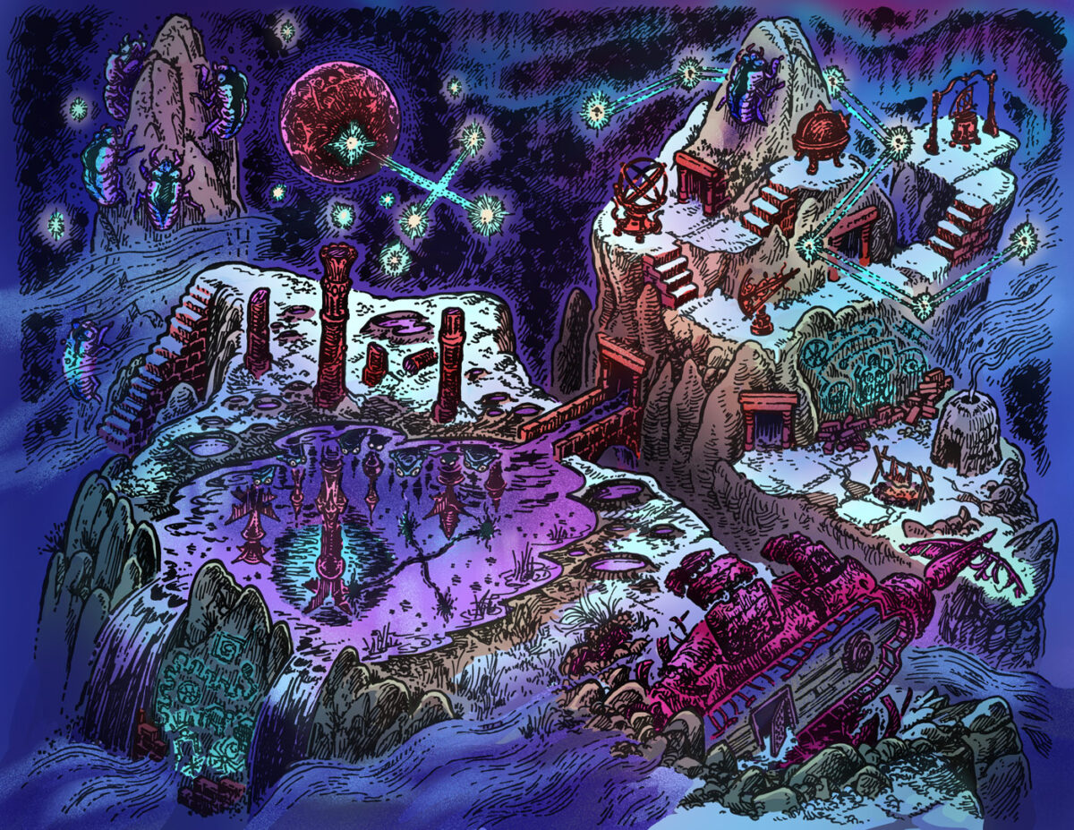
We actually split this map up into two cards for our map folio, but I coloured it as one big image so we would have convincing continuity between them, and keep the location feeling coherent and cohesive even as the two sides ended up somewhat tonally different!
Kyle’s work is wonderful to explore, and the experience of colouring this was also an experience of discovering new hidden details over and over again.
For colours, I kept it cosmic, letting the sky and aurora borealis fall back into cool blues, teals and purples, so that hte dancing stars and vibrating constellations would become the focus. Beneath them, the mountains and architecture took on neutral but warm hues, and the snow glows underneath the starlight. Eldritch and sci-fi elements got more neon colours, and everything is in a dance with Kyle’s beautiful hatching.
For texture, I stuck with a stippled approach to keep things feeling retro – Kyle’s maps feel like pages from a 40+ year old tome, and while I didn’t want to go all the way to ben day dots, i felt the noisy spray captured some of that magic.
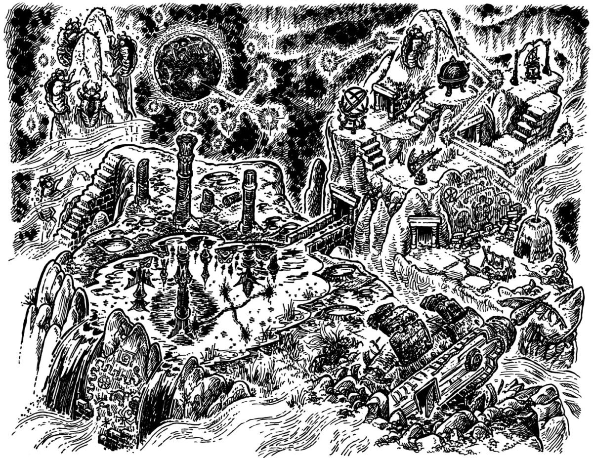
Here’s Kyle’s original drawing, if you want to take a better look at it:
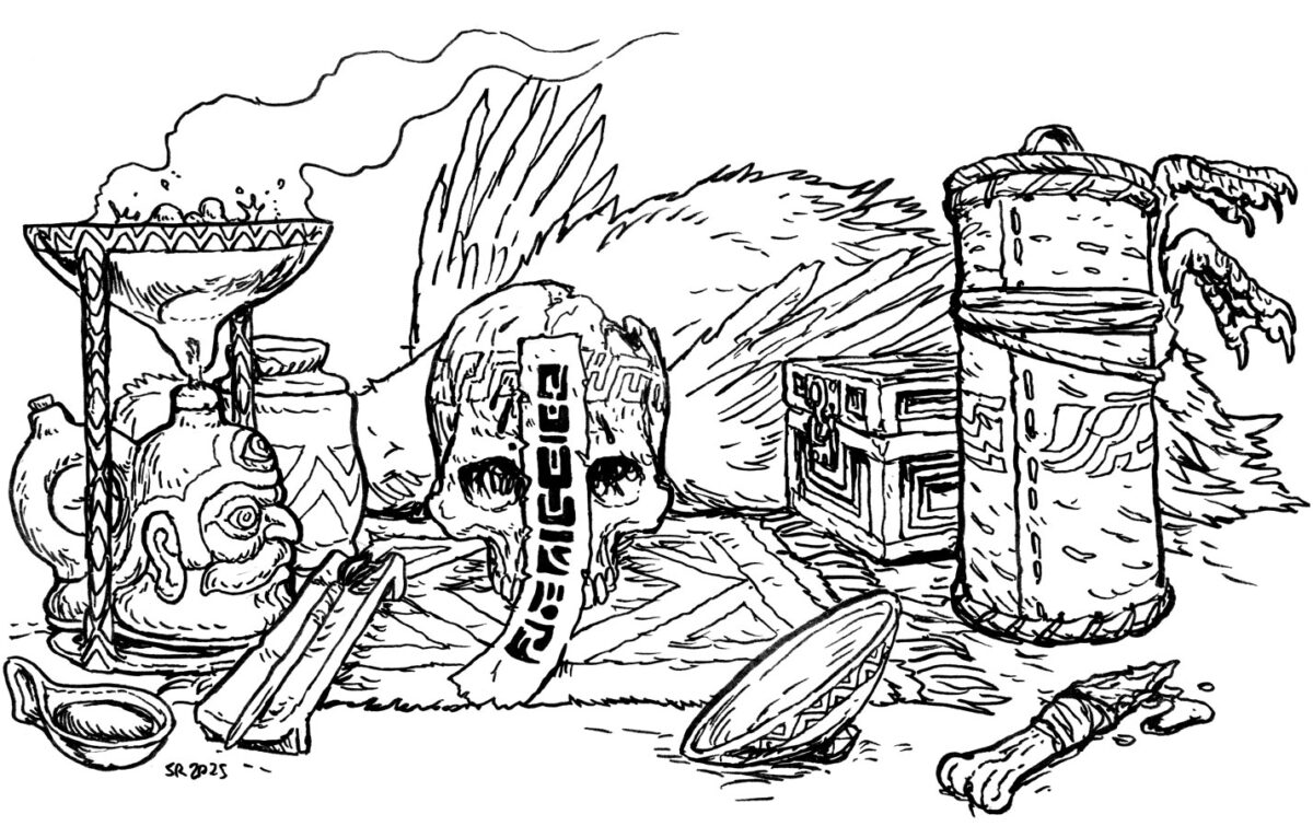
The other artist I spent a fair amount of time colouring was Simon Roy! We had four beautiful new eidolons in full colour already from him, so he sent us four drawings we were invited to transform to fill out the other half of his folio! Here’s his linework and my final colours for these four:
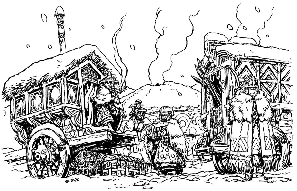
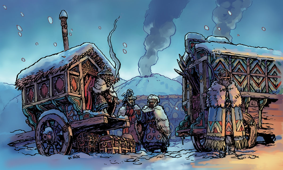
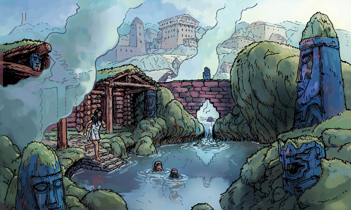
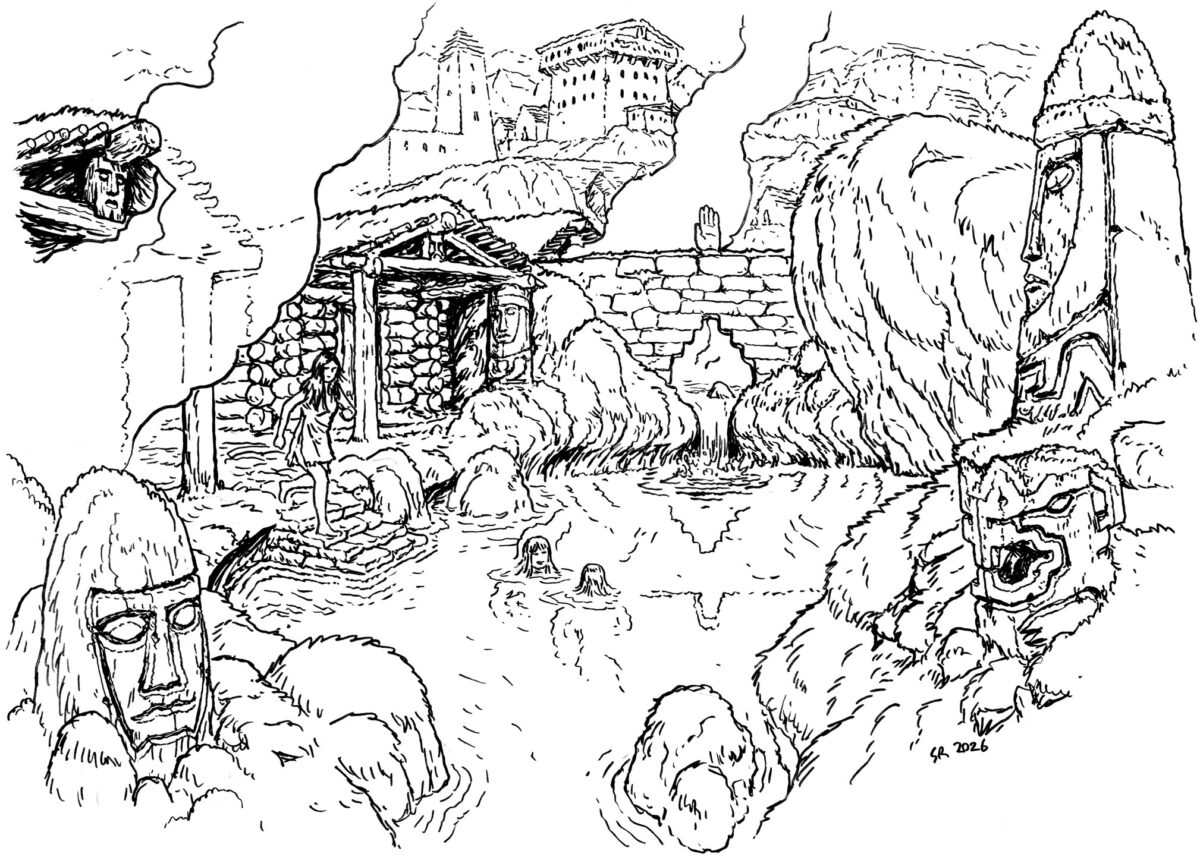
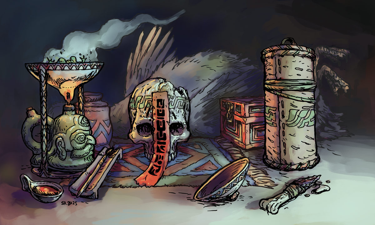
Simon and I have worked together on other projects in the past – we overlapped on the first Six Ages videogame – and I like to think we share a passion for worldbuilding through material culture design. But folks, no one else is doing it like Simon these days! Digging into these drawings was immersing myself in a really carefully built world, and colouring these was all about thinking about materials, connections between the scenes, and cultural patterning.
I had a lot of fun taking the colours from Simon’s first four eidolons (see them in this KS update!) and switching up their weight and prevalence, so that these four cards felt connected but tonally very different. These drawings are from a wintery realm, with no hard shadows, and I wanted to bring that to life through mood! I gave all the exteriors an overcast lighting setup, thinking about the spooky winter days when you never see the sun, and at noon it almost feels like dusk. The sky might glow, but it isn’t throwing much light of any kind. I love tackling nuanced lighting scenarios like that, and I had a blast bringing Simon’s vibrant world into vivid and complex colour!
Art directing Swords Without Master has been amazing through and through, and I am sure I have a lot more to say about it still, so stay tuned or hop on my RSS feed for future blog posts on the subject!
And if you are looking for colour treatments on anything – colour stories for your short film, colour design for your game, colour mock-ups for a book or comic – get in touch with me! I’ll have some availability this summer, and I’d love to help out.
Leave a Reply