
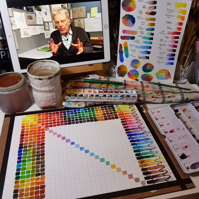
I treated myself to a new watercolour set, higher quality than the sets I’ve used in the past, about on par with the one-tube-at-a-time purchases I’ve made in terms of lightfastness and pigmentation and such. It’s a Mijello Mission Gold pure pigment palette!
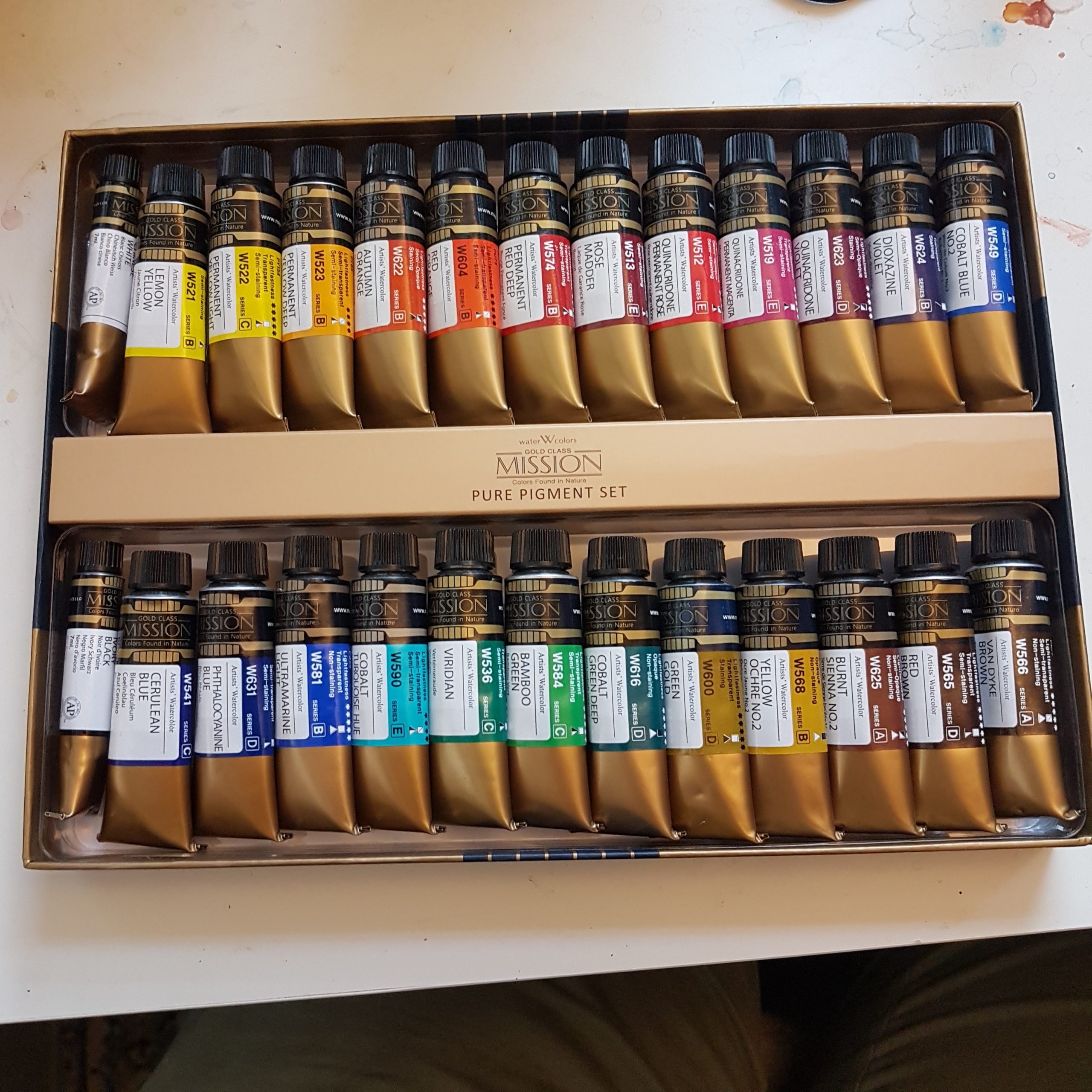
The premise of a pure pigment palette is that each paint is made up of a single pigment. Often, paint sets include convenience colours like payne’s grey that are composed of several pigments mixed together into one paint; and cheaper palettes might use a blend of cheaper pigments to make colours close to but not exactly matching more expensive pigments. This isn’t inherently bad! I have a wonderful collection of convenience colours and colours that granulate into separate pigments thanks to my Daniel Smith collection, and I love them! They have many good uses. But one potential challenge with multipigment paints is that you are likely to get a muddier result from mixing them than you would with a single pigment equivalent. So I thought, if I’m going in on a whole set, why not get one that fills this gap in my collection?
It’s been a while since I got a new full set – it’s been a REALLY long while, actually. The only other watercolour SET I own is the Windsor & Newton Cotman line hard pan set I got as a gift from my dad in grade 13 in highschool – yeah, back in MY day we had 13 grades – we do not anymore – and that was 18 years ago. To say that I know those paints like the back of my hand wouldn’t be an exaggeration – they’ve carried me through two rounds of art school, a ton of freelance, and an entire webcomic. But they’re student-grade paints, and I’ve used up my favourite colours, so I’ve been slowly adding single tubes of nicer paints in an effort to test the waters of my commitment to watercolour. Learning how a single new tube of paint works is a slightly smaller challenge than mapping a whole new set in my head, though – and I figured, with 25 new colours (ignoring the white in that set) to learn, it might be worthwhile doing some swatching and some charts.
So here, take a look at some swatches, gradients, and charts I’ve made since getting this!
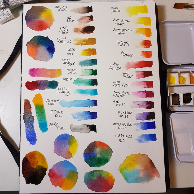
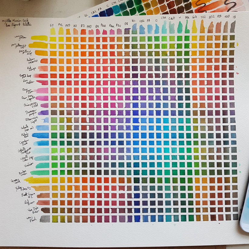
First chart I did was ambitious – a full mixing chart:
it was slow work! I would do a couple rows before bed for over a week, usually with some quality youtube art content on to keep me company.
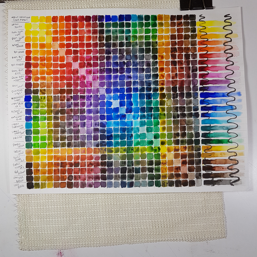
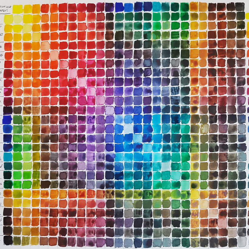
It’s so satisfying now though! I can see the possibility space of this palette!
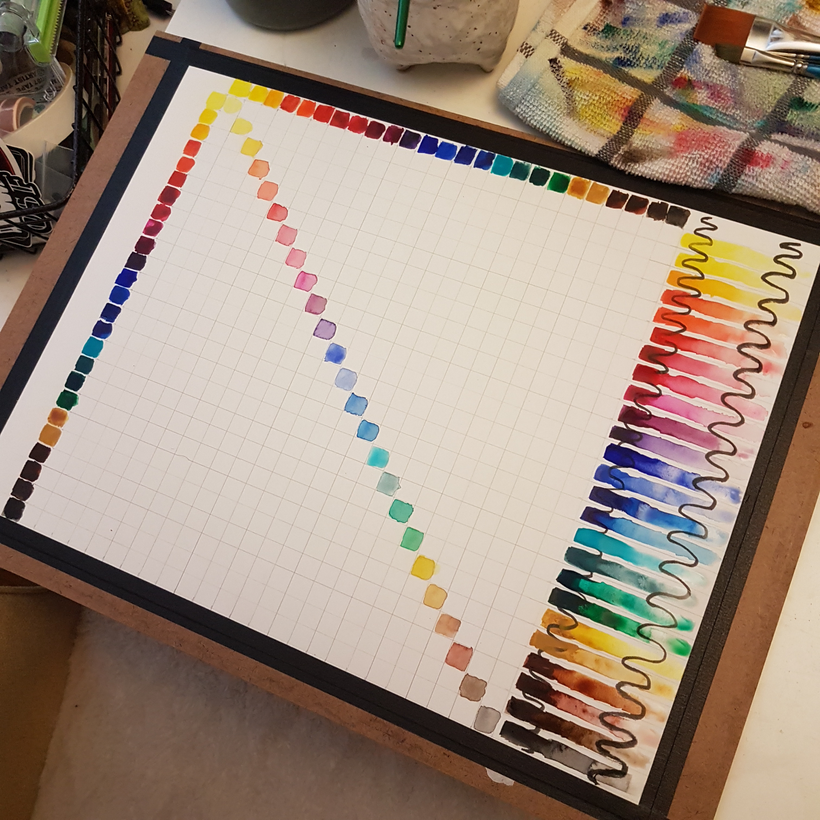
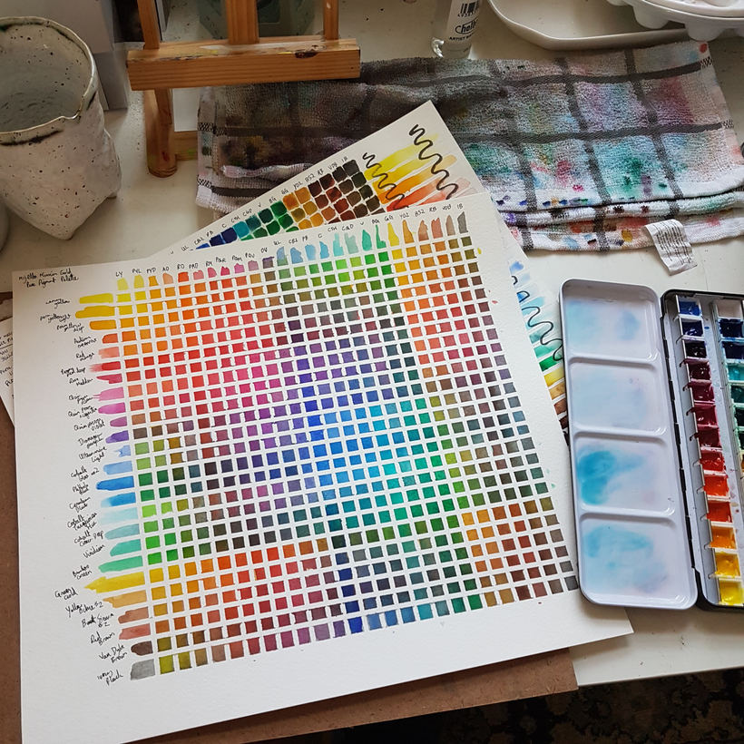
So then I did a glazing chart, to compare palette-mixed colour to equivalent glazed colour:
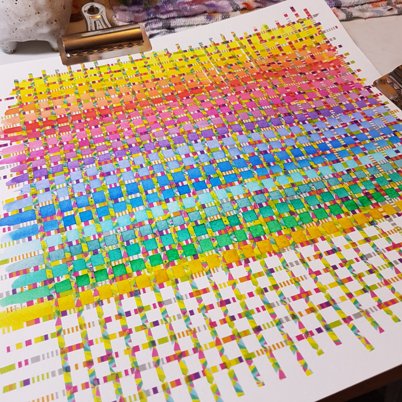
This one required thin tape, and the only thin tape I have is … very decorative, so it was a bit hard on the eyes while I was filling it in. That said, the result is thrilling AND beautiful:
I’m glad I did these, but now it’s time to properly test drive this palette. Here’s six little landscape thumbnails ft different colour palettes as a starter project:
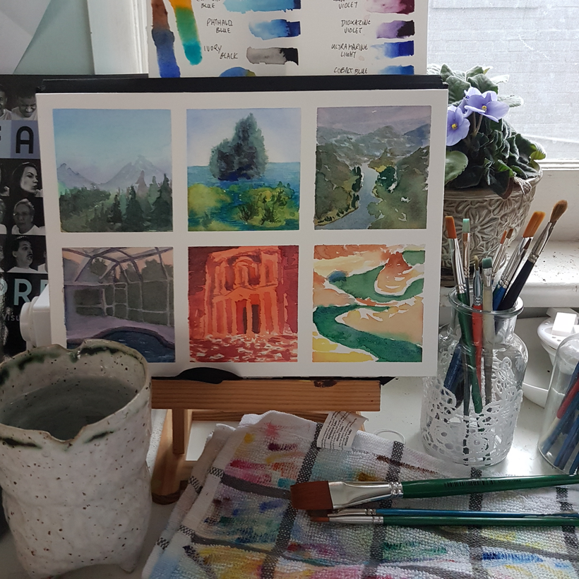
It’s been great and very meditative testing this palette out! And now it feels like time to really dig into it and see what it can do for me within personal work!
Here, have one more studio table glamour shot for fun:
Leave a Reply