I’ve been doing some gouache studies from remembered places this week to keep my hand in while I’m at the digital stage on a few pieces of art.
Getting away from reference photos helps me focus on the possibilities of the medium, and this piece was a test of using 100% cotton paper, which will keep wet areas wet for much much longer than cellulose or other substrates. That’s how I could get gouache to blend the way it does in the clouds.
It does mean that any techniques requiring the paper to be dry – which is most gouache techniques that I know – become way more important to time properly. also, you can get away with adding so much more water than you really should without realizing until it’s too late! Definitely a new challenge.
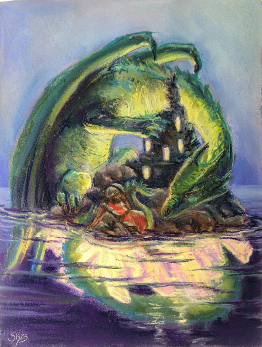
We are inching ever closer every day to the launch of the Swords Without Master kickstarter, which I am involved with as the art director and as an illustrator in my own right, and I wanted to share my first folio card with you!
I’ll be back later this week with a thorough breakdown of my process, because I had some real dark nights of the soul in the middle of this but I learned a lot about what I want out of the art I make, and I am excited about taking this process forward into the rest of the illustrations!
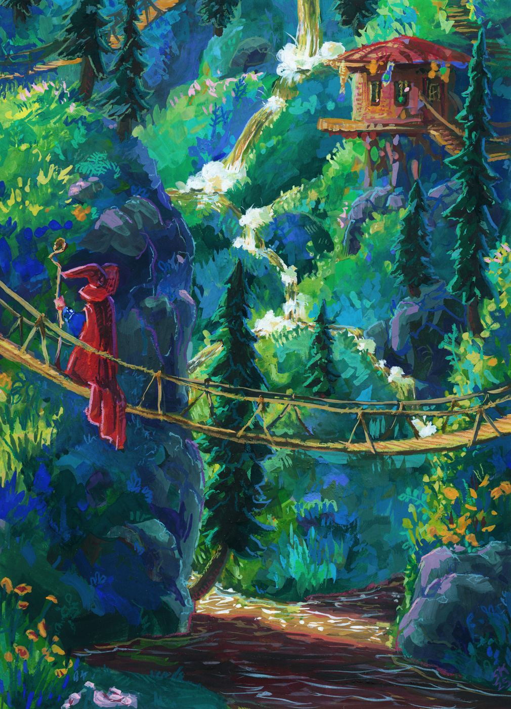
This paper test was scaled up to 9 x 12″, and it was on Strathmore’s 400 series mixed-media paper, which friends of mine who do water media colour on their comics recommend highly!
And it really is lovely for mixed media, but my gosh it was easy to accidentally lift all my gouache right back up at first, especially after using the 100% cotton paper on the last two wizards! This mixed media paper is very very smooth and heavily sized; paint just doesn’t sink into it. That might end up being my preference, because once you know what you’re dealing with, it is manageable, but I’ll do a few more tests before committing, I think.
Also as mentioned in the prior post, I wanted to switch from pencil crayons to neocolours, so I could trust them to be opaque, and I am delighted to report that yes, that is working great and I really can’t overstate what a joy the Neocolor II crayons are to use like this! I did need to sharpen them, which I know might shock some people, but to get precise linework I need a good point, and that’s just how I need to use them. They are especially dreamy on the smooth hot press finish of the mixed media paper, so I think my next test will be something with more texture so I can see what their limits are.
In terms of continuing to learn lessons about what I want to do with the gouache vs the crayons, I do really like the cute doodle-ish quality of the crayons on this one, but I may have gone a little harder than planned with the gouache and not quite hit the balance I’m looking for.
That said, I do really love this piece, and I am very proud of it! It’s the closest I’ve come so far to the vibes I want to hit, and also I just love a nice waterfall, y’know?
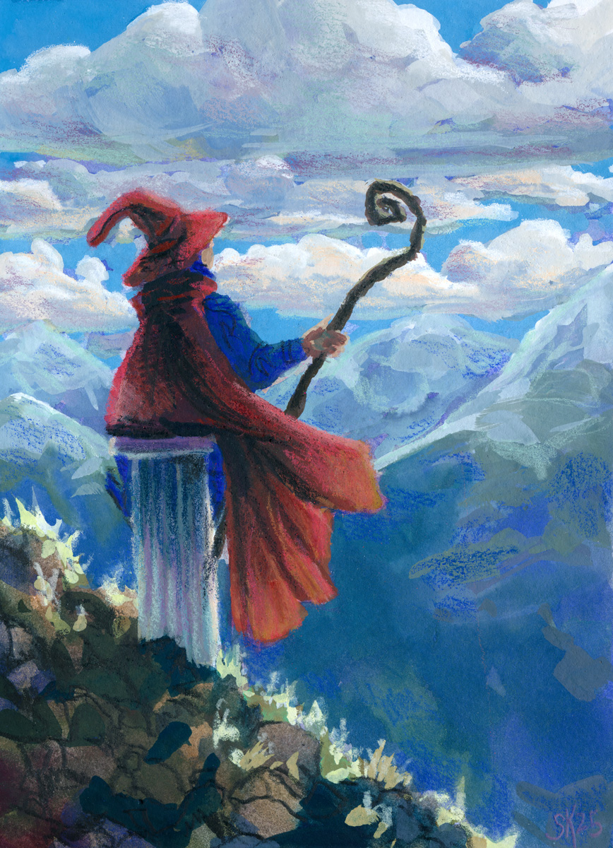
Further paper tests allow further wizardry – this time in a more contemplative mode, though.
A second test run with the hot press cotton paper let me get more expressive with my brushstrokes and try out more contrasting of the paint approach and the pencil crayon approach
This one feels maybe a bit over-rendered for the style I want? I think the linework on the wizard and the rocky ground is closest to my goal – the shading I added with the pencil crayons on the clouds and mountains isn’t really hitting as hard for me.
The other thing I’m wrestling with is how translucent even my most opaque pencil crayons are! It might be time to switch over to the neocolor iis so that I can feel confident in the opacity of the colours I’m laying down over my painting – but that is for SURE going to necessitate me painting bigger — much bigger.
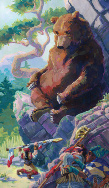
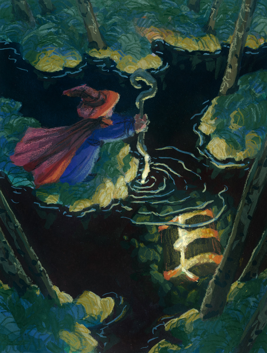
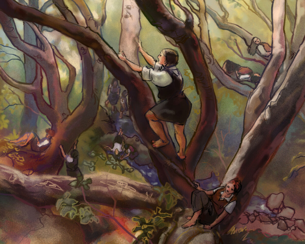
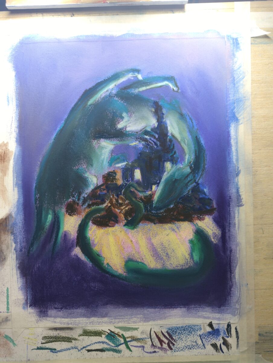
Another paper test as an excuse to paint this wizard doing a little treasure hunting in a dark forest.
For this one I switched to a hot press, 100% cotton paper and instead of wrestling with lifting, got instead to fight with how aggressively absorbent the paper is! It’s wild how much water it will hold. Gouache doesn’t always like water, so this ended up being a very different experience!
The pencil crayon sat on top of the hot press paper much better, though, and I really like how I was able to get some cleaner linework in in addition to the more textured pencil crayon fills.
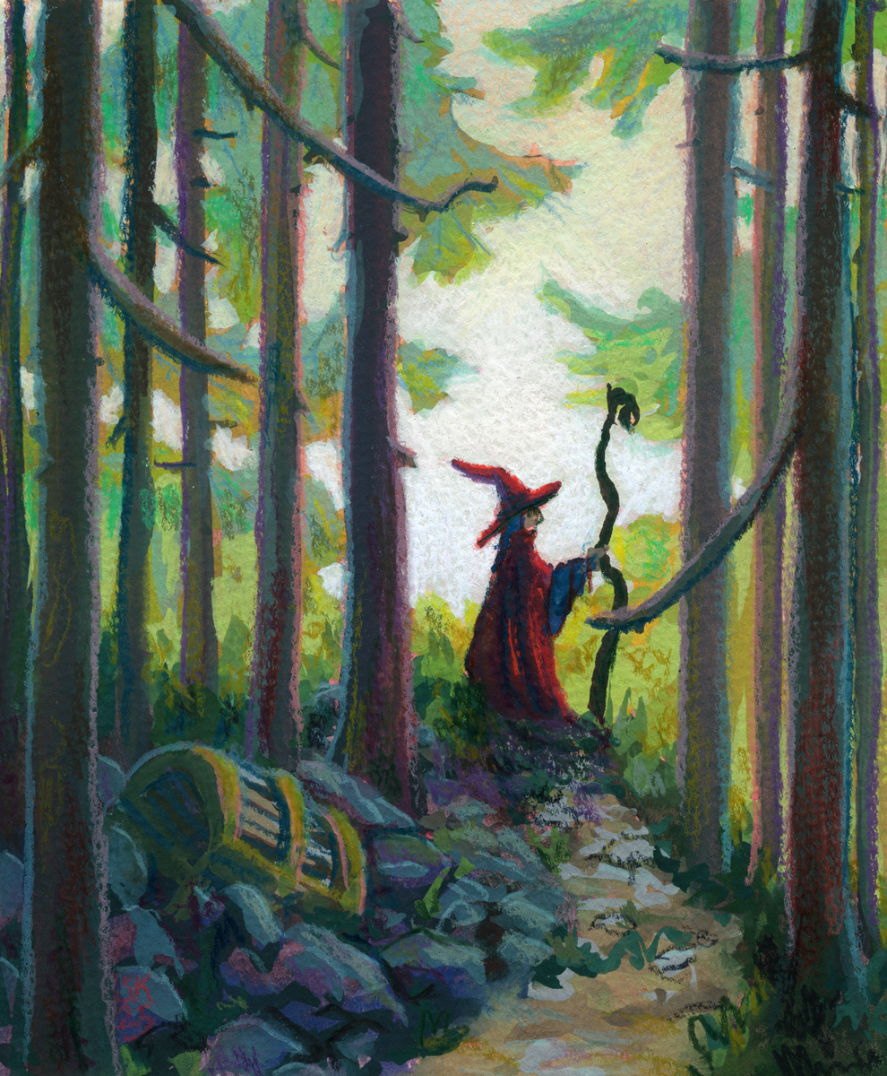
I have some new papers to test out and how better to test them than to paint a wizard on a journey? Here’s their first stop, a quiet forest:
I want to sort of fine tune my gouache plus pencil crayon/neocolor/pastels etc process into something i can rely on well enough to try flexing in other ways, if that makes sense? and I think I’m getting there with gouache finally, which is exciting!
This paper is really, really thin for any wet media use — 163g according to my research — but it is still absorbent and has a cold press texture on the front. It did make it hard to not constantly lift the gouache as I layered, but it also encouraged going right to Very Thick Paint by giving me enough tooth to pull thick gouache off my brush effectively.
The tooth is probably a bit too intense for small scale pencil crayon stuff though – it’s very hard to get clean lines and the texture is large enough compared to the drawing’s detail resolution to feel a little distracting to me. I do love how the tooth did encourage me to let the underpainting in red show through more though! Something to think about.
Overall though I think my professional gouache work will be at a much larger scale though so probably worth moving on and testing other papers.
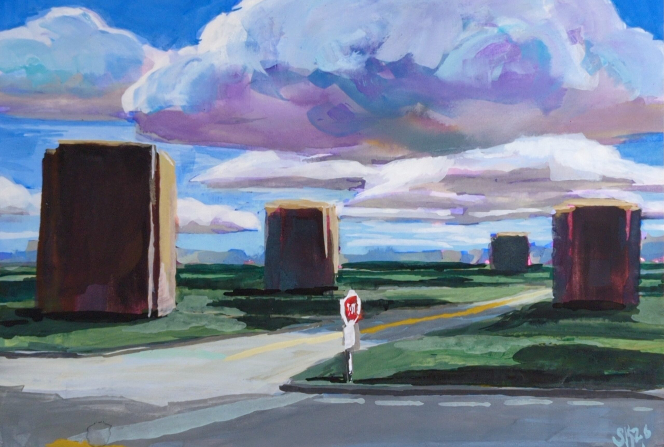
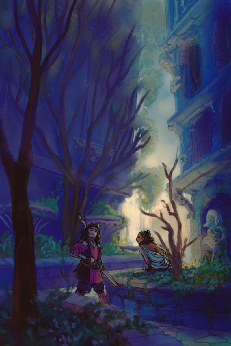
Another style experiment, this time done 95% in Procreate. This one has me using a photo I took in highschool of a courtyard downtown that I have painted from many times before – each time reinterpreting it further and further from the ref.
This one only came into Clip Studio when I realized I had painted it so dark that it only really was legible on the ipad – a mistake I have made before and, I am sure, will make again! That device really does blow out the shadow values a fair bit.
For this painting I returned to trying a heavier line and less rendering overall, simply making the lines transparent when I need them to fall back. I think the fuzziness and looseness of the lines feels satisfying on the environment, but the people also end up feeling a bit indeterminate in details as well.
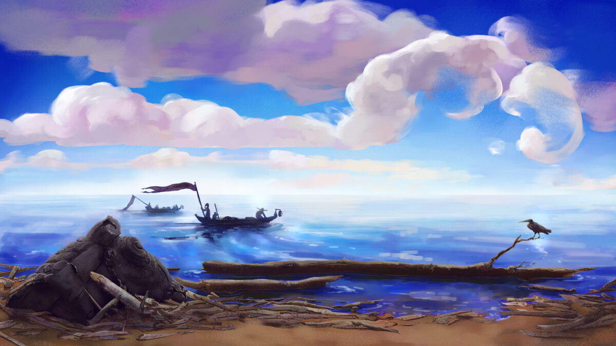
This was a 100% Clip Studio digital painting, based on a photo of mine from a visit to Hay River in the Northwest Territories; the sun was pretty unbelievable that summer, that far north.
For this one, I let myself do my rough with the airbrush, and I feel like it really defined the whole image, to the point where maybe that’s a trap I should avoid in future! But I do love how much fun I had with the textured brushes despite trying to protect soft gradients all over the place, and it felt a lot like the same push and pull I have when trying not to overblend and overwork a soft pastel piece.
Another photo study, but I took this one into Clip Studio after doing the first pass in procreate, which let me use the smarter selection tools to grab large areas and push-and-pull them more precisely.
This piece is a return to the softer, chalky line and using it to add colour as well as clarity, and I love how soft it turned out.
The photo I am studying is by Justine Kurland, who I refer to often when I need help staging something in a way that transcends the simpler, bolder statements of cinematic staging.
This was reffing a photo on pinterest; I wanted to refocus on how I want to handle stylizing figures.
I am slowly starting to nail down a process – there’s a rough sketch, a rough colour, inks, and then selection-based painting.
For this piece I did it 100% in procreate, which means using their slightly jankier selection tools, but I think for the rough expressive style it worked out fine.
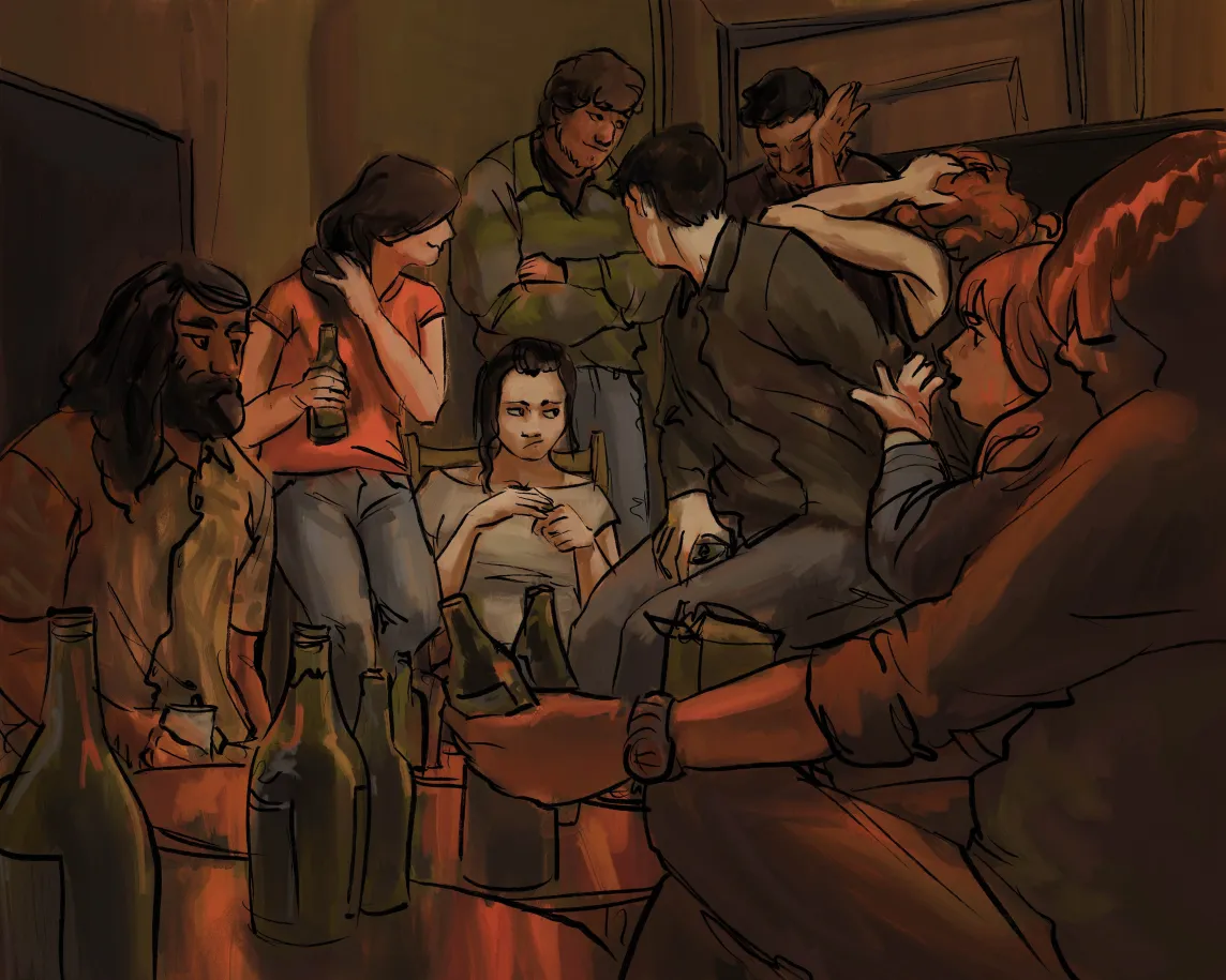
Another film still study, this one from Snow White and the Huntsman. This piece was done in Clip Studio, with a selection tool approach and no lines, and a fair amount of smudging brushes to get those tile and brick lines to feel distinct but integrated.
Clip Studio’s reference layer tools is so powerful for selection-based painting processes! If you haven’t tried them, I definitely recommend digging up a quick overview tutorial and testing them out, it really feels game changing every time I use it, and I’ve been using it for a decade.
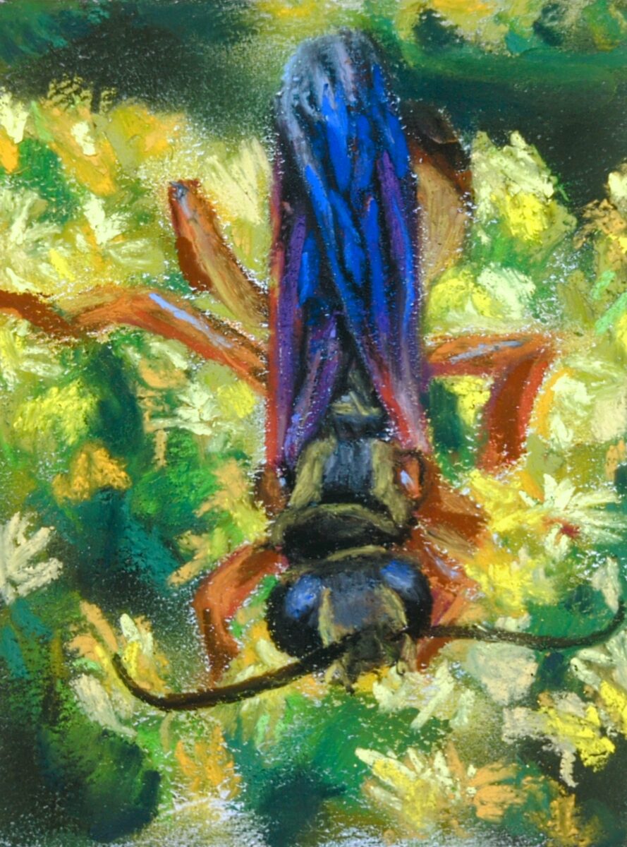
A small study of my own photo of a golden digger wasp on some goldenrod flowers last summer! I primed the paper with some opaque white watercolour ground to add tooth, and honestly I think it helped a fair bit and allowed me to get a nice blend of soft and hard edges on this one.
it’s coming along! while I suspect there’s a limit to how much I can do this, I’ve learned that you can use a paper stump or similar to lift up quite a lot of the soft pastel and redraw – which is really letting me get away with changing things that I should have figured out before I started this drawing.