swap to chronological order of most recently modified
-
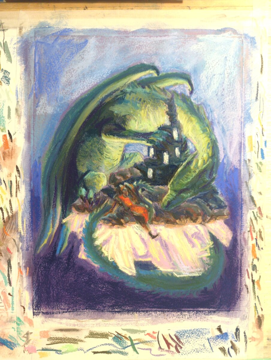
it’s coming along! while I suspect there’s a limit to how much I can do this, I’ve learned that you can use a paper stump or similar to lift up quite a lot of the soft pastel and redraw – which is really letting me get away with changing things that I should have figured out before I started this drawing.
-
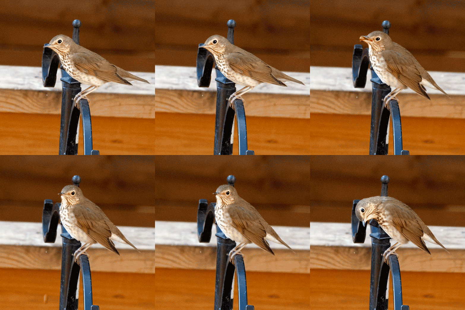
gifs are so powerful!
-
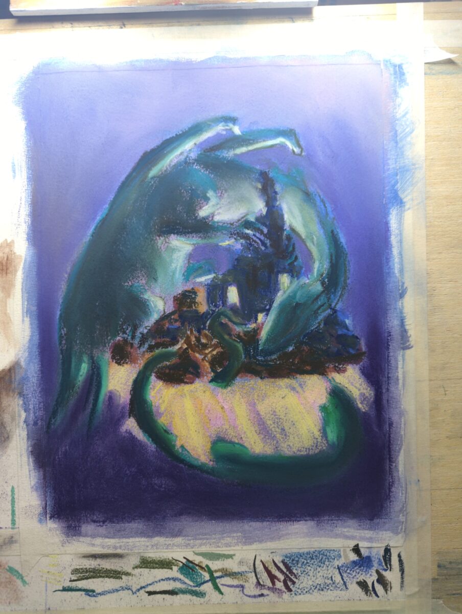
I’ve painted the paper with opaque watercolour ground to add more tooth and honestly it’s working really well!
-
Curious about iNaturalist? Worried about not owning a fancy camera?
posted:
updated:
posted to: reccommendationsLet this forum thread remind you that uploading observations is really all about sharing information in whatever way you can!
https://forum.inaturalist.org/t/whats-the-worst-pic-you-uploaded-to-inat/40286/25
If it’s an ID-able subject, you’re good to upload!
Here, some examples from the thread:
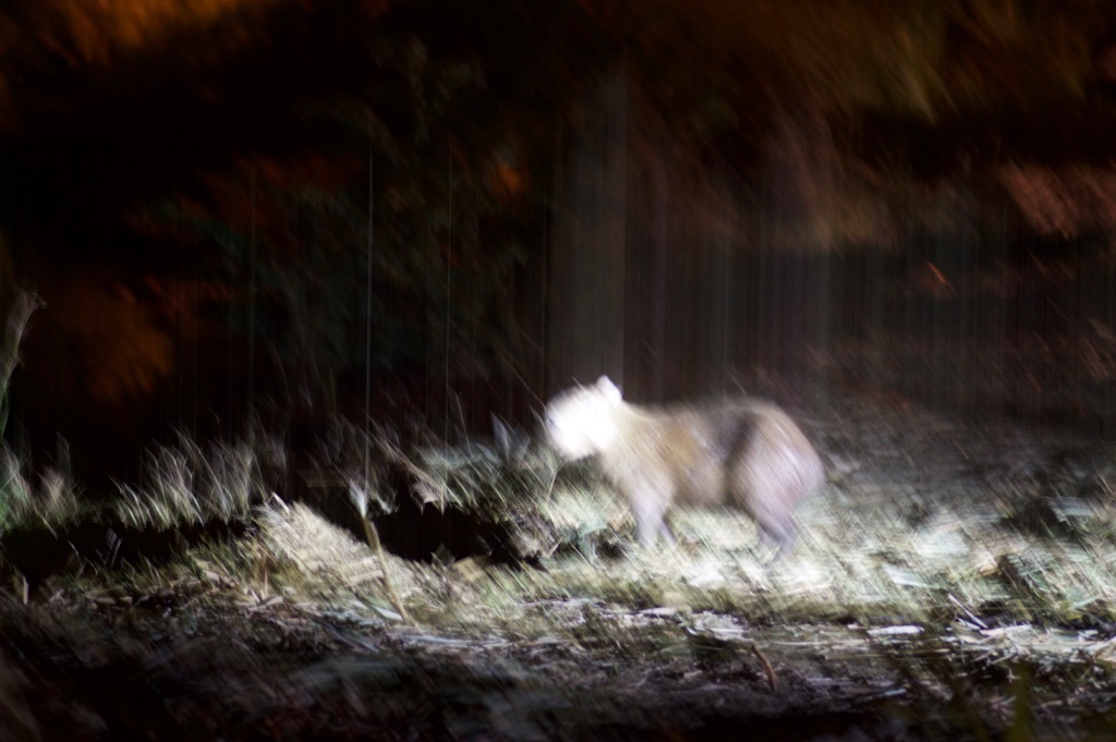 Lesser Capybara from Soberania, PA-CL-CL, PA-CL, PA on January 28, 2016 at 03:52 PM by John Sullivan. Unfortunately it ran off before I could get a decent photo. · iNaturalist
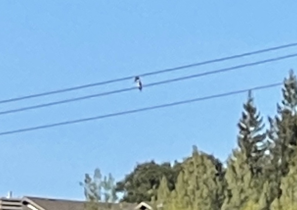 Belted Kingfisher from Vasona Lake County Park, Los Gatos, CA, US on December 10, 2020 at 11:08 AM by Terry. This bird is frequently seen perched in the wires across Vasona Lake. · iNaturalist
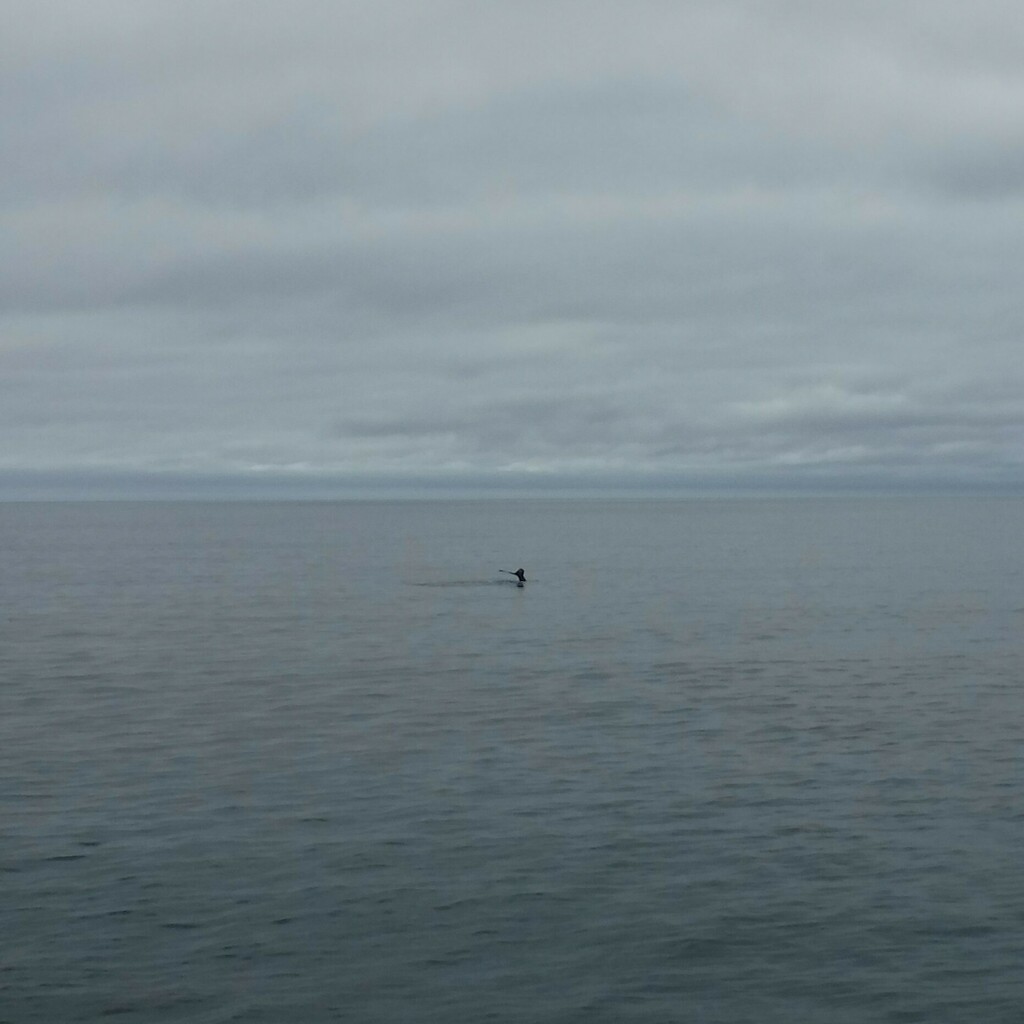 Humpback Whale on July 6, 2017 at 02:25 PM by Anne C Lewis. Notes from my journal say Humpback whales. · iNaturalist
Here’s a real blurry photo of mine that was a useful element of an ID:
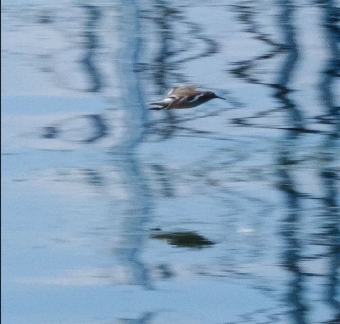
And here’s a post I made on cellphone-attachable lenses, and another on open source camera software for your phone, to help you get the most out of whatever you have!
-
Laura’s angle on iNaturalist
posted:
updated:
posted to: linkstagged: inaturalist, insects, interesting link, pillbugs, playful data, read this blog, structure, woodlouse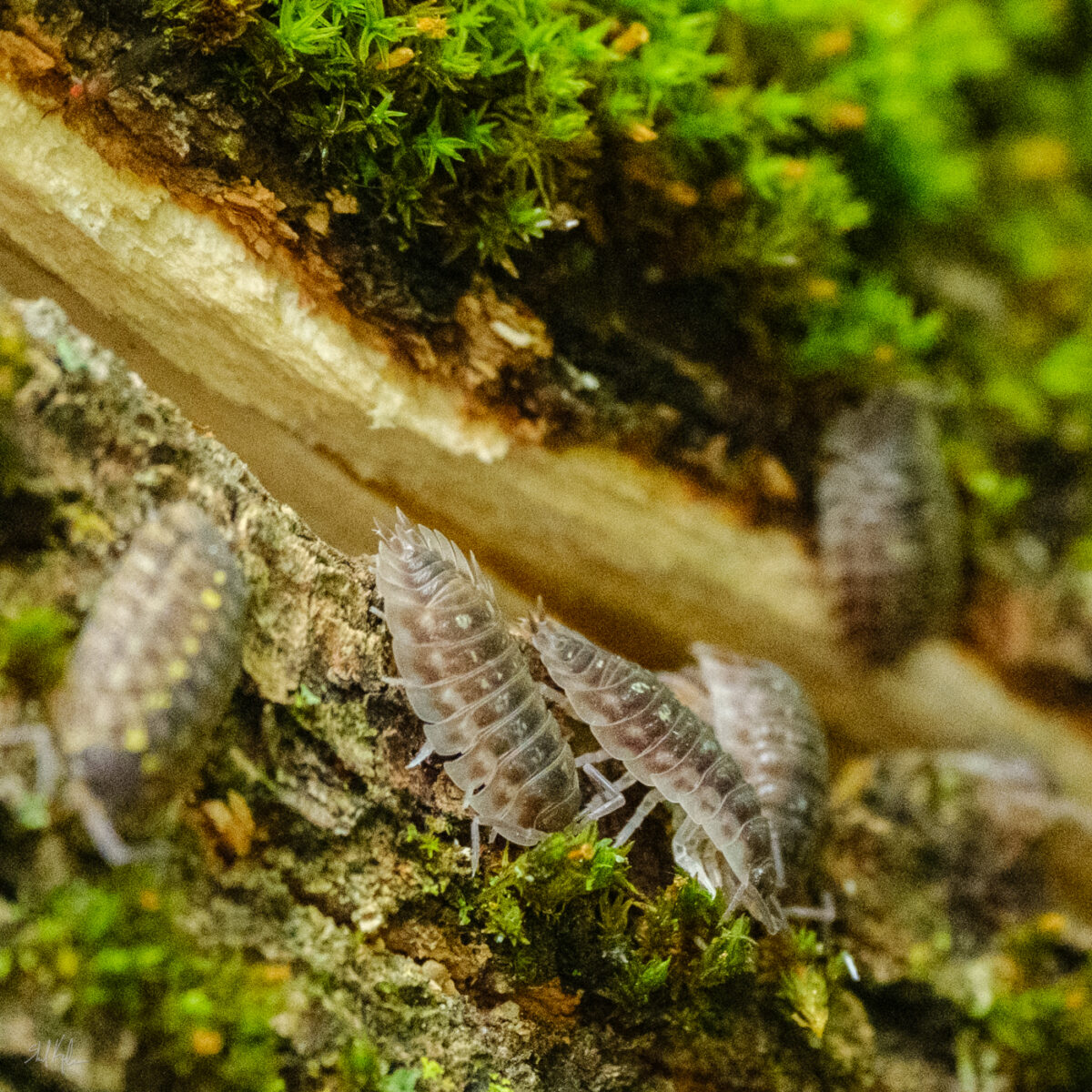
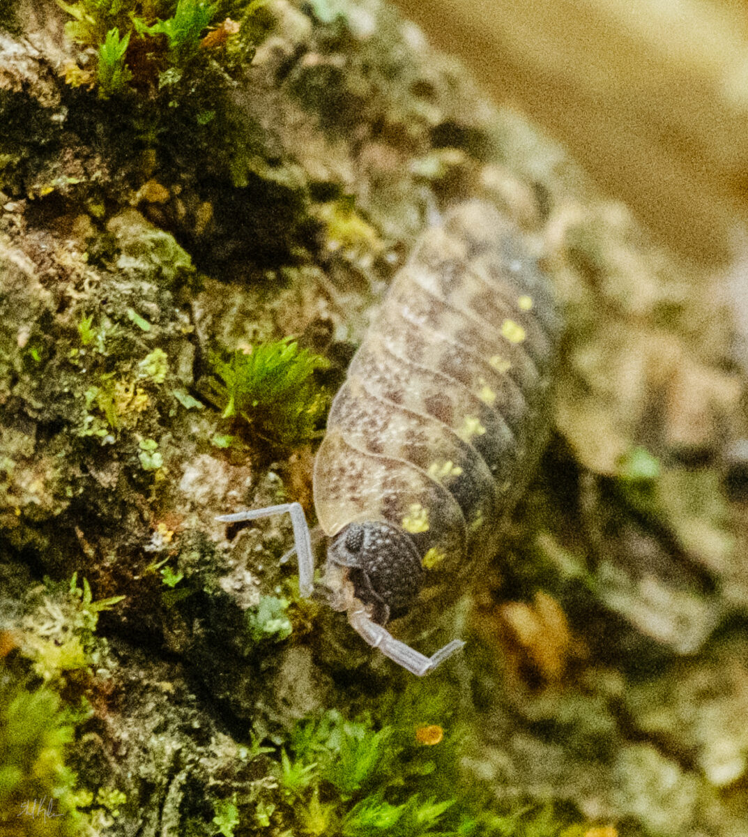
I’m enjoying not only posting on and browsing photos via iNaturalist, I’m also having a blast seeing how other people are getting something out of it!
Laura’s been posting about it on her blog this year too – there’s a strong data-parsing angle in Laura’s blog posts, finding interesting stories as single examples or as revealed en masse in big datasets, and it’s great to read her writing on her work and the work of scientists doing just that with the publicly available data on iNat:
 Interesting Link: iNaturalist map data sorted by “Locals” and “Tourists” | Laura Michet’s BlogThis website takes iNatural…
 I recommend looking at all the iNaturalist observations sorted by favorites | Laura Michet’s BlogI have posted a tiny amount here bef…
 Interesting link – on iNaturalist, two banana slugs have escaped the west coast | Laura Michet’s BlogiNaturalist is a “citizen science” website where users confirm animal IDs for use by scientists.
Laura also created a fantastically specific website, casualty.report, that shows the most recently modified research-grade1 photo of a mammal bone from iNaturalist:
Casualty ReportA website that shows the most recently modified, research-grade photo of a mammal bone from iNaturalist.Laura lives on the opposite side of the continent from me, in a hugely different ecosystem, with one of those species-dividing mountain ranges running between us, so following her on iNaturalist is a great way for me to be an ecotourist in my own right. I’m learning a lot about lizards2, and judging from her favourites of my observations, she’s having fun with my photos of our many and varied southern ontario pillbugs and woodlice. Pretty sure this is, once again, something classically good about the internet!
- Research-grade means that multiple identifiers have agreed on what species something is. it’s a broad filter for decently accurate identification, though I would bet papers are being written on common pitfalls of mass ID. ↩︎
- I’ve ruined my computer with my absurd fantasy writing such that autocorrect REALLY thought I meant “wizards” here AND it took a few rereads for me to realize that no, actually, I didn’t. ↩︎
-
Sometimes you spend eight years of your life in post-secondary art training of various types, and then a further 14 years as a professional artist doing work that includes highly rendered graphite drawing, and you still open a video on youtube out of curiosity and discover a whole wealth of technical information about pencil rendering you didn’t know you didn’t know1.
And honestly sometimes it’s the best feeling in the world!
Here’s the video in question, by artist Mike Sibley:
There’s a lot of good info in this video! But here’s a screenshot that made me yell at my screen for how misinformed I’ve been till now:
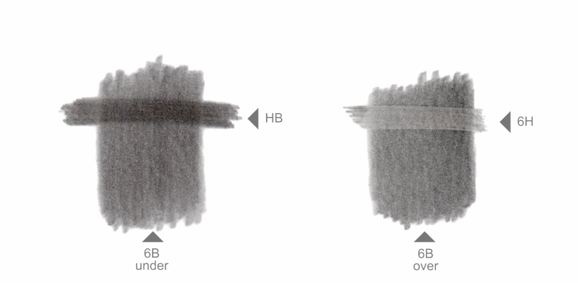
I had a fundamental misunderstanding of how graphite works and how to layer it! I thought harder graphite was an opaque substance that was lighter in masstone than softer graphite. This is not correct. As you can see in the screenshot, a harder, “lighter” grade of graphite can darken a softer grade if applied overtop! Why?? How?? Go watch and find out.
Now, I don’t want you to think these videos are clickbait One Cool Trick style – I’ve watched a LOT of them now and Mike Sibley is clearly an experienced and capable art teacher; each video focuses on some core concepts and walks you through them multiple times. Some others I recommend are:
I’m not, really, an artist who focuses on photorealism in my professional work – I have neither time, dexterity, nor interest, in making that the core of my practice. I do, however, think careful drawing studies are key tools in learning how to draw something, even if I never plan to go as detailed in later work as I do in the study! And pencil is a very forgiving, rewarding, and accessible tool for doing those studies. This is what got me googling “pencil drawing techniques” in the first place.
Of course, then he said THIS in the Drawing Textures video and convinced me that he and I are on the exact same page around What Drawing Does, and now I am going to watch everything by him that I can get my hands on.
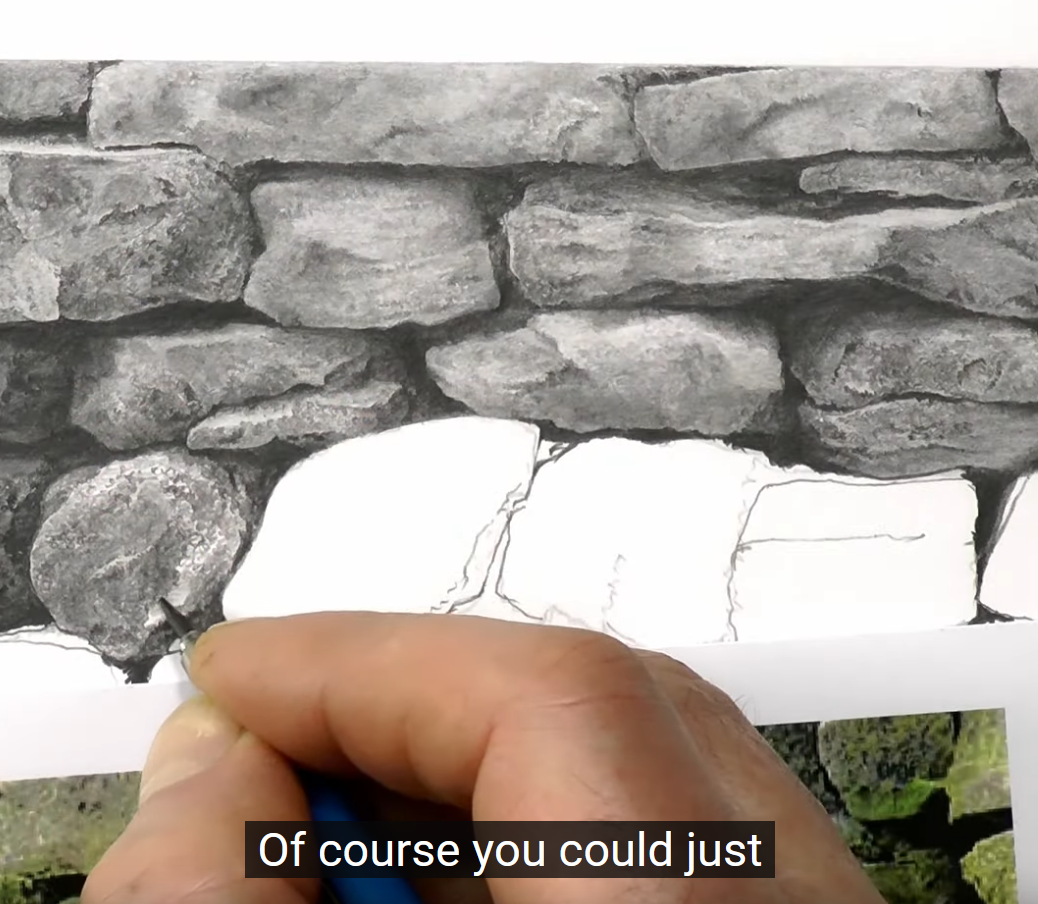
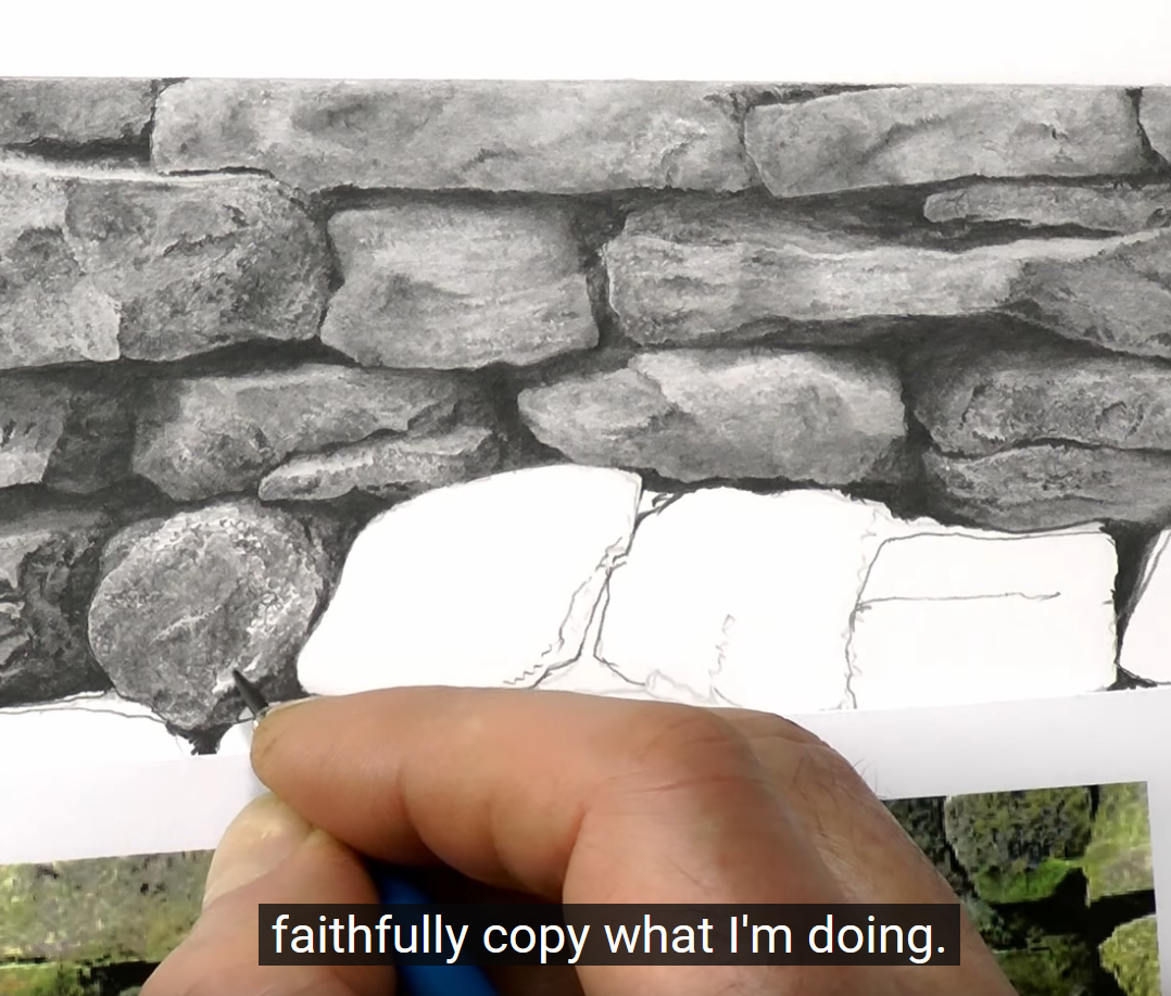
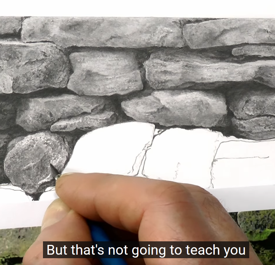
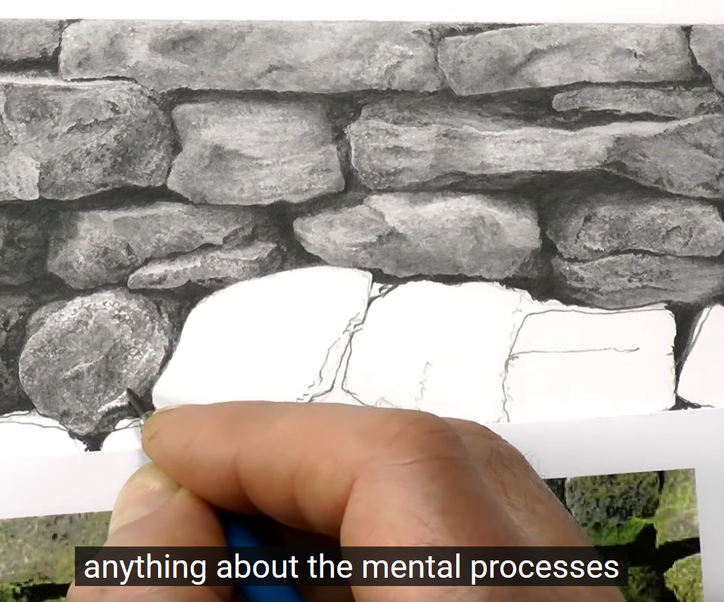
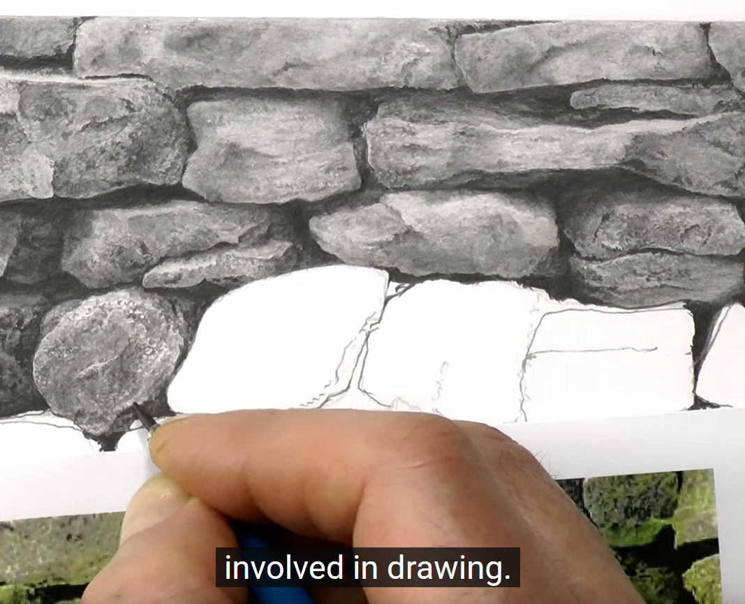
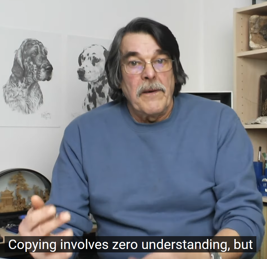
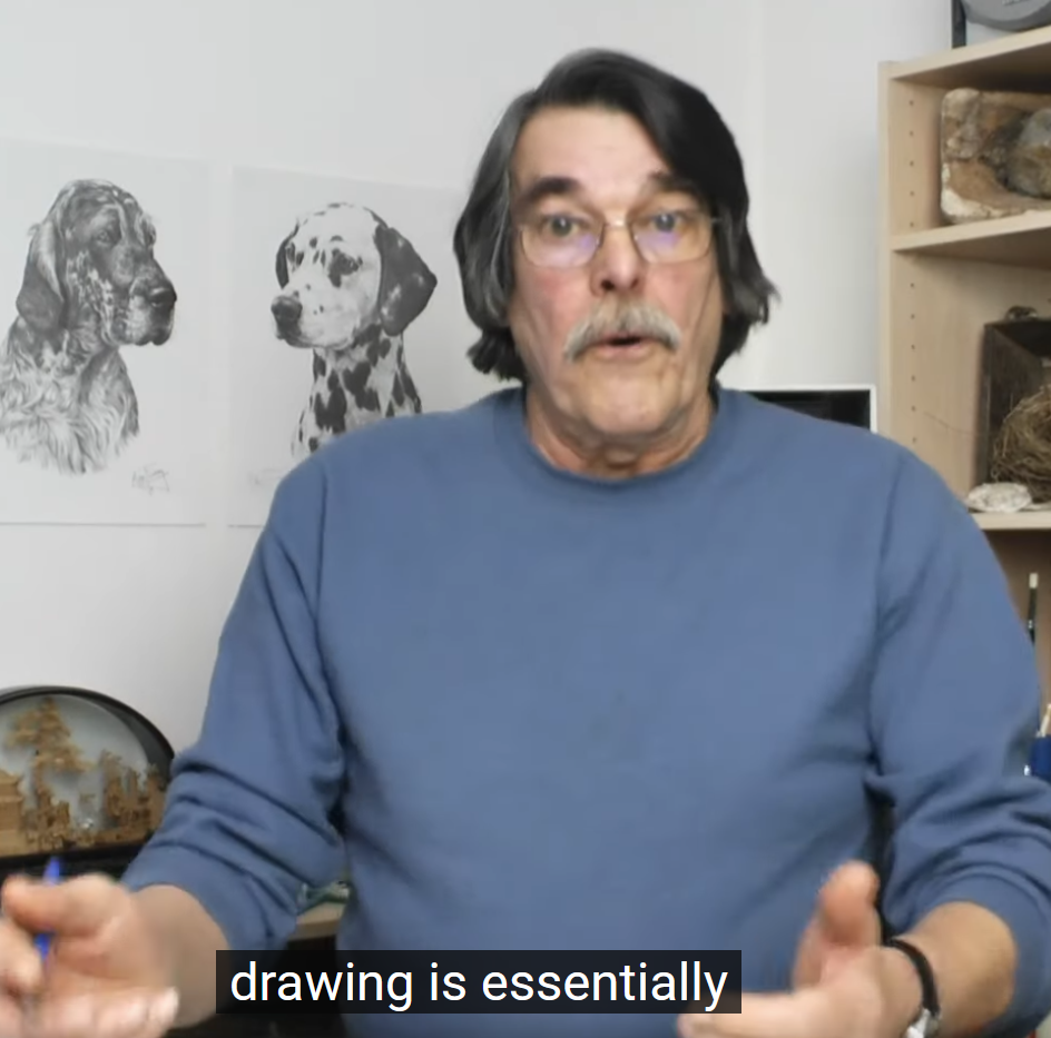
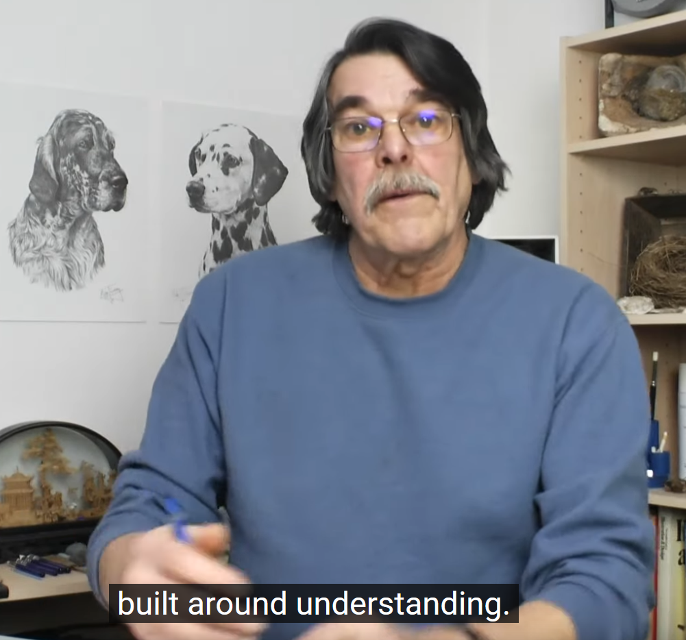
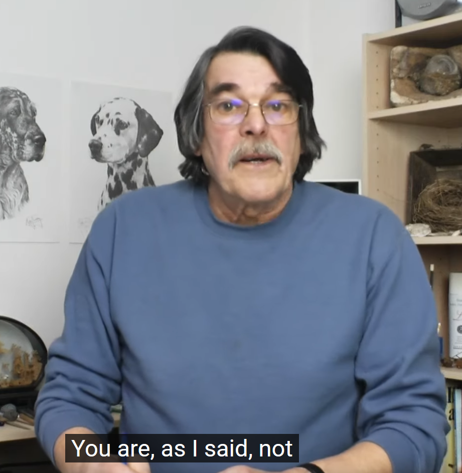
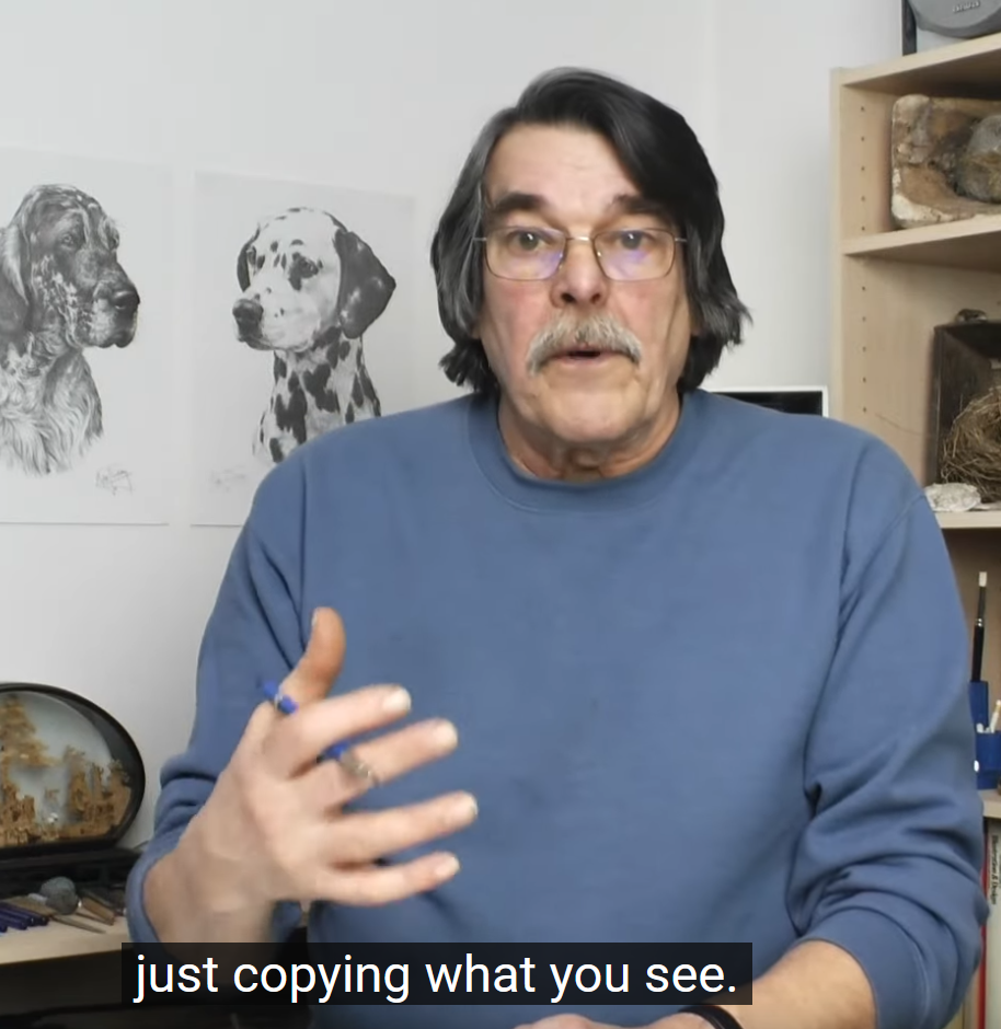
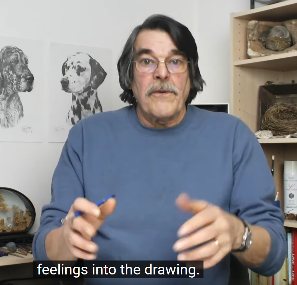
Hahaaa way to sum it up, Mike Sibley, and thanks so much for this great stuff!
This is the best case scenario of the internet, for me. The chance to discover new, useful information about something I’m interested in, no matter my current level of expertise. There’s a lot of trash out there for sure, but what a feeling, to find a vein of gold like this. I hope, if you’re interested in drawing with pencil, you’ll give one of these videos a try and see what else there is to learn on the subject!
- This is so key! I didn’t know how ignorant I was about how graphite works, which means I didn’t know the size or depth of the possibility space that exists within graphite art at all. Learning even just that there’s more to learn ahead of me is a thrilling feeling! Highly recommend it. ↩︎
One response to “High Level Pencil Skills Videos”
-
Whoa so so cool! I didn’t know that!
-
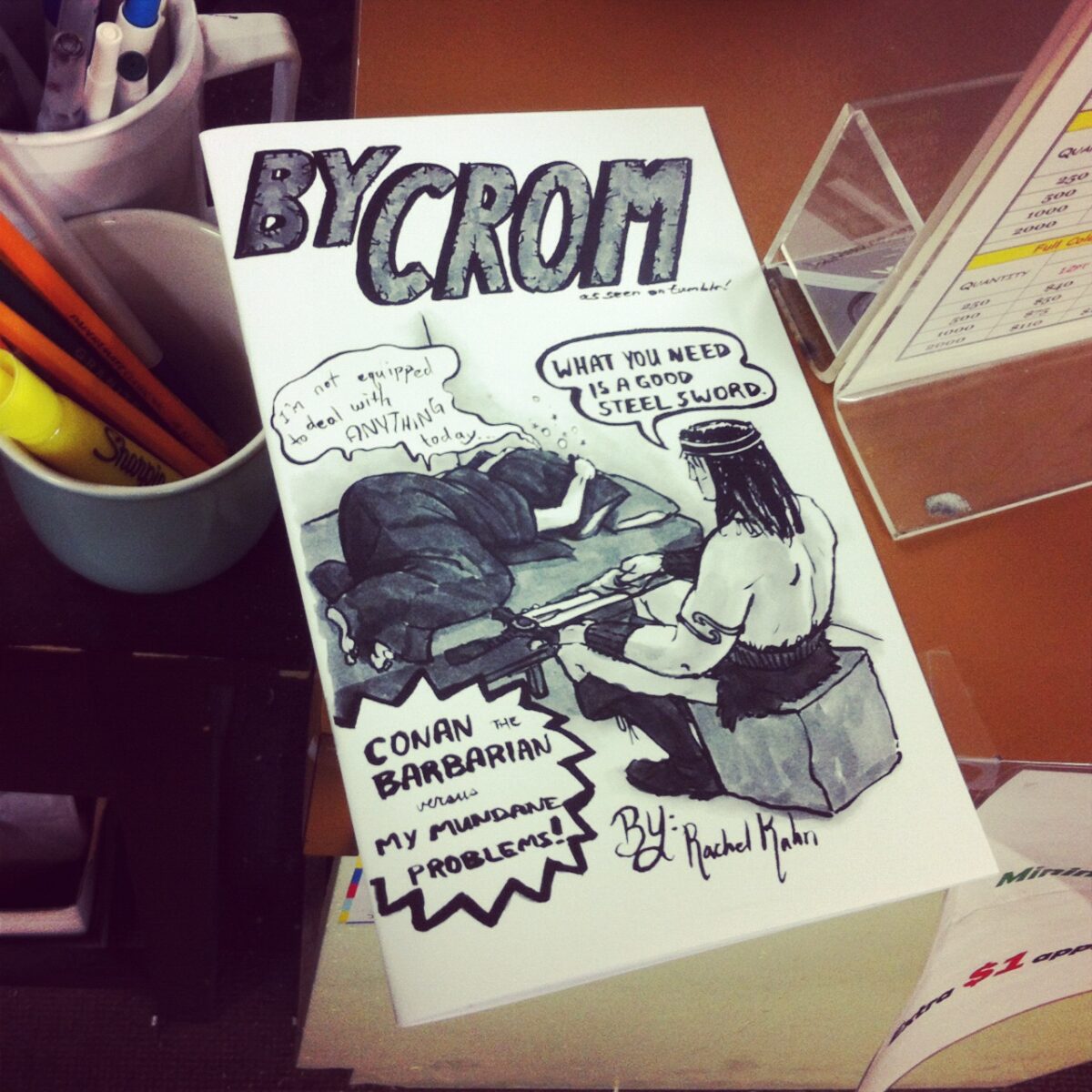
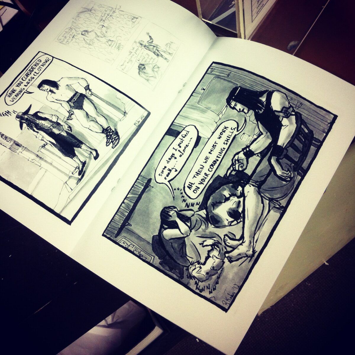
A quick collection of zines I have made, because I am trying to make more these days and it’s so nice to see a full rundown!
My first zine was a collection of my webcomic, By Crom! – black and white, 28 pages including the cover, photocopied and saddle-stapled and sold at Canzine back in 2012:
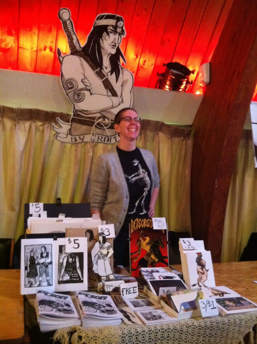
That fully got me hooked though, and I made a bunch of art zines next, collecting museum sketches and plein air painting and game night doodles:
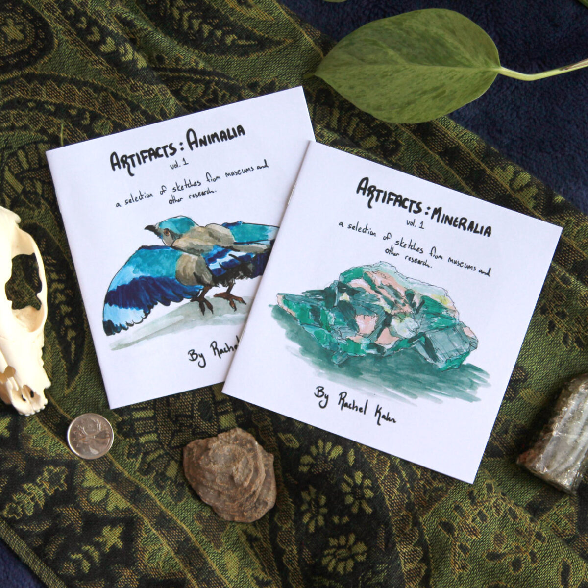
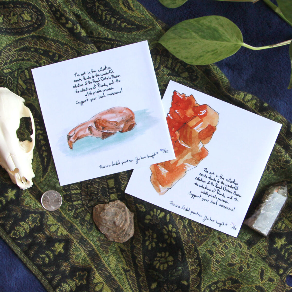
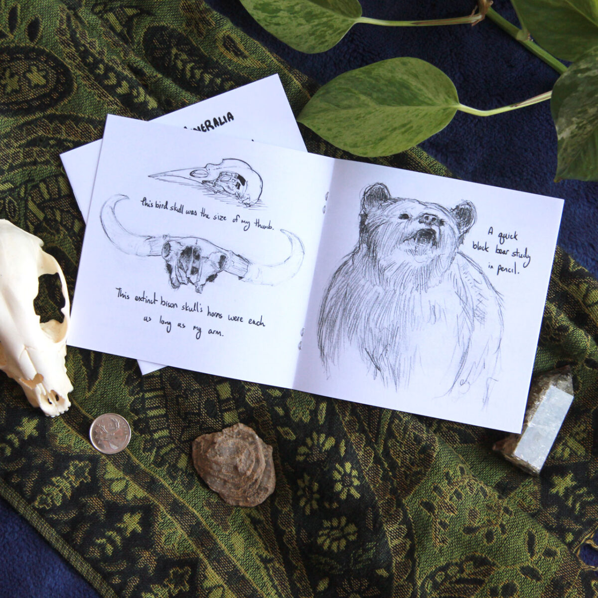
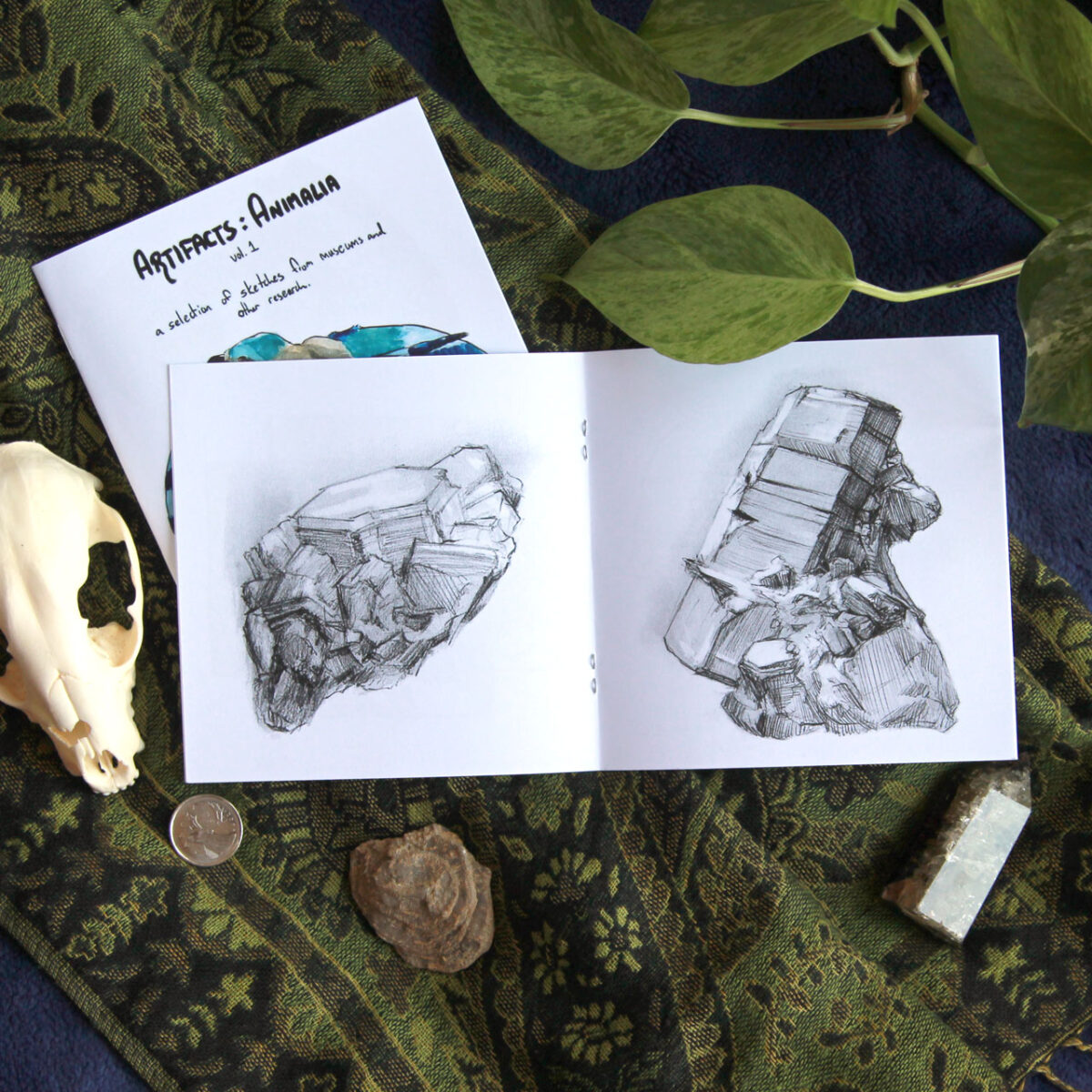


Then I went down the rabbit hole of *more comics* and made a riso comic zine AND an artzine ABOUT the comic zine:
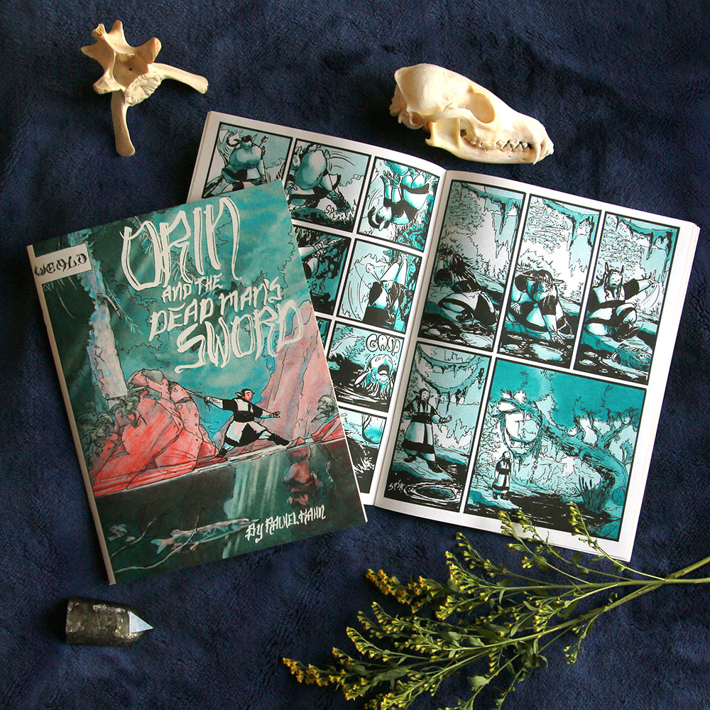


Risograph printing was way too fun to stop there though. so then I made two more riso zines, both heavy metal themed:
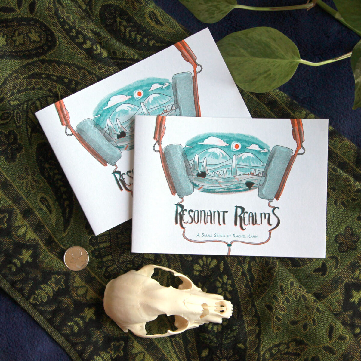
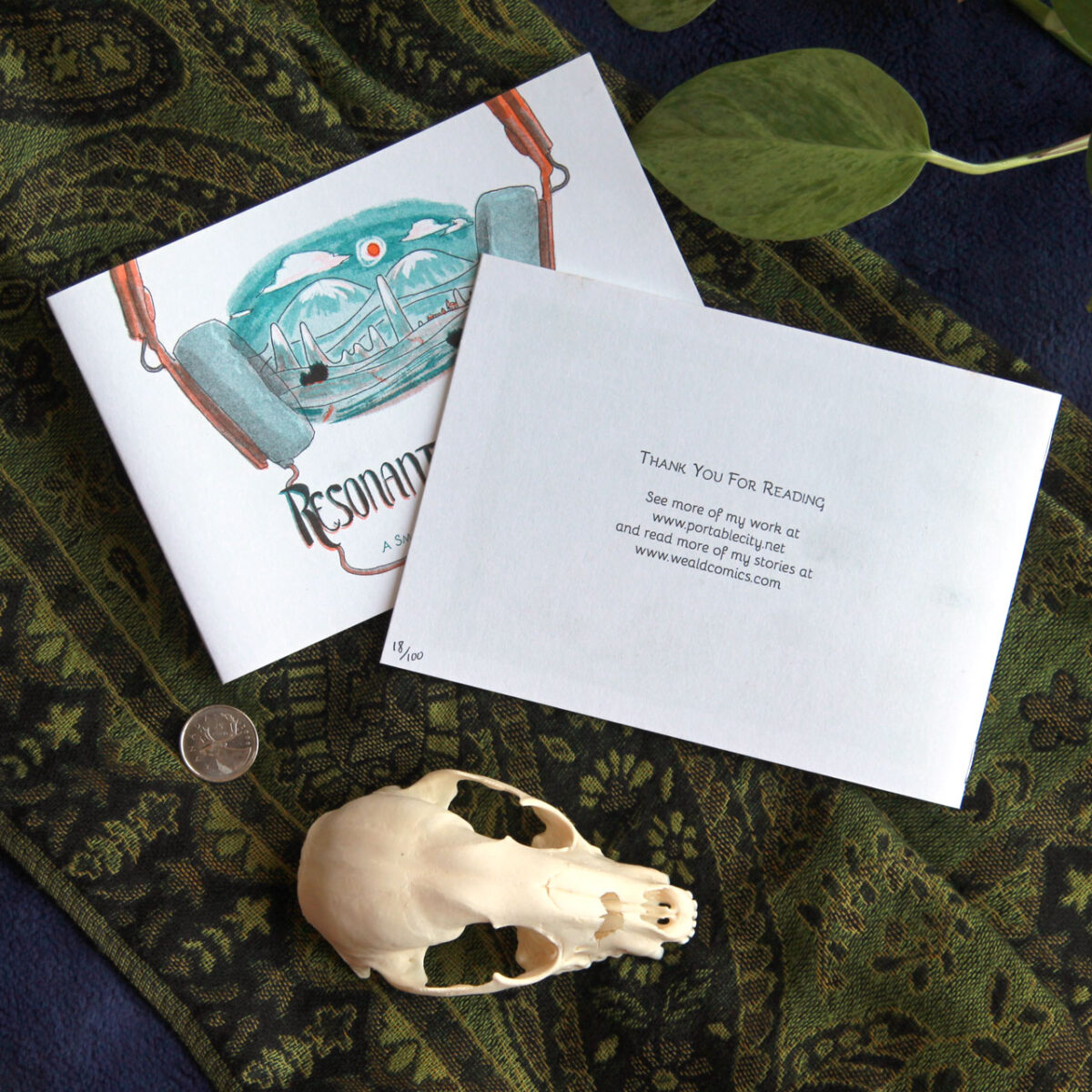
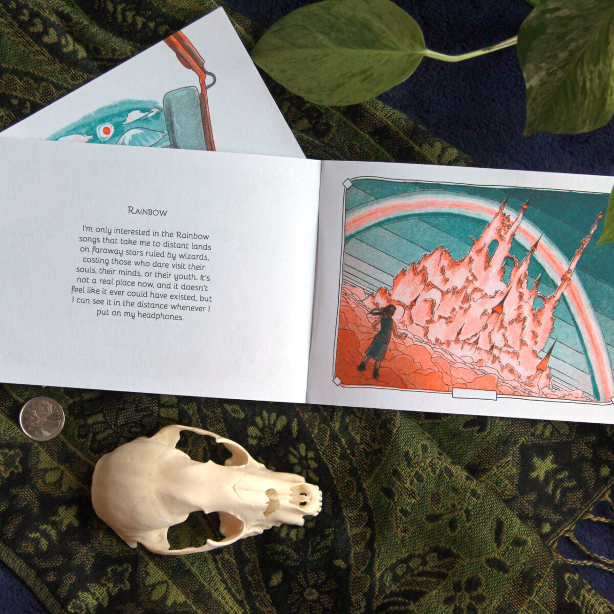
This little guy fits into a CD jewel case!
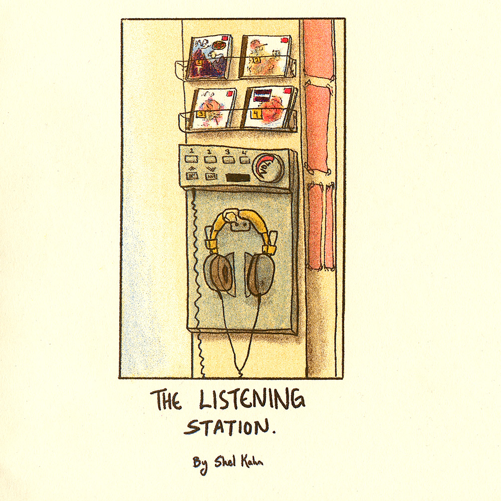

Beyond art, though, the world of ttrpg zines was calling me … calling me with the siren song of centerfold maps and folded inserts and player handouts and so many more fun ways to enhance the zines…
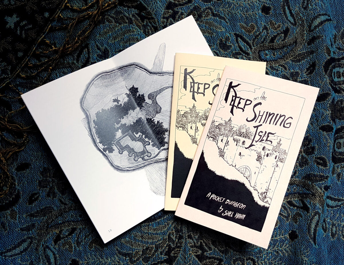
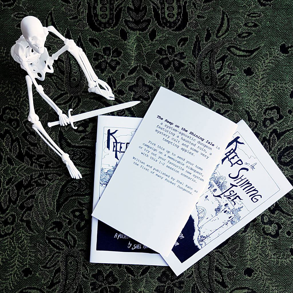
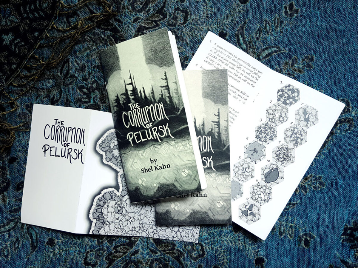
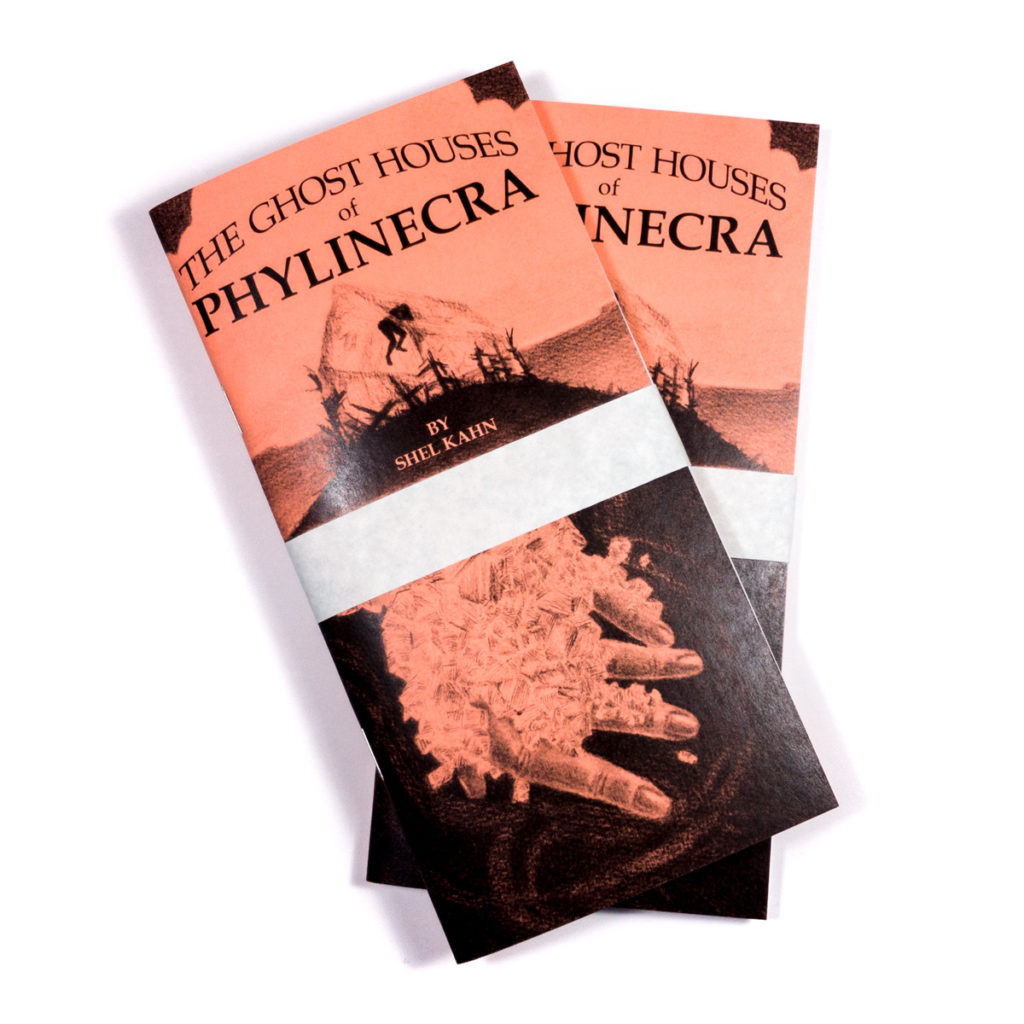
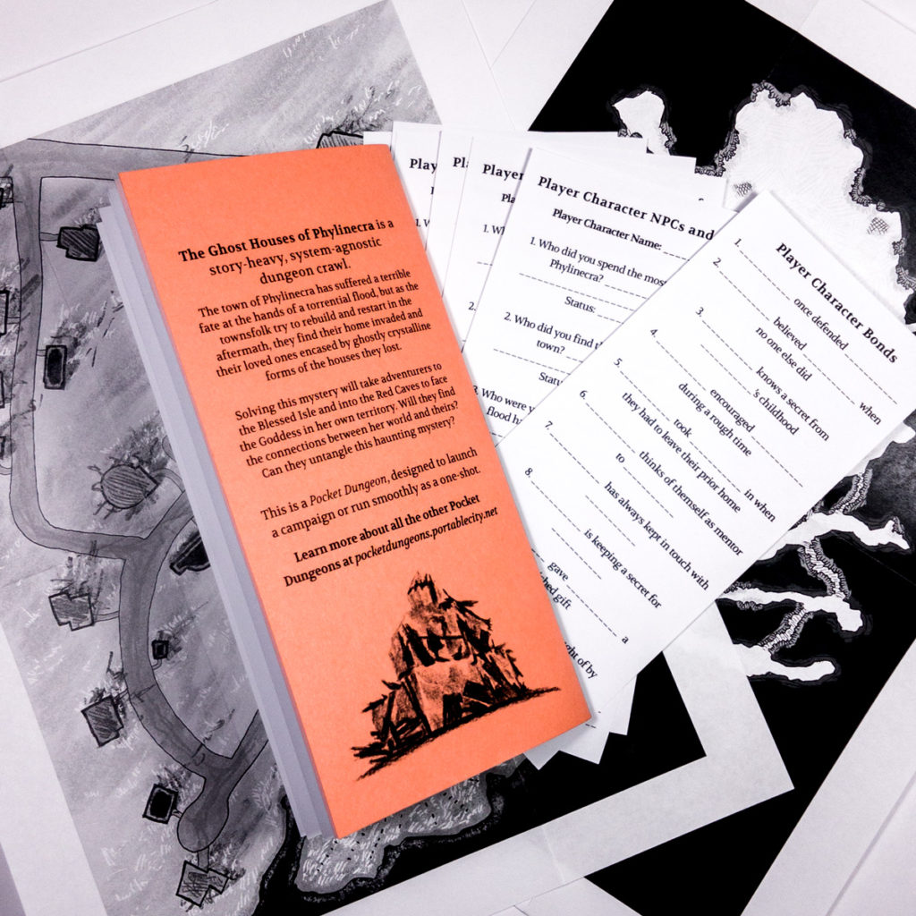
Fast forward to 2025, and I finally bite the bullet on a little cheap laser printer, and set myself up to print comic and fiction zines at home!
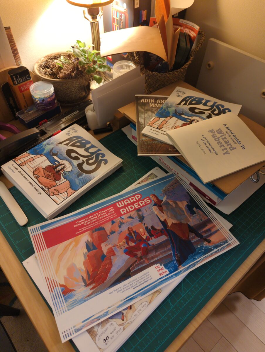
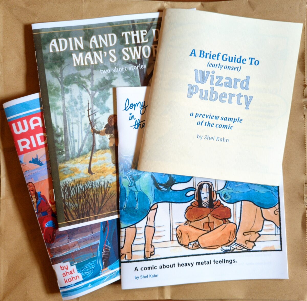
And a sneak peek at my newest investigation: ephemeral thermal printer zines. Receipt paper rolls are cheap and enticingly strange! And they print VERY fast. And really do hint at the possibility of scrolls!
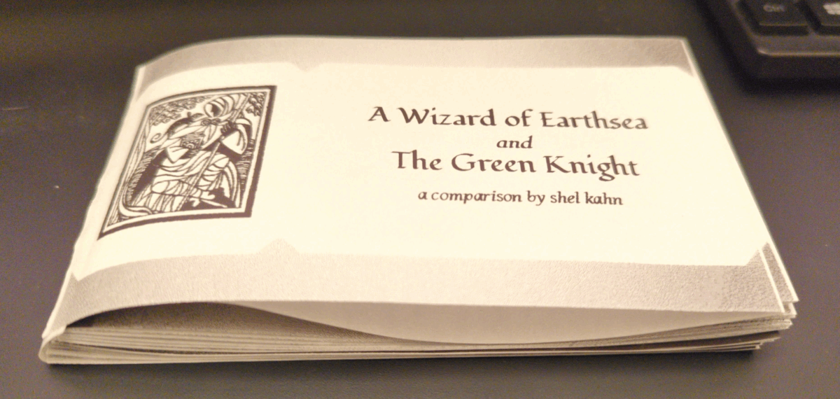

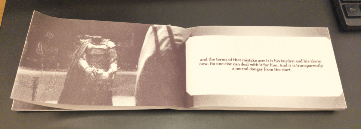
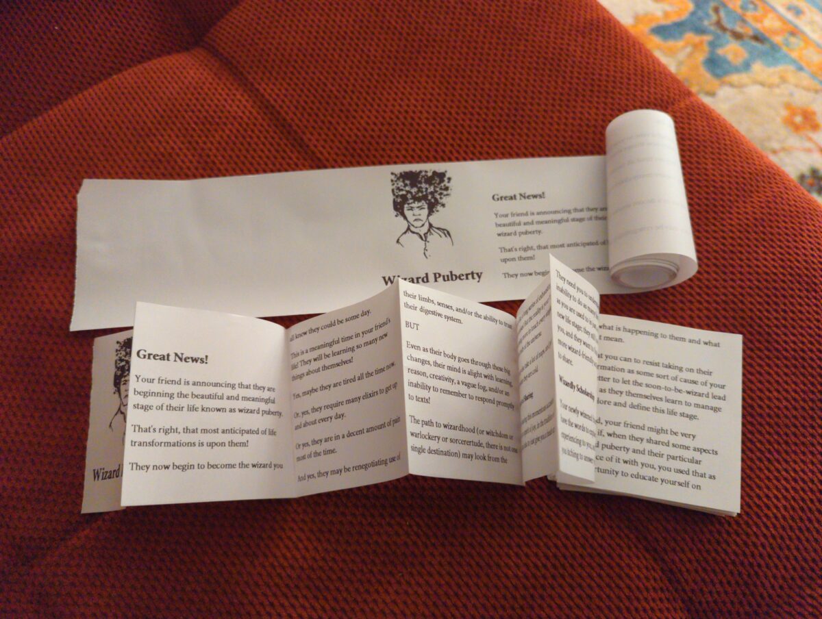
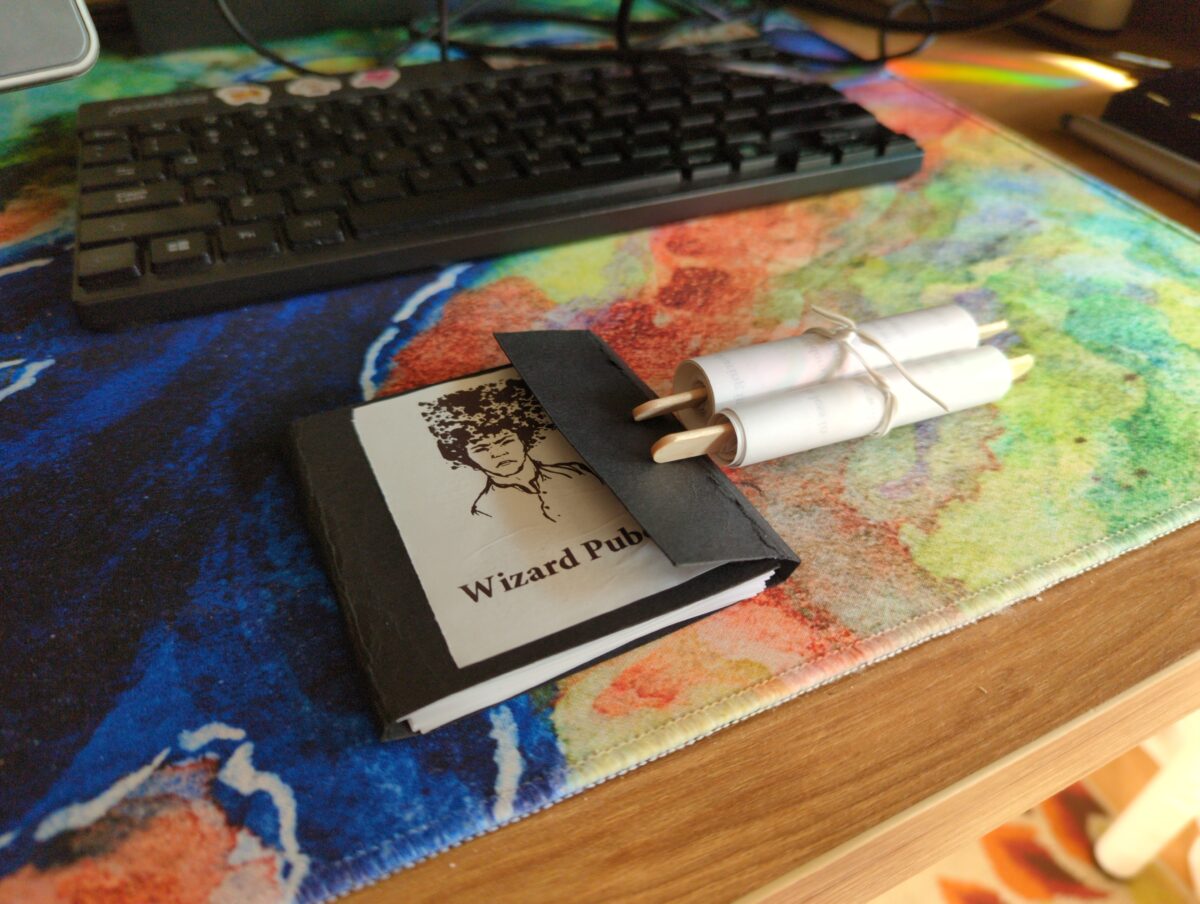
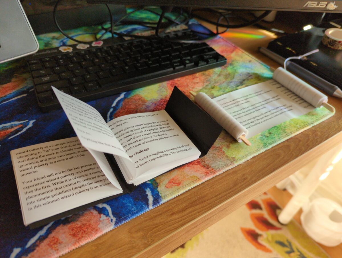
I’ve been a collector of zines for a very long time — back in the ancient times I studied artists books and multiples at university, which was probably where I first got pretentious about it, but the worlds of comics and games have really kept zines alive for me, showing me new incredible stuff every time I hit up a store or convention or festival. Shoutout to Will and Seb and Adam, who really took the time to get seriously pumped about gaming zines in particular with me back in the before times! Hopefully I will keep the zine momentum up for years to come.
Please drop me your fav zines in the comments, I would love to see some of the coolest stuff you’ve read/found/made!
-
Achievement! 1000+ Observations on iNaturalist!
posted:
updated:
posted to: phototagged: animals, arachnids, bees, birds, frogs, inaturalist, insects, structure, wildlife photography
In honour of taking enough photos and spending the time to categorize them and crop them and geotag them and sort them into distinct observations to have crossed the 1000 observations milestone on iNaturalist, I wanted to pick up where the Exposure Therapy for Bugs post I wrote left off: photographing animals and plants and fungi and so forth has been an amazing new way of seeing the world and is absolutely expanding my mental horizons.

One of the things I both feel inherently skeptical of and also recognize as a central pillar of my worldview is anthropocentrism. by which I mean, I firmly believe that all living things have an inherent intrinsic value, and also a unique and essentially ineffable lived experience and, i guess, point of view. But I also know that my mind centers humanity, and also my mind can only actually perceive the world through my inherently human lens, and that I will never really be able to know what life is like for other living things. But I firmly believe that it is both complex and different, and that these differences are valuable and interesting and worth keeping in mind and being open to and respecting.

I think about this in relationship to pets, of course — dogs and cats and also birds and fish and hamsters and so forth — but also I am very interested in nonhuman intelligence in wild animals; in trees; in slime moulds.
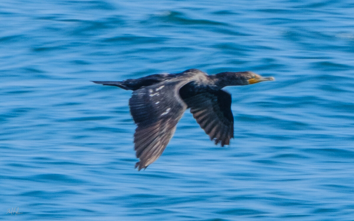
But I have had a somewhat surface level interest in ecology, to be honest, in that I memorized all our local songbirds as a small child, and have learned to id some larger flowering native plants on the highway verges, at least when in bloom, and so forth. But I didn’t really spend much time on invertebrates, or all the little weeds that invade our lawns, or such. But deciding to photograph for iNaturalist observations started to challenge me to pay more attention, to stare longer, to really look at what’s around me outdoors.

And its been magical! I stood still last weekend and stared at a huge huntsman/daddy long legs, perched nearly at eye level on a budding goldenrod, grooming itself. This thing is absolutely a gross-out bug for me, and I haven’t actually lost that response – their huge hinged legs and translucent chelicerae and clustered eyes are wonderfully creepy still! But also it was Just A Little Guy, y’know? It just needed to give its foremost legs a thorough wash.

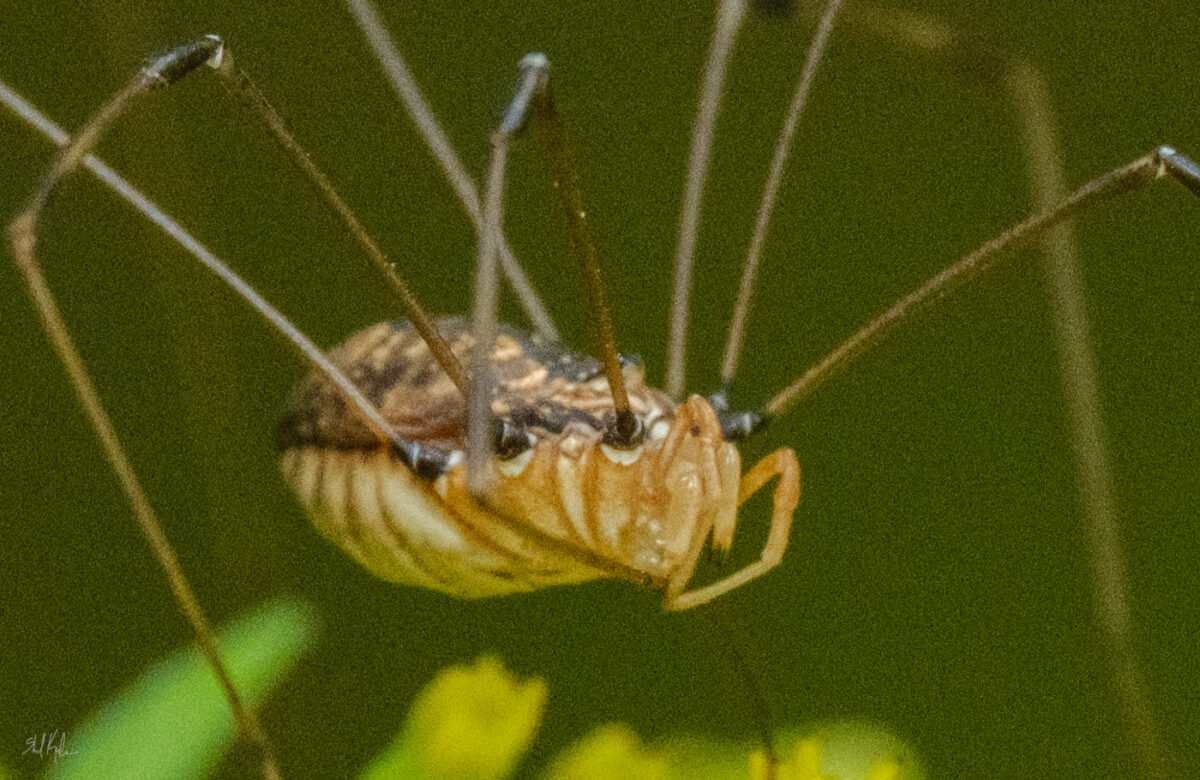

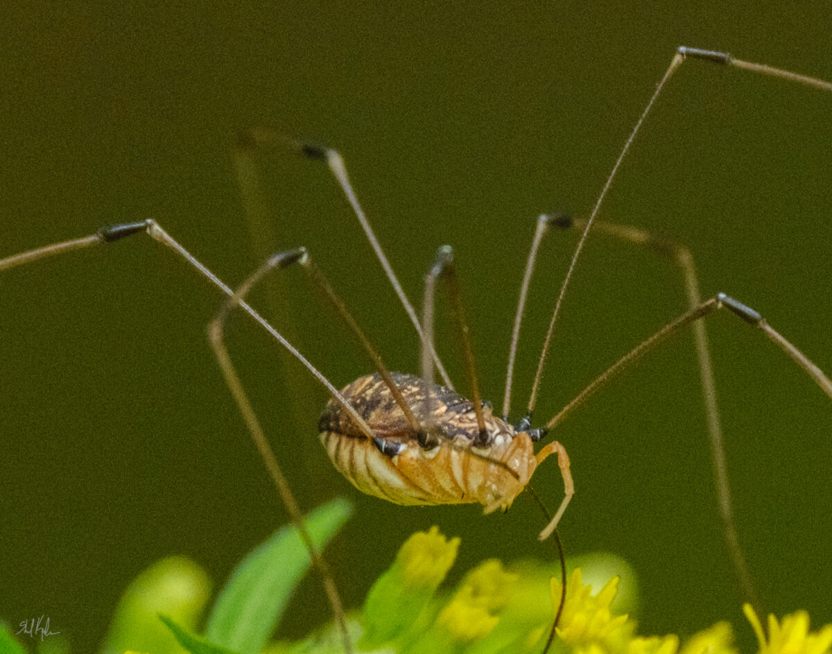
And then I stepped back and realized there were three others all just resting on goldenrod leaves within a foot of each other, which both gave me a brief hit of that overall creepy feeling of remembering that there’s always more bugs around than you think, but also proposed an intriguing question of why are they all here, all grouped up near each other, in the late afternoon? why goldenrod? are they gathering on purpose? And there are whimsical potential answers, the kind you can build a fairy tale out of, but also real scientific potential answers, and it’s a question that I can use to start investigating huntsman behaviour, or just a question to keep around mentally to remind myself that bugs are inscrutable little creatures and likely always more complicated than I think.

And this feels good to know! It also makes me feel bad if I kill a bug, and that’s hard because they are so small and fragile! But also some of them are very willing to fuck with me. Or my stuff. The eternal dilemma.

But to get back to the point of this post, it’s turned the outside world into a much more interesting place, and that feels enormously magical. If you’ve been tempted by iNaturalist or any other sort of citizen science initiative I super endorse trying it out!

One response to “Achievement! 1000+ Observations on iNaturalist!”
-
the huntsman photos are fantastic, i’ve never looked at one close before, i like how their body has different textures for the front and top and bottom. the dragonfly looks like a rocket on a launch pad.
-
-
That’s right, chalky, powdery, gloriously colourful soft pastels! Not to be confused with oil pastels, which I have been hyperfocusing on for a year or so.
So, like, years and years and years and years ago I did work in soft pastels a little – I was studying fine art painting and I didn’t have anyone around to instruct me in them specifically, but I did a few pieces for assignments or cafe art shows and such:
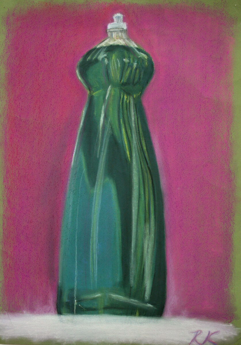
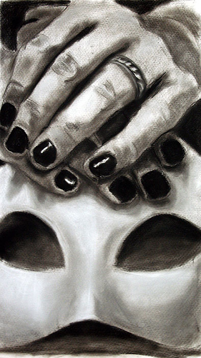
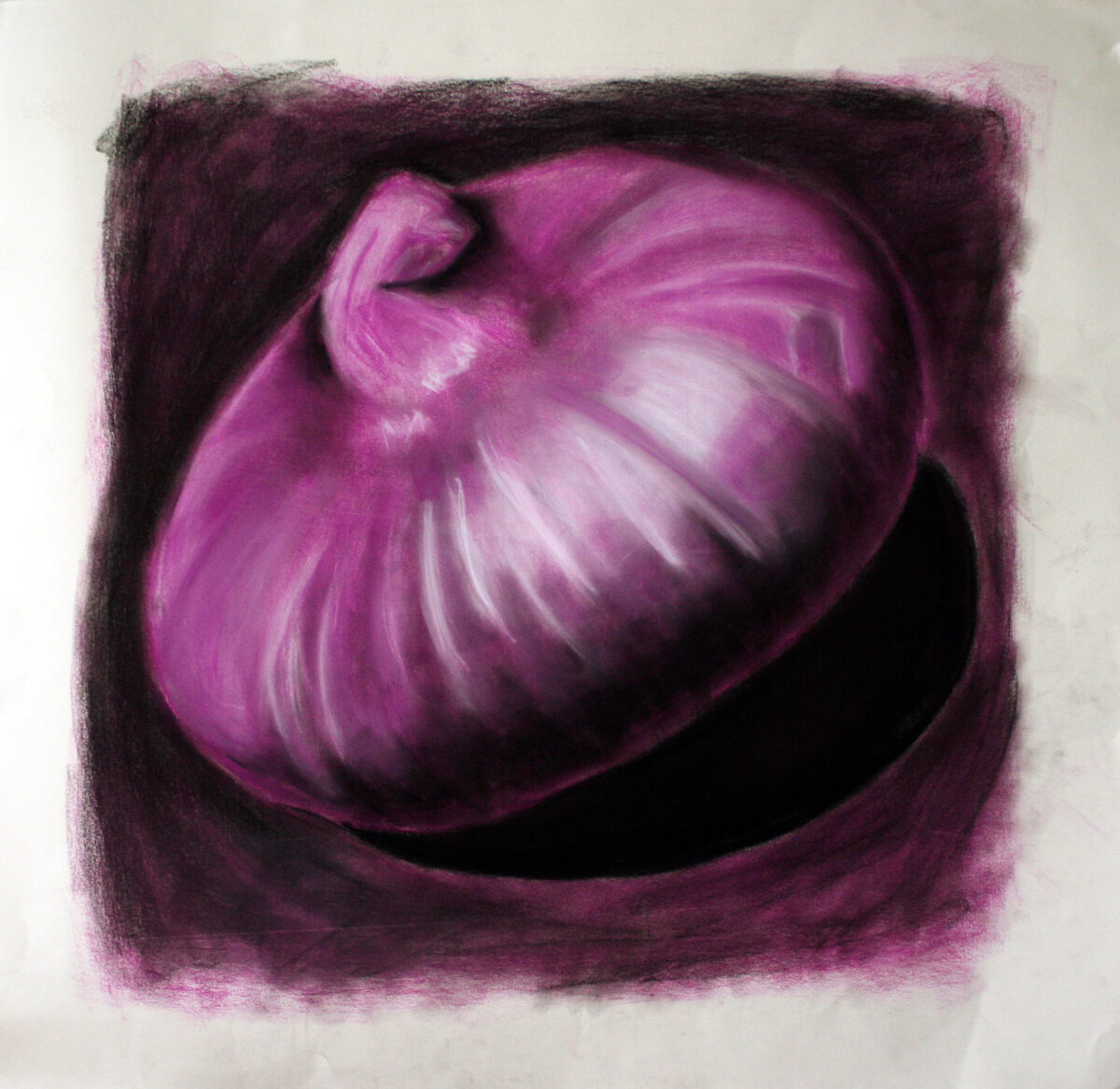
These three above were drawn on whatever paper I had, as a way to just experiment with media in painting and drawing classes in my first few years of art school.
These next two, though, I am pretty sure were drawn on a decent printmaking rag paper, and you can definitely see signs of more intentional layering and blending! These were painted for a cafe art show I had in my last year at university, and they’re each in the 18 x 24″ range, give or take:
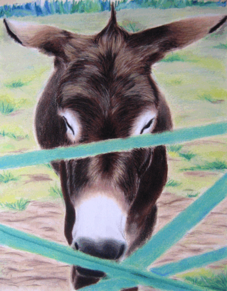
fun fact: the cafe refused to let me hang this painting when I brought it in – the owner was terrified people would look at it and just think “ass” and that the sheer lewdness of that would tarnish his classy vibes. 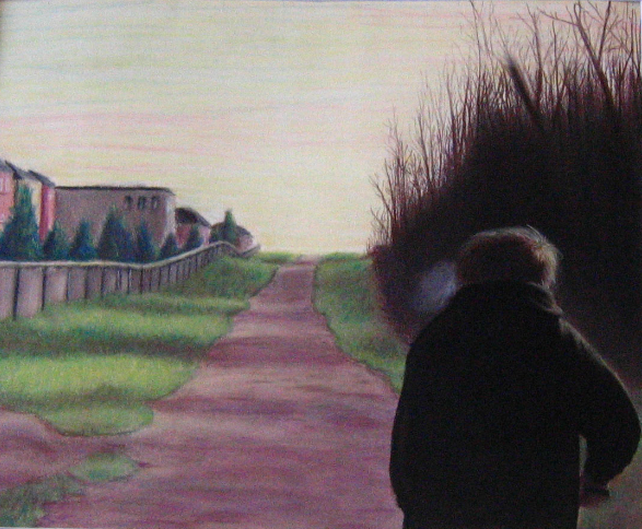
This last one I still have – it’s a painting of my brother, from a photo, and I should really get some better documentation of it. You can see some of my artistic interests starting to solidify: moody lighting, skies that aren’t blue, uncanny suburbia, people not engaging with the viewer, creepy clustered trees… maybe it would be fun to rework this one someday, too!
Anyways, those were painted in early 2007, and then I didn’t intentionally touch chalk/soft pastels again until a little over a month ago!
(As an aside, one of the strongest reasons I avoided this art material was because of all the time I had spent in art college drawing with conte on newsprint. Conte is a sensory nightmare for me, conte on newsprint doubly so, and I had assumed that soft pastels (not oil, the chalky ones) would feel the same. Thankfully I was wrong!)
A few weeks ago, my friend Andrea brought a few sticks of some soft pastels to lifedrawing night and let me try them; and they didn’t really squick me out, even as I used them on something very close to newsprint. After that, it was a quick slide down into the rabbit hole of youtube’s pastel artist content, and anyways, most of the work I’ve done at home this past month has been in soft pastels.
What I don’t have is great photodocumentation yet – I need to take all these paintings outside and properly photograph them, and it’s been a blend of too hot, humid, smokey, or thunderstorming all summer. So, I apologize for the quality of my photos, but just to give you an idea of what I’ve been up to:

My first purchase was the Mungyo artist’s soft pastels – about 1cm thick squares; I bought the set of 48. Honestly, I doubt I will ever use the neons, but there’s some great neutrals and a lot of beautiful midtone very saturated colours in this set, and it’s been a great starting point! But absolutely yes I have been collecting more, especially when there’s open stock available at local art stores. I don’t have any clear brand favourites yet, but I am noticing certain pigments that are consistently frustrating to work with across brands! As I continue, I’ll try to take notes and share them here.
The first thing I did was try all the paper I have in the house, and also watch endless videos on youtube about how pastel artists feel about their substrates. Turns out paper is maybe the real deciding factor with pastels – much like watercolour, there are huge swaths of technique only available on specific types of substrate, and it took me a bit to figure out that some things I saw people doing were only going to be possible if I tracked down some very expensive sanded papers or cardstocks.
But despite watercolour papers and mixed media papers being universally disappointing, I did end up finding a stash of mine that worked well with the medium: cotton rag printmaking paper.
When I was doing my BFA at university I did a fair amount of intaglio printmaking, and printed mostly onto cotton rag paper. Thanks to past me, I still have a decent selection of Arches BFK Rives heavyweight in cream, Stonehenge vellum finish in white, and Somerset satin in white. Turns out these papers, with their heavy weight, mottled surface, and lack of strong surface sizing, have enough microscopic tooth to accept layers and layers of soft pastel pigment, and to put up with a fair amount of alcohol or water washes to lock those first few layers too.
I’d already decided that these were my favourite paper for oil pastel, so honestly I’m not surprised that they are high enough quality to win my heart in other arenas as well.
So that’s what I’ve been using!
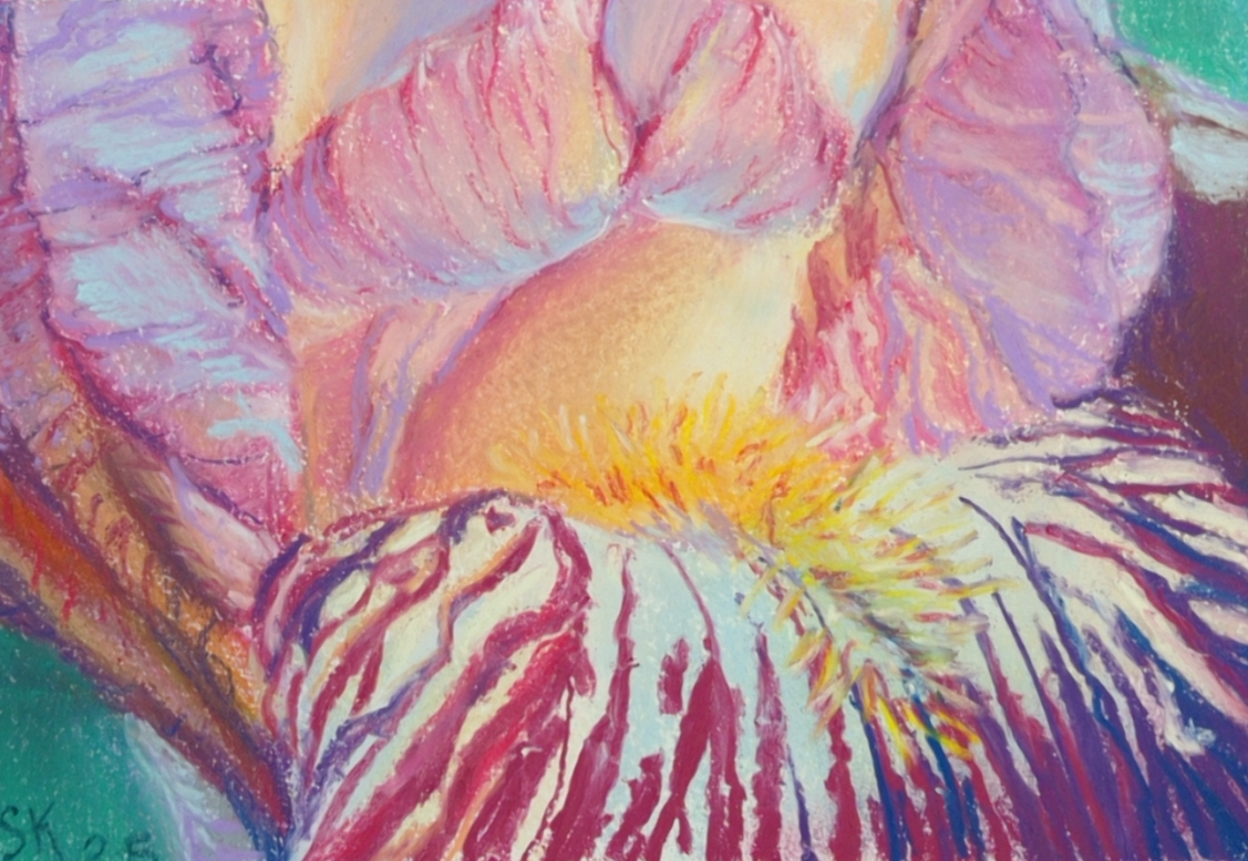
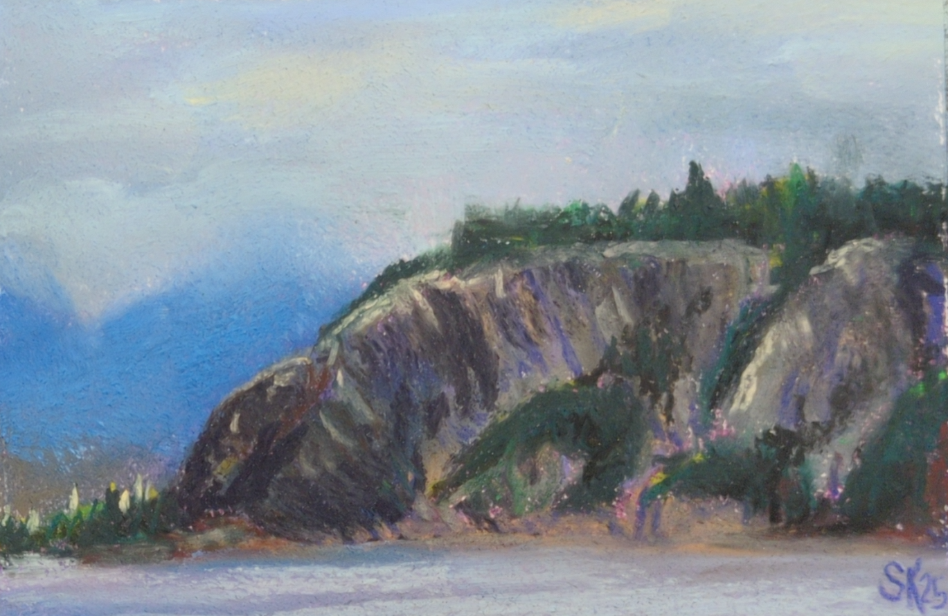
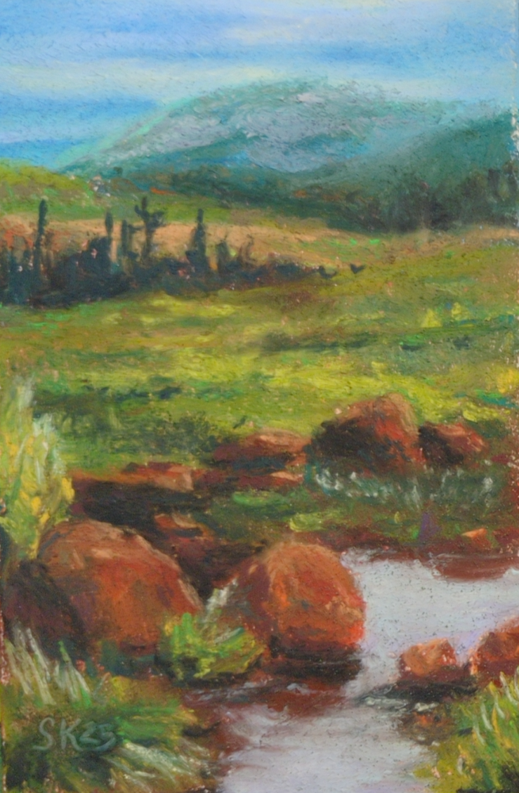
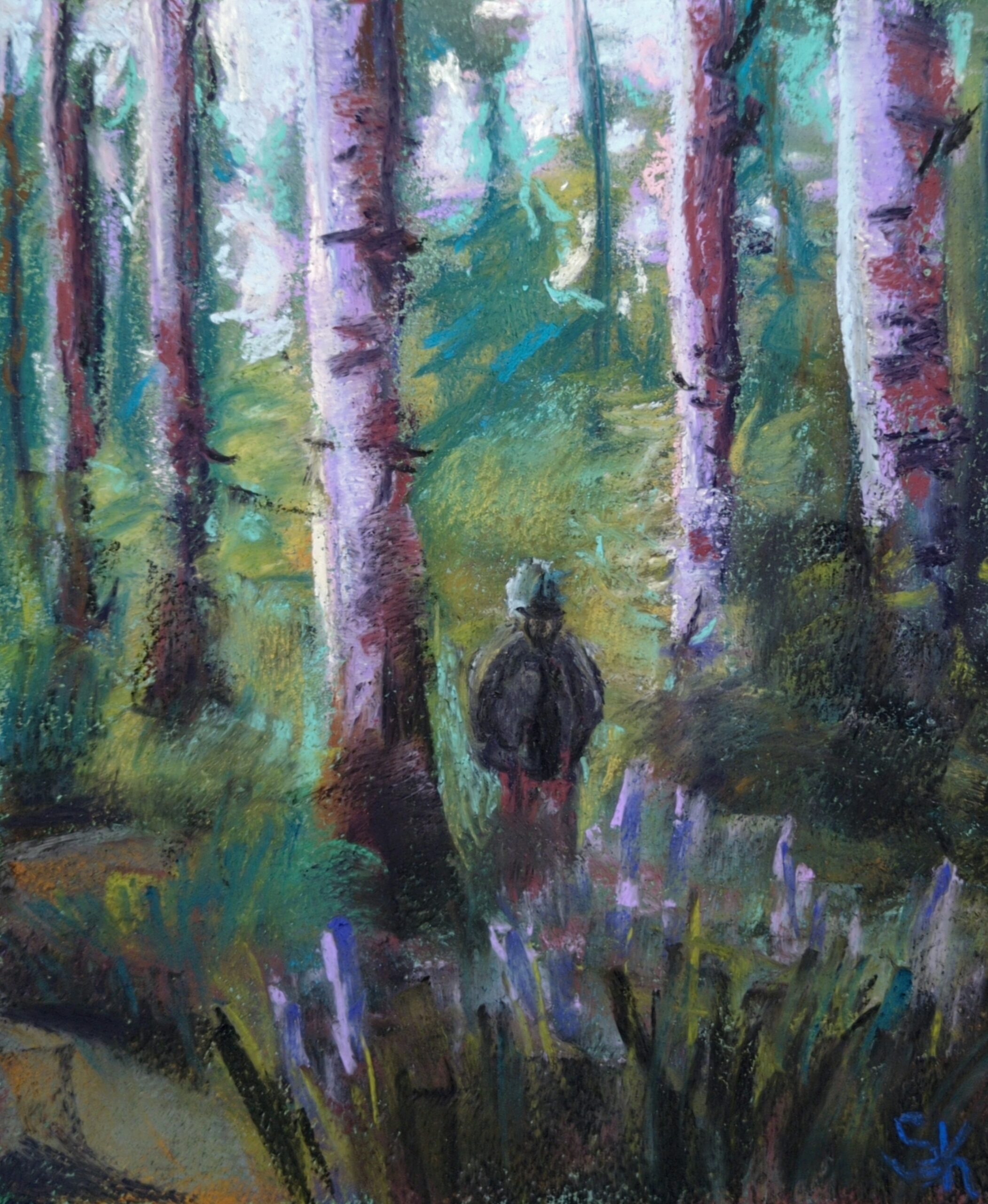

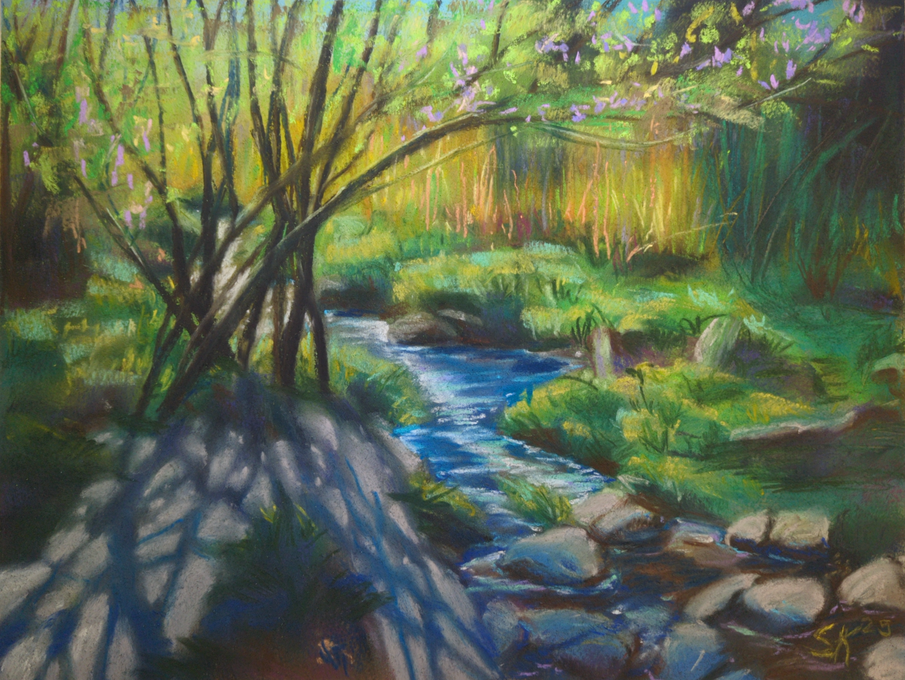
Next up I’ll be testing out some cheaper papers apparently designed for pastels, like canson mi-teintes and strathmore’s pastel paper; I’ll let you know how they go!
Oh, and the other lesson I learned about soft pastels: folks are NOT KIDDING when they warn you that spraying them with fixative will change the colour!
Before, and After:
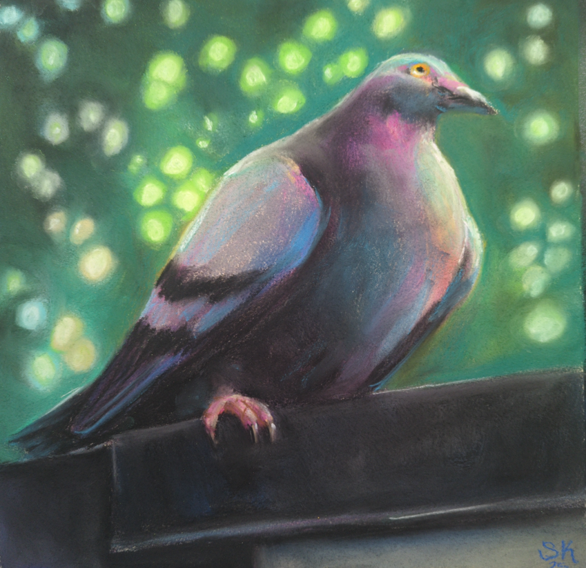
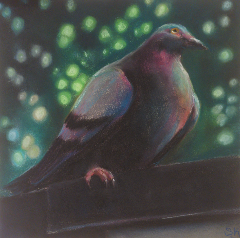
This guy was sprayed with krylon fine art UV safe fixative, and holy heck. I was not prepared for the way it wiped my value contrast out all over the place. My midtones! My punchy highlights!
Anyways I’ve caved and bought sennelier’s dedicated soft pastel fixative, and been taking folks’ warning to use it only in extremely thin, light coats very seriously. In the end, I don’t think there’s anything you can do to make a soft pastel drawing not smudge if you rub it with your finger – even my well sealed pigeon there will still let pigment lift if I try – and I think of the fixative as more of a mild layer of protection than anything else.
Also if that paragraph makes you cringe for how complicated storage of these must be, I am sorry to say you are completely correct, and they are at least as annoying to store as oil pastels. Turns out my life hinges entirely on glassine interleaving papers now! And I desperately need to go find some more asap.
There’s so much in this medium to learn – I see some incredibly expressive work in the contemporary art world, but also there are people using these to do photorealistic wildlife art, or portraiture, or surreal landscapes, all taking the medium and pushing it as far as it can go in various directions. Which directions am I interested in? How does it respond to my usual array of favourite subject matter? And also, for real, why does my fluorescent desk lamp seem to wash out my work so badly while I’m painting? Everything looks so much darker when it’s on a wall vs on my drawing table! So, much to learn still ahead of me.
One last image: this is how I’ve been storing them so far:
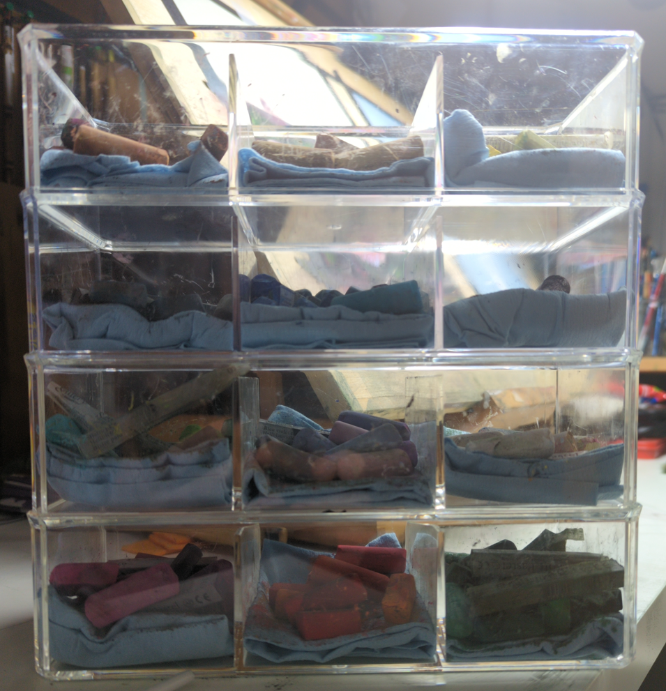
I probably need to cave and pick up more wooden drawers, but so far I am resisting.
4 responses to “Soft Pastels are Back in Town”
-
these are so pretty! my favorite is the vertical picture of the forest with a person in it, or the one beneath it with the wonderful shadows being cast by the thin trees. this medium really lends itself well to soft dreamy landscape pictures. ❤
-
Thank you so much! It really does feel like dreaminess is key to any soft pastel piece, you’re right!
-
-
your work is wonderful! it is dreamy but it has such a clarity to it. i liked reading about the troubles of storing this stuff… somehow you’ve still made me consider picking pastels up
-
Ahh thanks for the kind words! I would love to know if you did end up picking these up and trying them out?
-
-
-
Murderous Mermaid Thoughts
posted:
updated:
posted to: concept arttagged: concept art, creature design, mermaid, monster, monster design, sea creature, sketchbook, structureSpent some time in my sketchbook thinking about all the amazing and kind of horrifying ways sea creatures have arranged their mouths, and seeing what I can combine with mermaid ideas and to what effect.
(click on the images to see larger, crisper versions of them)
I was inspired by this sketch of mine from 2017:

I think I had seen a few amazing mermaid/angler fish designs as part of mermay that year and I had to get this weird fake face idea on paper. I still love the eyes on the mermaid’s shoulders! Can’t top that visceral feeling!
But I know a lot more about sea creature mouths nowadays, and I was recently at the aquarium refreshing my visual memory, so, here’s a few more mermaids that 100% would eat any and every hapless sailor they came across, with mouths we extremely do not want to look to closely at:
Starting with a more firmly eel-shaped reinterpretation of my first idea.

And then, well, have you looked closely at crustacean mouths? There’s so many moving parts! This is not accurate to any one crustacean in particular, just, you know, feeling the vibes:

And then, well, that chest-mouth is intriguing, but what if we made that way, way weirder:

Crustaceans are horrible but you know what’s way worse? Polychete worm mouths! First I simply put one on the face:

…but that isn’t nearly upsetting enough, so:

Well it’ll be hard to top that, but, quickly, where else can we put mouths? What about the top of the head, like an anemone? I gave her fan shrimp hands too, for maximum filter feeding:

Speaking of filter feeding, what about baskers and other filtering fish? Hard to open the expected mouth that wide but maybe we can bask using the ribcage:

What else could the ribcage do? Maybe grind things up, the way skates and rays do:

And finally, well, I did really want to sneak in one more straightforward monster, so here’s a take on a gulper eel – I gave her a lure as well, where a human heart maybe could be:

It’s always fun to take an idea and explore it so thoroughly! For these I resisted the urge to go gather reference, but if I was designing a mermaid monster for a client, this is the stage where I would take these ideas as a list, pick a few that worked best for their project, and go get a big pile of reference to deepen my explorations. While I like quite a few of these designs just as they are, there’s no way that I know EVERYTHING about how weird a sea creature’s mouth can be, and in my experience research always rewards with fun new details!
If I have time later maybe I’ll come back and pick one of these to do a deep dive design investigation of – if you could pick one to see taken further, which would it be?


Leave a Reply