swap to chronological order of most recently posted
-
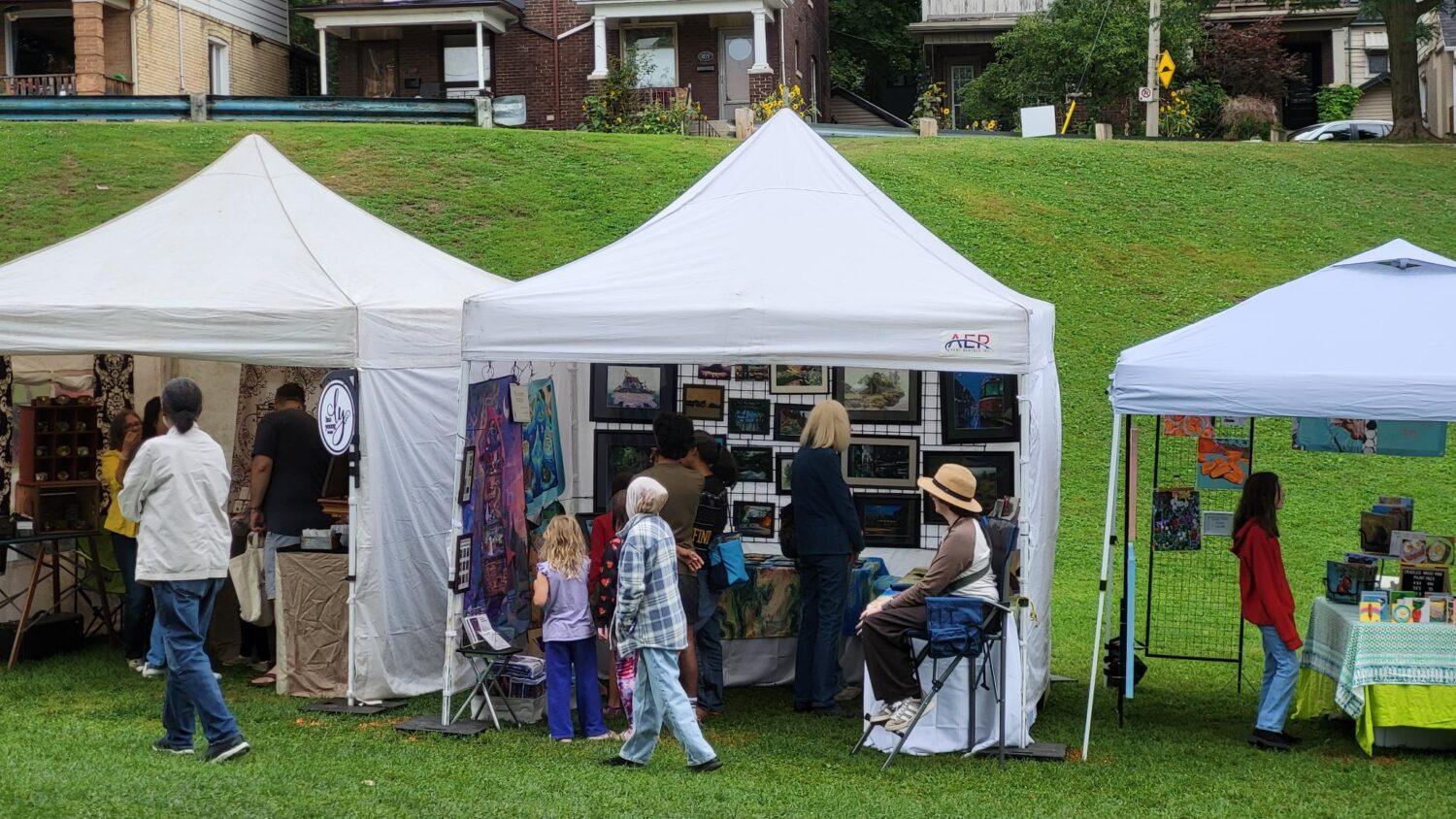
photo by matt rapati This past weekend I exhibited as part of the Danforth East Community Association’s Arts Fair, an east end art in the park event where a curated list of exhibitors set up in 10 x 10′ tents and folks can wander around and watch demos, buy art and crafts and such, and eat fair food, maybe my favourite part and utterly necessary to these events.
TLDR: this was a huge effort and a big up front investment, but it went really well and I loved it, and would definitely love doing it again in future! Read on to get the whole overly detailed story:
This was my first time doing an art fair! I’ve been tabling at conventions (comics, scifi, ttrpg, etc) for 14 years, but that’s really a different beast in a lot of ways. Firstly, 10 x 10 feet is a LOT of space, and not only is that terrain you can use, you also have three walls to decorate and curate! Three! Walls! I was terrified I wouldn’t have enough art to fill them, and that my tent would look sparse and amateurish. Hah. Hahaha. “Not enough stuff.” Sure. Me.
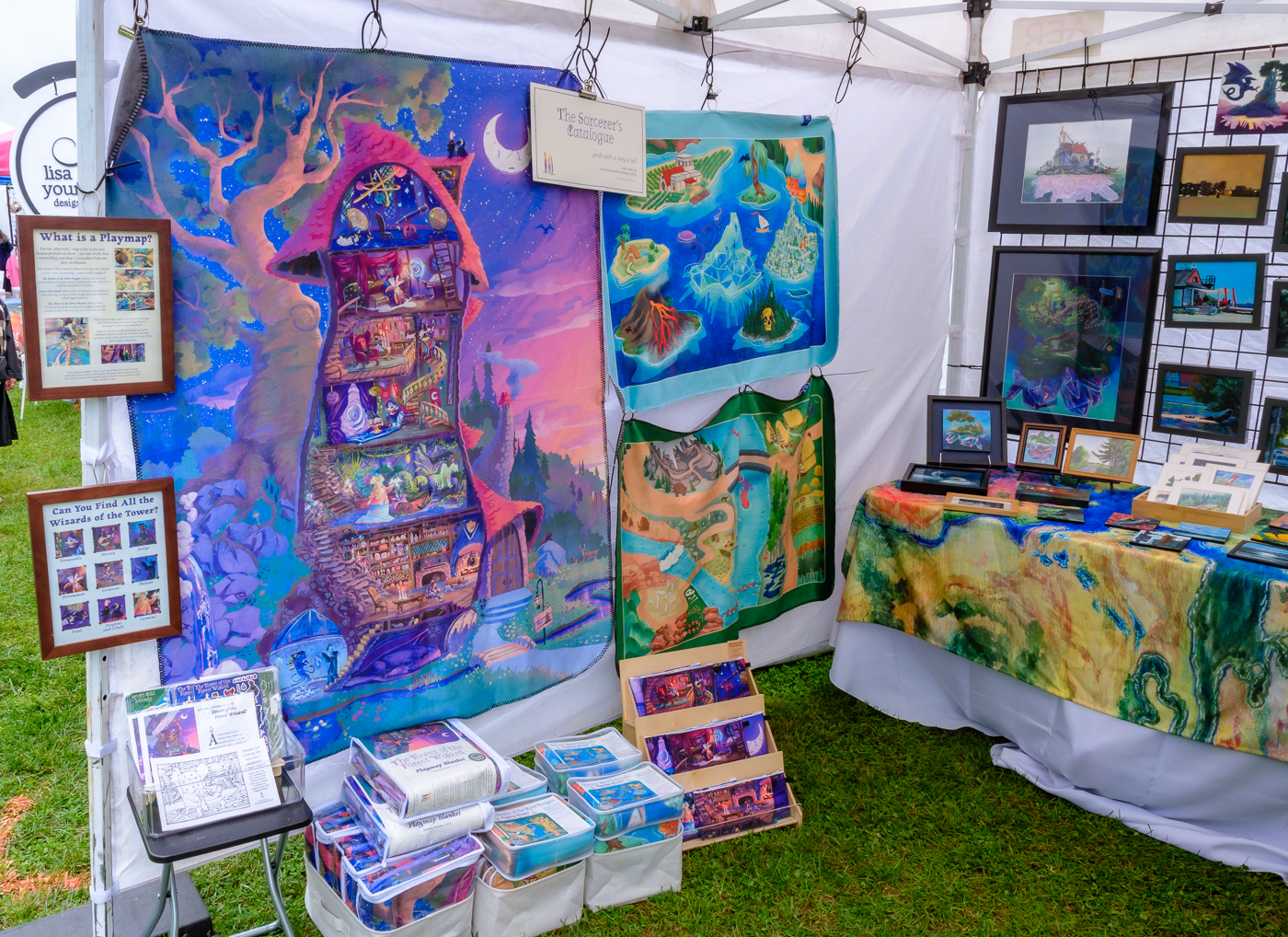
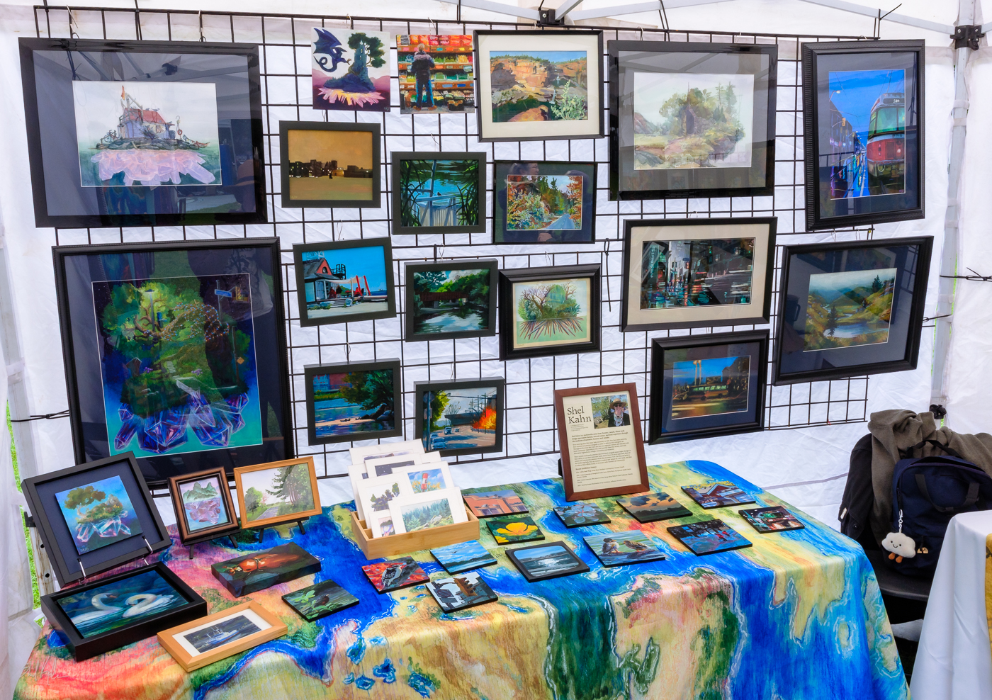
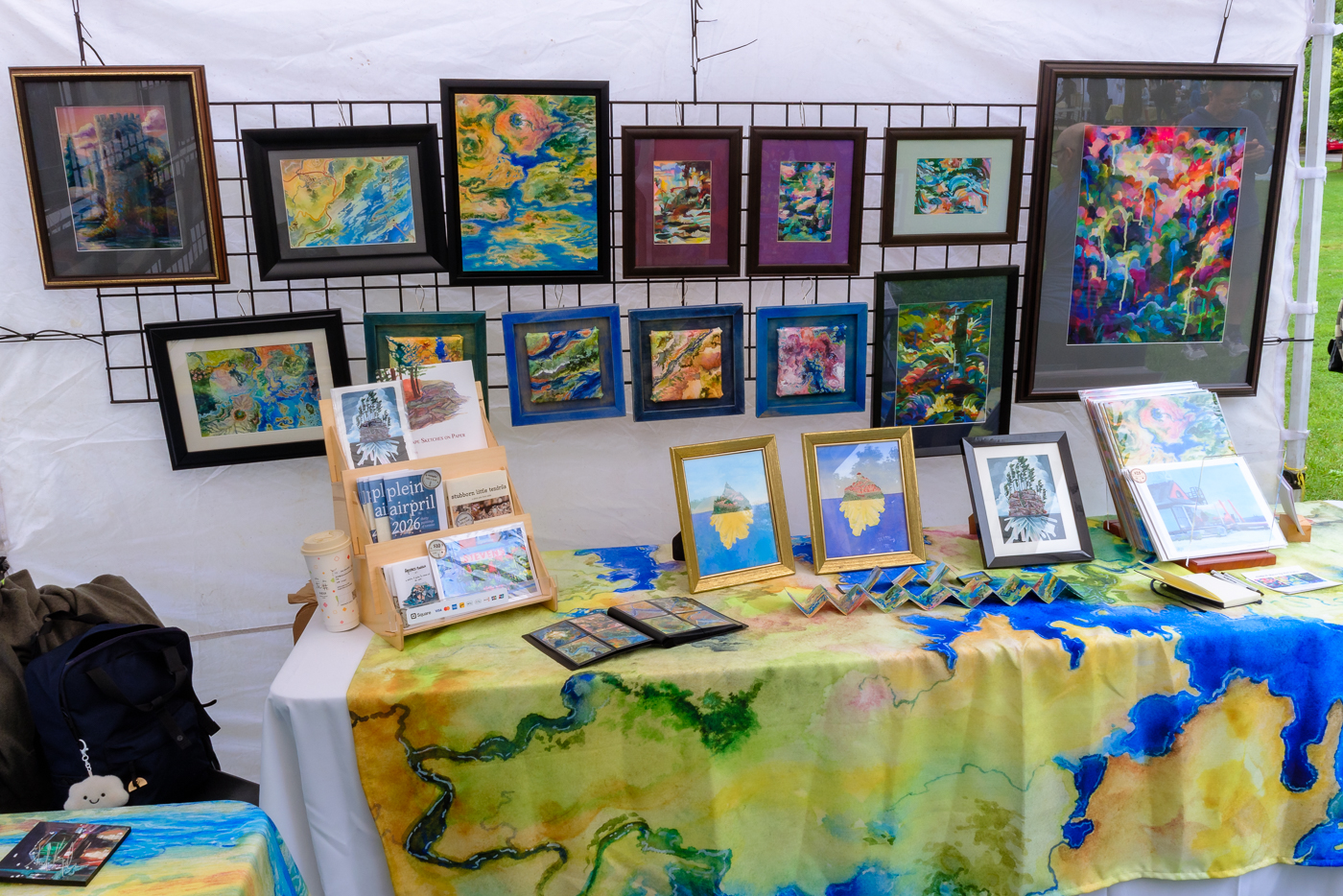
So let’s talk a bit about what this whole thing entails and how I pulled things together!
So, first one must submit an application, and then the event curators decide if you are a good fit, and they write you back and let you know. This event had us pay up front, and they refund you if you don’t get in. My first application last year was not accepted, but this year I was!
What was the difference? I think it was the Arts Market booth, honestly. Having a few months of that under my belt certainly made me look like I knew how to fill a wall with art and related items, and also meant that the local community would be familiar with me and my work already, and I wouldn’t be a complete unknown.
Once you get in, you need to source a tent. Folks who do these kinds of events regularly likely have bought their own tent, weights, walls, tables, et cetera, but mercifully instead of expecting us to all have our own tents, the event connected exhibitors with a tent rental company who could provide tents, weights, walls, tables, grids, chairs, tablecloths, and so on. This was perfect for me, and the added convenience of someone else setting the tent up for me and taking it down after was really helpful!
I chose to rent the tent, a 6′ table, an 8′ table (both with tablecloths), three grid panels to hang from the tent frame to make walls for my art, and a single folding chair. This gave me a really solid foundation to plan out my display, and meant I didn’t have to worry about dragging much full-on furniture into and out of the park!
With my structure chosen, I spent weeks drawing out display ideas in my sketchbooks, trying to narrow down what I wanted to show and how I wanted to show it. There were some big questions! Did I want to go ham on original art only, or include prints? Did I want to focus on big work or have a range of sizes? Did I want just the playmaps, or the related stickers and pencil cases and such as well? What about tote bags, scarves, other related merchandise? One thing that tabling at conventions has taught me is that it is VERY easy to have too many options and overwhelm your visitors – but with a 10 x 10′ tent, I felt like it was a different kind of balance to strike than, say, a 3 x 2′ table in an artist alley!
Decisions I made:
- I would have playmaps as 1/3 of my space, and fine art as the other 2/3rds.
- The playmaps deserved to be viewable in full, not just folded up on a table, so they were going to need to hang from the wall.
- The art needed some curation, so there were some running themes that people could notice and engage with.
- I would only bring prints or merch of art I was actively showing, not just the everything-ever-made approach.
From there I knew I needed to curate and then frame a lot of artwork, order more playmaps, and figure out how to brand my table coverings to feel in line with the rest of the display.
From showing elsewhere in Toronto this year, I know my Toronto plein airpril paintings can be a big hit, and I knew I wanted to include as many of those as I could in the show – but beyond that, I was going to need to make some decisions about what themes my original artwork would be grouped into. To do this, I sat down with my partner Matt and we played “yay or nay” with all of the original art I have in the house right now. “Yay” meant we felt it was worth framing and sharing at this show, and “Nay” meant it either didn’t feel up to my current standards OR it felt thematically off for the show itself – which meant I didn’t show any horror artwork, for example.
Once we had our pile of “Yay” artwork, I then sorted that pile into smaller groups by theme. The biggest groups were:
- Landscape painting (real, imagined, urban, wilderness, it all got grouped here)
- Crystal Islands (to no one’s surprise)
- Abstract Maps
- Abstract Painting
- Fantasy Illustration (monsters, characters, narrative scenes)
- Portrait Studies (from pinterest, from copyright free ref, from figure drawing class, etc)
- Still life studies (from life, from ref, etc)
With these piles in front of me, I decided to opt out of sharing the portrait work, the studies, and the fantasy illustration, as none were represented in my application and they didn’t feel reasonably in conversation with my Toronto plein airpril work that was my main anchor point. I’m not saying that work is bad — some of it is my absolute favourite! — but it just didn’t hang together with the curation I was doing for this show in particular, just like the horror art didn’t.
So I ended up with Landscapes, Crystal Islands, Abstracts, and Abstract Maps. This gave me a big stack of art in various sizes, and knowing that I had a lot of wall space to fill, I took the biggest works and put them aside to prioritize getting them framed, and then began digging through my basement for old family frames to see what I could refurbish for the occasion!
Thank goodness my family hordes things like photo frames, folks. I was able to source frames from my grandparents’ collection for a LOT of the artwork! Some of these frames were scuffed or dinged, so I bought sandpaper, wood filler and high quality enamel furniture spray paint and spent a lot of time outside in a face mask bringing them back to life. That honestly worked out really well, and I will probably do that for the rest of them just for myself and my own use, as it really gave new life to beautiful, sentimental, but worn down frames.
So, then I had a list of frames to use, and a list of artwork I needed to find frames for. Cross-referencing this narrowed down the artwork to what would fit in the frames I had, and left me with a list of pieces that were still in need of frames – especially some of the oddest sized works. I took that list with me to a few spots, including Value Village, local framing stores, and local art stores. After two different cab rides and one tote bag that collapsed into shreds just as we got to my front porch, I had all the frames I needed, and also, importantly, all of the matboard as well!
Because god help me, I work on paper a LOT. And, unfortunately, my past self was not very careful about making sure their artwork conformed to standard frame sizes. Which meant I had a lot of paintings that were never going to be able to be framed unless I committed to matting them, and unfortunately that meant I needed to cut a lot of custom mats myself. 15 paintings, to be specific. I DIY’d the framing and the mats for 15 paintings this month. I have developed a thumb callus from the mat cutter (you need a special tool for this by the way, if you try and do it with an exacto knife you will have a Bad Time) and a soul callus from the intense precision measuring and giant amount of math needed to make these precise and centred and nice. I never want to think about 1/32″ ever again, more the less like 7/32″. Nightmare.
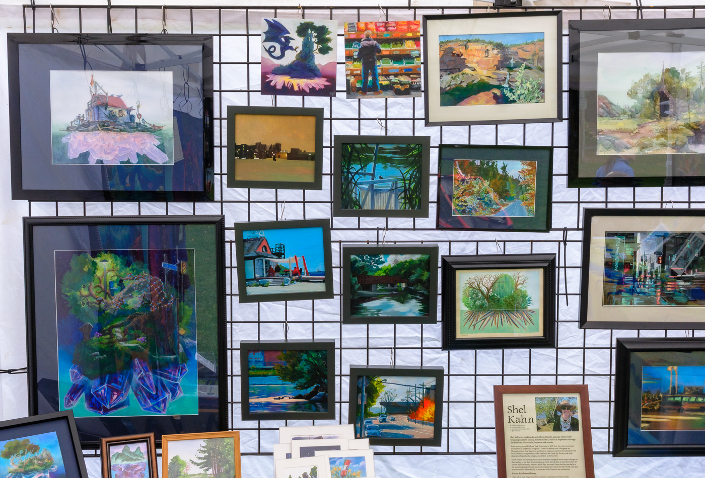
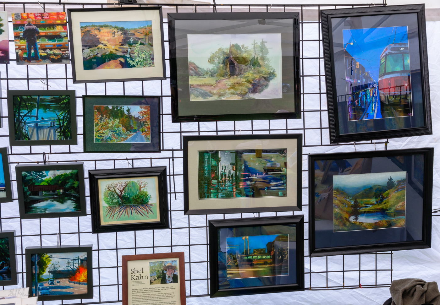
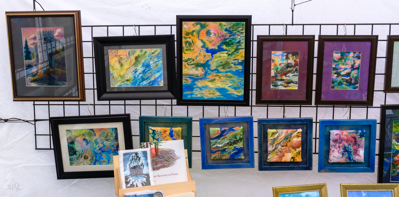
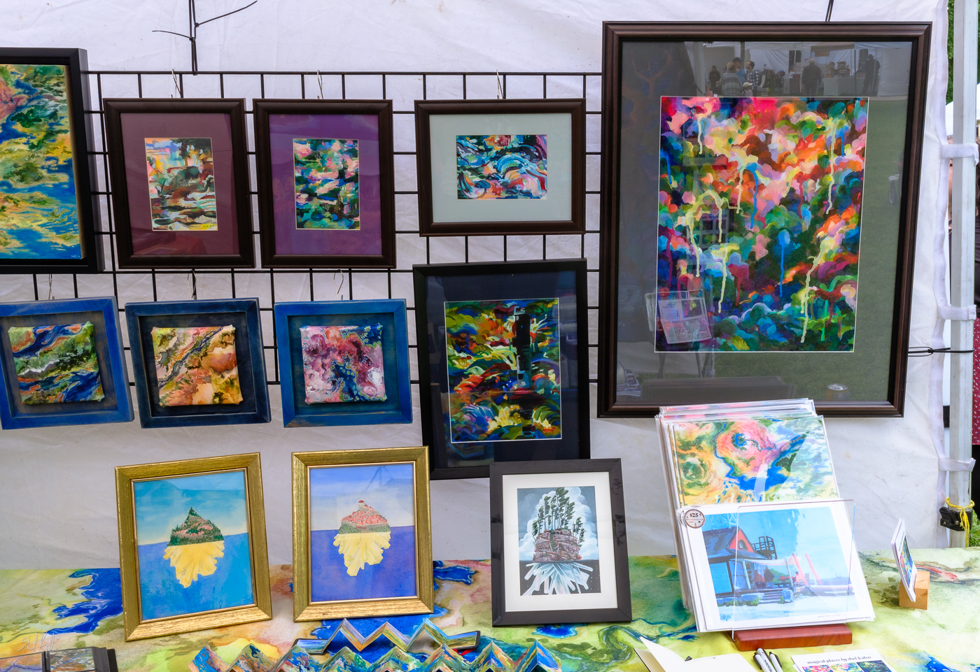
HOWEVER! This felt very very worth it when I hung them all up in the tent! I mean, incredibly worth it. Art looks so different in a frame! It’s so much easier to be proud of a painting after it’s framed, I super recommend it, especially if you’ve been having a Complicated Relationship™️ with your work recently.
Mercifully I did have a few pieces that didn’t need mats – they either fit nicely into existing frames I had (miraculously), or they could be float framed, or they were painted on cradled panel and just needed their edges finished and a nice sealer applied. And I had the six professionally framed paintings from the Sunnybrook show, and I had the two framed pieces from the Northern Contemporary show, and I had all my finished plein airprils with their varnished and finished edges.
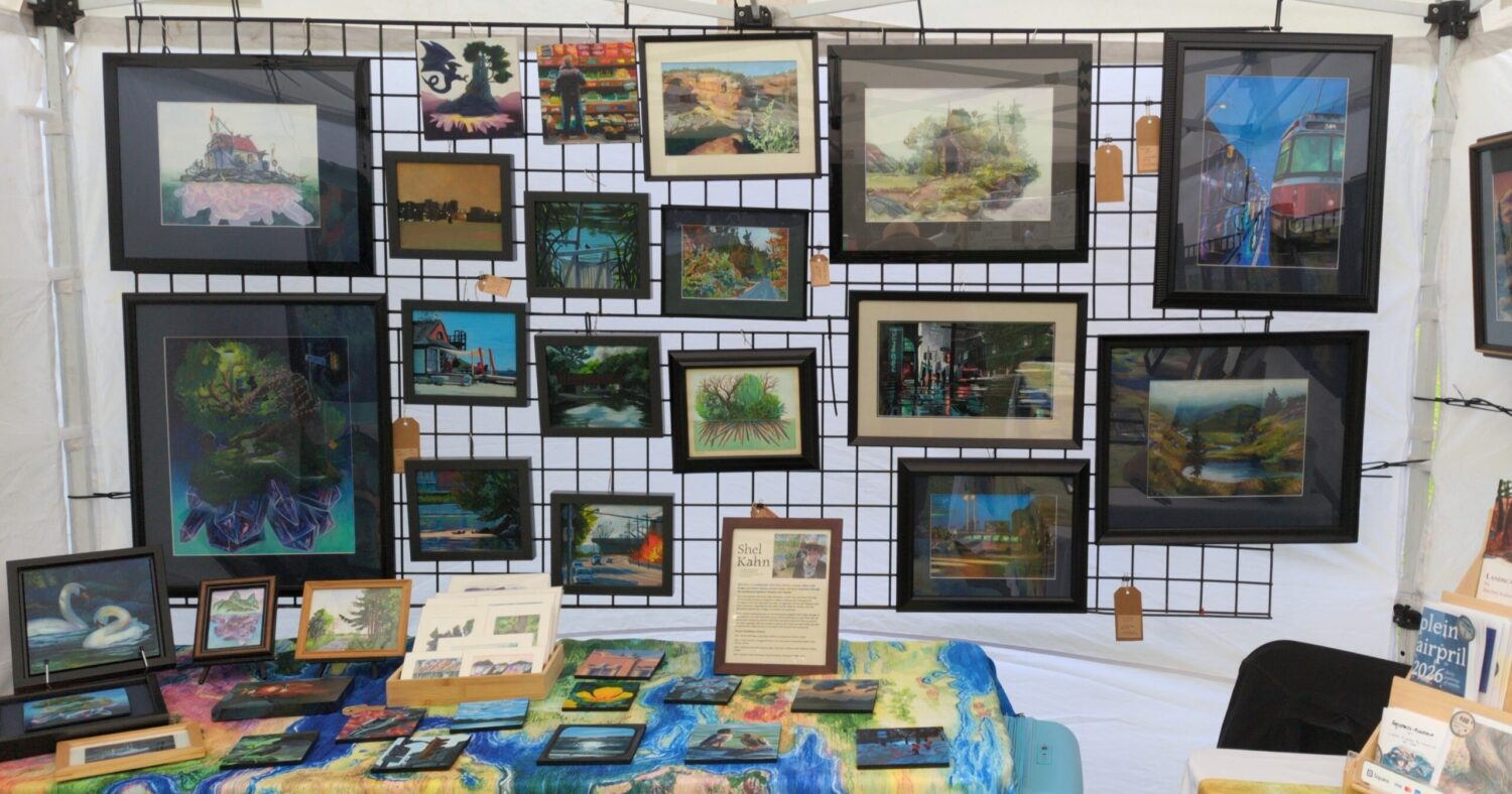
So between all of that, I had more than 50 pieces of original art, ready to hang or display, ready for my tent!
Did that make me feel better about it? Not really – turns out it’s possible to worry about having too MUCH stuff, if, say, you’re feeling dedicated to worrying in the lead up to a show. Which unfortunately it turned out I was.
HOWEVER. A stack of framed art is an undeniable accomplishment. Hell yeah. Flex those weirdly specific arm muscles!
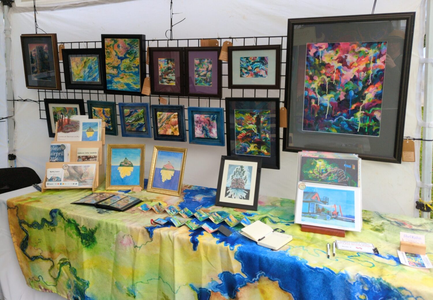
Beyond art on the walls, I also brought smaller originals that were matted and bagged, and even smaller originals that were collected into a portfolio, and even SMALLER originals, ACEOs, that I collected into an archival trading card folio. I don’t have the final count on all of those but I think I was pushing 100 pieces of original artwork. Frankly this probably was too much, but making sure that 50 of those were framed and on the walls meant my tent had a lot of presence and I do think that was worthwhile!
So then I had to figure out my prints! I only wanted prints of work I was exhibiting, so that ruled out a lot of my favs from my digital art practice, but in the end I think narrowing the field was helpful.
I brought my remaining art postcards, most of which were crystal island prints, and I brought my stack of Plein Airpril digital prints, all on 8.5 x 11″ paper. Then I decided I wanted some nice giclée prints for the occasion, so I picked three of the larger paintings I’d framed and prepped print files, and I ended up working with Canadian Imaging Solutions to make a run of beautiful 11 x 14″ fine art prints of them:
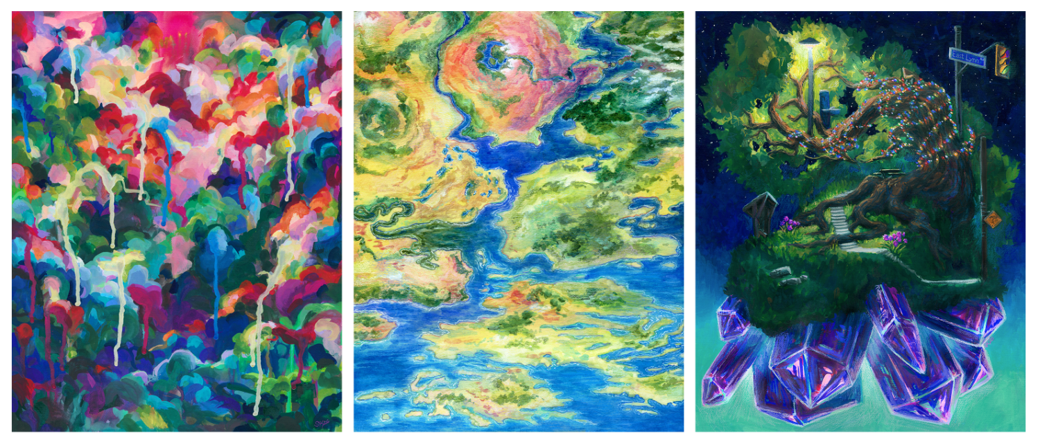
Fine art prints, larger ones especially, have to be a bit of a price jump from digital prints, and I worried that these wouldn’t move, but it turns out having a beautiful and luxurious and significantly more affordable alternative to a large original painting is absolutely worthwhile!
So then I had playmap decisions to make! I ordered more stock of all three designs – the Tower I ordered in a medium size, and the other two playmaps in smaller sizes, so we had a range of prices and sizes available for folks. I also restocked my playmap bags – you can see they’re all safe inside zippered pouches now, and that felt extra important for an outdoor fair like this.
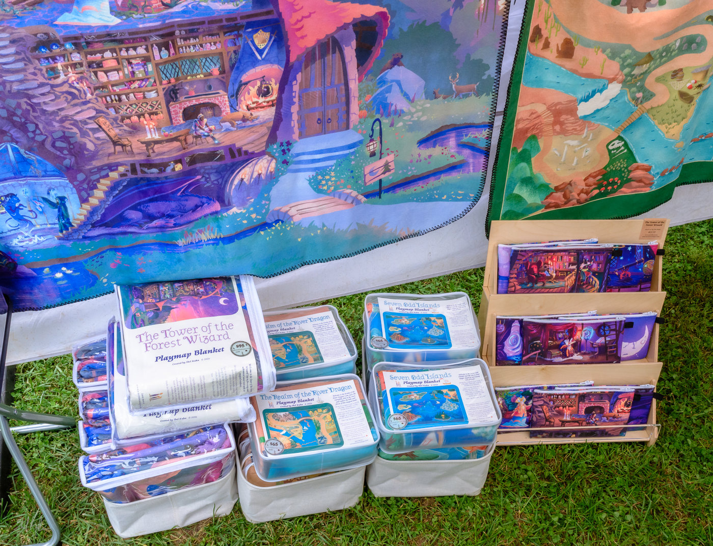
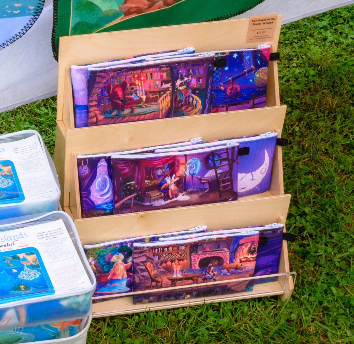
Since I was also going to let myself do a little bit of playmap-specific merch, I ordered a sample run of wizard pencil cases! They’re canvas pouches, and each one has a different wizard and their room on it, and on the back they have the bridge and sign welcoming you to the tower of the forest wizard, and I think they turned out pretty darn cute! I’ll get them up in my online shop in a few weeks, and put the remainder of my sample run in the Arts Market for locals.
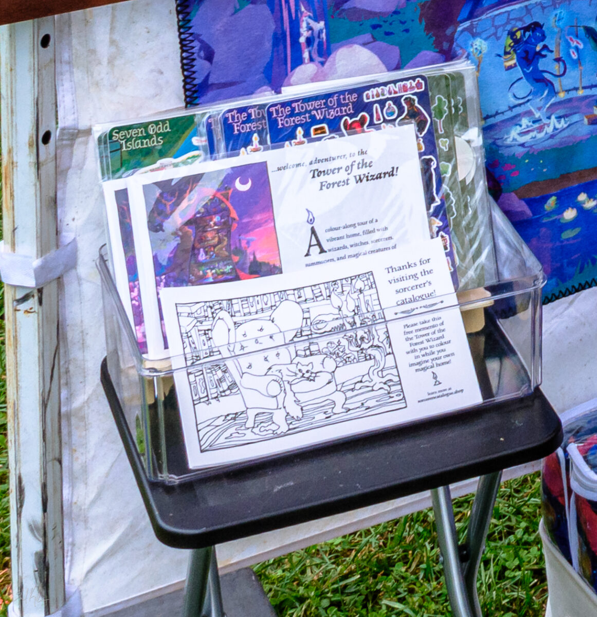
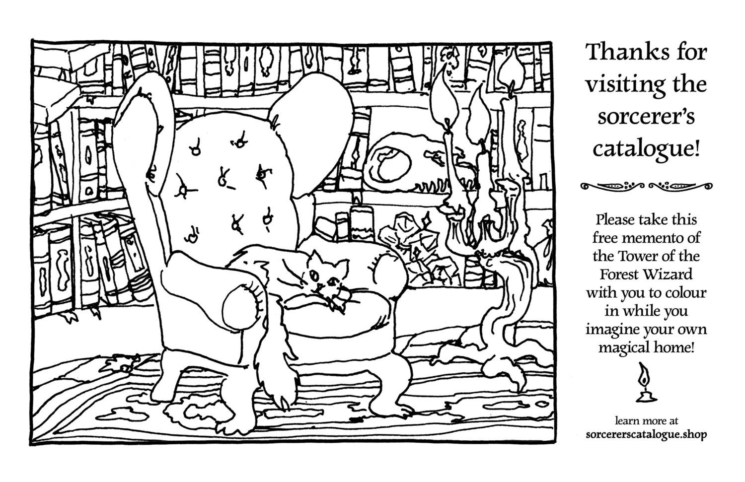
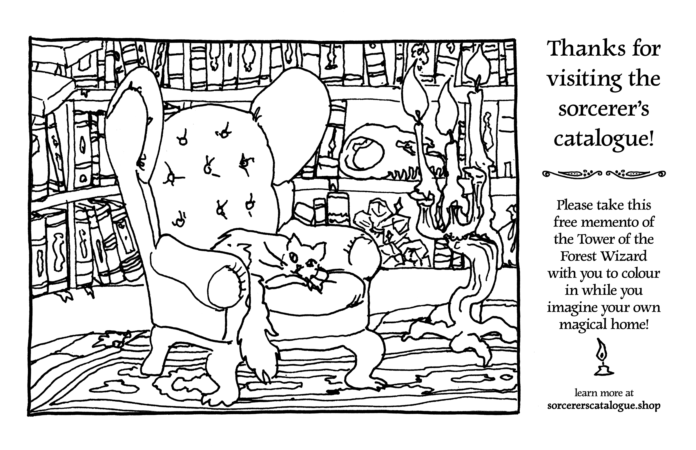
I also included my playmap themed sticker sheets, and the Tower of the Forest Wizard colouring pack, AND I made a free colouring sheet for folks to take home! If you would like to print one off for yourself, here’s the image – click to download:
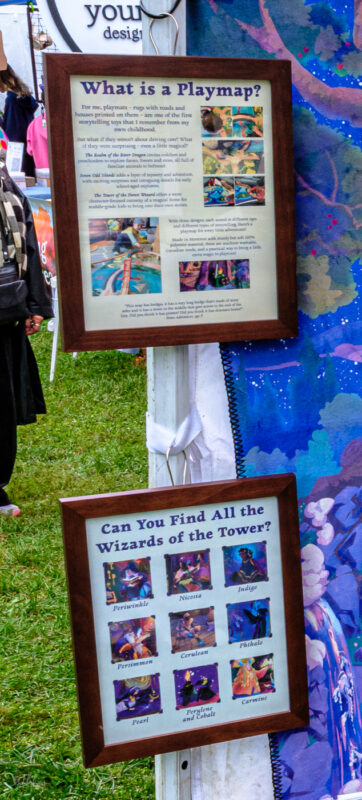
The other thing I did that I think made a big difference was I made two playmap info signs – one for adults, where they could read about what these are, how they work, what kind of washing instructions they have, and so on; and the other for kids, to introduce all the wizards for them to find. This was magical, and I am so glad I did it, and I will for sure be bringing these signs with me to all future showings of these playmaps! They helped a whole lot.
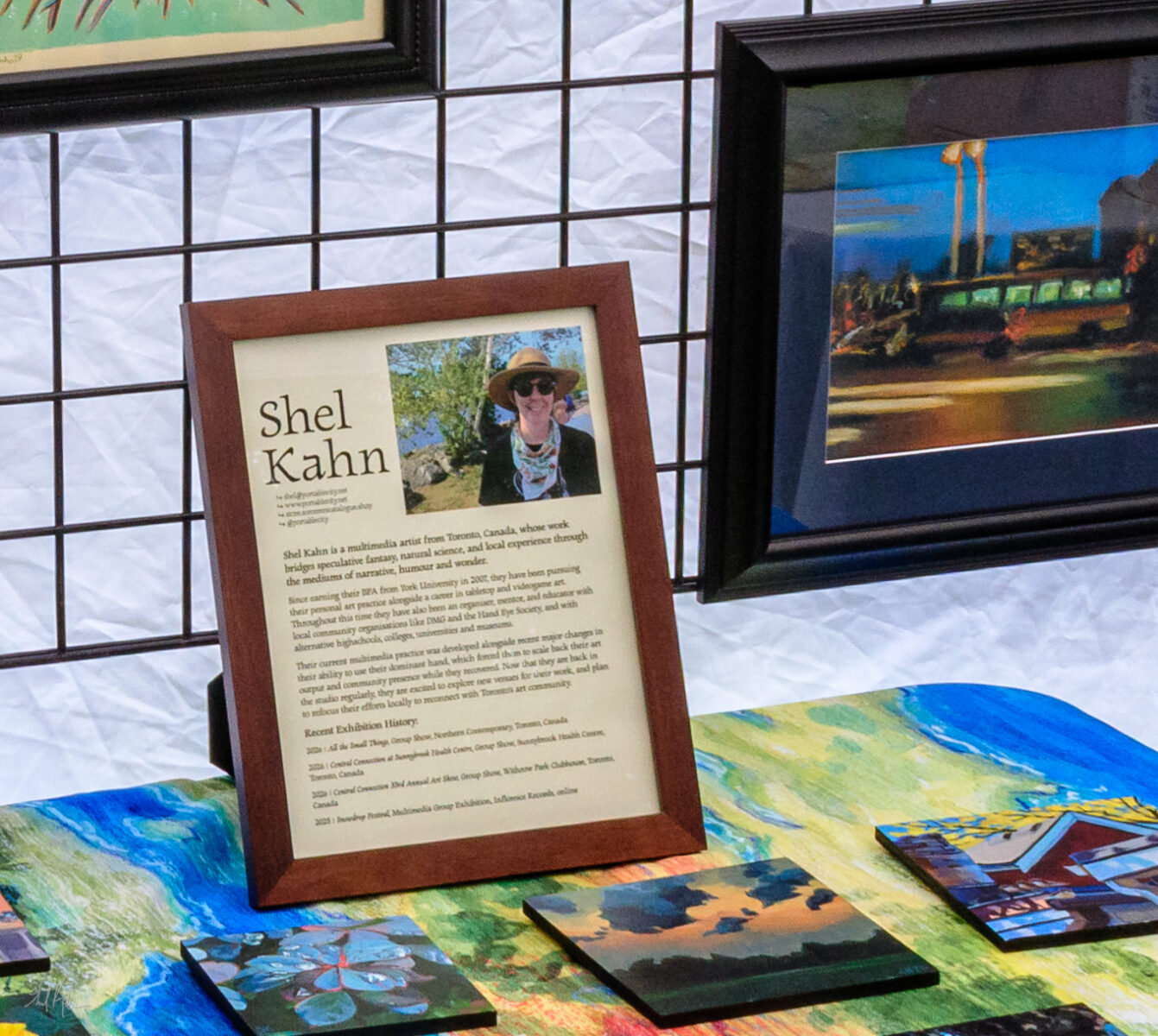
I also made an artist bio sheet, so folks who have never heard of me can get a little context for everything they’re seeing:
And finally I wanted to make sure my booth was branded nicely, so I chose two of my abstract map paintings and turned them into large tablecloths, which I think worked out extremely well! They were colourful and cheerful and directly connected to the artwork I was showing, and a great conversation starter as well!
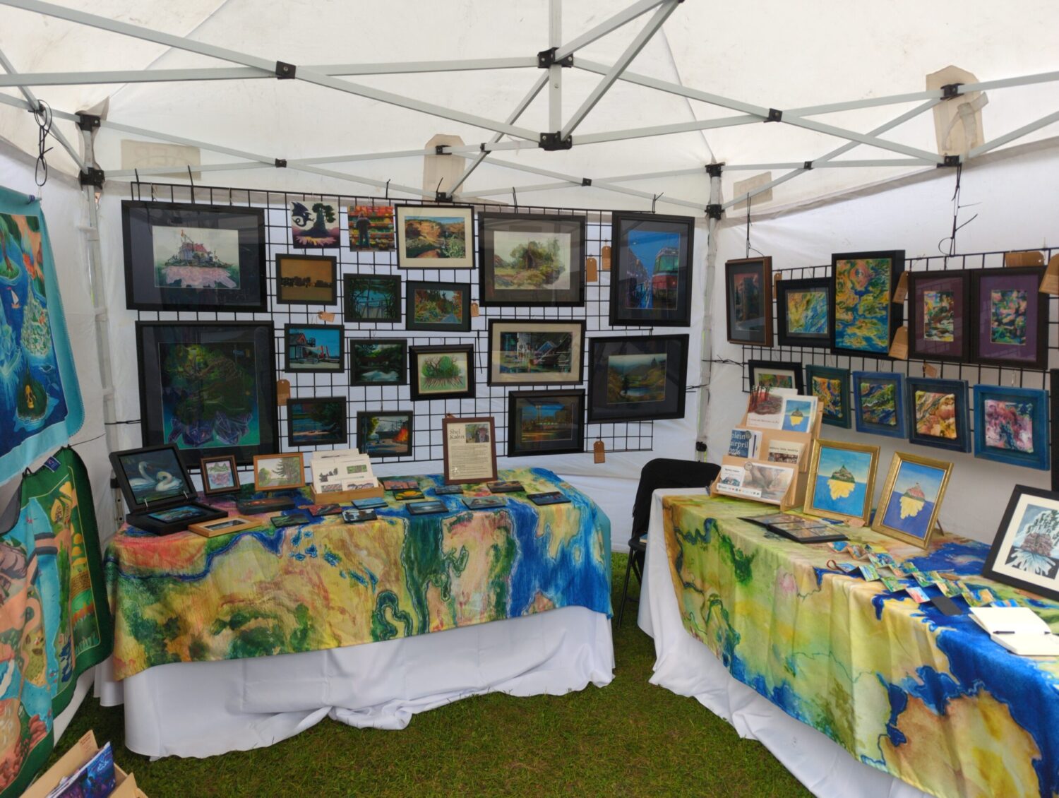
Beyond the tablecloths and the gridwalls, my display tools included:
- the two wooden bookshelves I have for comic conventions, which held prints and zines and pencil cases
- various table easels to hold artwork upright if there wasn’t room for it on the walls
- a record holder to let folks easily flip through the prints
- a drawer organizer to let folks easily flip through the matted and bagged originals
- a whole lot of thermal sticker price tags
- a whole lot of kraft paper hang tags in two sizes
- 48 shower curtain hooks to use as s-hooks and more when hanging things
- a 100 pack of heavy duty zip ties to hang the gridwalls, and everything else frankly. these were absolutely indispensable and I almost used all of them!
- structured fabric baskets for the playmap stock so it was off the ground but still at kid level
- a folding stool for the kid-oriented freebies and merch to sit on
The final thing I grabbed, right at the last minute based entirely on a recommendation from a few different vlogs I watched, was a folding director’s chair:
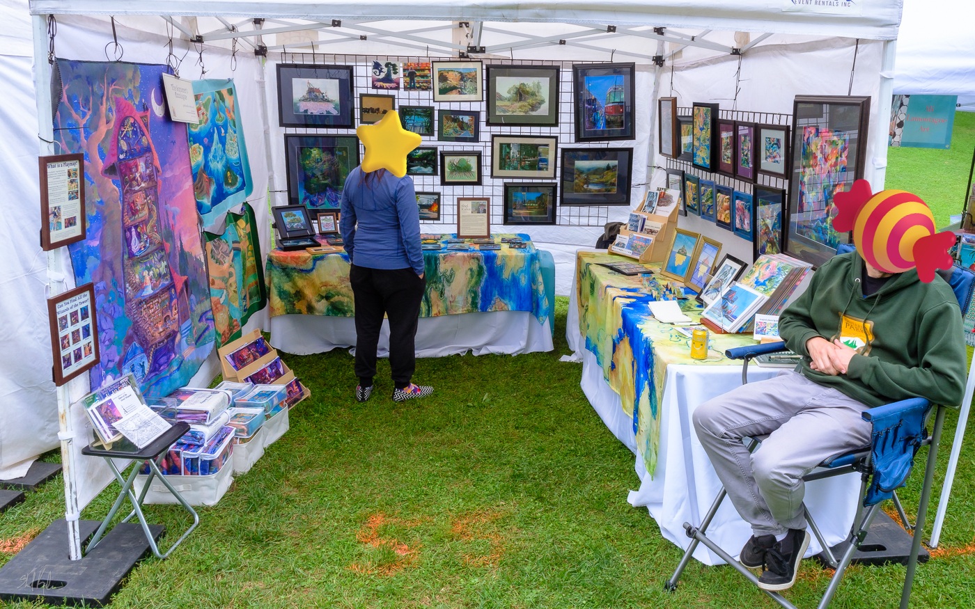
This put the seated person at eye level with standing visitors, making it way, way nicer to have conversations without standing the whole time! As a person with a fair amount of fatigue and pain, that was absolutely necessary for me and it made the weekend much more pleasant. I’m honestly considering dragging it to indoor conventions in future as well, as sitting often reduces how much I can interact with folks across my table, and I am sure this chair would improve things! Unfortunately it does way twelve million pounds, especially compared to a normal folding chair, but for a multi-day show I think it could make a huge difference for me to have on site.
So that was how I pulled it all together! There was a pretty big overhead cost, not just the event fee and the tent rental but all the framing supplies, the display supplies, the chair, and so on. Some of this is a one time cost that I will be able to avoid in future by reusing all this great stuff, and that’s a relief, but other things, like the zip ties, are going to get used up each time, and that’s just the way of it. With the increased cost and this being my first time doing these, I really didn’t want to promise myself that I would make it over the profit margin line this time – it’s a big number and I had no idea what I was doing here, and I worked hard to adjust my expectations as best I could.
So it was a really wonderful surprise to find out that I did actually sell enough to pay off all the setup fees AND the stock fees! The event paid for itself AND it paid for all the leftover stock I’ll be able to bring to future events around the city, and to list in my Arts Market booth for the holiday season! That’s amazing, and I’m so grateful to everyone who came out and said hi, or bought a print or a painting or a playmap, or brought their kids or their parents over to see the booth!
At the end of Sunday, the organizer Jen came over to introduce herself and thank me for joining them this year, and she told me that they had received a notable amount of compliments on my booth from attendees this year! I didn’t outright win any people’s choice awards or such, but I was apparently in the top ten? Which is a lovely feeling and I’m grateful she took the time to let me know! I’m going to hold onto this as I go back into the studio now and get back to making the art for a bit, and hopefully I’ll get to see some of my local community again soon at some holiday fairs!
So, question, have you done an art or craft fair like this before? What are your top tips as an exhibitor if so? If not, have you attended one? What made it great for you?
Thanks for reading! See you on the internet!
17 responses to “Adventure Report: My First Art Fair!”
-
Appreciate you sharing, I’m looking to do more events in the next year and I’m feeling a little at sea with it, so rundowns like this really help. 🙂 (Also open to recommendations for events to check out if you have any, beyond the couple big Toronto cons I’m having a surprisingly hard time!)
-
This is probably my biggest announcement this fall – I’m going to be exhibiting as part of Toronto’s east end art in the park fair!
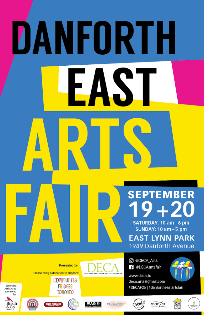
September 19th and 20th, Toronto folks can find me in tent #55 in East Lynn Park! Weather permitting, I’ll have a huge range of originals that have never been available for purchase before, as well as a wide range of art prints, posters, postcards, and of course my playmap blankets and related goods.
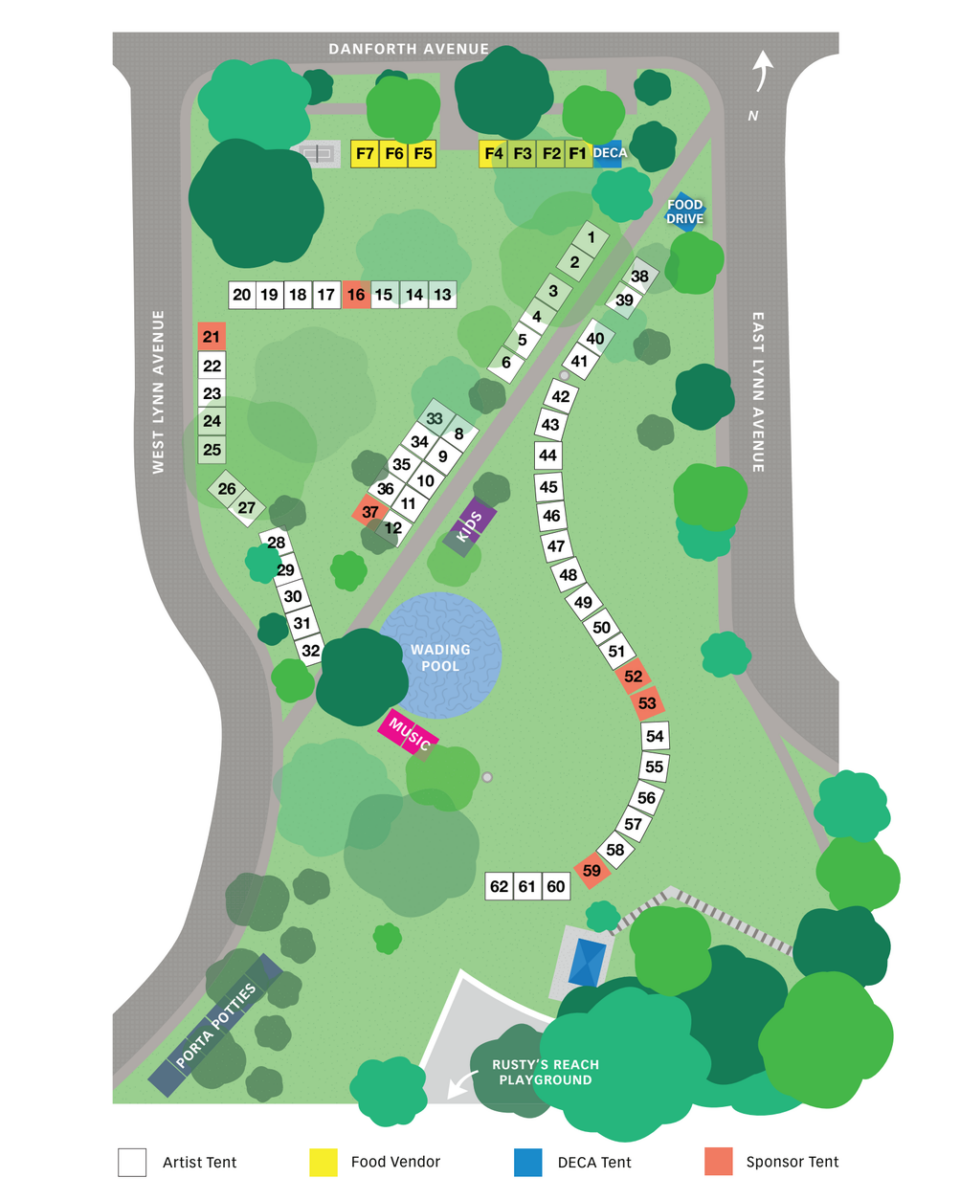
I’m thinking of doing some demos as well, maybe I’ll bring the easel and do some quick plein air studies of East Lynn Park for folks!
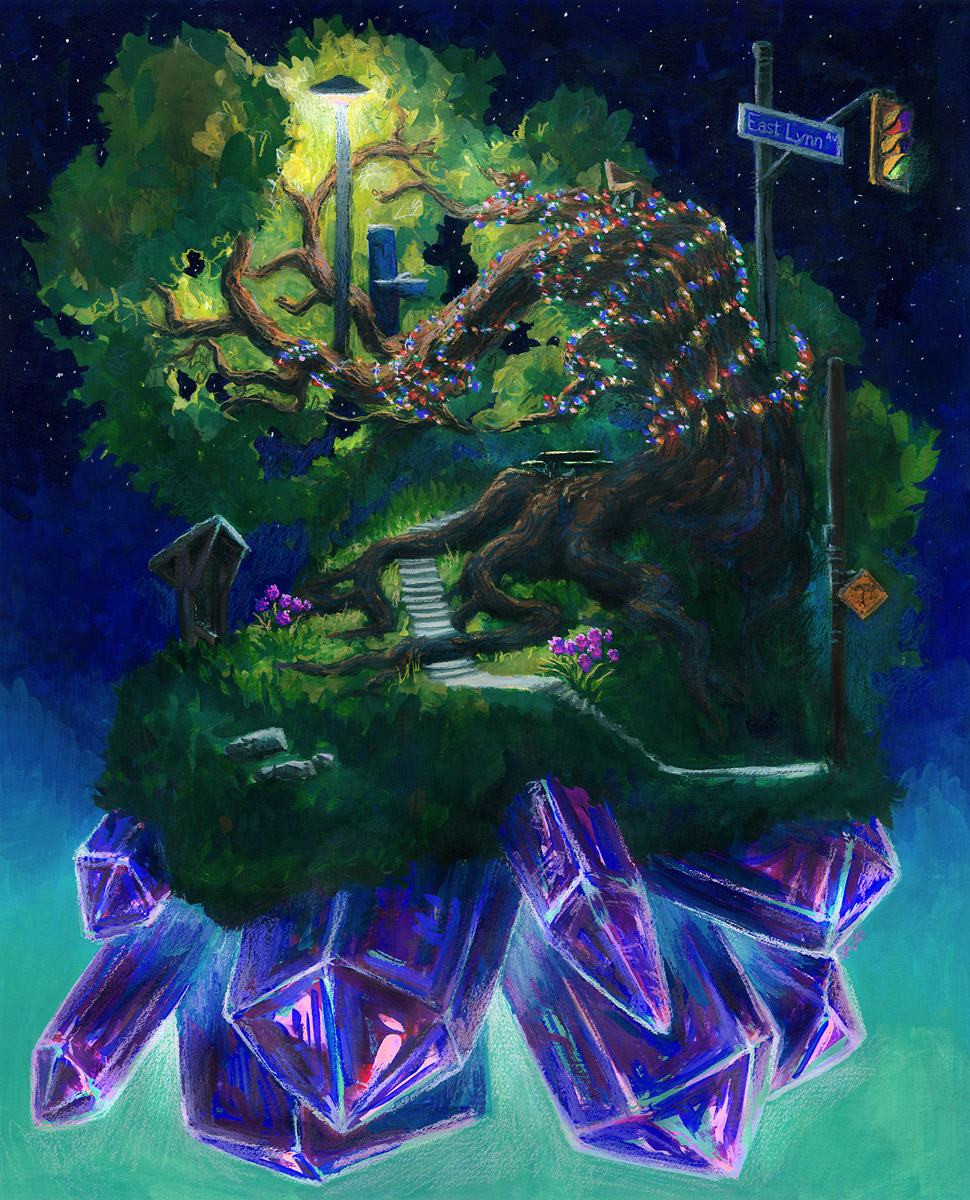
Speaking of, I am so excited to show off the large original of my East Lynn Crystal Island painting! I’ll be getting it a nice frame for the occasion and I’m excited to hear what the locals make of it:
Finally, if you are planning to come out for the fair, please say hi! And if you know you’ll be there and have your heart set on a particular painting of mine (the original or a print!) you should let me know in the comments, or via email! I can make sure to have it there for you to see in person if so, and that would make me so happy to do!
-
Short notice but! I have five pieces hanging in Northern Contemporary‘s All the Small Things show, featuring artwork under 12″!

I’m showing three oil pastel pieces and two gouache paintings:

Swans at Dusk
8 x 8″, oil pastel on cradled wood panel, framedWildflower Crystal Island
6 x 6″, oil pastel on wood panel, framed

Produce Glow
8 x 8″, oil pastel on cradled wood panel, exposed finished edgesGrapevine Beetle
8 x 6″, varnished gouache on cradled wood panel, exposed finished edges

Dragon and Island in Pink
8 x 8″, varnished gouache on cradled wood panel, exposed finished edgesI’ve been trying to participate more in local art shows and events this year, because deadlines are a really great tool to get things done, and because otherwise I am not sure I would ever frame any of my work – and it’s so cool to see my artwork properly framed! It really does change it from an object I am personally very, very familiar with, into something special and new and a little magical! I’ll try and document more of the framing process next time I do some at home, because it’s certainly a gauntlet all on its own, but in the meantime, if you’d like to see these five pieces (and a huge host of other amazing artwork) in person, make sure you swing by Northern Contemporary before September 8th!
-

Heads up Toronto folks! As part of the Central Connection art collective, I have six paintings from my 2026 Plein Airpril portfolio hanging in the halls of Sunnybrook Health Sciences Center in Toronto until September 18th! They’ve been beautifully framed (shoutout to Victor Gallery who were hugely helpful with my custom panel sizes!) and they’re six of my favourites – and six of the largest, at 7. 5 x 9″.


I hope they’ve added a little urban magic to the days of staff and patients of the hospital; it’s an honour to get to show work in a place that’s been instrumental in helping me be able to make work again!
Yeah maybe I should write a bit more about that, hey?
So throughout my radial nerve saga, after the surgery itself, I did checkups with not just my surgeon but a whole team of specialists, at Sunnybrook, in their plastic surgery department. (Side note: peripheral nerve surgery is a type of plastic surgery! Who knew! I mean surgeons, obviously, but still, it was news to me.) There were times where I’d be getting an assessment of my nerve regrowth via an EMG machine, and something like eight medical professionals of various stripes would be gathered around discussing what they saw. Someday I’ll talk about the sheer vertiginous surreal absurdity of that situation, but until then, suffice to say I know Sunnybrook spent a lot of time and expertise on making sure I got back as much function as possible in my drawing hand, and it’s pretty magical to know that paintings I did as part of my recovery are now hanging in its halls.
If you encounter them before they come down, let me know how they look!
One response to “Sunnybrook Art Show”
-
these paintings are all so beautiful, i love the first one especially and keep coming back to look at it. i’m so glad that you’ve recovered enough to comfortably make art again! the doctors did amazing work and it’s so cool that you get to pay them back in whatever little way you can. ❤
everything you draw makes me so happy.
-
-
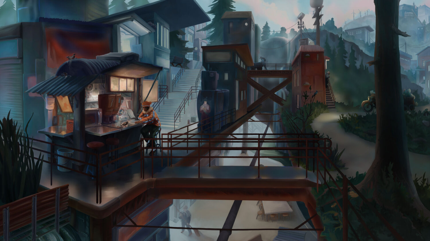
A rough concept developed to explore a less utopian solarpunk setting, one where complexities of urban development and resource extraction and labour dynamics haven’t been fully solved, but are still experimenting with integrating with nature in new ways.
-
Over the years I have done a wide spread of illustration work for Call of Cthulhu, focusing on realistic period pieces with a strong horror tone.


-
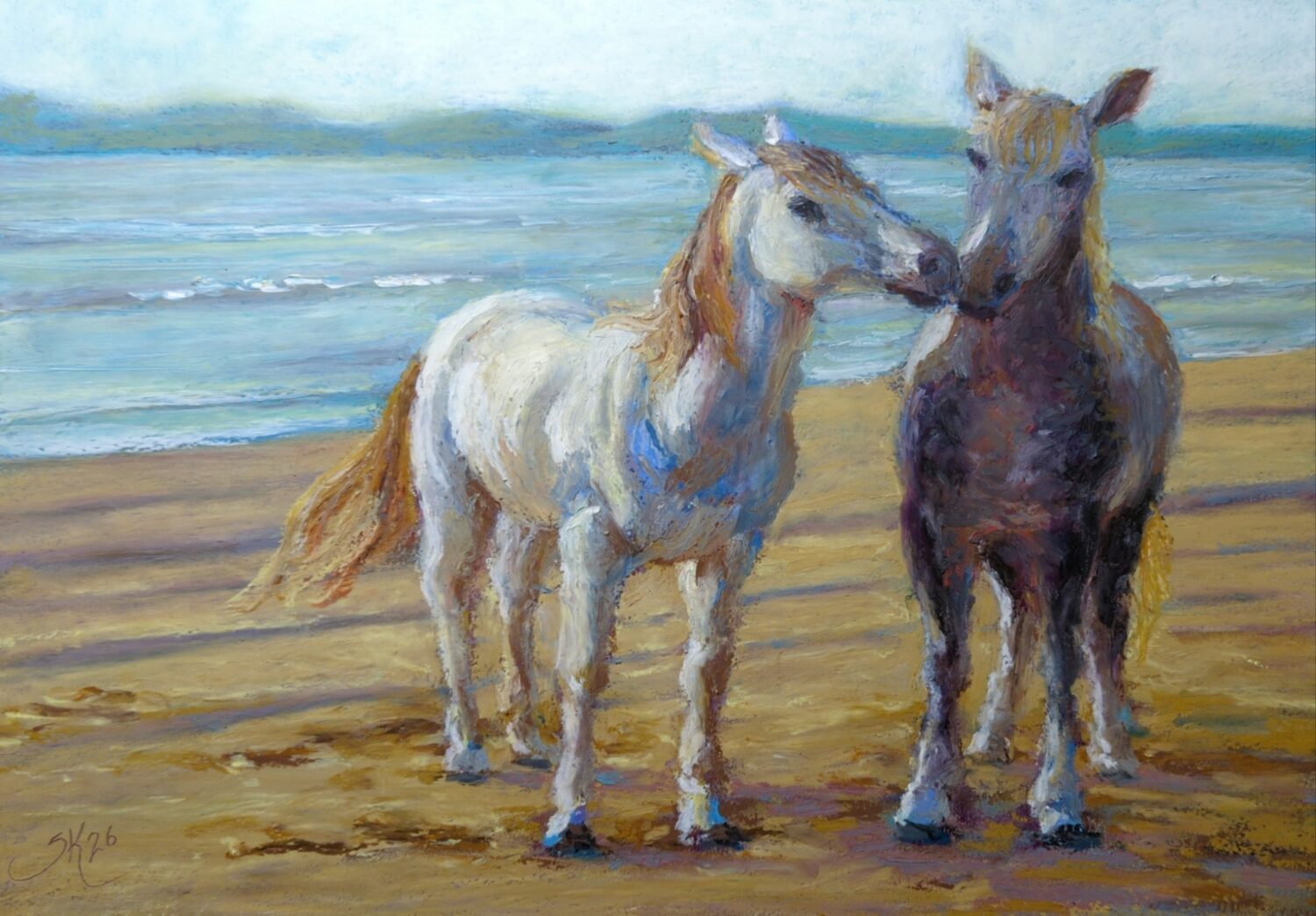
After my adventures in soft pastel and gouache this year, I’ve been feeling the urge to go back to oil pastels, especially with what I know now about different paper and texture and how it changes the soft pastels. this painting is a test run of some of the things that I learned about soft pastels being brought into oil pastels, and especially on that level I think it is success.
One of the tricky things about both mediums is that you can’t pre-mix the color before you put it on the canvas. If I have red and blue pastels, and I need purple, I can’t mix red and blue on a palette and see the purple I get before applying it – I have to do the mixing on the page itself and be prepared to modulate it on the page until it hits the exact purple I want. that’s really counterintuitive if you come from painting, especially acrylic or oil painting where mixing on the canvas really just isn’t standard practice. it’s much closer to glazing watercolors than anything else, I think.
When I started using oil pastels last year – or maybe the year before? – I spent a lot of time watching a few different people on YouTube share their process. one of them was Yolanda Blazquez, who does beautiful, very gently and softly blended oil pastel portraiture. I went back this week and rewatched a lot of her videos, and was able to get so much more out of them this time around! it’s wild what context can do!
Her process of building up pigment in many layers, and using the pastels, her hands, and paper stumps to do the blending, makes a lot more sense after I’ve spent half a year getting to know soft pastels as well. I wonder if this is because she herself also uses soft pastels, and if her process in both mediums is a result of the influence of both mediums? either way, while I started this painting with the intent of figuring out how to handle the transparent and opaque variety of my senellier oil pastels, because of the limits of that range and the high key of the photos i chose to reference, it actually became an exercise in figuring out Yolanda’s mixing methods. And now that I have those figured out – or, at least, I’ve dipped my toe in them – I feel a lot more confident tackling things like portraiture myself.
I’m starting a character design workshop this week, it’ll run for the rest of the summer, and while I’m doing that I want to spend some time doing more academic studies of the face and hands, and I think it would be fun to do that in oil pastel! it might also be kind of absurd. we’ll find out!
Also, on the subject of horses, they are hard to draw! I have been working on drawing horses since I was a kid and they remain difficult. I’m not unhappy with this piece as a final, as long as I never look at the reference again. but that is just the way of it with some subjects. further practice is always needed.
21 responses to “Oil Pastel Horses and Mixing Colours”
-
It’s nice when horses take you on a journey.
-
-
Sketching, Lifedrawing and Studies from Early Summer
posted:
updated:
posted to: arttagged: abstract, animal, dragon, fantasy art, gouache, landscape, lifedrawing, newfoundland, oil pastel, painting, portrait, sketchbook, soft pastel, structure, traditional art, watercolour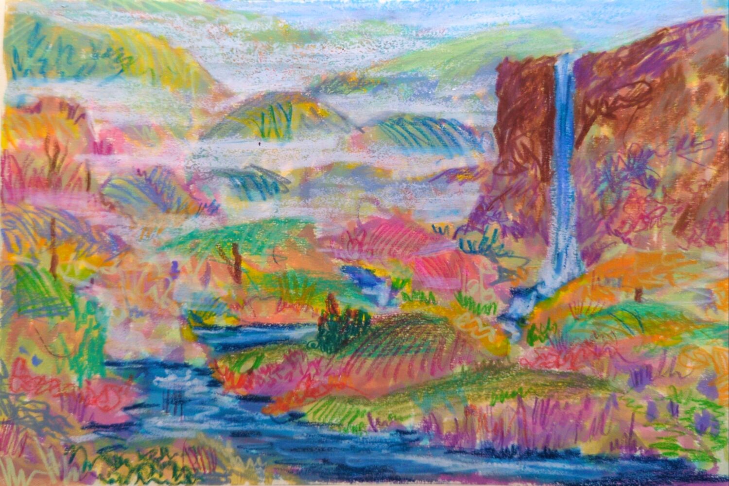
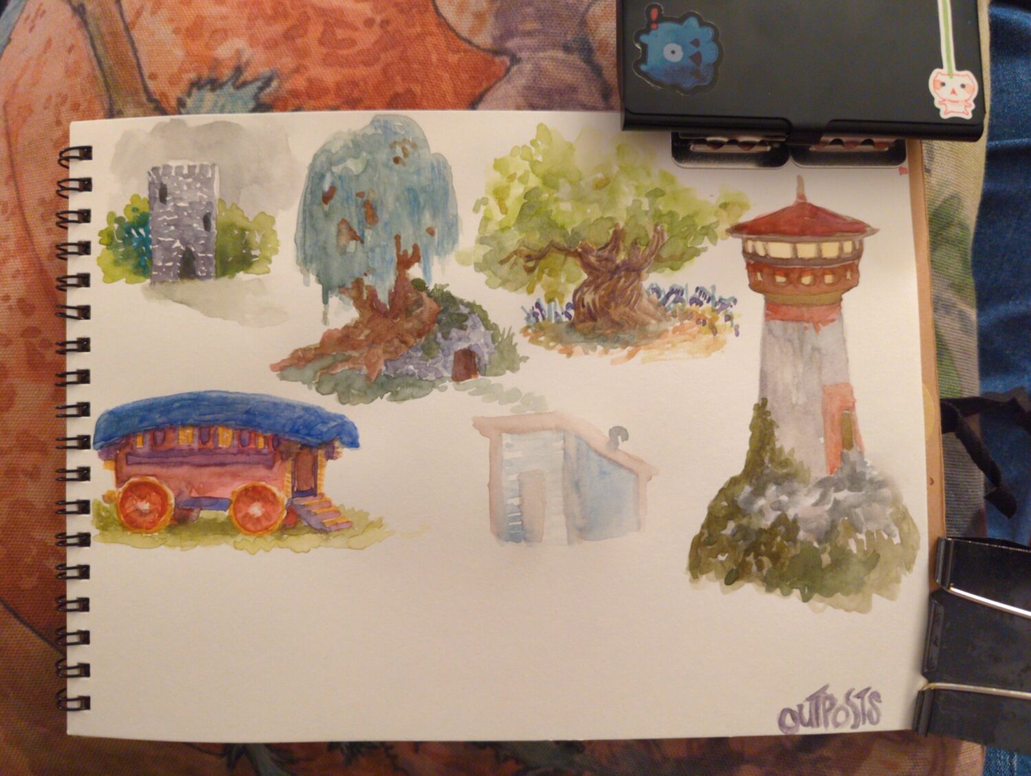
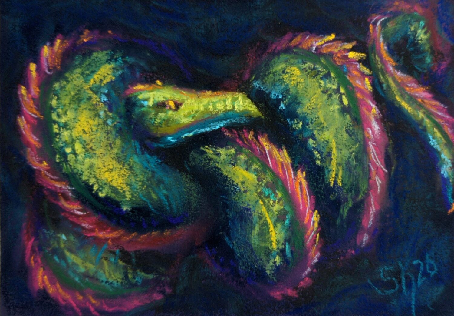
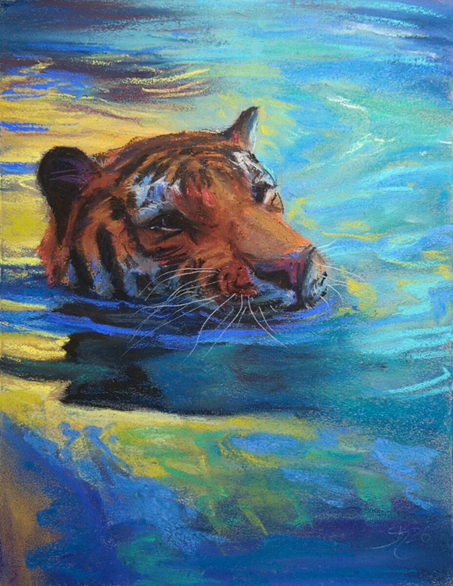
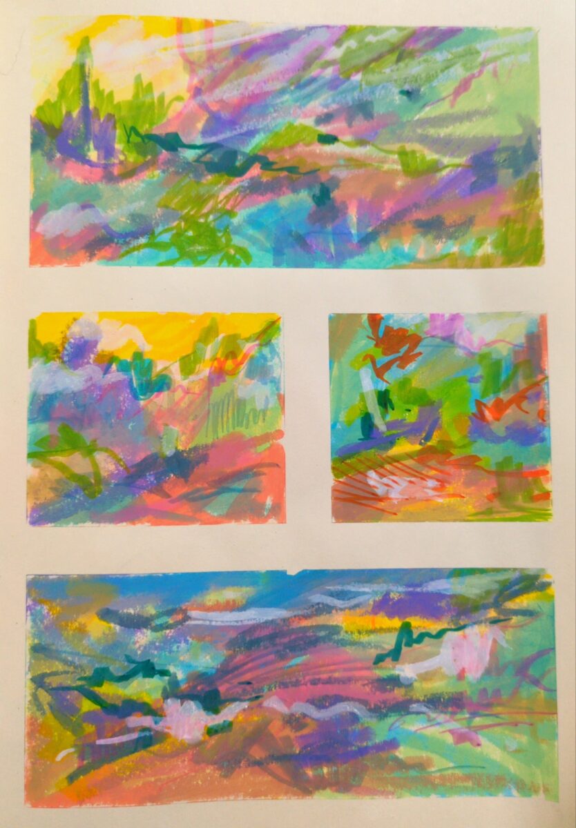
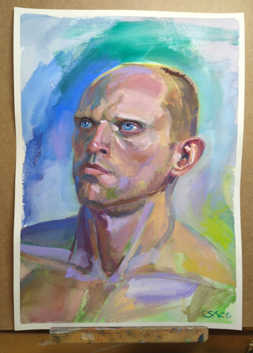
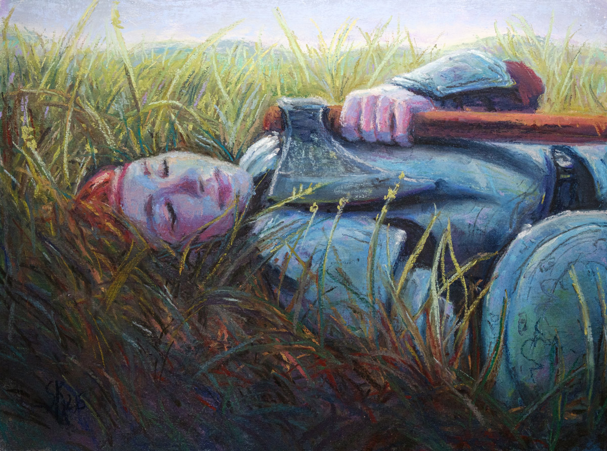
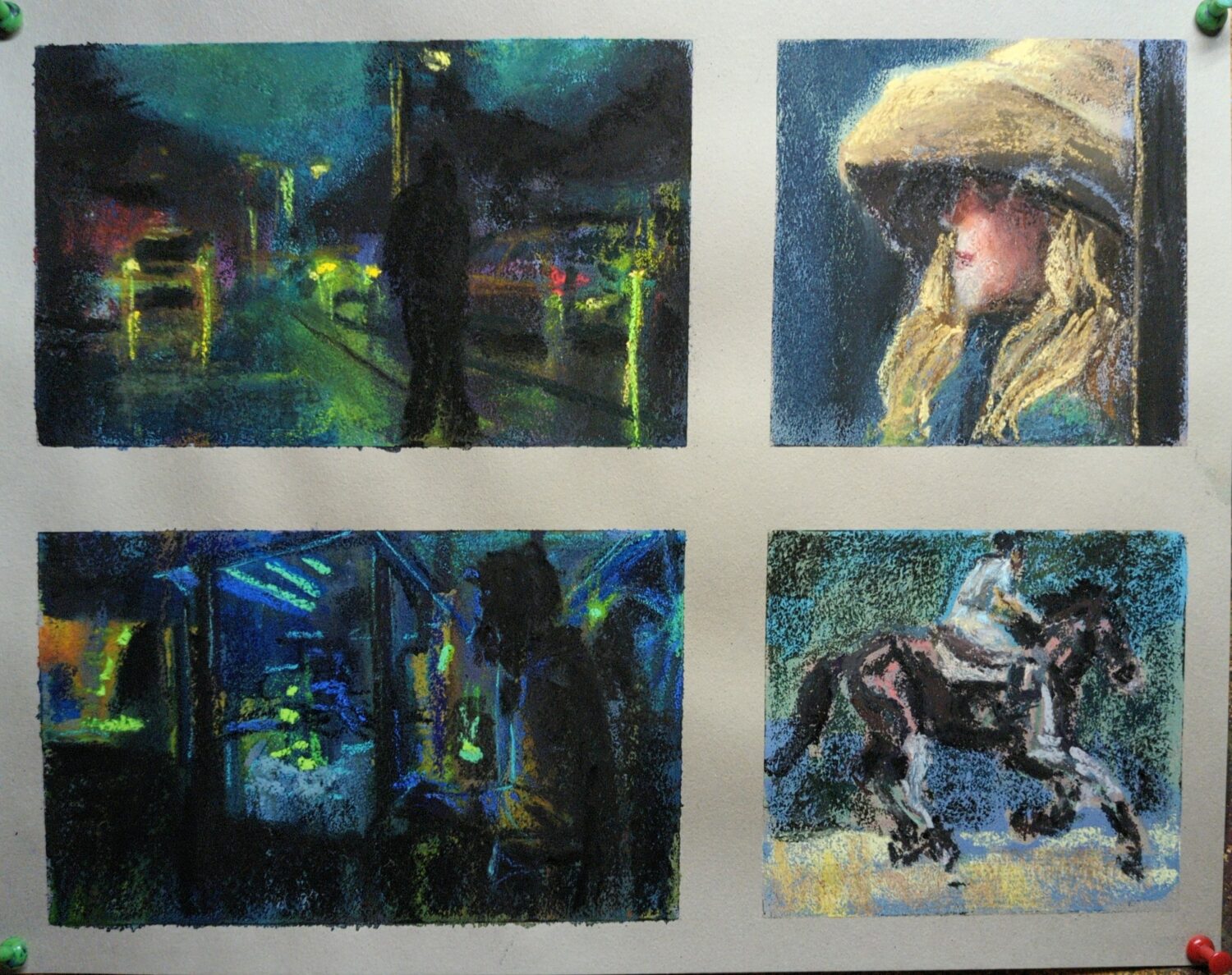
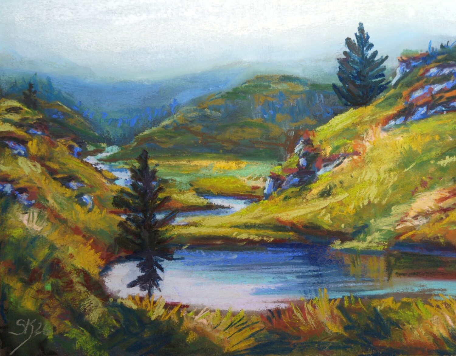
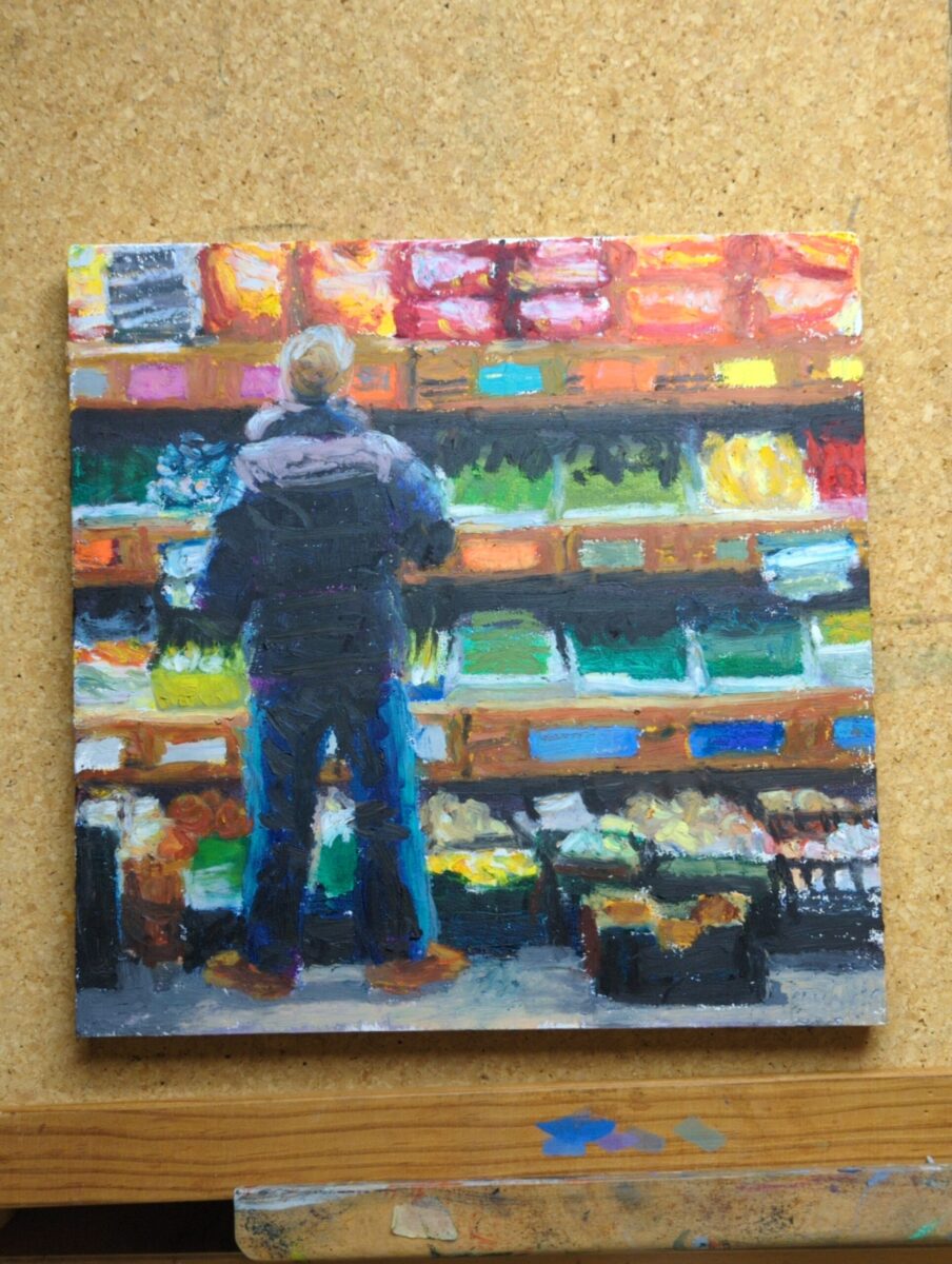
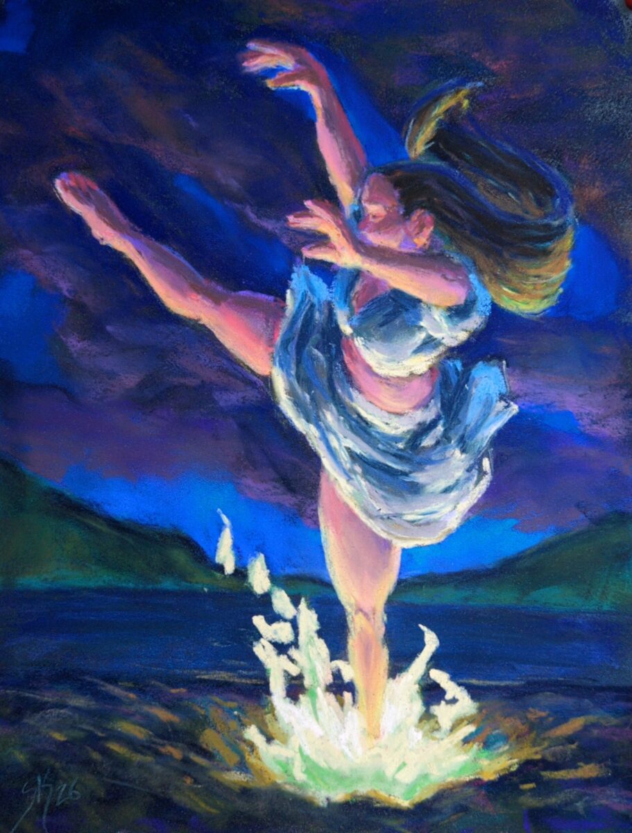
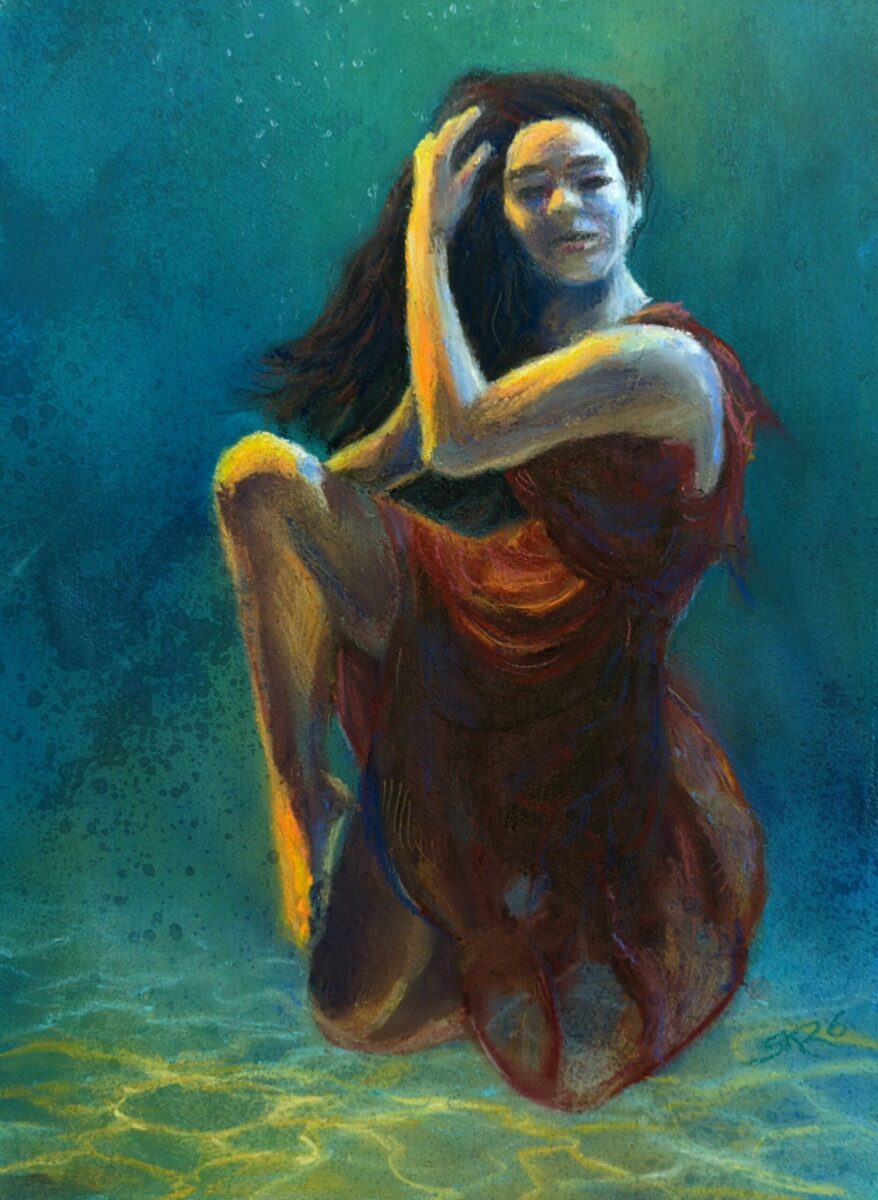
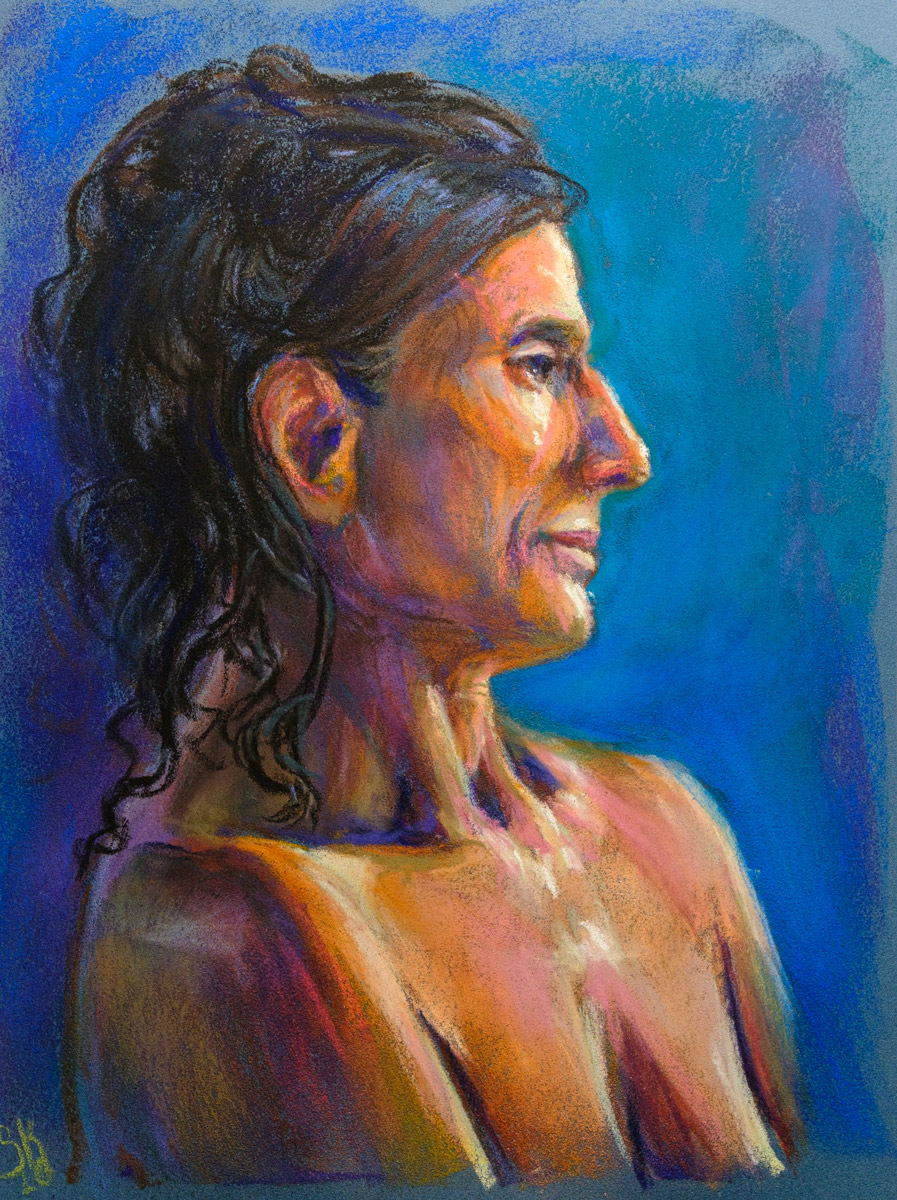
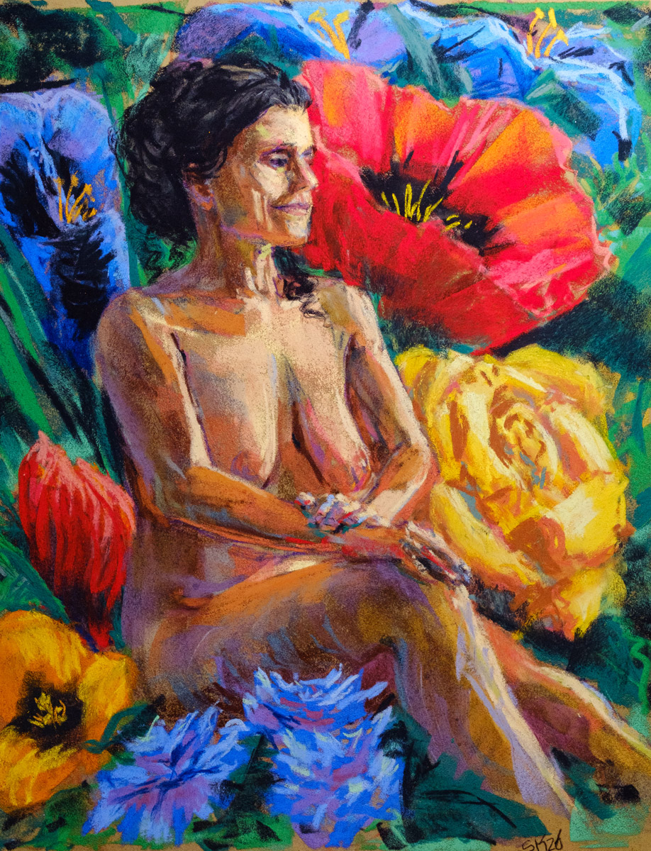
I’ve been making stuff and it’s been pretty varied! Hard to figure out how to talk about it all except as a big ol’ artdump, so, here! Have some art!
24 responses to “Sketching, Lifedrawing and Studies from Early Summer”
-
Lovely to see these all in one place
-
wow the water in the tiger piece is gorgeous! the nighttime pieces are my favorite, too. the way you color reflections is really lovely.
-
-
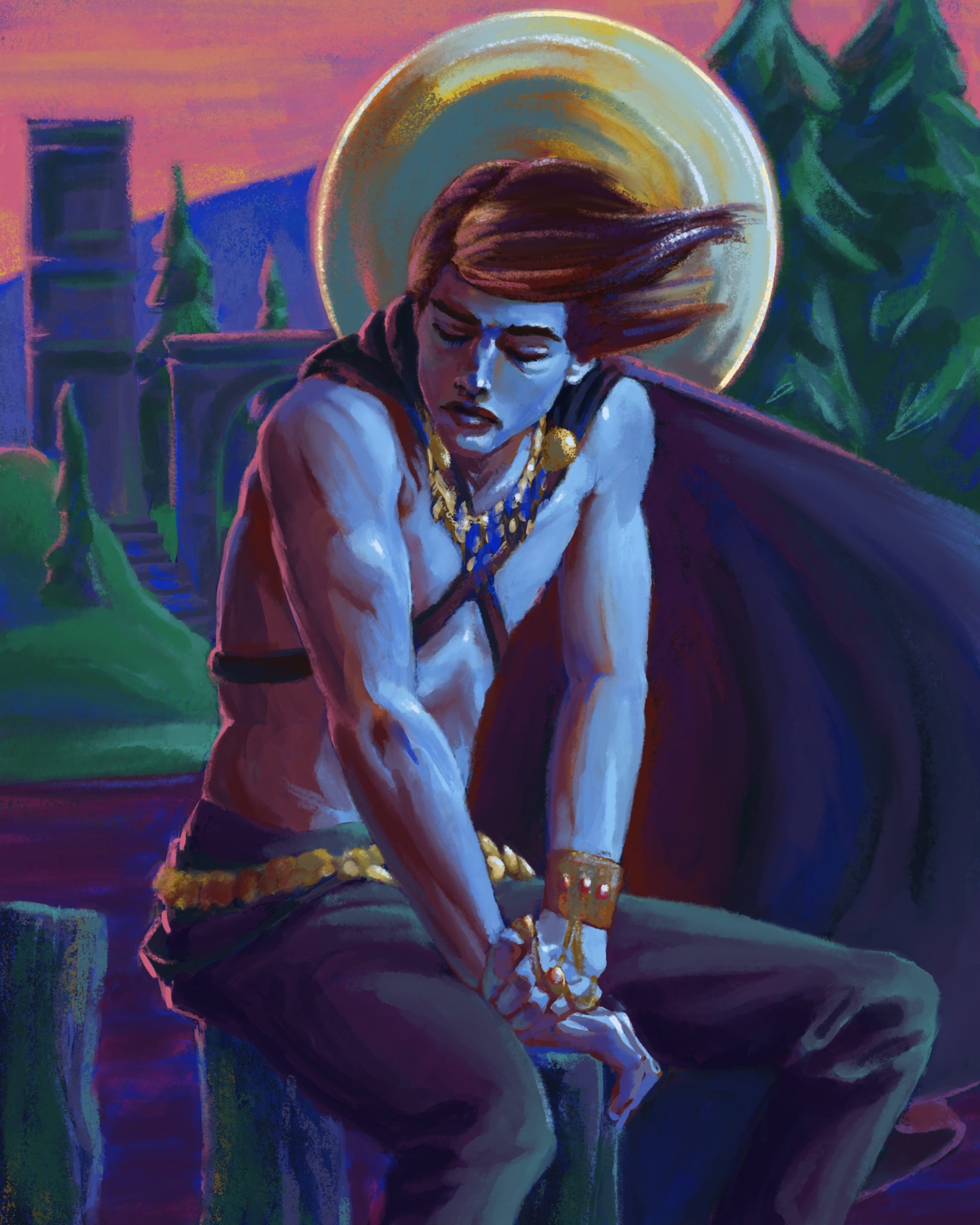
Inspired by symbolist painters.
8 responses to “Sword and Sorcery Character Portrait”
-
Forest Adventurers – Watercolour Illustration
posted:
updated:
tagged: adin, art, bear, forest, orin, painting, structure, traditional art, watercolor, watercolourDrawn from memories of new growth in forests recovering from floods, making use of Windsor & Newton and Daniel Smith watercolours. Pigments used include green apatite genuine and fuchsite, adding a shimmer to the painting in person.
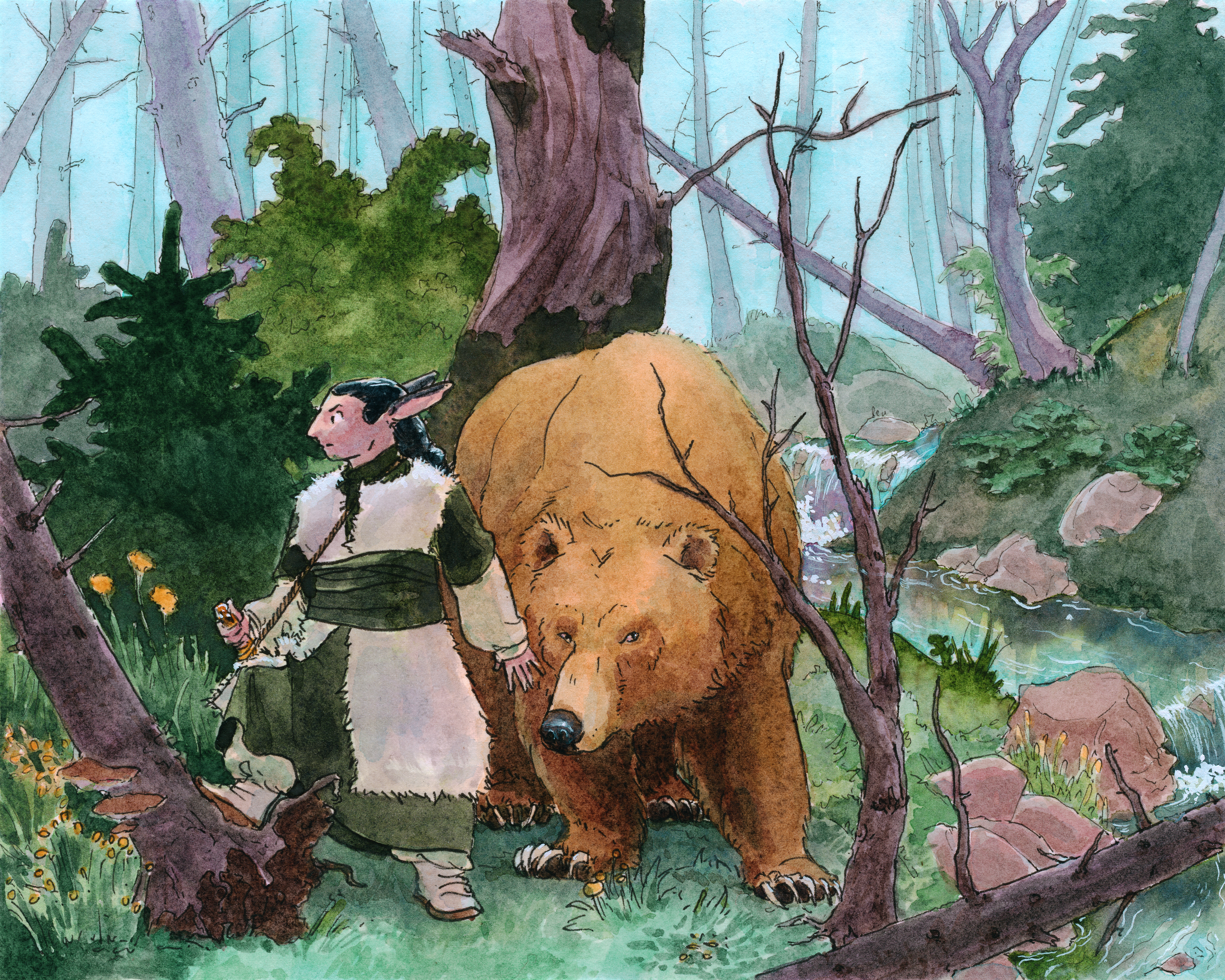
click here to buy a print of this piece 
7 responses to “Forest Adventurers – Watercolour Illustration”
-
wanna read the comics themselves? They’re up on my stories website for free: stories.portablecity.net/stories/comi…
-


Leave a Reply