
swap to chronological order of most recently posted
-
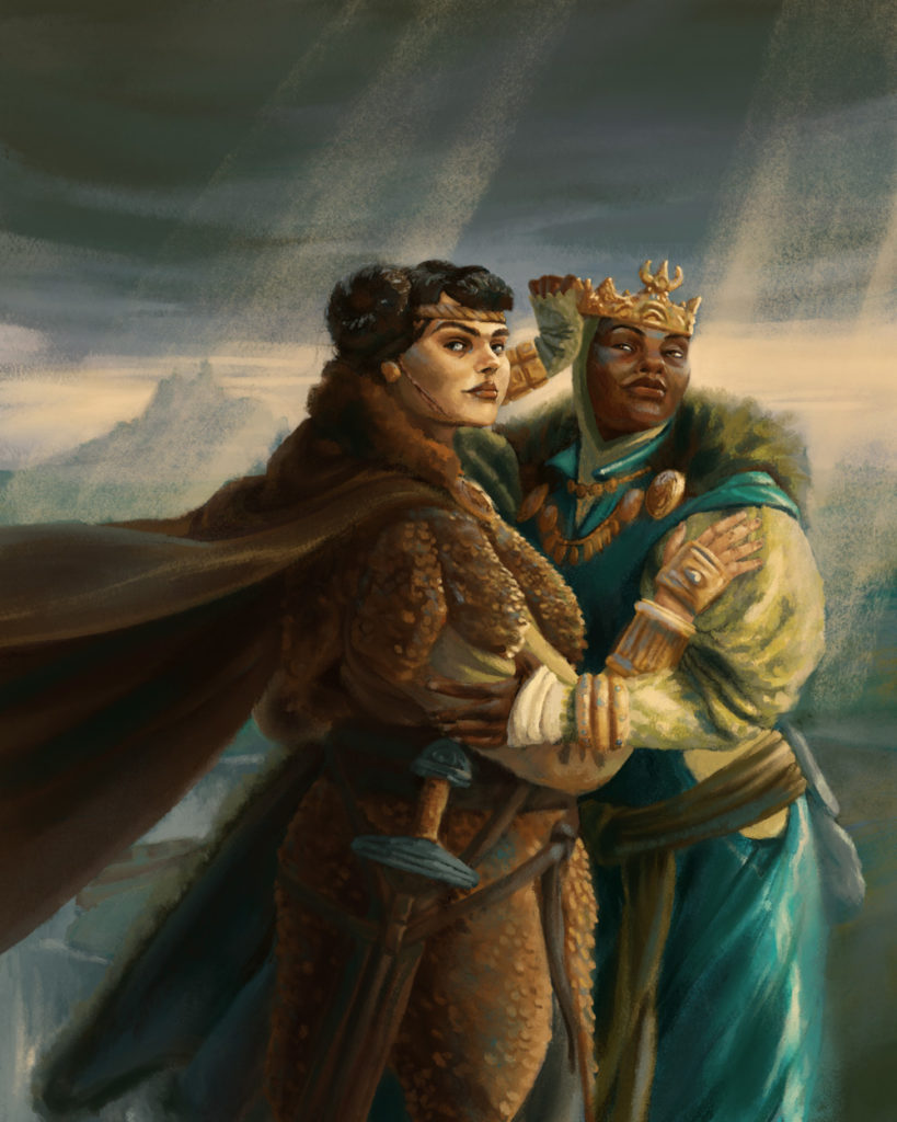
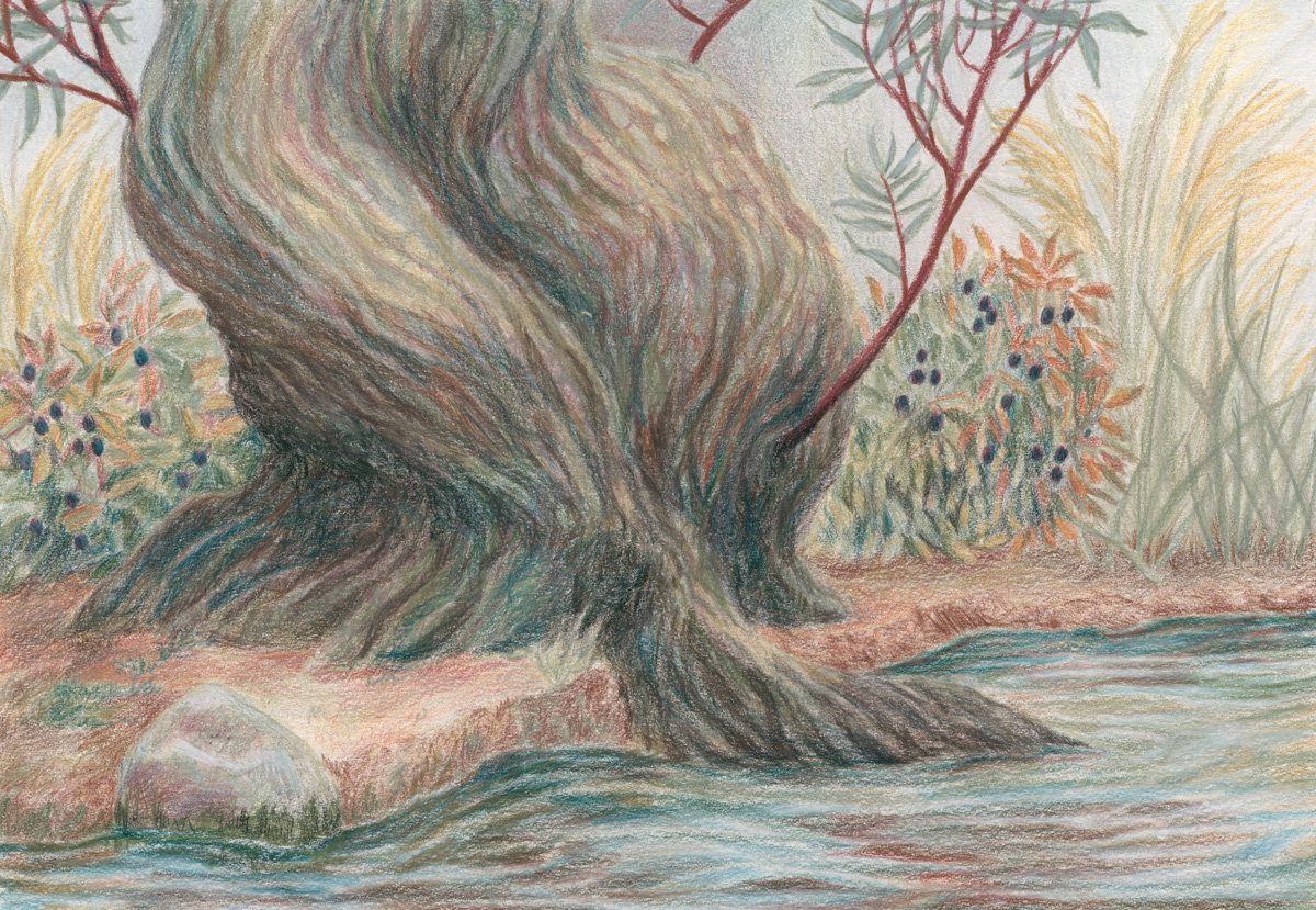
I have some new papers to test out and how better to test them than to paint a wizard on a journey? Here’s their first stop, a quiet forest:
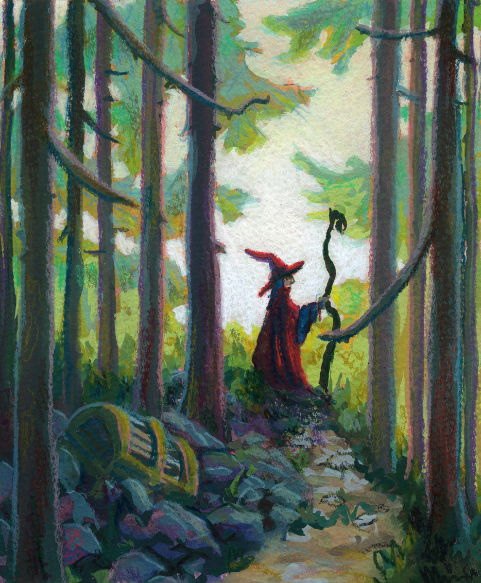
I want to sort of fine tune my gouache plus pencil crayon/neocolor/pastels etc process into something i can rely on well enough to try flexing in other ways, if that makes sense? and I think I’m getting there with gouache finally, which is exciting!
This paper is really, really thin for any wet media use — 163g according to my research — but it is still absorbent and has a cold press texture on the front. It did make it hard to not constantly lift the gouache as I layered, but it also encouraged going right to Very Thick Paint by giving me enough tooth to pull thick gouache off my brush effectively.
The tooth is probably a bit too intense for small scale pencil crayon stuff though – it’s very hard to get clean lines and the texture is large enough compared to the drawing’s detail resolution to feel a little distracting to me. I do love how the tooth did encourage me to let the underpainting in red show through more though! Something to think about.
Overall though I think my professional gouache work will be at a much larger scale though so probably worth moving on and testing other papers.
-
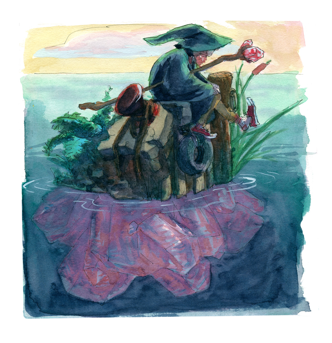
click here to buy a print of this piece watercolour and fountain pen, in my sketchbook.
I’ve been drawing modern wizards for my wizard puberty zine and what if they hung out on crystals islands.
-

click here to buy a print of this piece Graphite on printer paper, 11 x 17″.
-
Drawn from memories of new growth in forests recovering from floods, making use of Windsor & Newton and Daniel Smith watercolours. Pigments used include green apatite genuine and fuchsite, adding a shimmer to the painting in person.
click here to buy a print of this piece 
-
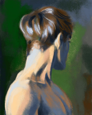
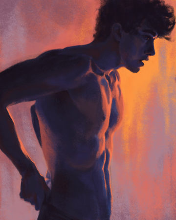
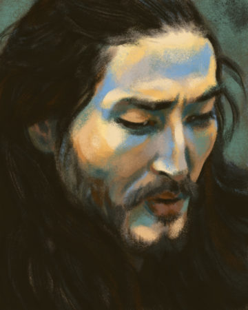
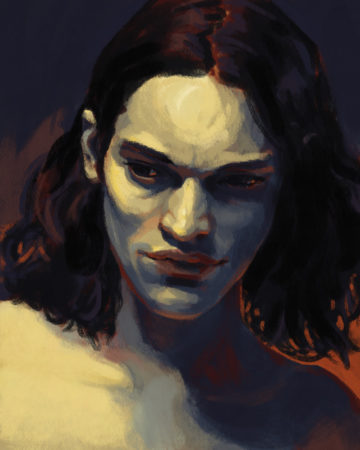
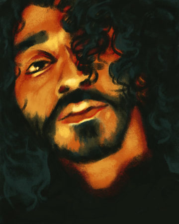
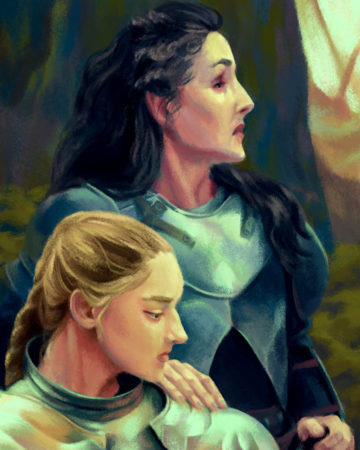
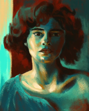
I’ve been using Procreate and a selection of MaxPacks chalk and gouache brushes to do some looser, more painterly digital studies from photo ref. Here’s a selection of recent ones:
-
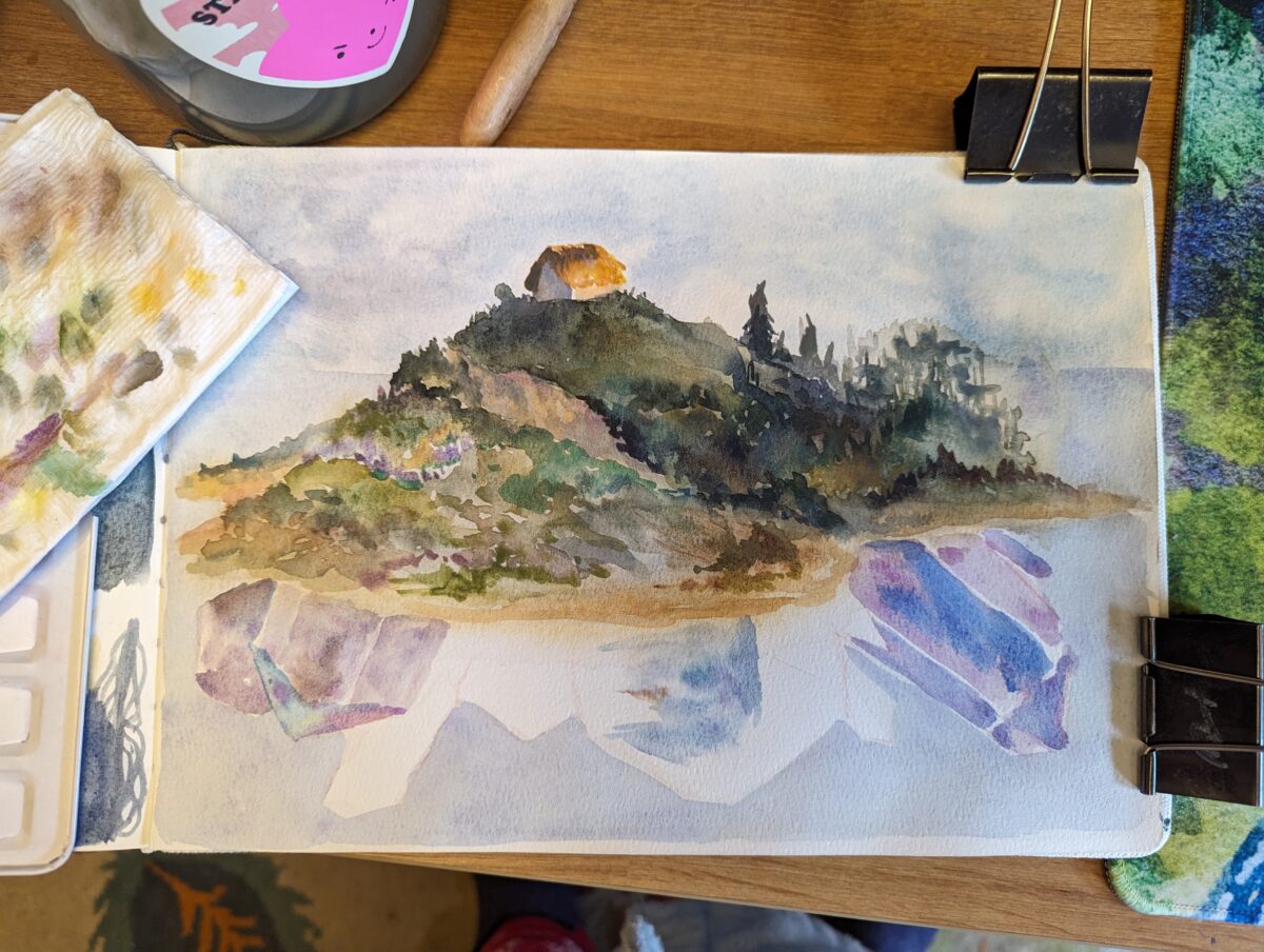
Watercolour in my etchr coldpress sketchbook.

click here to buy a print of this piece 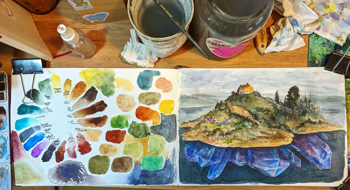

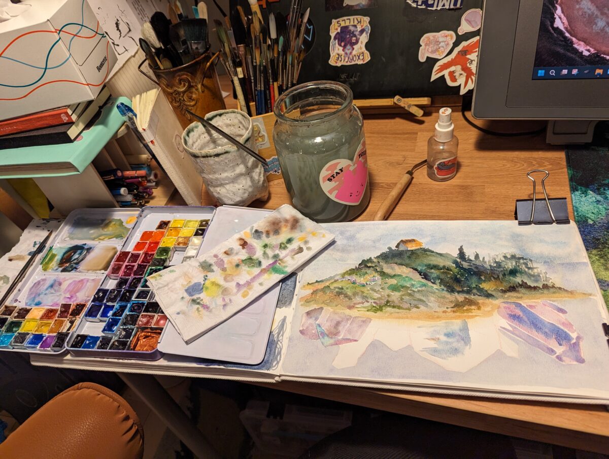
And some process shots, which I always find so enticing in their own way:
-
After a few weeks away it was great to get home to the oil pastels!1
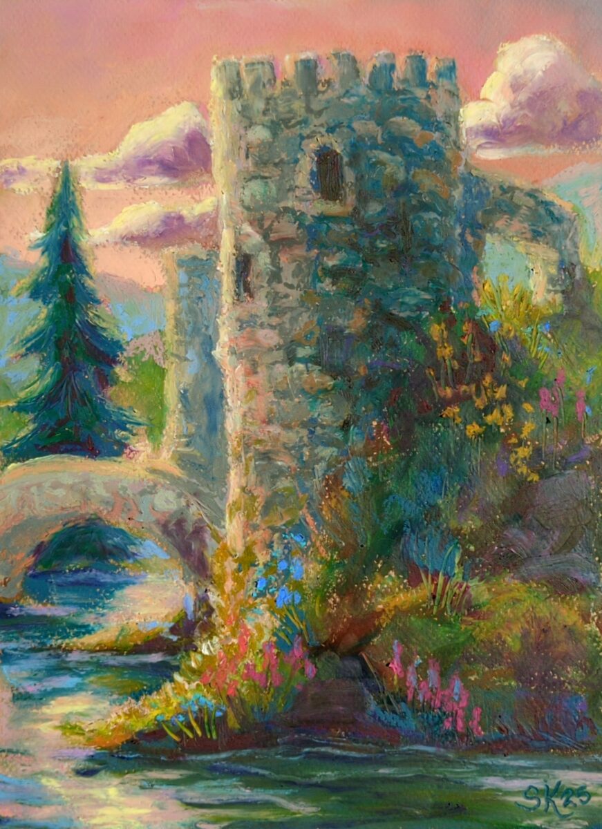
click here to buy a print of this piece I painted this one on canson mi-teintes paper, with sennelier oil pastels, and was reminded that when used on paper, even the greasiest oil pastels do set somewhat! Between days, the pastels set up enough it wasn’t blendable with my finger, though it was certainly still smudgable and easy to scratch. This meant I did really need to think in passes or layers, knowing that what was underneath would be unlikely to move much.
That aspect of this I definitely liked! But honestly, I used the more heavily textured side of the Mi-Teintes paper and I am not a huge fan of its visible texture. I’ll have to try the smoother side next time.
- They don’t travel so good, especially if they’re getting tossed around like on a plane. ↩︎
-
This monster came from too much heavy metal and some time in a sketchbook with my favourite pencils. After the drawing was done, I printed it out on watercolour paper to finish bringing the monster to life in full colour.
Watercolour on watercolour paper, 2017.
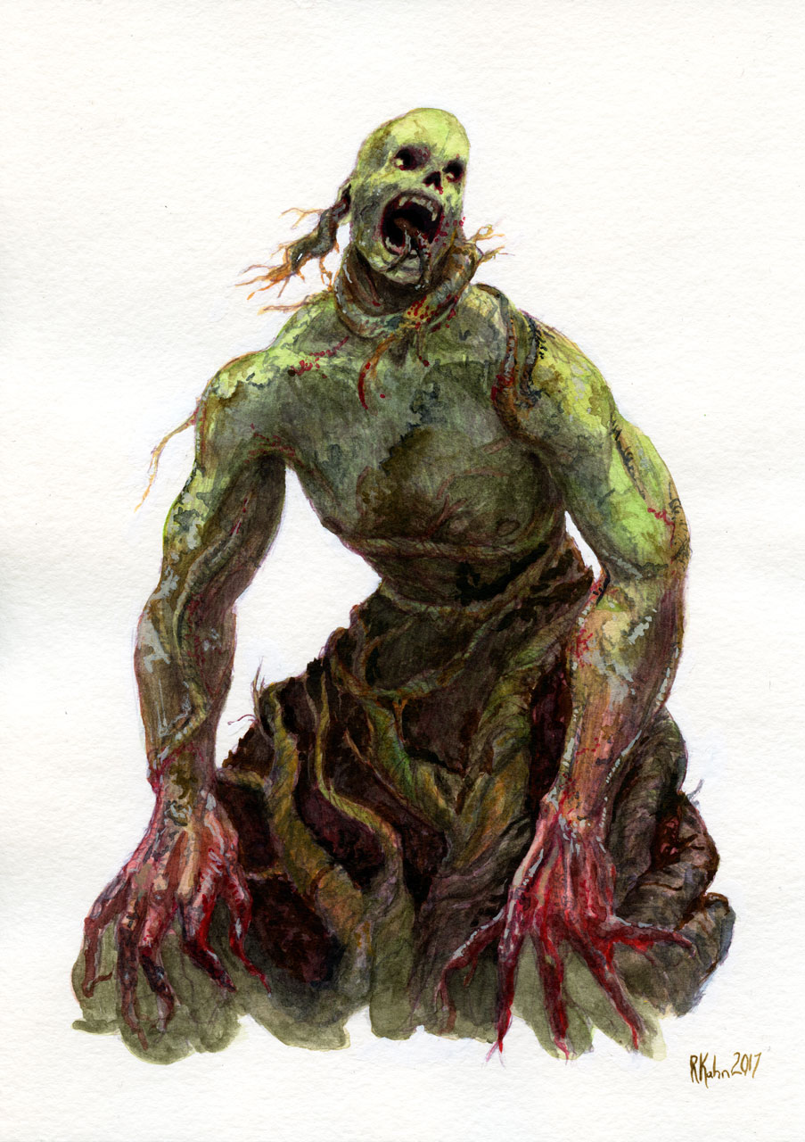
click here to buy a print of this piece
-
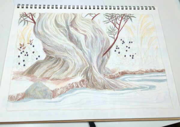
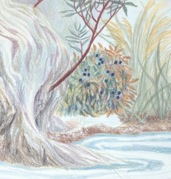
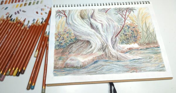
This was a delightful test drive of these Derwent brand Drawing Pencils!
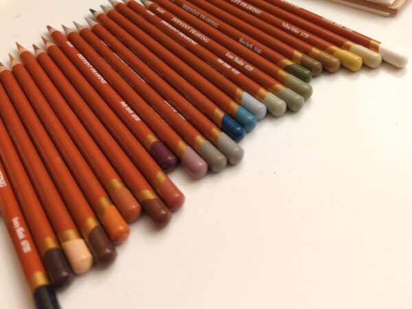
the pencils 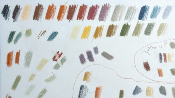
the swatches They’re a limited palette of 24 earth tones, very soft and waxy, decently opaque, and, it turns out, pretty erasable! So they were a very friendly and low stakes material to play with at length.
I did find some useful tips on youtube over time! One video explained that when they waxed out the paper – when you’ve added enough pigment that the grain of the paper has gone completely smooth, and there’s a milky film forming over your marks and dulling your colours – they had success wiping off that top layer with a paper towel, and it boggled my mind but this worked really well! That’s what made me try the white gum erasers, and they also worked well! Though the smaller, drier ones were certainly more effective than the bigger, more stretchy kind.
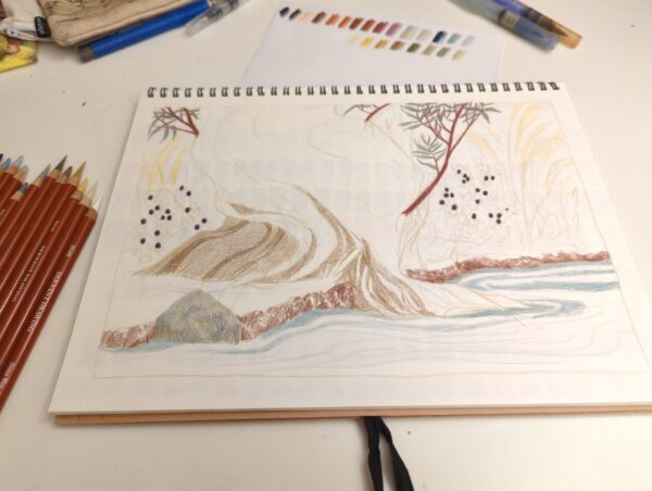
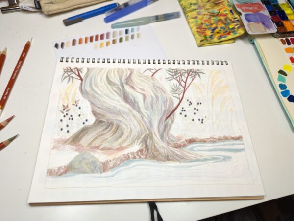
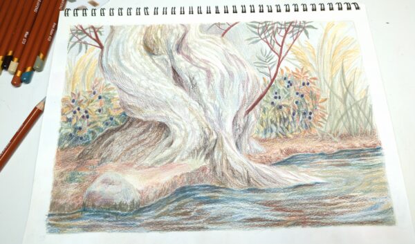
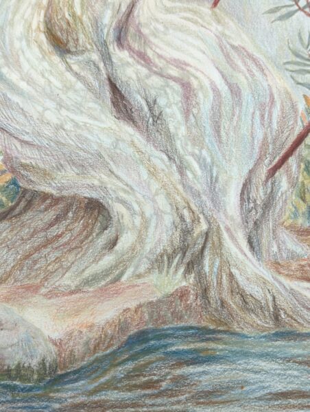
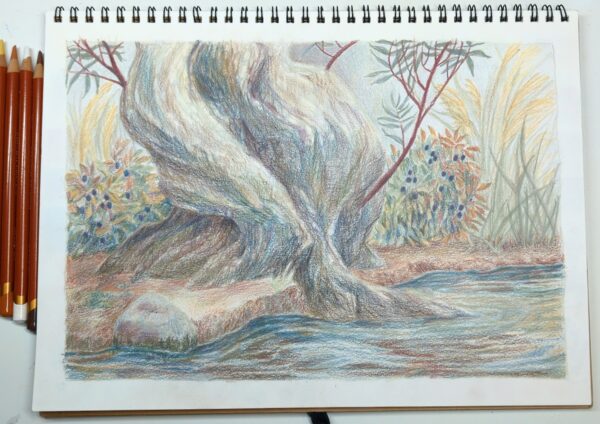
This exercise was done in a MUJI sketchbook, a very cheap option that I’m quickly getting very attached to! These things take gouache, marker, pencil, and ink very well, and have a nice tooth that lets me lay down a fair amount of waxy pigment before any consequences. Since discovering how much I loved them, I have gone and picked up a few extras, which hopefully will quiet any scarcity-mindedness that might haunt me.
I worked on this in the evenings, mostly as a wind down before bed, over two weeks or so. I’d been meaning to do a thorough test run of these pencils and found it really rewarding to let this piece build up slowly over days of short sessions – it let me test a lot of the properties of these pencils fully, and draw some of my favourite things!
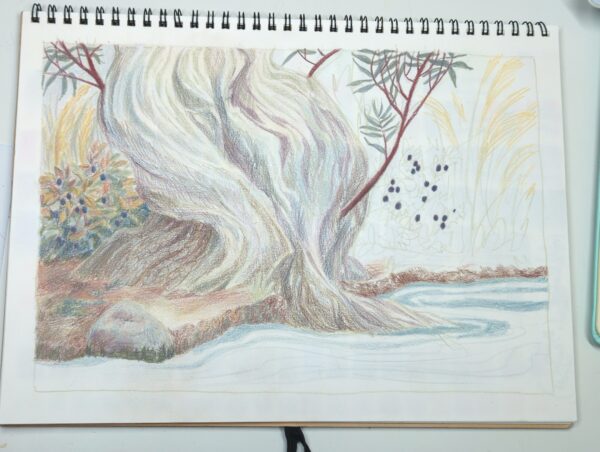
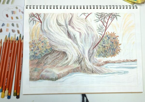
You probably saw this piece in progress, but if not, I did take a decent amount of shots, and shared them here as casual process posts. Please let me know if this ended up being annoying, especially those of you on the RSS feed! I can probably gate it off into its own tag better in future if that helps.
Here’s process shots from my time working on this piece:
-
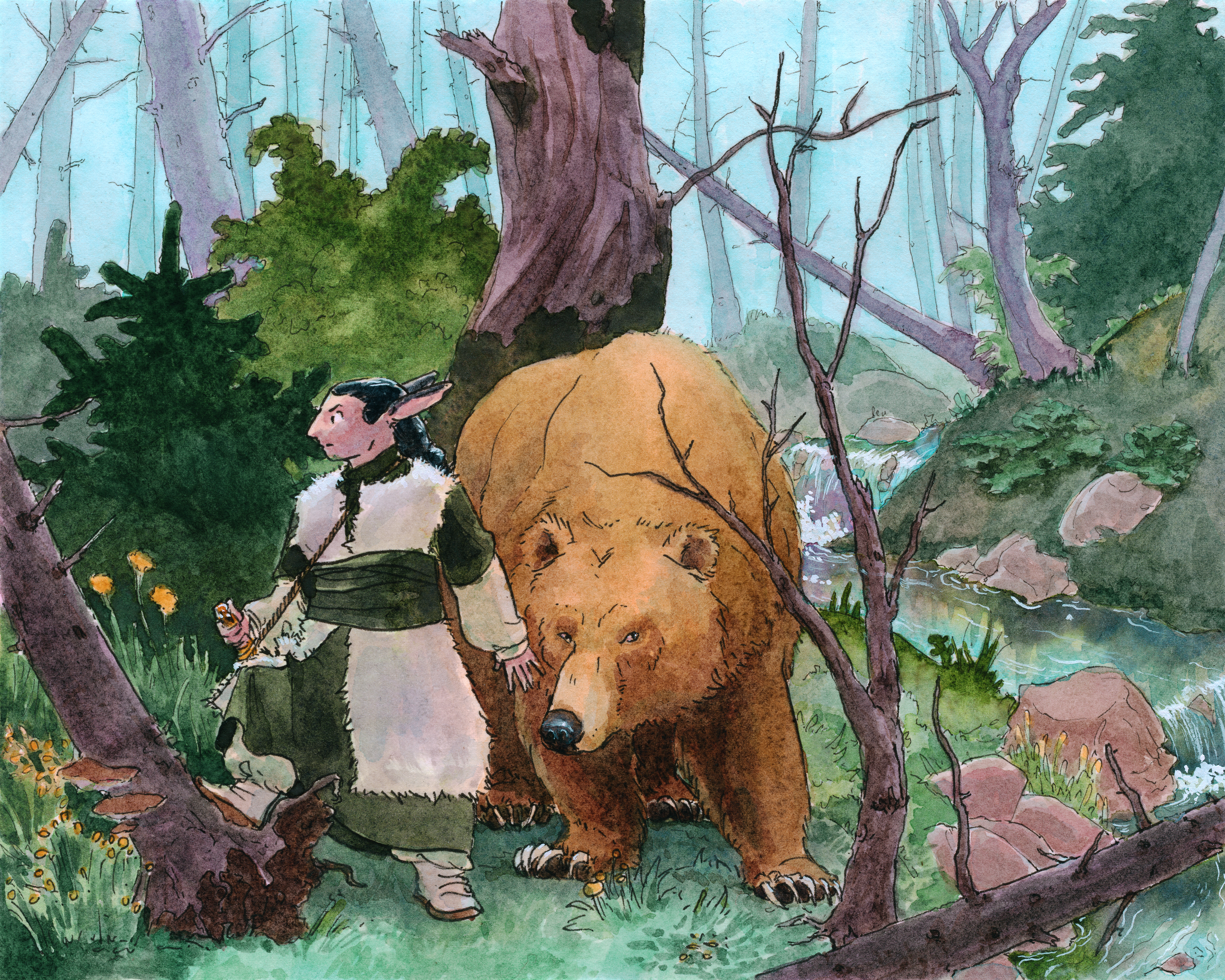
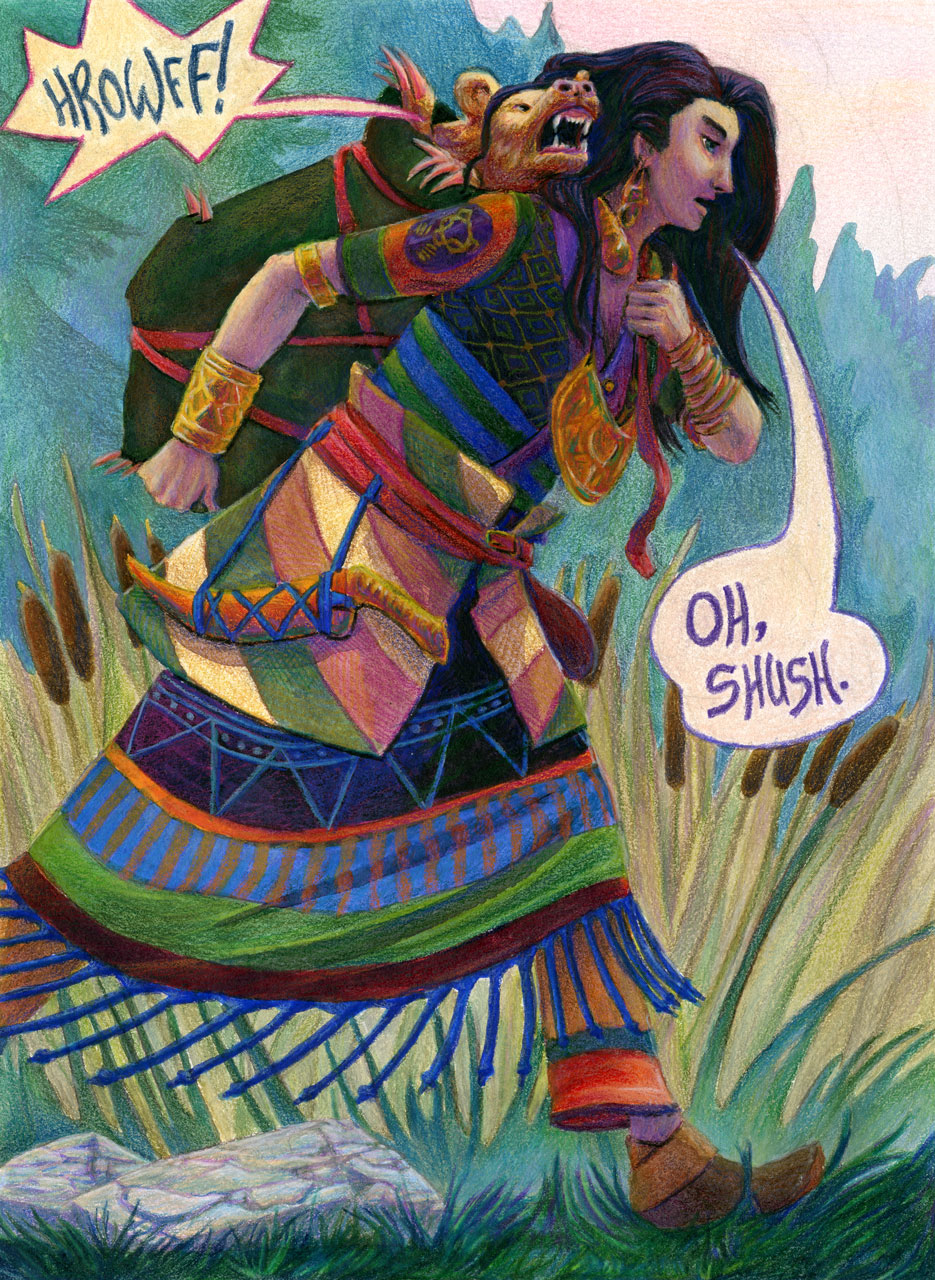
This fantasy illustration was created in watercolour and pencil crayon, and is 9 x 12″ on watercolour paper. It features a determined traveller carrying a cranky golden bear in a bag. The sun is just starting to rise and the mist clearing from the ground as they walk onward. We can see a golden bear insignia on the traveller’s sleeve.
click here to buy a print of this piece


Leave a Reply