
swap to chronological order of most recently posted
-
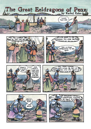
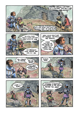
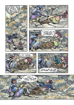
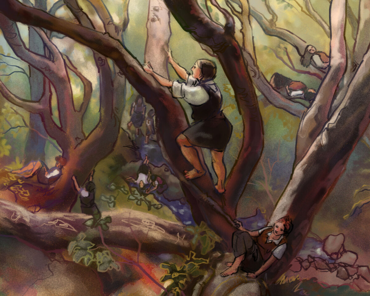
The Great Eeldragons of Penx Short Comic
posted:
updated:
posted to: comicstagged: 1001 knights, apprentice, colour, comic, dock, dragon, fantasy, Kelby, knights, panel, penx, Riam, sample, sequential, ship, structure, sword and sorcery, watercolor, watercolourMy comic for 1001 Knights, The Great Eeldragons of Penx. Swipe through to read the whole short comic.
-
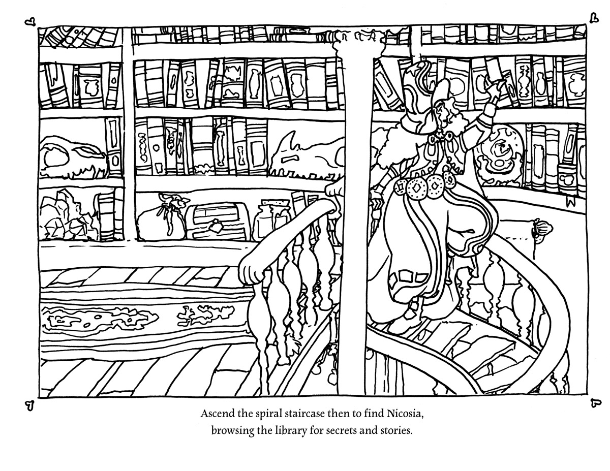
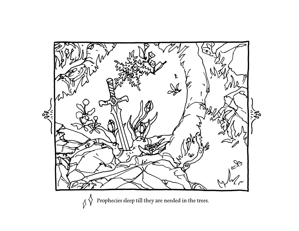
This fall I took on a project I’ve been meaning to do for a while – I have made a colouring book based on my playmap The Tower of the Forest Wizard!
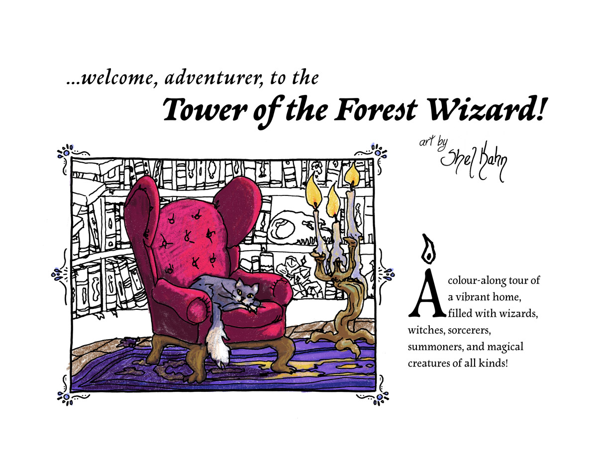
I loved colouring books as a kid and teen, and the more stuff in them the better – one of my most treasured was one that was hugely detailed drawings of tallships from the Age of Sail, as it phrased it, which had about as much whimsy or humour as a military history display. But colouring them in, it felt like a way to explore these ships and get to know them! Wandering through that book with my pencil crayons wasn’t so different from walking through these ships, counting the sails, following each line of rigging from one end to the other, starting to put together how this all worked. I really think drawing, colouring, making art with and of something is just such a great way to learn about it and experience it.
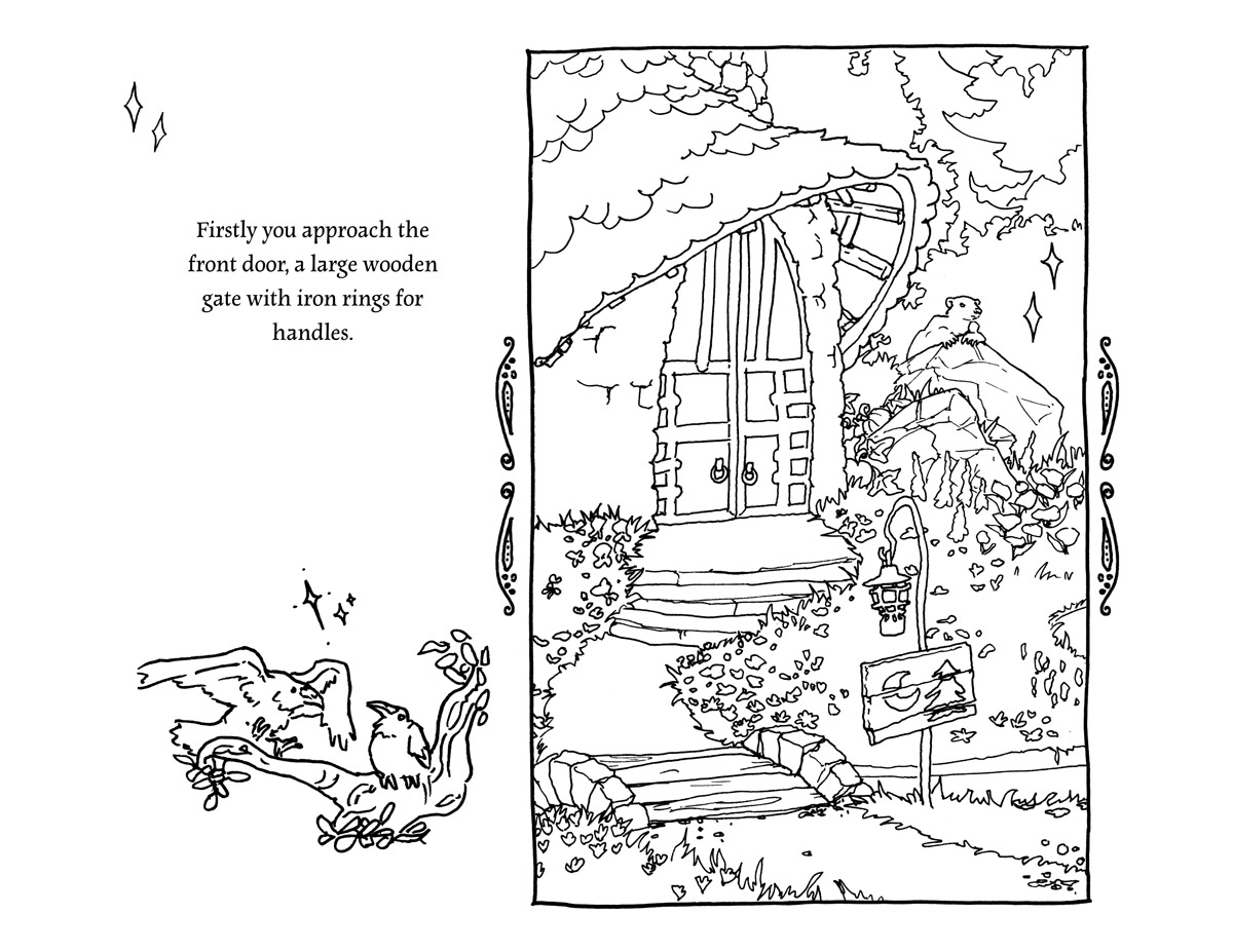
And I wanted to invite you to wander through the Tower of the Forest Wizard like that – to have an excuse to look at every book on the shelves, to notice the pumpkins in the kitchen, the mushrooms on the stairs, the parakeets in the garden, you know? And what better way than a colouring book!
I will have physical copies available locally here in Toronto soon – very soon (!) – and I am looking into how to make this book available internationally at a reasonable price, but that will probably take me until the new year.
However! It’s now listed on my itch as a PDF for you to print at home or import into your favourite art software to colour on your phone or tablet. The complexity varies, and there’s pages that will be fun for a younger kid, and pages that will be a challenge for an experienced colourist. I hope it’s a satisfying exploration of a cozy and magical space – and a great excuse to meet all the wizards you can dream of!
 The Tower of the Forest Wizard – Colouring Book by Shel Kahn and the Sorcerer’s CatalogueA colour-along tour of a vibrant, magical home, filled with surprising secrets ✨
(there are also community copies available for free to folks who need them – click on in and claim one!)
If you do take the time to colour a page or two I would love to see your art! or your kid’s art! or your retired mom’s art! There is no joy like seeing folks take something I made and make something magical and new from it. Thanks so much for taking a look at my darling wizard tower, it’s an honour to host visitors to this whimsical realm I built.
-
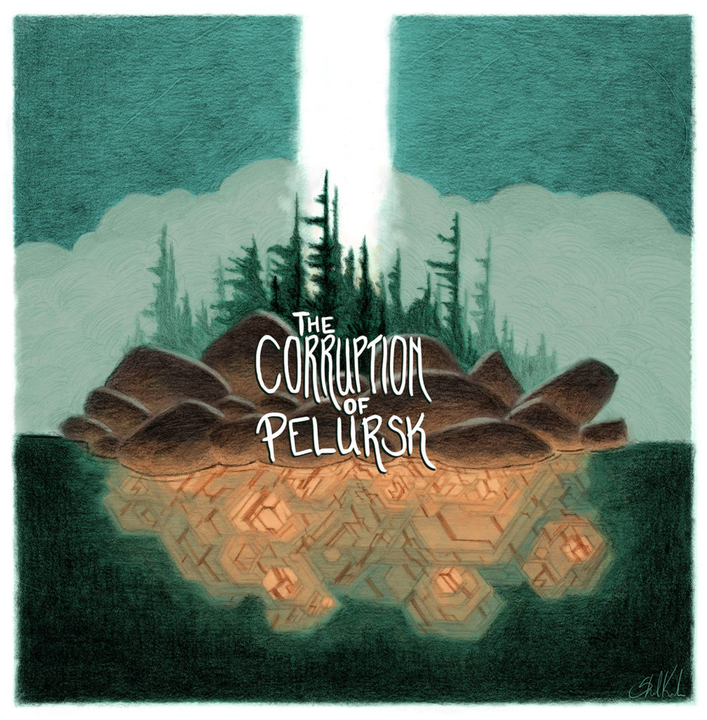
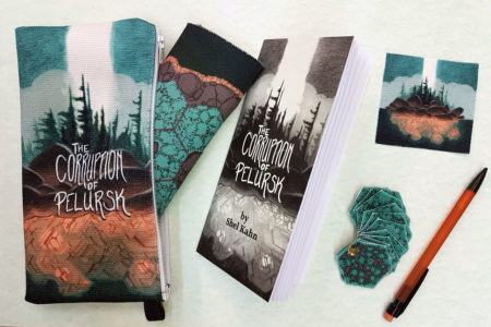
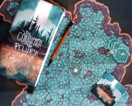
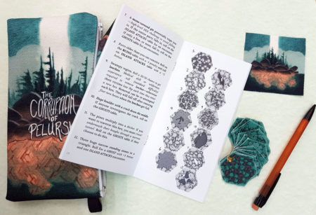
The Corruption of Pelursk is a system-agnostic tabletop RPG hexcrawl/dungeon, written by Shel Kahn.
The Isle of Pelursk holds a glowing, steaming, mist-shrouded secret at its heart, and once you’ve entered its clutches it does not want to let you leave.
Designed to fit easily as a sidequest into an ongoing campaign or stand confidently on its own, The Corruption of Pelursk launched on May 15th 2018 as a Pocket Dungeon Pack!
Each pack comes complete with:
- 60 page 3.5 x 7″ black and white zine
- 17 x 17″ fabric map of the island
- twelve 1.5″ fabric hexes
- a patch of the cover art
- a mechanical pencil
- all tucked into a 9 x 4″ canvas zippered pouch.
Also available are the zines themselves, packaged with a black and white map and ready-to-cut hexes at a slightly smaller scale.
Check out the pocket dungeons and pocket dungeon packs available in the store right here.
Want to run this system-agnostic adventure in D&D 5th Edition? Mike Harvey has created a thorough and complete conversion he’s sharing for free right here!
Thanks so much to Jason and Tom for their thorough review of The Corruption of Pelursk on their podcast Fear of a Black Dragon, at The Gauntlet!
Big thanks to Evlyn Moreau for her review of The Corruption of Pelursk over on her blog Le Chaudron Chromatique:
I like that the spine of the adventure is simple enough to grasp and to remember, after a single read I feel like I could easily run it. The fabric elements add a nice tactile feel that fit with the setting where everything is handcrafted by people.
Shoutout to Robert Carnel for their review of The Corruption of Pelursk over on The New Flesh:
Having presumably tricked their way onto the island the game then shifts to a clever hex-crawler with the island interior being the hex map and then you roll and place cutout hexes onto the map. … The hex crawl is definitely the more interesting part of the scenario and is quite imaginative.
-
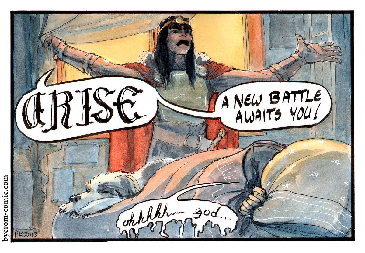
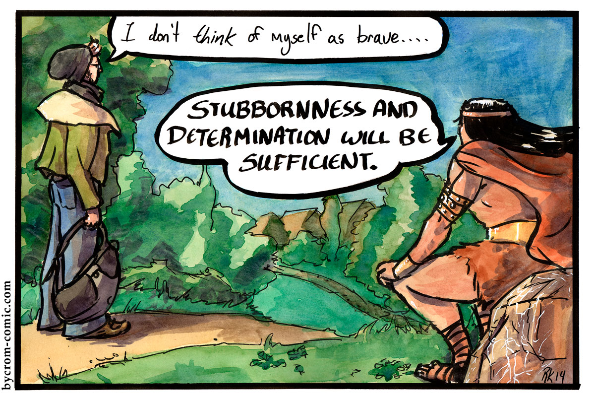
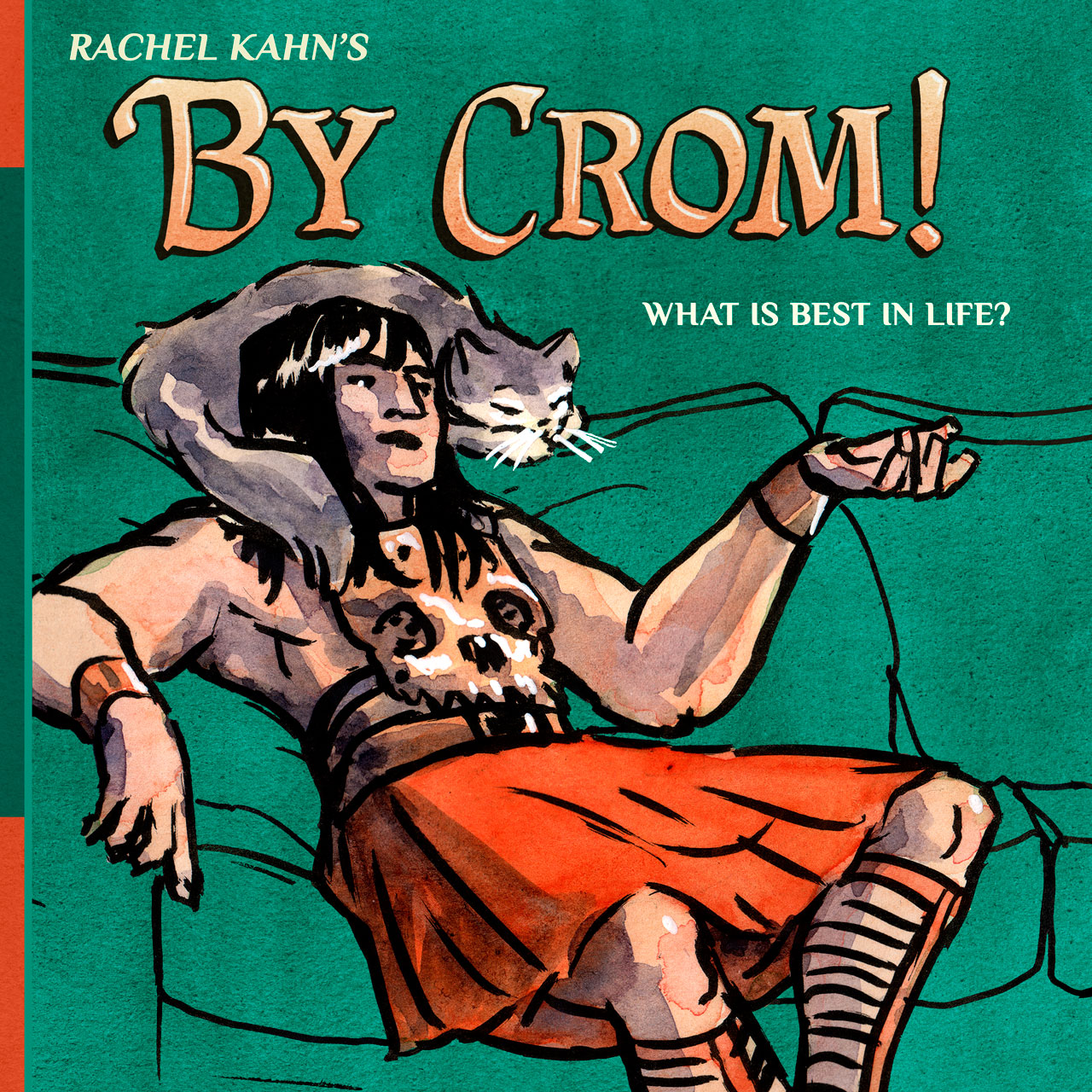
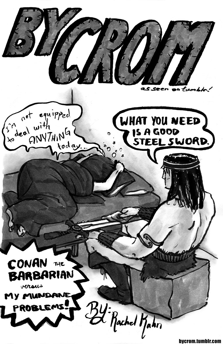
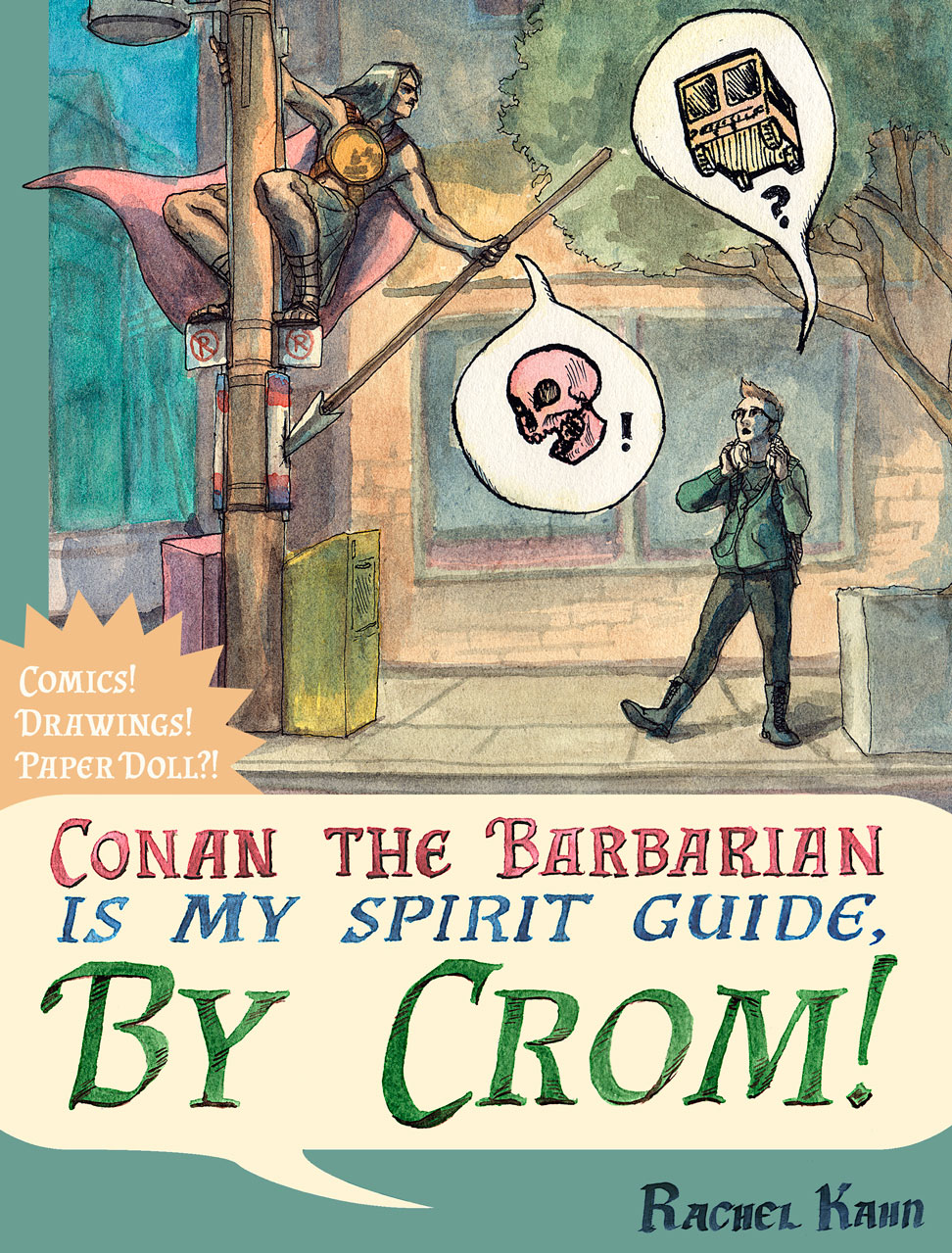
By Crom! – Life Advice from Conan the Barbarian
posted:
updated:
posted to: comicstagged: autobiography, By Crom, Conan the Barbarian, humor, image, pen and ink, portfolio, structure, watercolour, webcomicBy Crom! is a joke-a-panel autobio webcomic featuring life advice from the ever-practical, mighty-thewed Conan the Barbarian.

You can read it all for free on my Stories website, right here.
It ran online from 2012-2014 and was collected into a book in 2016 thanks to amazing support on Kickstarter! As it ran, the art style changed significantly. Below you can read the original run of the webcomic for free, broken into the three zines I first published before creating the all-in-one collected book.

By Crom! was collected in a print run of 1000 copies in 2016. While it is credited to Rachel, you’ll only get an email reply from Shel Kahn these days. Further archival information is recorded below:

this zine was printed in 2012, 25 pages + paper doll in the back, and launched at Toronto’s Canzine festival! 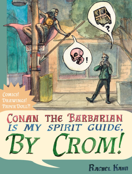
so, once the comic wrapped up, I did actually catch on to the fact that spirit guides are not a thing white people should be making jokes about, and dropped this language everywhere, but I did print a pile of books with this ignorant tagline, so I show it here now in the interest of an honest archive. 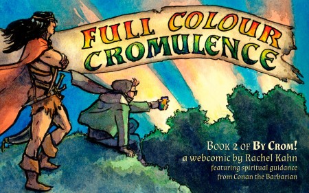
this full colour collection from 2014 included an array of guest comics from wonderfully talented friends, and a follow-up paper dog of my steadfast canine companion, Sam
By Crom! is an autobiographical comic by Shel Kahn, featuring life advice from their favourite fictional Barbarian.
Growing out of a love of swords, sorcery and sandaled barbarians as well as a lifelong struggle with anxiety and depression, By Crom! is a tribute not just to Robert E. Howard’s hero, but to everyone who could use a brave, practical and stoic inner voice to guide them through life’s rough spots.
In By Crom!, the barbarian adviser comes along for dog walks, doctor’s visits, school days and self-pity days, armed with his sword and his anachronistic perspective on modern life and modern problems.
By Crom! is a joke-a-panel webcomic, and it was published approximately weekly on Tuesdays from January, 2012 until May 2014. It began its life on bycrom.tumblr.com.
By Crom! was initially printed in two small-run volumes, both of which are now sold out in print. You can buy the new all-in-one volume from Shel Kahn in their store.
By Crom! had a very successful kickstarter to fund a new print book, you can see the campaign here!
The Collected By Crom! is out of print. It presented all the black and white comics, as well as a paper doll, five behind the scenes pinups, two fan pinups (one by cartoonist Adam Gorham), an eight-page longform comic, and an eloquent foreword by Diana Poulsen. It’s got a lot of barbarian-themed advice. It was printed in July 2013, in Ontario, Canada, and reprinted in April 2014 in Quebec, Canada.
Full Colour Cromulence is also out of print. It presented all the colour comics, nine guest comics featuring guest guidance from artists including Gillian Blekkenhorst, Trevor Henderson, Matt Rapati, Kris Sayer, Jen Schollen, Matt Smith, Mary Verhoeven, and Jenn Woodall; another paper doll, and an eloquent foreword by the talented Natalie Walschots. It was printed in April 2014, in Quebec, Canada.
Reception for By Crom! has been really positive.
By Crom! was nominated for the REH Foundation Black River Award!
Ginnis Tonik reviewed By Crom! on Women Write About Comics:
“Throughout the series, Comic Rachel deals with mental illness, the death of her beloved dog (it’s beautiful, and I cried), identity crises, careers, and bra shopping. It sounds intense, and it is, but with the stoic barbarianism of Crom, there’s a hilarity in the refreshing lack of sentimentality. This same lack of sentimentality only gets better when later in the collection, Crom shows up awash in watercolors.”
Ginnis Tonik reviewed By Crom! on Women Write About Comics“Although some of Kahn’s By Crom! comics juxtapose the fictional Hyborian Age that Conan comes from with the modern era and its coffee shops, public transit, and clothing that didn’t come from an animal you killed yourself … for the most part, it is about Conan as spirit guide; his warrior values are a chasm apart from Kahn’s artist lifestyle, but she imagines a wisdom in his droll (and occasionally head-knocking) advice.”
what Lauren Davis at io9.com had to say about the tumblr“By wrenching him from his context, Kahn reveals Conan’s personality: all about raw personal authenticity, the kind you achieve by acting rather than angsting… making, rather than purchasing… travelling to, rather than importing from. This is a Conan who is still relevant today and perhaps explains why we keep coming back to the originals.”
M. Harold Page writes about By Crom! on Black Gate“This is a kinder, gentler Conan: less barbarian, more Spirit Guide-Psychiastrist; a trusted confidant, like a nonthreatening sensitive male Sex in the City-style friend (for instance, Kahn and Conan have the same taste in gladiator sandals). … Ultimately By Crom! is an interesting subversion of so-called “traditional” gender roles. “
A. G. Pasquella writes about the first By Crom! zine in Broken Pencil“Whether it be laughter in the face of existential crisis or an armed assault on the depths of the dryer in search of that last sock, Conan always has a laconic wisdom to add to the situation. … And sometimes he just helps you walk the dog and eats all your strawberries. Barbarians are like that.”
Scott Wachter delights in Full Colour Cromulence on I Thought They Smelled Bad on the Outside“The art in these comics and beautiful and so expressive. There’s just so much honesty… This second installment of By Crom! is worth every penny, and it’s worth supporting. “
Sam Marchello explains her love of Full Colour Cromulence on Cherry Blossoms and Maple Syrup:You can also hear the By Crom! origin story (and much more nerdiness) on the Guys with Pencils podcast, episode 118.
If you would like to review By Crom!, please just drop me an email! I would be delighted to send you a pdf and answer any questions.
By Crom! would not be in print today without the support of 411 kickstarter backers. A huge thanks to them all:
SUMMONER
Morgan Hazel
FRIENDS OF THE ORACLE
Dr. Catfish, Jeremy Strandberg
TREASURE HUNTERS
Jeffrey Shanks, Jason Sickmeier, C. W. Marshall, Winston Kou
MERCHANTS
Espionage Cosmetics & The Geek Boutique, Tyche’s Games
ICONOPHILES
Catherine T., The Hoffmans, Paul Herman, Epidiah Ravachol, John Bullard, K. Sikorski, Liam DiNapoli, Tex Albritton, Lissa Guillet, Dan paul, Simone Cooper, Tess M, Tim Sullivan, William Jahncke
TRIBUTARIANS
Aaron Sapp, Debra Kay more, A Bucket, Mary, Mark, Nathan & Hannah Watson, Janna Hochberg, Aknawt, Jeff Butler, Danielle Ellison, Marty Chodorek, Mark Finn, Gunnar Gissel, Natalie Simpson, Rachel “Nausicaa” Tougas, Larry Wooten, Peter Fong, Roisin McCormac, Sean Gilliland, Tim Brandis, Nicola Urbinati
SEEKERS OF ICONS
Bobby Derie, Chris Eadie, Cooper Braun-Enos, Fernando Fino, GaryJSailor, Garrett Fitzgerald, Hall, Katherine Fackrell, Donald L. Engstrom-Reese, Sharaya Copas, Jack Graham, Jillyjally, Jon Bolding, Ken Sturgis, Wayne R, Josh McGraw, Melissa McGee, Diana Poulsen, Nathan D. Paoletta, OTTO66, PJ Foxhoven, Amaya, Joven Tolentino, Alex Martin, rvr67michael@gmail.com, Corwin, Tineke Bolleman
SCRIBES
Amanda, Carl Rigney, Kevin Hutchison, Roland Cooper, Dave Turner, Doug Kovacs, Paul Madavi, Rachel E.S. Walton, Eric N Samuels, Fin T, Freddy Martinez, Eric Franklin, Gray Richardson, Pete Tracy, Henning, James Lee Griffin, Jim Cox, Joe Greathead, Jess Pestlin, Jonas Richter, Kai Sterker, Kate Hillier, Kristin Linder, Vincent Baker, Marcelle ‘MNat’ Natisin, Maaike B-W, Naomi Macleod, Melissa Bernard, Jon A. Freeman, Peter S, Philip Gelatt, Paul Popernack, Stephen Perkins, SK Gaski, Stephen, Seth, Terri Connor, Tim McLennan, Timothy Carroll, Tristan
WARRIORS
Ann-Kathrin N, anon, Kelly Williams, Andrew Fitzgibbons, andrew marturano, Anne Price, Anne V, Ariel Koh, Jesse Bullington, Brennan Taylor, B. A. Parcells, Tony Becerra, Seth Bender, wadledo, Brad Ellison, Brian A. Berkey, H Richards, Juliana Bright, Brandi Weber, Cariston Fawcett, Catherine Little, Charlie Elmer, Chris McLaren, Clara Nigh, clarkytehcruel73, Chris Sullens, Cat Tobin, Kaylee Lowe, Ben Cordes, Christopher Winzenburg, Dan Eyer, Daniel Loyd + Fiona Ferguson-Loyd, Danica King, Daniel Caruso, David Falck, David Cantrell, David Schwartz, Cori May, Pink Pitcher, Dethe Elza, Michael Robins, David Lars Chamberlain, Jeronimo, Sophie Bodington, Rini B, Eriq Nelson, Evelyn A, Evil Hat Productions, Gopal Bhatnagar, Flavio “Grumpybear” Mortarino, Menachem Cohen, Fritz, Laundry Bear Games, Ross Hathaway, Gavin Bennet, Geoffrey Davis, Richie Cyngler, Alex Blue, Dara Gold, Gregory Grimes, Ahm, Kelley Vanda, Henry Clark, Hannah Orlove, Ilan Muskat, Ruth Boyack, Kevin Gentilcore, Andrea G Redman, Jackie Tam, Jacob Kesinger, Janne, Jason Knepper, Jason Palumbo, Jim DelRosso, Jeb Boyt, Jacob Randolph, Jason Lutes, Joaquín Cogollos, Joe Beason, John Corey, Jonathan Helland, Joshua Bearden, Jim Peterson, Joseph Riesen, Judd Karlman, James F. Wright, Catherine Benvenuti, Kenneth Mark Dsouza, Anonymous, Kathryn Hoover, Kevin J. “Womzilla” Maroney, John Kuo, Kevin Pointer, Kyla Lee Ward, Larry Lade, Lauren Neuman, Liz Courts, Diego Valdez, Leah Watts, Jason Pitre, Luc Teunen, Lawrence Watt-Evans, Lydia, David Dierks, Marcu, Marla Desat, Matt Machell, Matt Sullivan, Moe Lane, Megan Crewe, Meghan Dornbrock, Matt Cramsie, Eric Mersmann, Michael Sherwood, Michael Lell, Michael Jones, Mike Babish, Maggie McLean, Randall Nichols, Jesse Morgan, Michael Pureka, Vashti Rennacker, Michael Raichelson, Heather Salmon, Nikolai, Eirik G. Kunz, Owen Craig, Patrick Rennie, Paul Phillips, Pierre ‘Le Dude’ Gravelat, Paul, pookie, James D., Matthew Hendrickson, Nicholas Qualls, Scott & Lara, Wilhelm Fitzpatrick, Raymond J. Bull, Zim Dubois, Richard L. Skinner III, Richard Neary, Ricky Lima, Rob P., Rob Deobald, Rick Tillman, Rudy “Chainsaw” Basso, Sam Gazey, Nick S., Spenser Isdahl, Darbs, Shepard Lowell, Shervyn, Robert Rees, Mel Fox, Silas James, Simon Stroud, David J. Schwartz, Sean Smith, Stan MacDonald, Stephen Lea Sheppard, Steven S. Long, Julia B. Ellingboe, Paul F, Kelvin Green, Jacob Thompson, Hollow Mask, Rocket 5, Tim Koppang, Timo, Travis Johnson, Tyler Ste Marie, Tyson Vanoverhill, Dustin Bacon, Vicky Metner, Vince, Vince Bayless, V McMican, Andrija Popovic, Tanya kan, Adam Day, Zane Dempsey, Debora Wu
EARLY BIRDS
Stasia Archibald, Adam, Alexander Huls, Priscilla Kim, Brent P. Newhall, Bryant Johnson, Daniel Eliot Boese, Doug Red, Jason Anarchy, Scott Wachter, Emily Madly, Jack Gulick, John B., Keith Stetson, Kris Sayer, Mark Delaney, Gareth Ryder-Hanrahan, Adam Drew, Ruth Tillman, Sean Gomes, Martin Hopkins, Meera “The Fierce” Barry, Wally Hastings, Alexx, Zack Davisson
DIGITAL ALLIES
Aaron Cattle, Amanda Makepeace, Andrea Mognon, Andrew A, The Rev. Andrew Karlson, Anonymous, Anthony Franchini, Bill Martin, Brad Fonseca, Bruke, Caitlin Jane Hughes, Charlotte Hillery, Chris Cummings, Chris Miles, Chris Mitchell, Chris Stewart, Christopher Northern, Christopher Smith Adair, Conan10, Cory Tharp, Deevon, Dominic Quach, Don, Beth & Meghan Ferris, Dr Vector, Drew Clowery, Eric Boyd, Frank Romero, huang, Igor Toscano, Ivan Donati, J. Walton, James Edward Reed, Jason O’Neal, Jeff Tidball, Joe Banner, John Hergenroeder, Josh Brumley, JP Sauers III, K-Slacker, Katie Shanahan, Kayla Valderas, Leah Webber, Lester Ward, Luke-Wayland, Mat, Matt McConnell, Matt Sanders, Michael Van Vleet, Patty Kirsch, Pauline Martyn, Pete Smith, Phil Adler, Philippe “Sildoenfein” D., Role Playing Public Radio, Ryan Macklin, S. Hood, Samwise Crider, Sarah Doombringer, Scott, Scott E. Robinson, Scott W., Shannon Pitts, Sho Ikeda, Spikeball, Sure, Taneka Stotts & Christina McKenzie, thatraja, Tim Eagon, Tubamaster, William Mawdsley, Yuu Yoshikawa, Zache
WISE FRIENDS
Hannah Shaffer, Jeff Leeds, Patrick Rainville, Steve Dempsey
2 responses to “By Crom! – Life Advice from Conan the Barbarian”
-
Hello Shel, I’m interested for purchase your comics “by crom”, is that still possible ?
thank you !-
Thanks for reaching out Raphaël! Right now I only have the PDF up for sale, but I suspect I’ll be reopening my physical goods shop in 2025 if you’re hoping for a physical copy of the book! To hear when that happens you can hop on my infrequently used mailing list right here.
-
-
-
Another photo study, but I took this one into Clip Studio after doing the first pass in procreate, which let me use the smarter selection tools to grab large areas and push-and-pull them more precisely.
This piece is a return to the softer, chalky line and using it to add colour as well as clarity, and I love how soft it turned out.
The photo I am studying is by Justine Kurland, who I refer to often when I need help staging something in a way that transcends the simpler, bolder statements of cinematic staging.
One response to “Style Explorations – Landscape with Figures Study”
-
WAIT maybe this one lol
-
-
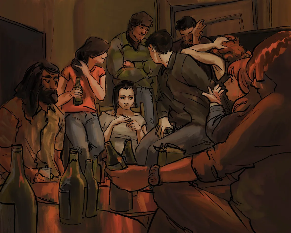
This was reffing a photo on pinterest; I wanted to refocus on how I want to handle stylizing figures.
I am slowly starting to nail down a process – there’s a rough sketch, a rough colour, inks, and then selection-based painting.
For this piece I did it 100% in procreate, which means using their slightly jankier selection tools, but I think for the rough expressive style it worked out fine.
One response to “Style Exploration – Digital Paint with Dark Inked Lines”
-
Ooo I think this is my fav style exploration so far!!
-
-
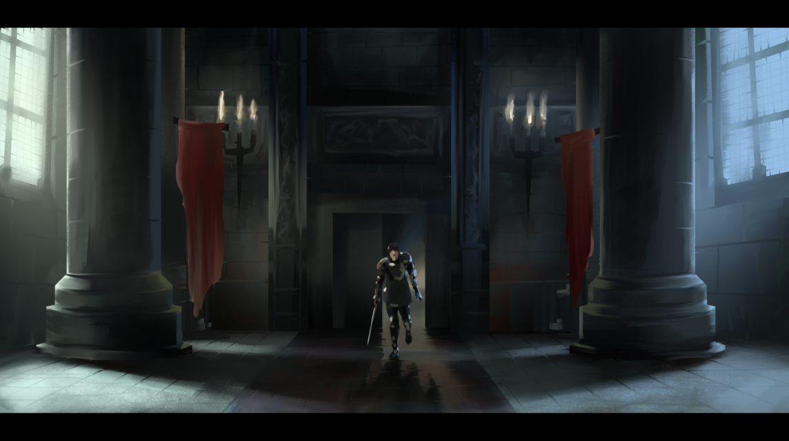
Another film still study, this one from Snow White and the Huntsman. This piece was done in Clip Studio, with a selection tool approach and no lines, and a fair amount of smudging brushes to get those tile and brick lines to feel distinct but integrated.
Clip Studio’s reference layer tools is so powerful for selection-based painting processes! If you haven’t tried them, I definitely recommend digging up a quick overview tutorial and testing them out, it really feels game changing every time I use it, and I’ve been using it for a decade.
-
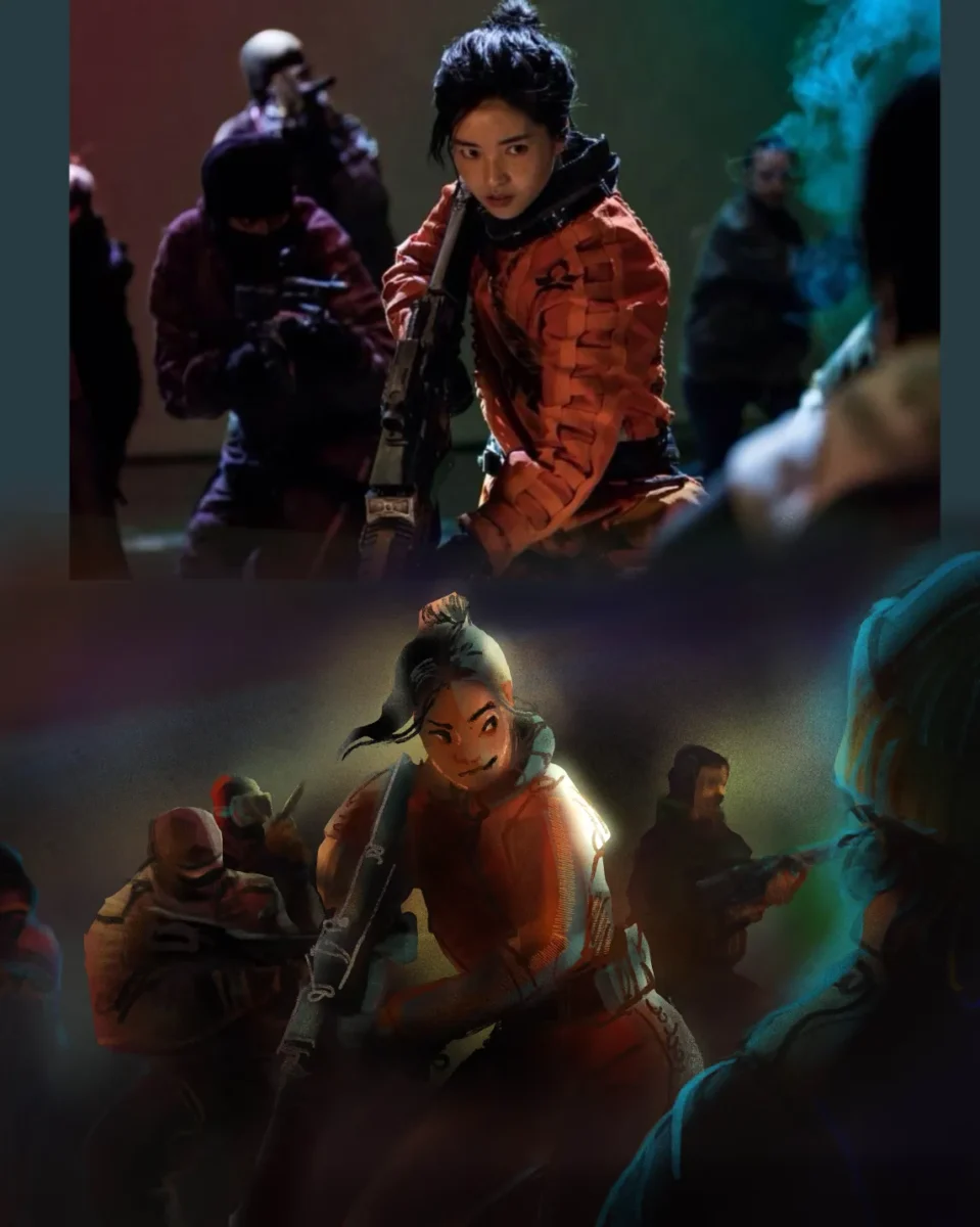
Playing around with painting with the selection tool as well as relying more on chunky colourful linework. Screenshot from Space Sweepers.
-
Astronomics Game Art : Designing Mining Equipment! Pt 1
posted:
updated:
posted to: game devtagged: art directing, astronomics, concept art, indie games, numizmatic, structure, videogames, visdev, visual researchPt 1: Research
Gonna talk this week about designing mining equipment for the sci-fi game Astronomics – demo on steam right now! – And I thought I’d start with a little conversation about research and process (…that doesn’t really have on a much art in it but just stay with me) and maybe get to tap in a little bit into how someone like me who doesn’t do a lot of technical design learned a lot about how to get excited about that whole field through the research stage of this game.
So when I say research I really do mean fairly old-school research — and this is probably gonna be a theme with a lot of the posts about this game in particular, because I don’t think you can build sci-fi without some understanding of engineering systems and current scientific realities to then play with, you know?
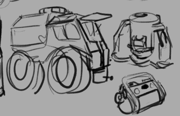
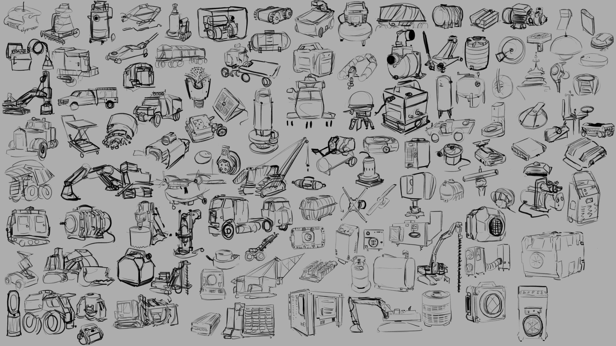
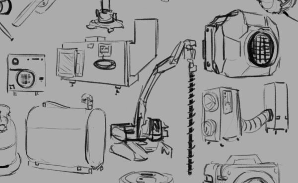
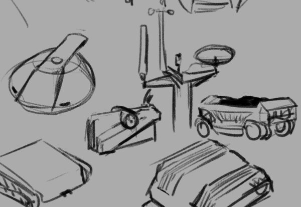
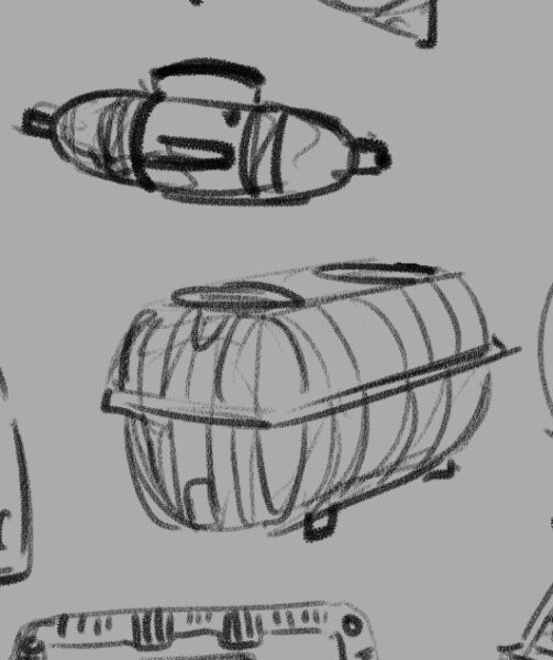
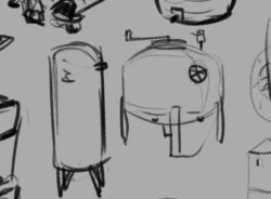
As you may gather from the trailer, Astronomics is a game about asteroid mining, among other things. Which meant that we had a lot of need for legit industrial feeling props and tools for the player to use, things that felt functional and believable without feeling complicated or delicate. I really enjoy the challenge of adding appeal to something that maybe people don’t always think about being appealing or fun or cute (this is never an absolute statement — there’s always somebody already able to see more appeal in any given subject and I could ever imagine) so part of the research stage is going and looking for that appeal. So above you can see a sheet of loose rough sketches I did in clip studio paint from reference that I gathered with the rest of the team and by myself that seemed relevant to some of the designs we were pursuing.
If you’ve had the chance to play the demo, you’ll know that it’s not just surface mining but we are going to be letting you mind gases and liquids and underground mineral veins as well — these are all things that people do in the real world of course, so process one was taking a quick look at those actual industries and then figuring out how I could condense that activity down into a pretty simple and easy to understand machine.
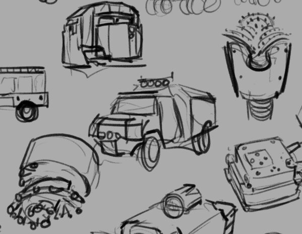
So turned out what we needed was something that drilled and dug, something that pumped liquids, something that sucked air, and all of these things needed to then produce some sort of container to hold what they had collected.
In a videogame you really need to communicate to the player why each act they do is significant and different from the others, and as the art director it was my job to figure how to do that through visual design of the tools they’re going to be using. So that meant that even though you could certainly store liquid and gas and solid resources in the same kind of box, I wanted to try and find ways to keep each thing feeling different. Best case scenario is that you’re able to look at a prop we’ve designed and know in a split second which of these three states of matter it will be containing; in the research stage one of the things I’m looking for is any existing visual language that we have (in this Western English-speaking North American videogame audience culture) that already solves this problem.
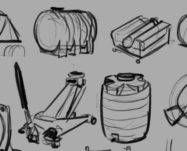
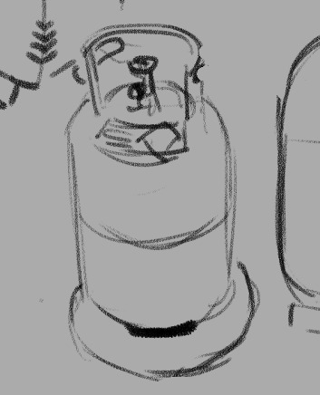
The great thing about industrial design is that they indeed have very intentionally tackled this problem. Part of it is purely physics optimization that the field of engineering has been working towards for human history. For example, when you’re storing liquid and you want to remove all of it from a container you probably don’t want something with corners — that’s how you end up with cylindrical liquid storage. When you’re storing a gas you’re likely keeping it under pressure, which means you need a shape that will withstand pressure evenly, which means you’re looking for something with literally no corners or edges ideally — and that’s how you end up with bubble-shaped gas storage like a propane canister. And then when you’re storing something solid and you want to use the space most efficiently and be able to stack whatever it is that you have packed it into, you have a box.
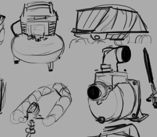
Real good news is, a box and a cylinder and a sphere are all wonderfully visually distinct shapes in a fantastically strong place to start when it comes to solving the question of storage. So then we get into the challenge of the machines themselves — what distinguishes a drill from a pump from a vacuum?
So that’s the beginning of some of the questions that you have to answer when you’re designing props for a game — in the research stage is only one of bunch of different ways you start figuring out these answers. But I want to talk for just a second a little bit about how I personally wrangle my research, because I am definitely not telling you this is the only way to do it. It seems like it may be worth explaining what I get out of this process and see if anything here make sense for you!
One of the reasons that I have this huge page of sketches, big and detailed or tiny and loose, all laid out in one place for me to look at, is because I personally learn and remember things more strongly by taking notes. With my hand holding a pencil ideally. And when they’re abstract concepts or verbal or numerical then I’ll use writing and I won’t have a problem with it, but my job at this stage was not to figure out abstract concepts or to find themes — my job was to solve visual problems. So my first order of business was visual research specifically. Now for me, that involves lots of things — I have a Pinterest board for any sort of subcategory of stuff I’m researching to just do enormous broad research with; then I probably bring most of those images into a huge working .PSD file and move them around to create groupings. And then I start drawing.
I really think that drawing is integral for me at this stage. I don’t think I could do this without drawing as part of my research. There’s so much that I just don’t bother noticing if I’m not going to be drawing the thing that I’m looking at; even the worst, fastest, sketchy as drawing makes me pay infinitely more attention to something then I do when I am simply collecting information mentally. I’m phrasing this in a somewhat exaggerated, self-deprecating way, but I really can’t exaggerate how much more I get out of things when I sit down and draw them. They talk about drawing is a way of seeing, and for me that’s a practice I’ve intentionally pushed and explored in my life.
The other thing, though, is that visual problem that I need to solve. Sometimes solutions to the problem aren’t obvious until they are visualized — it can be very easy to get distracted by things like surface details and miss the silhouette language, or vice versa, but when you are doing the drawing you have to wrestle with the silhouette and the details and make decisions about them. Visual trends appear way more clear when you are drawing something for the 10th time as opposed to simply seeing it for the 10th time. And all of the layers of cultural meaning and context that clutter up a photograph can be simply ignored as you transfer only what you need to a drawing, where you might discover something that everything else hid until then. Beyond that, one of the things you may notice about the sketches is that they are somewhat cartoony — I’m certainly trying to capture important details and be representational to a degree, but much like gesture drawing the human figure, researching this way lets me start finding out what the gestures are of these different sorts of subject matter. This is something that I knew about creature design, and about flora design, and one of the real joys of this game in particular was proving to myself that this gesture approach applied to industrial machines and technology as well.
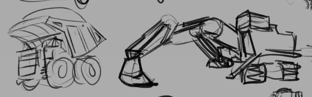
I mean, I knew that there were cute trucks out there, but gosh.
I think if you are in need of something to reinvigorate a particular piece of subject matter for you — if you’re designing something that you are just not that excited about, or if you don’t feel challenged by the work in front of you — I really think sitting and sketching from reference can open up the complexities and help push you and your work farther. It certainly works for me and I know that the learning I did on this game is something I carry with me to future projects as well.
That seems like a pretty strong place to leave this post in particular, but I’ll be back later this week with more breakdowns and screen caps of the actual design process of all of our adorable mining equipment!
I would really love to hear from folks if you also engage in similar research processes before going into full design mode — or if you have a completely different way to get your mind revved up and ready to go, I would really enjoy reading about it!
In the meantime, if you’re curious about mining asteroids but it’s cute please feel free to check out the Astronomics demo on steam, I made an awful lot of visdev art for this and handed it off to some incredible game creators who have done some really impressive stuff taking their ideas and my ideas and running to honestly some pretty new and exciting places with them.
-
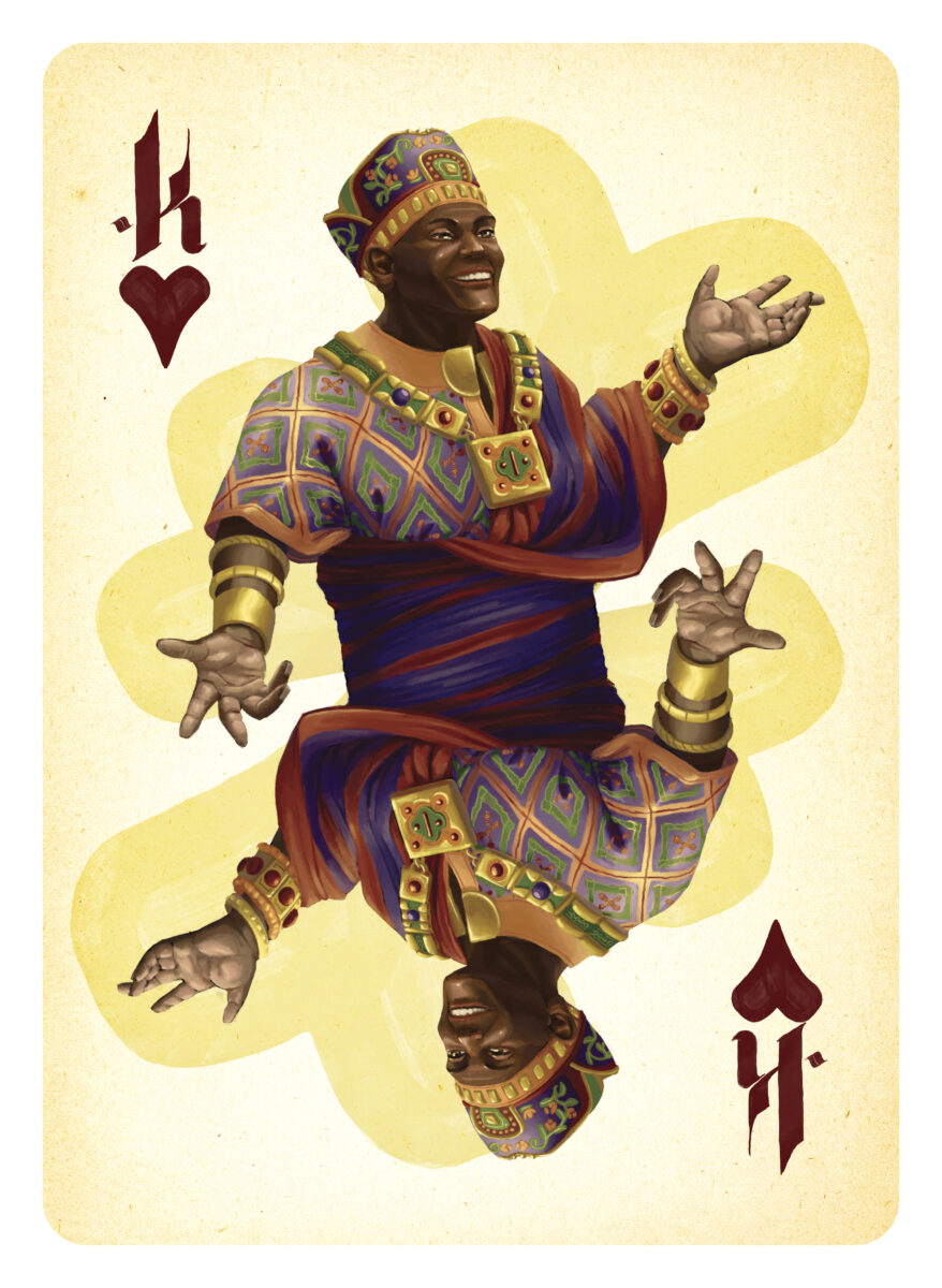
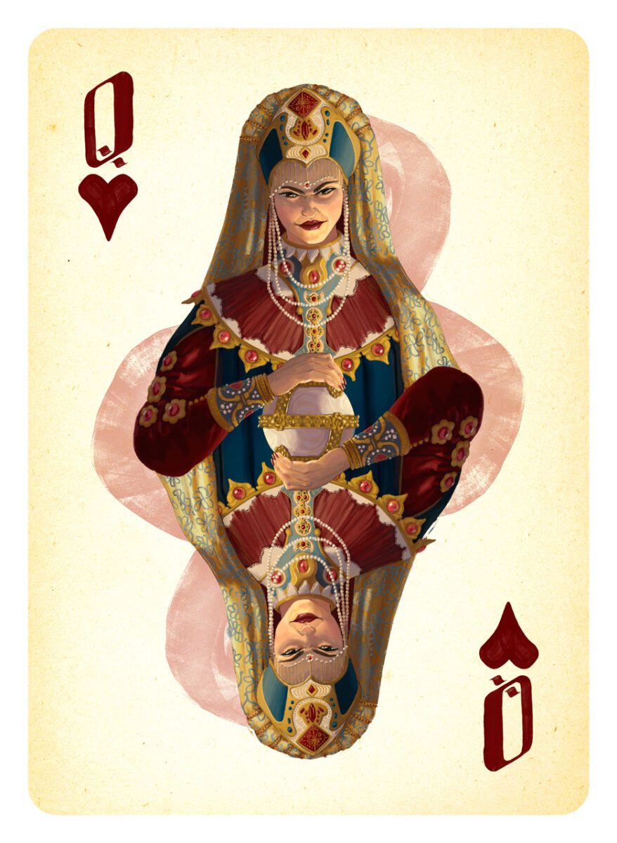
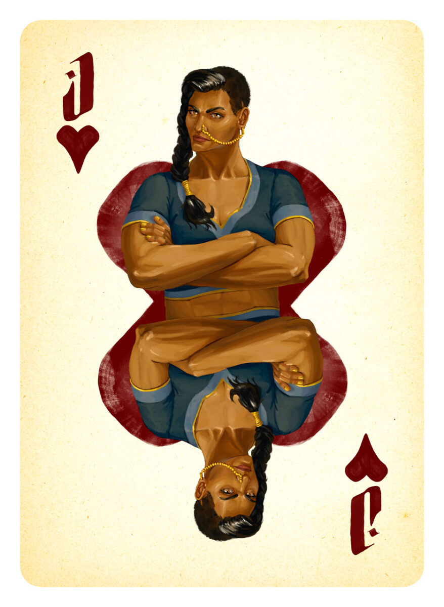
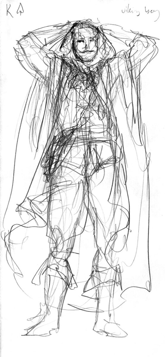
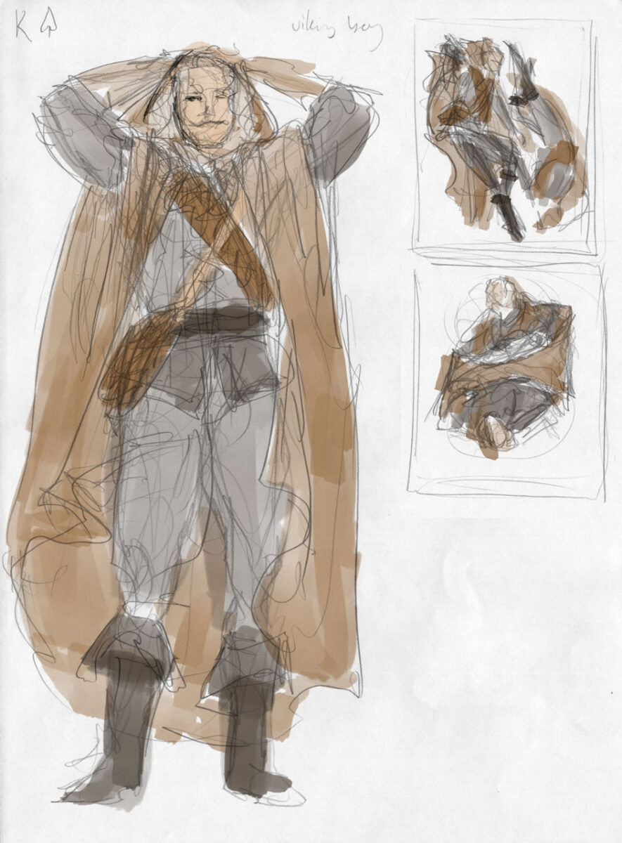
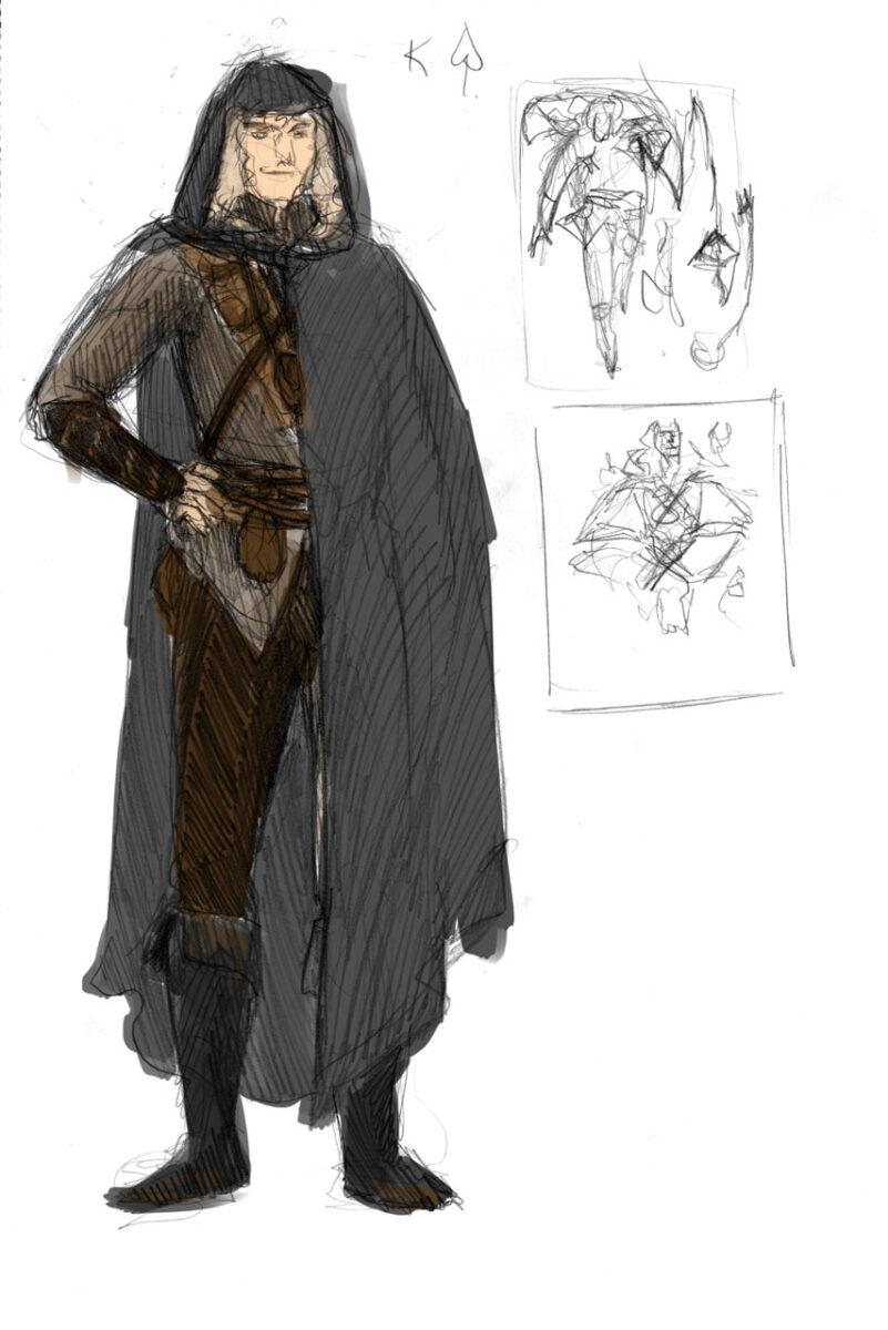
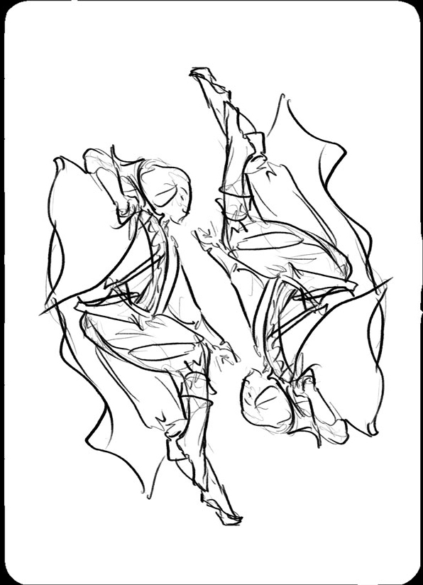
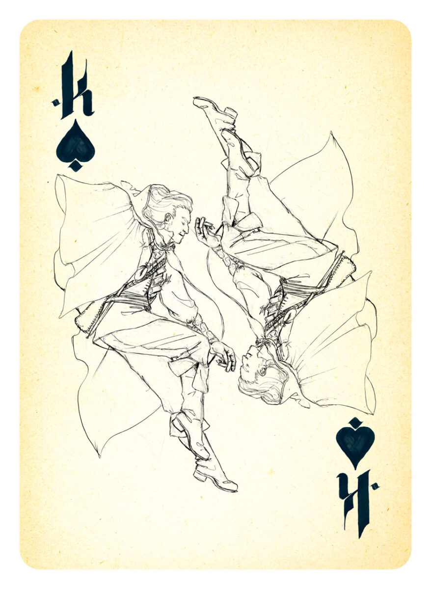
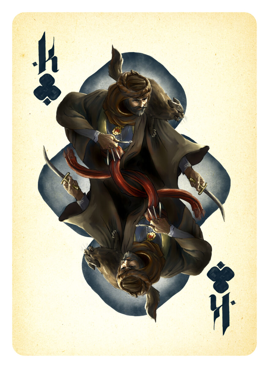
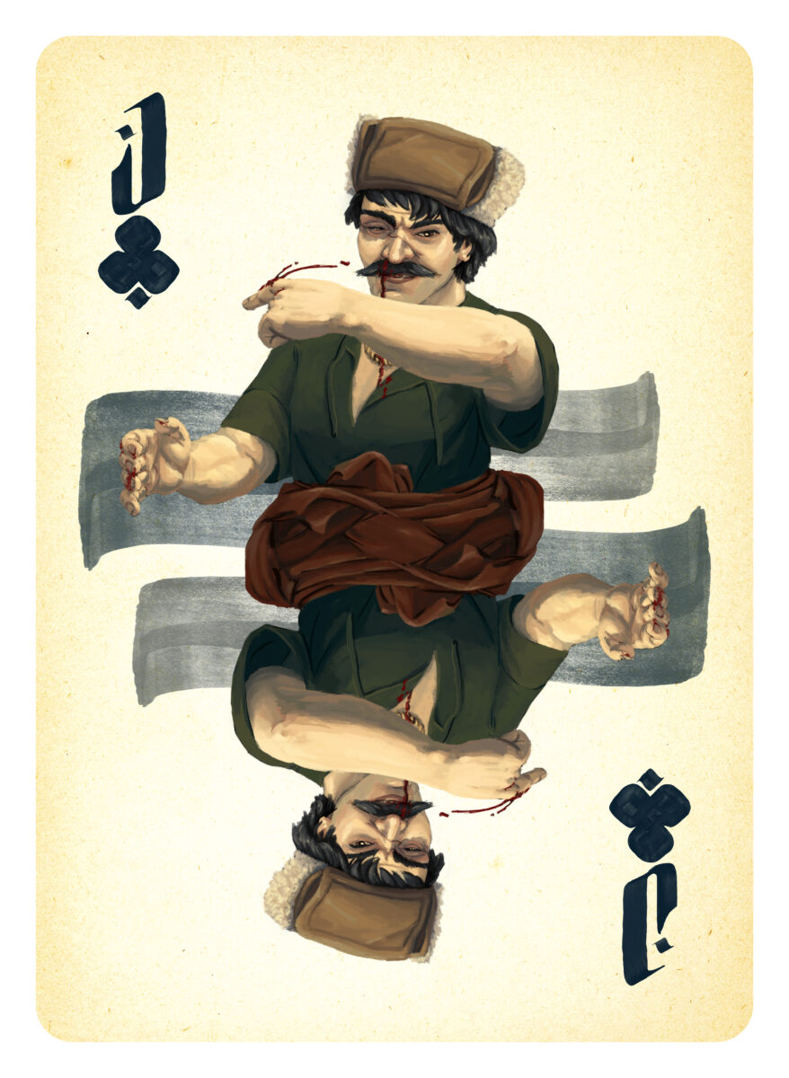
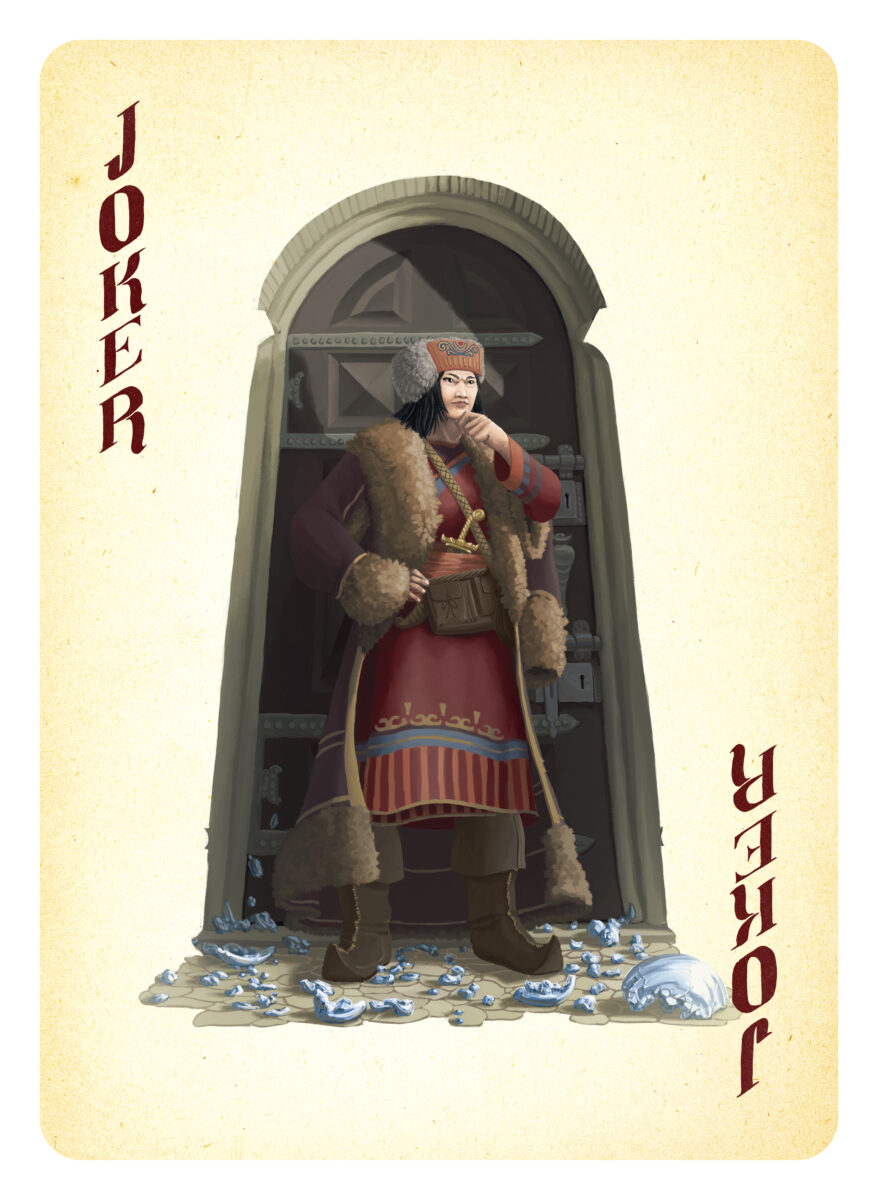
About a decade ago I had the privilege of painting a card deck of fantasy medieval fighters, thieves, assassins, and sorcerers for Will Hindmarch. He had pitched the card deck as both a play aid (the game he was developing at the time used a traditional poker deck) and a world building tool, filling the game with NPCs who taught the players about potential character encounters, NPC alliances, and the flavour and feel of the world they were playing in.
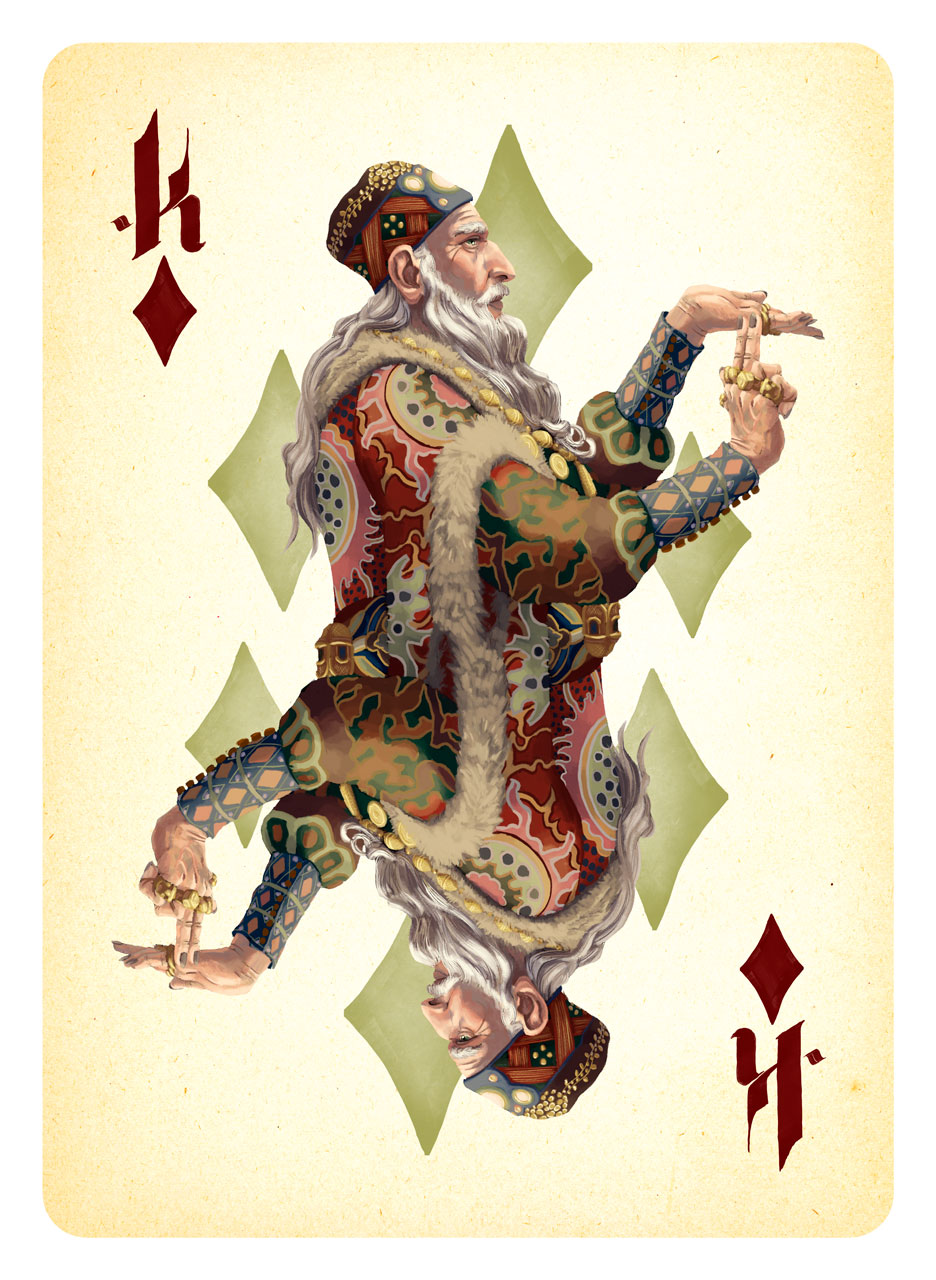
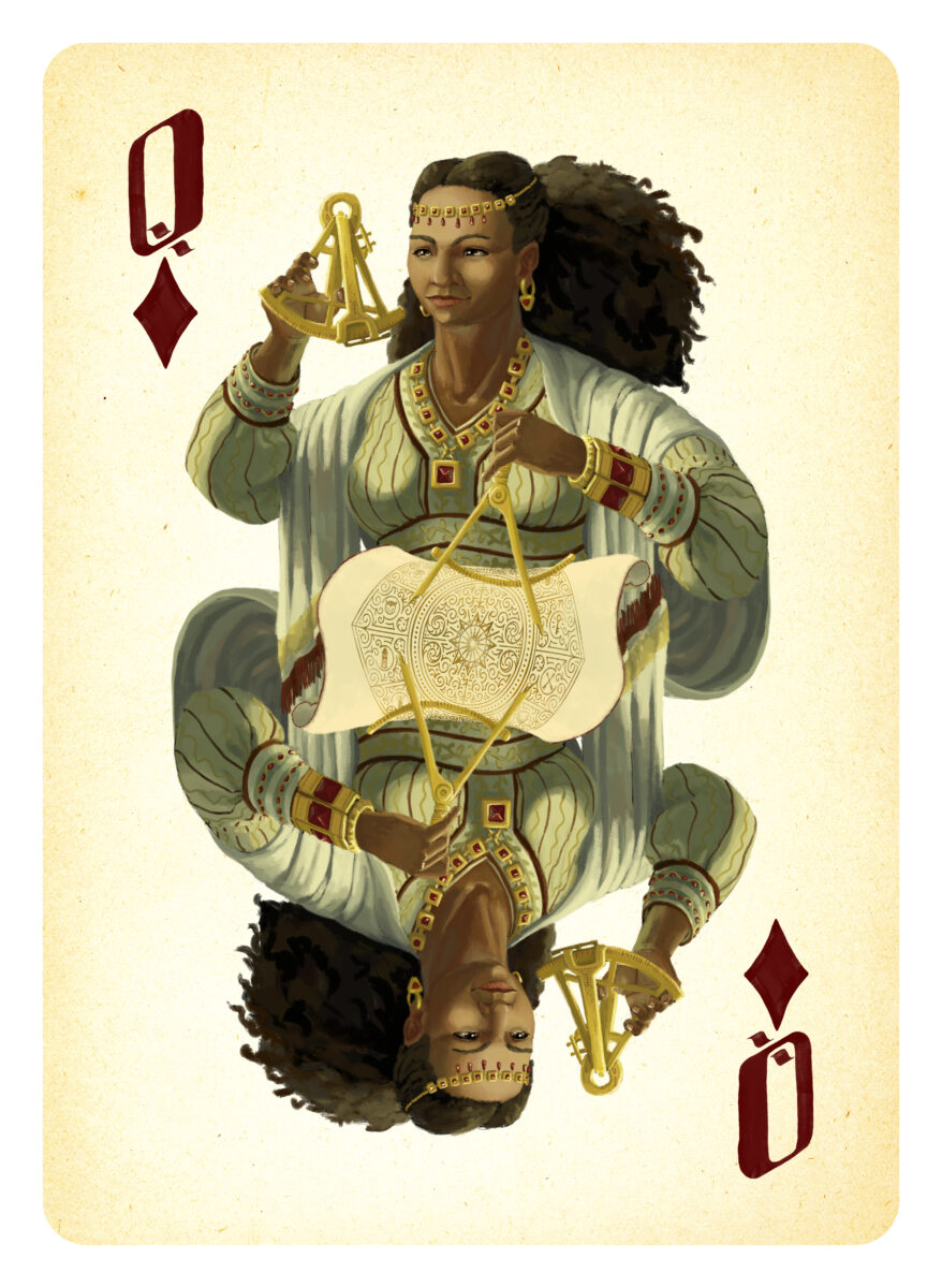
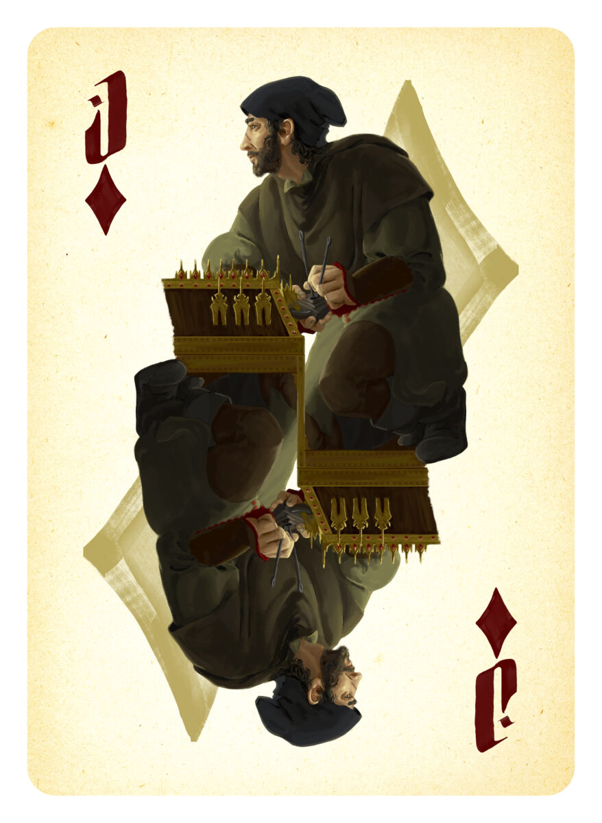
Thanks to these robust goals, I spent a fair amount of the time on these doing character design work and just so, so much research. We built these characters, their outfits, accessories, and any environment you caught glimpses of, out of a variety of medieval, Renaissance, and more recent cultural notes, with a focus on making sure our cast spanned Europe, North Africa, the Middle East and Asia.
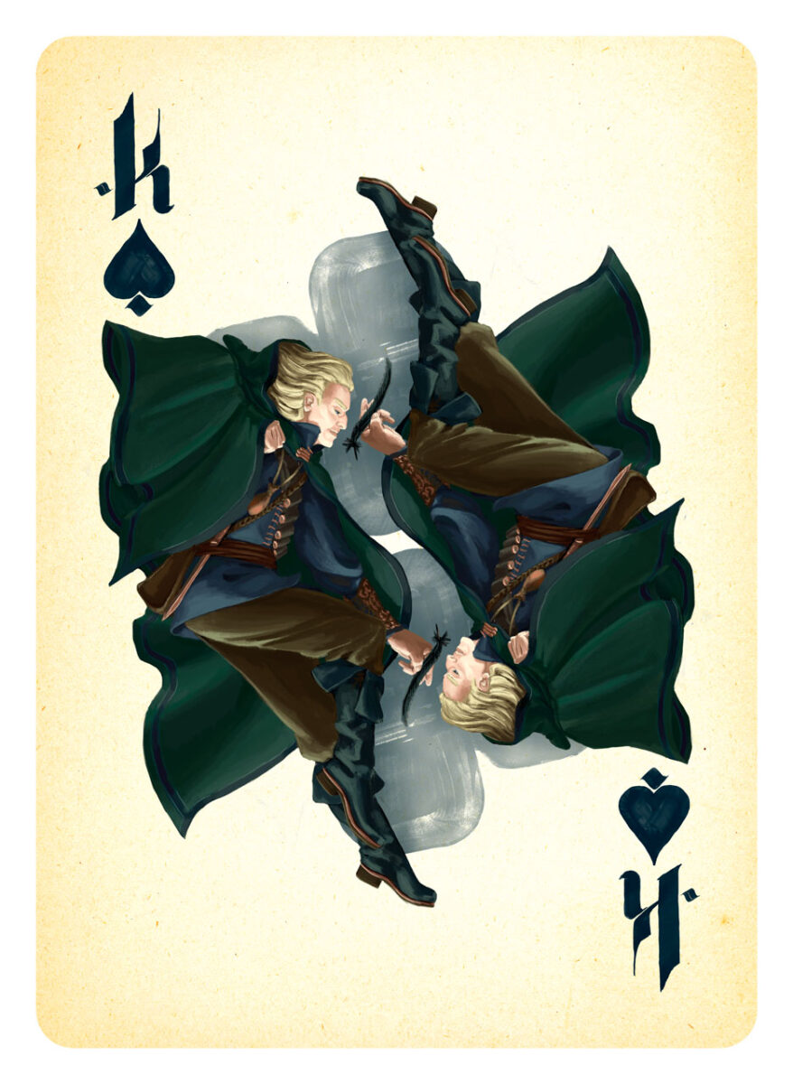
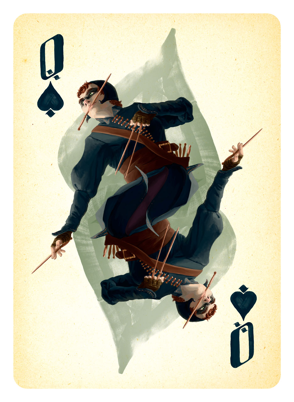
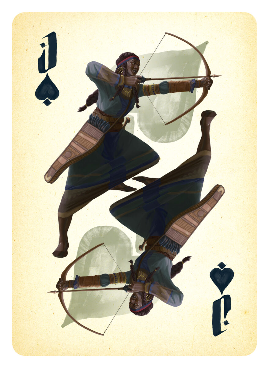
Before I set pen to tablet, I did a lot of drawing on paper, trying to nail down these characters as individuals, and to hammer out what poses best sold the character in the context of the playing card conceit, as we had the goal of keeping the surreal doubling of a bicycle-style poker deck’s face cards.
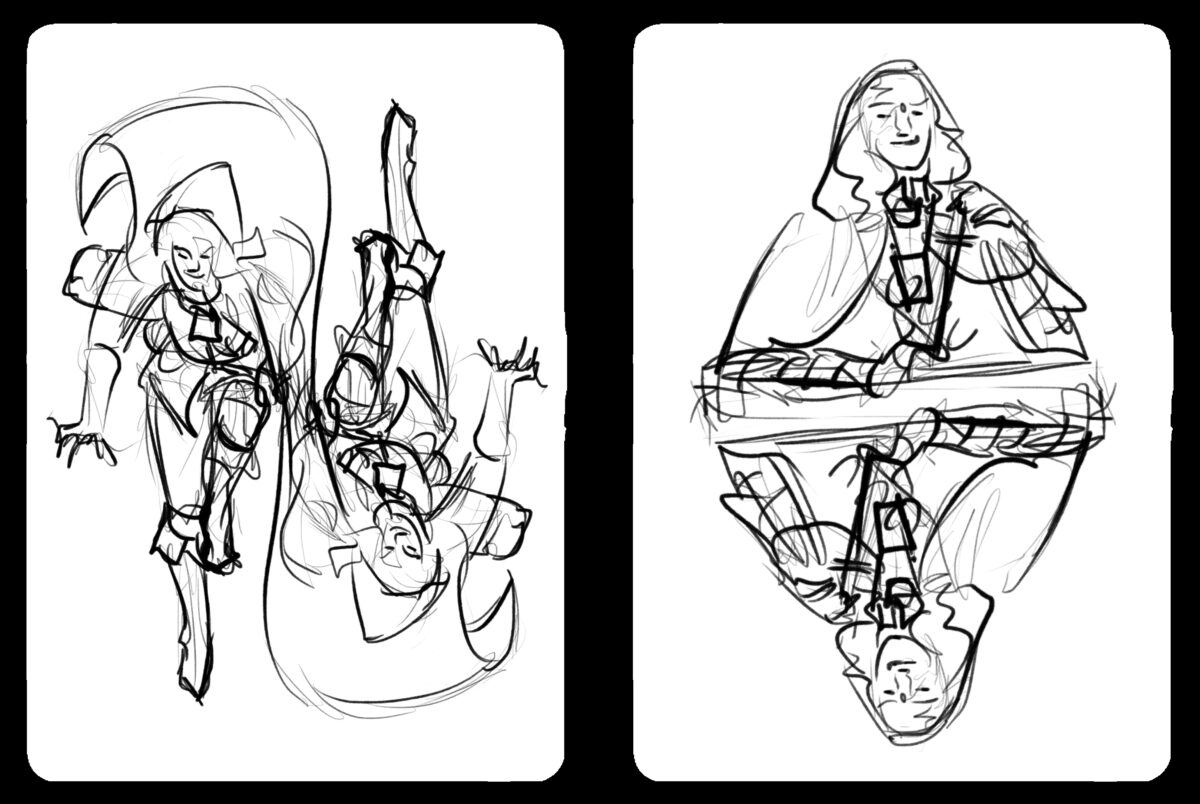
When I was working on these, Will gave me permission to stream the painting process, and I spent hours and hours on Twitch painting in Photoshop and chatting with other art nerds on stream. I made some important art friends that way! And I learned that streaming is a whole job in and of itself, and probably not the way I want to build my career on the internet overall. It was fun! But I’m not really built for it.

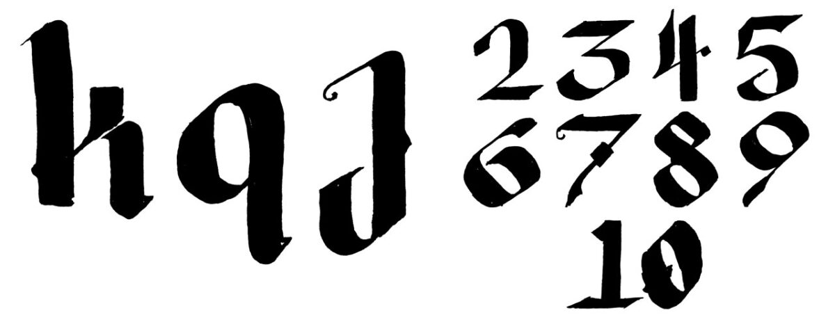
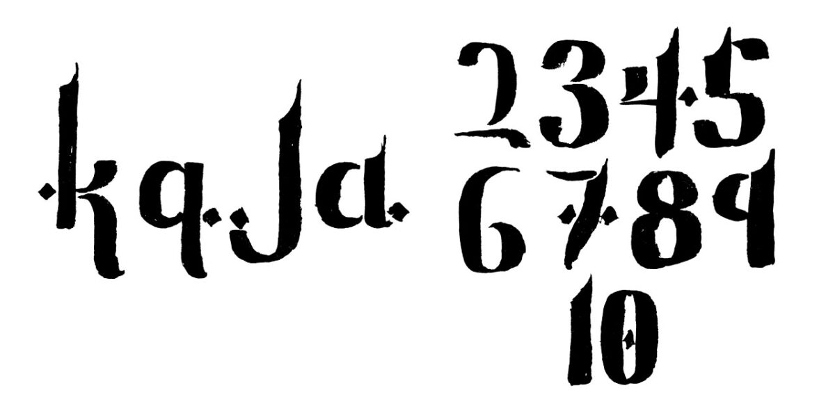
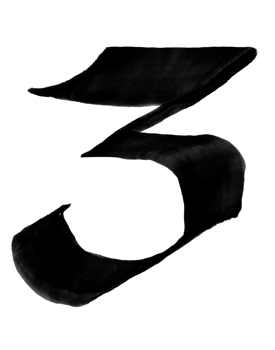
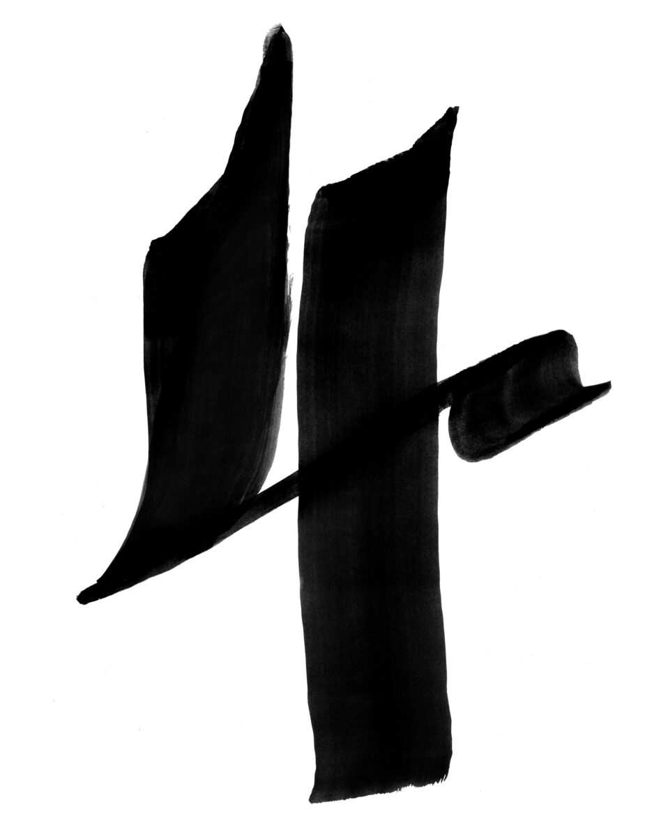
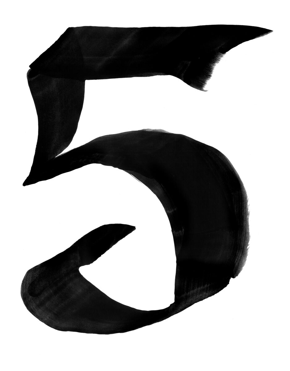
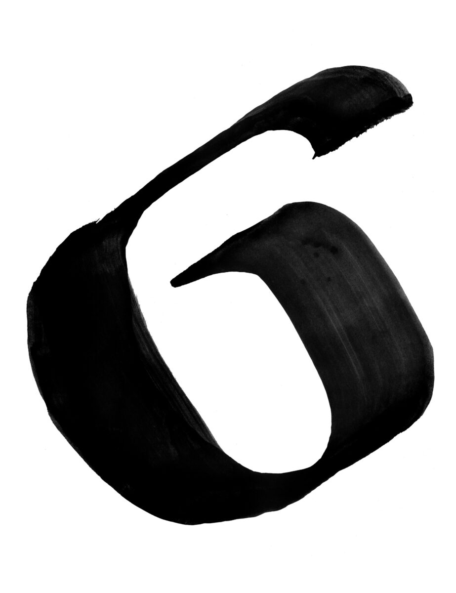
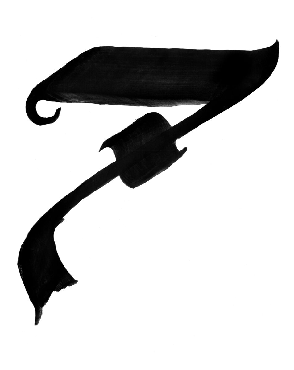
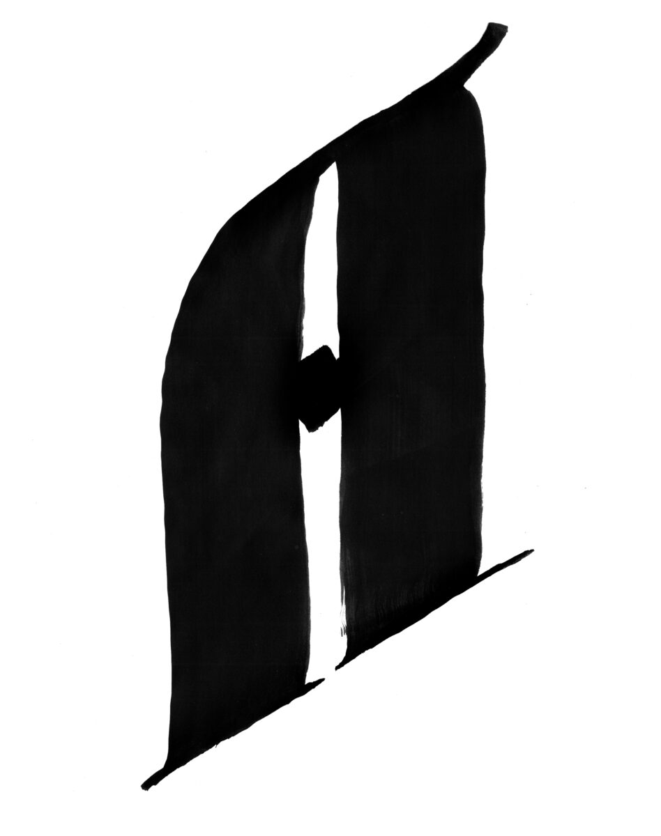
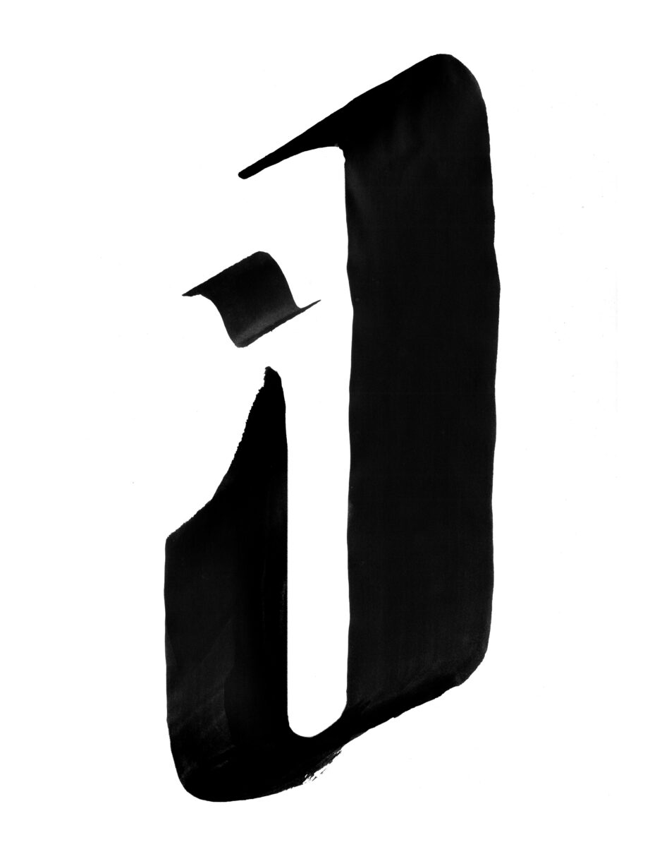
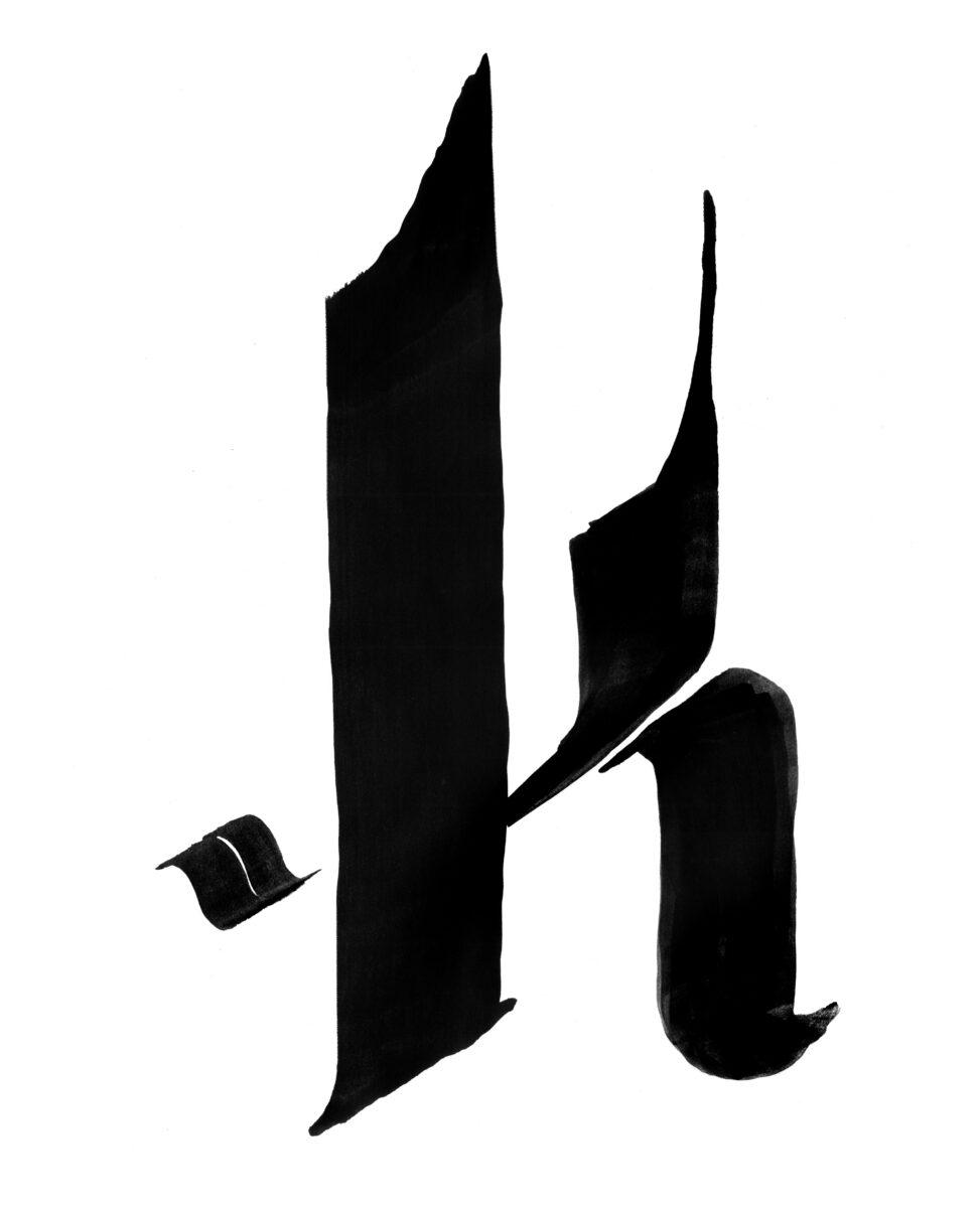
I also hand-lettered the cards, providing Will with all the numbers, letters, and icons required to build out the full deck. We built the lettering style by combining typographic influences from a variety of medieval manuscripts, and I painted them on paper to get as much texture as possible for the overlays on the backs of the cards, and then turned them into simpler vectors for use in the graphic design:


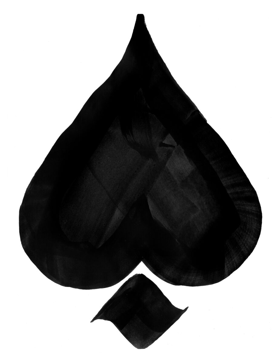
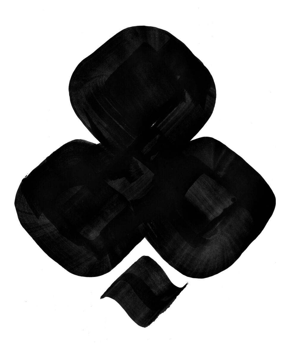
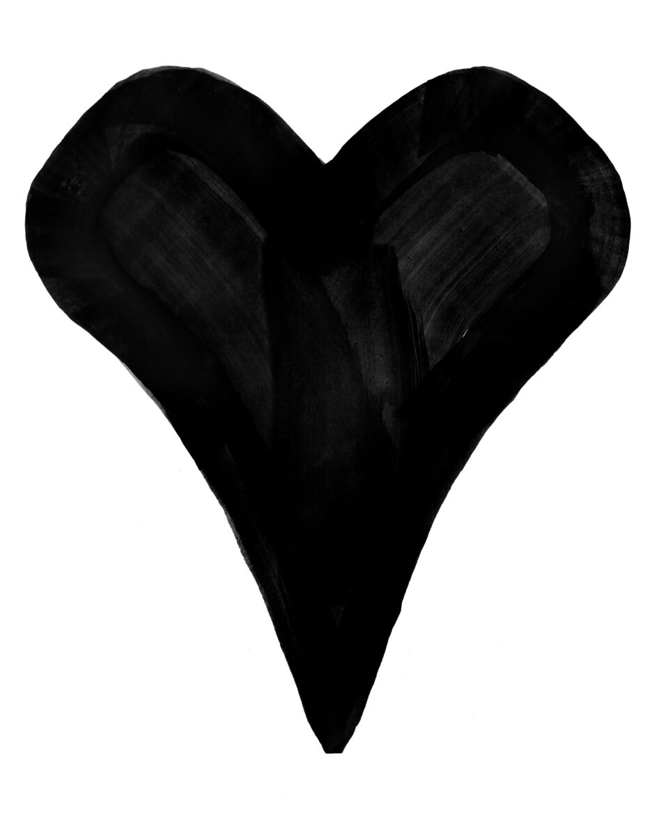
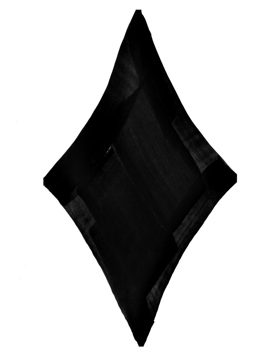


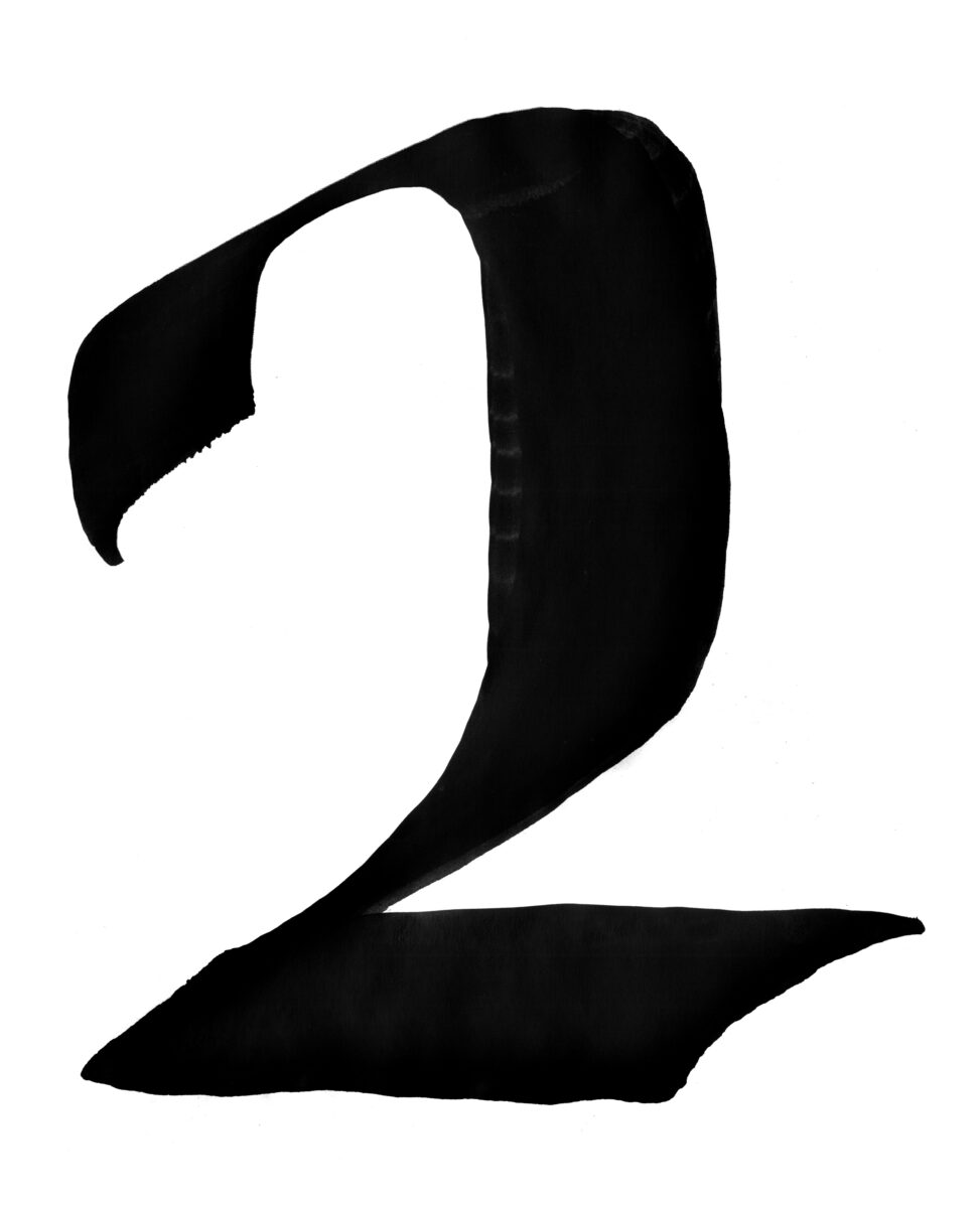


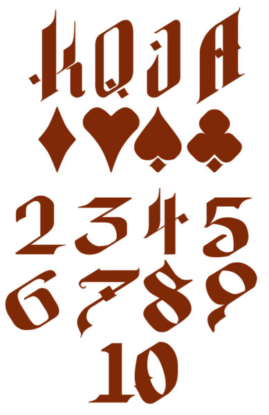
In the end, we built a deck with 16 painted face cards and two painted Jokers (functionally the detectives that pursue the various criminal elements you meet elsewhere in the deck), and I remain very proud of them all!

2 responses to “Project DARK Card Art Retrospective”
-
These are very nice! It’s unfortunate the KS was never fulfilled and these were never printed, I would have loved to have a deck of these.
-
Omg these are gorgeous!! Lots of love I especially love the font you created and the Jack of hearts
-

Leave a Reply