
swap to chronological order of most recently posted
-
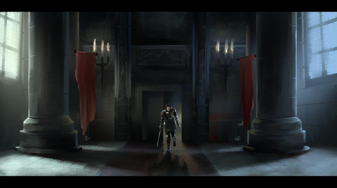
Another film still study, this one from Snow White and the Huntsman. This piece was done in Clip Studio, with a selection tool approach and no lines, and a fair amount of smudging brushes to get those tile and brick lines to feel distinct but integrated.
Clip Studio’s reference layer tools is so powerful for selection-based painting processes! If you haven’t tried them, I definitely recommend digging up a quick overview tutorial and testing them out, it really feels game changing every time I use it, and I’ve been using it for a decade.
-
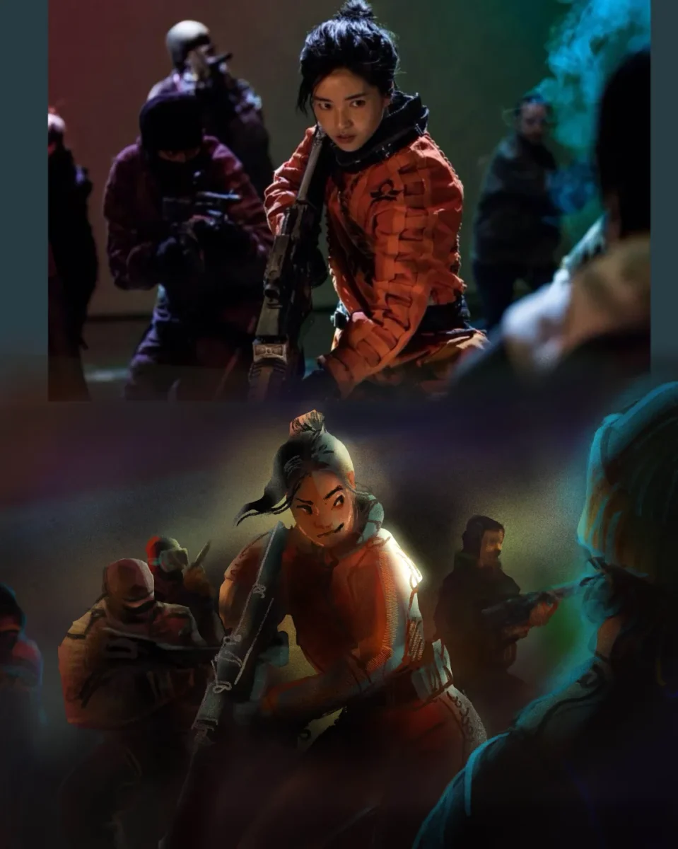
Playing around with painting with the selection tool as well as relying more on chunky colourful linework. Screenshot from Space Sweepers.
-
Astronomics Game Art : Designing Mining Equipment! Pt 1
posted:
updated:
posted to: game devtagged: art directing, astronomics, concept art, indie games, numizmatic, structure, videogames, visdev, visual researchPt 1: Research
Gonna talk this week about designing mining equipment for the sci-fi game Astronomics – demo on steam right now! – And I thought I’d start with a little conversation about research and process (…that doesn’t really have on a much art in it but just stay with me) and maybe get to tap in a little bit into how someone like me who doesn’t do a lot of technical design learned a lot about how to get excited about that whole field through the research stage of this game.
So when I say research I really do mean fairly old-school research — and this is probably gonna be a theme with a lot of the posts about this game in particular, because I don’t think you can build sci-fi without some understanding of engineering systems and current scientific realities to then play with, you know?
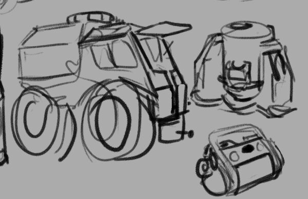
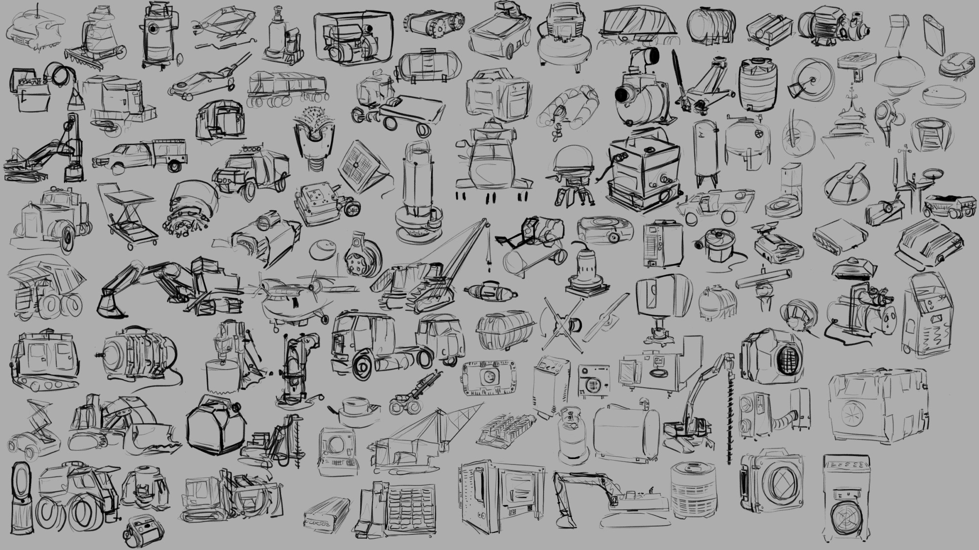
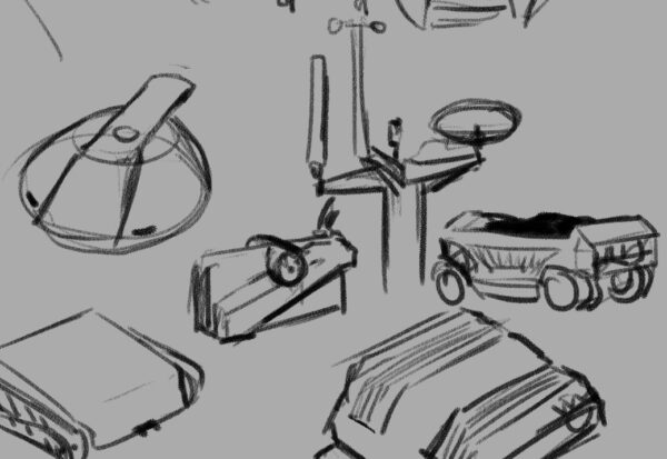
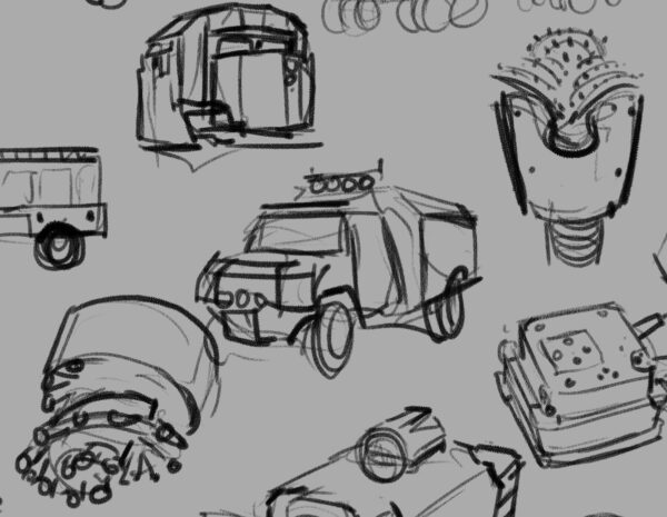
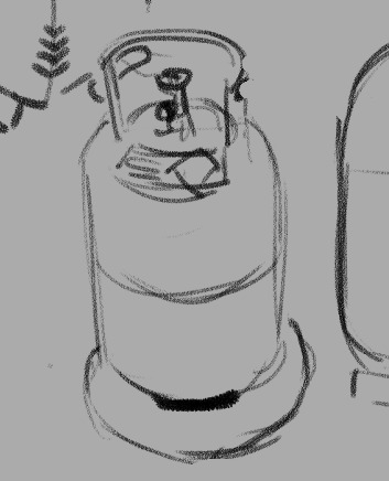
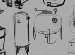
As you may gather from the trailer, Astronomics is a game about asteroid mining, among other things. Which meant that we had a lot of need for legit industrial feeling props and tools for the player to use, things that felt functional and believable without feeling complicated or delicate. I really enjoy the challenge of adding appeal to something that maybe people don’t always think about being appealing or fun or cute (this is never an absolute statement — there’s always somebody already able to see more appeal in any given subject and I could ever imagine) so part of the research stage is going and looking for that appeal. So above you can see a sheet of loose rough sketches I did in clip studio paint from reference that I gathered with the rest of the team and by myself that seemed relevant to some of the designs we were pursuing.
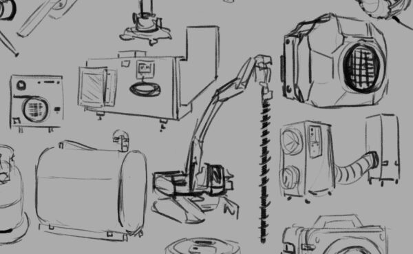
If you’ve had the chance to play the demo, you’ll know that it’s not just surface mining but we are going to be letting you mind gases and liquids and underground mineral veins as well — these are all things that people do in the real world of course, so process one was taking a quick look at those actual industries and then figuring out how I could condense that activity down into a pretty simple and easy to understand machine.
So turned out what we needed was something that drilled and dug, something that pumped liquids, something that sucked air, and all of these things needed to then produce some sort of container to hold what they had collected.
In a videogame you really need to communicate to the player why each act they do is significant and different from the others, and as the art director it was my job to figure how to do that through visual design of the tools they’re going to be using. So that meant that even though you could certainly store liquid and gas and solid resources in the same kind of box, I wanted to try and find ways to keep each thing feeling different. Best case scenario is that you’re able to look at a prop we’ve designed and know in a split second which of these three states of matter it will be containing; in the research stage one of the things I’m looking for is any existing visual language that we have (in this Western English-speaking North American videogame audience culture) that already solves this problem.
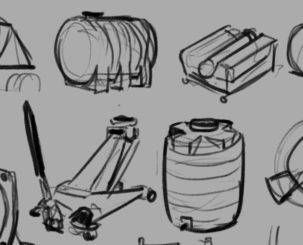
The great thing about industrial design is that they indeed have very intentionally tackled this problem. Part of it is purely physics optimization that the field of engineering has been working towards for human history. For example, when you’re storing liquid and you want to remove all of it from a container you probably don’t want something with corners — that’s how you end up with cylindrical liquid storage. When you’re storing a gas you’re likely keeping it under pressure, which means you need a shape that will withstand pressure evenly, which means you’re looking for something with literally no corners or edges ideally — and that’s how you end up with bubble-shaped gas storage like a propane canister. And then when you’re storing something solid and you want to use the space most efficiently and be able to stack whatever it is that you have packed it into, you have a box.
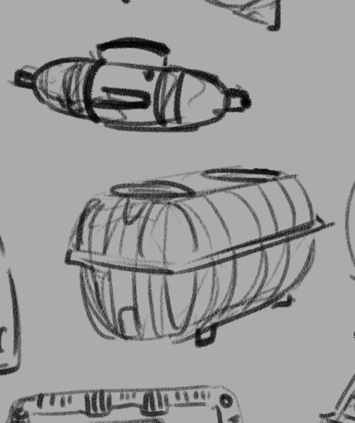
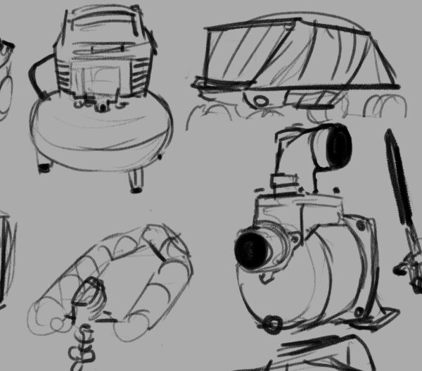
Real good news is, a box and a cylinder and a sphere are all wonderfully visually distinct shapes in a fantastically strong place to start when it comes to solving the question of storage. So then we get into the challenge of the machines themselves — what distinguishes a drill from a pump from a vacuum?
So that’s the beginning of some of the questions that you have to answer when you’re designing props for a game — in the research stage is only one of bunch of different ways you start figuring out these answers. But I want to talk for just a second a little bit about how I personally wrangle my research, because I am definitely not telling you this is the only way to do it. It seems like it may be worth explaining what I get out of this process and see if anything here make sense for you!
One of the reasons that I have this huge page of sketches, big and detailed or tiny and loose, all laid out in one place for me to look at, is because I personally learn and remember things more strongly by taking notes. With my hand holding a pencil ideally. And when they’re abstract concepts or verbal or numerical then I’ll use writing and I won’t have a problem with it, but my job at this stage was not to figure out abstract concepts or to find themes — my job was to solve visual problems. So my first order of business was visual research specifically. Now for me, that involves lots of things — I have a Pinterest board for any sort of subcategory of stuff I’m researching to just do enormous broad research with; then I probably bring most of those images into a huge working .PSD file and move them around to create groupings. And then I start drawing.
I really think that drawing is integral for me at this stage. I don’t think I could do this without drawing as part of my research. There’s so much that I just don’t bother noticing if I’m not going to be drawing the thing that I’m looking at; even the worst, fastest, sketchy as drawing makes me pay infinitely more attention to something then I do when I am simply collecting information mentally. I’m phrasing this in a somewhat exaggerated, self-deprecating way, but I really can’t exaggerate how much more I get out of things when I sit down and draw them. They talk about drawing is a way of seeing, and for me that’s a practice I’ve intentionally pushed and explored in my life.
The other thing, though, is that visual problem that I need to solve. Sometimes solutions to the problem aren’t obvious until they are visualized — it can be very easy to get distracted by things like surface details and miss the silhouette language, or vice versa, but when you are doing the drawing you have to wrestle with the silhouette and the details and make decisions about them. Visual trends appear way more clear when you are drawing something for the 10th time as opposed to simply seeing it for the 10th time. And all of the layers of cultural meaning and context that clutter up a photograph can be simply ignored as you transfer only what you need to a drawing, where you might discover something that everything else hid until then. Beyond that, one of the things you may notice about the sketches is that they are somewhat cartoony — I’m certainly trying to capture important details and be representational to a degree, but much like gesture drawing the human figure, researching this way lets me start finding out what the gestures are of these different sorts of subject matter. This is something that I knew about creature design, and about flora design, and one of the real joys of this game in particular was proving to myself that this gesture approach applied to industrial machines and technology as well.
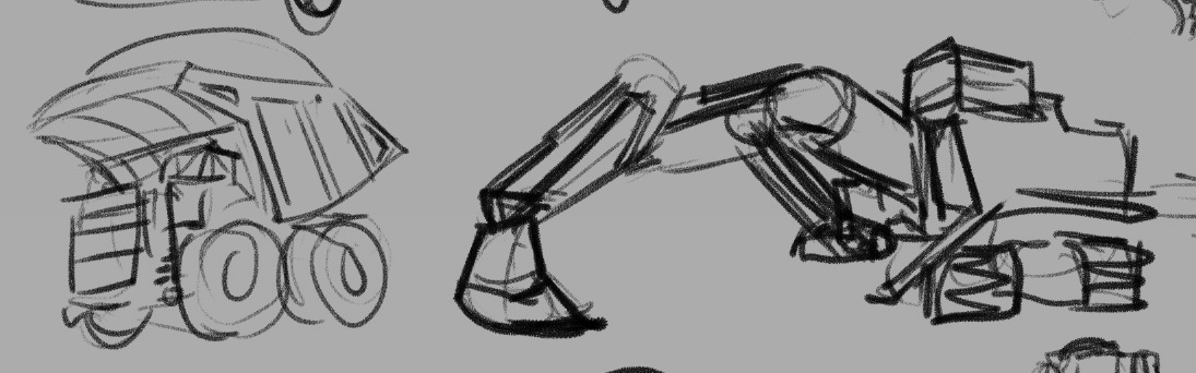
I mean, I knew that there were cute trucks out there, but gosh.
I think if you are in need of something to reinvigorate a particular piece of subject matter for you — if you’re designing something that you are just not that excited about, or if you don’t feel challenged by the work in front of you — I really think sitting and sketching from reference can open up the complexities and help push you and your work farther. It certainly works for me and I know that the learning I did on this game is something I carry with me to future projects as well.
That seems like a pretty strong place to leave this post in particular, but I’ll be back later this week with more breakdowns and screen caps of the actual design process of all of our adorable mining equipment!
I would really love to hear from folks if you also engage in similar research processes before going into full design mode — or if you have a completely different way to get your mind revved up and ready to go, I would really enjoy reading about it!
In the meantime, if you’re curious about mining asteroids but it’s cute please feel free to check out the Astronomics demo on steam, I made an awful lot of visdev art for this and handed it off to some incredible game creators who have done some really impressive stuff taking their ideas and my ideas and running to honestly some pretty new and exciting places with them.
-
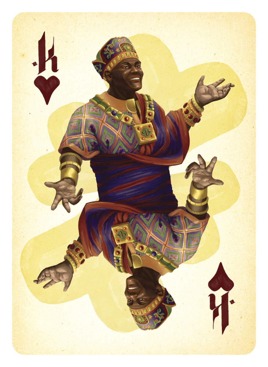
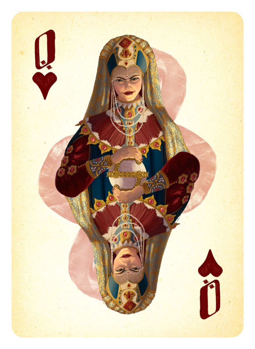
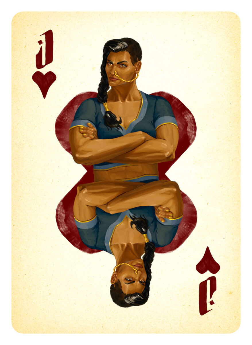
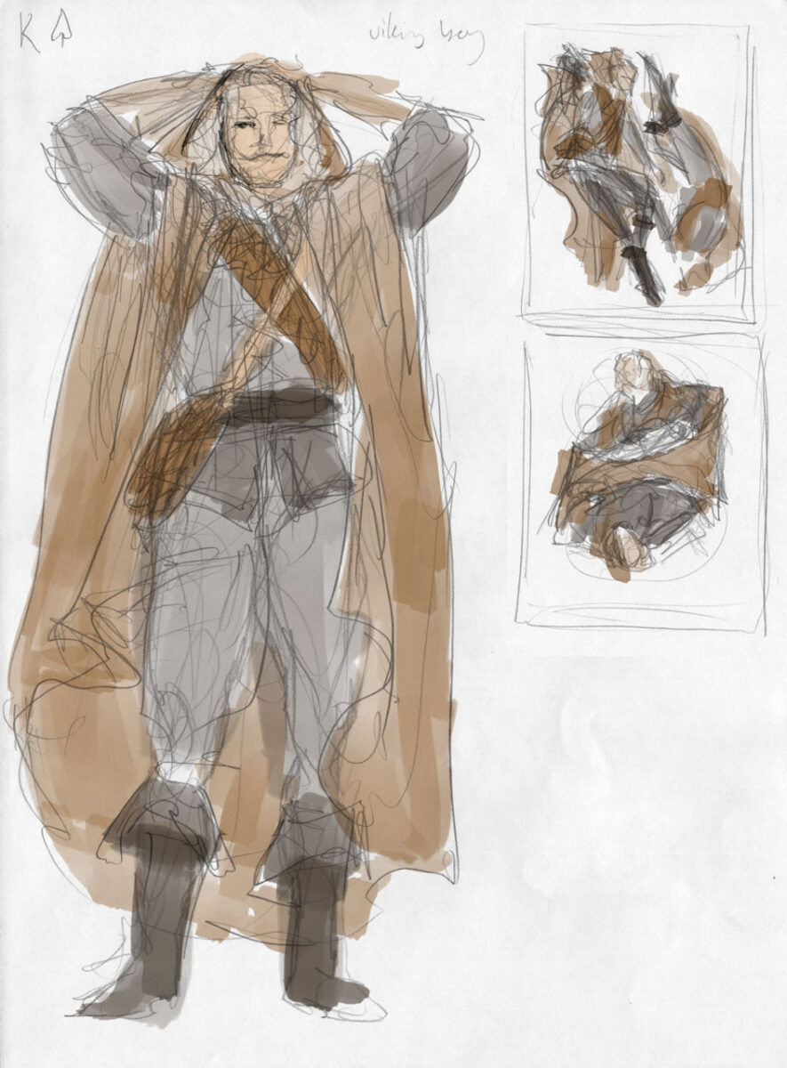
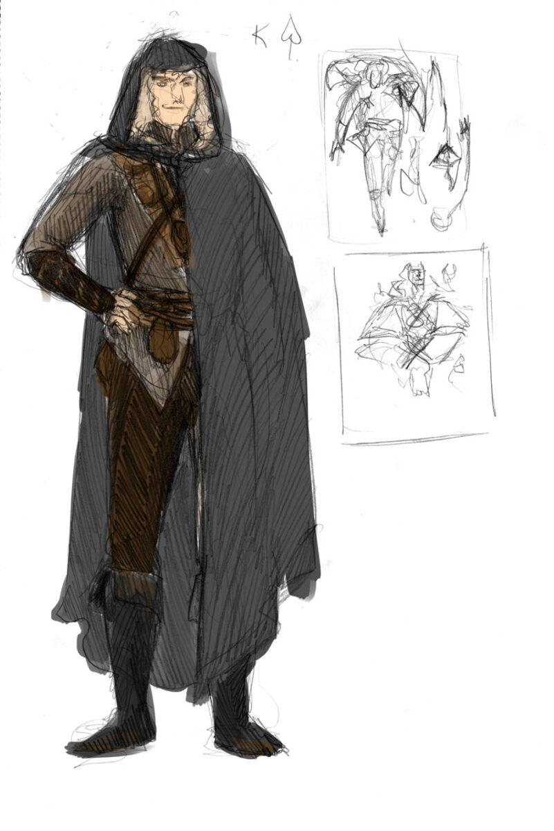
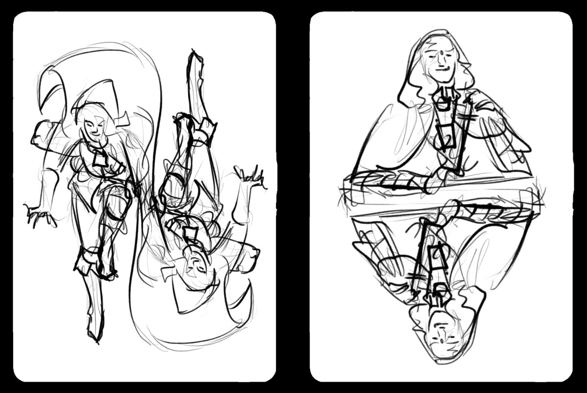
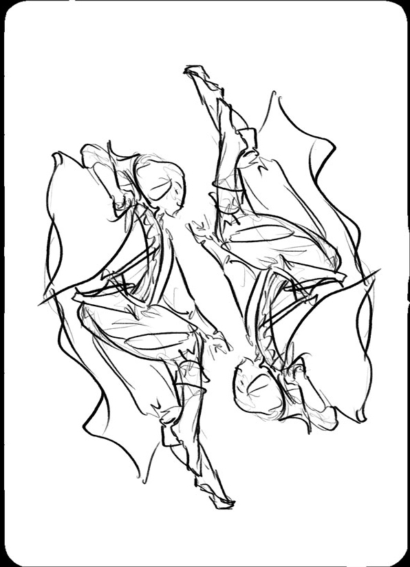
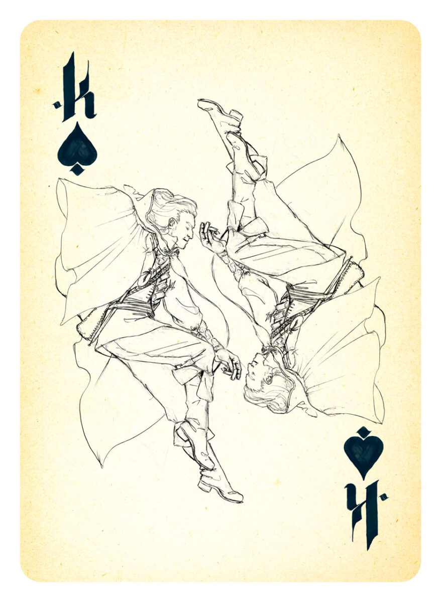
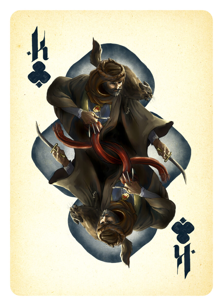
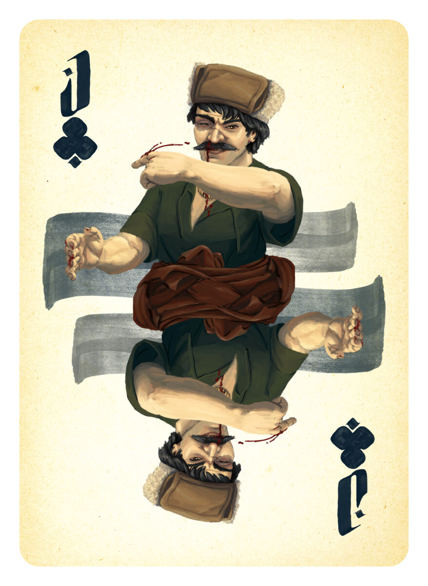
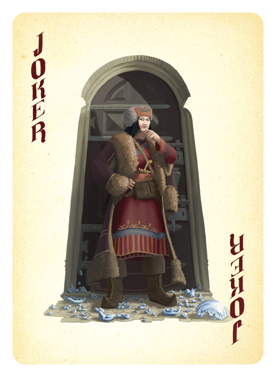
About a decade ago I had the privilege of painting a card deck of fantasy medieval fighters, thieves, assassins, and sorcerers for Will Hindmarch. He had pitched the card deck as both a play aid (the game he was developing at the time used a traditional poker deck) and a world building tool, filling the game with NPCs who taught the players about potential character encounters, NPC alliances, and the flavour and feel of the world they were playing in.
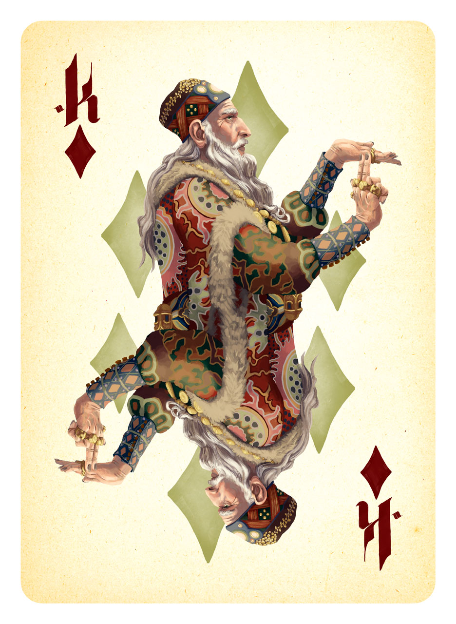
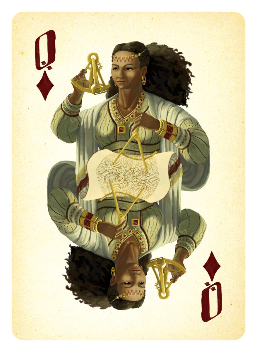
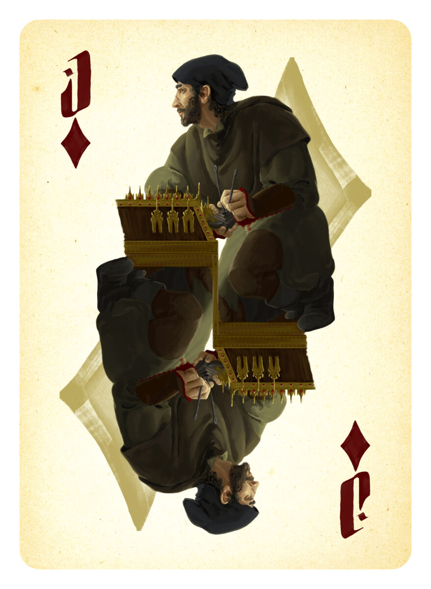
Thanks to these robust goals, I spent a fair amount of the time on these doing character design work and just so, so much research. We built these characters, their outfits, accessories, and any environment you caught glimpses of, out of a variety of medieval, Renaissance, and more recent cultural notes, with a focus on making sure our cast spanned Europe, North Africa, the Middle East and Asia.
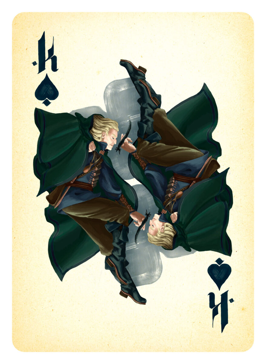
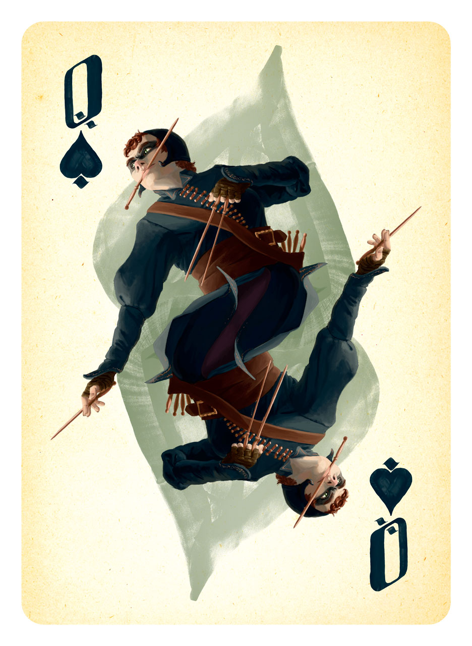
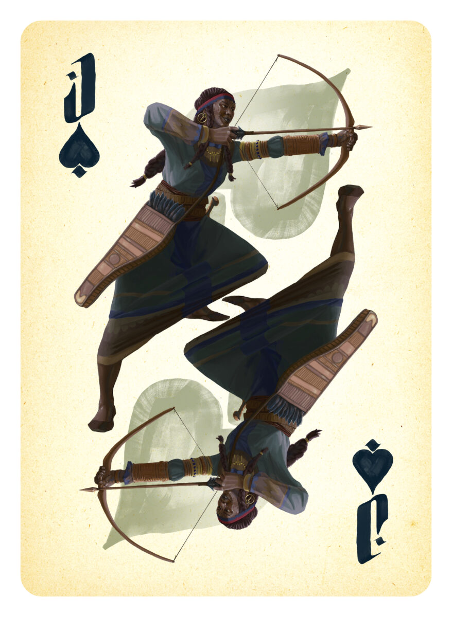
Before I set pen to tablet, I did a lot of drawing on paper, trying to nail down these characters as individuals, and to hammer out what poses best sold the character in the context of the playing card conceit, as we had the goal of keeping the surreal doubling of a bicycle-style poker deck’s face cards.
When I was working on these, Will gave me permission to stream the painting process, and I spent hours and hours on Twitch painting in Photoshop and chatting with other art nerds on stream. I made some important art friends that way! And I learned that streaming is a whole job in and of itself, and probably not the way I want to build my career on the internet overall. It was fun! But I’m not really built for it.

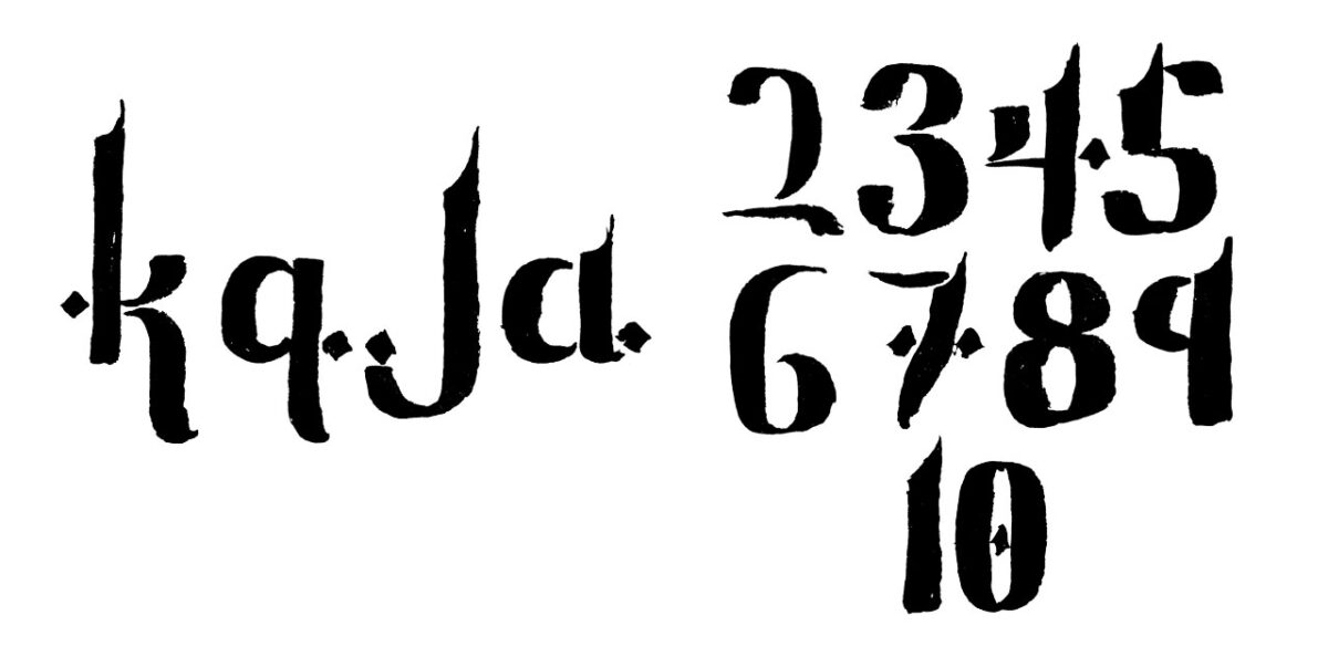
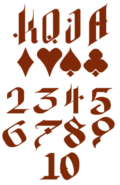
I also hand-lettered the cards, providing Will with all the numbers, letters, and icons required to build out the full deck. We built the lettering style by combining typographic influences from a variety of medieval manuscripts, and I painted them on paper to get as much texture as possible for the overlays on the backs of the cards, and then turned them into simpler vectors for use in the graphic design:


In the end, we built a deck with 16 painted face cards and two painted Jokers (functionally the detectives that pursue the various criminal elements you meet elsewhere in the deck), and I remain very proud of them all!

2 responses to “Project DARK Card Art Retrospective”
-
These are very nice! It’s unfortunate the KS was never fulfilled and these were never printed, I would have loved to have a deck of these.
-
Omg these are gorgeous!! Lots of love I especially love the font you created and the Jack of hearts
-
-
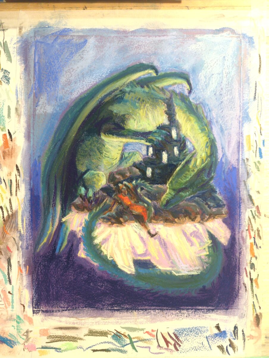
soft pastels on primed paper, 9 x 12″.
-
More than anything else I have worked with, soft pastels – by which I mean the dry, sometimes chalky ones, not the oily ones – really do create that stereotypical art studio chaos from which a beautiful painting emerges.
Everything in my life is now a little dusty. I’ve got an air filter I run, and I catch the dust on sticky tape, and I clean my hands with wet wipes, and i use damp rags for cleanup, and I never blow dust in the air or anything of the sort, but my god do these things get everywhere.
My workable is no longer white. i could probably get it back to white with the addition of soap and some elbow grease, but for now it’s a smudged grey, and that’s how it’s been for weeks. My chair is covered in colourful fingerprints; all my drawing implements are the same.
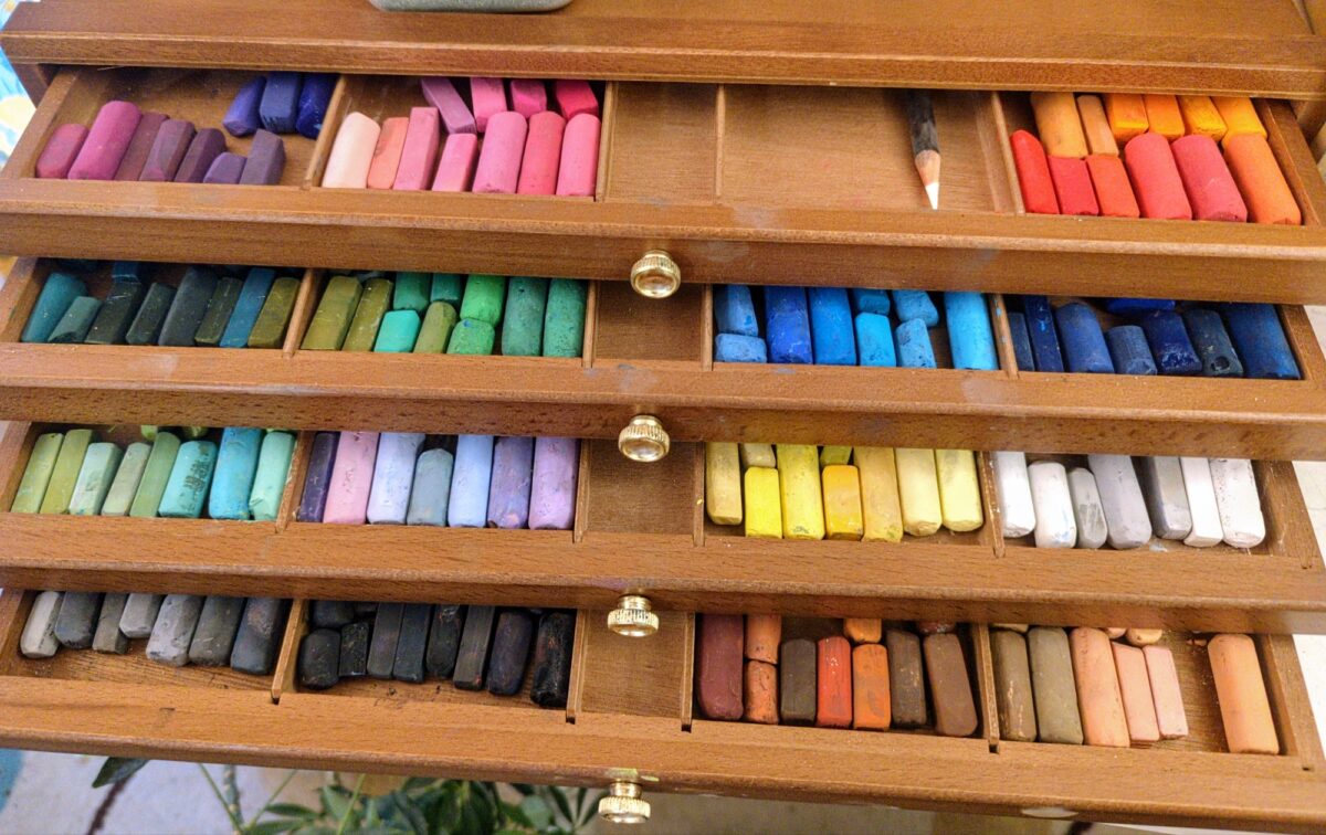
there is no end to the urge to collect these things; different brands have as many as 500 different colors available and it’s a problem. one of the ways I’ve capped my collecting urge with other art media is to limit my storage space, so I recently did good and get those wooden drawers with the hopes of making storing these easier, less messy, less destructive, and concretely finite in space.
The other unending quest is for a perfect substrate to draw with them on. The rag paper has been decent; and I’ve been experimenting with priming it with opaque or transparent watercolor ground, which does add further tooth. The opaque ground does seem to be much better, which is too bad because it’s nice to show off the paper colors underneath.
But there’s so many papers to try! and while most of them are hugely expensive, like pastelmat card and such, my friend did hook me up with a pad of mid-tone gray Canson XL sand texture paper, which I immediately made into a little sketchbook for myself and swatched all my colors into.
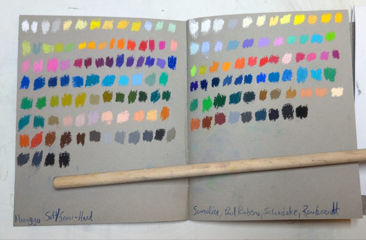
This paper doesn’t hold infinite pigment by any means, but it pulls pigment off of the pastel in a way the other paper I’ve used doesn’t, and might be a decent comparison to a sanded paper when it comes to figuring out how to make certain marks.
I also just picked up some proper pastel ground, so I’m sure I’ll be sharing results of those experiments here as well.
but back to the problem of the mess; my workspace is covered in pastel dust, I am covered in pastel dust and my poor pastels are also all covered in pastel dust! but thankfully a friend showed me somebody using cornmeal and sand as media to clean and store pastels cleanly within, and after a small controlled test I can only conclude that they are geniuses, and I need to go get my hands on some cleanable sand.
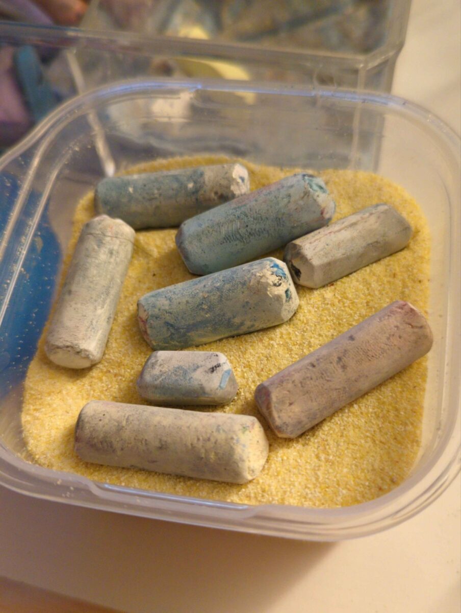
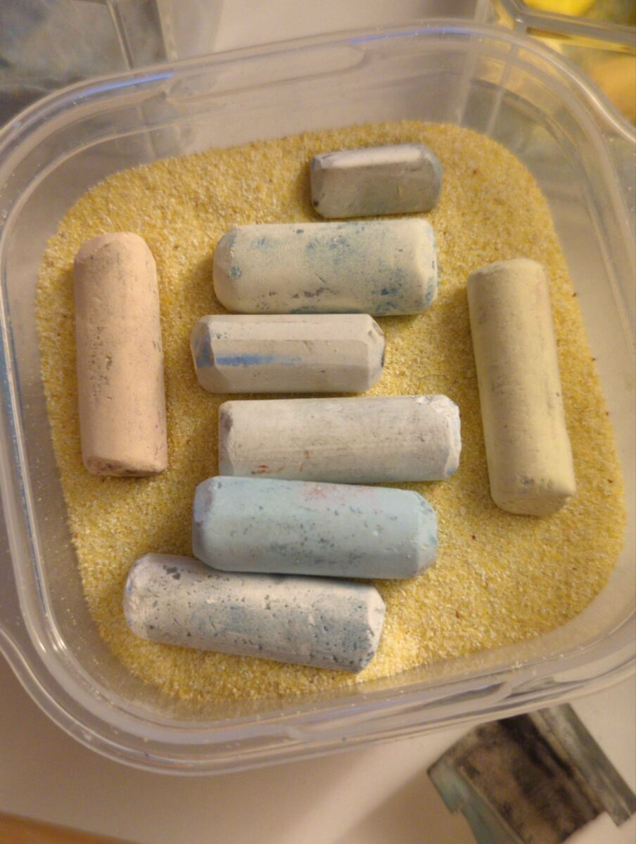
just shaking the pastels around in the corn meal does an enormously effective job on the soft ones of cleaning off all of the gray dust that accumulates on the outside of them. on firmer pastels rubbing them in there with your fingers and sort of pressing the cornmeal against them will get the job done as well. It’s saved me a lot of paper towel, and hopefully also a lot of breathing in any of that dust! since then I’ve upgraded to a larger container for cleaning the pastels, but I’m keeping this small tupperware for when I want to bring a bunch of them to life drawing or such.
I’m still exploring all the different types of pastels, all the different brands available, all the different ways to draw with them, and I got to say that they are a punishing medium, but not in the way I expected.
I think they might have the same problem for me that digital art can have; it’s too easy to overwork things. It feels completely reasonable to blend every single mark that I put on the page; and it doesn’t feel like there’s any reason not to use every single color that I have. except of course I know that better art comes from more controlled palettes and more intentional soft and hard edges, and I know that the papers I’m using have a limited amount of tooth and I can’t simply keep putting layers of blended and softened pastels on top of each other and then expect to be able to throw in one or two clean hard marks on top.
and then much like oil pastels, they really are not made for doing detailed work at a small scale, and I keep giving myself challenges that require that kind of stuff. The real secret is going to be to work larger, stand back from the work more, and stop trying to put tiny figures in my artwork. or at least, make them so tiny that they really can’t get rendered at all. now that I have this canson XL sandy paper hopefully I can work larger without feeling as stingy, and hopefully working with these, much like working with oil pastels, will help me remember to go abstract, be expressive, and play a lot more with my mark making.
I’ve also learned that these store well in those cellophane art bags, the kind you might get when you buy a fine art print from somebody. this is a huge discovery that is going to make it a lot less stressful to produce work and store it. now I can order more glassine paper just for my oil pastels, and hunt down some affordable cello bags for both my print sales and my soft pastels!
in summary, I’m having a great time and I super recommend giving these a shot if you are tempted as well. I think the best bang for your buck is probably the mungyo soft and semi-hard pastel sets; they have enormous ranges of colours and at least in Toronto there’s places that have open stock, allowing me to build a personally relevant palette. and then once you’ve learned how much you like these, you can join me in falling down the infinite rabbit hole of fancier, artist grade soft pastels from senellier, schminke, rembrandt and unison.
is it a bit of a curse that way? yes definitely, but who’s complaining?
One response to “Soft Pastel Materials”
-
Whoa!!! :0 I’m learning so much about pastels, that swatch picture looks so vibrant too I was like whoaaaaaaa hehe, I’m excited to see both your pastel journey and your pastel organization and cleanliness journey :))
-
-
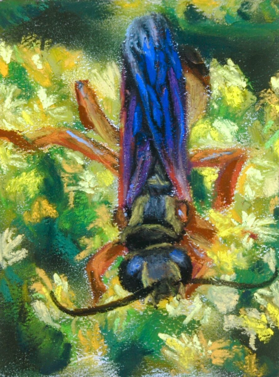
A small study of my own photo of a golden digger wasp on some goldenrod flowers last summer! I primed the paper with some opaque white watercolour ground to add tooth, and honestly I think it helped a fair bit and allowed me to get a nice blend of soft and hard edges on this one.
-
One of my fav tech savvy cartoonists wrote up a huge post on what RSS is, how you can use it, how they’re using it in two different apps, and more! Jey’s a great explainer of complicated things, and if you’ve been noticing folks talking about RSS more these days, this is a great overview and gives you some solid places to start setting up your own rss reading experience!

-
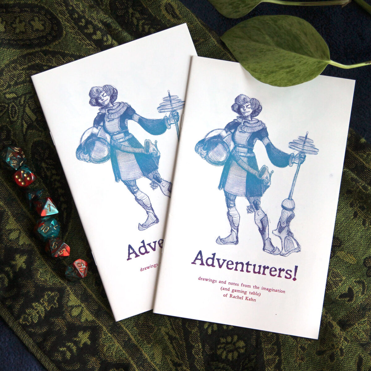
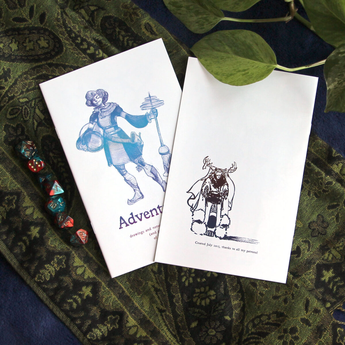
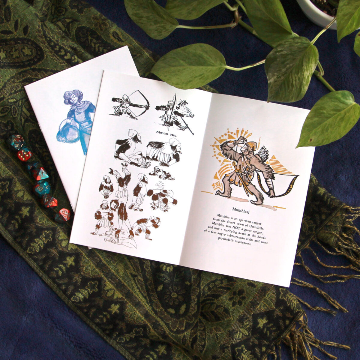
I created the Adventurers zine in 2015 as part of my old patreon, to collect some of my favourite character art from game sessions and story ideas. Featuring scifi, fantasy, and horror protagonists from games like Dungeons and Dragons, Trail of Cthulhu, Feng Shui, and Sword and Backpack.
Available as a PDF on my itch right here: https://sorcererscatalogue.itch.io/adventurers
-
it’s coming along! while I suspect there’s a limit to how much I can do this, I’ve learned that you can use a paper stump or similar to lift up quite a lot of the soft pastel and redraw – which is really letting me get away with changing things that I should have figured out before I started this drawing.
Leave a Reply