swap to chronological order of most recently posted
-
Beautiful abstract video I found while researching music videos and synaesthesia
posted:
updated:
posted to: reccommendationsThis was a bit of a journey! First it started with me looking up Kid Koala‘s music videos, and being very charmed bythe tactile abstraction and simplicity of this one:
Which led me to look up the animation studio he had worked with, See Creature, and start poking around their portfolio of beautiful things:

…wherein I discovered this gorgeous abstract video, “Reflection”:
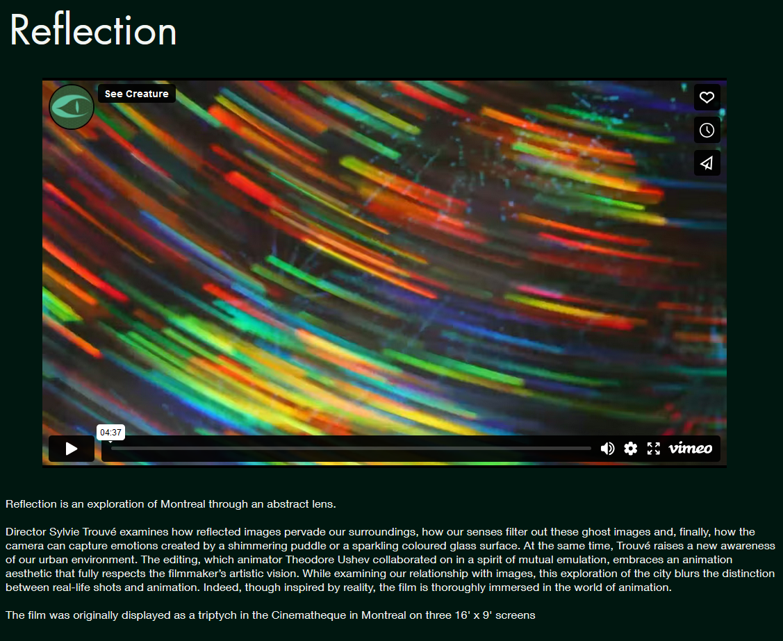
…and of course I HAD to watch that! and I loved it so very much!
Here’s the single window version:
And here’s the triptych, which contains its own amazing decisions regarding integrating three panes. Wish I could have seen this in person!
I love music videos, music animation, and especially abstract music videos! In history of animation in undergrad I remember learning about Oskar Fischinger’s interwar-period abstract animations, and how they led into Fantasia’s Bach sequence. mercifully there’s a beautiful scan of his Optical Poem on youtube these days!
Looks like Fishinger’s work is being archived at the Center for Visual Music in LA, another rabbit hole I absoLUTEly will be going down in future:
Center for Visual MusicWhile I know synaesthesia has a specific clinical meaning, it’s been a term I’ve really found useful to apply to multimedia realtime art – video, dance, games, theatre – to describe the particular effect of temporal unity in visual and auditory work. It’s not the only measure of combing sound and vision! But it feels to me to be similar to visual compositon and musical rhythm or mode – it’s an overall aspect that can build all sorts of emotional responses without necessarily dictating content whatsoever. I love to see it on display for its own sake, the same way I love to see a painting distilling its compositional choices down to one big bold simple statement.
Anyways, thought these were all lovely enough to share!
5 responses to “Beautiful abstract video I found while researching music videos and synaesthesia”
-
Great shares. And yeah, Oskar Fischinger is such a fascinating artist (I studied him too while at university). He was a populist at his core and really attempted to get at something universal with his work by setting abstract shapes and colours to music, something that anyone from any culture or language could appreciate. Since then it’s changed the way I think about abstract art, generally. His paintings are great too.
-
Yeah Fischinger and Kandinsky’s elaborate abstract motivations really helped me get excited about abstract art as well! Undermines the kind of reactionist stance that it’s about obscuring communication.
-
Yeah, absolutely!
-
-
-
-
The Tower of the Forest Wizard
posted:
updated:
tagged: cross section, cutaway, digital painting, fantasy, fantasy art, playmap, portfolio, structure, tower, wizard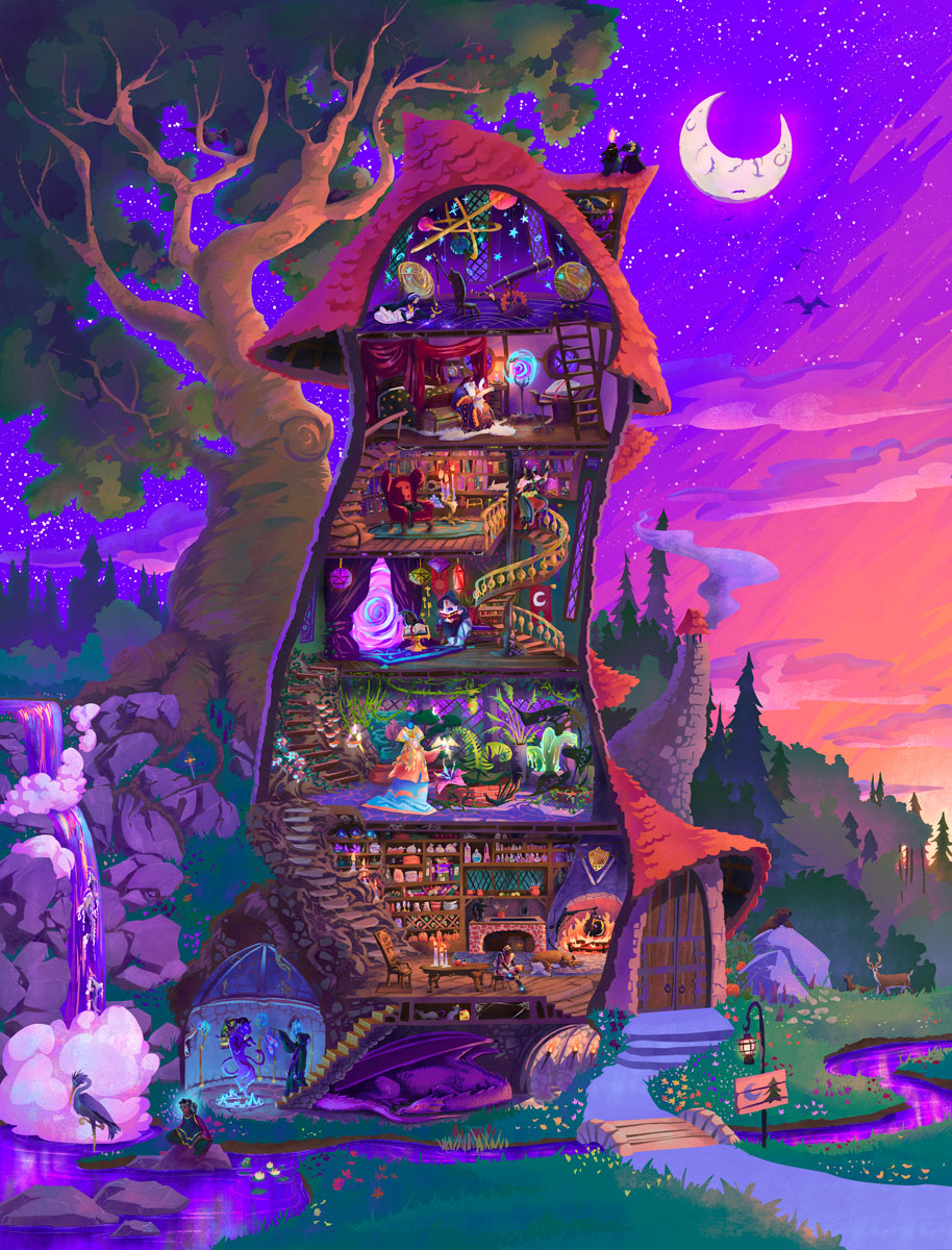
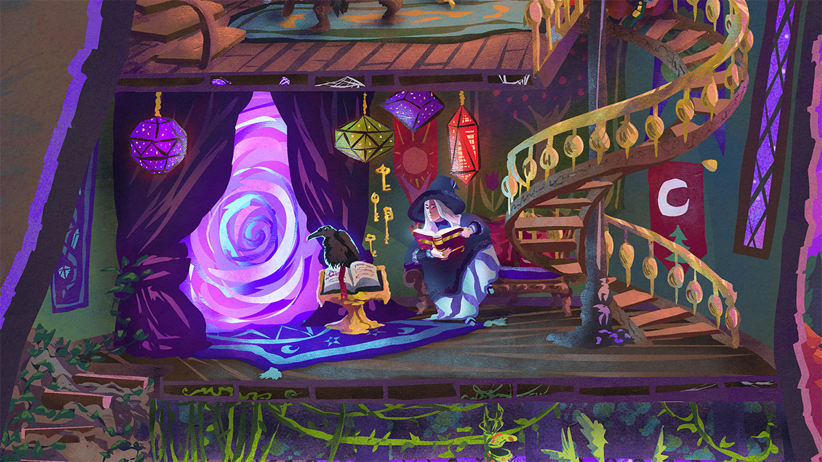
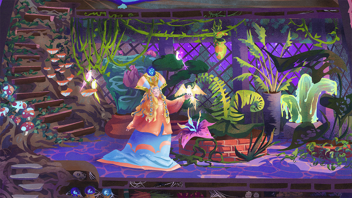
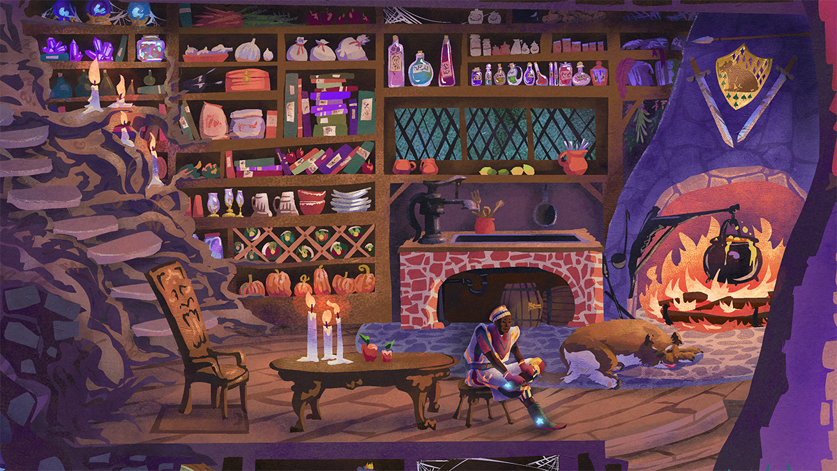
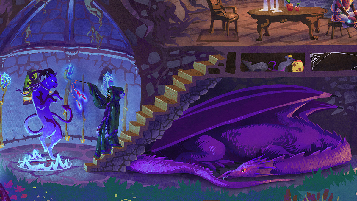
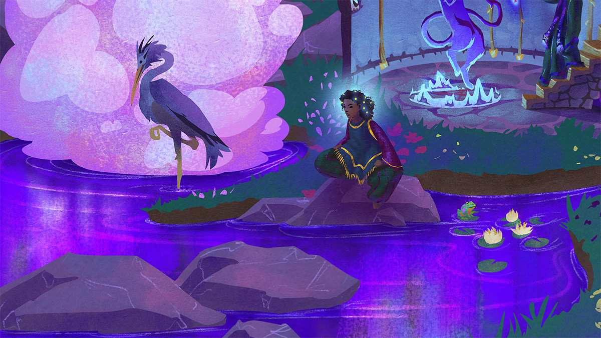
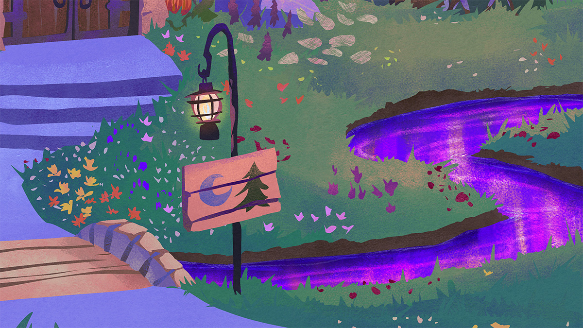
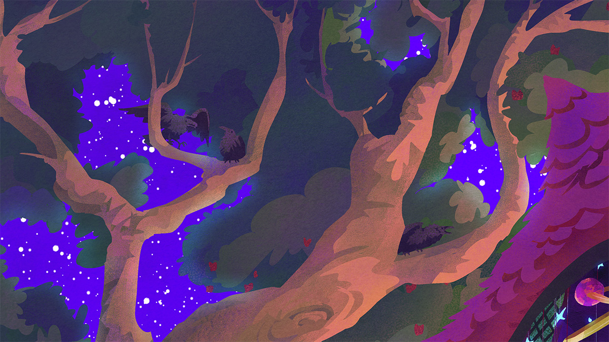
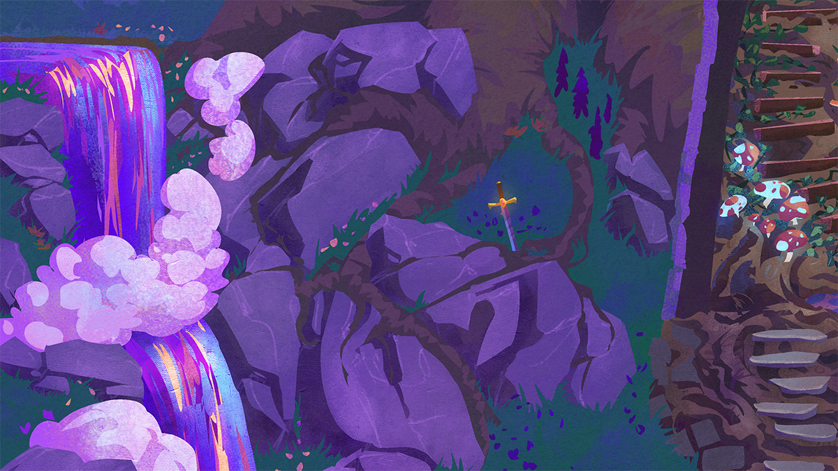
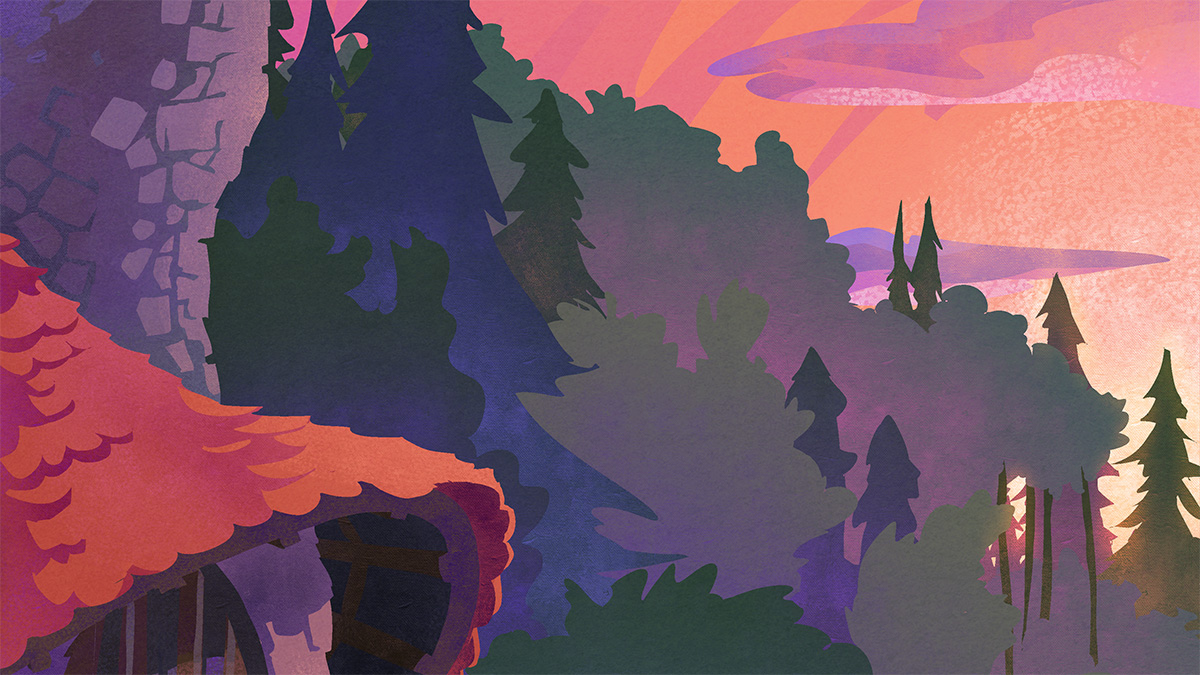
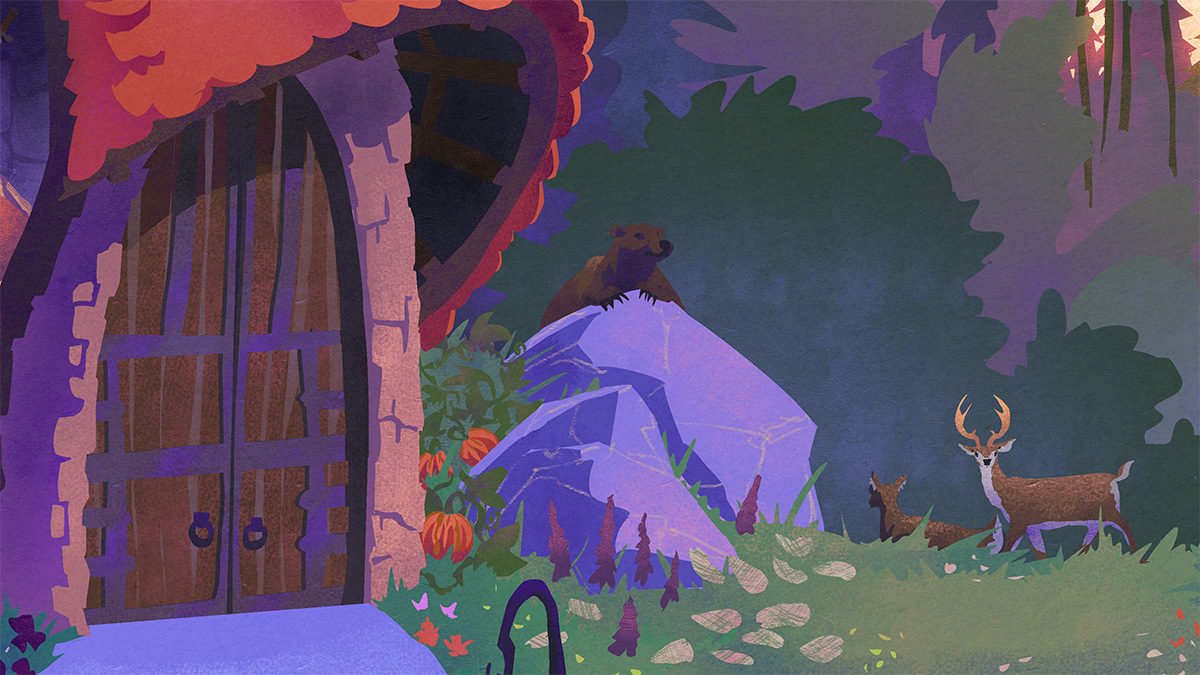
Presenting The Tower of the Forest Wizard, a vibrant painting of a magical wizard’s tower, complete with everyone and everything that it might contain.
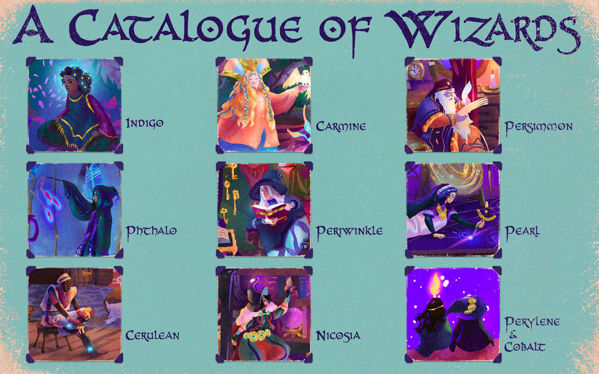
The tower was inspired by Jill Barklem’s beautiful Brambly Hedge tree homes, combined with my love for cutaway schematic drawings and late 90s airbrushed fantasy art colours.
It was designed to look beautiful from a distance, and to be fully immersive – even playable – up close, for all the storytellers in our lives, big and small.
With seven magical levels, ranging from dungeon hallways to cozy reading rooms to mystical astronomy observatories, this tower has everything a forest wizard could need! Being surrounded by scenic waterfalls, sunset vistas and friendly wildlife only adds to its appeal.
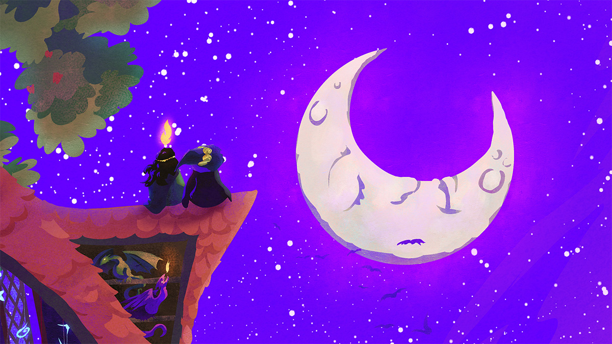
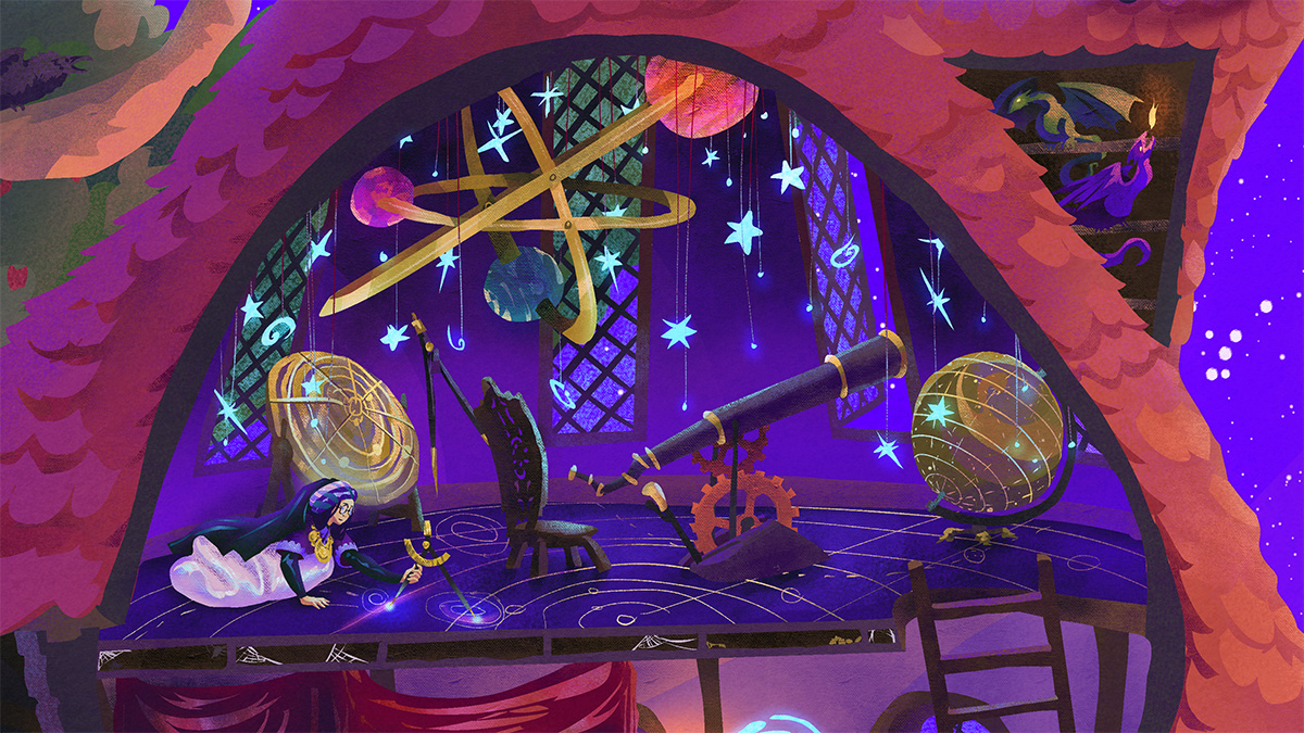
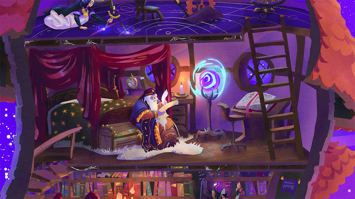
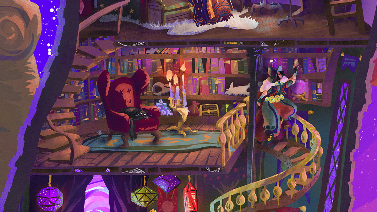
16 responses to “The Tower of the Forest Wizard”
-
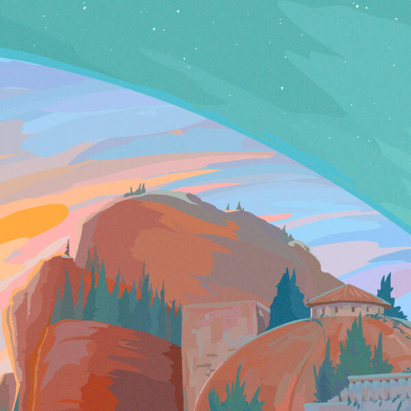
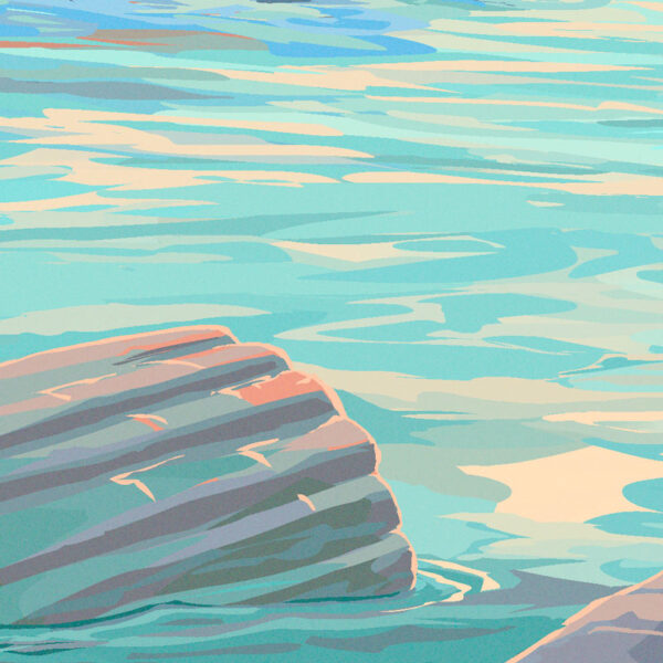
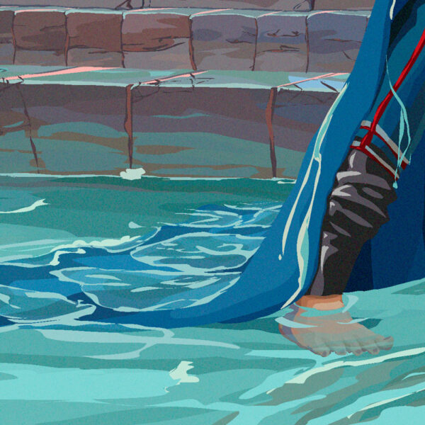
Inspired by the retro scifi themed album “Warp Riders” by The Sword, this piece is designed to be used in whole or in part.
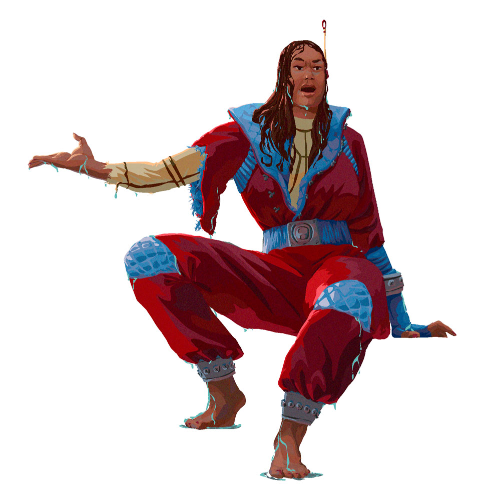

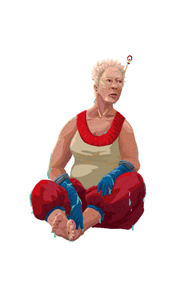
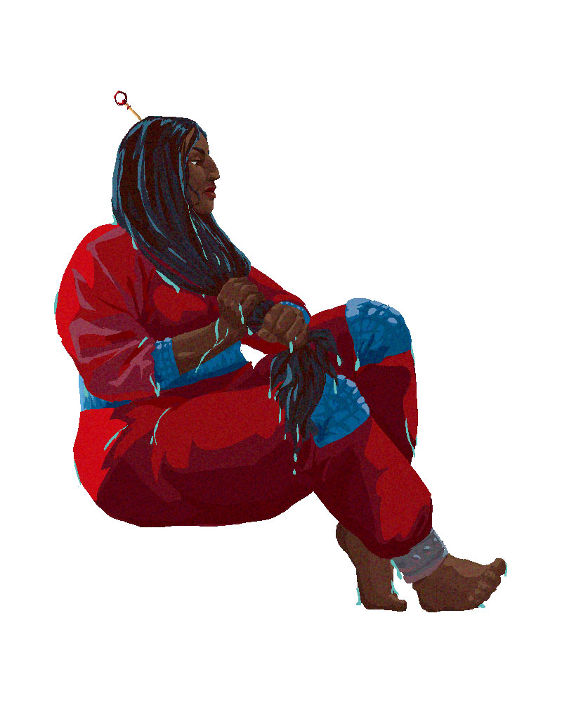
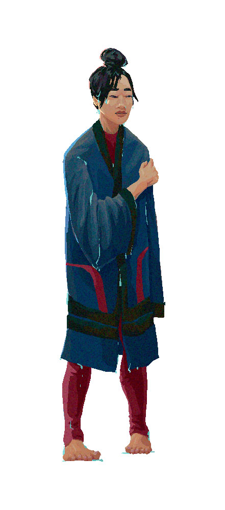
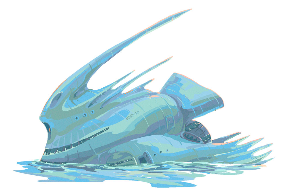
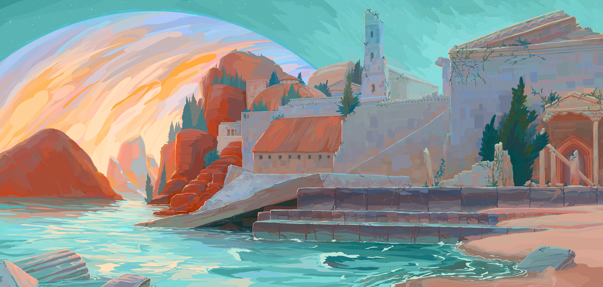
Here are some details:





9 responses to “Stranded – Digital Illustration, Character and Environment Designs”
-
The Golden Bear
posted:
updated:
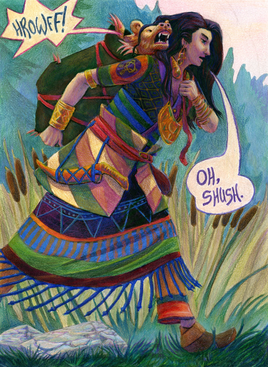
tagged: adventure, art, bear, colour, drawing, fantasy, fantasy art, girl, painting, pencil crayon, structure, traditional art, watercolourThis fantasy illustration was created in watercolour and pencil crayon, and is 9 x 12″ on watercolour paper. It features a determined traveller carrying a cranky golden bear in a bag. The sun is just starting to rise and the mist clearing from the ground as they walk onward. We can see a golden bear insignia on the traveller’s sleeve.
click here to buy a print of this piece 30 responses to “The Golden Bear”
-
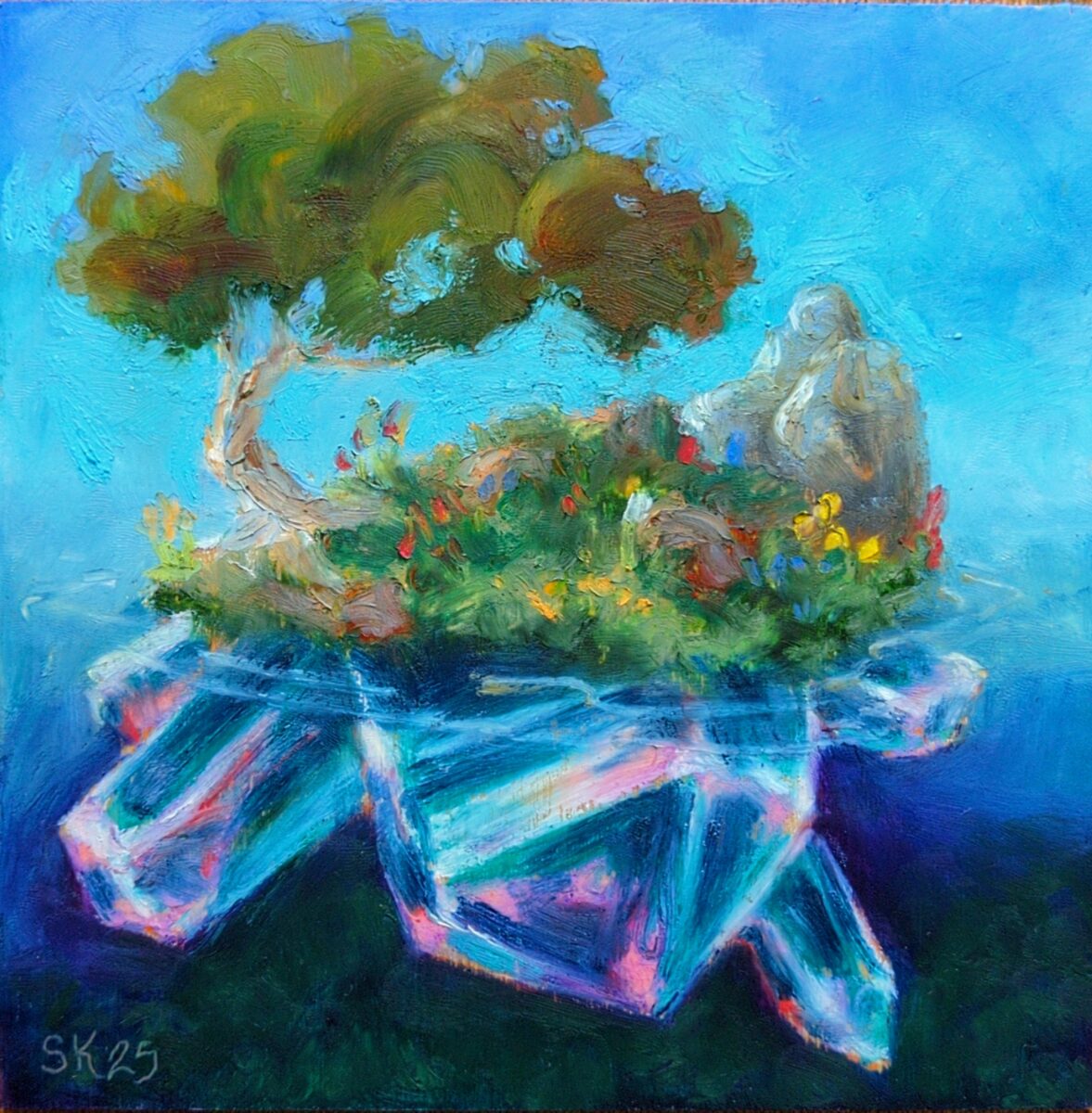
6 x 6″, sennelier oil pastels on unprimed wood.
My partner gave me the full set of sennelier oil pastels for my birthday last week and it’s been excruciatingly hard not to abandon all my other commitments and responsibilities and just play with them incessantly because they are an incredibly enticing and beautiful medium that really doesn’t feel like anything else I’ve ever used!
They are buttery soft, and instead of the consistent opacity of other brands, they actually have a range from opaque to fully transparent stocks, based on the pigments in them. What this means is that they work much more like my watercolours, and allow me to transfer over my payment and mixing knowledge from watercolours to these oil pastels! This also means that they can produce super vibrant mixes, which you can see at work in the crystals in this piece especially, but which really helped me being everything here to life.
Finally, they are so soft that even the gentlest touch with a fingertip or blending stump blurs and spreads the pastel around, making them a constant temptation to soften everything. In this piece i tried to balance my hard and soft edges, and i think the tree leaves are a great success in doing that in an appealing way. I’m very excited to try applying some of my Russian academic oil painting principles to solve oil pastels paintings in future; since i stopped using oil paints and solvents, i really haven’t had a medium available to me that can actually achieve all the fat over lean, hard and soft edges, glazing, and value grouping techniques I was taught. suffice to say I am pumped on this!
have you played with these before? do you have any advice, or questions? and what do you think of this somewhat amped up painterly approach?
12 responses to “Wildflower Crystal Island in Oil Pastels”
-
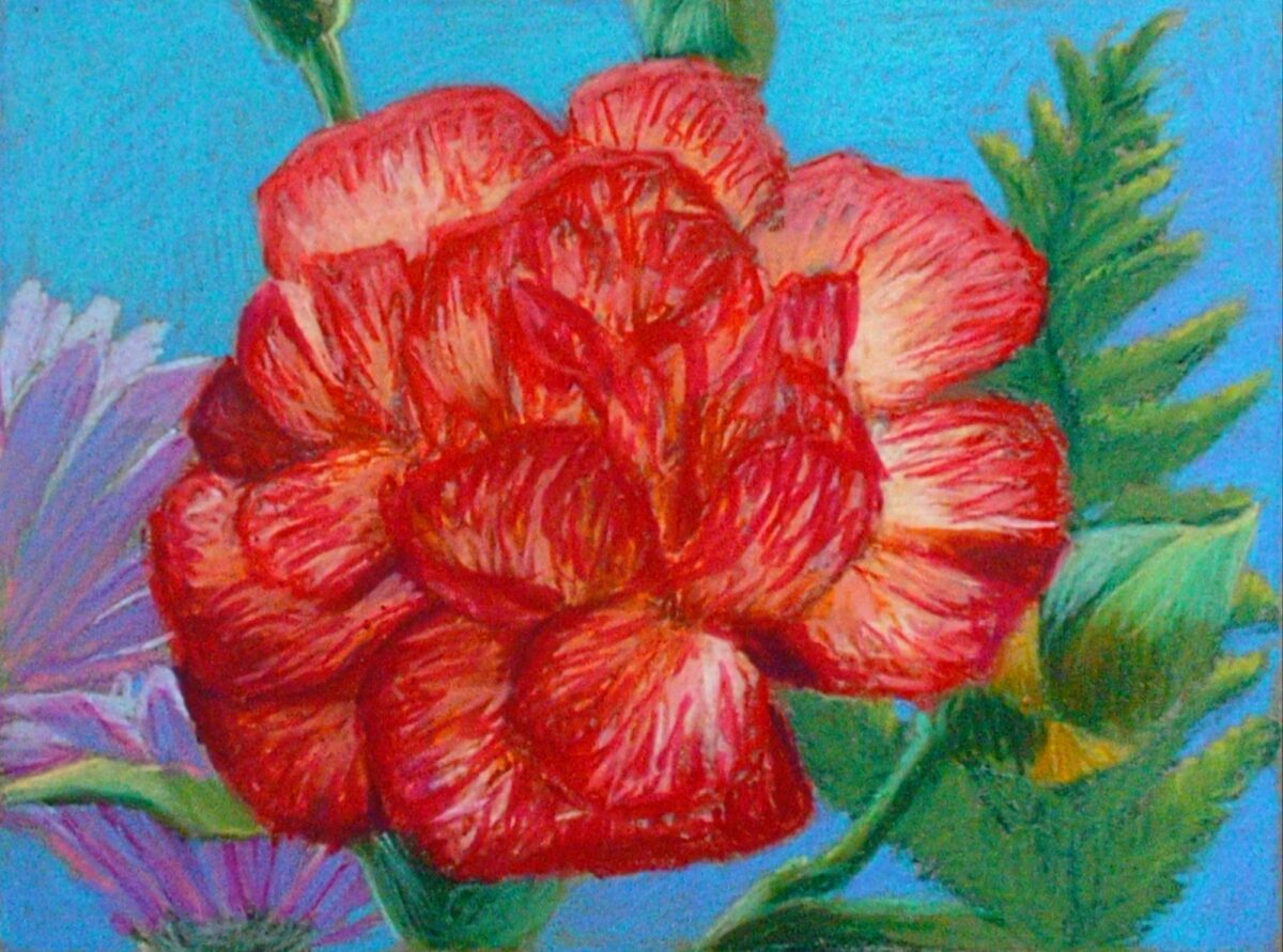
Drawn without water, on a 6 x 9″ grey blue cardstock, I think Strathmore brand. Drawn from life, from a lovely birthday bouquet.
-

Gansai tambi paints and neocolor iis; a very fun combo! I am often sad about the difficulty of making watercolours create rich even dark washes, but the gansai tambi paints excel at it. The only tragedy is how glossy they come out if you go thick with them.
Neocolors lay down beautifully on them though, glossy or not, and as a test case I think this is a great proof of concept!
6 responses to “Sketchbook landscape sketch”
-
new watercolour palette
posted:
updated:
posted to: arttagged: art supplies, art toolkit, colour, folio palette, palette, plein air, structure, traditional art, watercolourTreated my birthday self to an Art Toolkit Folio Palette! It’s both big and small, with lots of mixing space, even though it packs up very slim and weighs very little; and it magnets to itself and to whatever I want to stick it to for painting. While the -14C snowy weather here in Southern Ontario is not going to have me doing much plein air this month, I think my future self will really enjoy taking this to the beach, the park, etc!
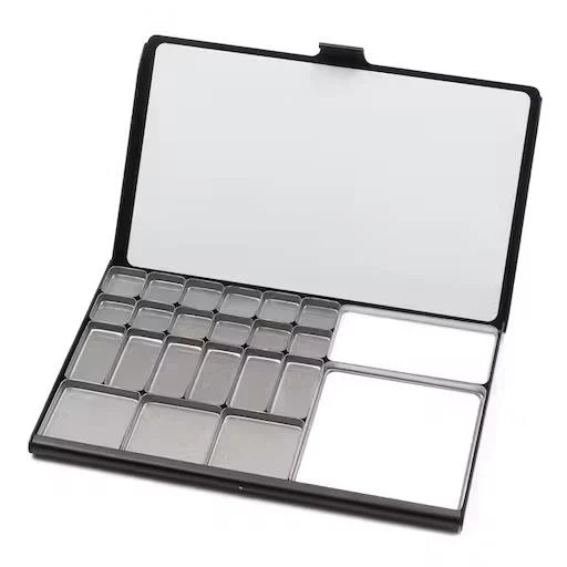
(I also picked up an extra mixing pan to swap out for two of the larger square pans; I already appreciate the extra space, as I am a messy, chaotic mixer.)
In good timing, I also finished swatching all my watercolours onto cards, so I used them to assemble myself a palette of tube paints to fill this with:
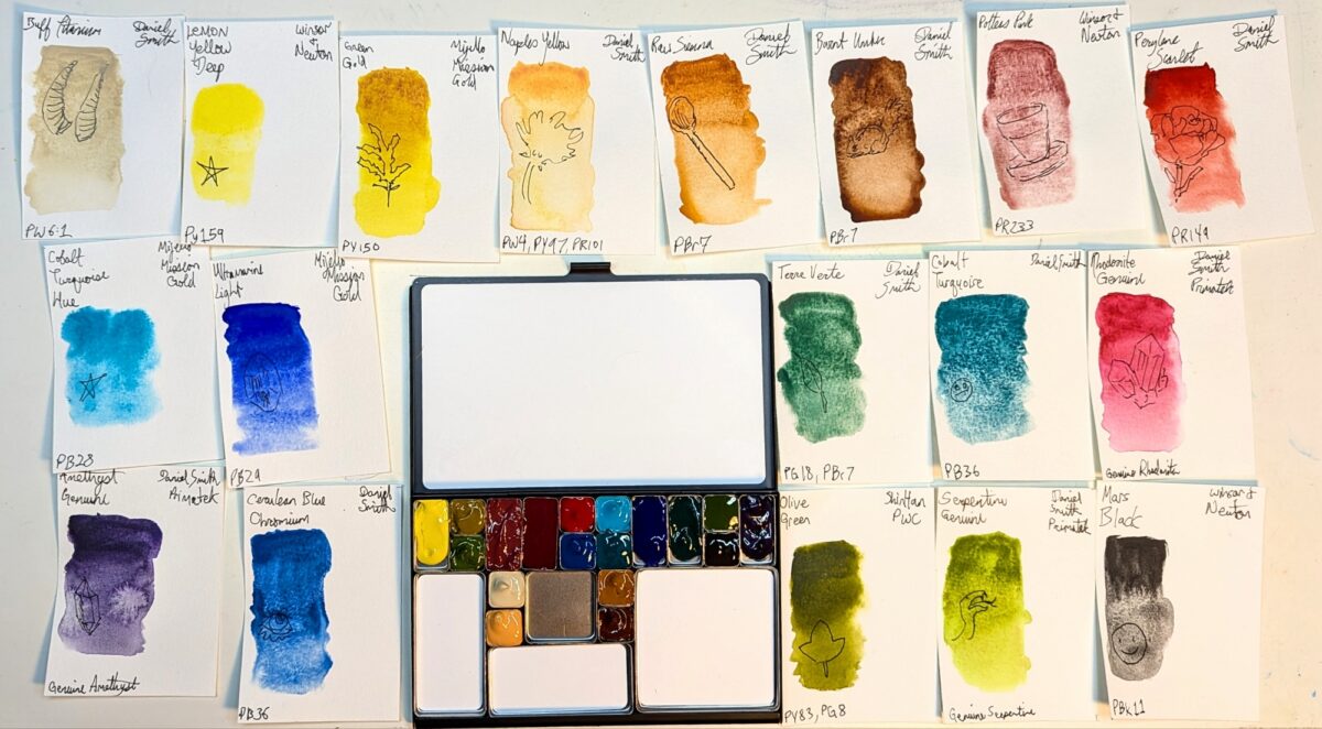
I went heavy on the granulating paints; if this is a plein air landscape and urban sketching palette, then it doesn’t need as much texture control as one I might take figure drawing. I got to include a few of my newer tubes, too, to really test run them in a more focused way:
- Lemon Yellow Deep (W&N)
- Perylene Scarlet (DS)
- Terre Verte (DS) (I picked this up because the Winsor & Newton terre verte I own is probably the palest, weakest paint I own and yet I adore the colour, so i was hoping for just a more powerful version thereof; sadly the Daniel Smith one is a totally different colour and pigment composition, but turns out I also love IT, so~)
- Olive Green (SH PWC)
- Mars Black (W&N)
The yellow, scarlet and black listed are all notably granulating versions of those colours, so I am excited to see what kind of unhinged texture I can lay out on the page with this palette!
I’ve started doing some sketchbook studies to test drive it and while I think I might have made a mistake omitting my perylene green, maybe that kind of challenge is good for me!
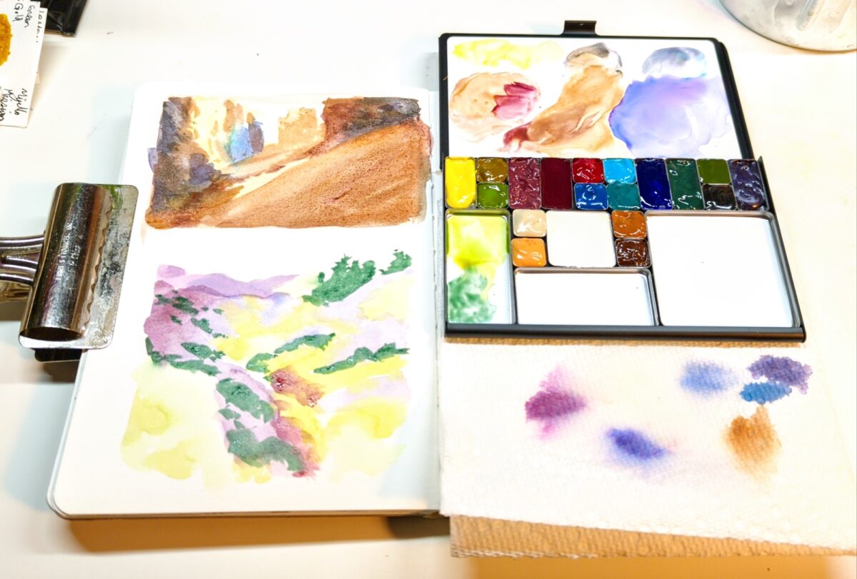
I will say, the mixing area on this palette is velvety and perfect. I have never had a palette be such a joy to mix on out of the box – the paint spreads usefully on it in a way I have enormous trouble conditioning my enameled metal or plastic palettes into achieving literally ever! It’s raised the bar for me and whoops, now I have higher standards.
What do you think of these colours? Do you have a beloved palette you have conditioned into perfection? Are you also dreaming of sitting under a tree and painting in a few months?
8 responses to “new watercolour palette”
-
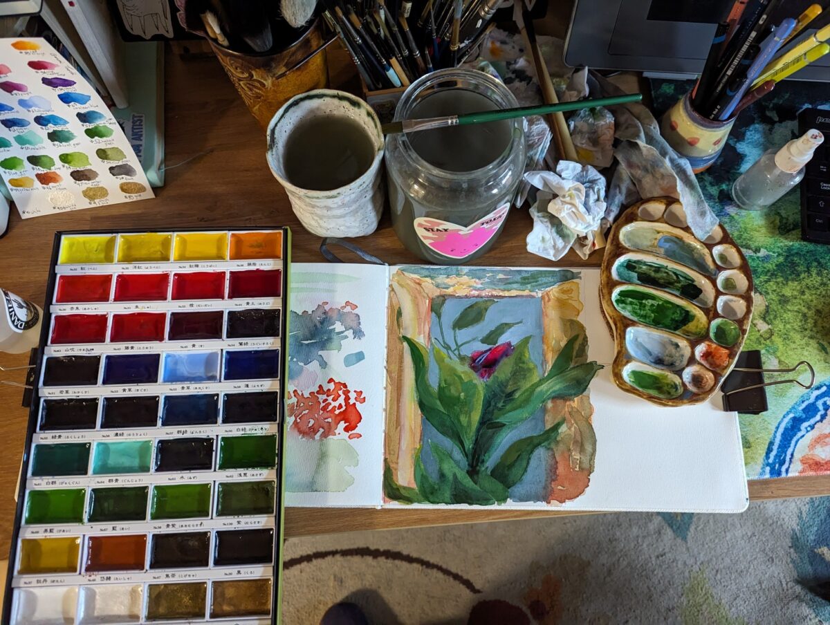
I got this set of Kuretake Gansai Tambi in the fall and day down to play with them in my etchr sketchbook this week. The 100% cotton paper that usually is my best friend, however, felt less useful with these than with my usual watercolours.
which isn’t to say i didn’t have fun! the colour range of the set is great and the vibrancy is *amazing*.
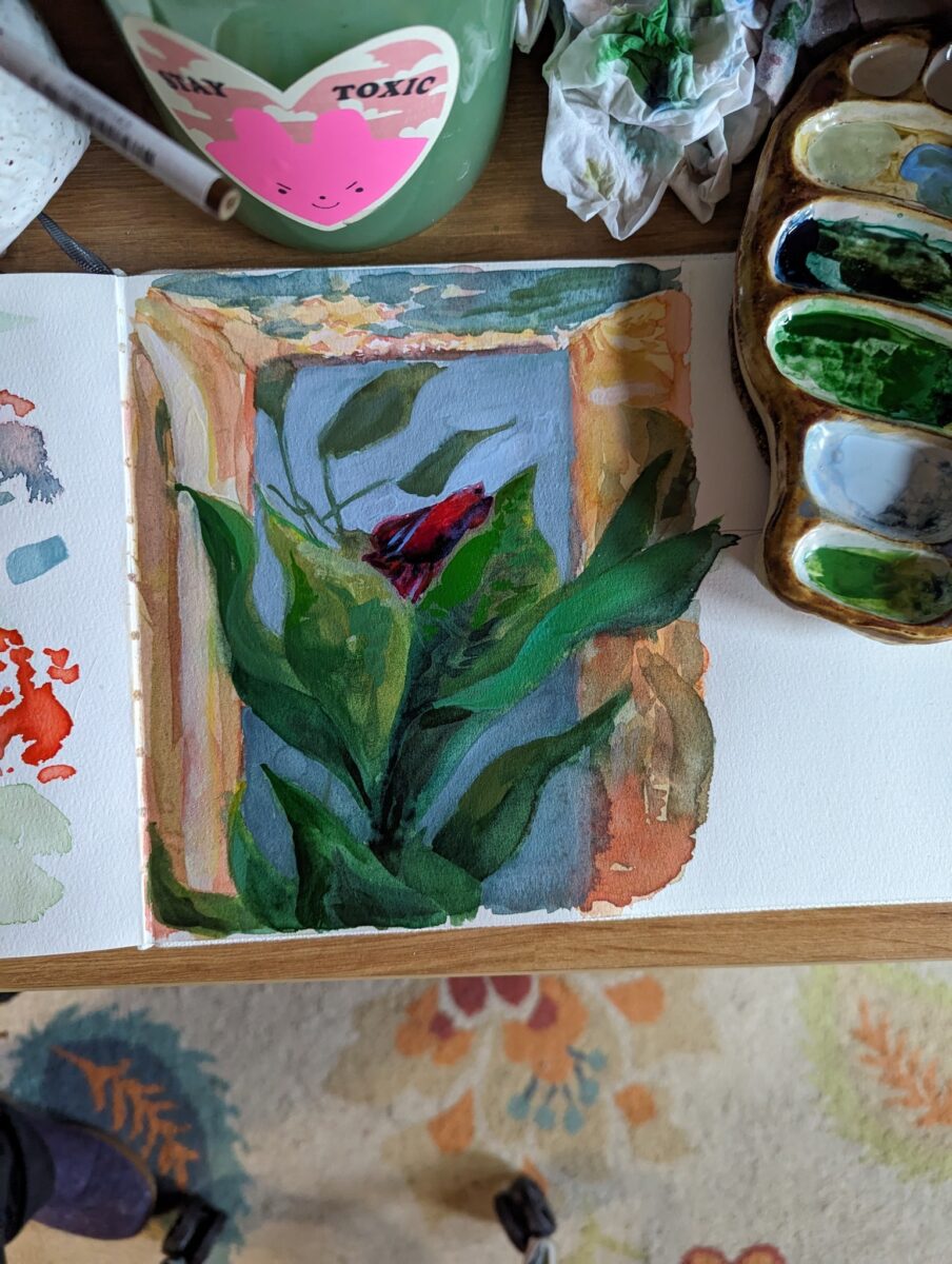
but i realized i really don’t know much about these paints besides the fact that they’re at least a little different from Western style watercolours; so i did some googling, and i thought I’d share some highlights:
a great breakdown of the actual chemical differences:
a great demo of how they can be pushed far beyond what you think in terms of layering and vibrancy:
They sound like a product related to traditional paint prep methods for nihonga, which is painted on washi paper :
 Nihonga – Wikipedia
this playlist is a very clear overview of nihonga materials:
Nihonga Tutorial Playlist
these days they seem very strongly associated with etagami, which I’m just starting to research:
In summary, no, they definitely don’t work like my Daniel Smith or Mijello or Holbein watercolours, but that’s because they’re very definitely not the same thing. I’m excited to play around with the paints in combo with different materials and see what they unlock for me!
Also, god, I’m already tempted to get more; they really do have a jewel-like quality, shining in those big flat pans….
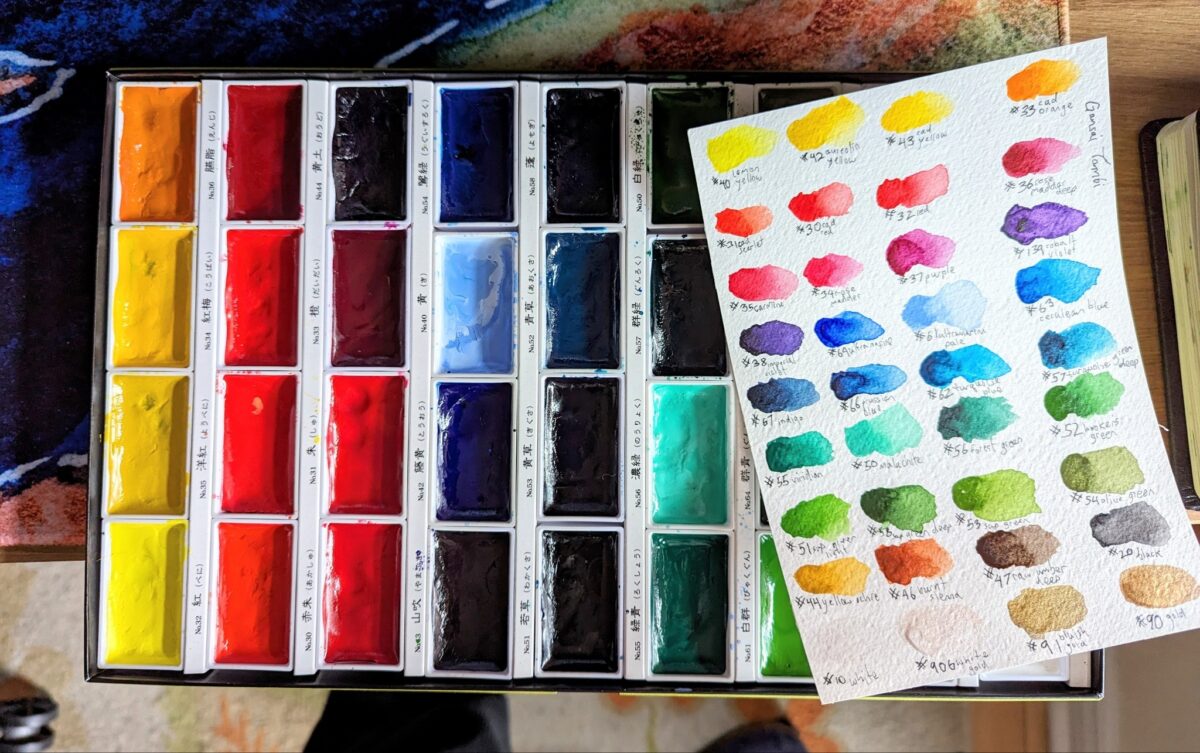
(i did rearrange them into this colour wheel order to help me learn the palette, if you noticed the labels in the box no longer line up with the colours)
10 responses to “Everything I’ve learned about Gansai Tambi paints”
-

I’ve been thinking about how the sennelier oil pastels are so soft that you can get full on painting style soft and hard edges etc, and I picked up a few small canvas boards to see if they were a useful substrate for faking oil painting effects!
Unfortunately the sennelier pastels are so slippery that they really don’t grip the canvas at all, and it became hard to layer the way i wanted. but there is definitely still a painterliness to this that excites me! i think for my next try I’ll pay down a first pass with a much thicker, stickier oil pastel – haiyas or mungyos maybe – and see if that starts to fill in the weave and give the developers more to bond with when i get to that layer.
One of the challenges of oil pastels, at least for me, has been finding a medium with the right absorbency, texture, grip, etc. I haven’t been that big a fan of the pastelmat I’ve tried – even before i had softer oil pastels, things seemed to build up to an unmanageable amount of greasiness too quickly for me, due to the inabsorbency of the sanded paper.
Unprimed wood, heavy cotton bristol, and cotton rag printmaking paper have been the most successful for me so far. The wood gives me some texture while still having a little absorbency; the bristol is utterly smooth but again, the pastel does set a little on it as it absorbs the oil; and the heavy cotton rag paper seems to absorb an incredible amount of the oil from the pastels while usually still having a decent rough or cold press texture to offer my markmaking. if anything, because of how dry it renders my oil pastels, it’s been the least blendable by far.
So i should probably go back to the cotton rag soon and see what that level of control gets me with the sennelier oil pastels; but I’m intrigued by this canvas potential and I’ll probably do another still life on a canvas board first!
oh, technical note: these canvas boards are all pre-gessoed rough canvas, making them very unabsorbent and giving them a large resolution weave texture. Maybe it would be worth trying a linen canvas? or an unprimed canvas with more squish?
Also, going through my photo collection, i think i could paint still life strawberries every day for the rest of the winter and not run out of reference. Is this a good idea? is there any chance someone might want to own an oil pastel drawing of a strawberry someday? there’s only so many i can hang up in my own home…
6 responses to “Strawberry oil pastel study on canvas board”


Leave a Reply