
swap to chronological order of most recently modified
-
I had a great time talking with Nathan and Epidiah at the Unwritten Earths Symposium about art, games, and all the amazing things we have in store for Swords Without Master – check the episode out here:
 Unwritten Earths Symposium: The Shel Kahn EpisodeIn this episode, we sit down with friend, artist, game designer and art director for Swords Without Master Shel Kahn to talk about… all of those things! We touch on the different roles of art in game design, working with abstract imagery, refining your taste as a chooser-of-images even if commissioning original art isn’t realistic, and the ways artwork and visual design elements help out the game design endeavor. Art… it’s good!
Eppy and Nathan kindly let me go on several rants about what art does in TTRPGs, how graphic design is art and vice versa, and how it’s a visual medium because you read with your eyes! Somehow we did stay on topic and it did not turn into a two hour ramble about our favourite metal concept albums, but there’s always next time!
-
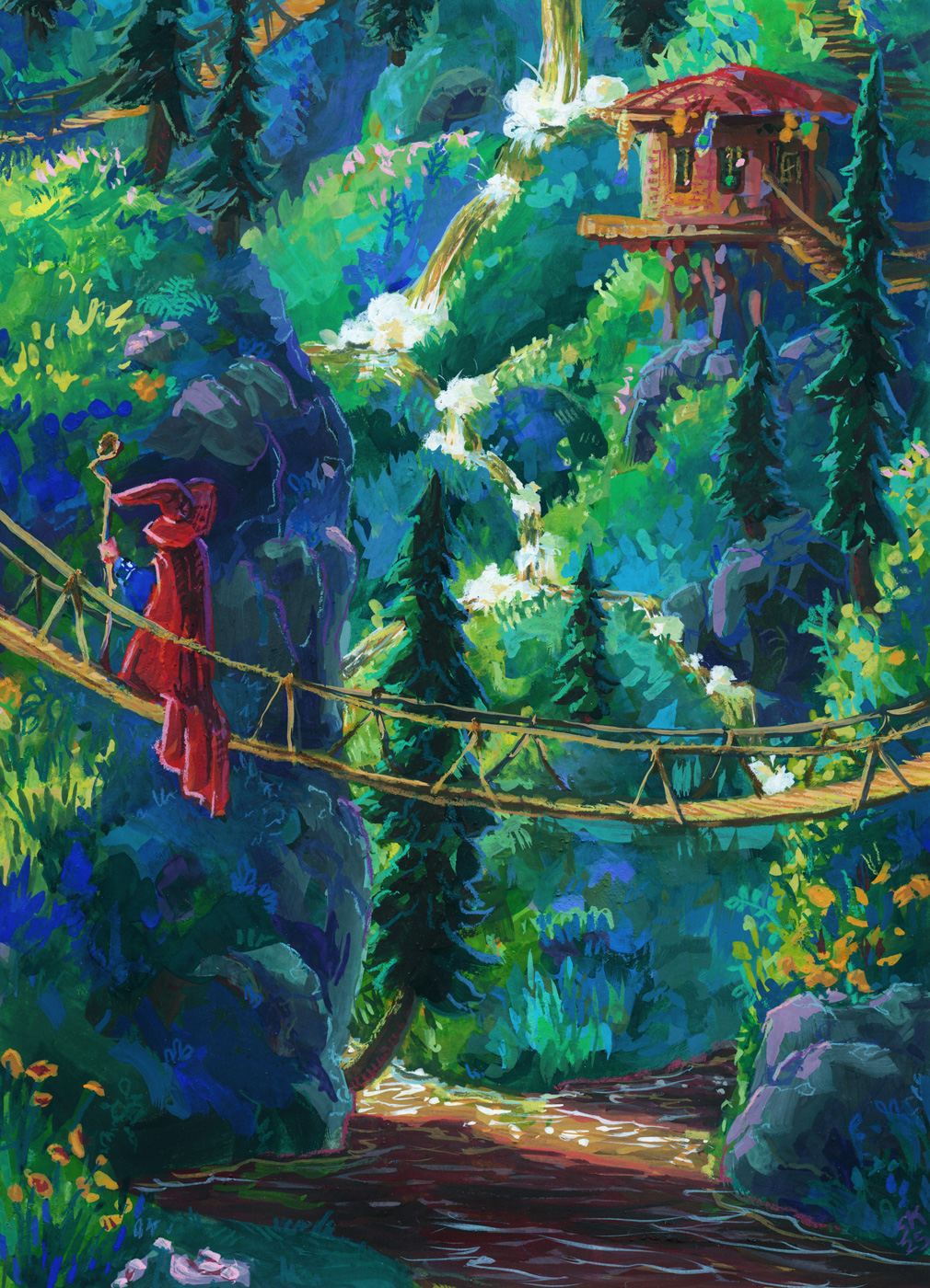
For this painting I spent more time than I honestly expected wrestling with my style goals. In the context of my arm recovery, I’ve been trying to figure out a stylistic angle for myself going forward as an illustrator.
Over the past few months I’ve been doing style tests1, digitally and then on paper, trying to see what feels good, what feels sustainable, what excites me, and what leaves me obsessively fine tuning forever even when I like the painting:


In the end, I decided for Swords Without Master to go forward with finals in gouache, with details added using neocolor ii crayons — but it’s also professional-level work and I need to balance my interest in traditional media with making something as good as I can make it, and using a process that guarantees milestones my clients can give feedback on! So the first chunk of this work is going to look the same as it would for any digital illustration I might do, which I didn’t think would be a problem, but I may have underestimated my own anxieties.
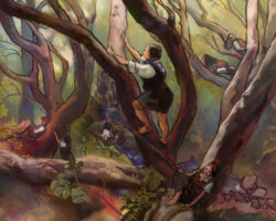
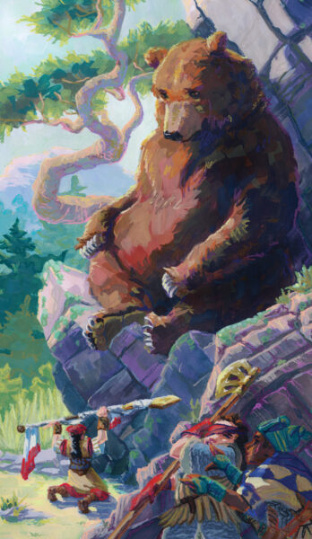
So, step one: the thumbnail! I actually handed in a bunch of thumbnails, since for this project I’ll be doing 6-8 paintings, and from that first batch the client chose three to go forward with, and this one in particular to do first:

My thumbnailing process is pretty broad – whatever medium I have to hand is what I sketch with, and if I can’t think of something to sketch, I make lists, look up reference, dig through older sketches for ideas, or go hunting through my personal photos for a composition or theme that always inspires me! For this one I knew I wanted a hazy, sunny day feel, and enough nature visible to ground the location.

I actually did go down a little side quest where I put the bear under a waterfall and threw the rogues into a river, but I didn’t feel great about how it took the focus off the action and ended up shelving it and coming back to the thumbnail with a more literal interpretation:

After going through a few colour mockups with the client to reach this one above, I took the art back and started the laborious digital drawing process:

Drawing digitally can feel awkward compared to paper for me in terms of line quality, especially on the slippery cintiq, but being able to zoom in and use my whole arm to draw shapes has been a huge help with getting back to drawing after my nerve graft.
The other important aspect of the drawing process is the gathering of reference:

So, so much reference.
I also gathered reference for the figures, the costumes, the landscape and tree, and so on – the reality is that, for something to feel grounded, I need to use reference at some point in its design, even if I don’t use it the whole time.2
However, I also didn’t reproduce any of my referenced images exactly, because a) that wasn’t at all what this illustration actually needed, b) that would undermine the style goals I set at the beginning, and c) that’s the moment when finding royalty-free reference becomes necessary, in my mind. So in the end I built a drawing that was heavily referenced, but not drawn to feel perfectly realistic.

This is about where the voices of doubt started to kick in. These were lovely inks, I thought! They reminded me of previous work I’d done that I liked – work that other people had also liked! Why abandon them?
But I put a pin in it and went on to my next step, one which I feel confident was hugely important, and one I really don’t do often enough: a value study.
First, I did what we call a notan: black and white. The first one I did based on my chosen lighting:

Now, again, this is not going to be a two-toned drawing. I’m still planning to paint it in full colour, and add linework! But doing a notan was something I’d been meaning to try, as I feel like one of the biggest challenges for me in recent work has been maintaining solid value separation between my lights and darks, and I wanted to experiment more with dramatic lighting in this series for Swords Without Master. If I want to be in control of my lighting, I need to plan it in such a way as to know for sure that it will read well and enhance the image. If I can figure that out in two values, then I can certainly wrangle it in full colour! In theory. So with black and white only, and all the lines removed, I was comfortable that my composition read well and was eye catching.
Then, because the bear was such a big, dark figure compared to lighter sand and rocks and sky and trees, and thus I needed to solve for the dramatic variety in local colour value, I did a notan of the local values of everything too:

This gave me a chance to think about value in regards to the rogues’ designs as well – value pattern is really important in character design, and especially if I want to use these designs again in another drawing, I need them to be readable and distinct. So, I did a notan of local values, unaffected by lighting, and while it wasnt quite as legible as my first, I was happy it gave me interesting shapes and a decently appealing value pattern as well.
These two then got combined to show me a three value version of the image:

Yep, that reads.
So with the magic of adding back in the linework and tinting my notans, I was able to start seeing my warm/cool pattern too:

And then I took all of this prep work — colour rough, drawing, notans, tinted shadows — and I did a rough and ready digital painting of my piece.

And this is when I really hit the wall of my own confidence. This was a solid half-done digital painting! I could take this to finish in clip studio paint, and I could probably do it pretty quickly! And why not – it wouldn’t look bad. It felt very similar to prior work I’ve done – work I’m proud of, work I like! But that was work I did before my arm surgery, and work that had really very different goals than the work I do now.
Back when I drew like this – clean lines, soft digital colours, layered paper textures – I was worried about realism in a big way. I wasn’t that comfortable with it yet at that point, but I cared about it a lot! These days, realism is only a part of my goal with an illustration, and one thing I have learned as I have felt more comfortable with realism is that I don’t actually want to focus on it as an artist. I have other priorities now.
Back then, I also cared about having a fast and efficient process – I developed this line and digital-wash approach because I took on a huge job for Call of Cthulhu, and had to produce 50+ illustrations in a super short period of time. The digital process I created for that was extremely easy to reproduce by duplicating source layers across all my pieces and carving out light, shadow and local colour really quickly! My process these days is going to have to be slower no matter what I do, so I would much rather take the time to find a process that is rewarding in the moment, as well as one that gets me results I like.
Also, back when I drew like this, I had a fully functioning dominant hand, and I felt in control of my lines. And no matter how much the inks I have here for the bear remind me of my inks in the past, I know that they aren’t nearly as well controlled, and that I do not feel like I am getting to make the choices I want to make about line weight, shape, direction, and so forth. It’s subtle, but the differences are there in the results, and the process of inking itself is so different now that I can’t ignore that.
And part of me misses that style a lot – I miss confident clean inks and quick digital washes, and I remember how proud I was of these pieces when I drew them!
But I also remember feeling limited by this style, and feeling like it made me tight and cautious as an artist, unable to do the dramatic lighting effects and more expressive markmaking that I admired in other painters’ work.
And now, while I debated going back to that comfortable old process, I also felt a little… I think I have to call it claustrophobia. I felt the call, and it also felt like a trap. I can’t be that artist anymore, and frankly I know in my heart that I don’t want to! And I was here with clients who had worked with me in the past, and who are excited to work with me now, and who were putting trust in my ability to give them something exciting, even though they knew it couldn’t and wouldn’t be the same as what I had done for them in the past.
So I took a deep breath and committed to the plan I had made in the beginning: do my planning stages on the computer, and then print out the linework, lightbox it onto watercolour paper, get out my gouache and neocolors, and paint this thing.
The painting process was, as expected, really, really fun!
I did my tracing of the linework in watercolour pencil crayons, and misted the page to lock them in. They blur a bit when you do this, but overall they stayed legible, and I love being able to trust that even if the linework peeks through the final paint layer, it will be soft and colourful and feel like a natural part of the rest of the piece.
Then I pulled up my notan studies and started carving out those shadows:

Every section of the painting got a different shadow colour, mostly as an experiment in separating the various planes of action. I am not sure if this ended up having much of an effect on the final, but it was easy to test out and certainly helped me track things during the painting process!

And then I started painting properly! One of the decisions I made was to do some quick local washes of colour, with intent to paint over them more opaquely further along in the process, but I found myself skipping to the opaque stage faster than I meant to. I also found myself really losing track of my value plan, almost instantly!

So then, before rendering anything further, I dug back in and darkened all my values on everything but the bear. I actually kept going back and making things darker, over and over again, throughout the process. I am definitely certain I wouldn’t have felt confident doing that without the notan studies I had done earlier helping me map things out.
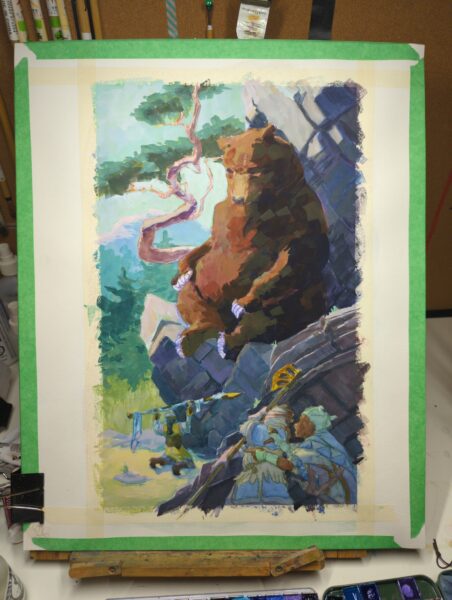
One of the things I did put off as long as I could was the figures in the foreground. People are always hardest to paint, and I was really worried about losing all my careful characterful drawing underneath opaque brushwork – which is why everything else is pretty rendered and they are still in pastel washes at this stage.

Finally though I sat down, painted them, repainted all the shadows on them even darker, popped a few highlights to add contrast, and called the gouache layer done. In this stage above you can now see the tiniest beginning of neocolor ii linework in the piece – specifically the bear’s eyes. I had hoped the linework would tie down all my expressive, loose brushwork, and at this point I was able to relax and say to myself that yes, absolutely it would.

So I drew over everything I thought could benefit from textural linework! I am really, really happy with this piece – and not just because I took myself on a deep dark journey of the soul in the middle. I am excited about making professional work with expressive brushwork like this! I am thrilled I can use my favourite medium and most enjoyable process on client jobs now. And I really am excited about not just what I achieved with this painting, but what unmapped painting territory lies ahead of me for the next ones!
Below is my scanned and cleaned and adjusted final piece. I would love to know your thoughts on the process – and if you’ve been working traditionally, how you’ve found letting go of digital processes despite the lure of them?

2 responses to “Painting the Great Bear for Swords Without Master”
-
the finished piece is beautiful, and i love your writeup! the two separate notans is a wonderful idea and i love how it looks when you combine them. i know that value contrast is one of my personal weaknesses so i should find some way to put something similar into my own workflow, although it’s a lot trickier when modelling 3D game environments.
i really can’t overstate how great the finished painting looks. i’m glad you’re having fun with it too. ❤
-
I would be super interested in a write-up on what all those test were exploring.
-
-
I come to you with unmatched good news!
The glorious tabletop RPG Swords Without Master1 is being released as a standalone book!
The game is live on kickstarter, awaiting your support to manifest itself in the most glorious and fitting form: a book, custom dice, and a true dragon’s hoard of art in the form of eidolon card folios!
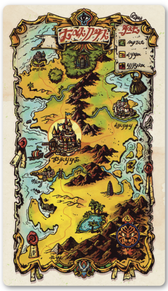
map by Ripley Matthews Treasures for the Mind
What excites me most about playing Swords Without Master? The genre-ful feast the game entices you to imagine as you play!
Your rogues: sworn to those whose names they hold; armored in remnants of adventures past; gleaming with determination, obsession or glorious doom.
Your realm: writhing storm clouds over thrice-cursed swampland; a dessicated dragon corpse hollowed out into an unearthly church; crumbling castle ruins hiding an ephemeral market of artifacts, amulets, spells and swords.
All of you at the table alternately feted and foiled by the whim of the dice — driven into stories both jovial and glum, given gifts of both mysteries and morals, and so much more.
eidolon by Jabari Weathers Treasures for the Eye
What brought me into the inner workings of this endeavour?
I have the honour of contributing to this glorious game as the art director! I have been working with Epidiah Ravachol and Nathan D Paoletta at Unwritten Earths to make sure that the illustrations are as wondrous and strange as the game deserves, and I am over the moon with what we have in store for you!
What wonders await you in this new edition?
There will be beautiful cover art from the brilliant Erin Vest, whose work captures the wonder, mystery, glumness and joviality we love in Swords Without Master!
The book will be filled to bursting with glorious interior artwork, all of it held together with evocative glyphs designed by Elemei!

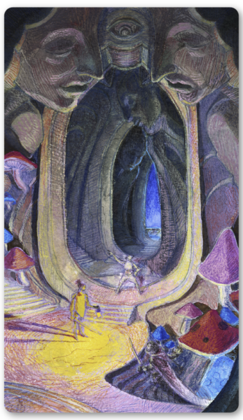
glyphs by Elemei We are also creating beautiful folios of artful tarot-sized eidolon cards, to inspire you as you play!
The kickstarter is launching with four folios of 6 cards each:
Master Selu Fyrmyor’s Pilfered Charts of the Knowable World
maps by Ripley Matthews, Fernando Salvaterra, Arlin Ortiz and Kyle LatinoAn Age Before Time
illustrated by Goran GligovićThe Sepulchre of Astonishments
illustrated by Jabari WeathersTrials of the Stargazers
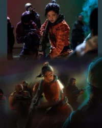
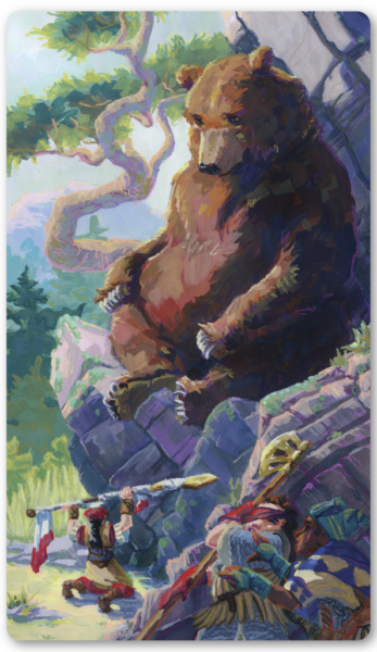
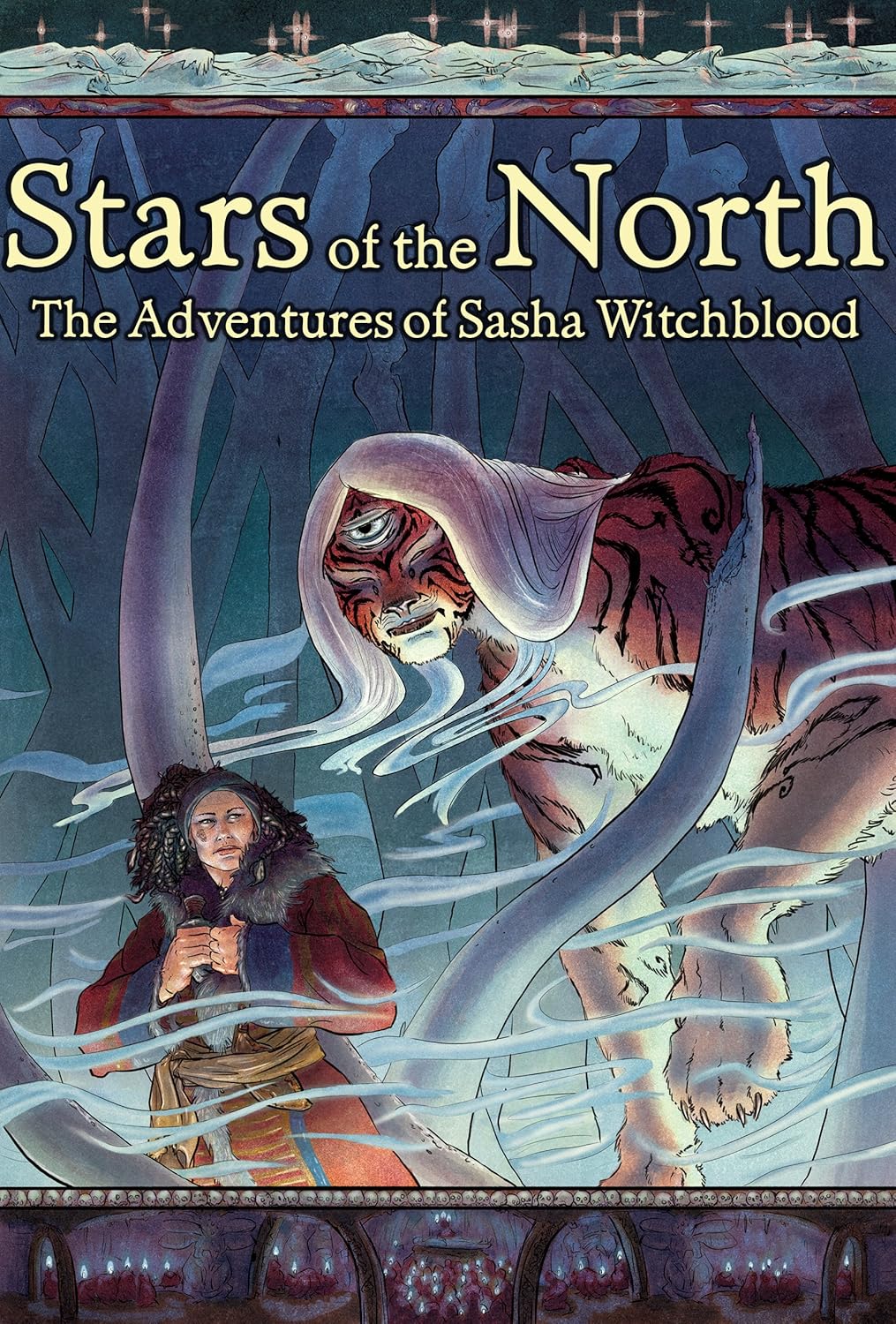
illustrated by me, Shel Kahn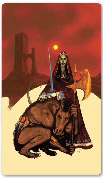
eidolon by Goran Gligović Treasures for the Hand
Some treasures cannot be available forever – hand-made custom low-vision accessible tone dice, say.
The unparalleled Jaydot Dice is crafting tone bones – pairs of oversized (20mm) 6-sided dice to help you roll for glum or jovial tones. They will be distinguishable visually and through touch, and due to the skilled labour involved in each set, they are limited edition kickstarter exclusives.
If these speak to you, do not miss this chance to snag a set!
eidolon by Shel Kahn - Previously only available in Worlds Without Master Issue #3 ↩︎
-
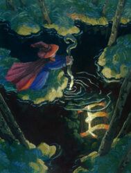
click the image to zoom in We are inching ever closer every day to the launch of the Swords Without Master kickstarter, which I am involved with as the art director and as an illustrator in my own right, and I wanted to share my first folio card with you!
I’ll be back later this week with a thorough breakdown of my process, because I had some real dark nights of the soul in the middle of this but I learned a lot about what I want out of the art I make, and I am excited about taking this process forward into the rest of the illustrations!
-
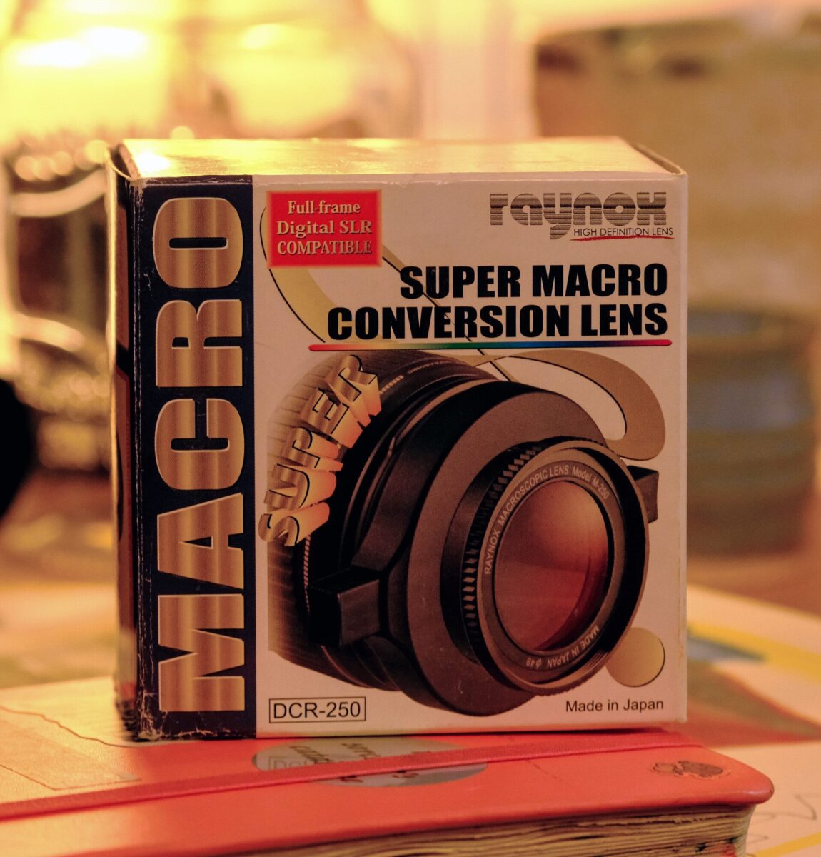
My partner gave me this Raynox DCR-250 Super Macro Conversion Lens for christmas! It clips onto the end of all my other lenses, and lets me take photos like these:


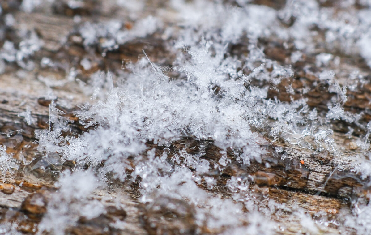


It’s going to be an incredible tool when the bugs are back in the spring, but in the meantime I want to learn more about how it works on each different lens, and also set aside some time for testing flash types and continuous lighting types so I’m ready to freeze the action.
I’ve also been really grateful for macro photographers on youtube who explain things to me from the basics. This video on how to approach bugs so they don’t fly away was very useful:
It also betrays something I find so charming about insect photographers: they can’t help themselves, the more time they spend photographing them, the more they start to see insects as little guys!
I also appreciate wildlife photographers in general who make resources on how to not only get cool photos, but how to stay safe while doing it:
Now I just need to find a video on photographing hornets without getting stung…
-

lots of macro techniques to be learned now, so I can get deep into macro bugs next spring!
-
-
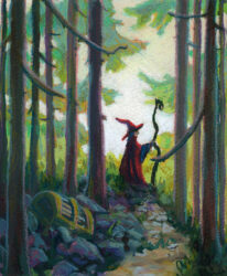
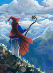
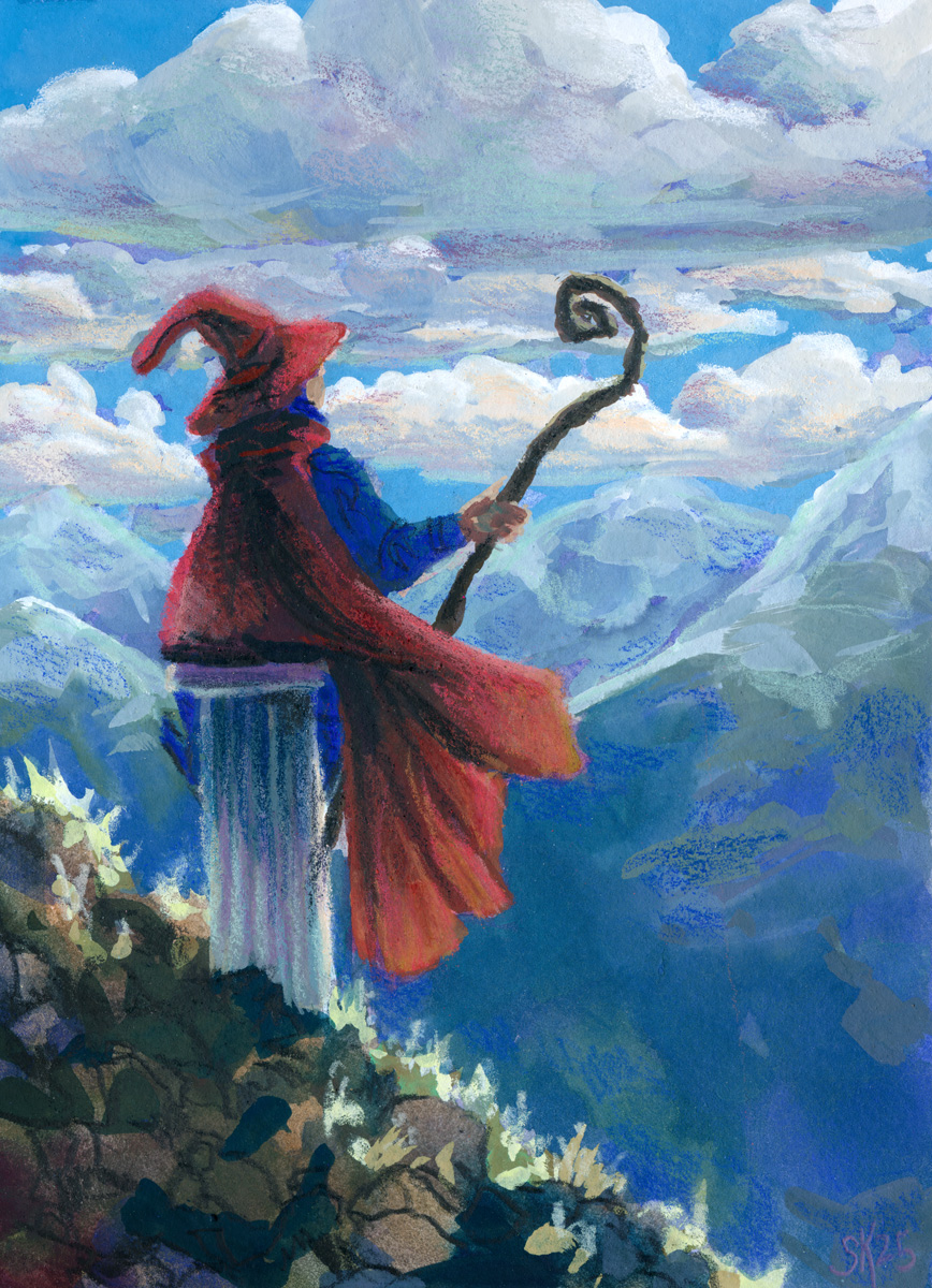
Testing more paper by sending the wizard to a very, very colourful realm:
click here to buy a print of this piece This paper test was scaled up to 9 x 12″, and it was on Strathmore’s 400 series mixed-media paper, which friends of mine who do water media colour on their comics recommend highly!
And it really is lovely for mixed media, but my gosh it was easy to accidentally lift all my gouache right back up at first, especially after using the 100% cotton paper on the last two wizards! This mixed media paper is very very smooth and heavily sized; paint just doesn’t sink into it. That might end up being my preference, because once you know what you’re dealing with, it is manageable, but I’ll do a few more tests before committing, I think.
Also as mentioned in the prior post, I wanted to switch from pencil crayons to neocolours, so I could trust them to be opaque, and I am delighted to report that yes, that is working great and I really can’t overstate what a joy the Neocolor II crayons are to use like this! I did need to sharpen them, which I know might shock some people, but to get precise linework I need a good point, and that’s just how I need to use them. They are especially dreamy on the smooth hot press finish of the mixed media paper, so I think my next test will be something with more texture so I can see what their limits are.
In terms of continuing to learn lessons about what I want to do with the gouache vs the crayons, I do really like the cute doodle-ish quality of the crayons on this one, but I may have gone a little harder than planned with the gouache and not quite hit the balance I’m looking for.
That said, I do really love this piece, and I am very proud of it! It’s the closest I’ve come so far to the vibes I want to hit, and also I just love a nice waterfall, y’know?
-
Further paper tests allow further wizardry – this time in a more contemplative mode, though.
A second test run with the hot press cotton paper let me get more expressive with my brushstrokes and try out more contrasting of the paint approach and the pencil crayon approach
This one feels maybe a bit over-rendered for the style I want? I think the linework on the wizard and the rocky ground is closest to my goal – the shading I added with the pencil crayons on the clouds and mountains isn’t really hitting as hard for me.
The other thing I’m wrestling with is how translucent even my most opaque pencil crayons are! It might be time to switch over to the neocolor iis so that I can feel confident in the opacity of the colours I’m laying down over my painting – but that is for SURE going to necessitate me painting bigger — much bigger.
-
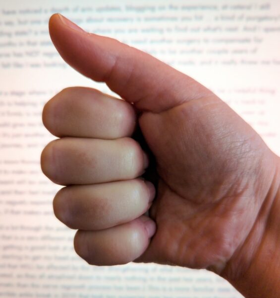
look at my incredibly powerful thumbs-up! it is so much work to do! So you may have noticed a dearth of arm updates, blogging on the experience, et cetera! I still have a lot to say, but one of the things about recovery is sometimes you hit … a kind of purgatory? limbo? holding state? a miserable stage where you are waiting to find out what’s next. And I spent about 10 months in that state, thinking I was likely to need another surgery to compensate for ways the nerve has NOT regrown, and that surgery was likely to be another couple years of recovery. It felt like I was looking at resetting all the progress I had made, and it really threw me for a loop!
I am now at a stage where it is looking like an additional surgery won’t actually be a helpful thing to do, which is helping clear my head a bit! To be clear: this doesn’t mean my hand is back to “normal” – it firmly is not! – but I’ve regained function that surgery would compromise, even as surgery could give me back other function I have not regained. Maybe someday I’ll explain this better, but it’s just another one of the really hard no-clear-win-condition decisions I’ve had to make along this journey, and right now I am honestly very worn out by it.
I have one more thorough check-in ahead of me before the surgeon hands me off for good, and I don’t want to make any HUGE plans till that’s done, but more and more it’s looking like my life going forward will be one with lots of daily physio exercises (the kind where you wiggle a finger ten times and then feel tired) and partial radial nerve function in my dominant hand. That’s what I have been vaguely expecting since the start of this, but it didn’t really MEAN anything until I got to this stage, if that makes sense?
I’ve talked a lot through the posts on this about how my status has been changing since the start, and how that is a very different experience than adjusting to a new chronic static condition. Now I am likely getting a good look at what nerve connections I will have in this arm for the rest of my life, and starting to get my head around what that is going to mean for learning to function around them (and that WILL be affected by the slow strengthening of what muscles have been successfully re-enervated, as they all atrophied down to nearly nothing in the past two years, but that will be less dramatic than the nerve regrowth process has been.) This is a more familiar state for me as I had a terrible ankle break in 2019 that took two surgeries over two years to get through, and I got to relearn to walk twice, and now six years later I know what that ankle can and can’t do, and I also know how much better I have gotten at using the function it DOES have.
So I am not, like, overjoyed at going forward with partial use of my dominant hand after all this, but it is still: a) better than slowly but steadily losing my radial nerve irreversably, which is what we prevented when we started this whole process; b) better than longterm chronic pain in that hand, which is a real risk of additional surgery; c) not actually apocalyptic, which I think, if you have kept an eye on this blog in the past year, you can see playing out.
These days, with my dominant hand, I can draw, though not the same way I used to. I can write, though it’s slower and more messy than it used to be. I am relearning to type, and I am mad about how slow and clumsy and awkward it feels, but I am doing better than hunting and pecking with my index finger and that’s worth celebrating. There are some things I switched to my left hand after surgery that I am leaving in the care of my left hand for now, maybe forever, and many of them are tasks that require strength AND dexterity, like pouring the kettle, or lifting a hot frying pan, or brushing my teeth. And I am confident that, between physio and just the slow process of daily use, I will get better at using the hand I have. I don’t know how MUCH better; and I do know that I am now more vulnerable to overuse and other types of injuries. But there is a huge relief to be had knowing that right now, things with my hand are not going to be getting worse.
It sure has been a real mindfuck though – and likely will be going forward as well, as I give myself space to safely react to things I was trying to kind of ignore while in limbo. And I do have a lot of thoughts I would still like to write out on the surreal experience of all this, in hopes that anyone else weathering Medical Oddity Life can find some comfort and fellow-feeling amongst the giant pile of words. So I’ll be back with more arm stuff I think, but probably not until after that final checkup in February.
Thanks again for reading along! Take care!

Leave a Reply