
swap to chronological order of most recently modified
-
A quick collection of zines I have made, because I am trying to make more these days and it’s so nice to see a full rundown!
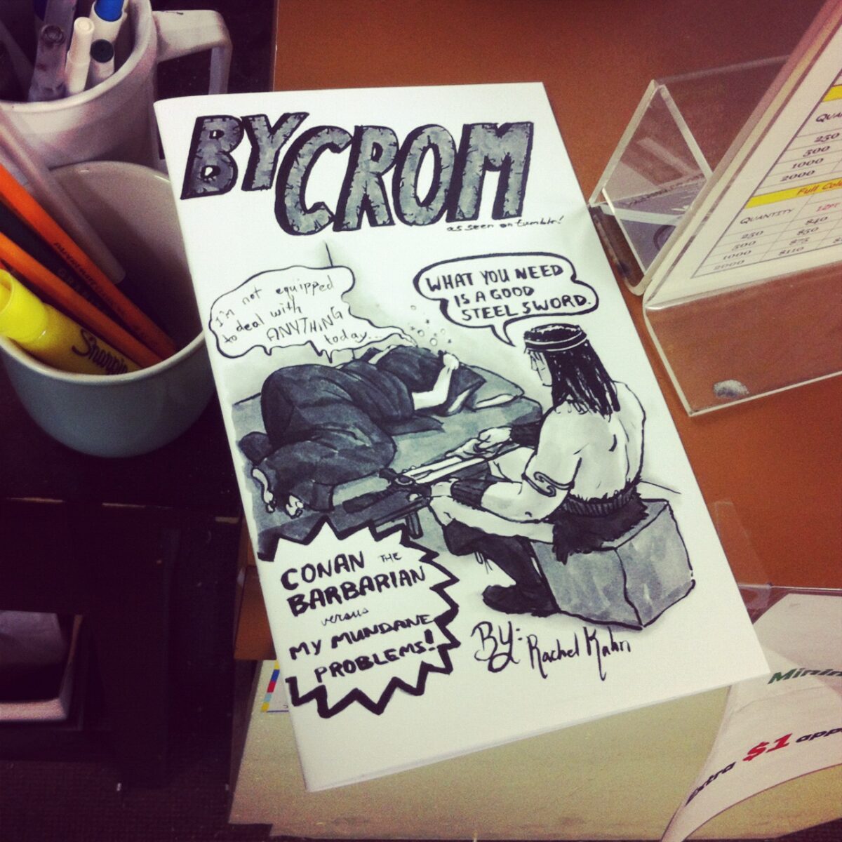
My first zine was a collection of my webcomic, By Crom! – black and white, 28 pages including the cover, photocopied and saddle-stapled and sold at Canzine back in 2012:
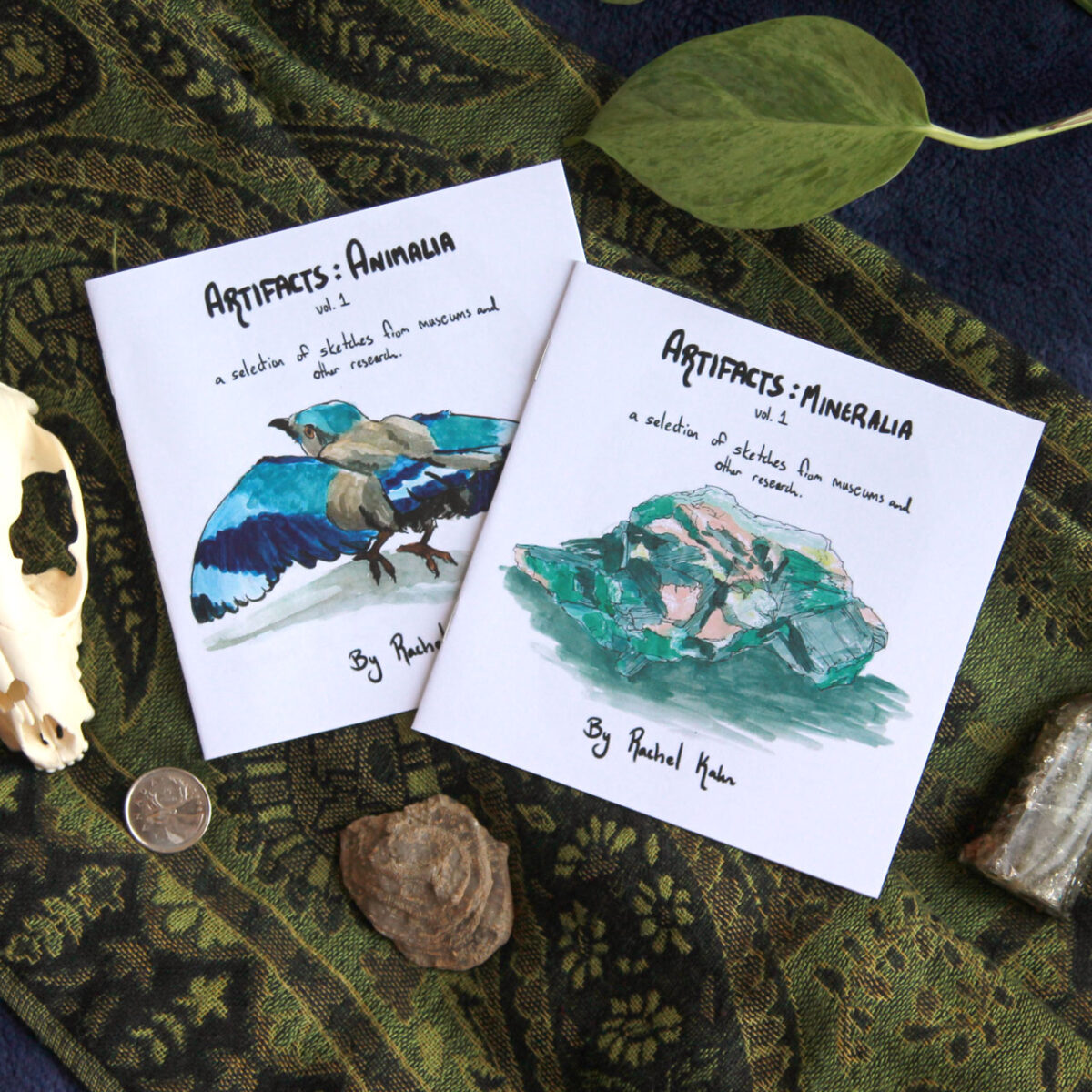
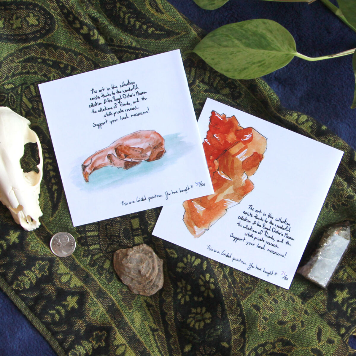
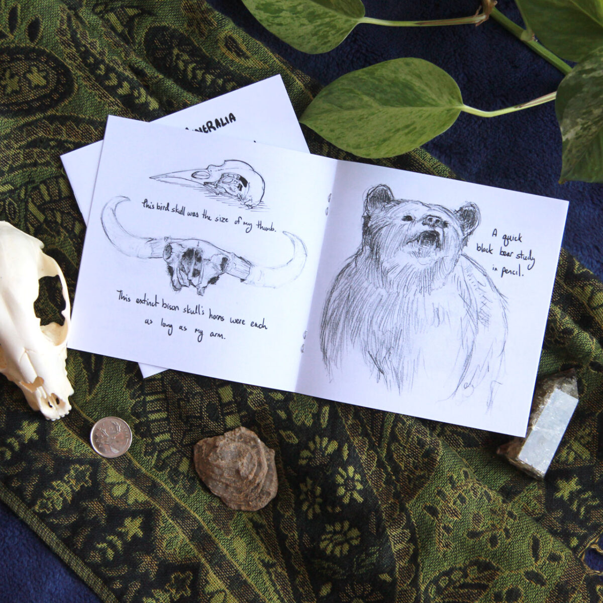
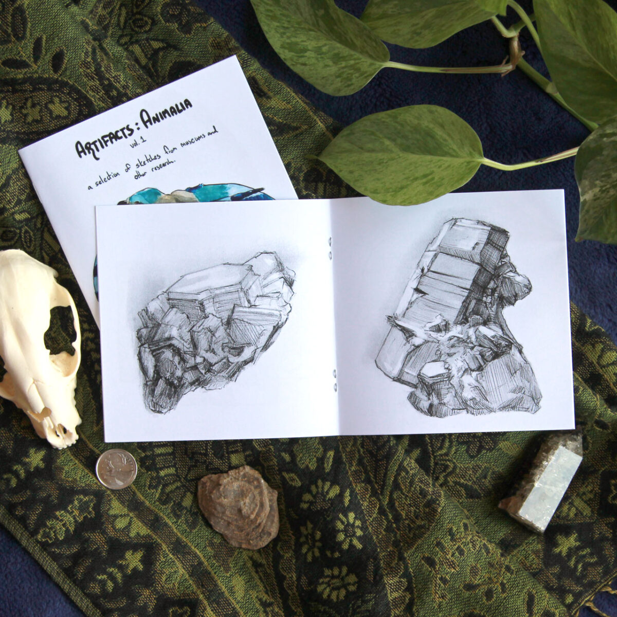
That fully got me hooked though, and I made a bunch of art zines next, collecting museum sketches and plein air painting and game night doodles:


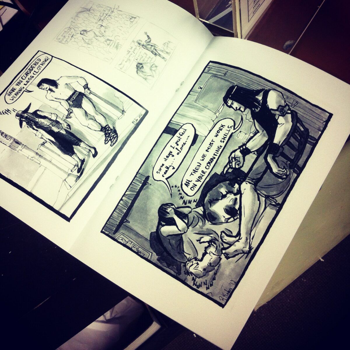
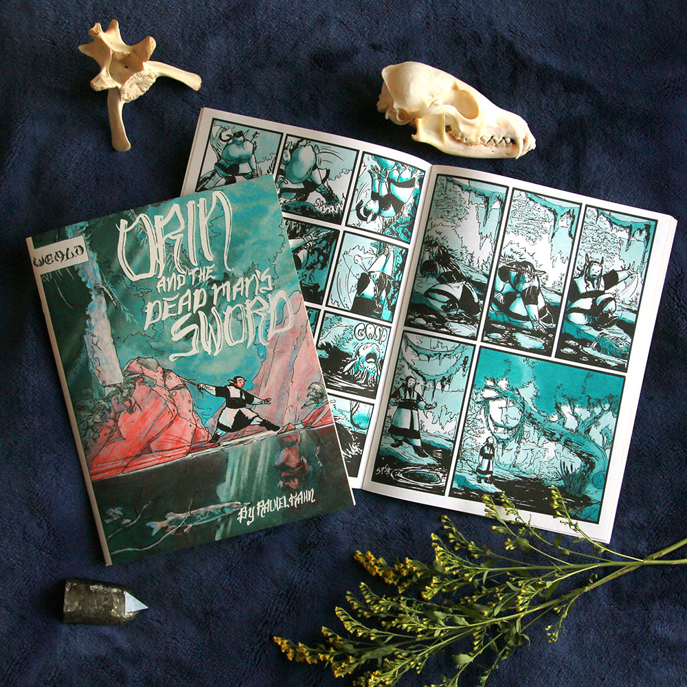
Then I went down the rabbit hole of *more comics* and made a riso comic zine AND an artzine ABOUT the comic zine:


Risograph printing was way too fun to stop there though. so then I made two more riso zines, both heavy metal themed:
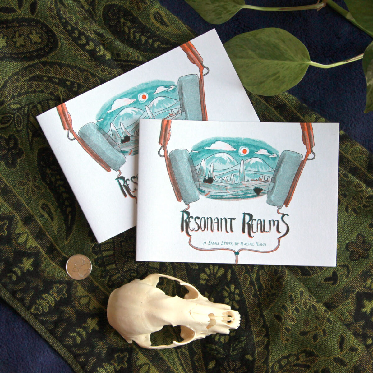
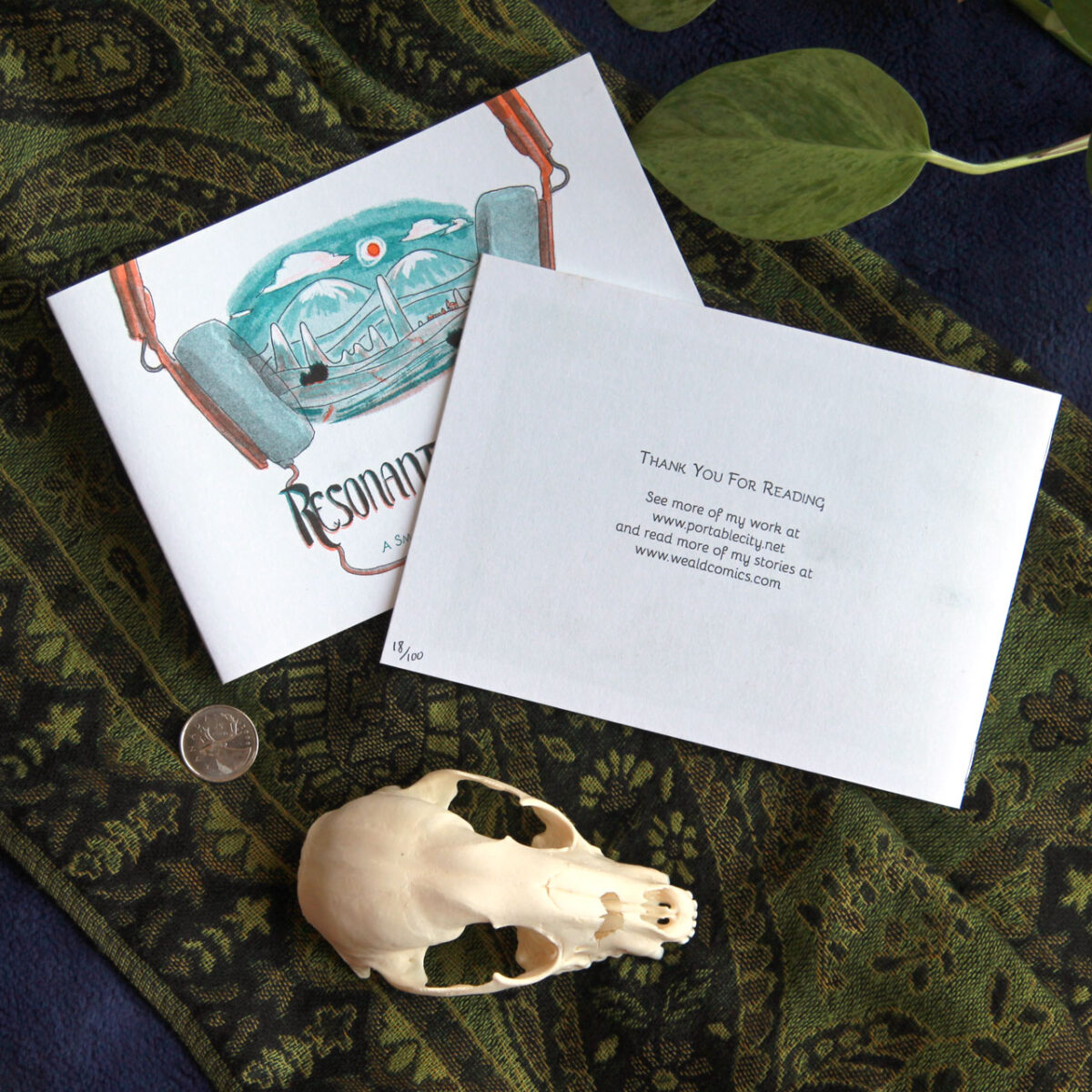
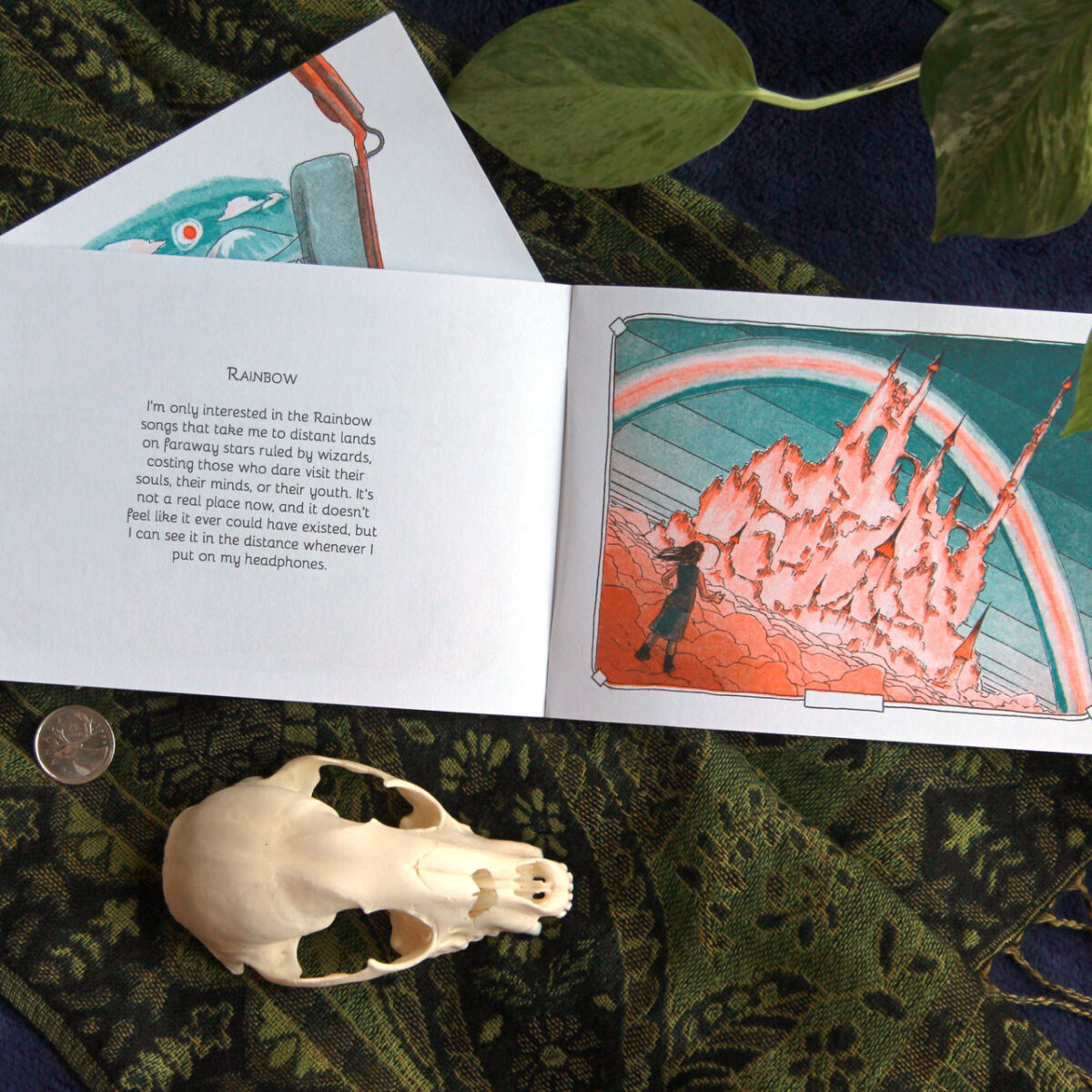
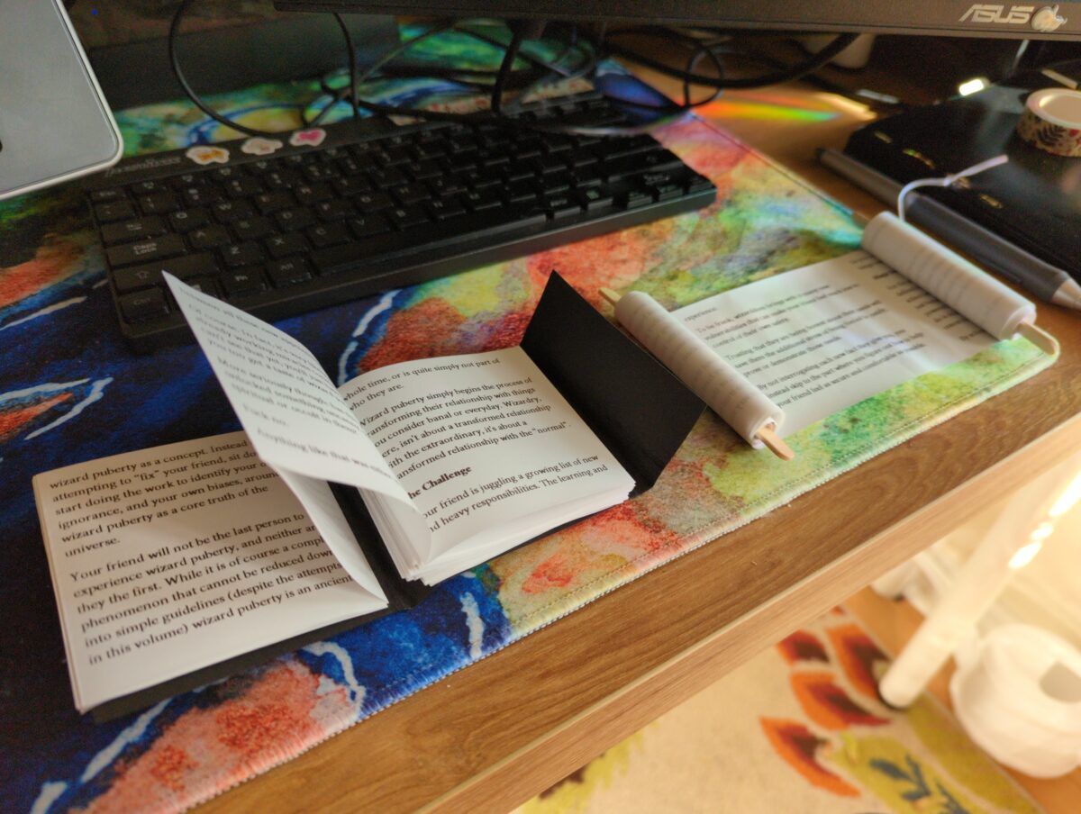
This little guy fits into a CD jewel case!

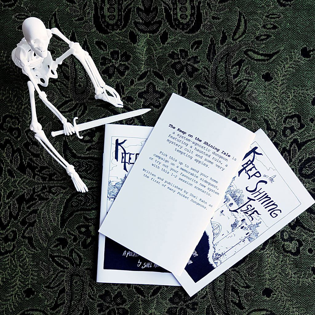
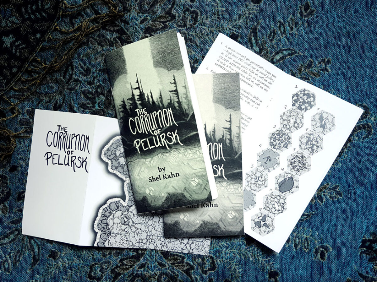
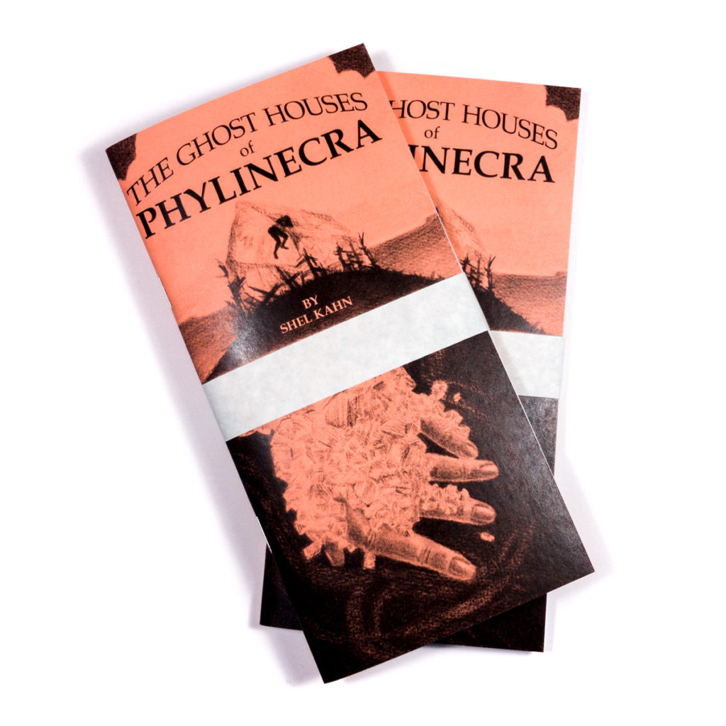
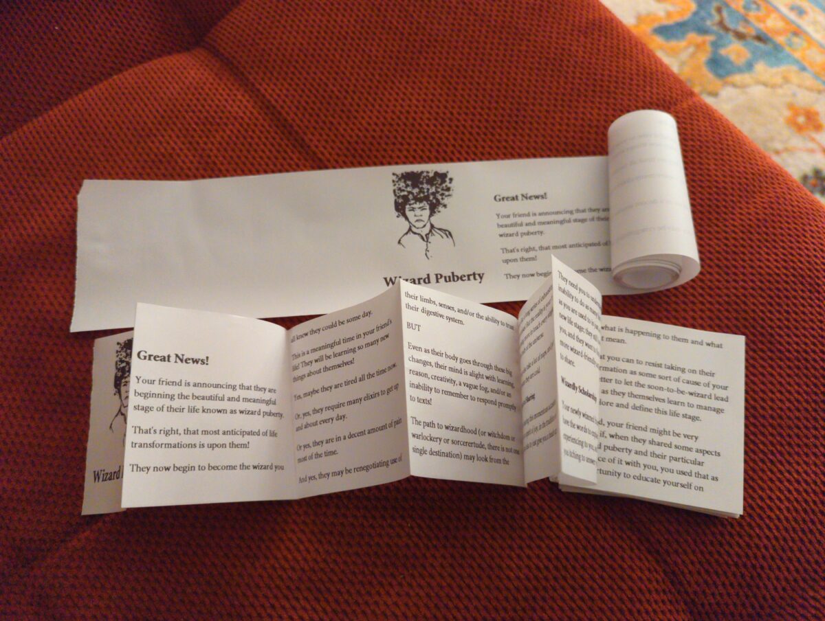
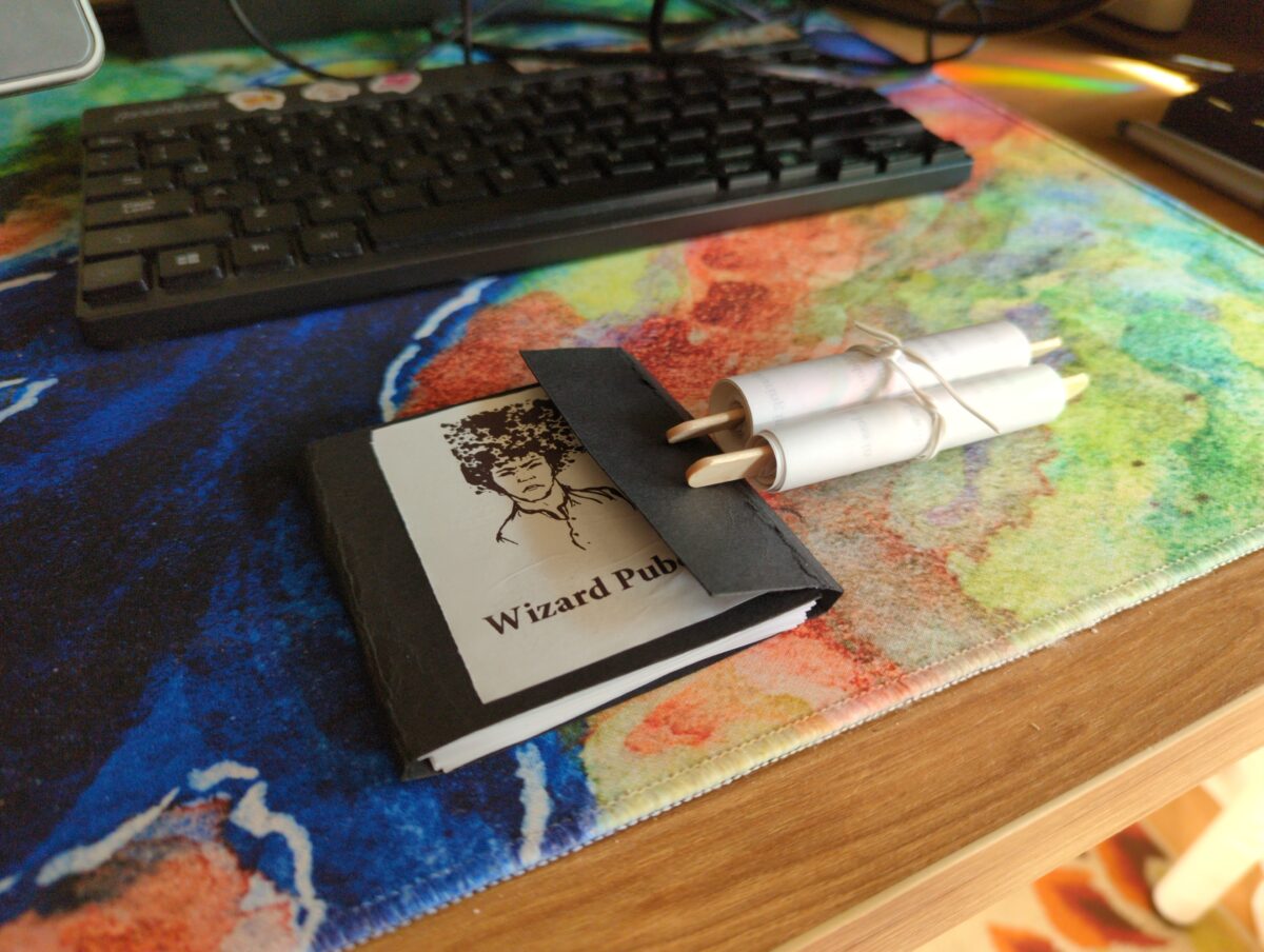
Beyond art, though, the world of ttrpg zines was calling me … calling me with the siren song of centerfold maps and folded inserts and player handouts and so many more fun ways to enhance the zines…
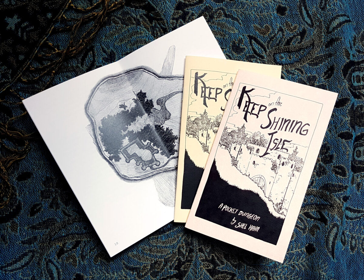
Fast forward to 2025, and I finally bite the bullet on a little cheap laser printer, and set myself up to print comic and fiction zines at home!
And a sneak peek at my newest investigation: ephemeral thermal printer zines. Receipt paper rolls are cheap and enticingly strange! And they print VERY fast. And really do hint at the possibility of scrolls!
I’ve been a collector of zines for a very long time — back in the ancient times I studied artists books and multiples at university, which was probably where I first got pretentious about it, but the worlds of comics and games have really kept zines alive for me, showing me new incredible stuff every time I hit up a store or convention or festival. Shoutout to Will and Seb and Adam, who really took the time to get seriously pumped about gaming zines in particular with me back in the before times! Hopefully I will keep the zine momentum up for years to come.
Please drop me your fav zines in the comments, I would love to see some of the coolest stuff you’ve read/found/made!
-
Achievement! 1000+ Observations on iNaturalist!
posted:
updated:
posted to: phototagged: animals, arachnids, bees, birds, frogs, inaturalist, insects, structure, wildlife photography
In honour of taking enough photos and spending the time to categorize them and crop them and geotag them and sort them into distinct observations to have crossed the 1000 observations milestone on iNaturalist, I wanted to pick up where the Exposure Therapy for Bugs post I wrote left off: photographing animals and plants and fungi and so forth has been an amazing new way of seeing the world and is absolutely expanding my mental horizons.

One of the things I both feel inherently skeptical of and also recognize as a central pillar of my worldview is anthropocentrism. by which I mean, I firmly believe that all living things have an inherent intrinsic value, and also a unique and essentially ineffable lived experience and, i guess, point of view. But I also know that my mind centers humanity, and also my mind can only actually perceive the world through my inherently human lens, and that I will never really be able to know what life is like for other living things. But I firmly believe that it is both complex and different, and that these differences are valuable and interesting and worth keeping in mind and being open to and respecting.

I think about this in relationship to pets, of course — dogs and cats and also birds and fish and hamsters and so forth — but also I am very interested in nonhuman intelligence in wild animals; in trees; in slime moulds.
But I have had a somewhat surface level interest in ecology, to be honest, in that I memorized all our local songbirds as a small child, and have learned to id some larger flowering native plants on the highway verges, at least when in bloom, and so forth. But I didn’t really spend much time on invertebrates, or all the little weeds that invade our lawns, or such. But deciding to photograph for iNaturalist observations started to challenge me to pay more attention, to stare longer, to really look at what’s around me outdoors.

And its been magical! I stood still last weekend and stared at a huge huntsman/daddy long legs, perched nearly at eye level on a budding goldenrod, grooming itself. This thing is absolutely a gross-out bug for me, and I haven’t actually lost that response – their huge hinged legs and translucent chelicerae and clustered eyes are wonderfully creepy still! But also it was Just A Little Guy, y’know? It just needed to give its foremost legs a thorough wash.

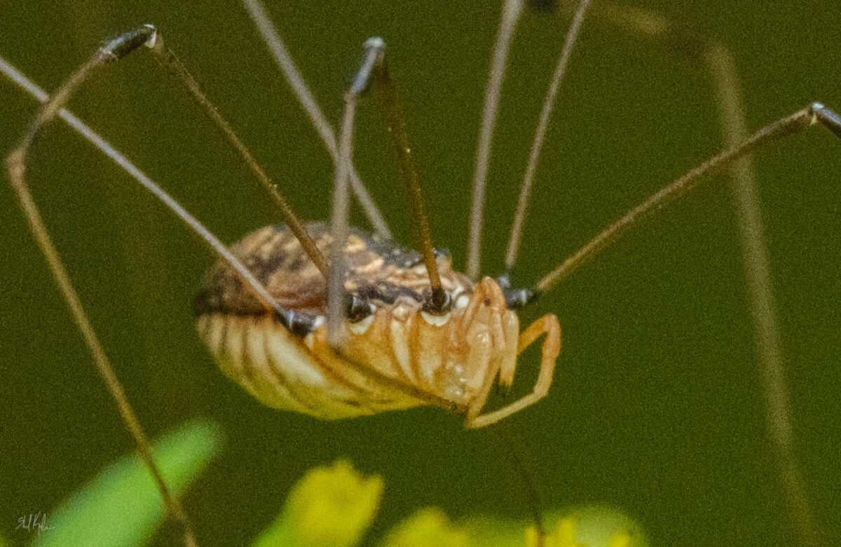

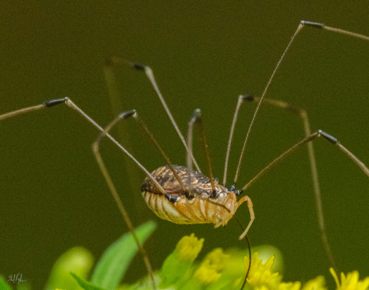
And then I stepped back and realized there were three others all just resting on goldenrod leaves within a foot of each other, which both gave me a brief hit of that overall creepy feeling of remembering that there’s always more bugs around than you think, but also proposed an intriguing question of why are they all here, all grouped up near each other, in the late afternoon? why goldenrod? are they gathering on purpose? And there are whimsical potential answers, the kind you can build a fairy tale out of, but also real scientific potential answers, and it’s a question that I can use to start investigating huntsman behaviour, or just a question to keep around mentally to remind myself that bugs are inscrutable little creatures and likely always more complicated than I think.

And this feels good to know! It also makes me feel bad if I kill a bug, and that’s hard because they are so small and fragile! But also some of them are very willing to fuck with me. Or my stuff. The eternal dilemma.

But to get back to the point of this post, it’s turned the outside world into a much more interesting place, and that feels enormously magical. If you’ve been tempted by iNaturalist or any other sort of citizen science initiative I super endorse trying it out!

One response to “Achievement! 1000+ Observations on iNaturalist!”
-
the huntsman photos are fantastic, i’ve never looked at one close before, i like how their body has different textures for the front and top and bottom. the dragonfly looks like a rocket on a launch pad.
-
-
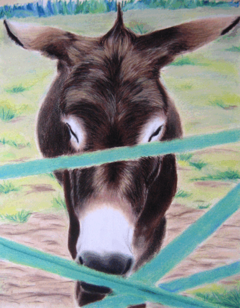
That’s right, chalky, powdery, gloriously colourful soft pastels! Not to be confused with oil pastels, which I have been hyperfocusing on for a year or so.
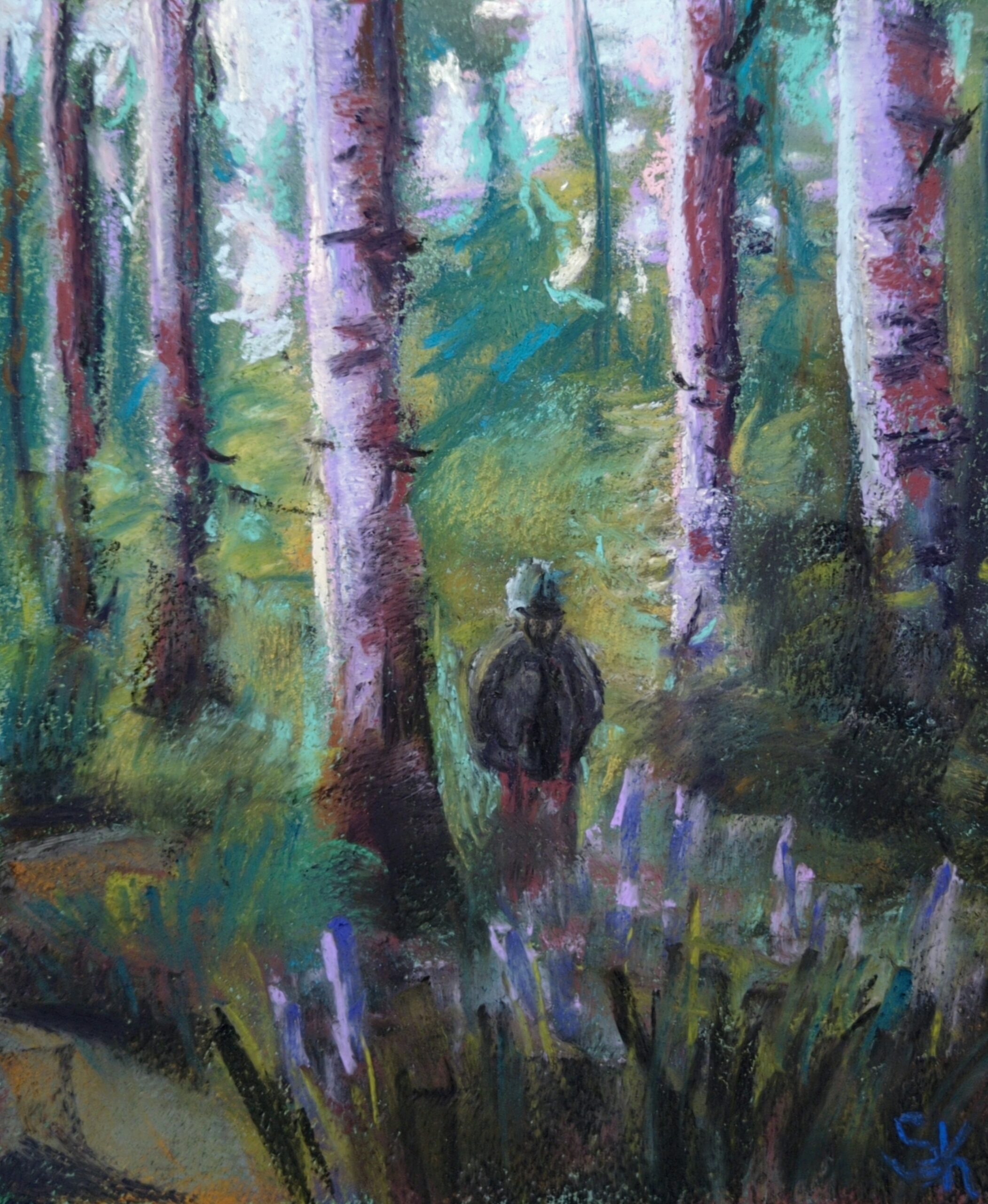
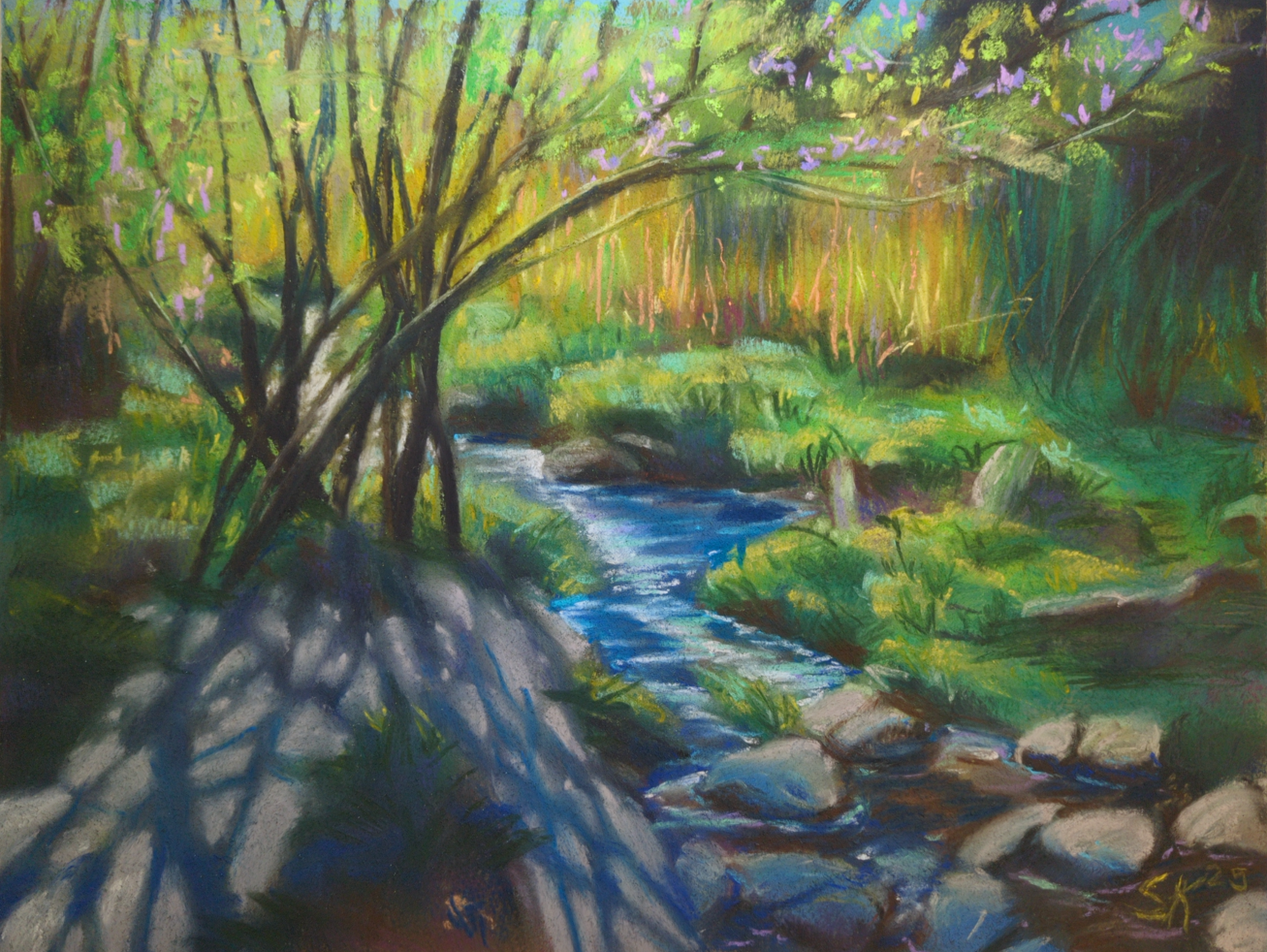
So, like, years and years and years and years ago I did work in soft pastels a little – I was studying fine art painting and I didn’t have anyone around to instruct me in them specifically, but I did a few pieces for assignments or cafe art shows and such:
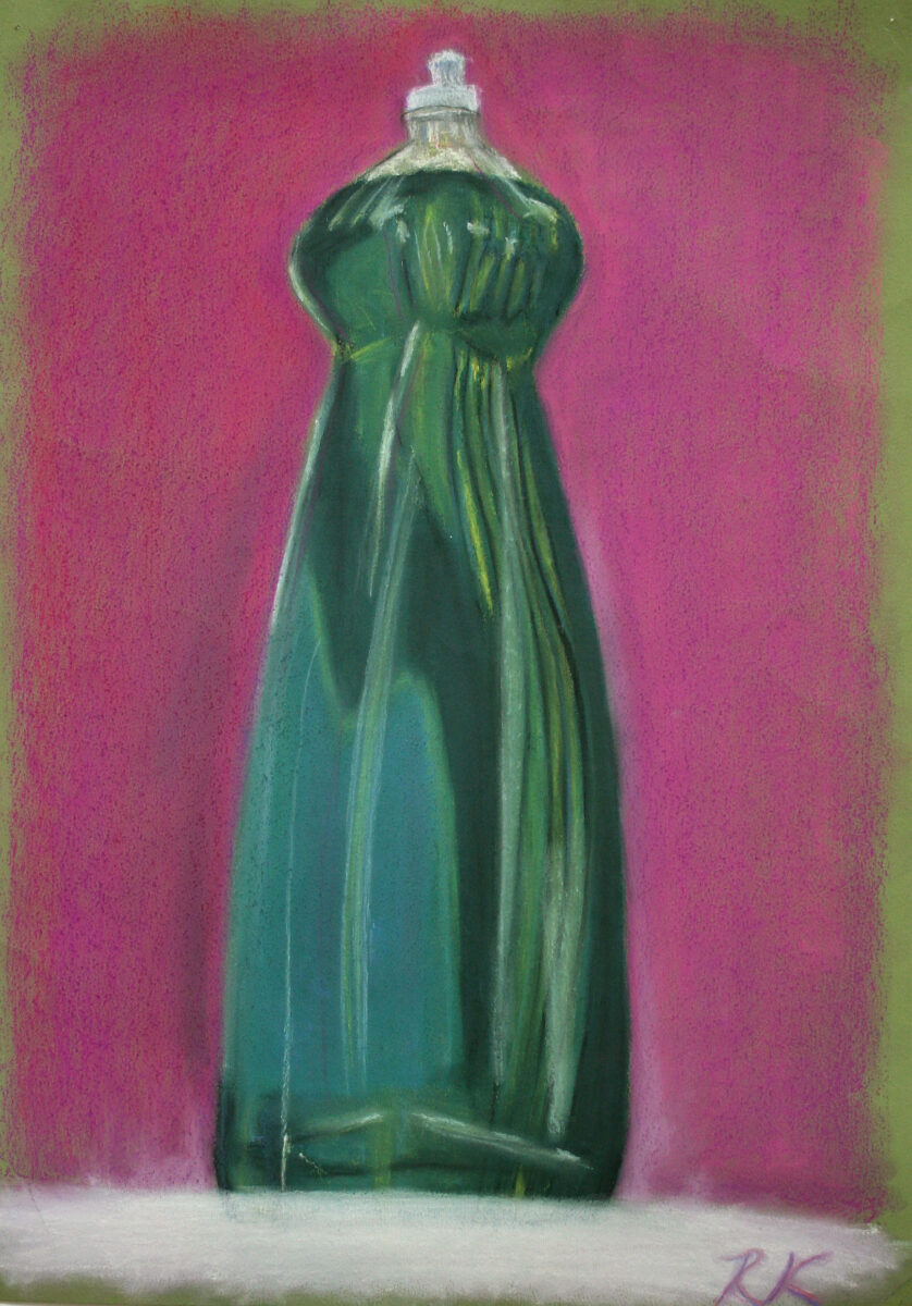
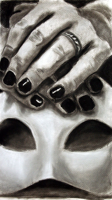
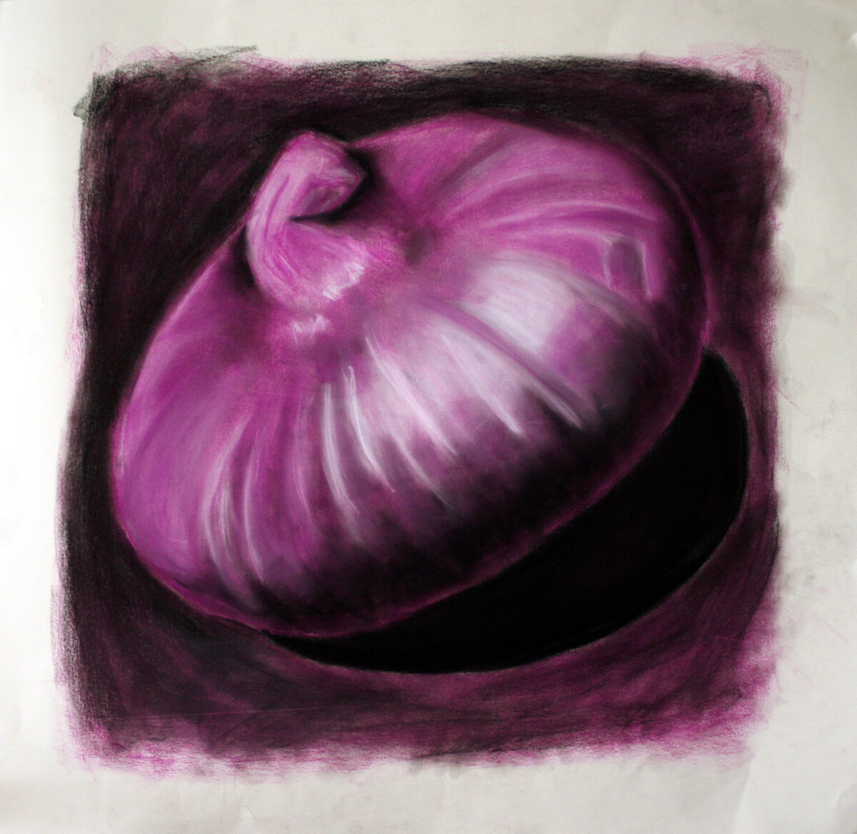
These three above were drawn on whatever paper I had, as a way to just experiment with media in painting and drawing classes in my first few years of art school.
These next two, though, I am pretty sure were drawn on a decent printmaking rag paper, and you can definitely see signs of more intentional layering and blending! These were painted for a cafe art show I had in my last year at university, and they’re each in the 18 x 24″ range, give or take:
fun fact: the cafe refused to let me hang this painting when I brought it in – the owner was terrified people would look at it and just think “ass” and that the sheer lewdness of that would tarnish his classy vibes. 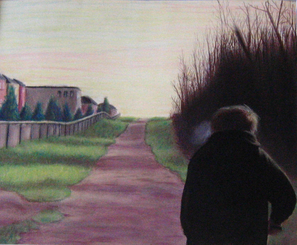
This last one I still have – it’s a painting of my brother, from a photo, and I should really get some better documentation of it. You can see some of my artistic interests starting to solidify: moody lighting, skies that aren’t blue, uncanny suburbia, people not engaging with the viewer, creepy clustered trees… maybe it would be fun to rework this one someday, too!
Anyways, those were painted in early 2007, and then I didn’t intentionally touch chalk/soft pastels again until a little over a month ago!
(As an aside, one of the strongest reasons I avoided this art material was because of all the time I had spent in art college drawing with conte on newsprint. Conte is a sensory nightmare for me, conte on newsprint doubly so, and I had assumed that soft pastels (not oil, the chalky ones) would feel the same. Thankfully I was wrong!)
A few weeks ago, my friend Andrea brought a few sticks of some soft pastels to lifedrawing night and let me try them; and they didn’t really squick me out, even as I used them on something very close to newsprint. After that, it was a quick slide down into the rabbit hole of youtube’s pastel artist content, and anyways, most of the work I’ve done at home this past month has been in soft pastels.
What I don’t have is great photodocumentation yet – I need to take all these paintings outside and properly photograph them, and it’s been a blend of too hot, humid, smokey, or thunderstorming all summer. So, I apologize for the quality of my photos, but just to give you an idea of what I’ve been up to:

My first purchase was the Mungyo artist’s soft pastels – about 1cm thick squares; I bought the set of 48. Honestly, I doubt I will ever use the neons, but there’s some great neutrals and a lot of beautiful midtone very saturated colours in this set, and it’s been a great starting point! But absolutely yes I have been collecting more, especially when there’s open stock available at local art stores. I don’t have any clear brand favourites yet, but I am noticing certain pigments that are consistently frustrating to work with across brands! As I continue, I’ll try to take notes and share them here.
The first thing I did was try all the paper I have in the house, and also watch endless videos on youtube about how pastel artists feel about their substrates. Turns out paper is maybe the real deciding factor with pastels – much like watercolour, there are huge swaths of technique only available on specific types of substrate, and it took me a bit to figure out that some things I saw people doing were only going to be possible if I tracked down some very expensive sanded papers or cardstocks.
But despite watercolour papers and mixed media papers being universally disappointing, I did end up finding a stash of mine that worked well with the medium: cotton rag printmaking paper.
When I was doing my BFA at university I did a fair amount of intaglio printmaking, and printed mostly onto cotton rag paper. Thanks to past me, I still have a decent selection of Arches BFK Rives heavyweight in cream, Stonehenge vellum finish in white, and Somerset satin in white. Turns out these papers, with their heavy weight, mottled surface, and lack of strong surface sizing, have enough microscopic tooth to accept layers and layers of soft pastel pigment, and to put up with a fair amount of alcohol or water washes to lock those first few layers too.
I’d already decided that these were my favourite paper for oil pastel, so honestly I’m not surprised that they are high enough quality to win my heart in other arenas as well.
So that’s what I’ve been using!

Next up I’ll be testing out some cheaper papers apparently designed for pastels, like canson mi-teintes and strathmore’s pastel paper; I’ll let you know how they go!
Oh, and the other lesson I learned about soft pastels: folks are NOT KIDDING when they warn you that spraying them with fixative will change the colour!
Before, and After:
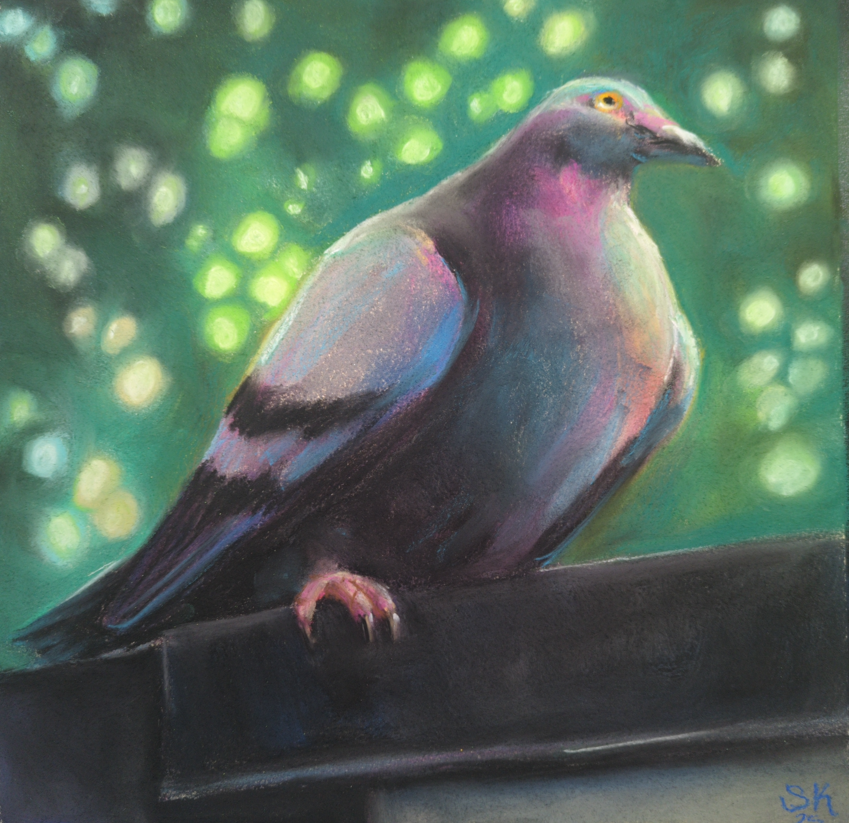
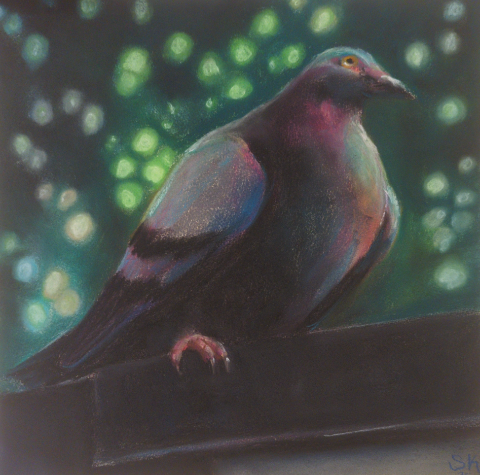
This guy was sprayed with krylon fine art UV safe fixative, and holy heck. I was not prepared for the way it wiped my value contrast out all over the place. My midtones! My punchy highlights!
Anyways I’ve caved and bought sennelier’s dedicated soft pastel fixative, and been taking folks’ warning to use it only in extremely thin, light coats very seriously. In the end, I don’t think there’s anything you can do to make a soft pastel drawing not smudge if you rub it with your finger – even my well sealed pigeon there will still let pigment lift if I try – and I think of the fixative as more of a mild layer of protection than anything else.
Also if that paragraph makes you cringe for how complicated storage of these must be, I am sorry to say you are completely correct, and they are at least as annoying to store as oil pastels. Turns out my life hinges entirely on glassine interleaving papers now! And I desperately need to go find some more asap.
There’s so much in this medium to learn – I see some incredibly expressive work in the contemporary art world, but also there are people using these to do photorealistic wildlife art, or portraiture, or surreal landscapes, all taking the medium and pushing it as far as it can go in various directions. Which directions am I interested in? How does it respond to my usual array of favourite subject matter? And also, for real, why does my fluorescent desk lamp seem to wash out my work so badly while I’m painting? Everything looks so much darker when it’s on a wall vs on my drawing table! So, much to learn still ahead of me.
One last image: this is how I’ve been storing them so far:
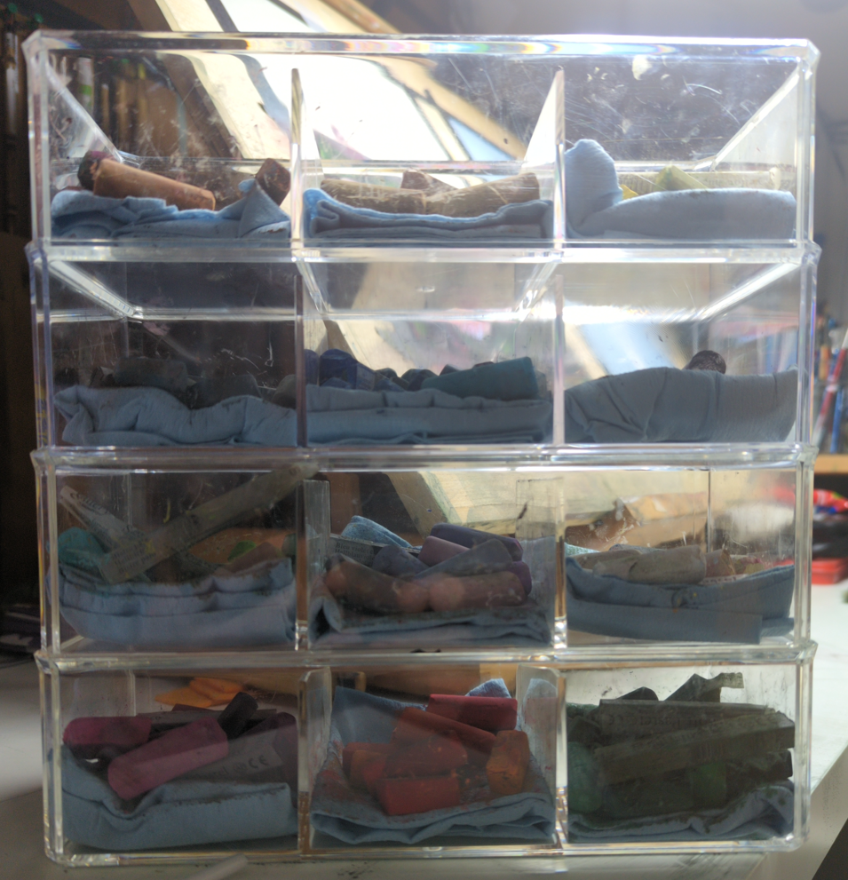
I probably need to cave and pick up more wooden drawers, but so far I am resisting.
3 responses to “Soft Pastels are Back in Town”
-
these are so pretty! my favorite is the vertical picture of the forest with a person in it, or the one beneath it with the wonderful shadows being cast by the thin trees. this medium really lends itself well to soft dreamy landscape pictures. ❤
-
Thank you so much! It really does feel like dreaminess is key to any soft pastel piece, you’re right!
-
-
your work is wonderful! it is dreamy but it has such a clarity to it. i liked reading about the troubles of storing this stuff… somehow you’ve still made me consider picking pastels up
-
-
Murderous Mermaid Thoughts
posted:
updated:
posted to: concept arttagged: concept art, creature design, mermaid, monster, monster design, sea creature, sketchbook, structureSpent some time in my sketchbook thinking about all the amazing and kind of horrifying ways sea creatures have arranged their mouths, and seeing what I can combine with mermaid ideas and to what effect.
(click on the images to see larger, crisper versions of them)
I was inspired by this sketch of mine from 2017:

I think I had seen a few amazing mermaid/angler fish designs as part of mermay that year and I had to get this weird fake face idea on paper. I still love the eyes on the mermaid’s shoulders! Can’t top that visceral feeling!
But I know a lot more about sea creature mouths nowadays, and I was recently at the aquarium refreshing my visual memory, so, here’s a few more mermaids that 100% would eat any and every hapless sailor they came across, with mouths we extremely do not want to look to closely at:
Starting with a more firmly eel-shaped reinterpretation of my first idea.

And then, well, have you looked closely at crustacean mouths? There’s so many moving parts! This is not accurate to any one crustacean in particular, just, you know, feeling the vibes:

And then, well, that chest-mouth is intriguing, but what if we made that way, way weirder:

Crustaceans are horrible but you know what’s way worse? Polychete worm mouths! First I simply put one on the face:

…but that isn’t nearly upsetting enough, so:

Well it’ll be hard to top that, but, quickly, where else can we put mouths? What about the top of the head, like an anemone? I gave her fan shrimp hands too, for maximum filter feeding:

Speaking of filter feeding, what about baskers and other filtering fish? Hard to open the expected mouth that wide but maybe we can bask using the ribcage:

What else could the ribcage do? Maybe grind things up, the way skates and rays do:

And finally, well, I did really want to sneak in one more straightforward monster, so here’s a take on a gulper eel – I gave her a lure as well, where a human heart maybe could be:

It’s always fun to take an idea and explore it so thoroughly! For these I resisted the urge to go gather reference, but if I was designing a mermaid monster for a client, this is the stage where I would take these ideas as a list, pick a few that worked best for their project, and go get a big pile of reference to deepen my explorations. While I like quite a few of these designs just as they are, there’s no way that I know EVERYTHING about how weird a sea creature’s mouth can be, and in my experience research always rewards with fun new details!
If I have time later maybe I’ll come back and pick one of these to do a deep dive design investigation of – if you could pick one to see taken further, which would it be?
-


art directing a disney game was probably the most exciting surprise of this decade for me! So it’s been a big year of launches and adventures and news and updates and all the rest, but I am now sitting down to plan out the fall and winter, and I’ll be looking to take on some new jobs!
I’ve spruced up the portfolio section of my site and sorted it into a few categories: art direction, visual development, illustration, and original art.
I loved building out this solarpunk game world with Peculiar Path After a few years there of focusing on videogame work I am for sure excited to keep my streak going and make more games! I learned so much while art directing at Bloom about working in-engine, as well as working with and leading a much bigger team than ever before, and I’d really enjoy a chance to test my skills in those arenas.
getting to develop this portal for Level Eater’s first ever gaming journals was extremely fun I also miss doing concept art, and if you’ve got some visual development needed for a game pitch or prototype, I’d love to be involved! I enjoy working with bold, stylized visuals and building magical worlds that support the game’s story and really highlight and show off the game mechanics.
I’ve done vis dev for more than just games, though, and if you need colour work, creature, character, costume, or environment designs for your show, movie, tabletop game, immersive theatre production, or public art installation, I’m definitely interested!

specifically please give me more weird creatures to paint, i crave it Also, I was an illustrator first, and I would really love to get to sink my teeth into making some beautiful paintings and drawings this coming year. If you need cover art for your novel, your comic book, or your tabletop RPG, please reach out! I’m not taking on comic book interior art right now, but I would be excited to hear about other fully illustrated projects, such as middle grade novels or children’s books; and if you have something a little different, like product or packaging designs that need art, I’d love to see how I can help out.
Now, this is maybe more for Toronto locals than anyone else, but, did you know I used to be a mural painter? almost twenty years ago? Well if you like the look of how I paint my original artwork, and you want that to happen on your walls (inside or out), definitely reach out! And for non-locals, I am thinking about opening original art commissions by October, so if you are looking for something special for your home this winter, keep an eye out for that post.

playmaps are months of work to draw, but when I see how excited folks get about checking out all the magical details, it all feels worthwhile To fully shoot my shot, though, I need to confess to a secret: I would love to get to design toys. I’ve had such a great time making videogames and tabletop games, but they’re not quite scratching the itch — and making playmaps like the Tower of the Forest Wizard has been incredible, but what if I got to stretch beyond the 2D space into something kids could physically hold in their hands? If you’ve got a project like that in front of you, I’d be enormously honoured and so excited to get to contribute. And if you’re open to pitches? I’ve got a few ideas kicking around. I’d love to tell you all about them!
This is a big old-fashioned hire-me post, yes, but to be really real: getting to collaborate with folks who are excited about what they’re making is always an honour, and I’m so grateful for all the amazing things I’ve had a small (or large) part in over my career.
People have brought me in to help them bring their ideas to life, and that honestly is maybe my biggest professional motivator! I want to help people tell stories. If you have a story that needs telling – or if you want to make something that puts that power into the hands of players, readers, or performers – I would love to be a part of it.
Drop me an email and let’s talk!

this? someone building a train set on top of my map? this is an amazing feeling.
-

burst mode burst mode burst mode
One response to “Bee fight! Bee yeet!”
-
Woot woot! Love the burst mode!
-
-
I am loving making these gifs of my burst mode shots!
-
Gifs aren’t exactly effortless BUT: they are charming.
One response to “Testing burst mode on my camera”
-
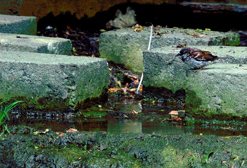
Wow so cute!!! I love the Lil birdie
-
-
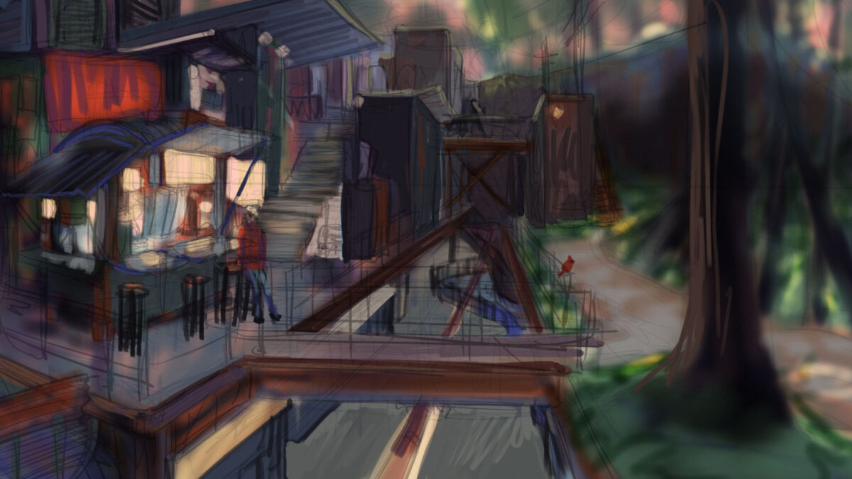
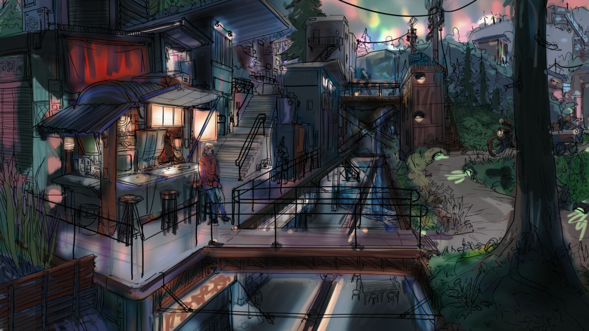
Felt like doing another environmental piece. Here’s an update on my work-in-progress!
Everything in my brain these days is a little solarpunk-tinged, but I wanted to try using some ref from our travels along the north of Lake Superior for the environment, since I feel like Solarpunk as a genre usually goes for a more tropical or temperate instead of boreal ecosystem feel, but obviously people can live sustainably – and have, and do, and will – at all latitudes.
Also I just love to draw a big ol’ spruce!
Process so far:
First, rough (really rough) sketches stacked on top of each other and filled with airbrushed colour. I built the palette from my colour ref screenshots folder, and while I like some parts of it it wasn’t quite hitting for me. Also, I accidentally composed an image where there’s a key split right at the halfway point horizontally, which isn’t working for me either.
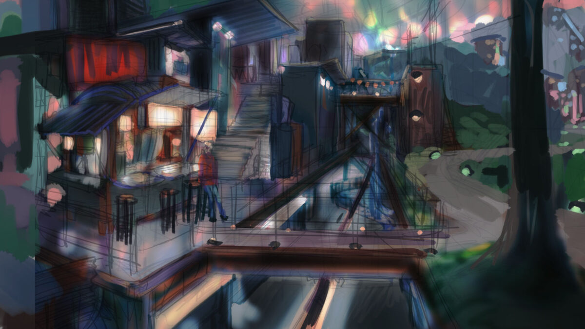
So then we did some grabbing and moving of compositional elements, and also I used a whole array of adjustment layers to start tweaking the colours, bringing in more cold atmospheric perspective and varying the temperature of the different light sources:
With that hammered out it was time for a Clean Drawing! I throw a 15% opacity white layer over everything so I can see what I’m doing:
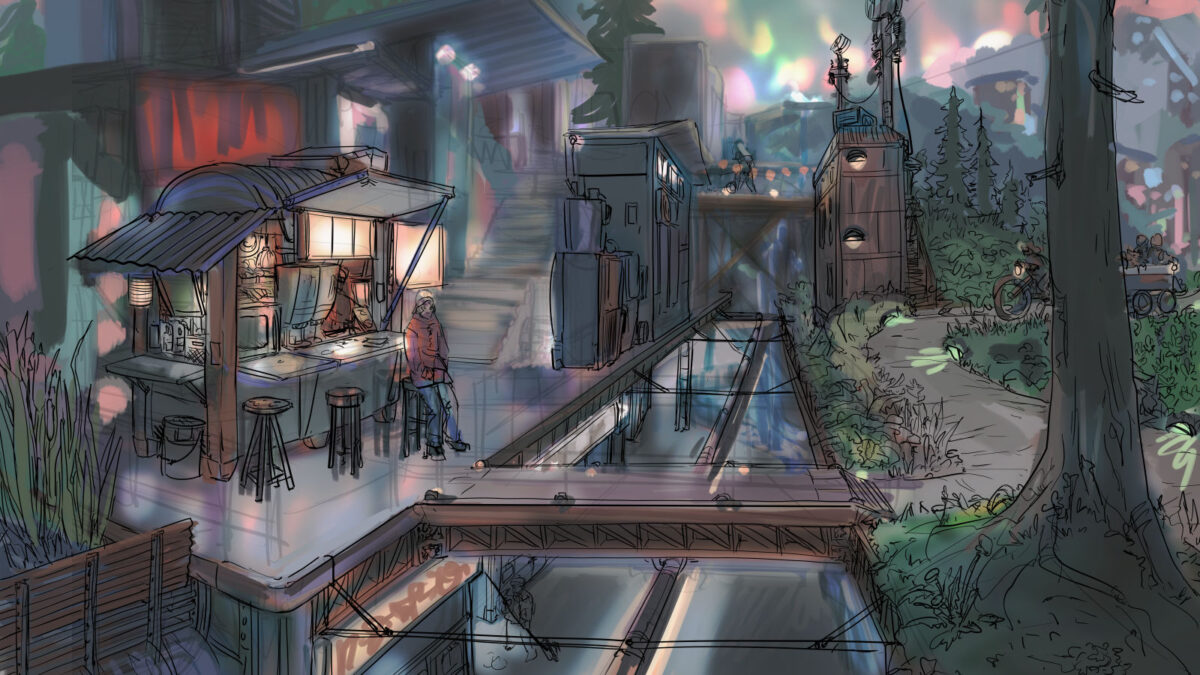
And the drawing is mostly done now! Next pass will be Small Charming Detail drawing additions (maybe adding a few more people, or wildlife, or graffiti?) and also I missed some safety railings, but we’re just about ready to start painting.
One of the things I used to think was silly was taking the time to do the drawing like this. At my most warmed-up, I can draw as I paint, at least a little bit, but after decades of doing this kind of work I am forced to admit that thinking about the narrative (location, time of day, set dressing, character posing, environmental storytelling etc) is a drawing activity for me, not a painting one. That feels a bit weird to admit, but it’s true! Once I’m thinking about value and colour, I stop prioritizing narrative as much – maybe because painting is more of a math style activity, using a less verbal part of my mind? Drawing is definitely WAY more verbal for me.
Anyways, the clean drawing remains a VERY important stage, and I would like my concept art teachers from 16 years ago to hear me say this aloud: you were right. Do the drawing. Stop skipping the damn drawing.
Anyways, this piece is gonna take me some time to paint, but I’ll be sure to drop back in when I have more to show of it! And if you have feedback or suggestions, you know where the comments form is!
-
New to digital art? Switching to Clip Studio Paint? Either way, it can be helpful to know how to learn and customize all the various keyboard shortcuts it offers!
I wrote this up in an Art Director capacity but seems like the kind of thing other folks might want to reference sometimes too! So, here we are, a quick overview of ways to customize your keyboard shortcuts etc in CSP:
(click on the screenshots to expand them)
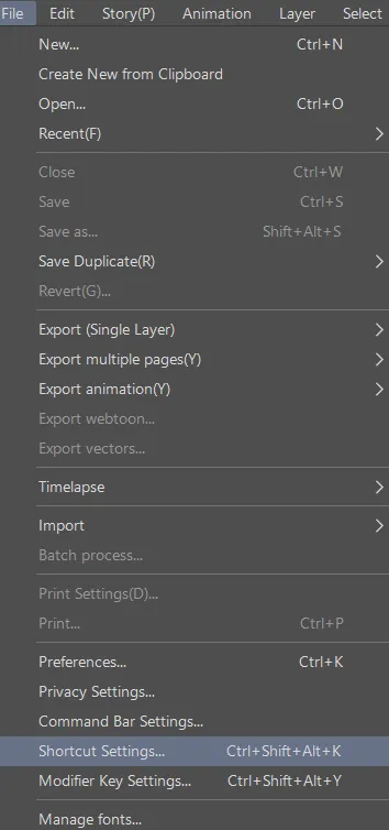
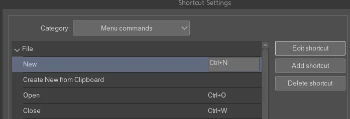
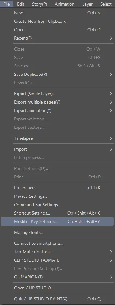
Shortcuts are under the file menu!
The shortcuts manager is a little separate popup window.
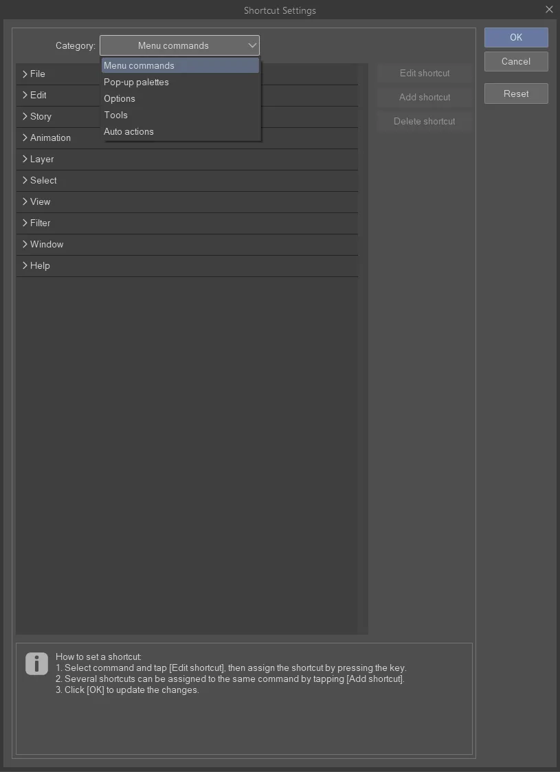
There’s a dropdown for all the different types of keyboard shortcuts:
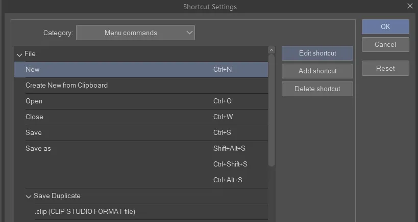
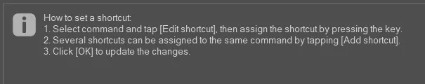
once you select one you can edit, add or delete it
once you click edit you will see the shortcut box open but there won’t be a cursor in it
It’ll just capture whatever key you press.
there’s info at the bottom
if you try and set a shortcut to a key already in use it will flag you:
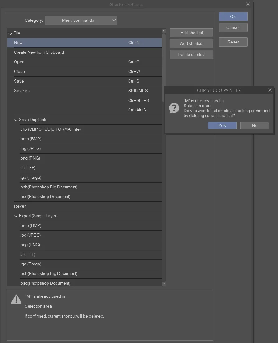
if you choose “yes” it will remove it from the other shortcut purpose. If you click “no” it will reset your current shortcut to what it was before.
most things I can’t find elsewhere turn out to be listed under “options” such as brush size up and down:
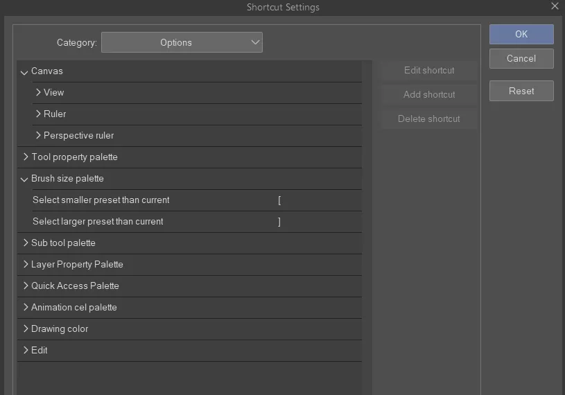
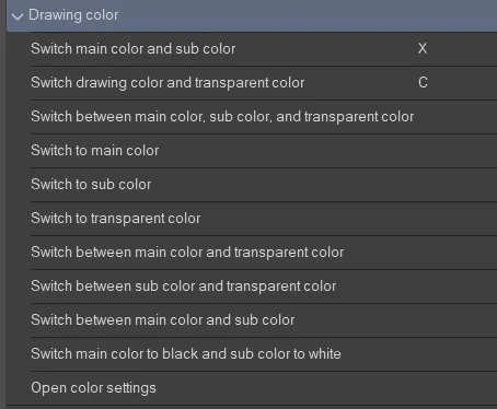
another useful one in Options is Drawing Color:
Tools also have keyboard shortcuts you can edit!
Tools are special because they can share single key press shortcuts:
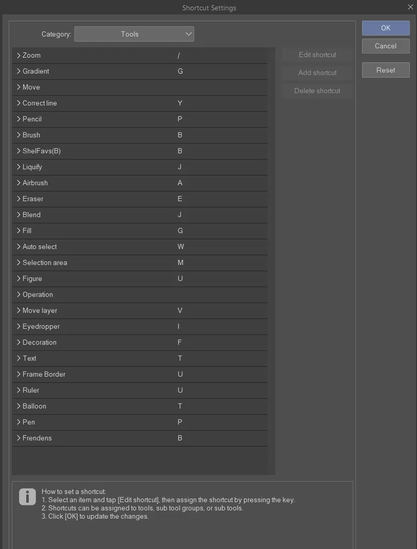
You cycle through them by repeatedly pressing the key. This is fundamentally different from Photoshop but totally workable. I have not figured out how to adjust the ORDER you cycle through them, though, which is annoying.
You cannot add modifier keys to these shortcuts, so you just have to use single keys. This is because in CSP you can temporarily switch tools by holding down the single key shortcut while you want to use the other tool, and then when you release the key it will revert to your previous tool. (Photoshop actually does this too, which is neat!)
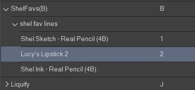
finally, you can assign shortcuts to individual brushes here too:
And don’t forget! All of this setup can be designed to best work with your tablet/cintiq/macro keyboard/wacom expresskey remote!
Also if you’re switching apps it is good to know that your pen pressure sensitivity settings are specific to each brush – in fact, to each sub-setting of each brush:
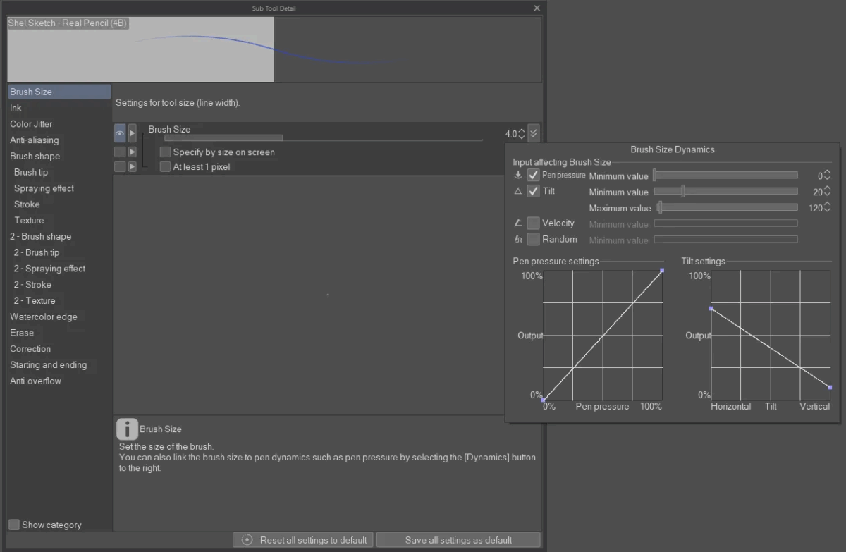
So you can hugely customize this!
If overall tablet pen sensitivity is feeling weird, you might want to go into your tablet settings and make a Clip Studio Paint application context and adjust the pressure sensitivity settings in there:
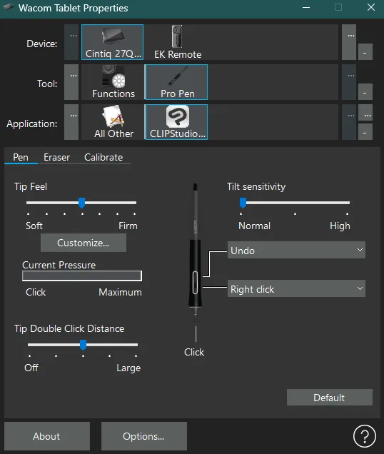
If necessary you can also adjust modifier key settings:
There are SO MANY
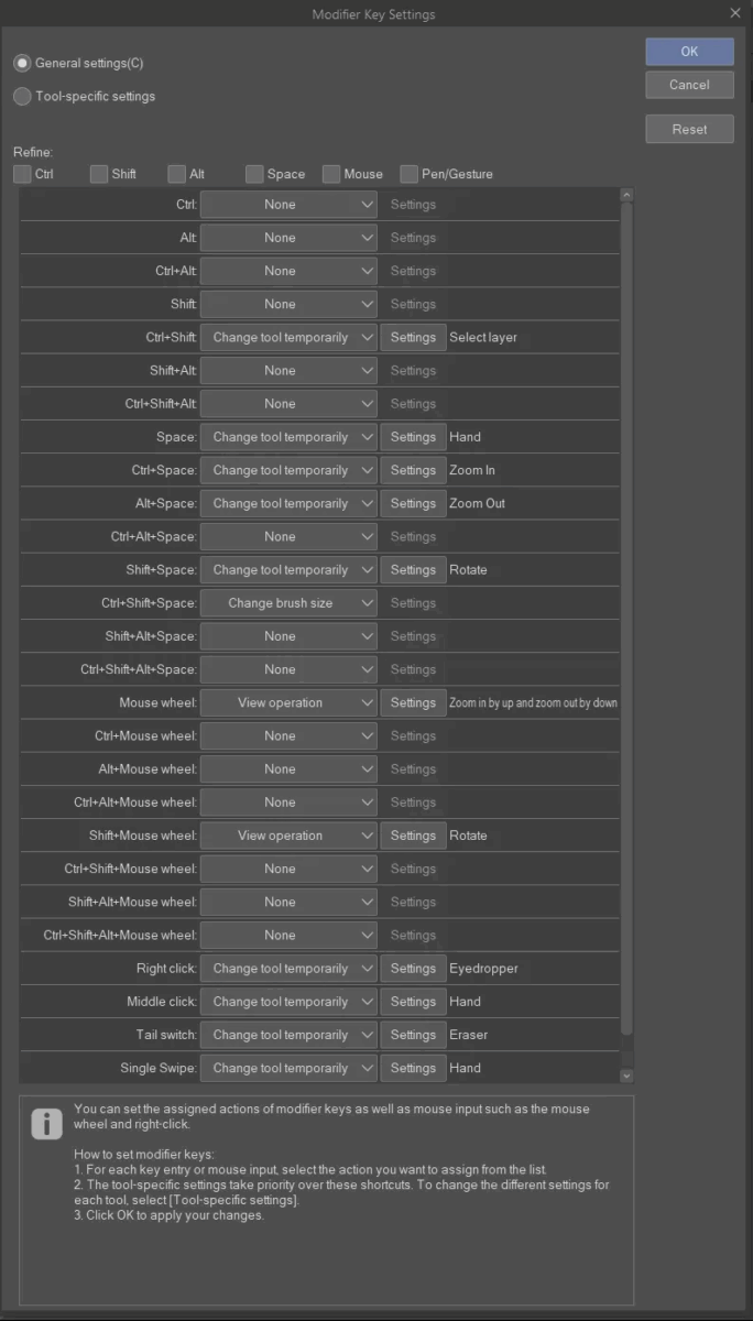
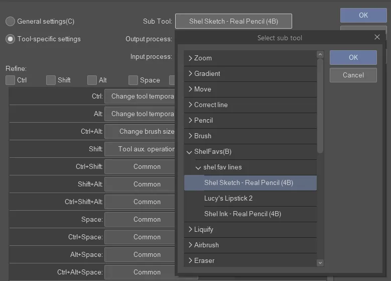
and you can be specific to individual subtools like specific brushes:
it’s a bit overwhelming, for sure, but really powerful!
just make sure if you want a setting to apply to most tools to do it in General Settings:
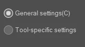
For example, I made my middle click on my mouse into the Hand tool, but first I only did it to the brush I was currently using and couldn’t figure out why it wasn’t working everywhere, till I went back to this submenu and saw I needed to apply it to General Settings.
If you want to backup or load settings from another computer or from before a reinstall, you need to use CSP’s cloud service: https://tips.clip-studio.com/en-us/articles/887 – SOME cloud space should come included with your account, should be enough for your settings!
And last but not least, don’t forget that there is a manual! https://help.clip-studio.com/en-us/manual_en/720_preferences/Shortcut_Settings.htm
Leave a Reply