
swap to chronological order of most recently posted
-
This palette really holds you accountable to relative colour! But also: you can use every pencil crayon in your possession and it will still feel perfectly harmonious.
-
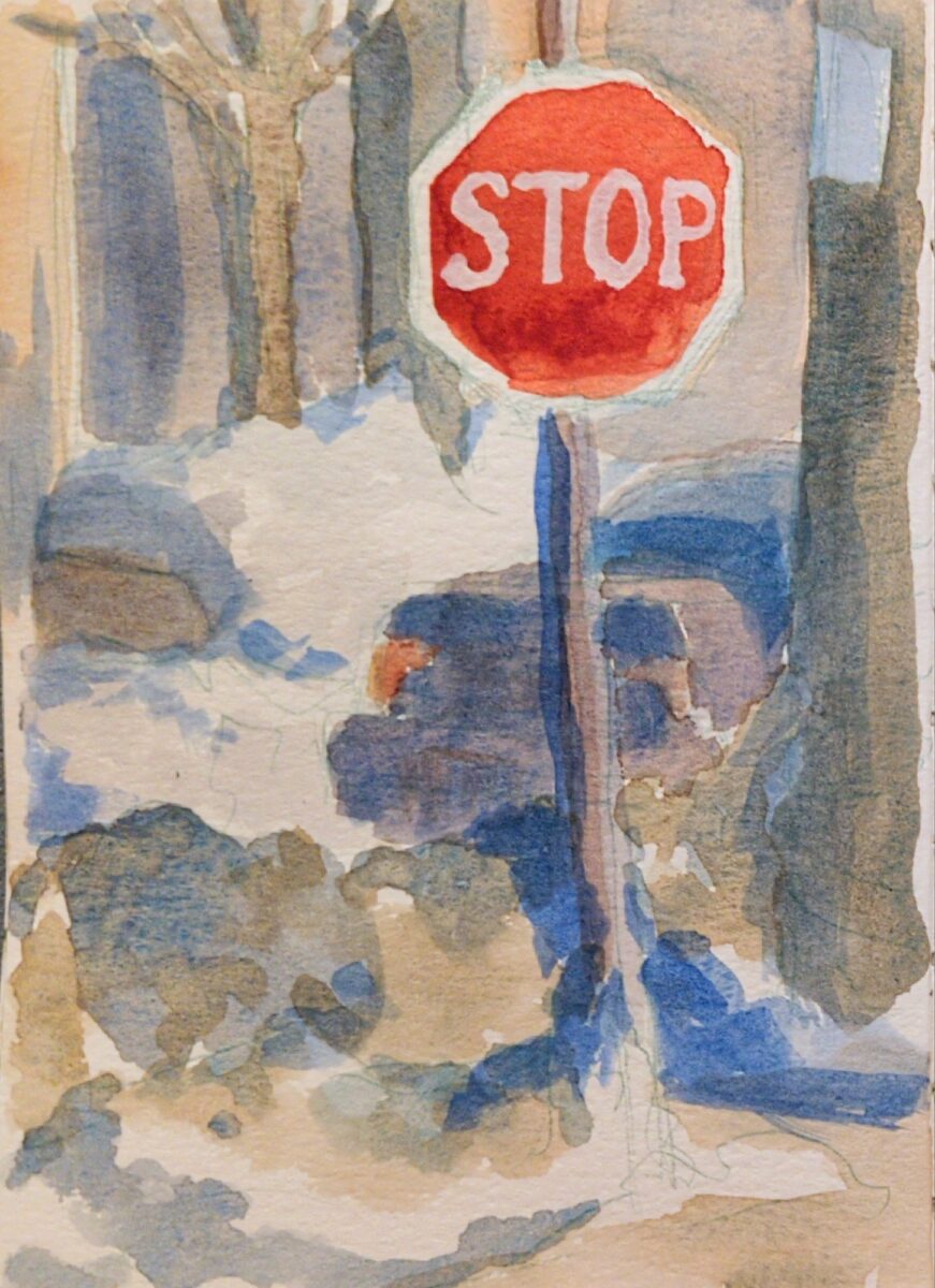
A painting from the cafe window and two made up landscapes, to test drive this watercolour selection and see if it’s missing anything.
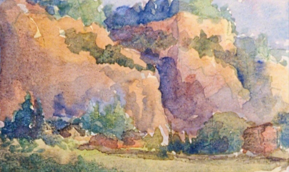

I love how warm the greens can be despite my palette having cobalt teal AND cobalt turquoise! And the granulation is really working for me.
I do miss having a near-black blue or green – anthraquinone or prussian blue, or perylene green – but it is fun finding other ways to get those deep darks. It’s definitely making me use my purple more, and I do love what purple does to green.
Probably the biggest thing missing from this palette is a saturated middle yellow. I have lemon yellow deep, which is very cold and quite pale, and I have Mijello Mission Gold’s green gold, PY150, which is warm in masstone (full power) and quite cold and intense in dilution (watered down). My only warm wash colour is raw sienna. It is giving things kind of a cool cast even to the yellow light in that middle landscape sketch; that might honestly be a nice technique to use for a palette destined for outdoor painting. We’ll see!
These were all painted in my lightwish 100% cotton watercolour sketchbook, and you can see I have a hard time getting crisp small details in here. I think there’s two reasons: firstly, the paper holds SO much water, it takes much longer than I expect to dry (this is also a feature, if you want to control and modify washes at length); and secondly, I’m testing this palette with waterbrushes, and it’s very hard to control the water enough to get dark rich sticky mixes that are JUST liquid enough to lay down smoothly. I don’t particularly think the paper itself is at fault as much as my technique. BUT. Something I’m noting and thinking about.
-

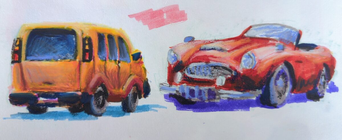
I’ve been enjoying sketching with the neocolours over a base layer or ink or paint, so today I threw a bunch into my bag of crayola mini markers that I normally save for visiting my friends and family with kids1. Markers + neocolour iis in the very cheap, light, portable sketch books you can get at Muji turns out to be very fun!
I included a shot of my swatches; one of the things I find challenging about the kids markers is that they almost never include any truly light or pale colours. One of the things I’ve learned about the neocolour iis is that they really look their best when layered over a midtone. Together, these problems become a feature!
These are certainly not the world’s best cars; this is a sketchbook page done for fun while onthe phone. But maybe you, seeing this, are thinking about some supplies you have that might work really well together? And if so you should go try that and let me know what you learn!
- Kids will always want to draw if I’m drawing, it’s usually worth it to bring them some friendly supplies I won’t be stressed about sharing. ↩︎
-
-
-
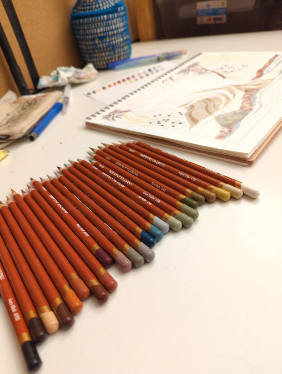
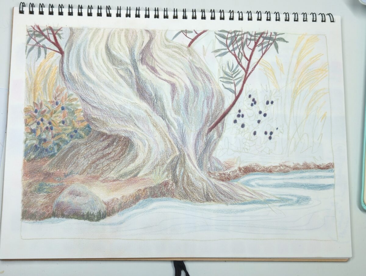
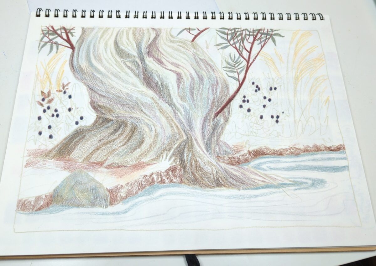
these are the Derwent Drawing line of pencil crayons, and I’m having a lot of fun with them in my cheap MUJI sketchbooks!
-
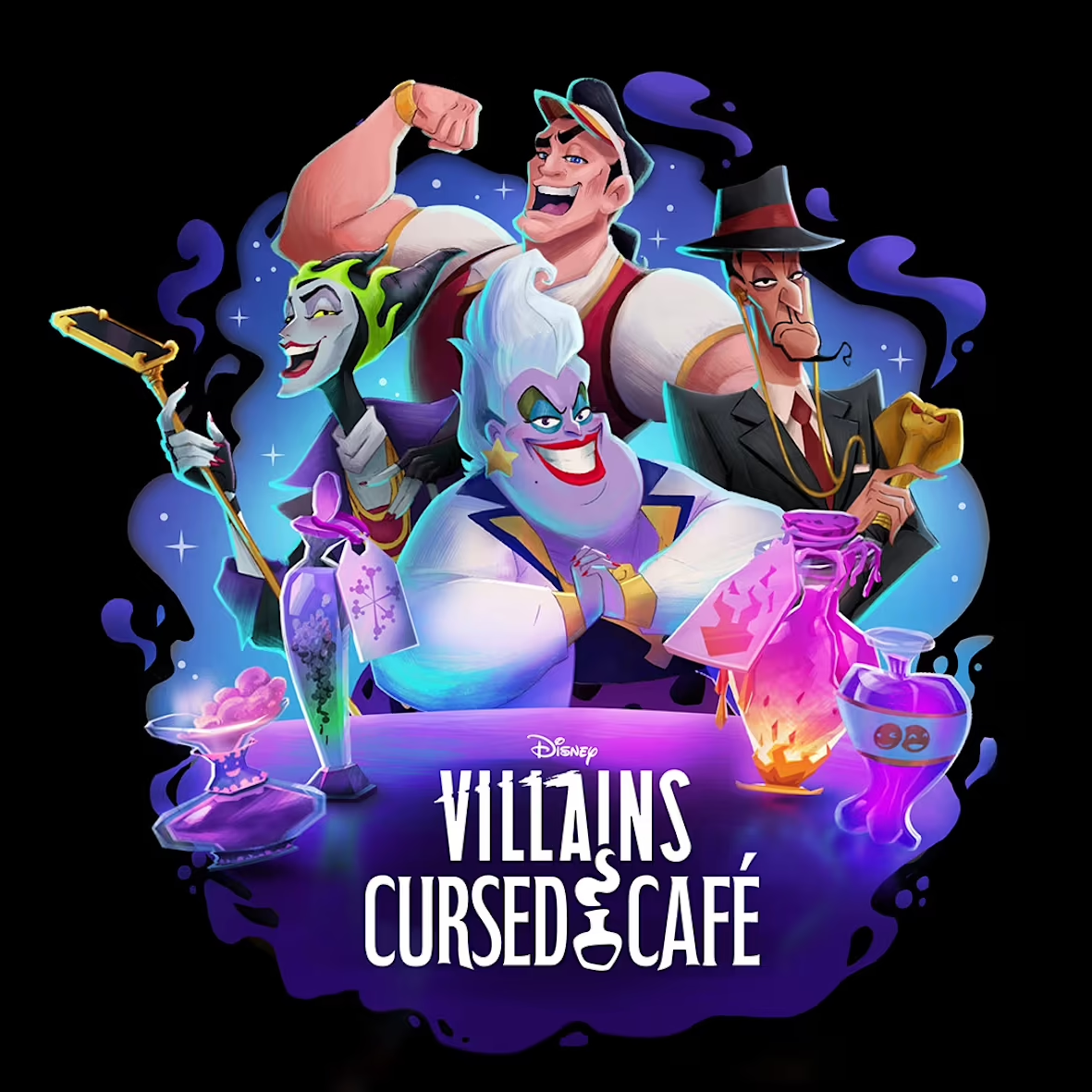
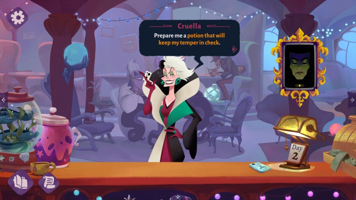
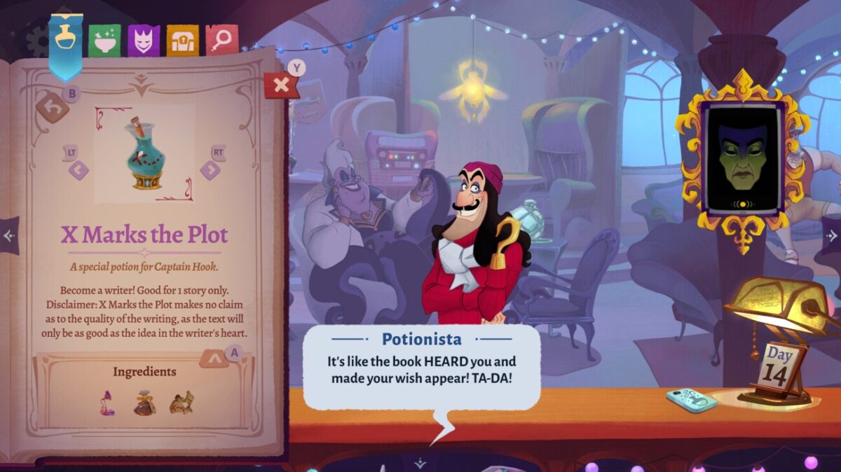
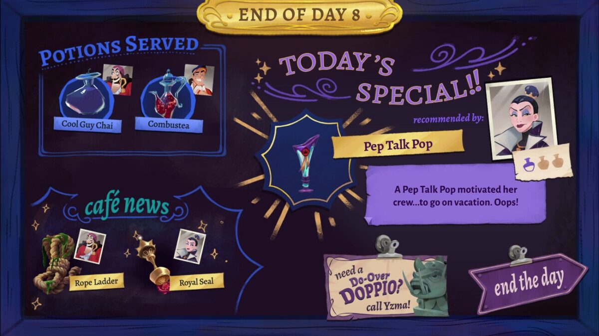
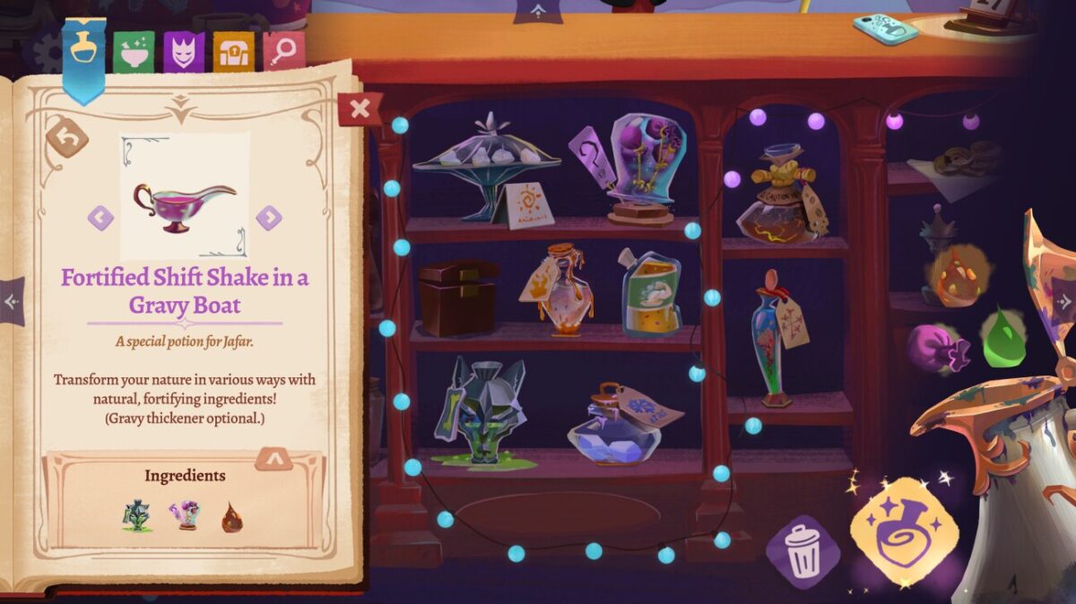
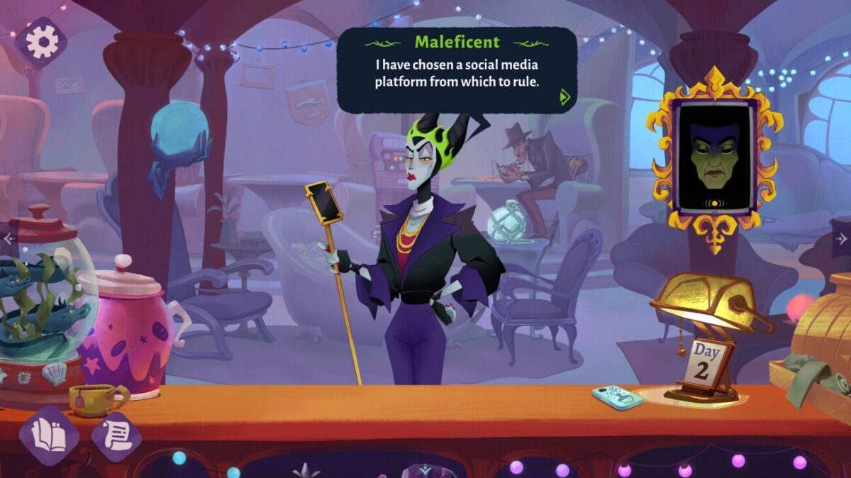
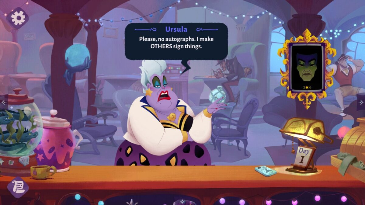
After nearly three years of work, I’m really proud to announce the release of Bloom Digital‘s newest game, Disney Villains Cursed Café. I art directed this game, and I’m so excited to get to share the results of all our hard work!
You’ve probably heard me talk about Bloom before – we’re an indie game company, known for our beloved visual novels LongStory and Later Daters. We are a team of people who love telling stories! Getting to put all that energy towards the Disney Villains was a real privilege.

Working with Disney helped all of us hold our work to an even higher standard, and push ourselves as game makers. There’s a real responsibility attached when you get the chance to work with these characters, and it would have been impossible to navigate that nearly as well without the constant guidance and feedback of the team we worked with at Disney. Thanks to everyone there for helping make this game happen!

I have to brag about my coworkers – I don’t think I can imagine a better team than the lineup we have at Bloom. When you have a team that becomes more than the sum of its parts, you get to make games that are also more than the sum of their parts! Huge thanks from me and the artists to Miriam Verburg for steering the ship the whole time, Heather Jackson for making it effortless to bring the narrative into the art every step of the way, Keana Almario for keeping us all accountable to the players experience, JP Stringham for tackling the game design inside and out, and Danielle Russell for facilitating all the communication and oversight necessary to make something like this happen.
It’s important that I tell you how wonderful the art team in particular was! It might be counter-intuitive, but, you’re not going to see a single pixel of my own drawing in this game. As an art director, it was my job to find the best artists possible and then direct them towards bringing this game to life. I had the privilege and responsibility to lead a team of incredible artists towards making this game, and whatever you see in there, I want you to know one of these people made it happen.
Yi Pan was our senior game artist, which means he and I worked together on concepts from the beginning; you can see his brilliant painting and immensely appealing design work up front and center in all our potions, gifts, and in so much of the overall color design of the game. Jey Pawlik was our character artist and I think it’s impossible to understate how charming they managed to make our modernized villains, no matter their moods! Janiel Lo worked with us across many disciplines, laying out and painting our complex, amazing environments, as well as helping us make sure our beautiful UI felt both integrated into the world and also comfortable and easy to use. Ally Rom Colthoff made it possible for us to have the environment art of my dreams by coming in and painting the heck out of that cafe! And the game wouldn’t be what it is without Sara Mena‘s concept work, and the contributions of many artists on the Disney side who contributed not only character art, UI, and identity designs, but helped us fine-tune everything that went into the game.
It’s the biggest team I’ve ever had the chance to work with as an art director, and I’m not kidding when I say that these professionals made it easy and fun to come in every day and see what brilliant new artwork awaited me.
Something extra special about this team was how excited the artists were to work with, brainstorm with, and sing the praises of each other. I’m so grateful for this team not just for their ability to make beautiful art but their ability to collaborate with each other, myself, and with the team at Disney. Everybody should be proud of themselves, not only as artists but as game makers.
I want to shout out the narrative team, who made time to be in the art meetings with me and the artists, making it so easy to keep everything absolutely on point narratively throughout the whole development. Heather and Mike took the time to get to know the art team, and made themselves available for quick questions, brainstorming sessions, and pep talks. I think what this did for the game was make it possible for every visual joke and narrative joke to play off each other in ways that could not have possibly happened without that kind of open communication.
To talk a little bit more about the UI process, one of the things that we decided to do early on was make this game’s UI very diegetic, to keep the buttons feeling as magical as everything else that you see and do in the game, and that would not have been possible without Keana’s expertise and dedication to solving complicated UX flow challenges. Her hard work let us get away with so much more by way of magical props, framing devices, and sparkles.
For me, as the art director, I don’t always get the chance to put my own handiwork into a game, and as I mentioned, all of the amazing drawing and painting that you see on screen is thanks to our art team. But what I did get to do, very much thanks to the support of JP, was tackle the majority of the VFX. Getting to be a VFX artist for a chunk of this project was a dream come true, because if there’s one thing this game is full of, it’s magic! Figuring out how to bring life and mystery and humour to all of the magic in this game was an amazing challenge that I am so glad I got to tackle.
As a game dev, launches are always special, but this launch has been outright overwhelming in such a good way. Thank you to everybody who is streaming the game, sharing lets plays, drawing fan art, and just generally yelling about getting to hang out with their faves in our magical Cursed Café! I hope as you play this game it feels like you’ve gotten to visit somewhere magical alongside the villains.
Thanks again to everybody involved for this opportunity. Drop your fav villian in the comments, and stay in touch with me and with Bloom to find out more about what else Bloom has lined up!
-
After a few weeks away it was great to get home to the oil pastels!1

I painted this one on canson mi-teintes paper, with sennelier oil pastels, and was reminded that when used on paper, even the greasiest oil pastels do set somewhat! Between days, the pastels set up enough it wasn’t blendable with my finger, though it was certainly still smudgable and easy to scratch. This meant I did really need to think in passes or layers, knowing that what was underneath would be unlikely to move much.
That aspect of this I definitely liked! But honestly, I used the more heavily textured side of the Mi-Teintes paper and I am not a huge fan of its visible texture. I’ll have to try the smoother side next time.
- They don’t travel so good, especially if they’re getting tossed around like on a plane. ↩︎
-
Gouache painting.

Leave a Reply