swap to chronological order of most recently posted
-

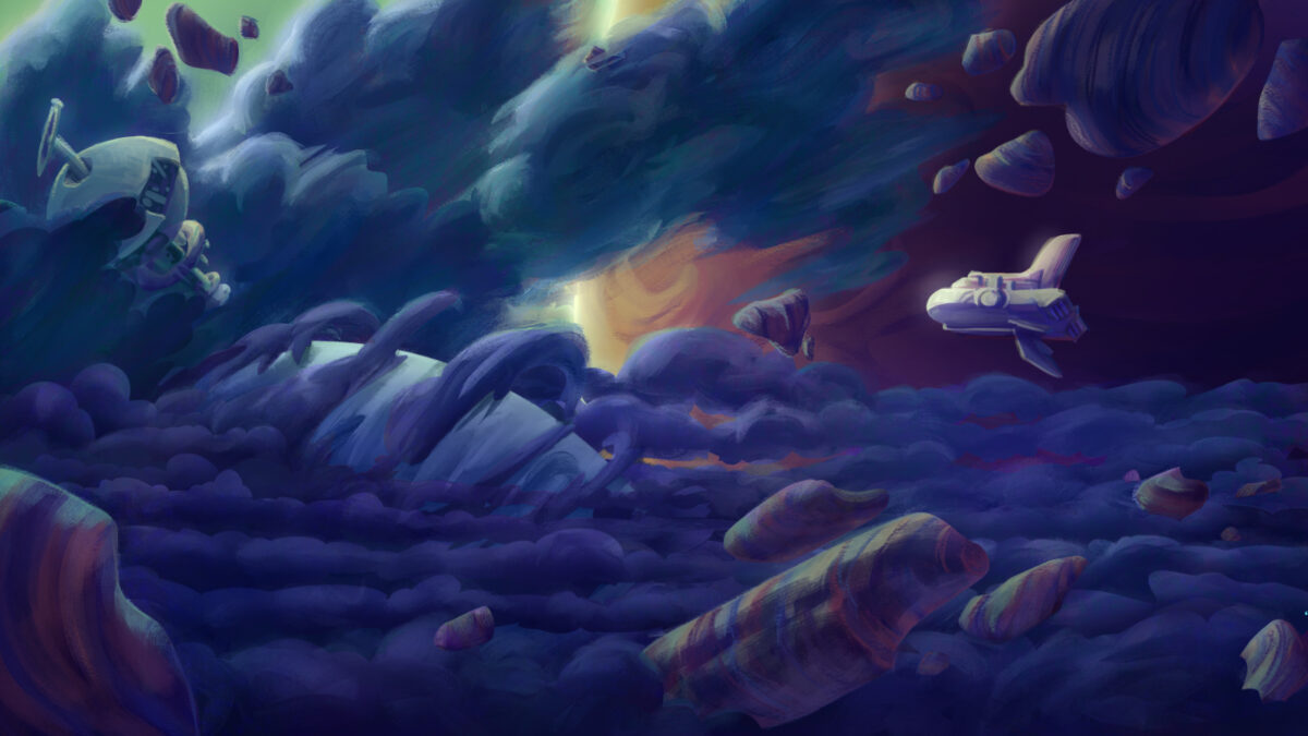
I had the pleasure of contributing a couple environments to the early development of Young Suns, from KO_OP Games. Working with art director GP Lackey was great; we went from a broad brief to two specific pieces through a really rewarding process of tossing ideas back and forth.
Some process shots for your enjoyment, starting with the broad exploration stage:
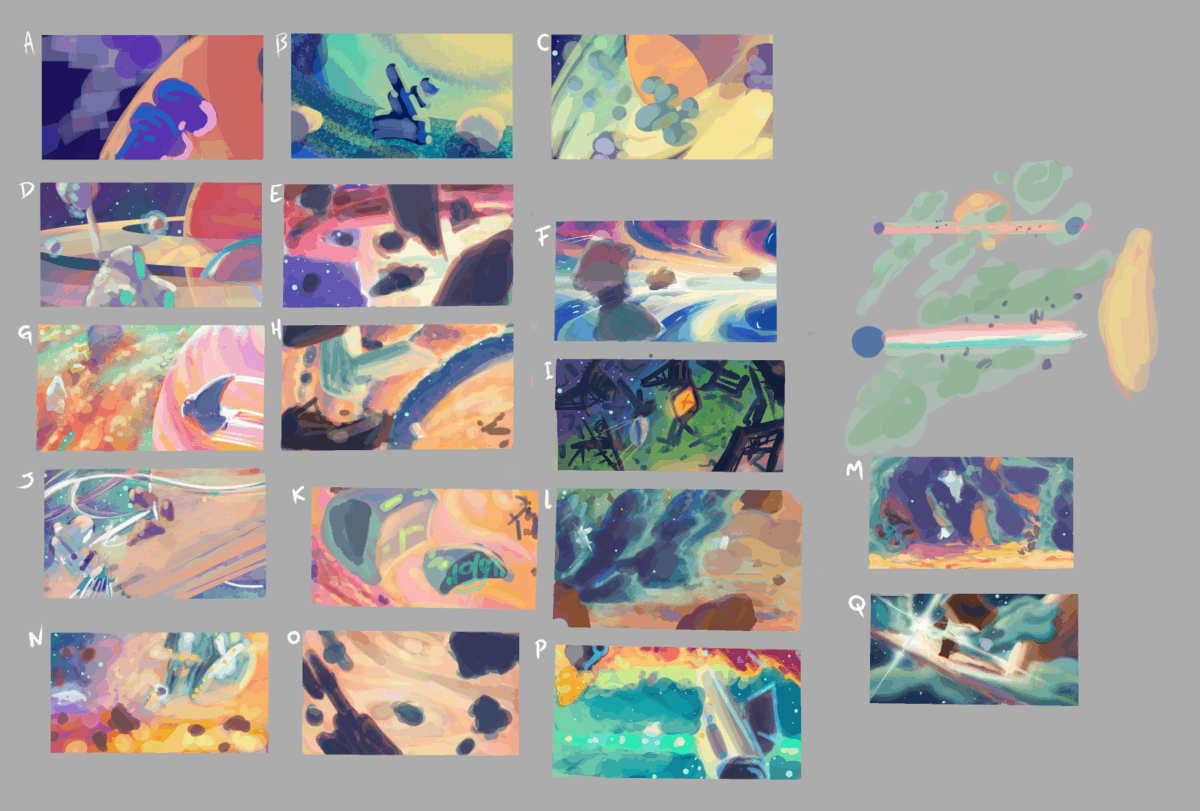
The thumbnails we used to work up into the final art:
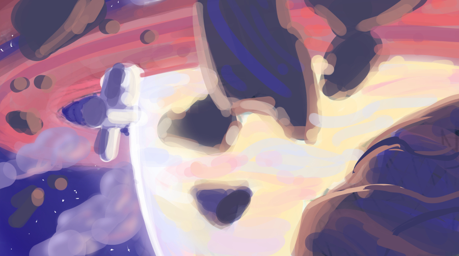
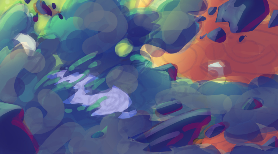
Definitely check out Young Suns when you get the chance!
 Young Suns | Discover, Customize, Explore — Play NowYoung Suns is a 1-4 player narrative life sim set in space! Available now in Game Preview on Xbox Game Pass, featuring character customization, space exploration, and storytelling. Coming soon to other platforms
One response to “Early Environment Concepts for Young Suns”
-
This art is beautiful! I was already excited for Young Suns because of the cool narrative folks on it but now I have another reason to be excited for it.
-
-
Laura posted recently about watching youtube videos of folks alone in nature, and keeping in her mind the reality that they are responsible for setting up, and taking down, every shot you see in the video – even if that means traveling the same route three times or more to get that effortless-seeming documentary contextual long shot:
https://blog.lauramichet.com/people-filming-themselves-in-nature
And it made me remember the Canadian tv show Survivorman, where Toronto local Les Stroud films himself solo in the wilderness in various survival situations. The first season came out while I was in undergrad and I fully imprinted on it – this was amazing, grounded-feeling information about wilderness survival, and it felt really relevant to a lot of the stories I wanted to write at the time! And I hadn’t really come across video content like this before – the show launched the same year youtube did, and probably didn’t intend to define this kind of content for decades to come? But wow it sure did.
But I wanted to share my favourite episode, and my favourite part of it, where Stroud explains that the real work, the hardest part, the bit that makes everything else higher stakes and more complicated, is the fact that he has to film himself:
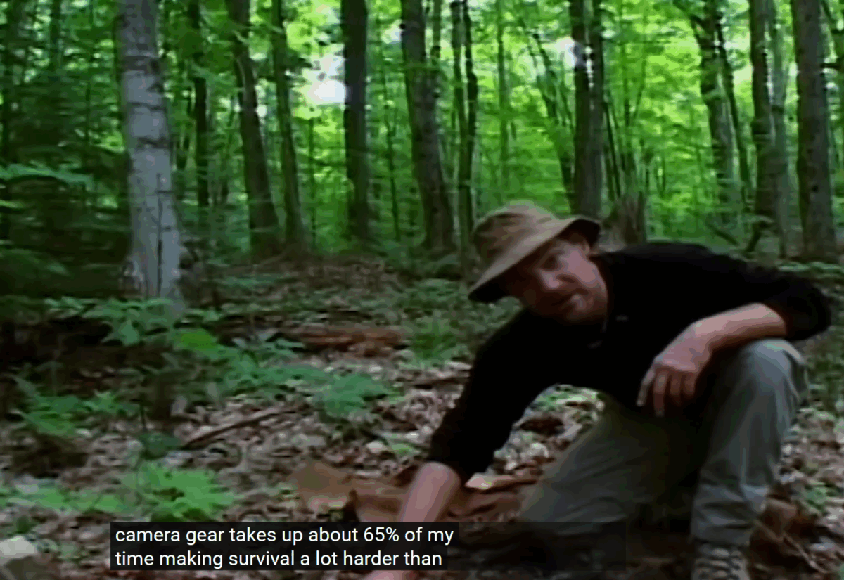
This line, about hiking all the way out of sight and then back again for the camera, changed something fundamental in my brain:
This kind of thing is really, really important media literacy, and I suspect we need it more than ever these days, as we have to start parsing AI video and more. Shoutout to Les Stroud for making sure that he included this in his first season.
-
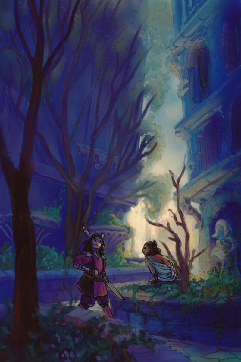
Another style experiment, this time done 95% in Procreate. This one has me using a photo I took in highschool of a courtyard downtown that I have painted from many times before – each time reinterpreting it further and further from the ref.
This one only came into Clip Studio when I realized I had painted it so dark that it only really was legible on the ipad – a mistake I have made before and, I am sure, will make again! That device really does blow out the shadow values a fair bit.
For this painting I returned to trying a heavier line and less rendering overall, simply making the lines transparent when I need them to fall back. I think the fuzziness and looseness of the lines feels satisfying on the environment, but the people also end up feeling a bit indeterminate in details as well.
The style quest continues!
-
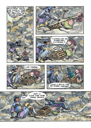
The Great Eeldragons of Penx Short Comic
posted:
updated:
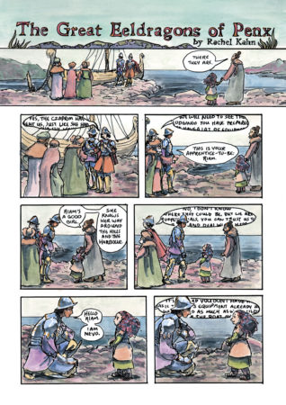
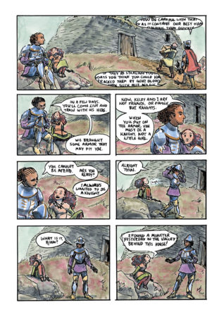
posted to: comicstagged: 1001 knights, apprentice, colour, comic, dock, dragon, fantasy, Kelby, knights, panel, penx, Riam, sample, sequential, ship, structure, sword and sorcery, watercolor, watercolourMy comic for 1001 Knights, The Great Eeldragons of Penx. Swipe through to read the whole short comic.
-
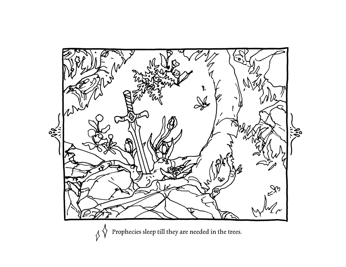
This fall I took on a project I’ve been meaning to do for a while – I have made a colouring book based on my playmap The Tower of the Forest Wizard!
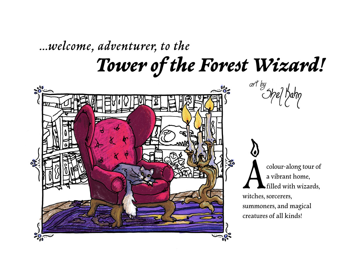
I loved colouring books as a kid and teen, and the more stuff in them the better – one of my most treasured was one that was hugely detailed drawings of tallships from the Age of Sail, as it phrased it, which had about as much whimsy or humour as a military history display. But colouring them in, it felt like a way to explore these ships and get to know them! Wandering through that book with my pencil crayons wasn’t so different from walking through these ships, counting the sails, following each line of rigging from one end to the other, starting to put together how this all worked. I really think drawing, colouring, making art with and of something is just such a great way to learn about it and experience it.
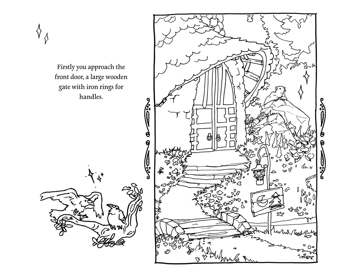
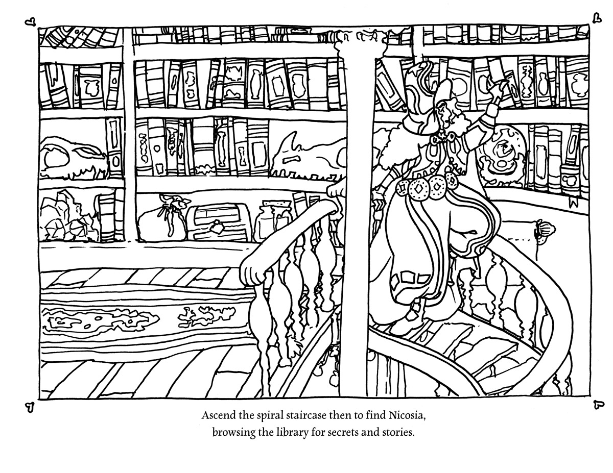
And I wanted to invite you to wander through the Tower of the Forest Wizard like that – to have an excuse to look at every book on the shelves, to notice the pumpkins in the kitchen, the mushrooms on the stairs, the parakeets in the garden, you know? And what better way than a colouring book!
I will have physical copies available locally here in Toronto soon – very soon (!) – and I am looking into how to make this book available internationally at a reasonable price, but that will probably take me until the new year.
However! It’s now listed on my itch as a PDF for you to print at home or import into your favourite art software to colour on your phone or tablet. The complexity varies, and there’s pages that will be fun for a younger kid, and pages that will be a challenge for an experienced colourist. I hope it’s a satisfying exploration of a cozy and magical space – and a great excuse to meet all the wizards you can dream of!
 The Tower of the Forest Wizard – Colouring Book by Shel Kahn and the Sorcerer’s CatalogueA colour-along tour of a vibrant, magical home, filled with surprising secrets ✨
(there are also community copies available for free to folks who need them – click on in and claim one!)
If you do take the time to colour a page or two I would love to see your art! or your kid’s art! or your retired mom’s art! There is no joy like seeing folks take something I made and make something magical and new from it. Thanks so much for taking a look at my darling wizard tower, it’s an honour to host visitors to this whimsical realm I built.
-
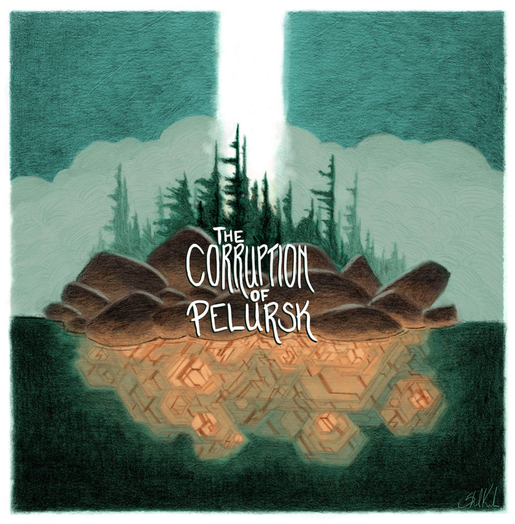
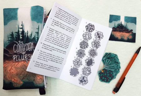
The Corruption of Pelursk is a system-agnostic tabletop RPG hexcrawl/dungeon, written by Shel Kahn.
The Isle of Pelursk holds a glowing, steaming, mist-shrouded secret at its heart, and once you’ve entered its clutches it does not want to let you leave.
Designed to fit easily as a sidequest into an ongoing campaign or stand confidently on its own, The Corruption of Pelursk launched on May 15th 2018 as a Pocket Dungeon Pack!
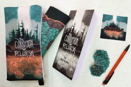
Each pack comes complete with:
- 60 page 3.5 x 7″ black and white zine
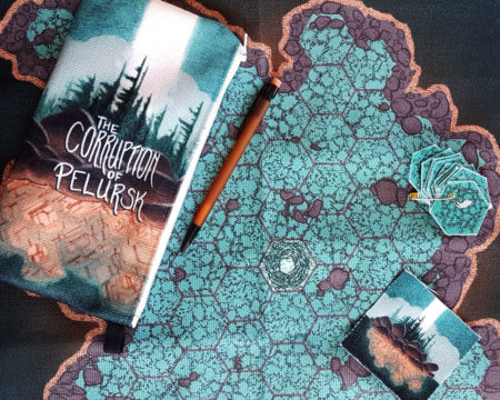
- 17 x 17″ fabric map of the island
- twelve 1.5″ fabric hexes
- a patch of the cover art
- a mechanical pencil
- all tucked into a 9 x 4″ canvas zippered pouch.
Also available are the zines themselves, packaged with a black and white map and ready-to-cut hexes at a slightly smaller scale.
Check out the pocket dungeons and pocket dungeon packs available in the store right here.
Want to run this system-agnostic adventure in D&D 5th Edition? Mike Harvey has created a thorough and complete conversion he’s sharing for free right here!
Thanks so much to Jason and Tom for their thorough review of The Corruption of Pelursk on their podcast Fear of a Black Dragon, at The Gauntlet!
Big thanks to Evlyn Moreau for her review of The Corruption of Pelursk over on her blog Le Chaudron Chromatique:
I like that the spine of the adventure is simple enough to grasp and to remember, after a single read I feel like I could easily run it. The fabric elements add a nice tactile feel that fit with the setting where everything is handcrafted by people.
Shoutout to Robert Carnel for their review of The Corruption of Pelursk over on The New Flesh:
Having presumably tricked their way onto the island the game then shifts to a clever hex-crawler with the island interior being the hex map and then you roll and place cutout hexes onto the map. … The hex crawl is definitely the more interesting part of the scenario and is quite imaginative.
-
Digital Style Exploration – Building Fantasy from a Photo
posted:
updated:
posted to: arttagged: blue sky, boats, building block, digital painting, driftwood, fantasy art, style exploration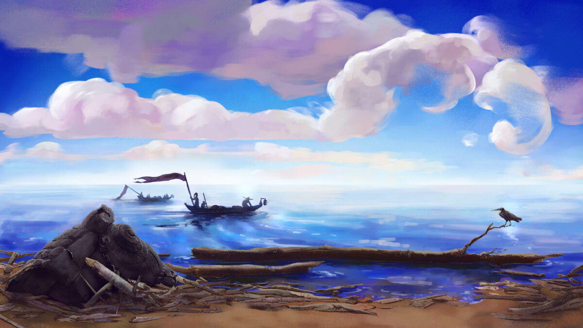
This was a 100% Clip Studio digital painting, based on a photo of mine from a visit to Hay River in the Northwest Territories; the sun was pretty unbelievable that summer, that far north.
For this one, I let myself do my rough with the airbrush, and I feel like it really defined the whole image, to the point where maybe that’s a trap I should avoid in future! But I do love how much fun I had with the textured brushes despite trying to protect soft gradients all over the place, and it felt a lot like the same push and pull I have when trying not to overblend and overwork a soft pastel piece.
-
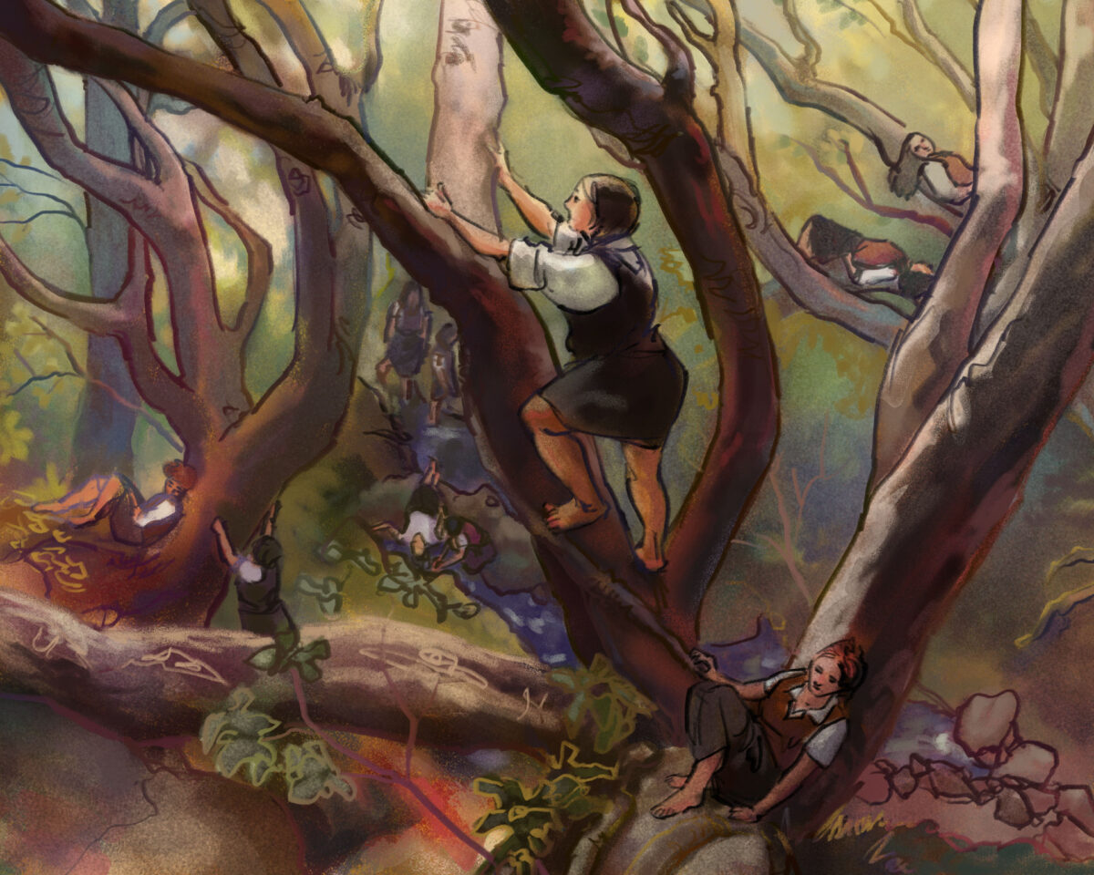
Another photo study, but I took this one into Clip Studio after doing the first pass in procreate, which let me use the smarter selection tools to grab large areas and push-and-pull them more precisely.
This piece is a return to the softer, chalky line and using it to add colour as well as clarity, and I love how soft it turned out.
The photo I am studying is by Justine Kurland, who I refer to often when I need help staging something in a way that transcends the simpler, bolder statements of cinematic staging.
One response to “Style Explorations – Landscape with Figures Study”
-
WAIT maybe this one lol
-
-
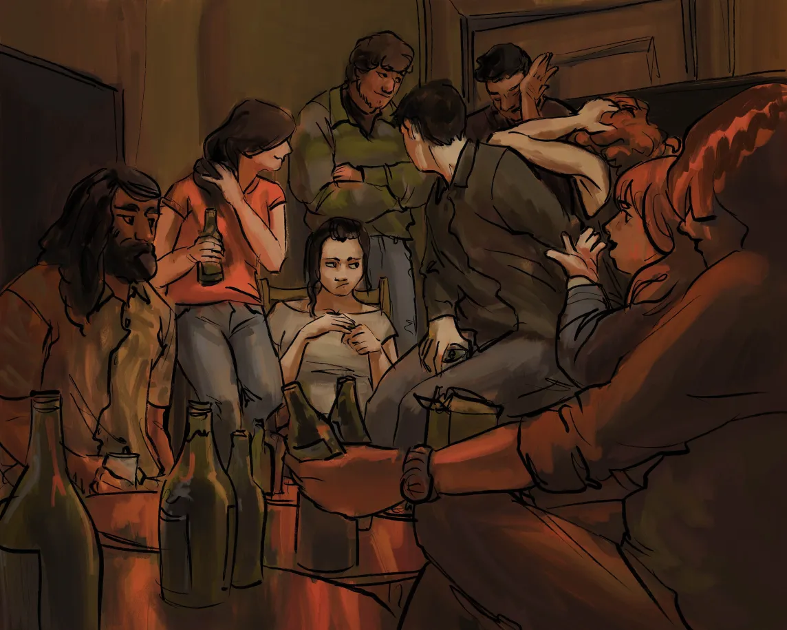
This was reffing a photo on pinterest; I wanted to refocus on how I want to handle stylizing figures.
I am slowly starting to nail down a process – there’s a rough sketch, a rough colour, inks, and then selection-based painting.
For this piece I did it 100% in procreate, which means using their slightly jankier selection tools, but I think for the rough expressive style it worked out fine.
One response to “Style Exploration – Digital Paint with Dark Inked Lines”
-
Ooo I think this is my fav style exploration so far!!
-



Leave a Reply