swap to chronological order of most recently posted
-
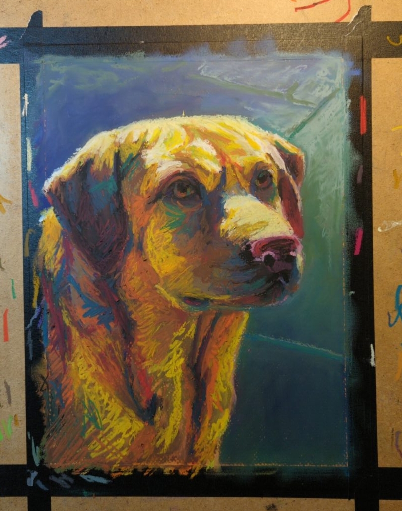

working on canson mi-tientes paper, which really let’s the pastel slide around despite the rougher side’s surface texture.
-

finished this piece of a much missed lucky boy; oil pastel on canson mi-tientes paper.
-
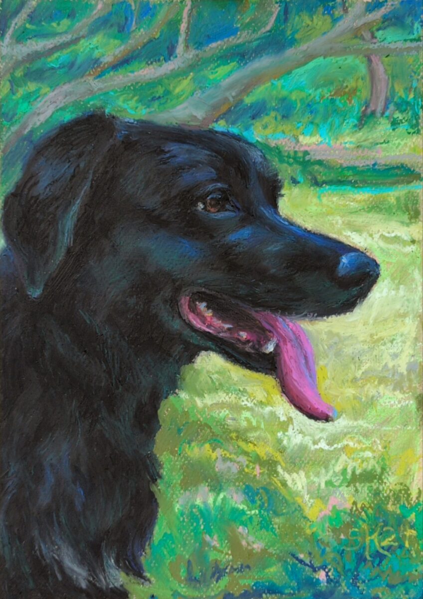
New challenge recognized: glossy black fur.
-
this is the biggest thing I’ve painted yet with the oil pastels; gonna be working in it for a while
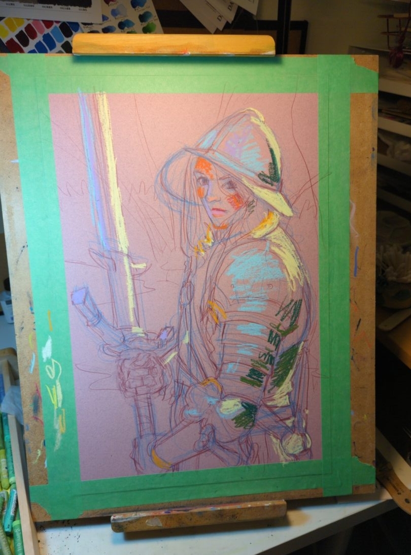
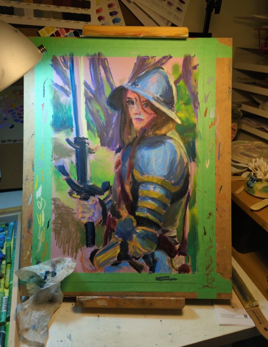
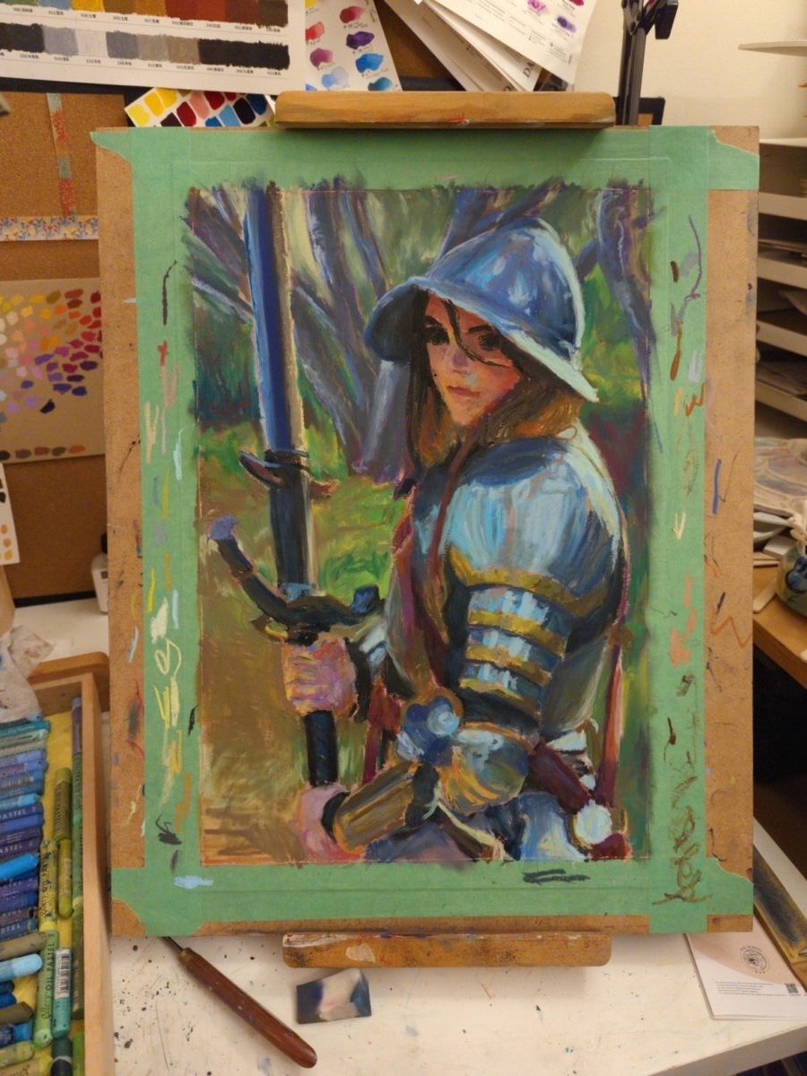
i was looking at digital paintings from 2022, and thinking about the method I had started using back then of having a mark making stage and a blending stage as two separate things; and the oil pastels are letting me start to approximate the same workflow, but on paper! interesting…
-

I painted this one on sanded paper, the much admired pastelmat type, and found it desperately unintuitive. The grippy surface could be nice, but it’s completely unabsorbant, and i found myself unable to layer the way I’m used to on rag papers, or honestly even on wood. that said, you really can blend infinitely on this stuff, so if that’s your jam you might get more out of it than i did!
Subject-wise this is based on my own photograph from a recent roadtrip, and it was a delight to get to zoom in on something I shot myself and try translating it into oil pastel! I’ve been playing more and more with macro lenses and extreme depth of field, and have been meaning for a while to experiment with translating that effect into paint of some kind of another.
That said, abstracting, blurring, and softening things is both really easy to do with oil pastel and really tricky to add nuance to. I can see some places in here where the effect is really landing, and others where things feel almost into only two planes, rather than the three or more I’d like to have had throughout. So, much to learn down this path, but I’m excited to keep going with it!
-


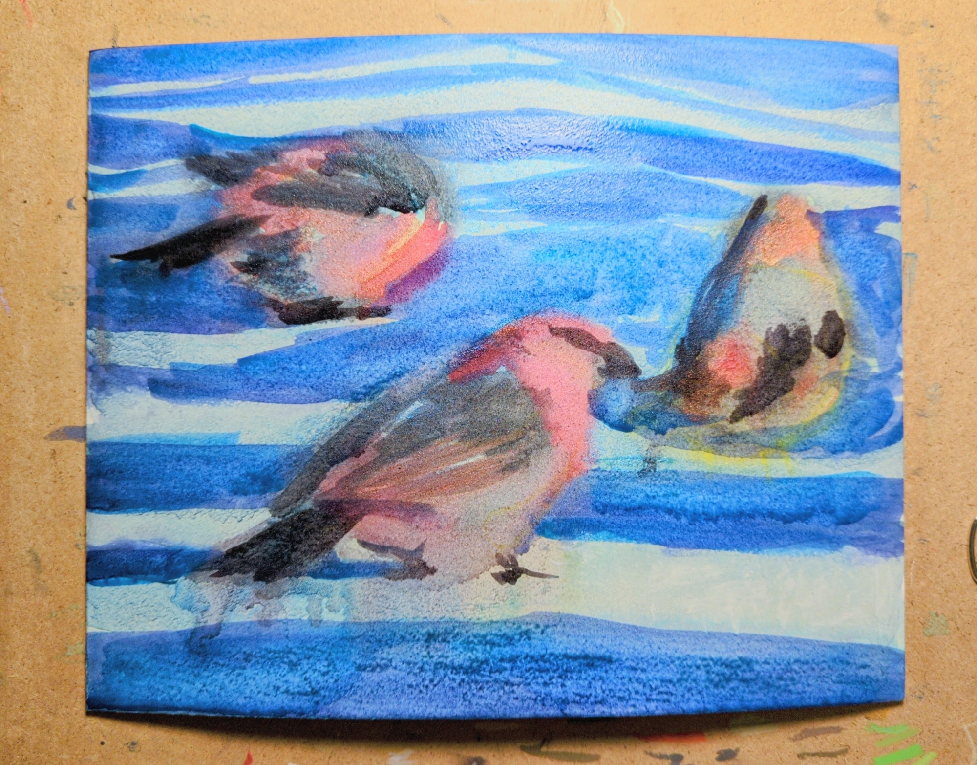
my latest oil pastel experiment is this painting of three pine grosbeaks, referencing a CC0 photograph shared as part of an observation on inaturalist.
this one was created on illustration board, with a full under painting in watercolor first, which you can see in the third image. The illustration board texture has a wonderful grain and could be a very satisfying surface for oil pastel, but it tends to warp pretty dramatically when painted on with water-based media. you can see any image on the right how much it has bowed out while wet; what you can’t see is that it has an inverse warp in it once dried. clamping it down to draw on it released some but not all of it. unfortunately this means it’s just not a good solution for anything with a watercolor under painting.
inaturalist has been a really exciting thing for me to explore, and once I discovered that you can search observations by image license I got really excited. if you’re also looking for reference, especially of specific animals, it might be a great place to start.
-
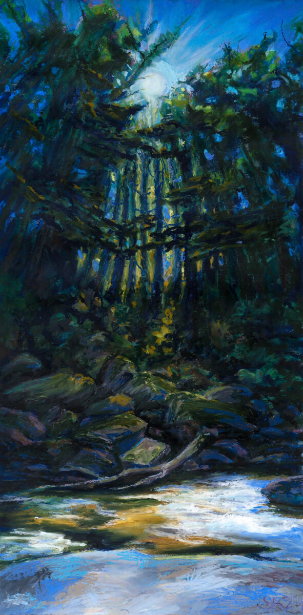
Presenting: this huge oil pastel painting I created this past August! It’s nearly two feet tall, painted in a variety of brands of oil pastel on stonehenge cotton rag paper, with an underpainting in watercolour.
I created it based on photos i’d taken while on a roadtrip around the great lakes through Canada and the US. These were captured on a beautiful cataract waterfall segment of the Voyageur trail across the northern shore of Lake Huron – we’d stopped for a rest and a drink sitting on the rocks in the shade, watching this stream go by and seeing the sun winking through the leaves.
I took a huge pile of photographs sitting there, trying to capture everything that felt so special about the spot, and when I got home I sat down with lightroom and photoshop and tried to develop and collage the photos torebuild my memory. Here’s the results of that digital shenaniganry:
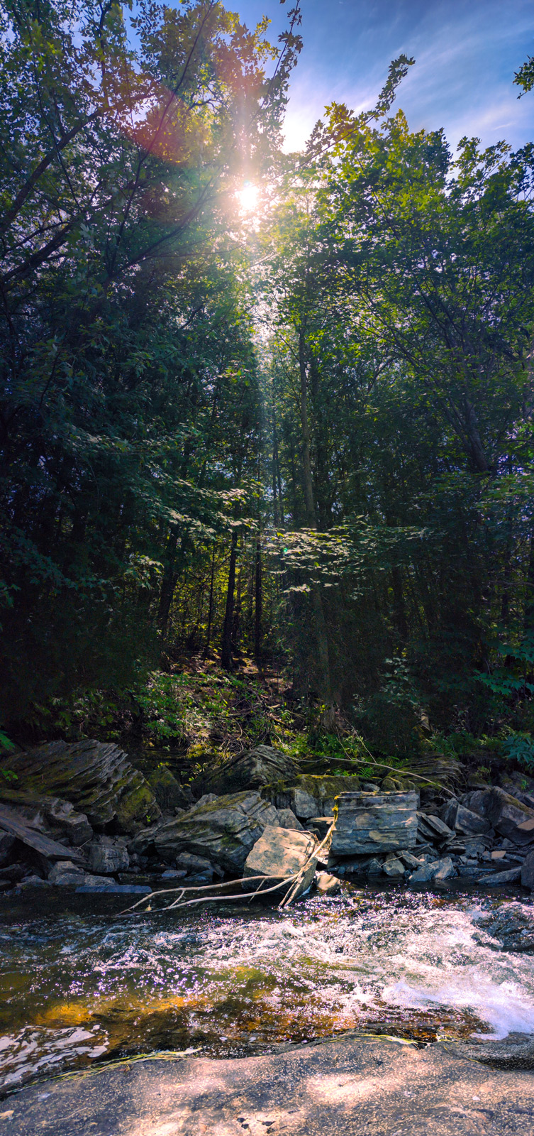
Unfortunately, photoshop was more interested in giving me generated nonsense in some spots than bothering to reassemble every leaf shared between shots, as you can see in these details below:
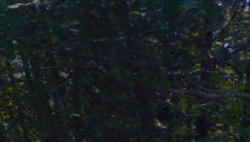
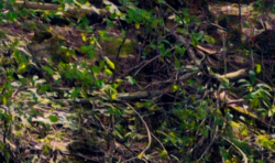
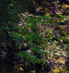
So it didn’t feel like I could, with the tools and patience I have at my disposal right now, create the epic collaged photo of my dreams — but so be it, I have other methods! Hence, oil pastel!
One of the things I keep doing to myself is trying to create oil pastel works with huge and subtle dynamic ranges, despite the fact that I know – I know! – that oil pastel has a very limited range of darks. Anyways, this is how I used up a third of a stick of Sennelier Sap Green, the rich warm nearly-black green of my dreams, and one of the most pricey and yet also soft and yet also small sticks of oil pastel. Worth it, I think.
I hope this post is also interesting for those curious about how I go from reference to painting! Here is a very literal side by side comparison:
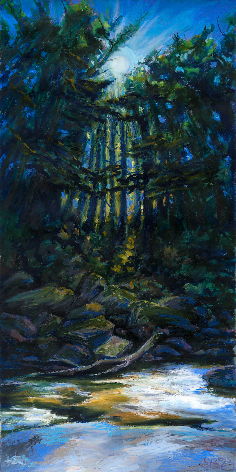
As you can see, keeping objects in subtle scale with one another goes at least a little out the window, especially with oil pastel. Even at the size I worked, it was beyond my skills or interest to get all the tiny fine details, and I moved things around compositionally quite a bit.
Honestly, this feels like a reference photo I might find myself coming back to someday for another go, but not out of dissatisfaction – I am enormously proud of this painting! But there’s so much in it, so much happening with perspective and rhythmic line and the scattered light, it might reward reinterpretation into a variety of media.
Do you have references you see yourself returning to in the future?
-
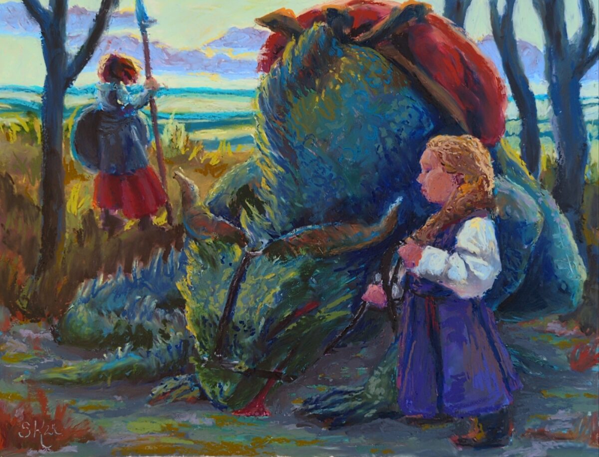
really love the colour palette i achieved here! not sure the drawing was strong enough to support it though, and the canvas was definitely too small for me at the level of precision in comfortable with right now. in the end i called this off before feeling 100% satisfied, but that’s simply the nature of exploratory work and no harm done. as i said, still very proud of this colour scheme!
-
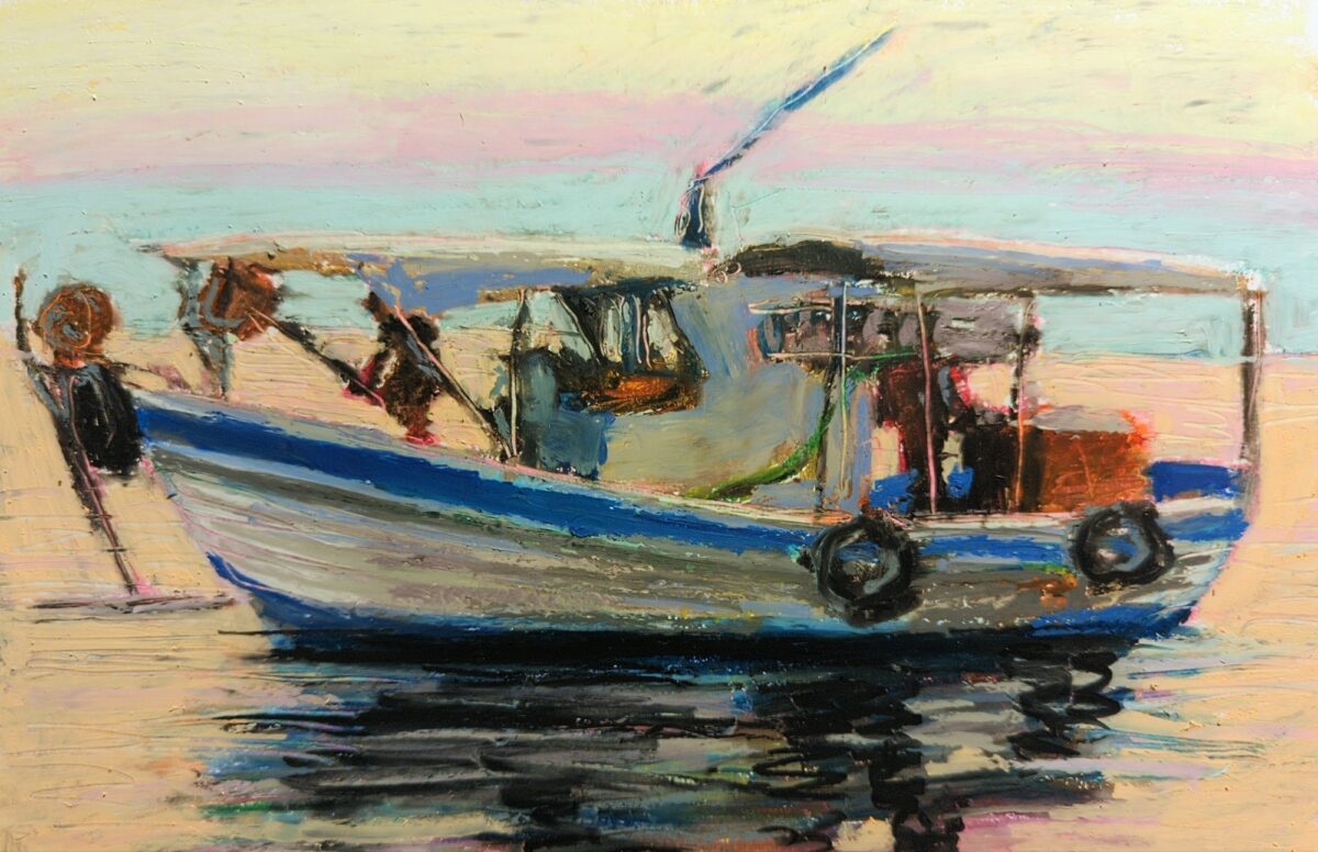
oil pastel pinterest study; i bought a pack of much firmer pastels and did the whole under drawing with those, and then layered the thick opaque pastels on top, and it really worked well!
-
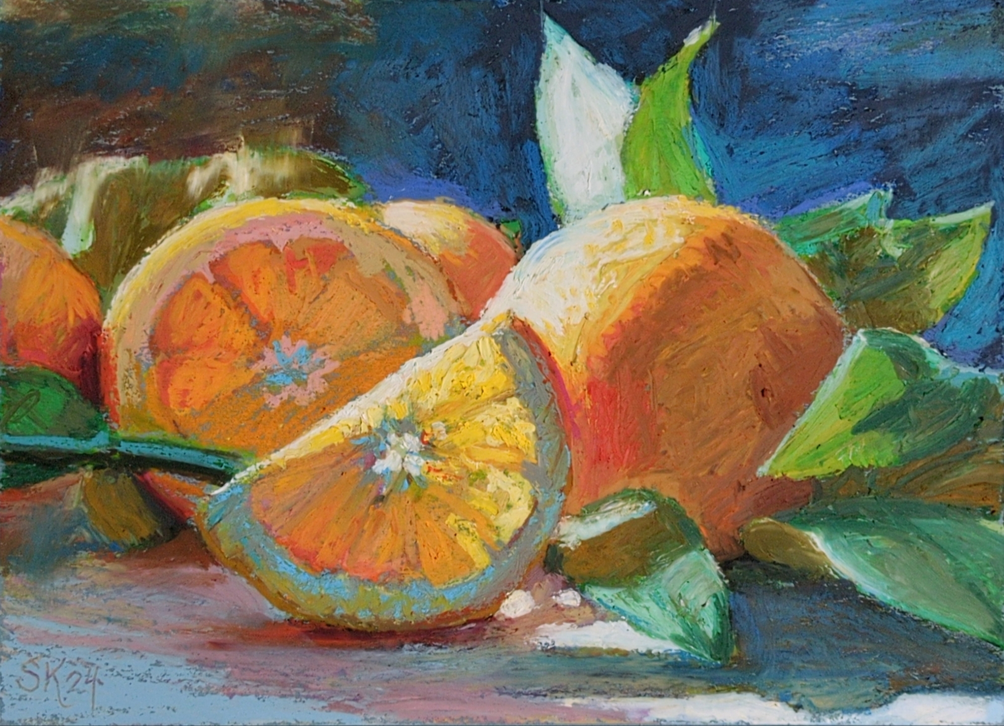
reffing a lovely still life from unsplash, i believe.
done on slate blue 9 x 12″ canson mi-tients paper.
I’ve been doing a lot of underdrawing with the cray-pas expressionist pastels, which are a lot firmer, so they don’t layer that well with themselves but they behave really predictably underneath the rest of my pastels, and are still really quite lovely as a color spread themselves. I think this might be my new go-to process!
I might try giving this one a real glossy varnish, just to see how close I can get things to look to an oil painting. maybe doing that on paper is stupid, but worth a try!
4 responses to “oil pastel oranges”
-
Beautiful!
-
✌️
-
-
oh wow that’s lovely!
-
heck thanks!
-
-


Leave a Reply