swap to chronological order of most recently posted
-

painted on wood! I converted my reference photo to black and white, as well, and I think it did give me more permission to be weird with the color.
you might not know this, but I kept pet birds from the age of 9 until I was almost 30, first a peach-faced lovebird named Pickles (i was 9, and it was a genius name) and then a series of budgies, Glacier, Uther, and Percival.
as an adult, I know a lot more about the exotic pet bird industry, and I don’t know if owning birds is for me anymore, but if I did, I think I would go for pigeons: proper domesticated creatures that have had evolutionary time to be less stressed around people, and big enough to feel less terrifyingly vulnerable in the hand.
but there is something extremely magical about a bird choosing to sit on your hand, and as I was flipping through unsplash looking for something to paint, I started putting together a collection of reference of just that. so maybe? there will be more of these?
-
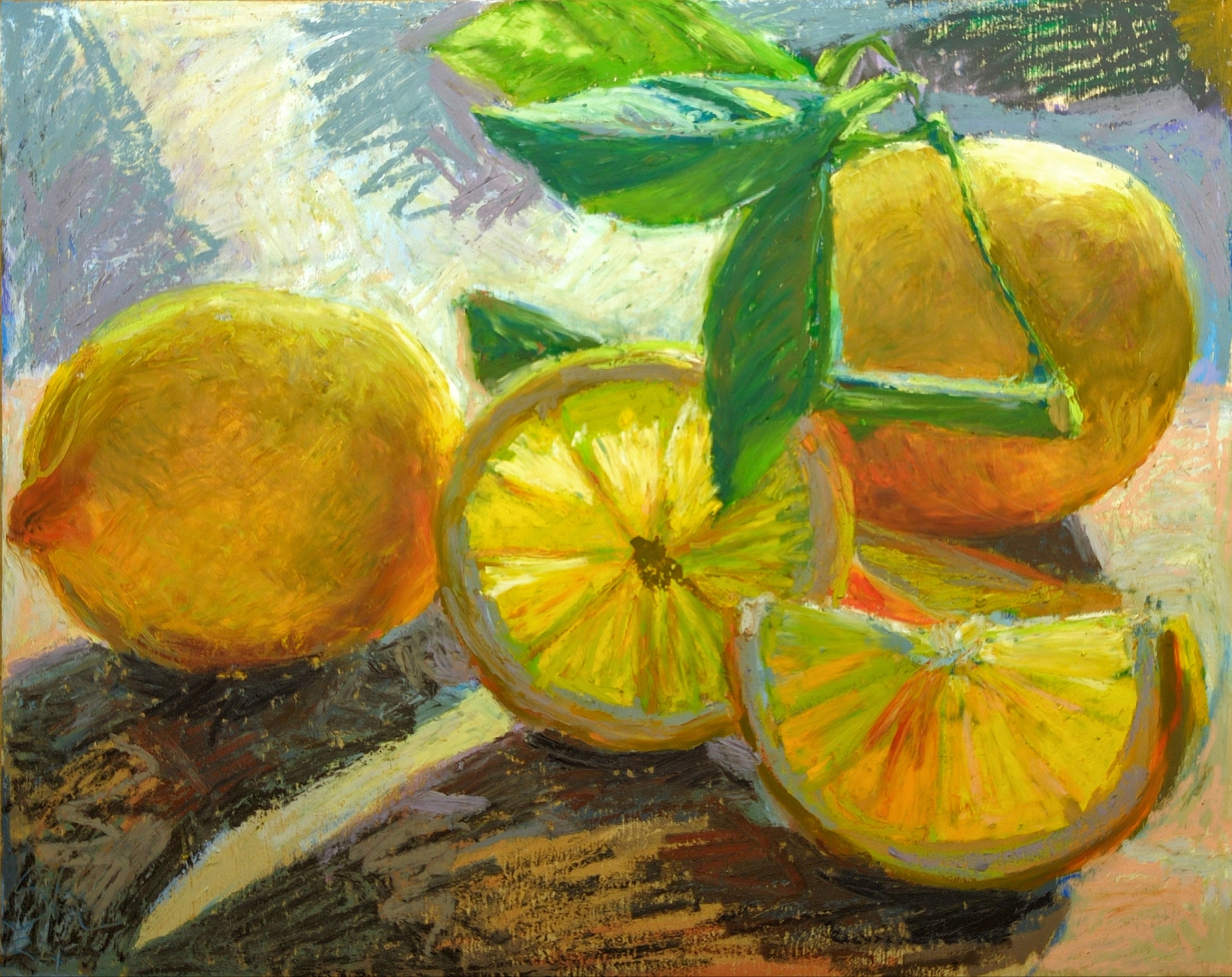
making these read yellow and not orange was tricky!
i haven’t really gotten the hang of mixing these oil pastels to achieve custom colours yet. I can do it but I don’t really have a go to method, not a real understanding of which colours mix how. the mungyo and haiya ones, which were more affordable, definitely mix to less saturated results than the caran d’ache neopastels or the sennellier pastels do, but sometimes you want those more muted results. My still life painting teacher back in 2009, Trudy, called them her “mouse colours”, and that charming language had stuck in my head sadly far better than my ability to plan for, mix, and make good use of neutrals.
something to work on for the next piece, i suppose!
-
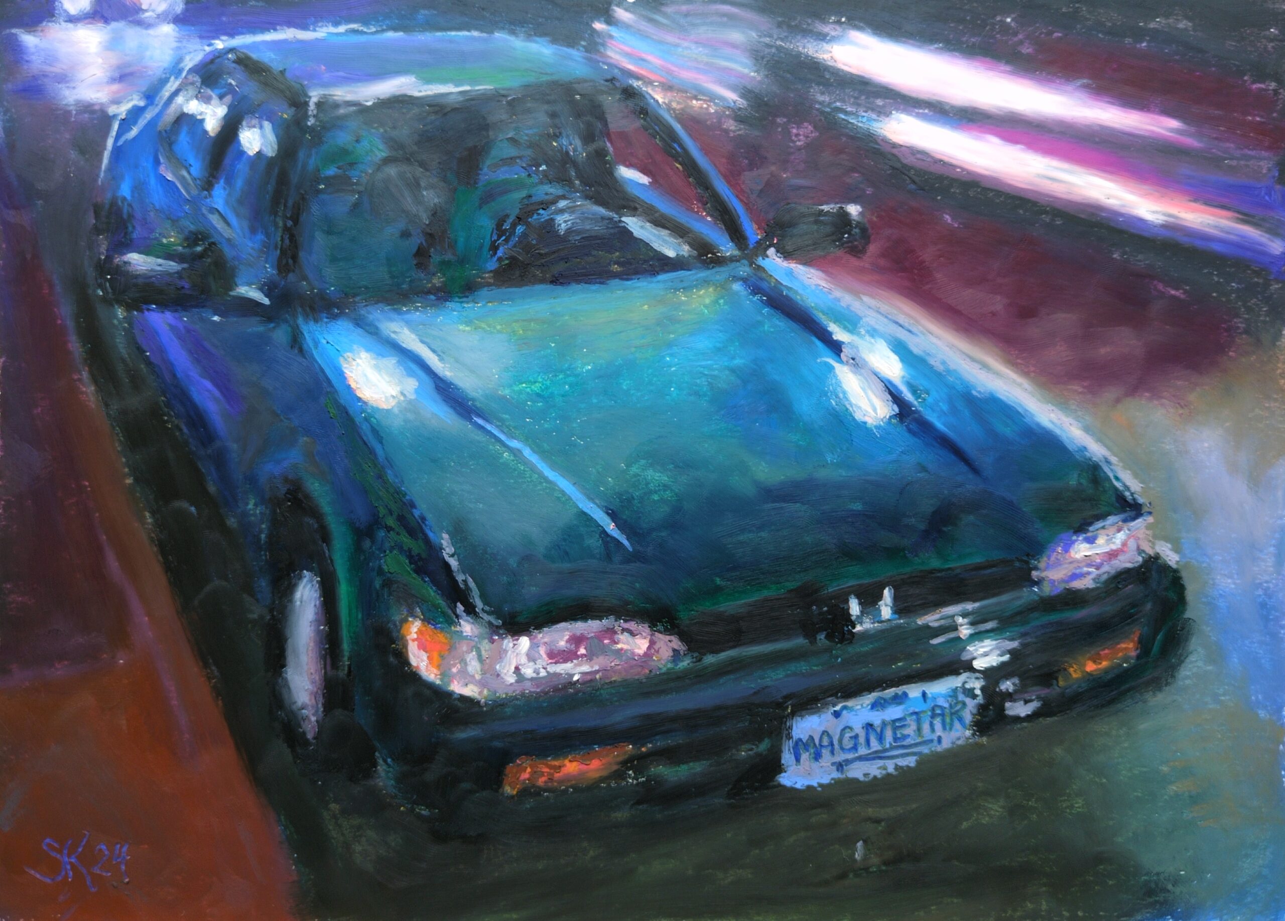
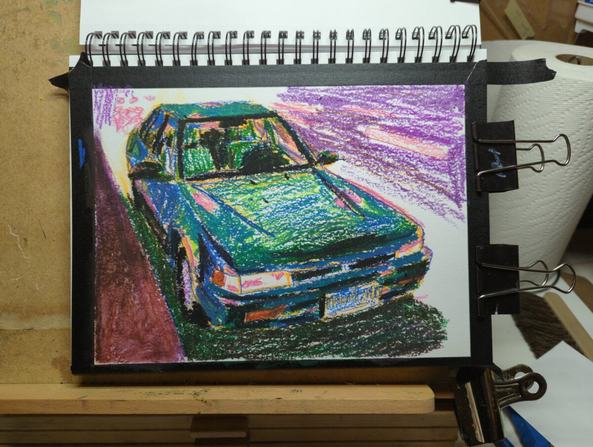
Did this study from a photo I took during the pandemic of a delightful vehicle we occasionally saw in our old neighbourhood. A magnetar is a very, very cool and scary space phenomenon and I extremely respect naming your ancient honda accord after it.
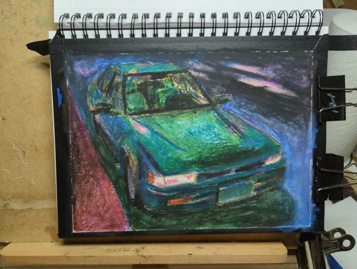
A couple process shots to show you the underdrawing I did in the cray-pas pastels – they’re very firm compared to the rest but I was still able to blend them a bit as you can see in the second process shot.
I did this study in the heavyweight coldpress Canson XL mixed media sketchbook; I was assuming the paper texture would hold the pastel still better than the bristol I’d been using in the Bateman brand sketchbook, and I think it did, but, only for a layer or two; by the end the pastel was very slippery and I could easily lose mydrawing if I wasn’t careful.
Speaking of drawing, since cars are a real bitch to draw, I did a full underdrawing of this in pencil crayon first to nail down all the shapes and the perspective, and it def paid off. I think the drawing as a whole stayed decently strong through to the finish as a ersult of the time I put in before adding colour; I really need to do that more often.
One thing I was trying to do with this one in particular was more blending to get custom colours. I rewatched a few Yolanda Blazquez demos to see how she gets such soft customized blended skintones, and ttarted trying her soft layering/finger blending technique here. I do think it helped and I got colours on the page I don’t have in stick form! However, yolanda uses pastelmat paper and that stuff holds the pastel still better – again, at least to a point – and she’s VERY good at putting the colour right where it goes the first time. I think one of my problems is I like to work up t o the right colour, and with pastels you do end up wit h Too Much On The Page eventually. I could be more liberal with my scraping back in future, I think.
Also, fun trick, you can do a lot with pencil crayons on top of oil pastel if you press firm enough to scrape back the pastel as you draw. That’s how I did the license plate.
I’m going to do a few more studies, trying to figure out what my favourite surface for oil pastel is. I’ve got some mi-teints paper on teh table now, and lots of printmaking rag on teh shelf nearby for further tests. Figuring out how I personally like to work in oil pastel remains a very fun quest and as my right hand regains tiny amounts of precision every day I amstarting tosee some real possibilities with this medium beyond the playful angle that’s attracted me so far.
Finally, I don’t know exactly what did it, but I seem to have ended up in a very 80s advertising painting zone with this – what would you call this vibe? Either way, accidental but fun result!
-
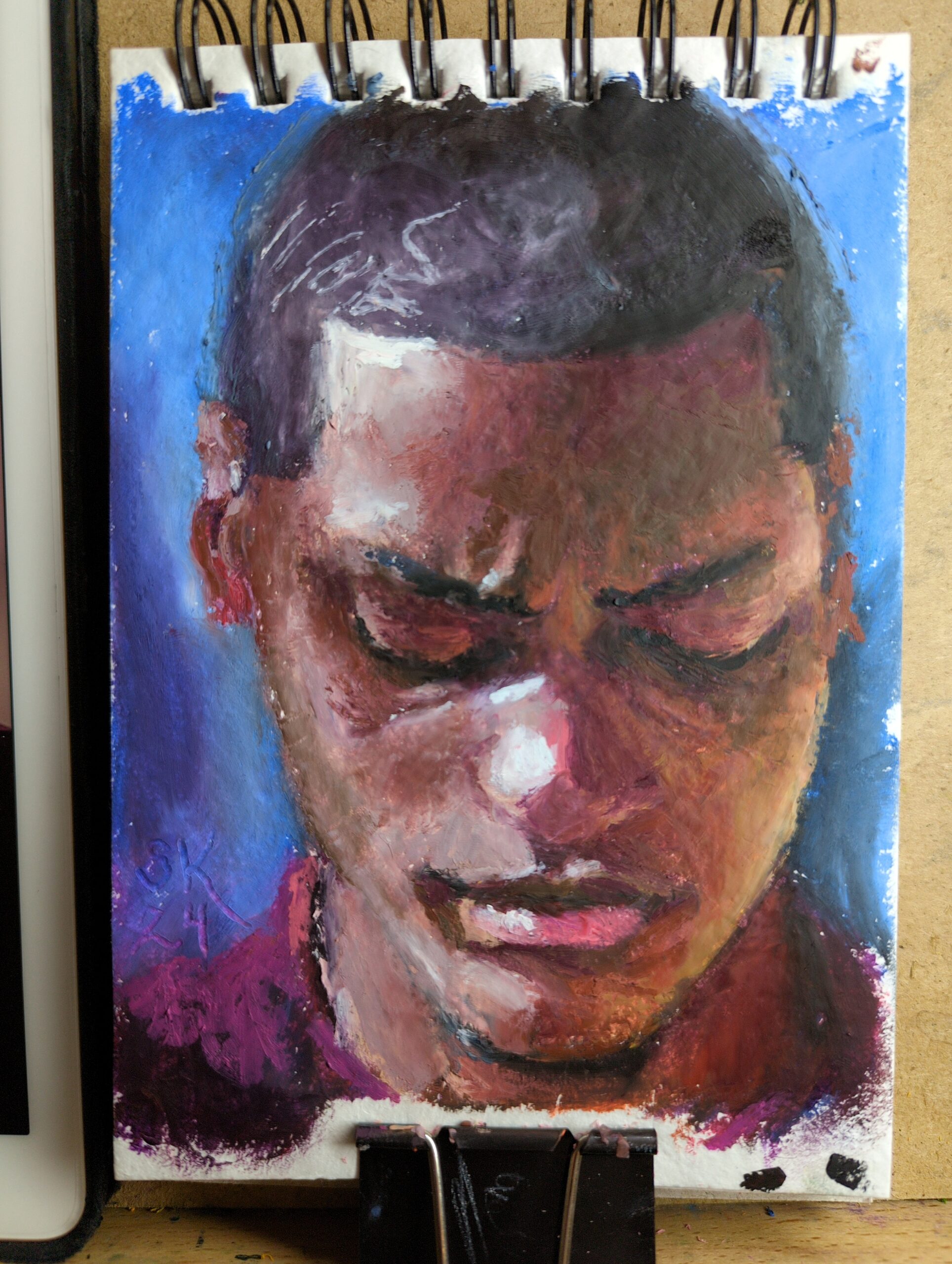
Browsed through Earth’s World for some great natural light portraits to practice with. This was made in a new little 5 x 7ish sketchbook I picked up that’s filled with recycled cotton rag paper. I’d been noticing that rag papers have taken my softest oil pastels the best – you can see one pushed to its limit here – and finding a rag paper sketchbook seemed lucky! So my plan is to fill it up with small tests and just work on my technique.
-

Not sure how I never uploaded the final of this! but here’s my finished knight portrait in oil pastels. I’m very happy with the shadowy blue light effect on the whole thing!
-
Light Fingers Game Board Design Process
posted:
updated:
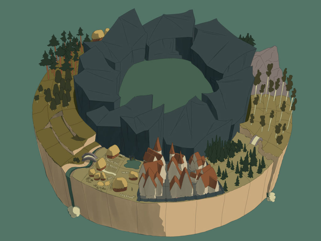
posted to: concept arttagged: art, client process, concept art, design, digital painting, game art, iteration, map, numizmatic, options, photoshop, structureI had the good luck, back in 2016, of being part of the excellent team making Numizmatic Games’ Nintendo Switch release Light Fingers, as the concept artist, and one of my favourite parts of the whole project was designing the game board!
You can see the final board here in motion; my concept design process follows:
We planned out the board from a distance first:
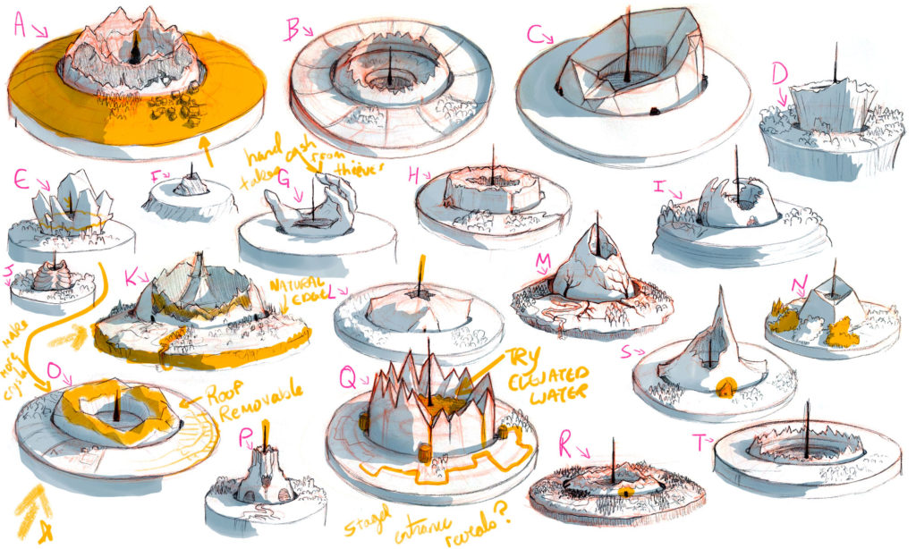
Once we had a better idea of what the zoomed-out view would feel like, we started to fine tune – and to come up with different types of tiles:
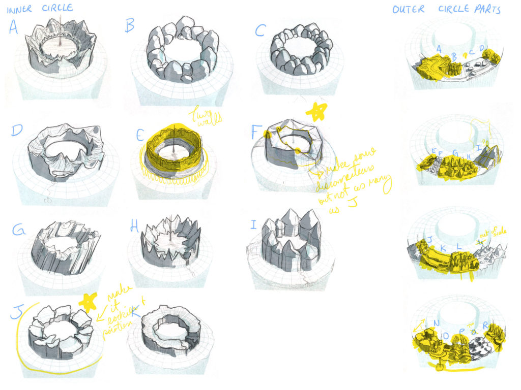
Then I created a rough version of the board’s mockup – a kind of visual menu folks could pull asset categories from. This isn’t mean to look like the final game board, but more to guide folks creating that board:
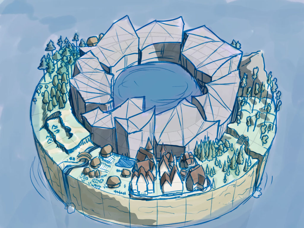
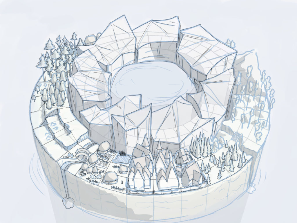
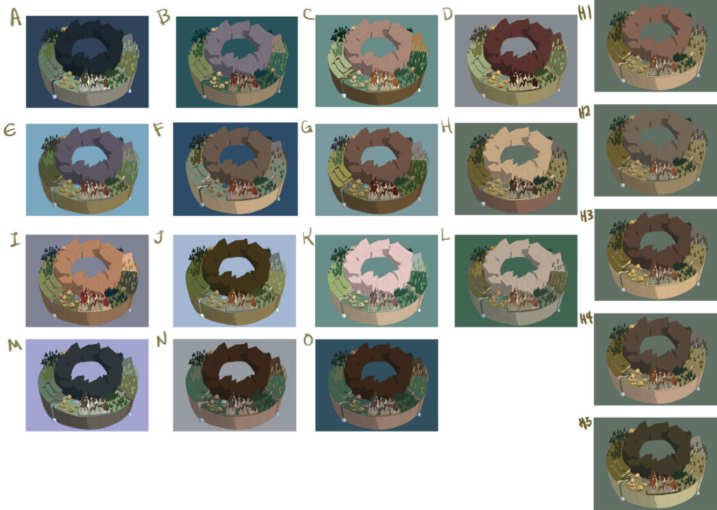
With approval on this, I tightened up the drawing, flatted it (filled it with temporary colours), and then we tested a LOT of different colour schemes:
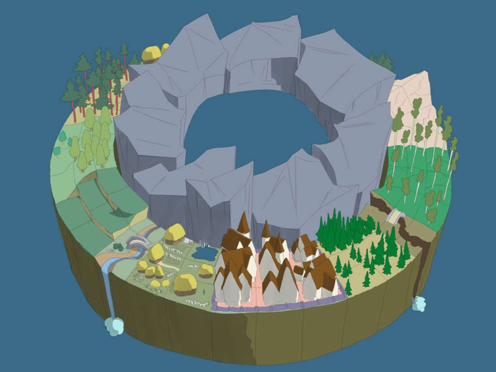
This is the final game board mockup I left with the Numizmatic crew:
-
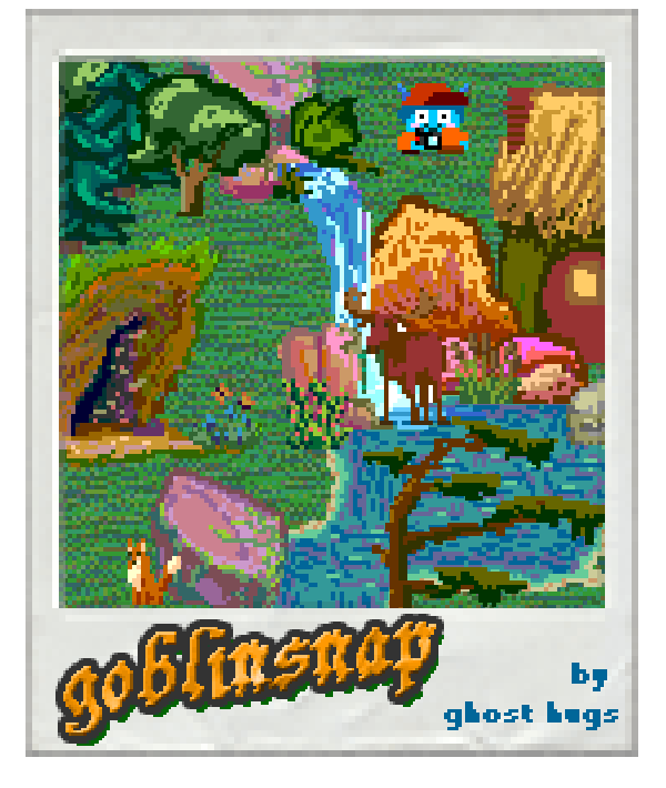
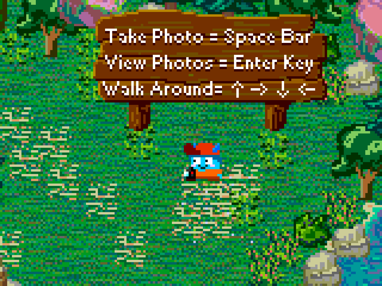
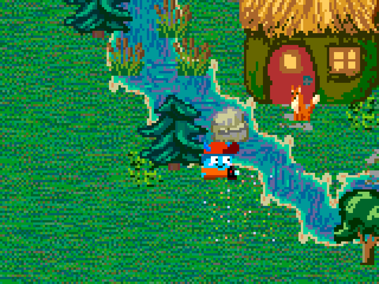
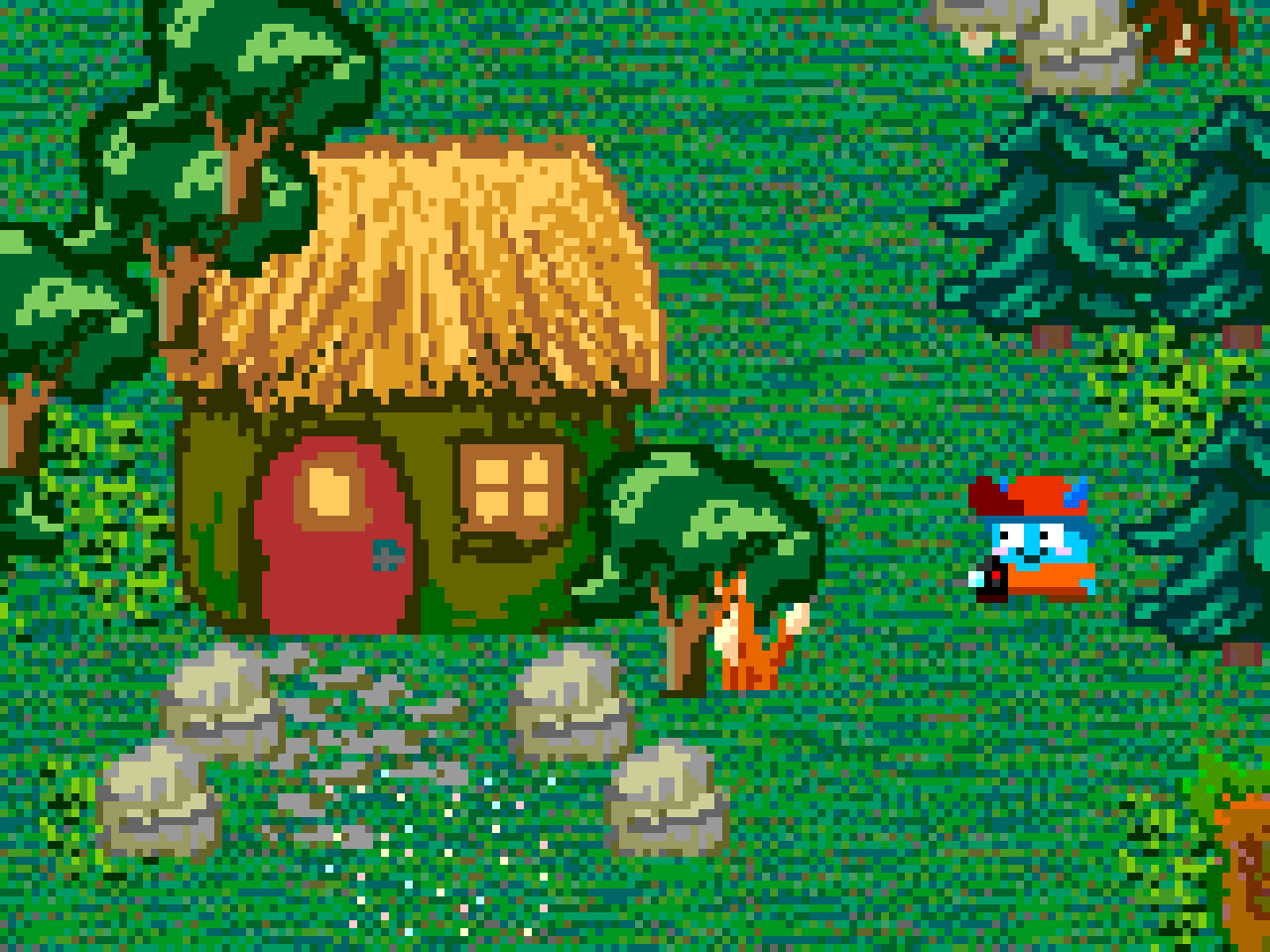
GoblinSnap was a game jam project where I collaborated with Matthew Rapati. He produced the character art, I created the environment, user interface and animations. We agreed on a retro pixelized approach, and used a limited palette. The game is a tiny finished product that we never took any further than the first level.
-
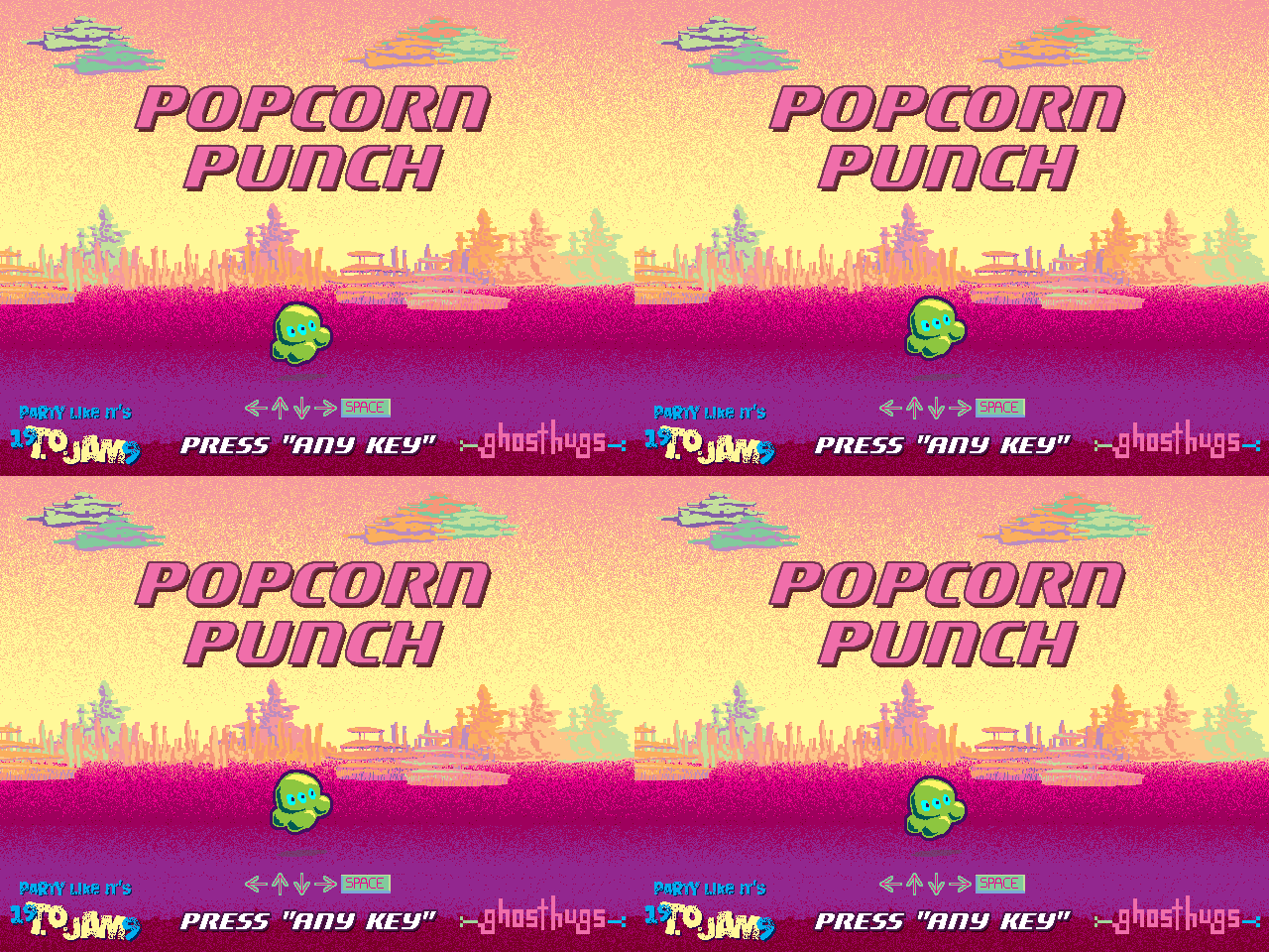
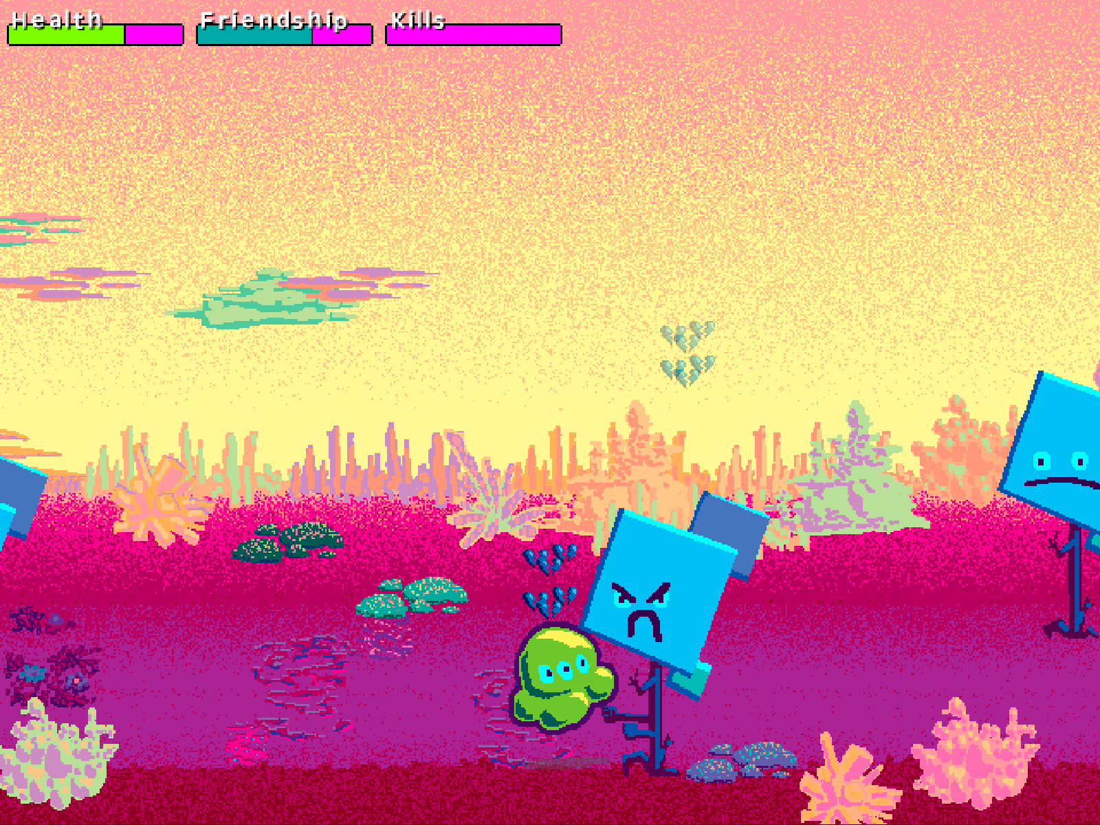
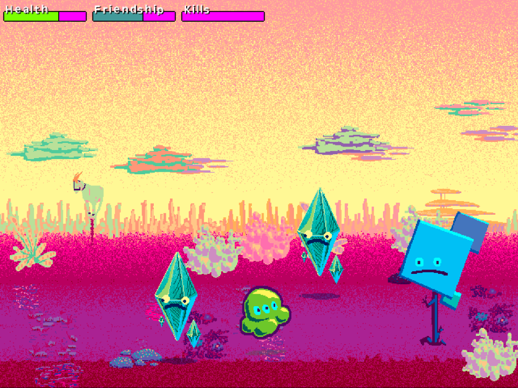
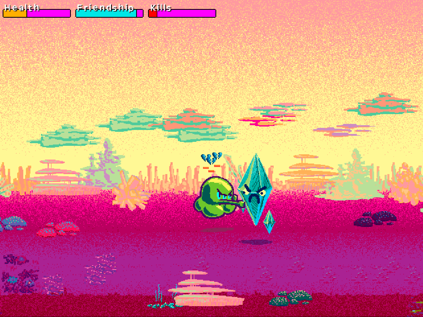
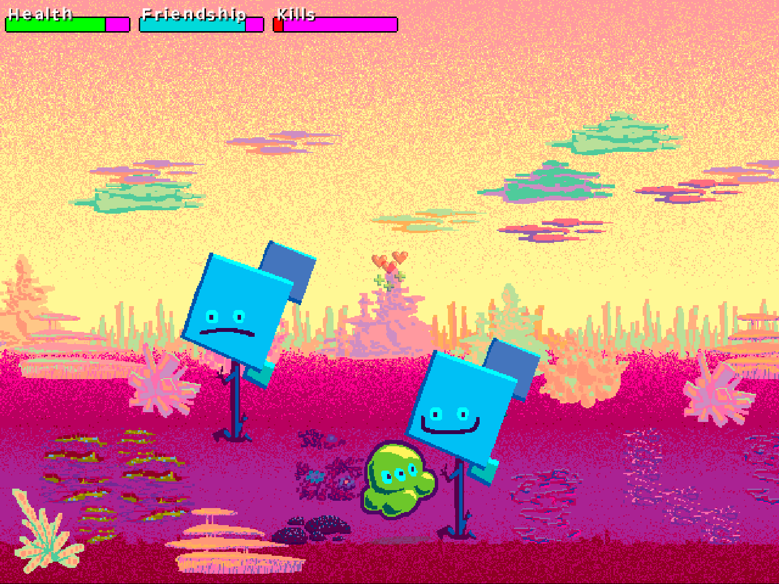
Popcorn Punch is a game jam project where I collaborated with Matthew Rapati. We were inspired by the surreal colourful art of Roger Dean and wanted to make something that felt like getting lost in an unpredictable album cover world. I produced all the art assets, created the animations and designed the title screen, while Matthew coded, and created music. We collaborated on the game design.
-
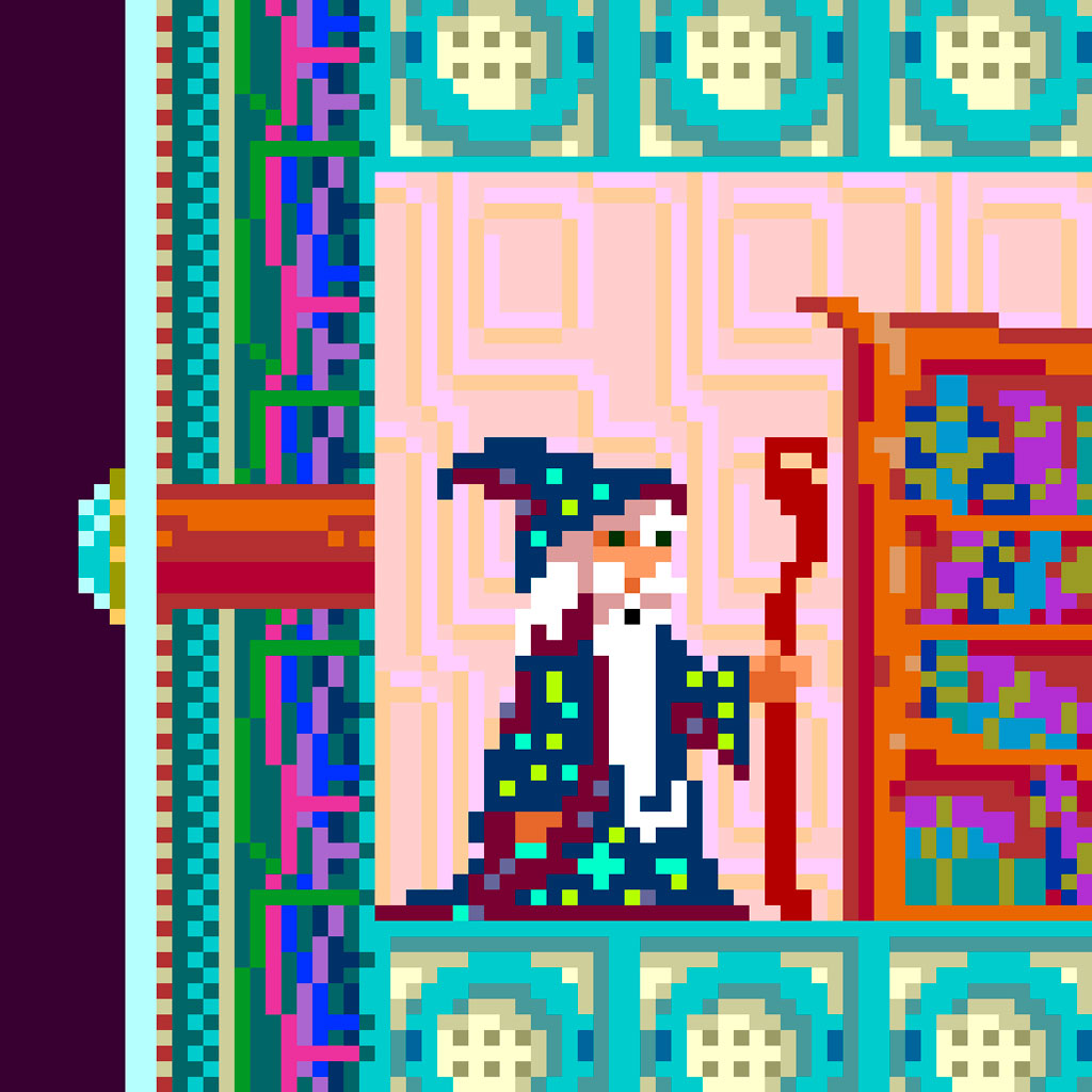
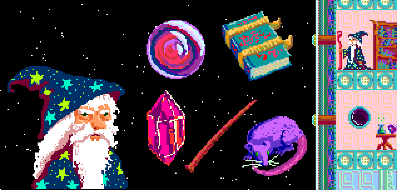
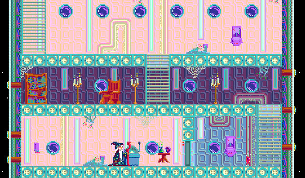
Space Wizard in Space was an adventure game style game jam project I worked on with Matthew Rapati. He coded and created the music, we designed the game together, and I produced all of the art assets and level design. Because it is a jam game, Space Wizard in Space is unfinished and untested, but we had a great time creating a cohesive vision.
-
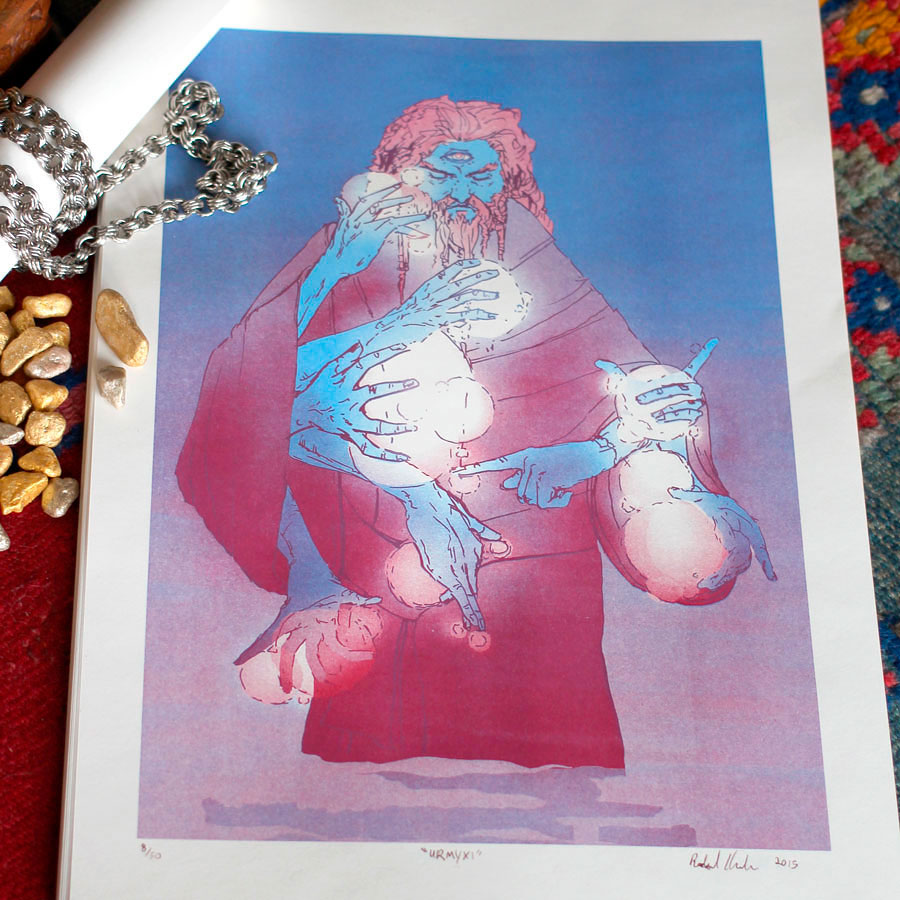
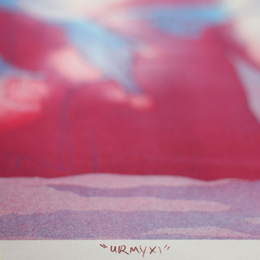
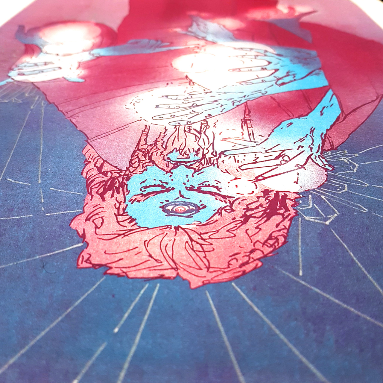
Fantasy illustration of a powerful wizard generating multiple selves through chronomancy, centred around an all-seeing third eye, glowing with power. Drawn in ink, separated in Photoshop, printed by Colour Code Risography.
The photoshop file really doesn’t tell you how magical the risograph will be, but if you’re curious:

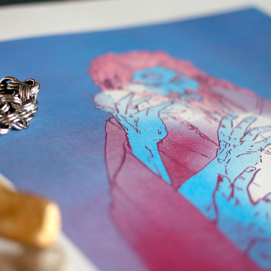
Detail shots of the print – and some of the silver accents I added for folks who wanted them – follow below:
Leave a Reply