
swap to chronological order of most recently modified
-
Ceramics
posted:
updated:
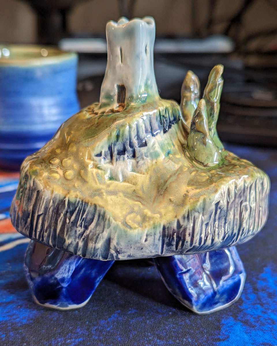
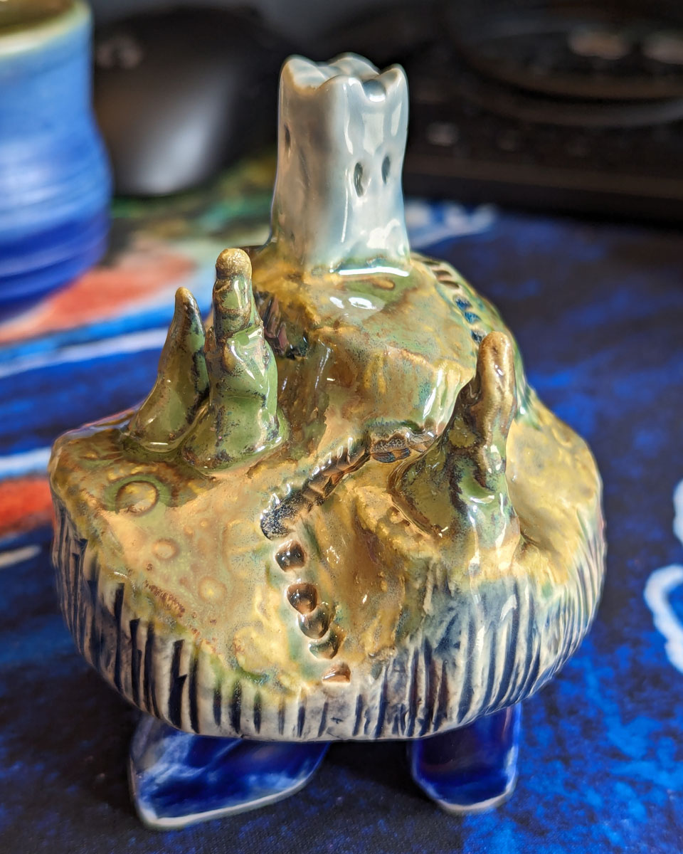
posted to: arttagged: celadons, ceramics, crystal islands, glazing, learning, palette, sculpture, structure, underglazeI’ve been learning ceramics in a casual ongoing way now, enjoying getting out of my comfort zone, and playing with a new medium. Much like printmaking, kiln fired and glazed ceramics are really a collaboration with chemistry and physics as well as a personal creative act, and I love that aspect so much.
Below I’m sharing my work in reverse chronology – the newest stuff is at the top. I think? you can see some real progress, but it’s amazing how much more I have to learn! I really love the feeling of being at the start of a long journey into a medium — it’s gotta be one of the most inspiring feelings I encounter as an artist.

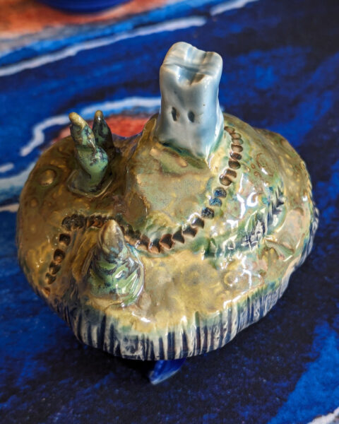

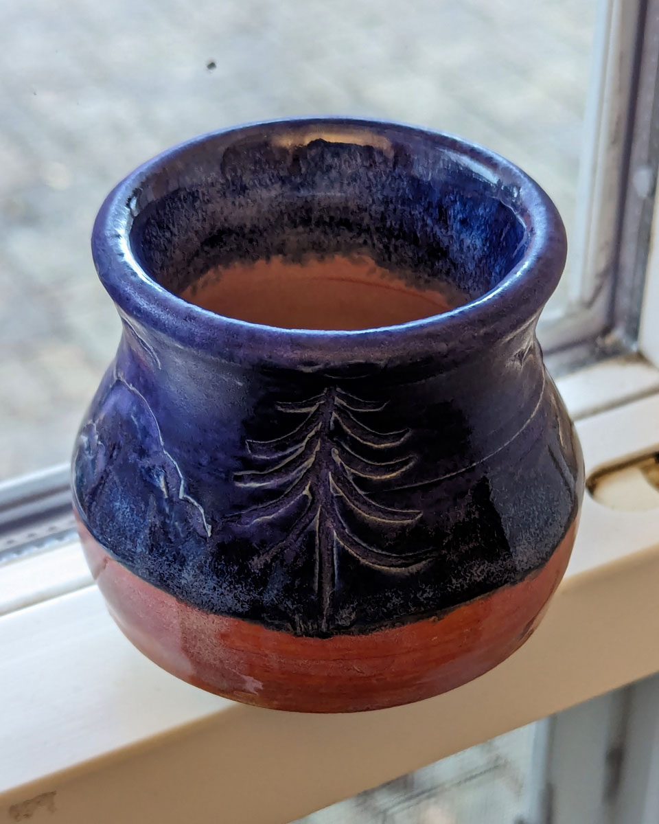
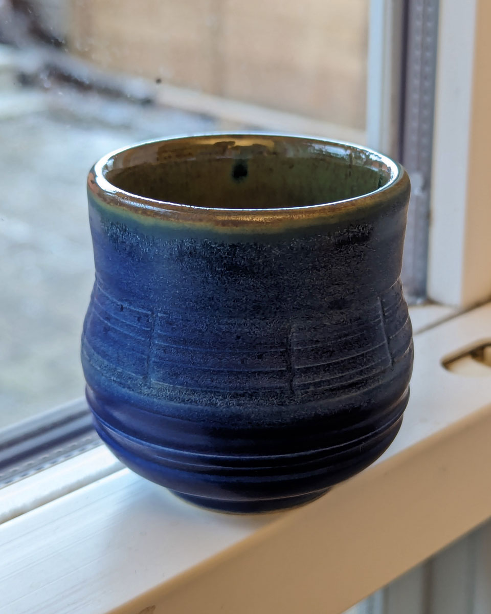
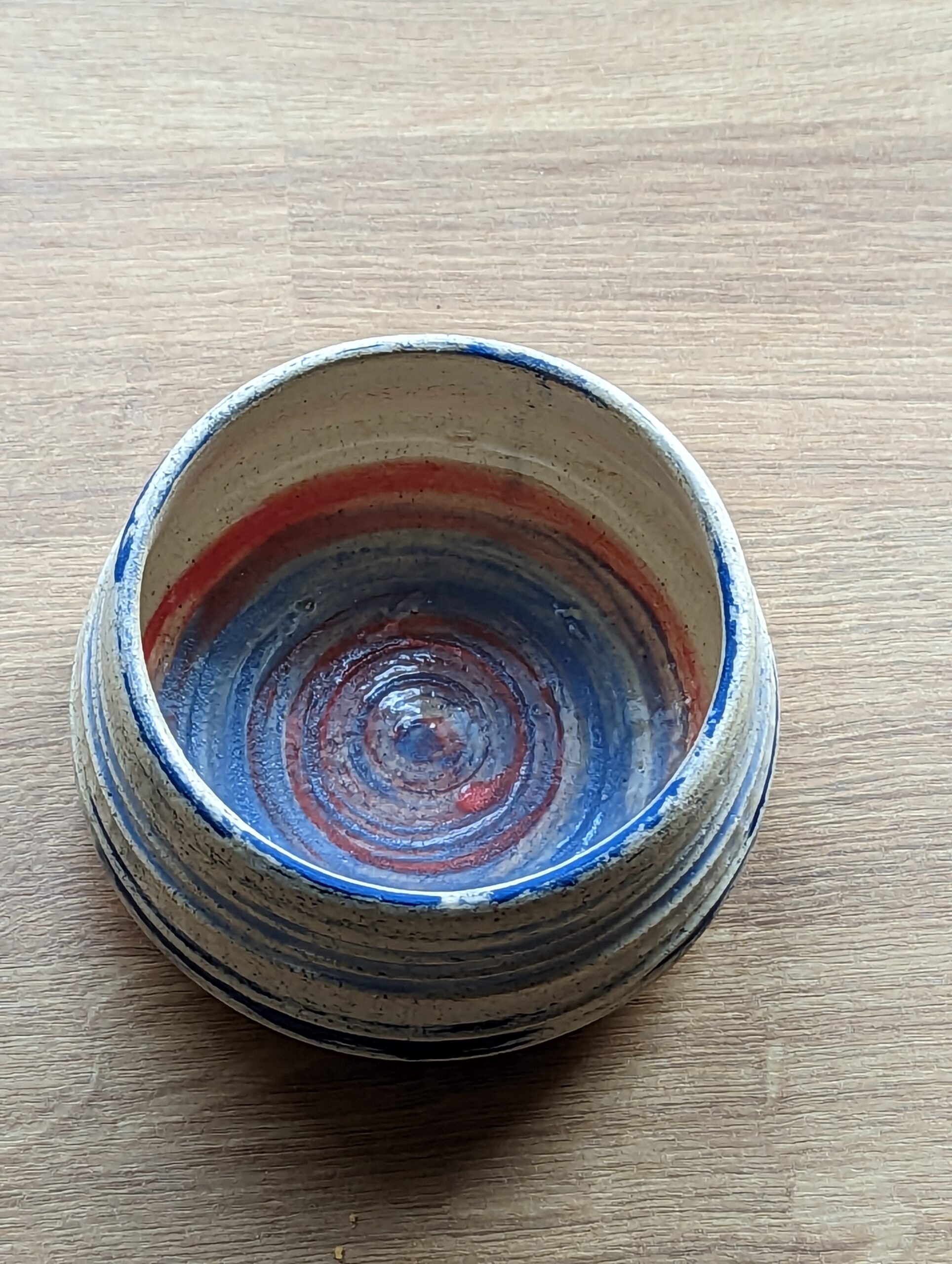
In January 2024, I took a local intro class that included both wheel and handbuilding – I had to relearn everything left-handed and, in the case of the wheel, one-handed, so I set my expectations low, but I really feel like I was able to push myself and make things I am very proud of! The crystal island above was not planned — the instructor simply inspired me after he demonstrated his own whimsical sculpture approach, and I couldn’t resist trying! It feels like a miracle that it stayed together, stands up on its own, and looks this good, and it’s left me starving for the chance to make infinitely more islands!


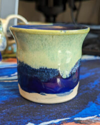

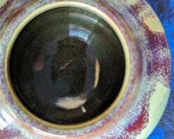
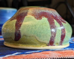

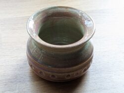
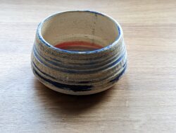
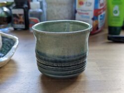
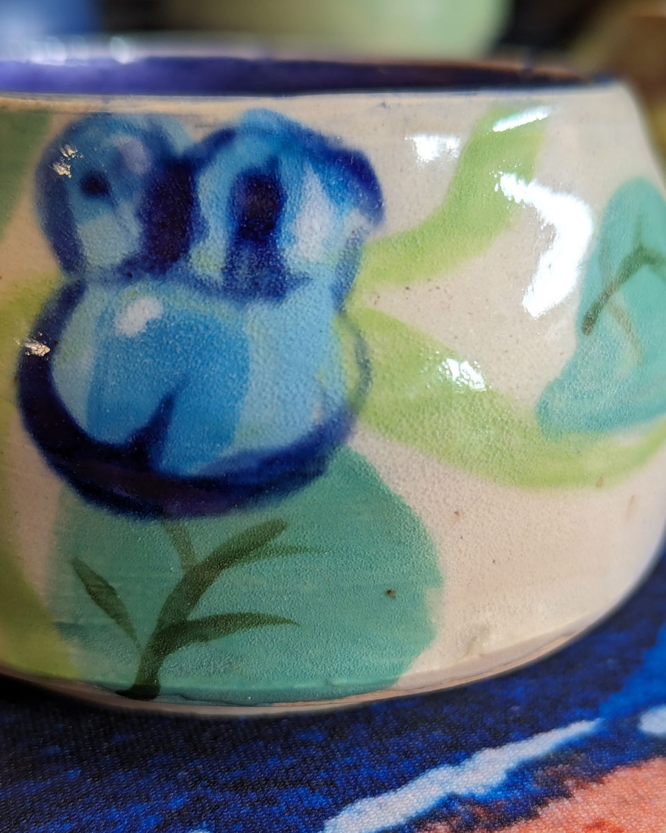
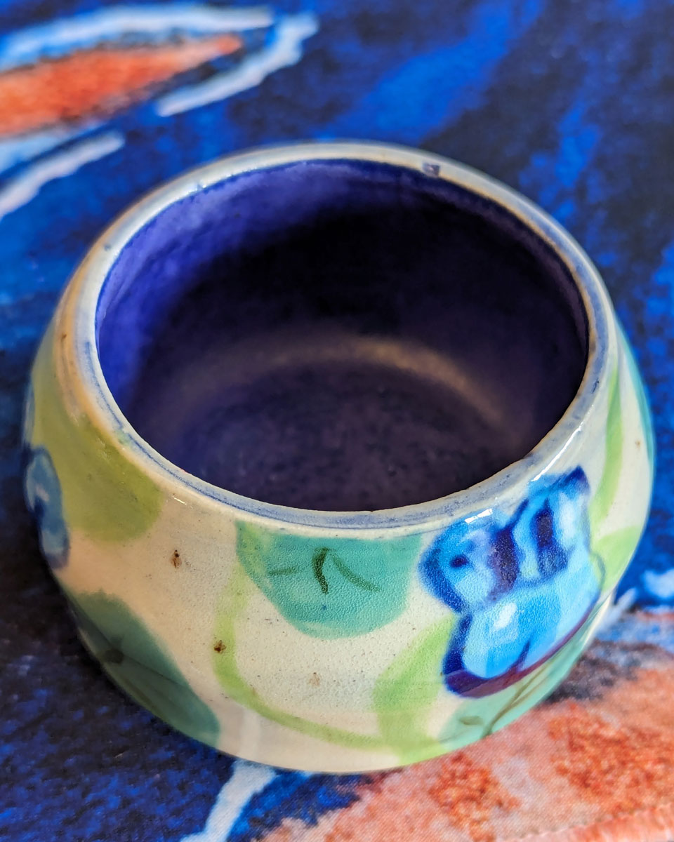
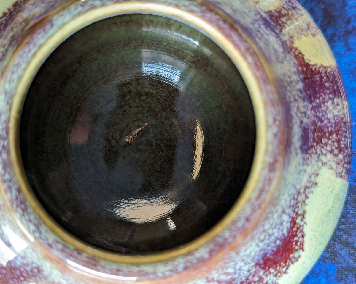
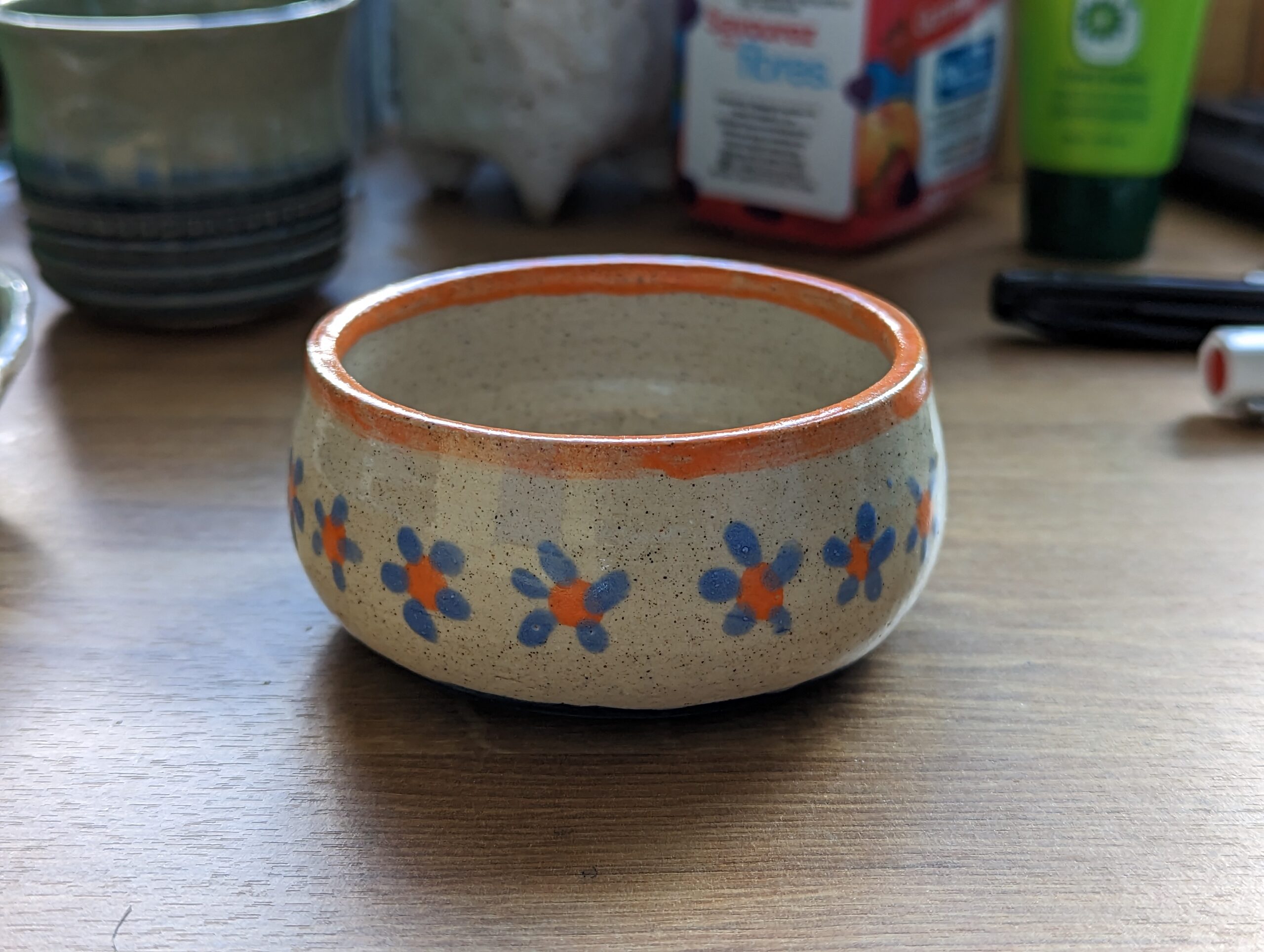
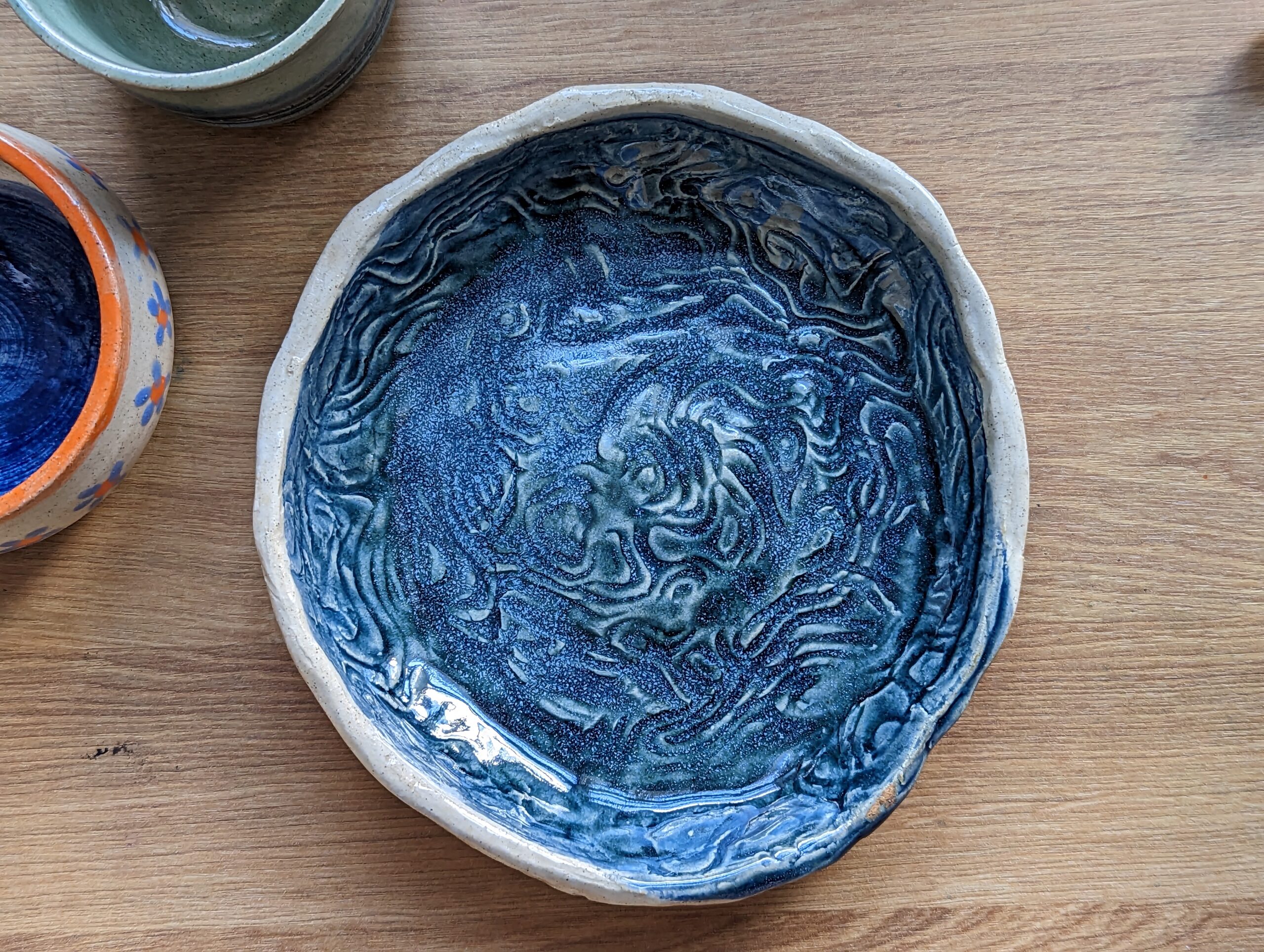
Wheel throwing single (left) handed (above) was certainly a new challenge, and while I didn’t manage to work things as thin and delicate as I had earlier with my right hand, as you can see below. But they had such a wonderful range of glazes; and that small-mouthed shallow bowl is, it turns out, my dream water cup for painting – impossible to splash, easy to reach the bottom to wipe the paint off. And despite an s-crack in the base, it holds water fine! A miracle.
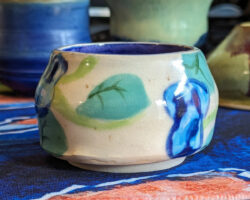
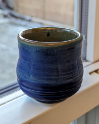
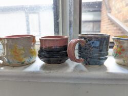
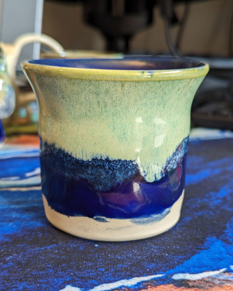
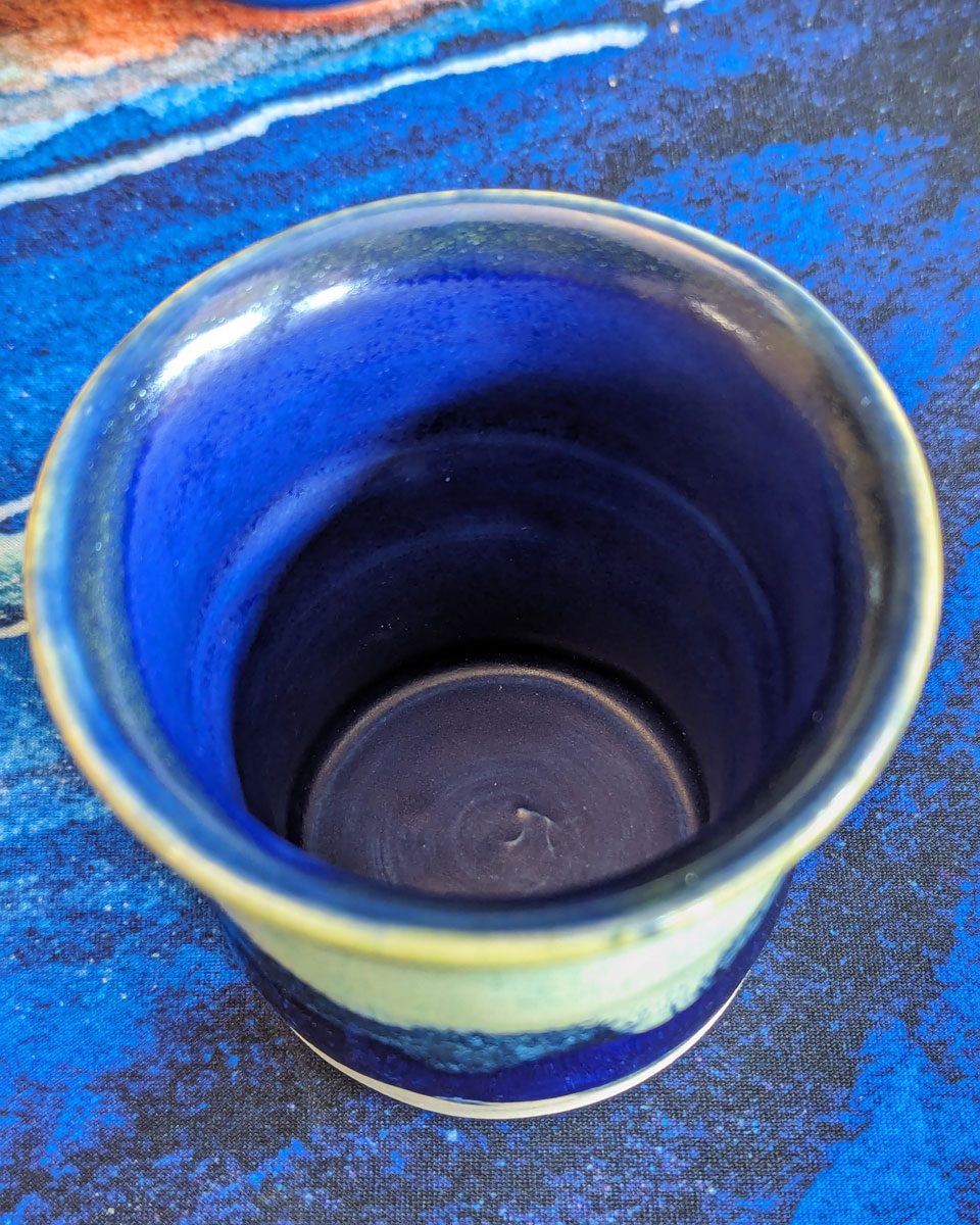
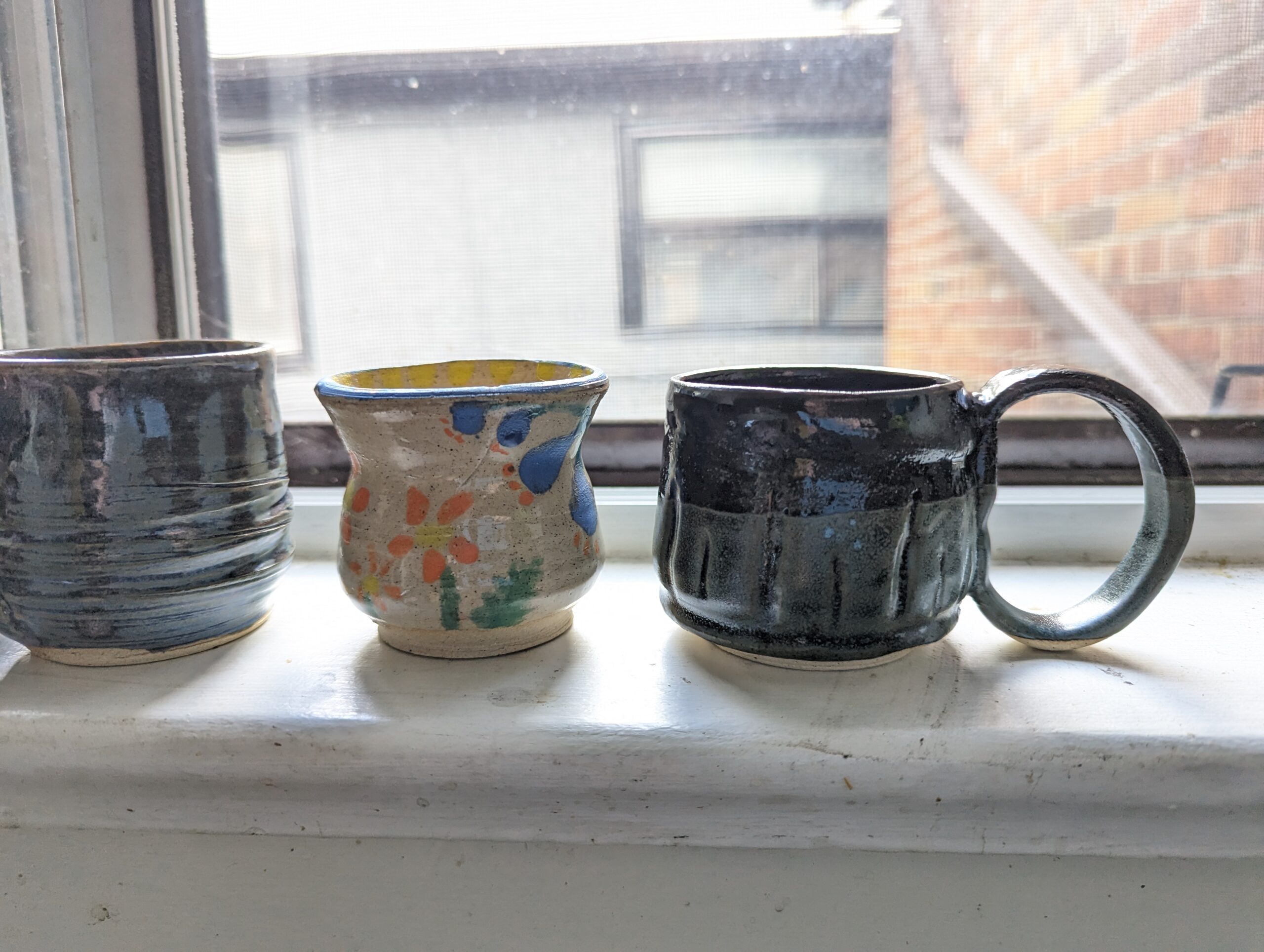
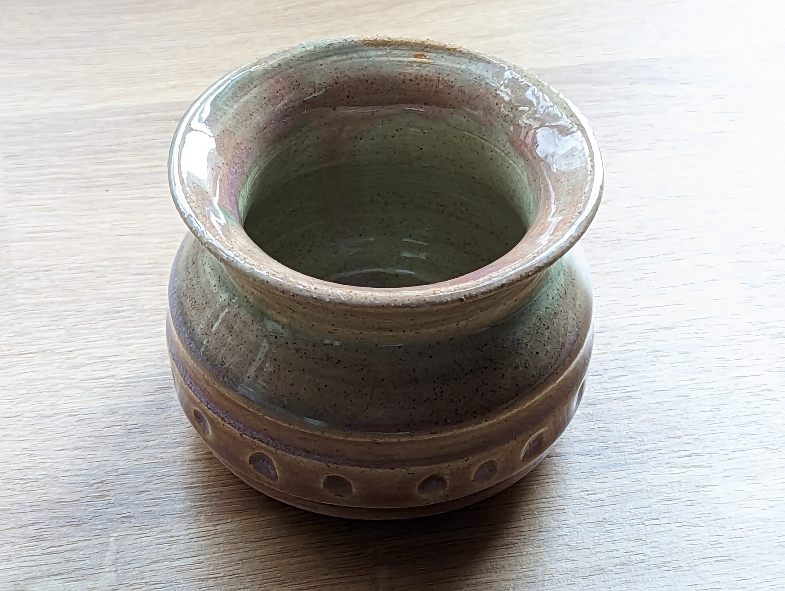
Below are five little cups I made over a three day workshop. First time making handles! As is traditional, none of these hold over 200ml of liquid due to shrinkage when firing – they’re so little! But I do still use them – the handles actually turned out lovely to hold, even if hilariously out of proportion with the little mugs themselves.
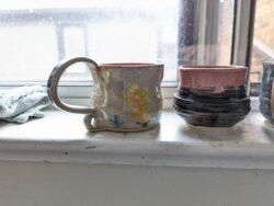

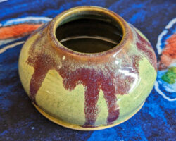
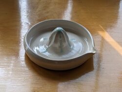
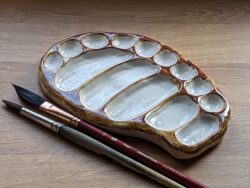
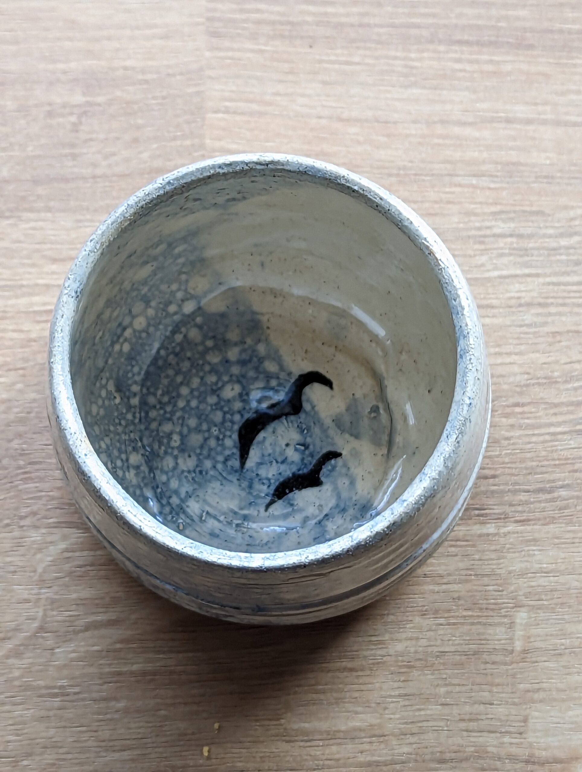
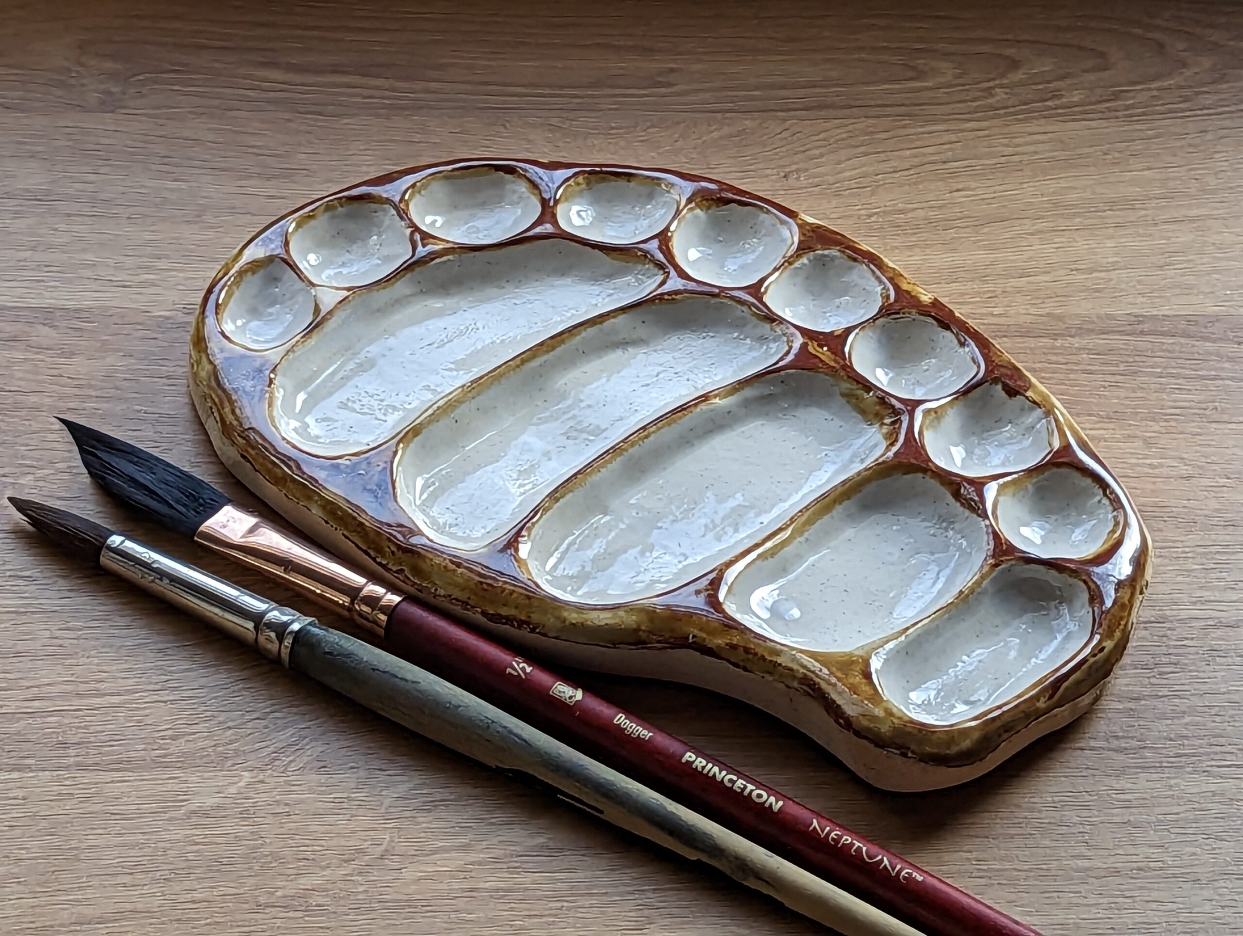
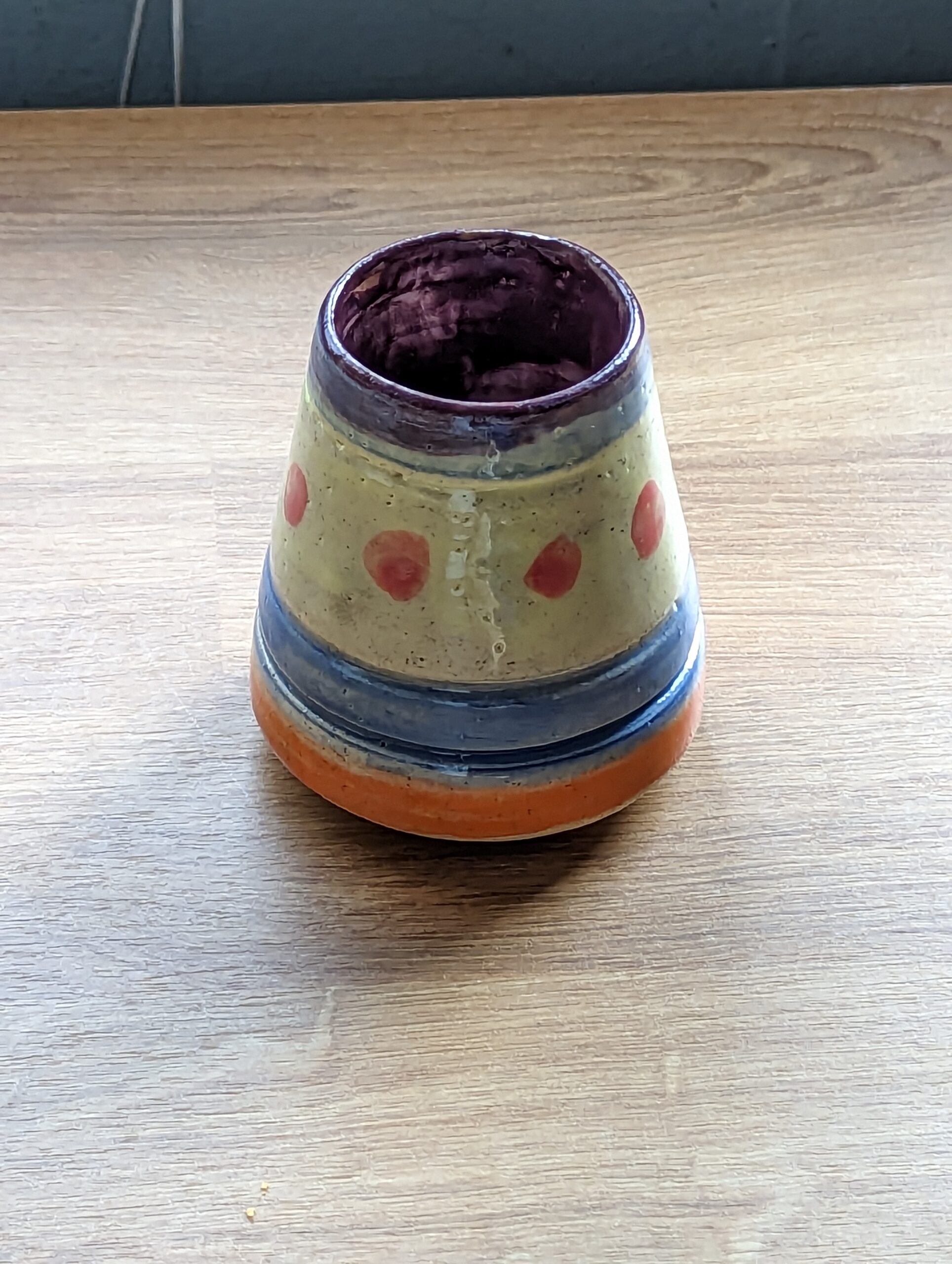
My first ceramics class, back in January 2023! Two functioning hands made learning the wheel a fun and exciting challenge, though at the time my handbuilding was frustratingly clumsy. Regardless, I got a functional (tiny) lemon juicer and a functional paint palette out of it, and I learned so much about throwing and glazing.
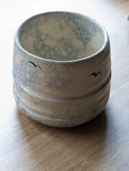
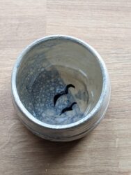
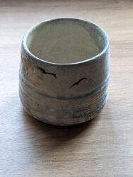
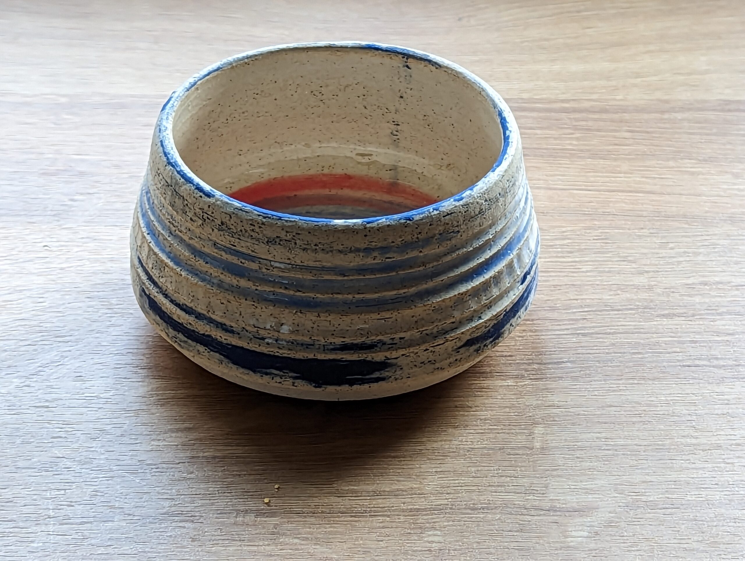
My favourite of all of this first batch is definitely the bubble glazed cup with the seagull silhouettes. Sadly the clear glaze on top crawled, but it’s a visual design idea I’d really love to try again soon.


-
So my day job at Bloom Digital has kept a lot of my life under NDA, and it’s a real treat to get to tell you about LongStory 2 and all the hard work we’ve been doing to make this game a reality!
LongStory was originally created in 2014 as an alternative to shallow “insert coins for romance” sims on the market. LongStory was one of the first dating sims that supported young people in exploring their gender, sexuality and identity in a safe supportive space, and we’ve had a devoted fan base since the first game launched.

And now, the LongStory 2 Kickstarter is live! We need games like LongStory now more than ever. We are looking to raise CAD $25,000 in finishing funds: https://bit.ly/4a8p7Jm
Your support will help us make a full new season of a diverse and LGBTQ+ game that our players have already fallen in love with. At Bloom we believe the world needs games that create that hopeful and loving future: You can help us continue this story with our signature compassion, curiosity, conversation and, occasionally, sarcasm.


Backing this project gets you access to the sequel, the original game and some sweet LongStory swag! Not to mention the satisfaction of knowing more inclusive, safe, consent-based emotional gaming content will be available for players new and old.
Also, did we mention, we’re live on Steam with a demo for Steam NextFest? You can take a good look at LongStory 2 for free right here:

It’s a gorgeous, heartfelt, funny game and it has the potential to really mean something, especially to any queer kids in your life; getting to be a small part of making it a reality has really meant a lot to me!
-
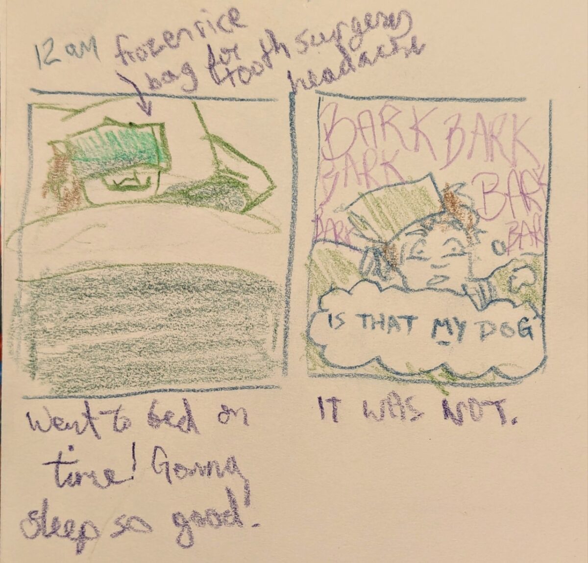
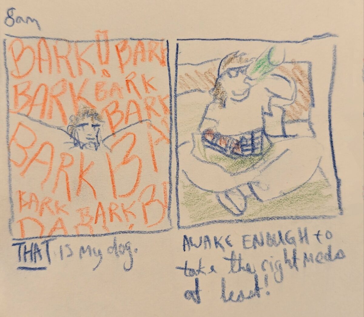
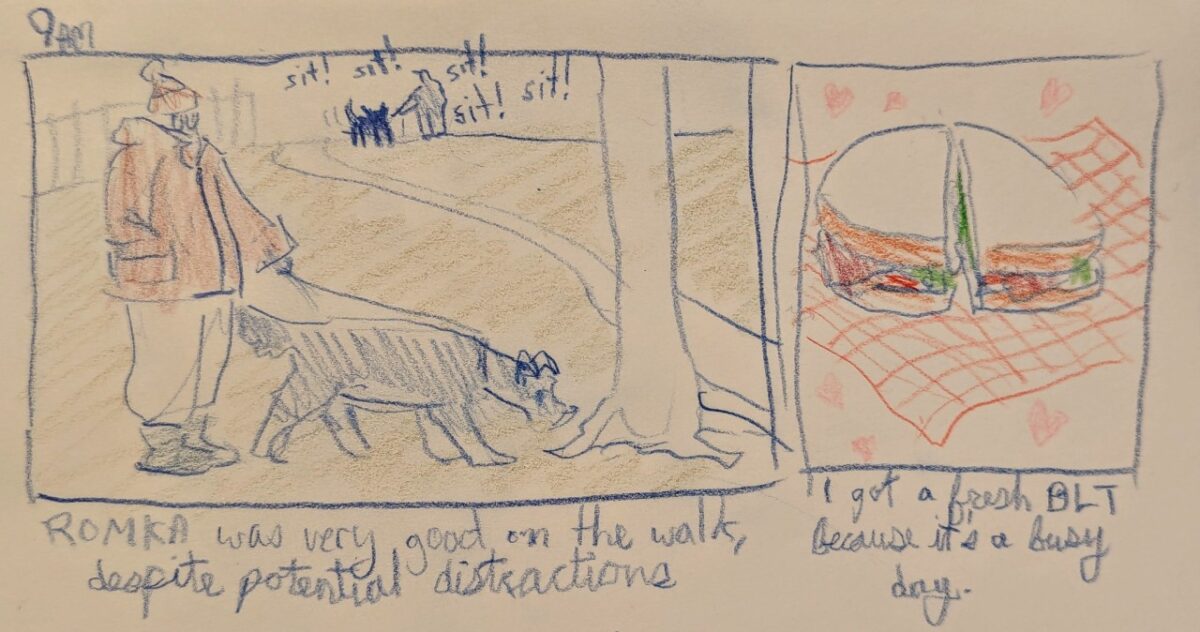
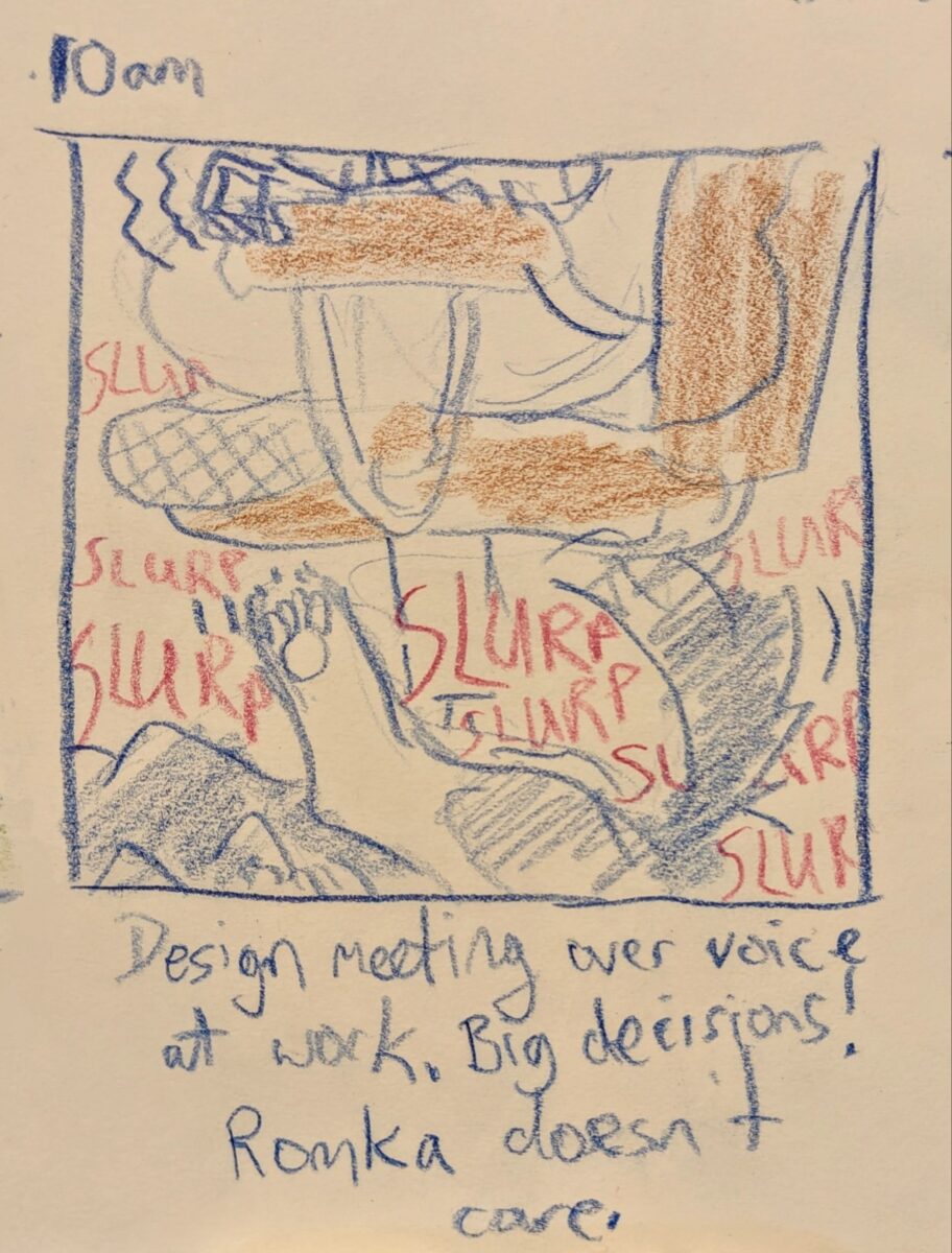
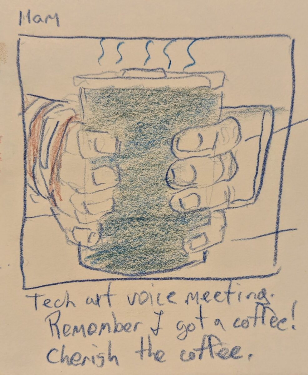
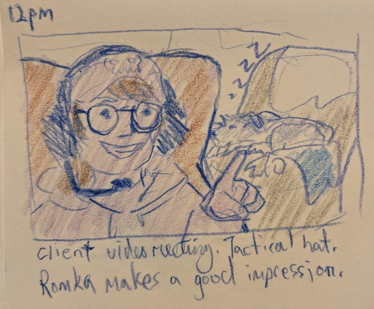
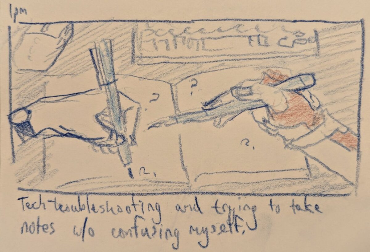
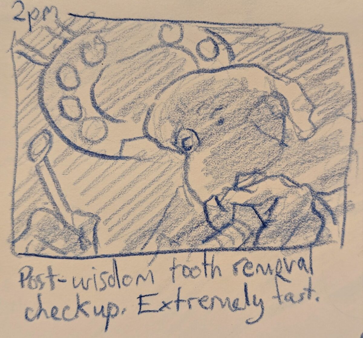
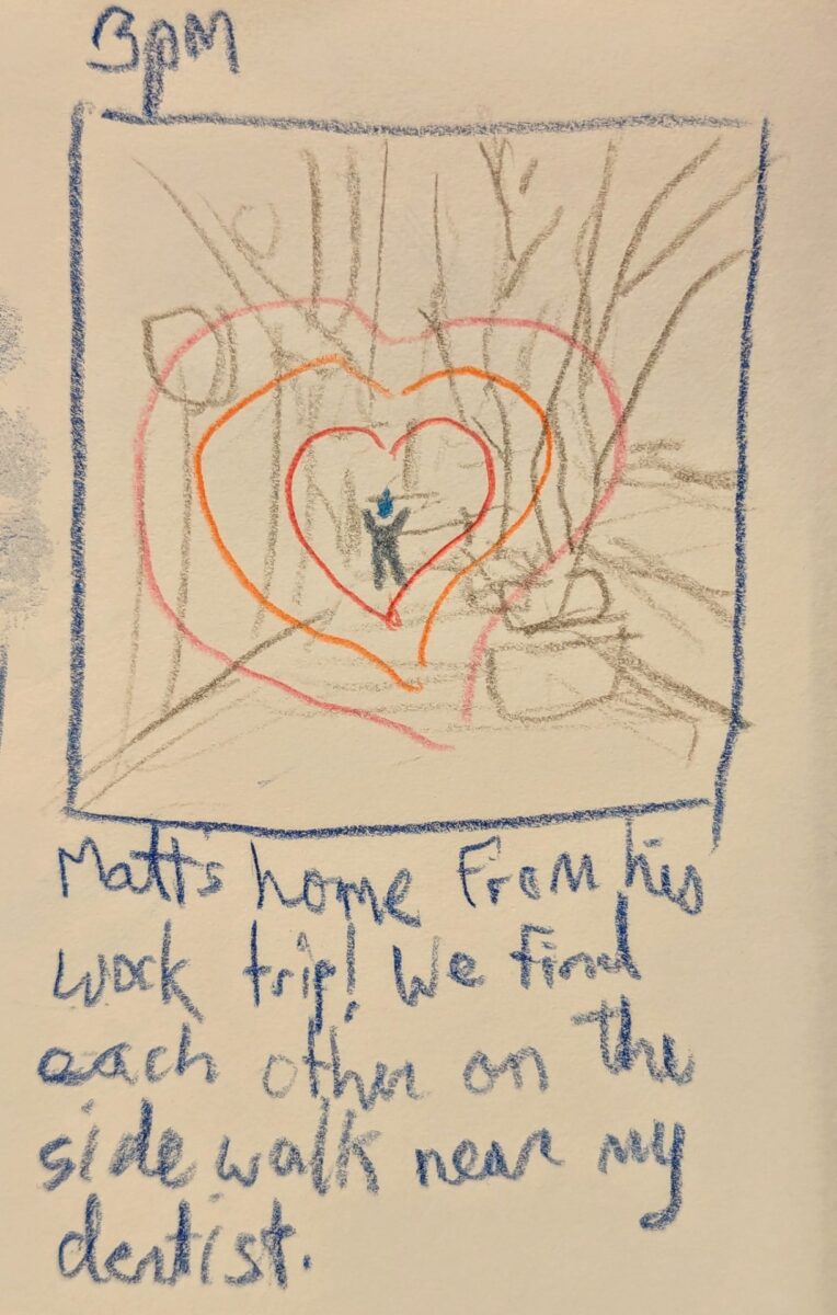
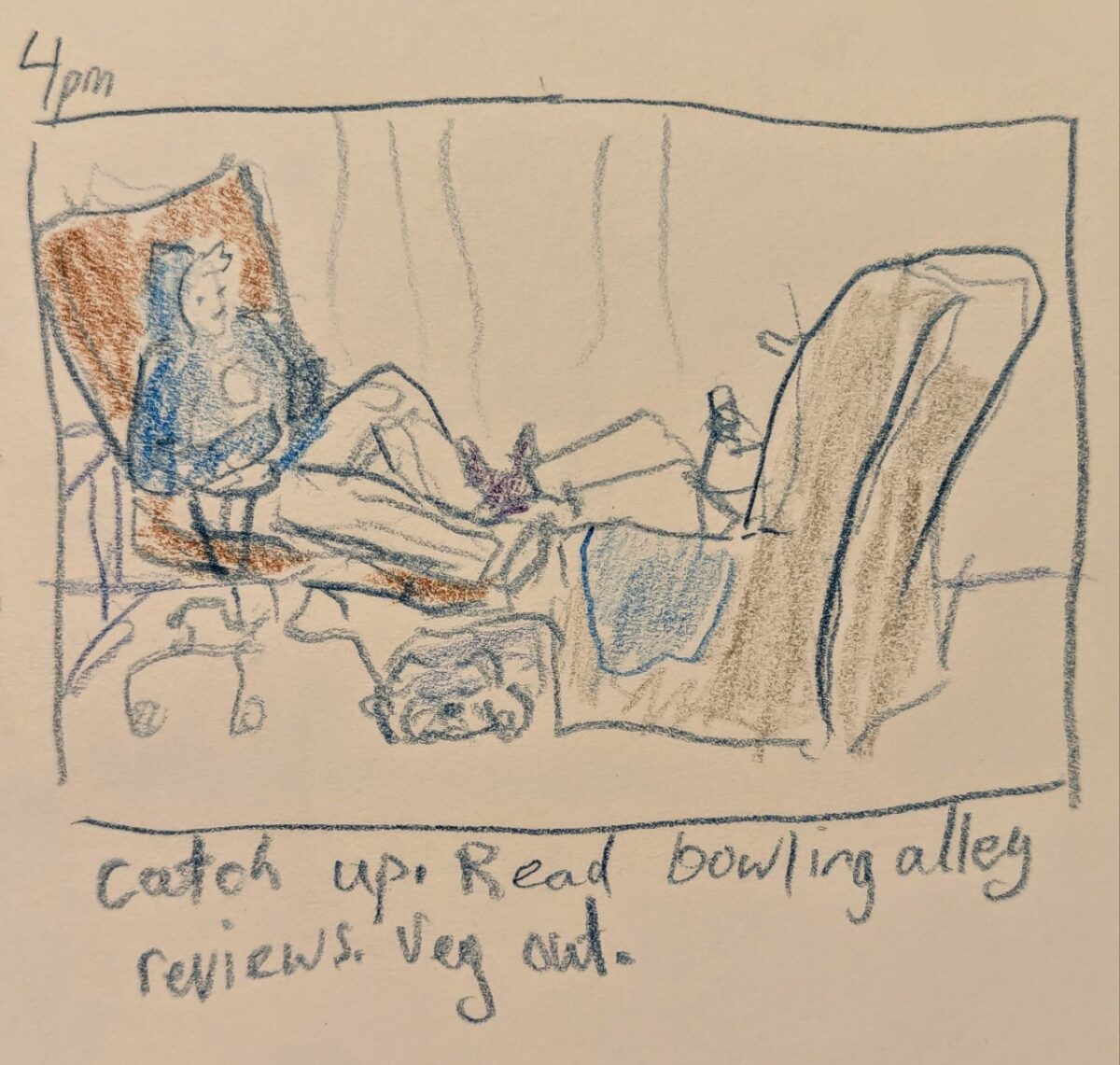
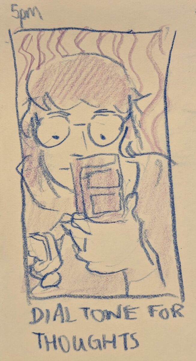
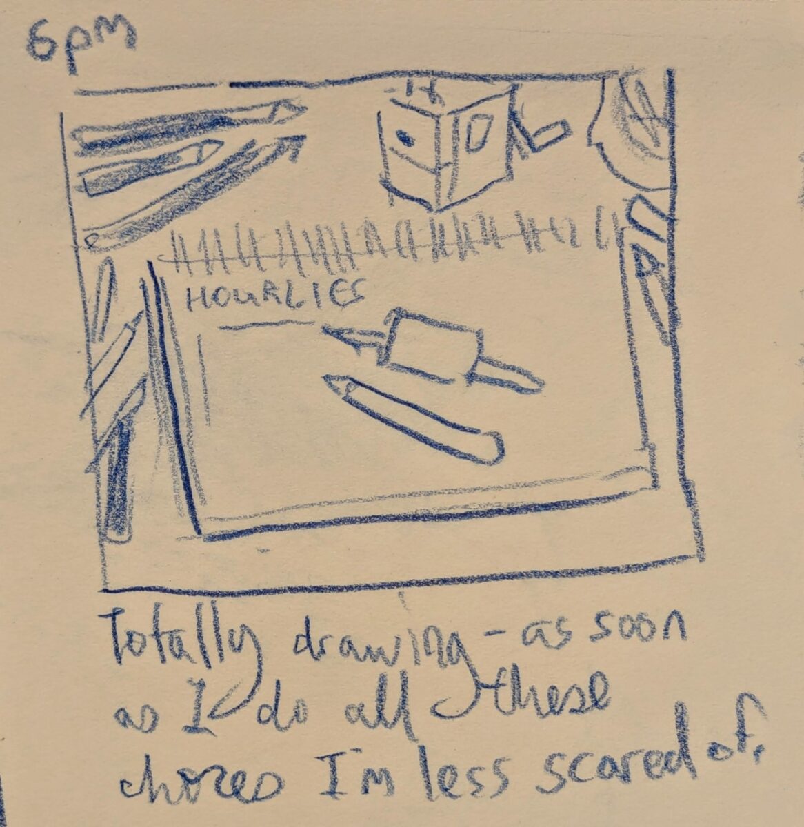
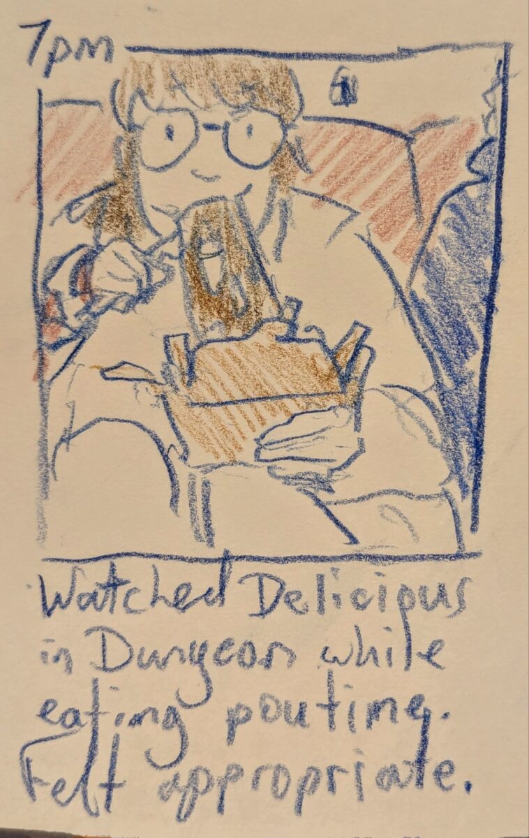
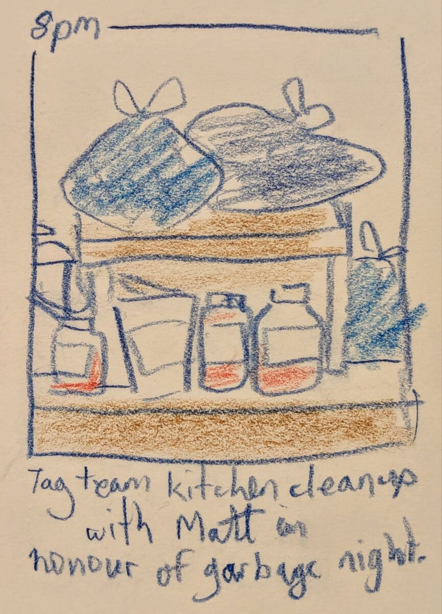
very proud of these sketchy pencil crayon autobio comics!
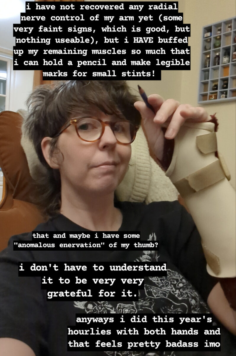
and an arm update for y’all as well:
-
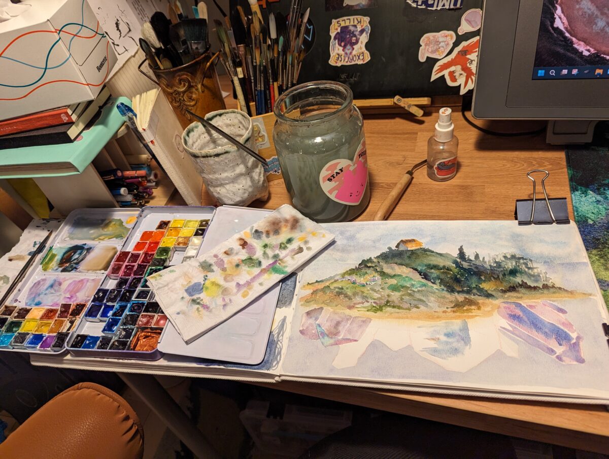
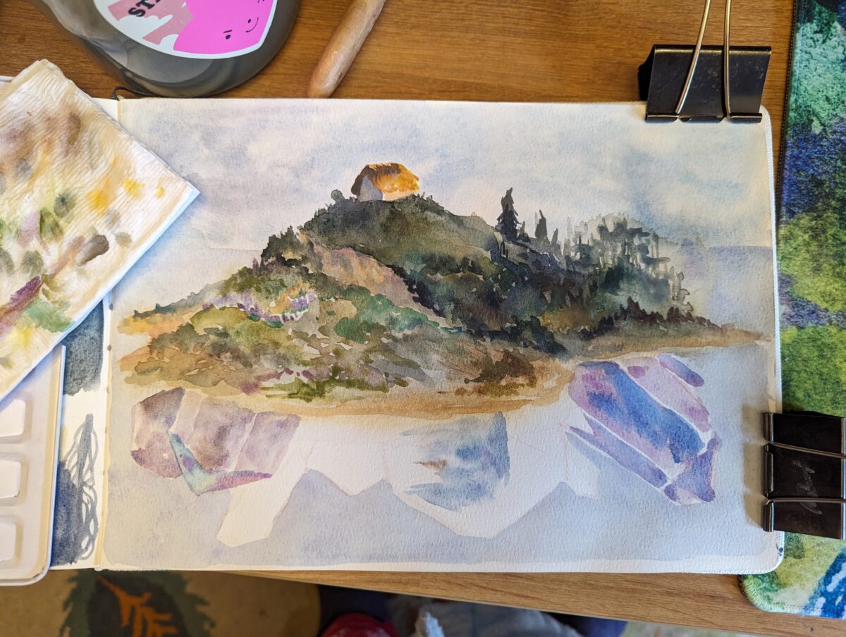
Watercolour in my etchr coldpress sketchbook.
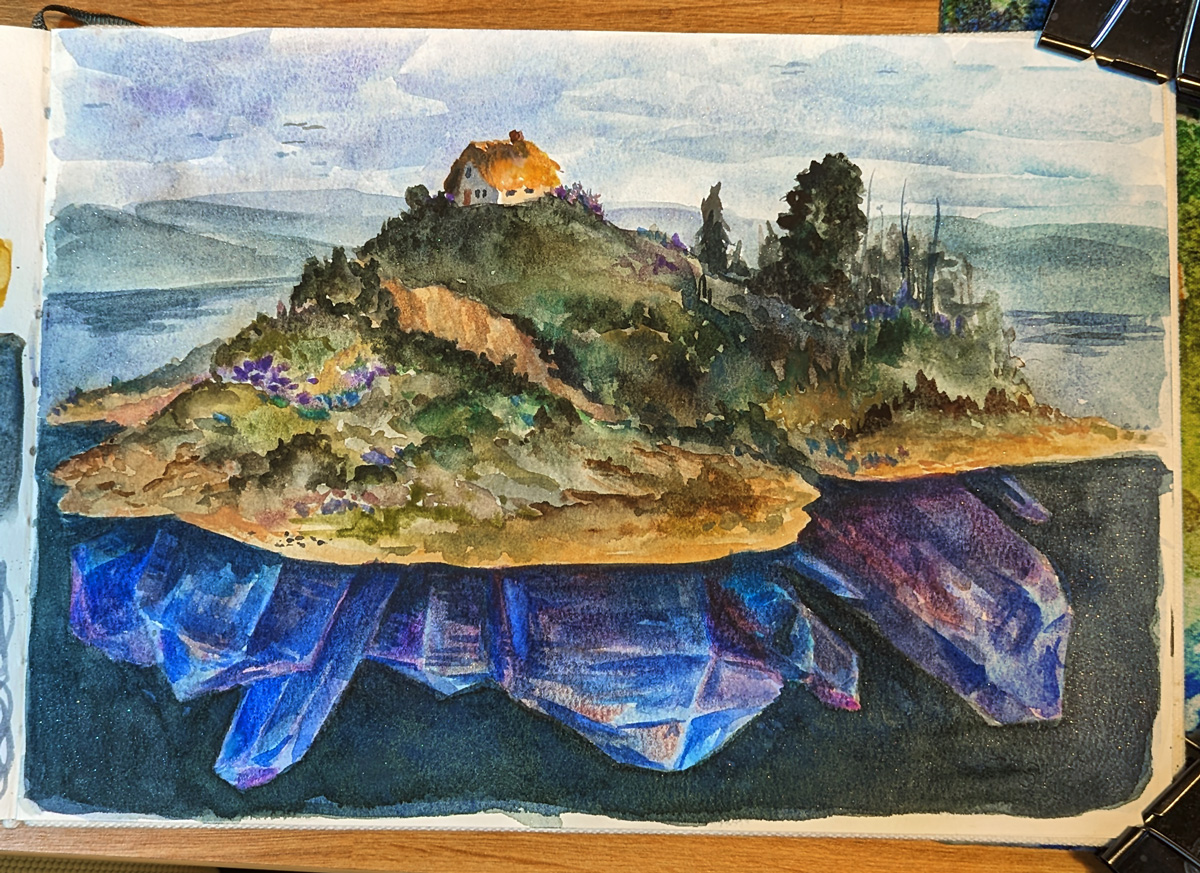
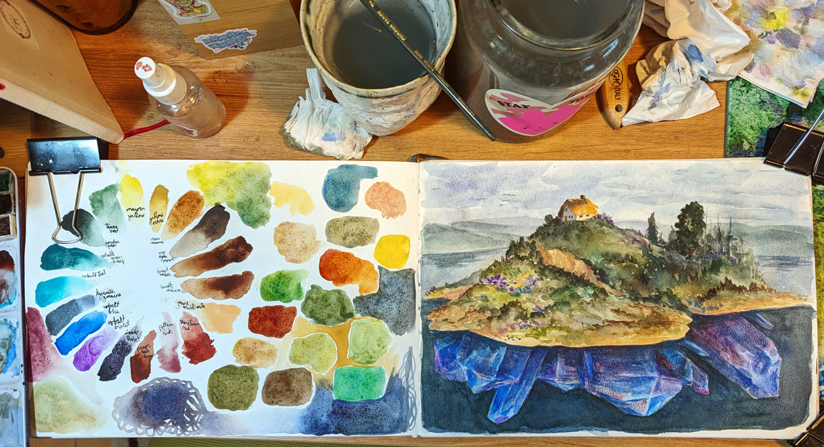

And some process shots, which I always find so enticing in their own way:
-
Oversized Equipment
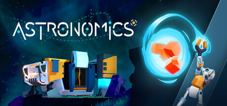
With a base set of equipment solved for Astronomics – demo on steam right now! – there were two things next on the checklist: thinking about colour design, and thinking about some of the equipment that didn’t fit into the neat little categories of drilling/pumping/vaccuuming etc.
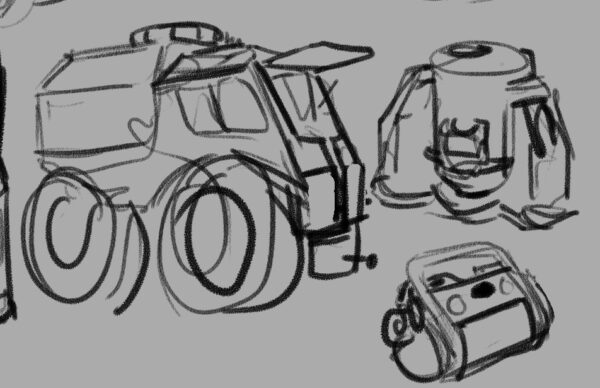
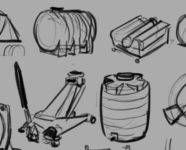
Firstup, we tackled some big ones: one of the things we wanted the player to get to work towards was processing raw materials — and that meant big processing equipment that could intake entire containers of raw material and spit out something different. These were a really fun challenge to keep in the same design language as our smaller machines while pushing the scale.
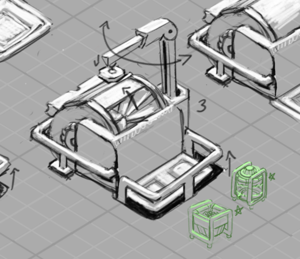
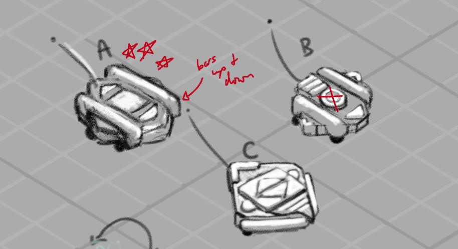
This is one place where our safety-bar themed style really helped — the ubiquitous bars were very useful as a shared unit of scale between the smaller and larger equipment – and in these early drawings they were a clear warning sign that I hadn’t fully measured out the scale relationships:
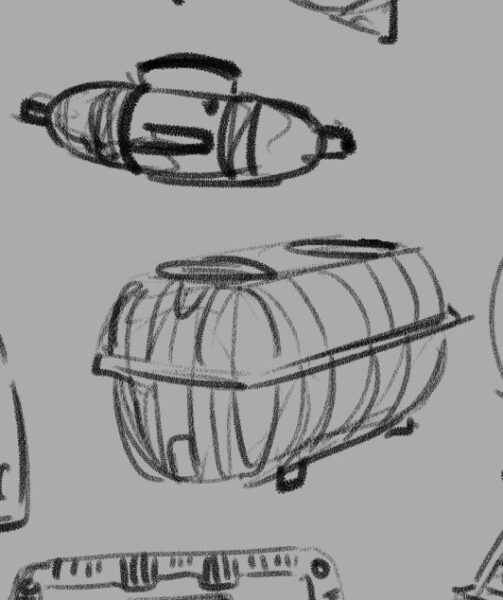
Here you can see the containers, when scaled down to a size where both could fit into that protected area on drawing 3, have safety bars about half or less as thick as the safety bars on the machine. Scale remained something we had to wrestle with and fine tune as we went, and we’ll actually come back to the containers in a little bit.
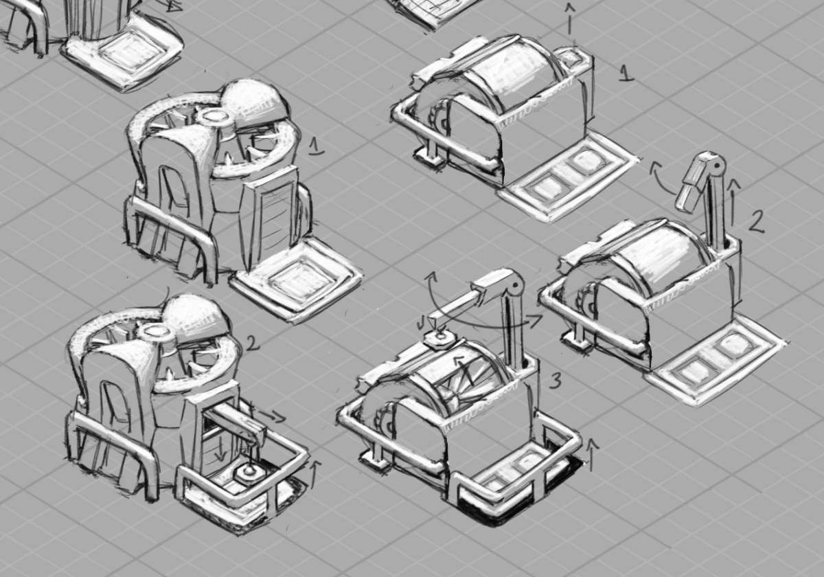
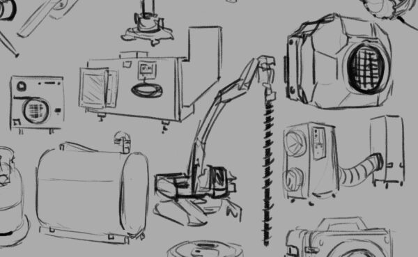
The other larger piece of equipment we needed was one that’s central to the demo — the crane! Here you can see a few of the different ideas we were exploring.
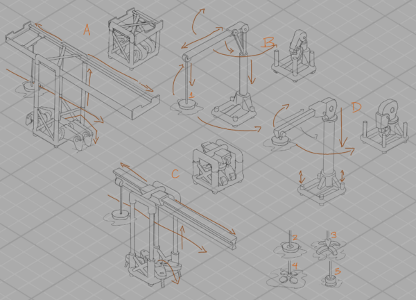
Key elements were: we wanted it to attach securely to the ground, and we wanted the player to feel like they had maximum options when it came to positioning its pickup and dropoff points. With those priorities and with our low-poly 3D outcome in mind, we ended up grabbing the legs from A and putting them on D — D felt like the most flexible in terms of how far we could spin or stretch the reach of the crane, and also the most simple in terms of modelling and animation challenges.
There were further edits and redesigns and tweaks and additional passes on a lot of this stuff — especially the containers — but I thought folks might like to see how we approached colour for the equipment! And that’s a HUGE question, so I’ll be saving that for its own post, alongside the epic journey that colour took while I was on the project.
-
Brainstorming and feedback loops
One of the first steps of designing is always brainstorming — sometimes this starts before research, sometimes I research first, and often I go back and forth, letting brainstorming push me to the limits of my current knowledge and then taking to the internet to open up new territory. For the equipment for Astronomics (demo on steam right now!), while the design team had a few key assets they were looking for, they were also still brainstorming and so we were all kind of discovering what the equipment part of the game could be as a whole.
For me, that brainstorming usually looks like a LOT of very rough drawings. I usually have my research sketches open nearby for reference, and I try and draw small enough that i can see all my brainstorming and seek out possibility spaces between ideas.
Above is my first VERY rough brainstorming page, and on it you can see art from two passes – the softer, lighter drawings are the open-ended thinking; the darker clear lines are the second pass, where I start filtering, choosing which pieces to take to the rest of the team to start conversations with.
You can see how we would collect feedback above – i would write notes and do additional drawing on top of the submitted artwork as we went through things in screenshared video meetings, and then have these with me as I iterated further.
One thing you might notice is that these are all drawn with straight lines — Astronomics is a low-poly 3D style game, and it was fun to think about simplifying the shapes right from the beginning. While I didn’t do all my drawing like this, it was a fast and quick way to get clean linework that had some connection to the style of the game long before we really knew anything about said style!
Speaking of style…
Next up, we had to make some big decisions. Astronomics has a lot of equipment with a big range of functions and scales and the most important thing was making sure it all read like equipment from the same manufacturer – that being CubeCorp, as you’ll see in the demo. I narrowed it down to three possibilities:
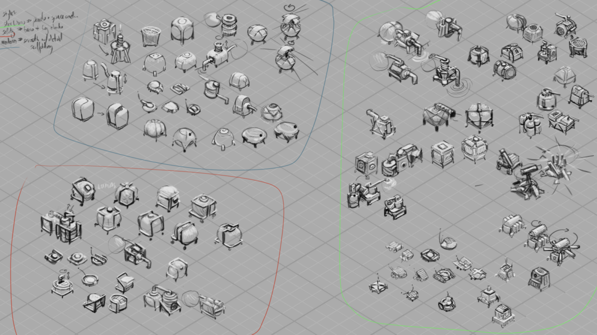
I went in three directions — “Star Wars” style, all panel lines and chamfered edges and a sense of overall complexity; “Safety” style, with safety bars and frames around everything, focusing otherwise on simple, chunky shapes; and “Modern” style, exploring simple silhouettes with hidden complexity.
(none of these are official names for known styles, eg, the star wars style didn’t actual aim for matching the style in those films particularly — these names were more mnemonic devices to help me quickly sum up what I was thinking in a punchy way, and help my coworkers refer to the styles more easily in conversation while we discussed an debated direction together.)
In the end, what we chose was mostly Safety-styled, but elements from both other directions made their way in too!
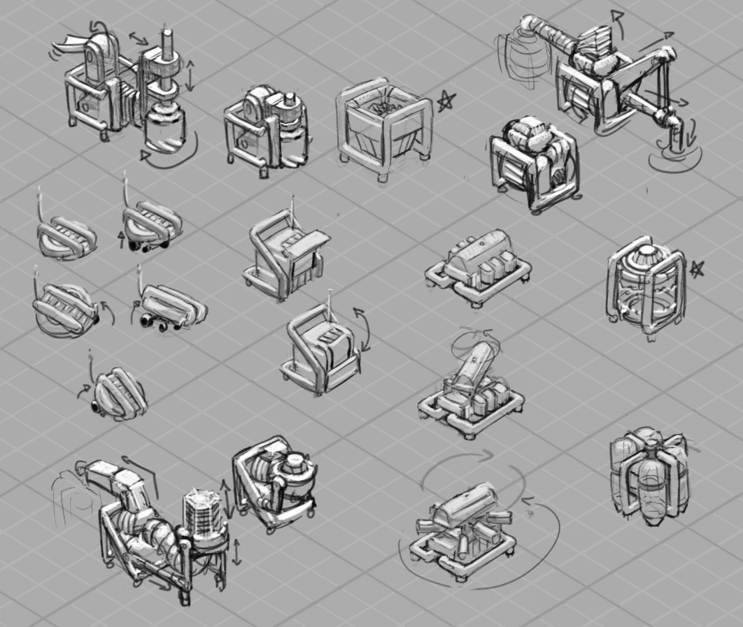
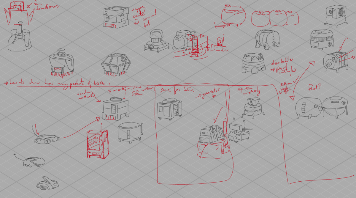
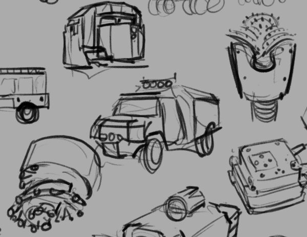
And here was my first sheet ft a pass on the drill, pump and vaccuum, containers for solids, liquids and gasses, a worker bot, a worker bot home, and a robust scanner machine.
A few things we were thinking about: we wanted there to be a sense of a unit of size that everything fit into – CubeCorp, remember? – and so even our most complicated equipment needed to pack down into that cube. That meant that we were going to be animating equipment essentially unfolding, so I tried even at this stage to think about what that could mean for the drill and pump and vaccuum, and you can see packed and unpacked states up there for each design.
They also were likely to be carried around by our little darling worker bots — so everybody needed feet the bots could squeeze between to get underneath. Speaking of, they probably went through the most designs of everything, and what’s in the demo does not appear in these pages at all, haha, but here, a few more passes:
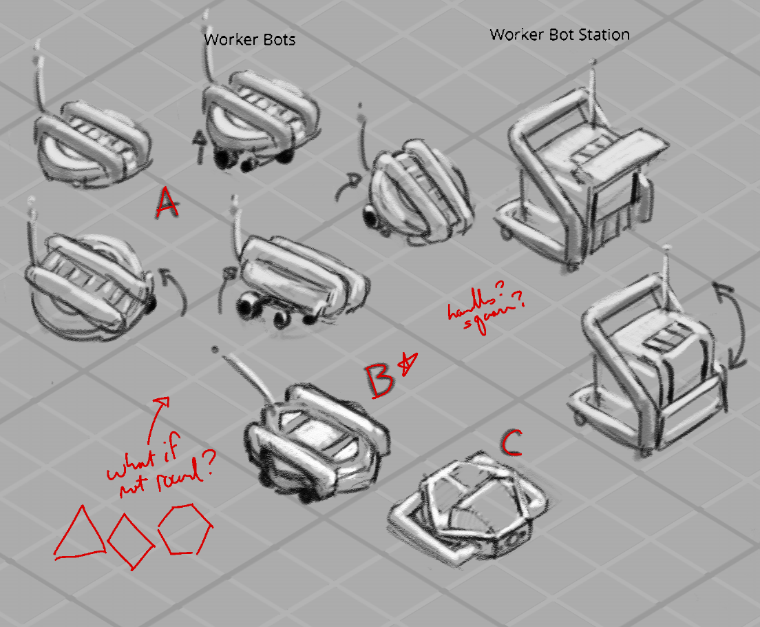
In fact, you might not be able to find any of these exact designs in the demo — that’s just the nature of concept art in games! What the game needed then and what it needed later — as the game design itself was developed — well, it changed, as it often can! I think it can be easy from the outside to assume that everything anyone thought of was eventually brought to life, but that rarely ever happens. Concept art is a process, and so even if these designs didn’t make it into the game, they were an important step along the path towards designs that did, and they taught us a lot about what we did and didn’t want Astronomics to look like!
-
Astronomics Game Art : Designing Mining Equipment! Pt 1
posted:
updated:
posted to: game devtagged: art directing, astronomics, concept art, indie games, numizmatic, structure, videogames, visdev, visual researchPt 1: Research
Gonna talk this week about designing mining equipment for the sci-fi game Astronomics – demo on steam right now! – And I thought I’d start with a little conversation about research and process (…that doesn’t really have on a much art in it but just stay with me) and maybe get to tap in a little bit into how someone like me who doesn’t do a lot of technical design learned a lot about how to get excited about that whole field through the research stage of this game.
So when I say research I really do mean fairly old-school research — and this is probably gonna be a theme with a lot of the posts about this game in particular, because I don’t think you can build sci-fi without some understanding of engineering systems and current scientific realities to then play with, you know?
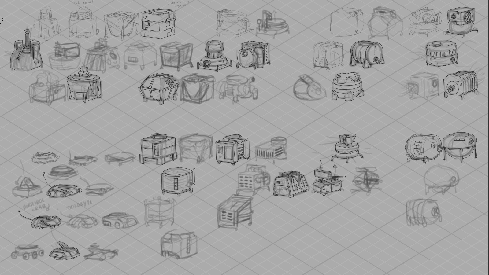
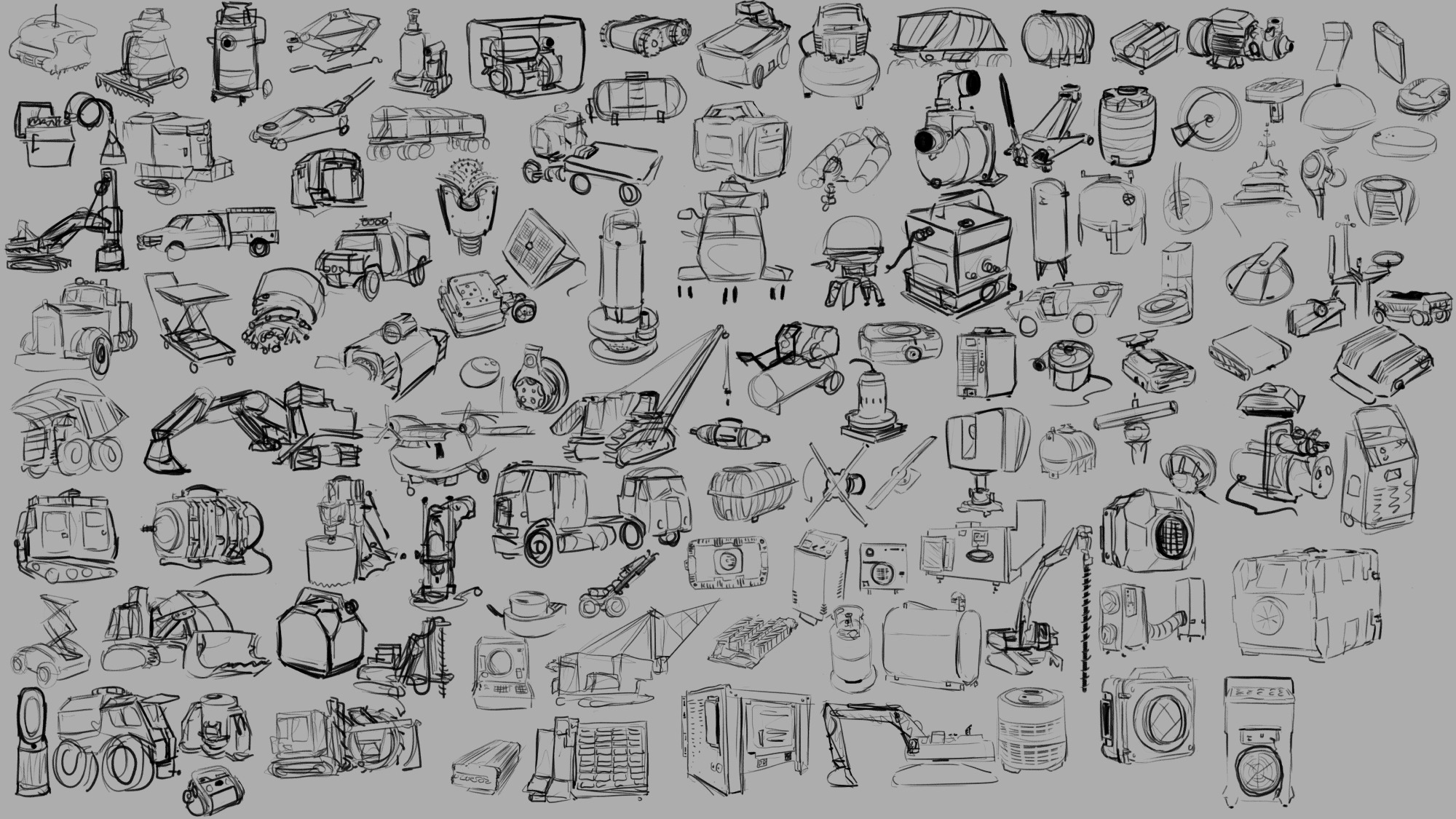
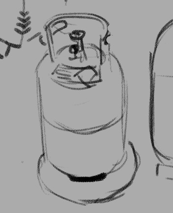
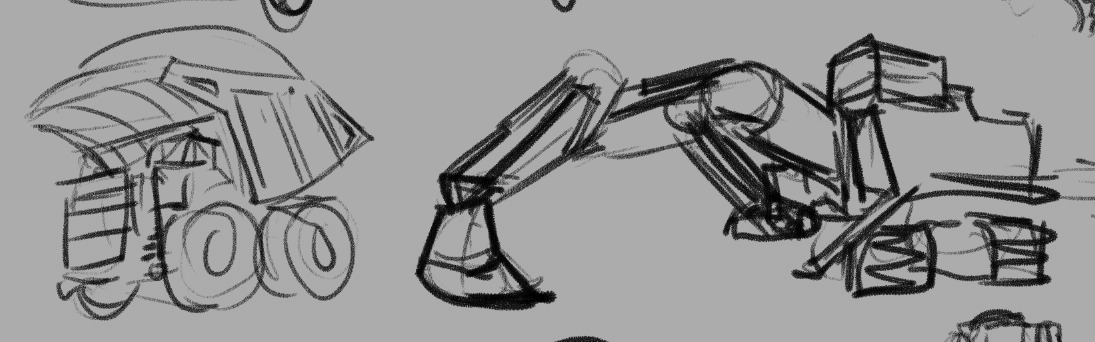
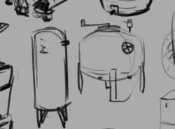
As you may gather from the trailer, Astronomics is a game about asteroid mining, among other things. Which meant that we had a lot of need for legit industrial feeling props and tools for the player to use, things that felt functional and believable without feeling complicated or delicate. I really enjoy the challenge of adding appeal to something that maybe people don’t always think about being appealing or fun or cute (this is never an absolute statement — there’s always somebody already able to see more appeal in any given subject and I could ever imagine) so part of the research stage is going and looking for that appeal. So above you can see a sheet of loose rough sketches I did in clip studio paint from reference that I gathered with the rest of the team and by myself that seemed relevant to some of the designs we were pursuing.
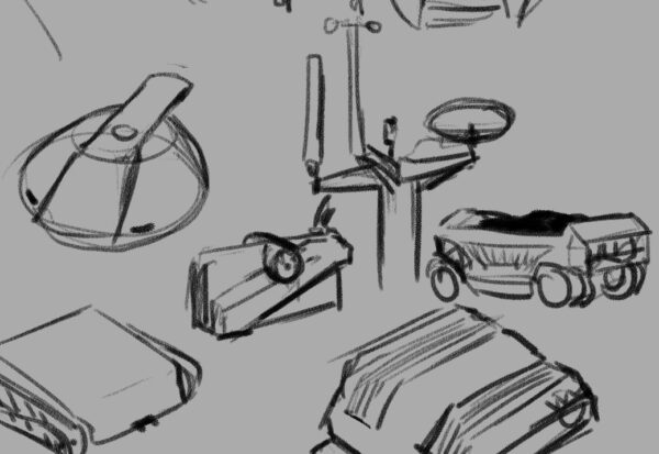
If you’ve had the chance to play the demo, you’ll know that it’s not just surface mining but we are going to be letting you mind gases and liquids and underground mineral veins as well — these are all things that people do in the real world of course, so process one was taking a quick look at those actual industries and then figuring out how I could condense that activity down into a pretty simple and easy to understand machine.
So turned out what we needed was something that drilled and dug, something that pumped liquids, something that sucked air, and all of these things needed to then produce some sort of container to hold what they had collected.
In a videogame you really need to communicate to the player why each act they do is significant and different from the others, and as the art director it was my job to figure how to do that through visual design of the tools they’re going to be using. So that meant that even though you could certainly store liquid and gas and solid resources in the same kind of box, I wanted to try and find ways to keep each thing feeling different. Best case scenario is that you’re able to look at a prop we’ve designed and know in a split second which of these three states of matter it will be containing; in the research stage one of the things I’m looking for is any existing visual language that we have (in this Western English-speaking North American videogame audience culture) that already solves this problem.
The great thing about industrial design is that they indeed have very intentionally tackled this problem. Part of it is purely physics optimization that the field of engineering has been working towards for human history. For example, when you’re storing liquid and you want to remove all of it from a container you probably don’t want something with corners — that’s how you end up with cylindrical liquid storage. When you’re storing a gas you’re likely keeping it under pressure, which means you need a shape that will withstand pressure evenly, which means you’re looking for something with literally no corners or edges ideally — and that’s how you end up with bubble-shaped gas storage like a propane canister. And then when you’re storing something solid and you want to use the space most efficiently and be able to stack whatever it is that you have packed it into, you have a box.
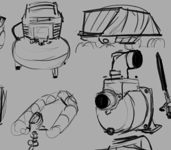
Real good news is, a box and a cylinder and a sphere are all wonderfully visually distinct shapes in a fantastically strong place to start when it comes to solving the question of storage. So then we get into the challenge of the machines themselves — what distinguishes a drill from a pump from a vacuum?
So that’s the beginning of some of the questions that you have to answer when you’re designing props for a game — in the research stage is only one of bunch of different ways you start figuring out these answers. But I want to talk for just a second a little bit about how I personally wrangle my research, because I am definitely not telling you this is the only way to do it. It seems like it may be worth explaining what I get out of this process and see if anything here make sense for you!
One of the reasons that I have this huge page of sketches, big and detailed or tiny and loose, all laid out in one place for me to look at, is because I personally learn and remember things more strongly by taking notes. With my hand holding a pencil ideally. And when they’re abstract concepts or verbal or numerical then I’ll use writing and I won’t have a problem with it, but my job at this stage was not to figure out abstract concepts or to find themes — my job was to solve visual problems. So my first order of business was visual research specifically. Now for me, that involves lots of things — I have a Pinterest board for any sort of subcategory of stuff I’m researching to just do enormous broad research with; then I probably bring most of those images into a huge working .PSD file and move them around to create groupings. And then I start drawing.
I really think that drawing is integral for me at this stage. I don’t think I could do this without drawing as part of my research. There’s so much that I just don’t bother noticing if I’m not going to be drawing the thing that I’m looking at; even the worst, fastest, sketchy as drawing makes me pay infinitely more attention to something then I do when I am simply collecting information mentally. I’m phrasing this in a somewhat exaggerated, self-deprecating way, but I really can’t exaggerate how much more I get out of things when I sit down and draw them. They talk about drawing is a way of seeing, and for me that’s a practice I’ve intentionally pushed and explored in my life.
The other thing, though, is that visual problem that I need to solve. Sometimes solutions to the problem aren’t obvious until they are visualized — it can be very easy to get distracted by things like surface details and miss the silhouette language, or vice versa, but when you are doing the drawing you have to wrestle with the silhouette and the details and make decisions about them. Visual trends appear way more clear when you are drawing something for the 10th time as opposed to simply seeing it for the 10th time. And all of the layers of cultural meaning and context that clutter up a photograph can be simply ignored as you transfer only what you need to a drawing, where you might discover something that everything else hid until then. Beyond that, one of the things you may notice about the sketches is that they are somewhat cartoony — I’m certainly trying to capture important details and be representational to a degree, but much like gesture drawing the human figure, researching this way lets me start finding out what the gestures are of these different sorts of subject matter. This is something that I knew about creature design, and about flora design, and one of the real joys of this game in particular was proving to myself that this gesture approach applied to industrial machines and technology as well.
I mean, I knew that there were cute trucks out there, but gosh.
I think if you are in need of something to reinvigorate a particular piece of subject matter for you — if you’re designing something that you are just not that excited about, or if you don’t feel challenged by the work in front of you — I really think sitting and sketching from reference can open up the complexities and help push you and your work farther. It certainly works for me and I know that the learning I did on this game is something I carry with me to future projects as well.
That seems like a pretty strong place to leave this post in particular, but I’ll be back later this week with more breakdowns and screen caps of the actual design process of all of our adorable mining equipment!
I would really love to hear from folks if you also engage in similar research processes before going into full design mode — or if you have a completely different way to get your mind revved up and ready to go, I would really enjoy reading about it!
In the meantime, if you’re curious about mining asteroids but it’s cute please feel free to check out the Astronomics demo on steam, I made an awful lot of visdev art for this and handed it off to some incredible game creators who have done some really impressive stuff taking their ideas and my ideas and running to honestly some pretty new and exciting places with them.
-
For just getting the painting-studies-from-life fire lit under you, I recommend Hawthorne on Painting : https://store.doverpublications.com/0486318745.html — it’s a collection of lecture notes from the cape cod school of art, and there’s no pictures, and that seems so counterintuitive, but the sheer passion for light and colour that shines through honestly is really inspiring. The core concept I took from it is that a painting study doesn’t require expert knowledge of anatomy, perspective, structure etc; just a passion for seeing colour, and then putting the right colour down in the right shaped mark in the right place; a simple and infinitely difficult skill to learn and a great way to get out of your own head when the subject matter feels overwhelming. It’s a very affordable little pocket-sized book and you can likely track down a used version as it’s been a classic for a long time.

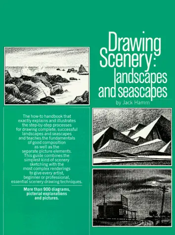
For more visual instruction, another classic-and-affordable book I have used to the point of disrepair is Jack Hamm’s Drawing Scenery: Landscapes and Seascapes : https://www.penguinrandomhouse.ca/books/352897/drawing-scenery-seascapes-and-landscapes-by-jack-hamm/9780399508066 — it starts with the bare bones of composition, but it goes into amazing detail on all sorts of elements of scenery from trees to skies to lighting and more. I keep his spread of Types of Clouds bookmarked for easy reference!
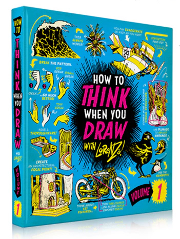
And for the fun of discovery and clear, direct instruction, I’ve really liked the Think When You Draw books : http://theetheringtonbrothers.blogspot.com/ — while this isn’t my personal visual style, they have such great, punchy, memorable instruction on such a huge, wide array of subjects, it’s been a great tool to get me over the “okay but cars/bikes/horses/spaceships are HARD” etc threshold!
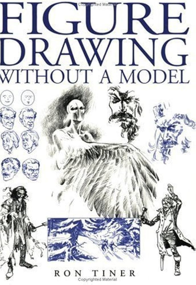
And finally for figure drawing, the book that really unlocked drawing people for me was Ron Tiner’s Figure Drawing Without a Model : https://www.scribd.com/doc/103174602/Ron-Tiner-Figure-Drawing-Without-a-Model — he covers a few different mental models of the figure to help build it from the ground up in your mind, and he connects these models very clearly to real life anatomy, drawing from life, and character design. Again, not a visual style I personally pursue, but immensely useful concepts that I still use today, 24 or so years after I first read this book, whenever I draw without a reference.
And I always recommend hitting up a used bookshop or two for some collections of art that inspires you — even if it isn’t your chosen medium, or subject matter, or style, if it gets your brain running then why not spend some time with it and see what you can get out of the book? Personally I always come back to my collections of Frank Frazetta, Rodney Matthews, Edward Hopper, Gian Lorenzo Bernini, and Caravaggio artwork, and most of those were random used bookshop discoveries.
Hope you find some great inspo and have fun exploring art further and further!
-
as I continue to chip away at my website, and get a feel for wordpress’s new full site editor capacity, I’m more excited than ever about what I can do with my website and also having some decision paralysis around what to do next, you know?
I think I mentioned this in an earlier post but I’m not in dire need of a portfolio site right now; for various reasons I’m not actively courting freelance art gigs, including but not limited to the state of my dominant hand, and the permanent salaried art director position I currently hold. it also seems likely to me that should I need to find a new job, I would likely seek out another art directing job; and the professional materials required to land one of those are not nearly as dependent on a portfolio of paintings as prior jobs in my career have been.
however I do really love sharing the work I’m doing, and have done, on the internet. and some of my work has a structure on its own, like my watercolor maps forming a pretty cohesive collection, or my crystal islands, or my comic work. I think those can all be their own sort of raison d’etre on the internet. but 99% of the things I make are much less organized than that, so I was wondering if it would make sense to simply approach things from an archival standpoint.
the nice thing about WordPress is the amount of metadata you can include in a post by having both the posted on date and the most recently modified date, as well as any custom Fields I choose to include, as well as tagging things like the medium or subject matter, and of course categorizing things. I feel like I would enjoy having a chronological archive of my own creative work on the internet in a way where I could find things if I wanted to share them in particular, but also in a way where it would be straightforward to do some curation to form a narrative around my own development or exploration of different mediums or ideas. like I think it’s pretty funny that I have almost three decades of my own artwork and that despite this depth of time and a huge range of skill, it’s all clearly made by the same nerd.
but I also have a little voice in my head that says this is hilariously self-centered and self-aggrandizing – and I have a slightly louder voice in my head that points out that this is maybe not something that I want to share publicly on the internet? but maybe that is easier to judge on a Case by case basis. like no, I’m not uploading my grade 9 handwritten novel, hahaha, can you imagine, dear God – but some of my grade nine drawings feel like important parts of my creative journey? God that’s so pretentious. anyways if I’m going to talk into the void on the internet I guess I can talk about whatever the hell I want, but I am curious if there’s a precedent for people maintaining archives of their creative lives publicly, and of course if there’s any interest from anyone else in this sort of thing.
living through this dominant hand stuff has certainly made me more self-reflective about my art right now anyways so, maybe this is something that feels like the right choice today and then in a year or two or three I will either choose to take down or feel deeply embarrassed by having done ever. future me will just have to deal though.
-
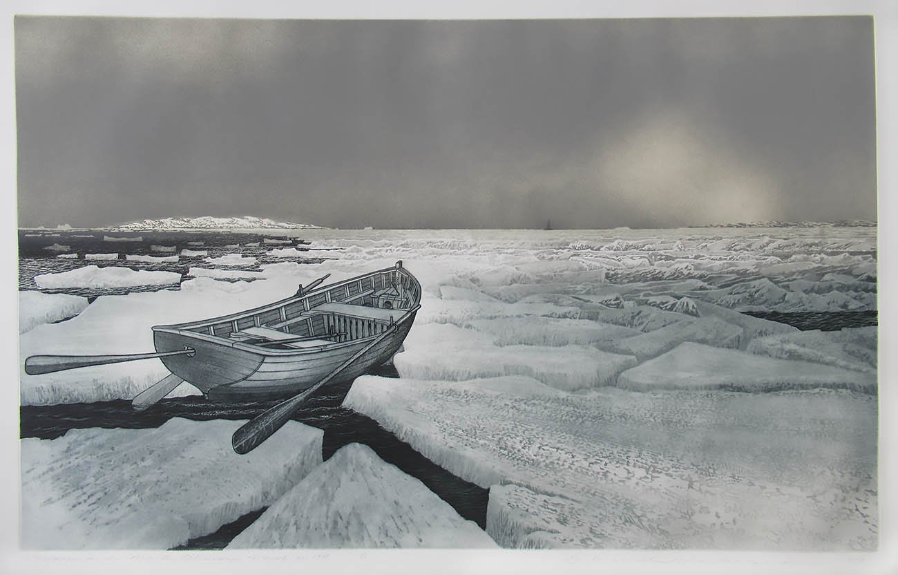
Friends, I just finished teaching the last third of a course on print production, and between that and the whole thing with twitter’s crop changing (somewhere? not for me but somewhere?) I’ve found myself thinking a lot about copper etching and my relationship with the acid bath.
So, first up, copper etching is an art form where you engrave (through various means) thin grooves into a copper plate, then squeeze thick ink into those grooves, then wipe off the ink on the face of the plate, then soak paper so it’s very soft, then push it all through a press.
The pressure forces the paper into the ink-lined grooves of the plate, pushing the ink onto the paper, and you thus transfer the image from your copper plate to your paper. It’s a magnificent art form you’ve certainly seen examples of, even if you didn’t know! Here, a Rembrandt:
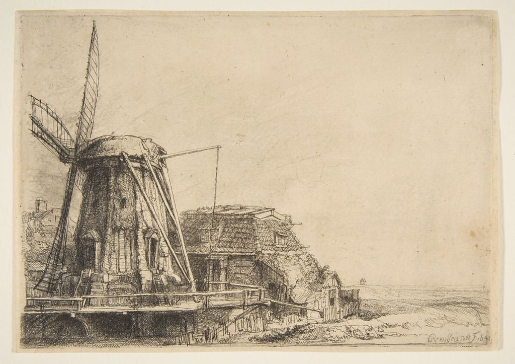
There’s a lot of ways to create these grooves in the plate; Rembrandt used a steel point and scratched them in, a technique called drypoint. Later, artists used a technique where a waxy resist would coat the plate, then drew lines in the resist, then soaked the plate in acid.
This is the acid bath of which I speak.
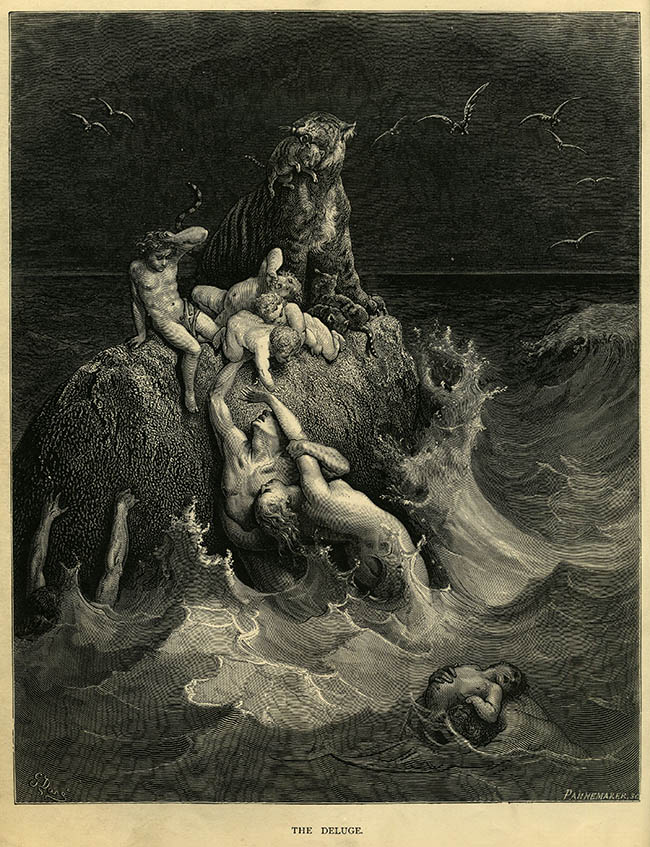
There’s a few ways to apply resist to a plate, and they give you different effects when you etch with them. First is a hard resist, which is a thick, firm wax that coats the plate and is removed by using that steel drypoint tool to create thin line work, like this Doré hatching:
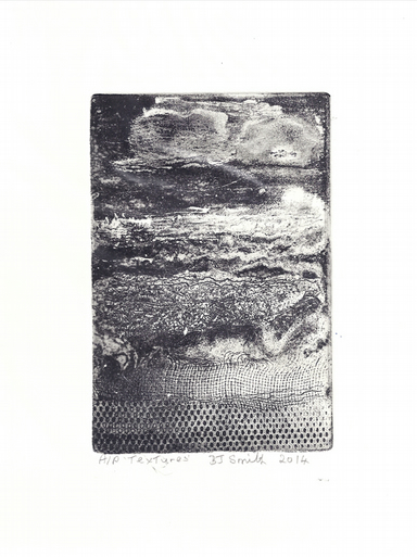
You can also use soft resist, a malleable wax that allows you to press textures into it, like Barbara Smith has in her piece “Textures” here:
(my terminology might be a bit off, I’m noticing as I google, but hopefully the metaphor will still stand)
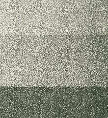
And the third method, my fav, is aquatint; a process where you add a resist that is .. spotty. Something like a light spray, or a dusting of wax, so that the plate is covered with a rough, dithered dot pattern of resist, with exposed copper in between. Example via Wikipedia:
I decided to try out copper plate etching, also called intaglio print making, after seeing David Blackwood’s work, where he works with aquatint extensively:

Aquatint lets you lay down fields of tone, which he uses in great contrast and collaboration with the linework he etches into the plate as well. It’s magnificent work, but it’s made all the more miraculous when you understand the whole thing with the acid bath.
So, when you put a copper plate into the acid bath, anywhere on the plate that isn’t protected by hard, soft or aquatint resist (also called ground) is slowly dissolved into the acid, creating little grooves. The longer it’s in the bath, the deeper the grooves – kind of.
The acid is fickle, and the more copper already dissolved into it, the slower it will dissolve new copper. And that’s a problem because you want to control exactly how deep those grooves go; the deeper the groove, the more ink it will hold, the darker the line will be on paper.
Under-etch your plate, and your lines will be faint, hold very little ink, and be extremely hard to get ink INTO when you apply it before making a print.
But you can’t know this until you take all that resist off the plate, wash it, and ink it up and print it.
OVERetch your plate, and the acid will start to eat the copper away from under your resist, widening your lines or flattening out your aquatint, so it’s easy to get ink into the lines, but hard not to wipe it back out when you try and wipe ink off the un-etched face of the plate.
Again, not obvious until you go and try printing your plate.
And with intaglio, by which I mean copper plate etching, you might want lines of varying darknesses – you might want aquatint of varying darknesses – and so you will be adding and removing resists of various kinds, and etching and re-etching your plate over and over again.
And you can do various things to get the feel for the acid bath’s … acidity … on the day you go to etch something in it, but depending on the size of your bath, you etching a large plate for a while might change the bath’s acidity. Worst is if it’s fresh and you didn’t know.
So this whole art form, whereby people produce some of the most precise and exquisite pieces in the north western historical canon IMO, is actually an absurd collaboration with a rogue chemical that may or may not do what you want at any point in time.

And by my third year of making work like this, I had concluded that you simply had to think of the acid bath as a rogue collaborator who you handed your plate off to over and over again throughout your process. You had to just take a deep breath and accept chaos as an element.
Yes, you did your best to prepare your plate, get the right resist on it, draw the right lines where you wanted them; and yes you set a timer and kept an eye on your plate and checked the etch over and over again – but in the end you were teaming up with chaos chemistry.
And I loved it! I loved the surprises you got from acid bath, even if they went against what I had planned. I loved improvising around its unpredictability! Once I accepted that it was part of the practice, I found it exhilirating.
And for me, that’s the appeal of all traditional media – I can’t predict every little thing, I’m not 100% in control at all times, and artwork has to happen despite all that.
And so I expanded this concept for myself out to my larger practice. When I send a file to print? I’m collaborating with a printer; both the person, who I can maybe talk to, and the machine, that will have its own peccadillos. I prepare as best I can and still I may be surprised.
I’m not saying I never threw out plates that got way out of hand, and I’m not saying I never had a print run of my work I had to send back or reprint – I’m just saying that my thought process around them has changed, so I allow for a wider range of surprises than I used to.
So when everyone was going on about the twitter crop finally changing, and I realized I didn’t really care, I noticed that I had expanded this concept to publishing online as well. I prep a nice jpg and then I take a deep breath and accept twitter’s chaos in collaboration.
And that’s how I discovered that, to me, twitter is just another acid bath.
One response to “Etching and Acid Baths and Surrender”
-
I enjoyed this article very much! I remember you showing me the whale print years ago.
-


Leave a Reply