
swap to chronological order of most recently modified
-
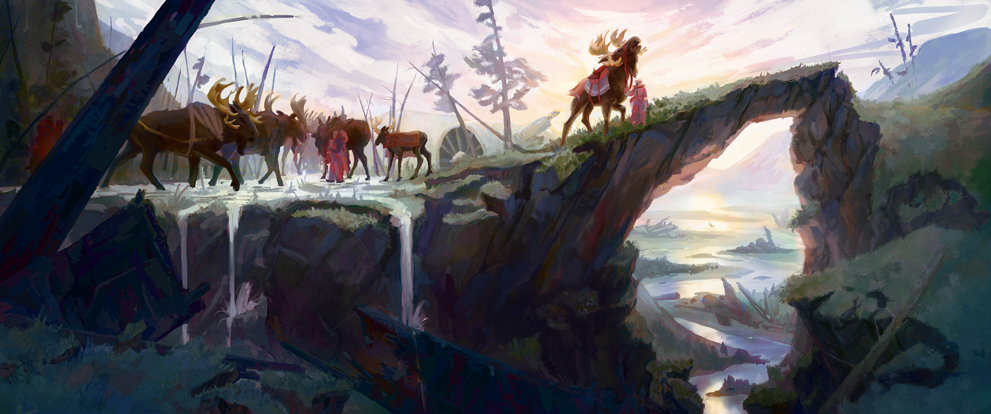
Herders and their stagmoose, dramatic geology, and a landscape strewn with the remains of history. Loose sketch concept.
-
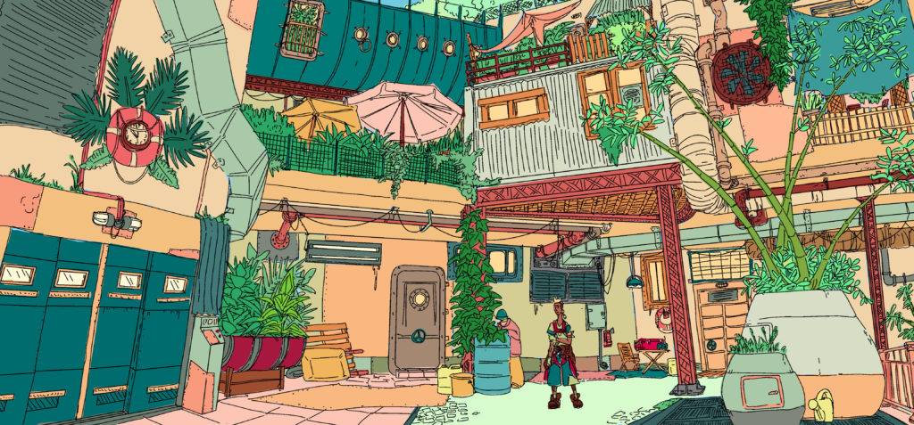
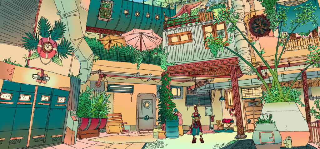
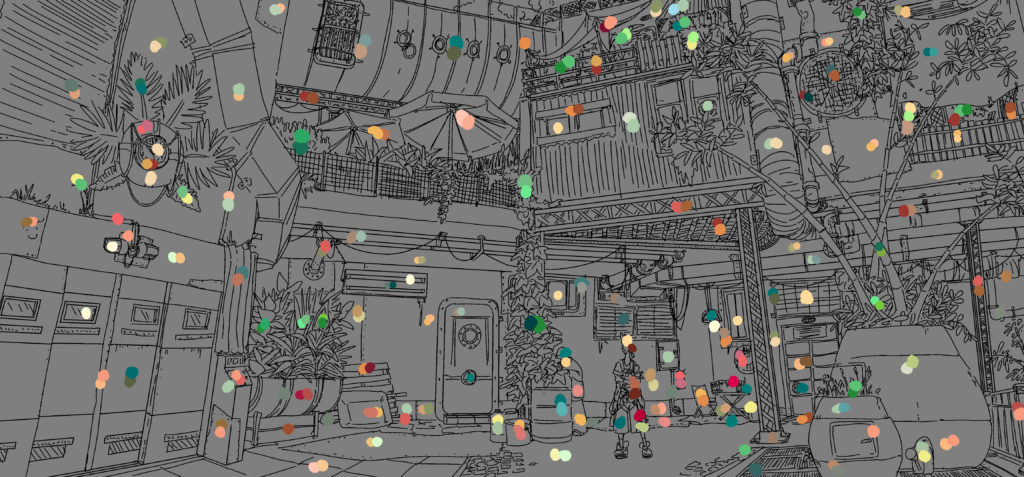
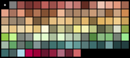
Environment design exploring the possibility of using asset store models to populate the level without losing the worldbuilding and colour design. Created as a thorough guide for the level designer, including labelled assets and isolated colour palette information.
We started with thumbnails painted from level blockout exploration to choose a location to build up:
The chosen blockout:
From there I created a rough concept as a guideline for what we wanted to achieve:
With the client’s approval, I went on from there to use the asset packs to choose props and objects that could set dress this area, developing a rendered greyscale layout and a reference image labeled with the associated asset back for each element:
From there I went on to design the colour scheme, from flats to gradients, tagging each asset with its local colours and creating a palette for the environment artist to use on the asset pack props.
-
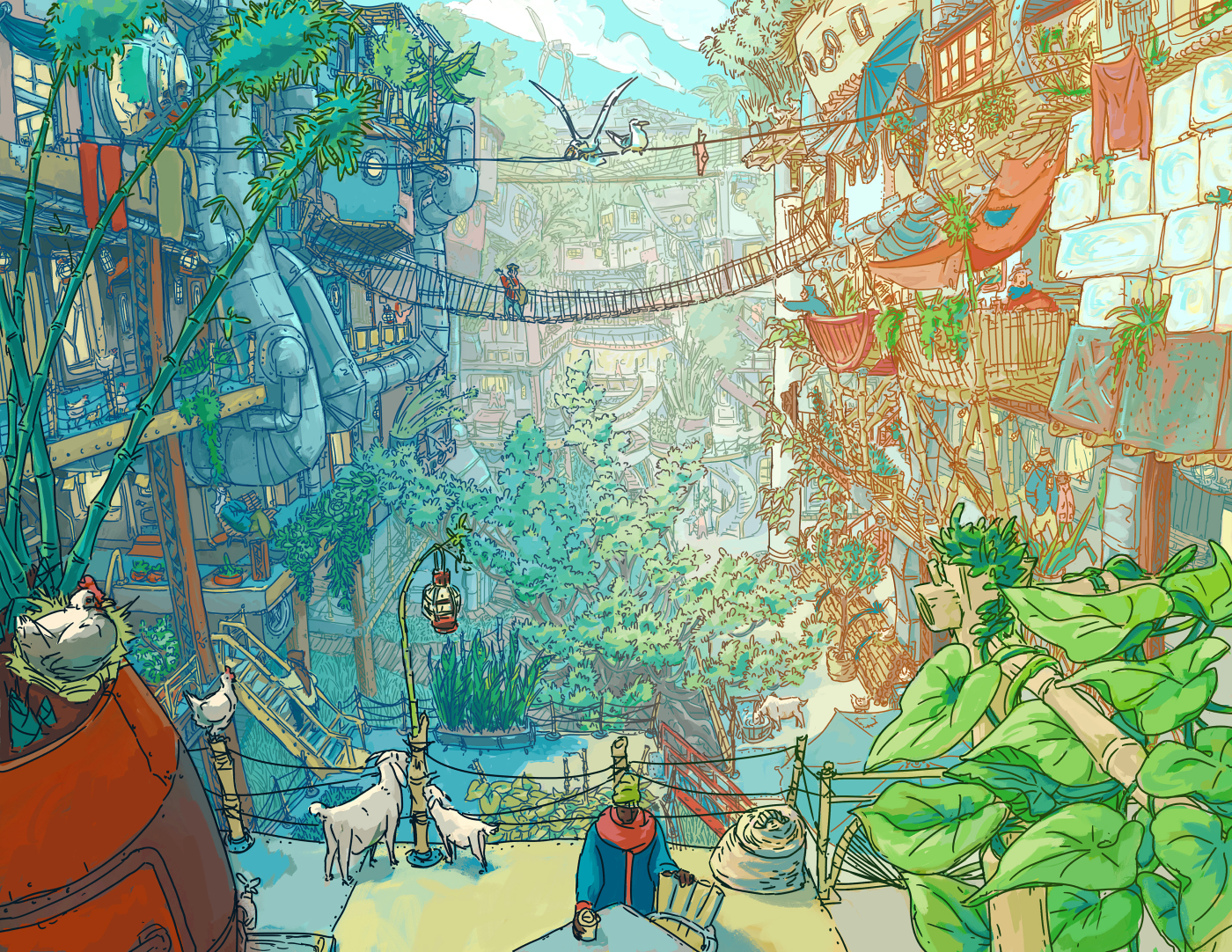
Blue Sky Environment Concept for unannounced solarpunk game from Peculiar Path
posted:
updated:
posted to: concept artBlue sky ideation process for environment designs and world building for an unannounced game from Peculiar Path.
The final image:
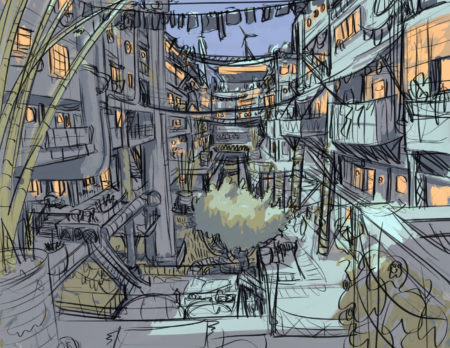
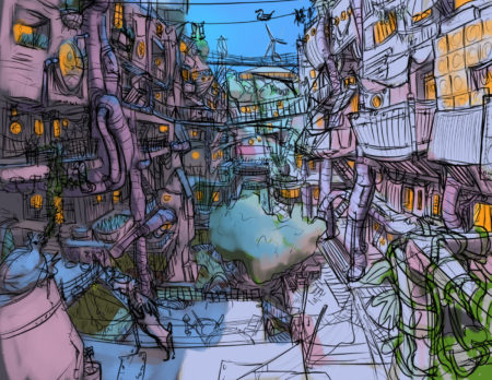
The linework:
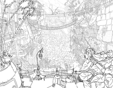
Stages in the design process – we started with something fairly realistic, pushed it to extremely stylized, and ended up somewhere in the middle for the final.
-
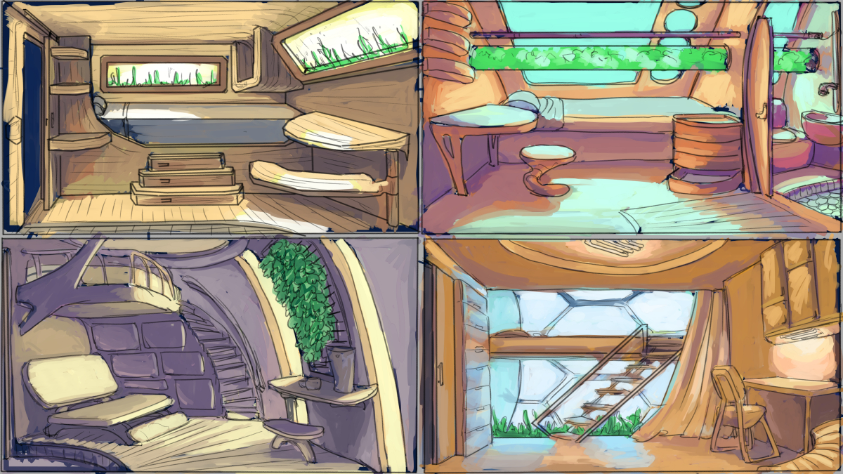
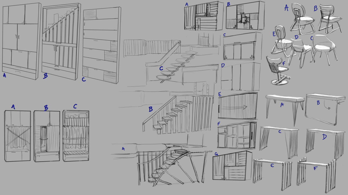
We did a pass exploring a more contemporary/futuristic aesthetic for the setting, focusing again on a cabin as a proof of concept, integrating elements from cutting edge material work in architecture and design.
The client provided a 3D blockout and some basic lights, built off of the floor plan and elevations, that I used as greyboxes to iterate the design. Here are the four directions we highlighted as possible approaches.
Here you can see the process of defining the layout, content, and style of the cabin:

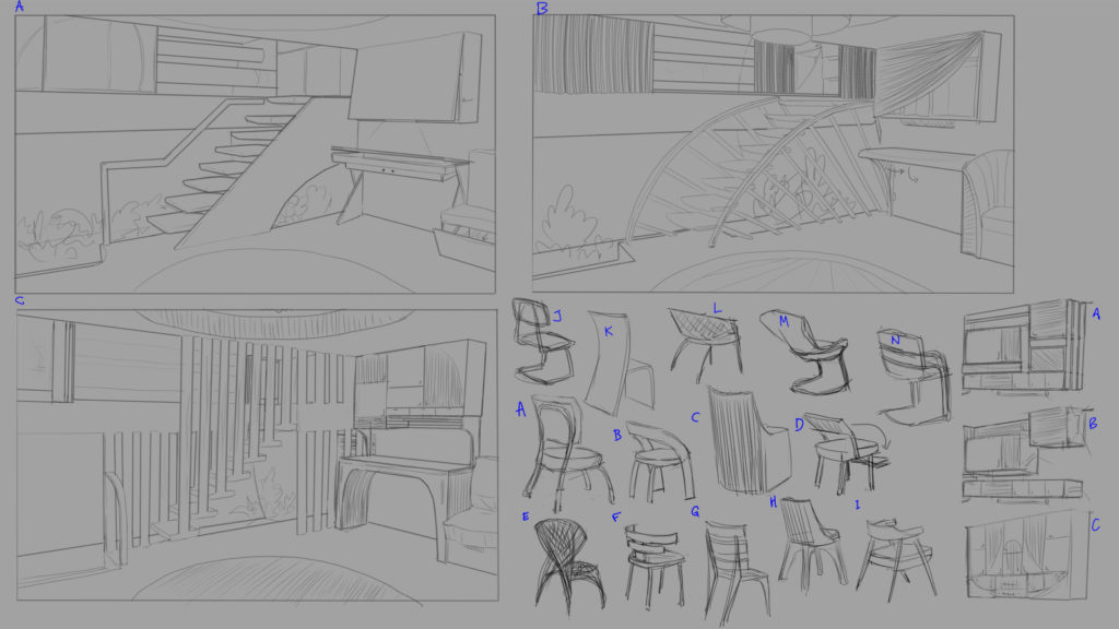

Here is the original floor plan, created after we chose a direction from these three colour thumbnails:

-
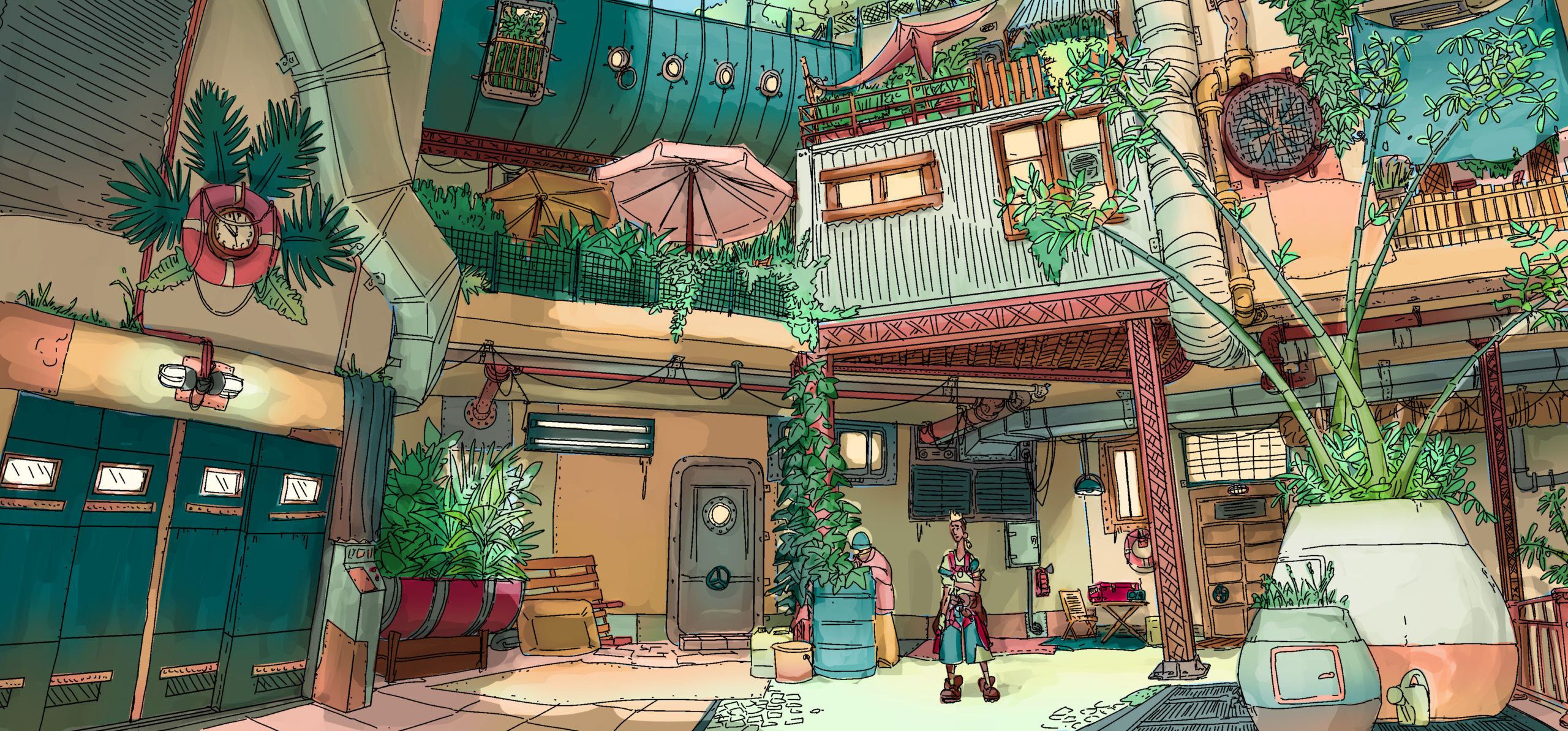
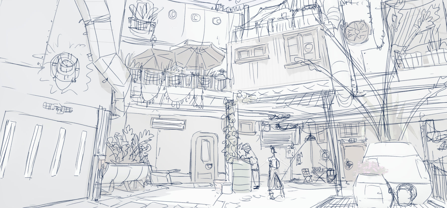
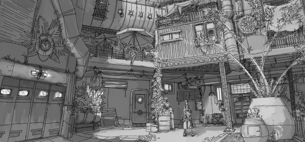
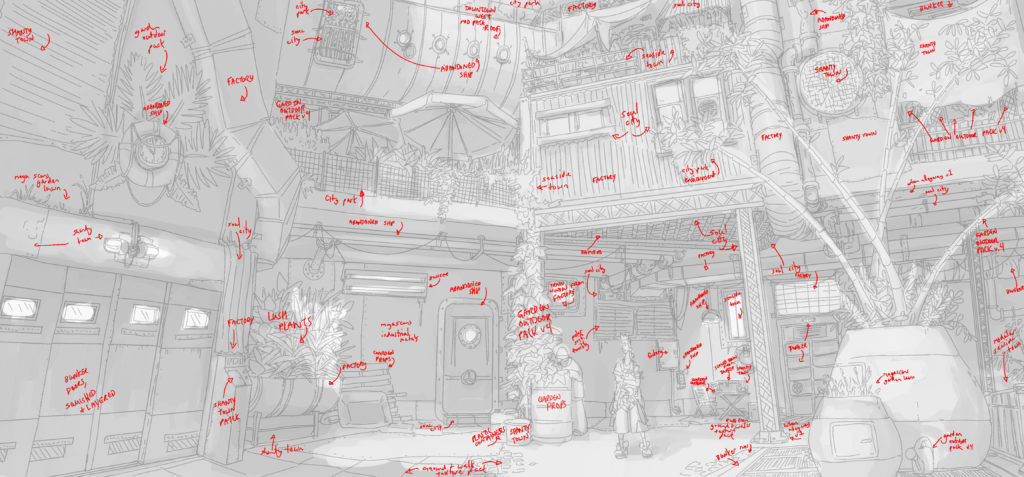
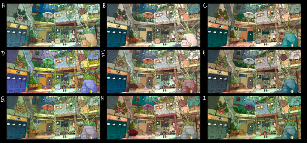
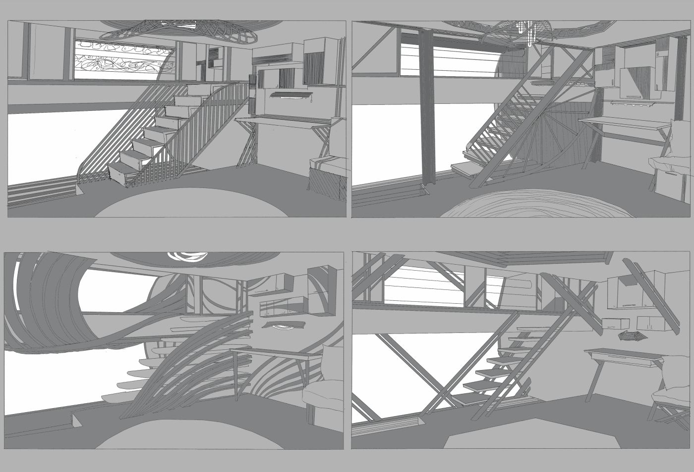
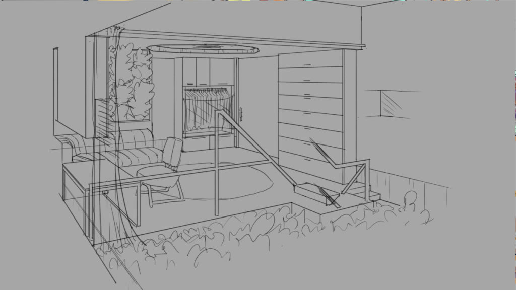
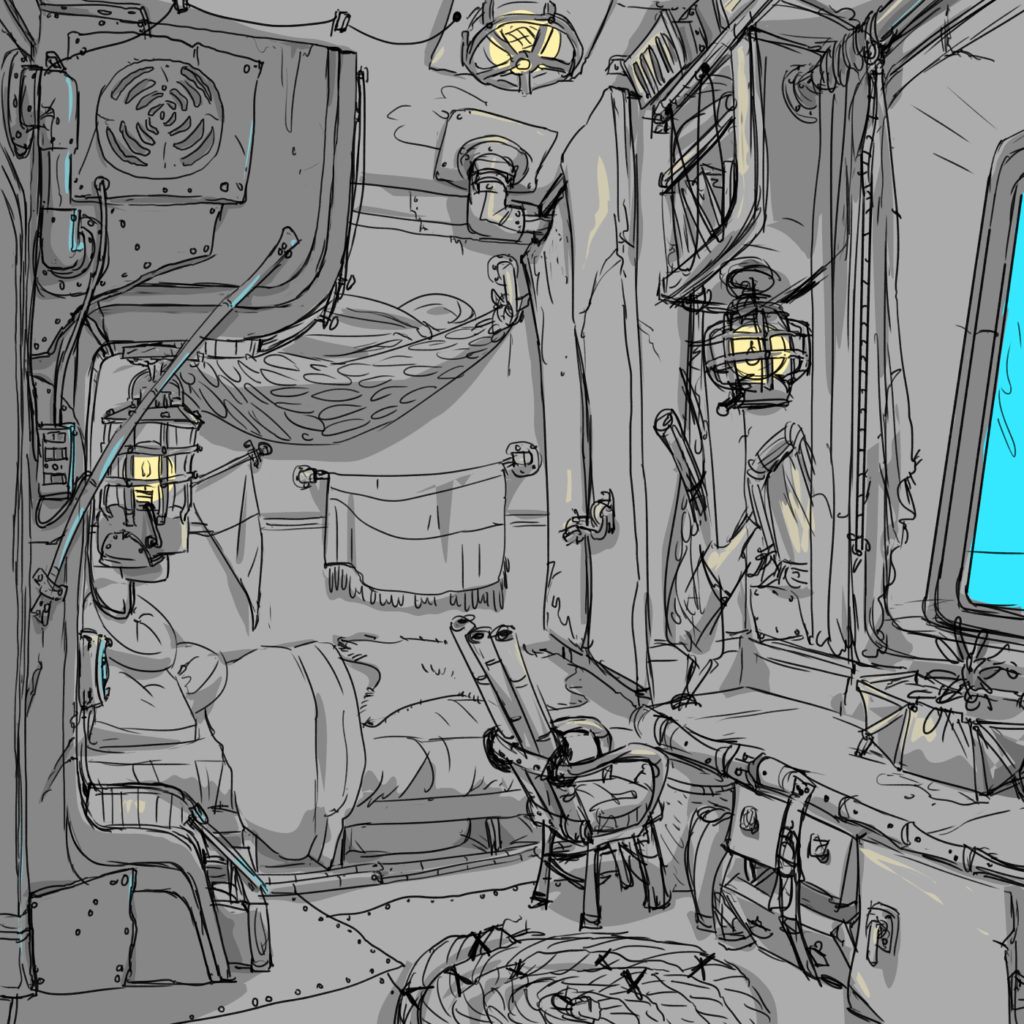
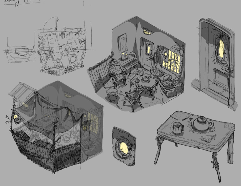
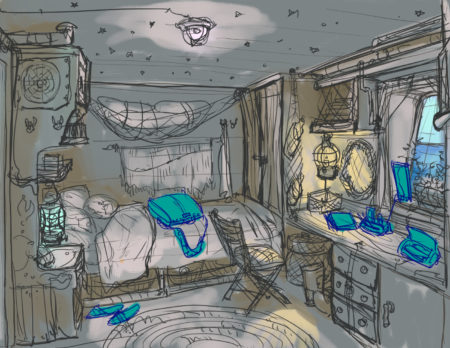
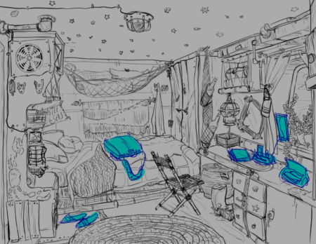
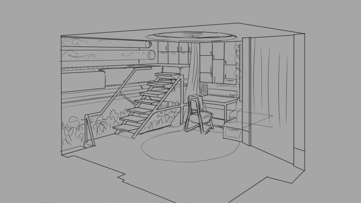
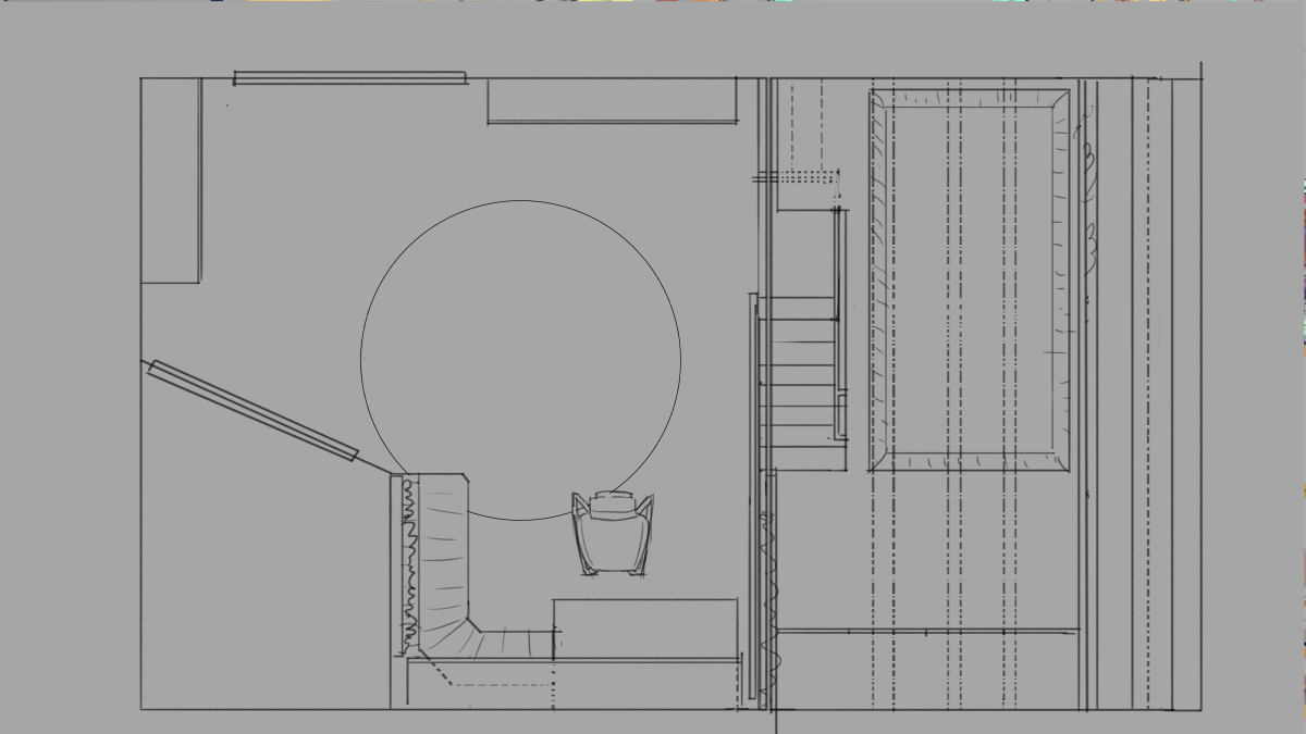
Interior design process for an unannounced title from Peculiar Path Games, featuring a cabin room and associated balcony layout.
The final room concept:
The final balcony concept, complete with floor plan and several callouts:
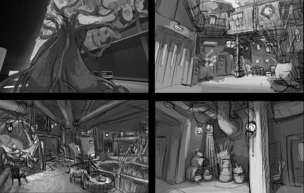
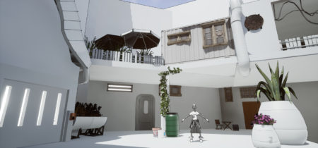
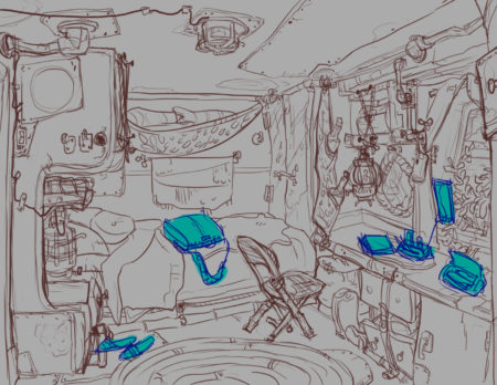
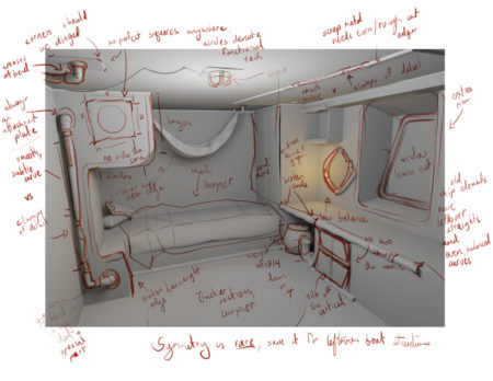
The cabin concept development process, start to finish, including a rough 3D blockout and feedback notes.
-
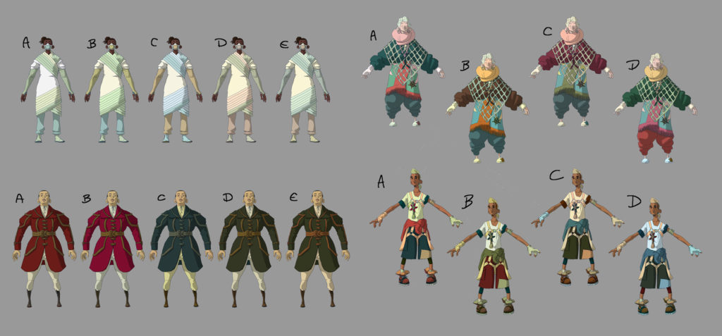
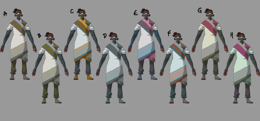
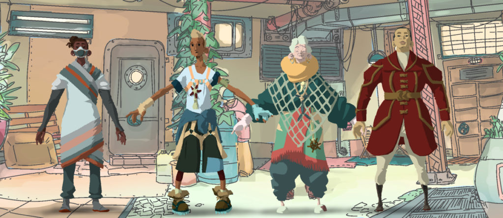
These four characters were designed for an unannounced Peculiar Path title.
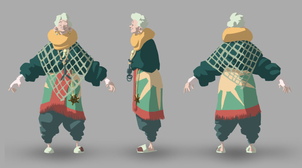
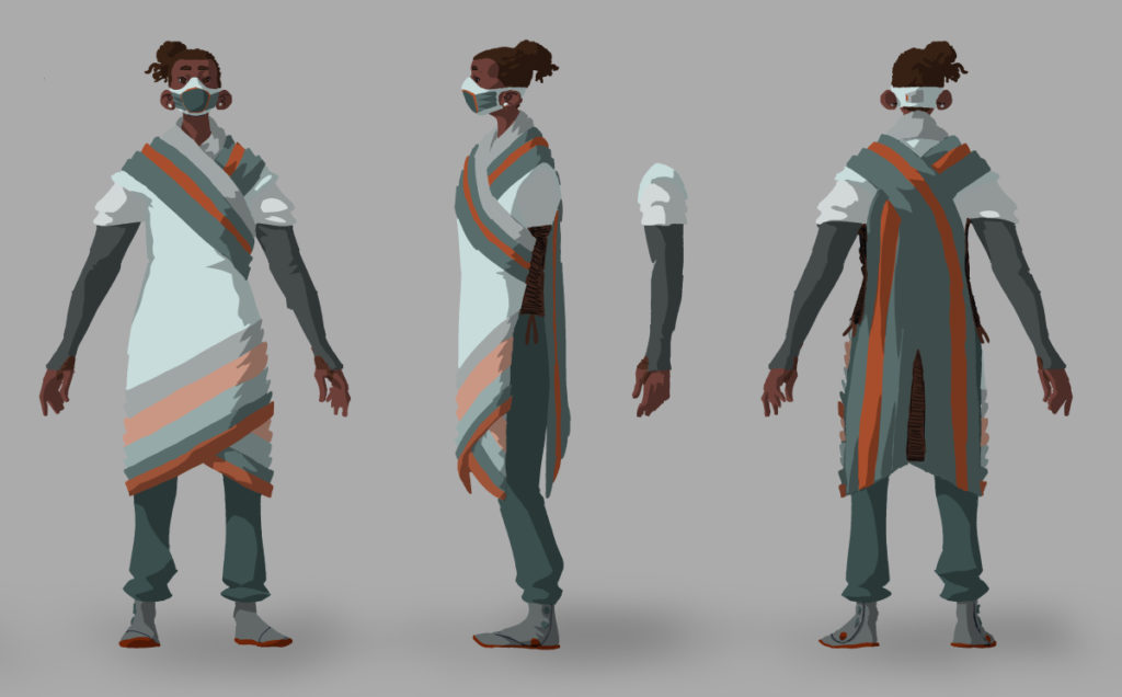
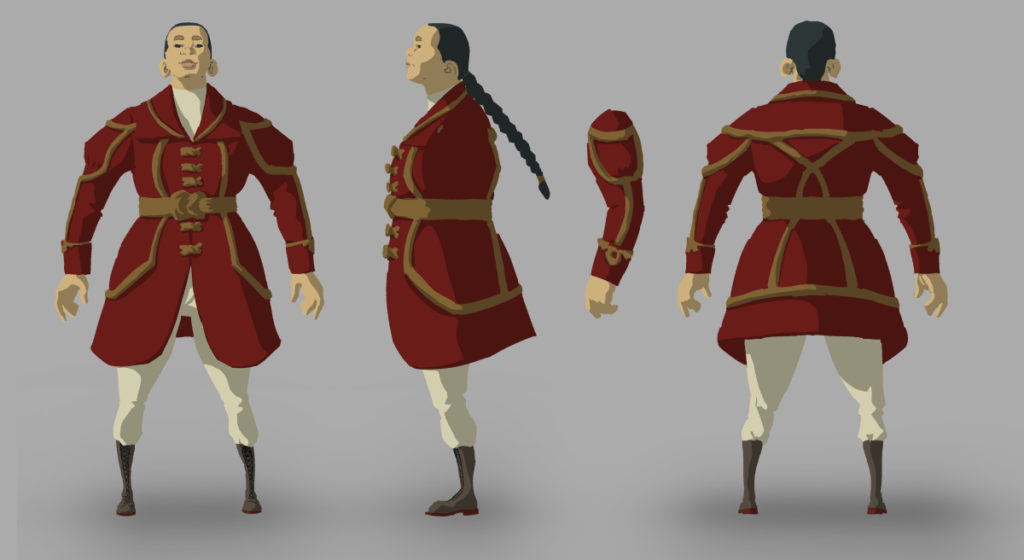
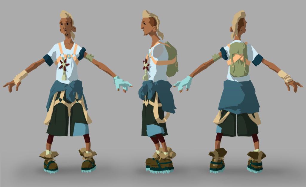
Below are some of the stages these characters went through.
We started with a skeletal template to help simplify future rigging processes, and iterated possible characters on top of it:
Once we had drawings down, we went through a colour design process:
-
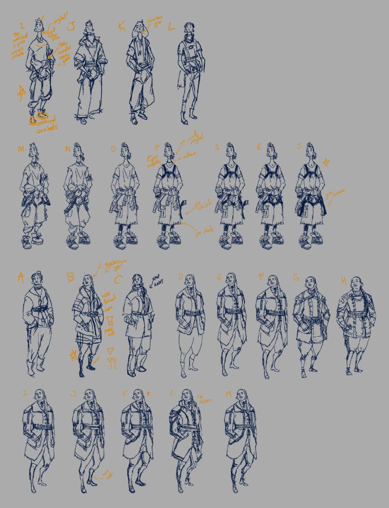
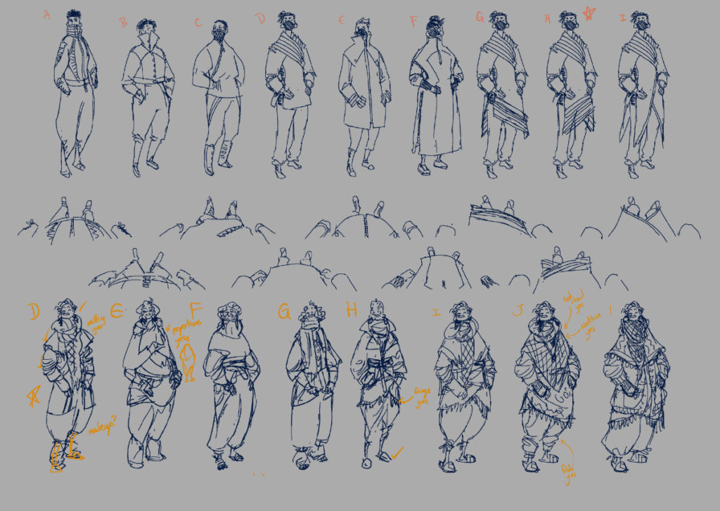
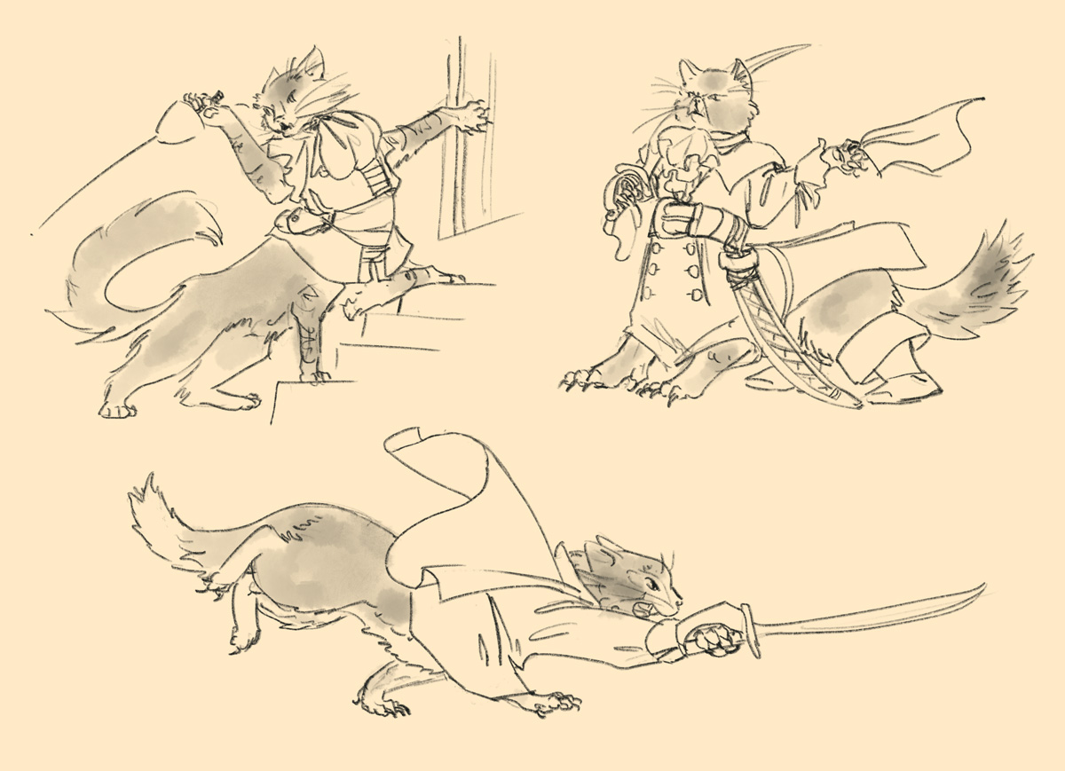
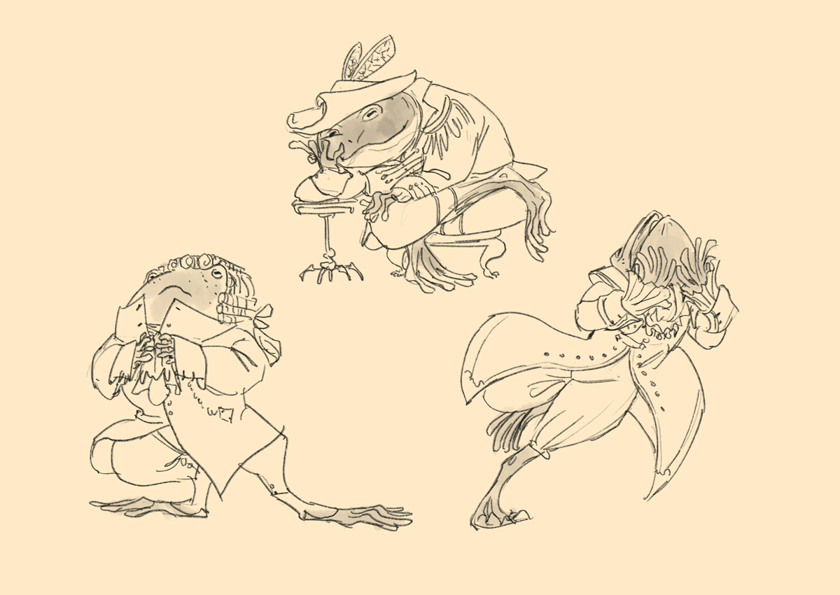
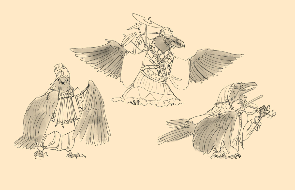
Twelve character designs created as a private commission for use as a selection of NPCs, with inspiration lifted from deep sea photography, Byzantine court robes, 17th century french coats, European folk costume, and Errol Flynn outfits. Available to license.
-
Thanks to the Orb, they’d been living large outside of time — until it all came crashing down.
Stranded on a strange moon, four space pirates and one stowaway find themselves forced to discover what comes next.

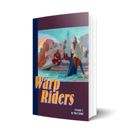
Warp Riders is a fast paced, pulpy, and sapphic orb-and-planet novella. It grew out of a NaNoWriMo tweetfic, and since then I’ve polished it up quite a bit.
If you’d like to read it for free, I’m running it online in small chapters, like a webcomic – catch up and subscribe right here!
But I’m also offering it as a pdf and epub, and all the money raised there will go to me getting it properly set up for professional level self publishing, including funding me drawing interior illustrations. Pick up a copy for yourself here and I’ll send you updated versions as they happen!
If you love a little magic in your sci-fi, a little space wizardry spiced with queer romance, I think this might be your jam!
-
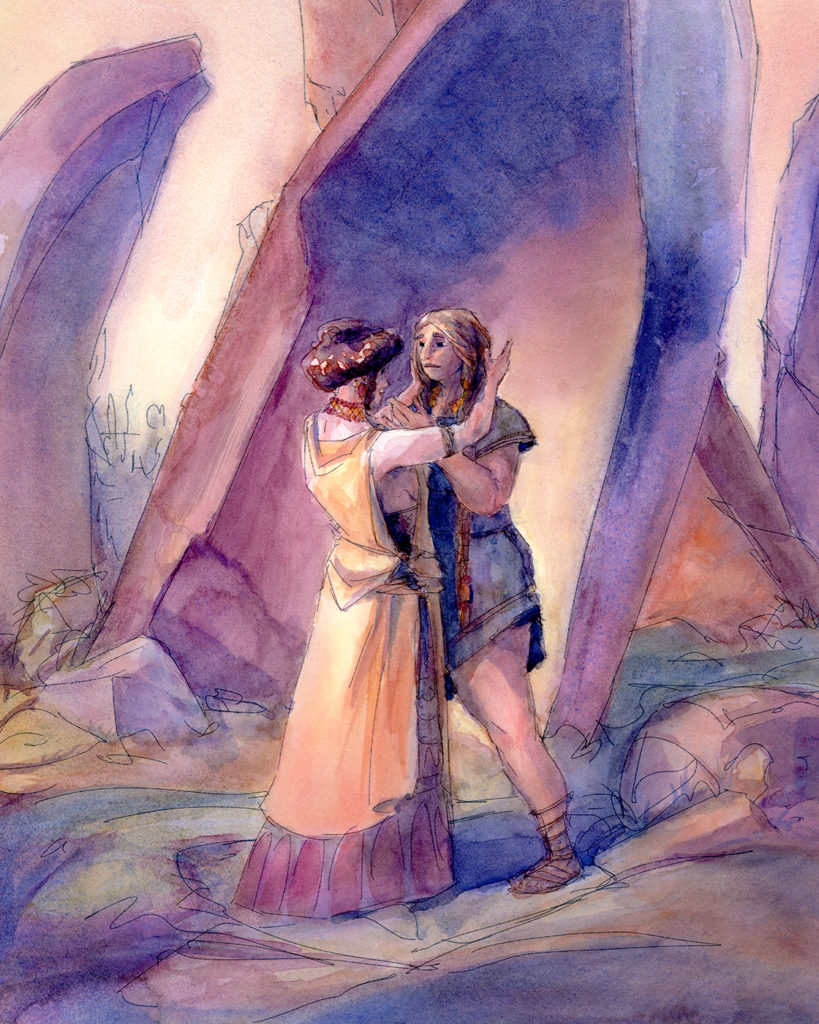
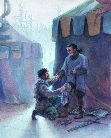
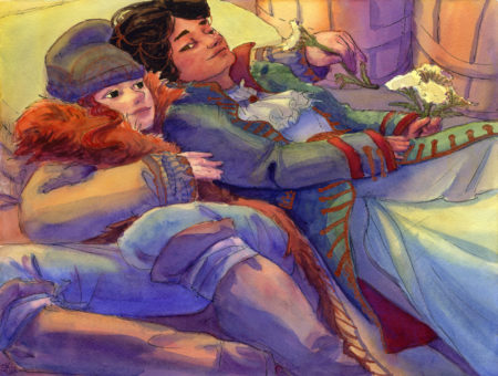
Three Dyads
posted:
updated:
posted to: arttagged: couples, little scenes, moody, original characters, painting, romantic, structure, watercolourI’ve been practicing taking pose ref and building a fictional scene around it, and decided to focus in on people having quiet moments together; I’ve also been trying to use more soft gradients in watercolour, which is DEFINITELY one of the trickier parts of the medium, so it’s been a great challenge! It’s also taught me the value of good watercolour paper, but I suspect that’s a lesson I’ll keep re-learning. So far the Fluid 100 line, which is 100% cotton, has been holding up better than I expected for something so affordable! Not quite as cheap as the paul rubens 100% cotton paper, but available in much bigger sizes.
It’s maybe not evenly distributed yet throughout these drawings, but I am trying – for real, really really trying – to find a fun and charming and simple way to cartoon faces that feels repeatable for me.
What do you think?
-
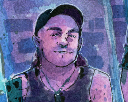
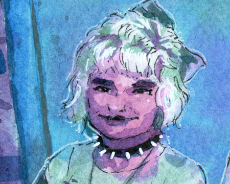
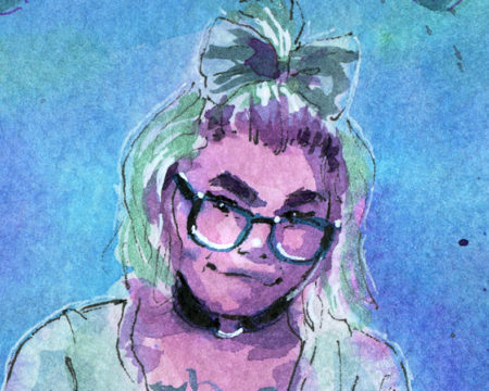
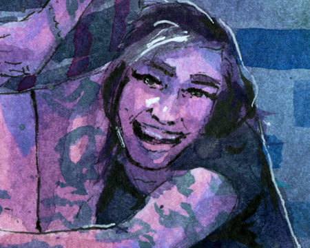
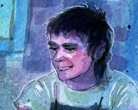
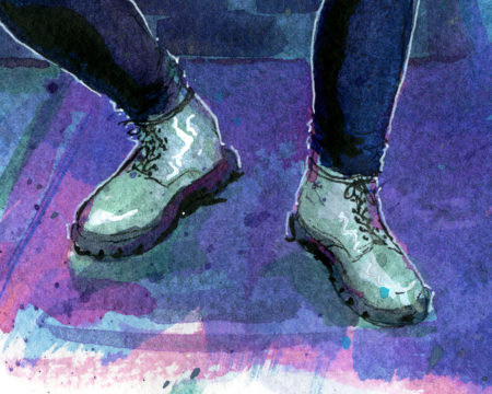
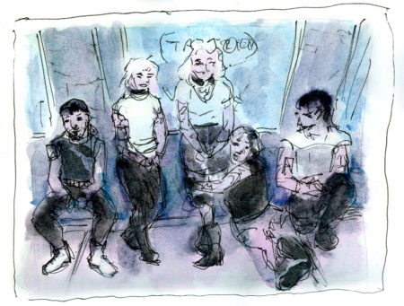
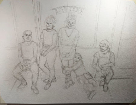
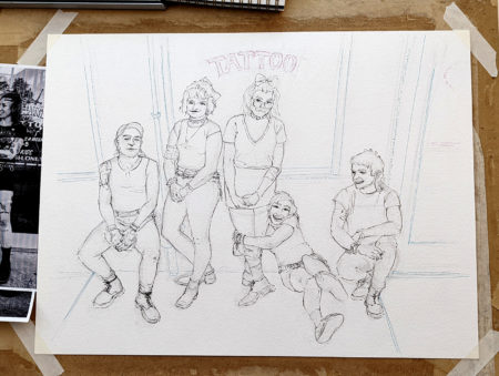
This winter I was approached to work on a commission based on the heavy metal portraits I did as studies last year, which, friends, that’s the dream, hey? Do a personal project, hear from someone who connected with it so much they want a private commission that seamlessly extends that body of work? Incredible!
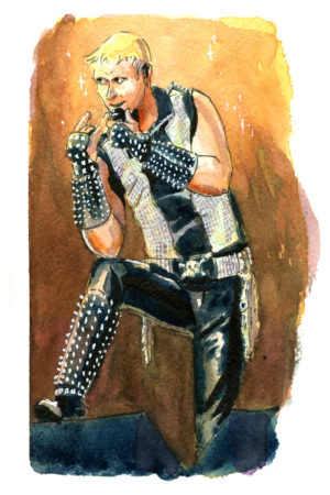


Lowell reached out with a request for a commission of the trans-feminist hardcore punk band G.L.O.S.S., and sent along a few reference photos and a link to this youtube video of a live set, which certainly set the stage for what an earnest, and intense, and also loud! band they were!
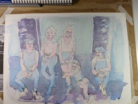
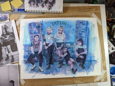
So, without further ado, here’s the final painting:
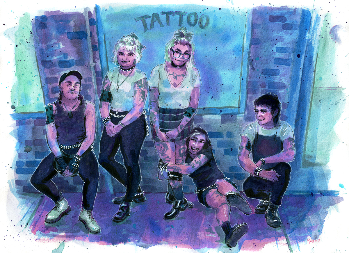
I don’t think this scan quite covers it though, because this piece is also luminescent, and iridescent, and also quite sparkly:
It’s also quite large – 12 x 16″, it’s gonna be a great statement piece and I wanted the colours to not worry about realism but to focus on pulling viewers in – while also being as queer as the core politics of this band.
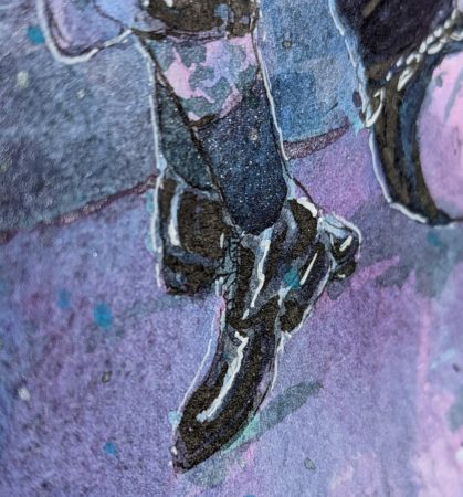
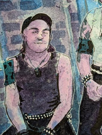
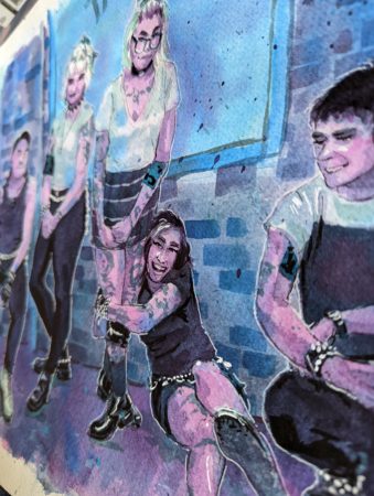
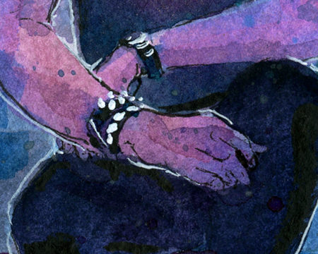
Finally, here are close-ups on the faces, and some other favourite moments of mine:
Also, would you like to see a couple in-progress shots from the drawing table? I really treasure these little reminders of how my paintings came into being:


Leave a Reply